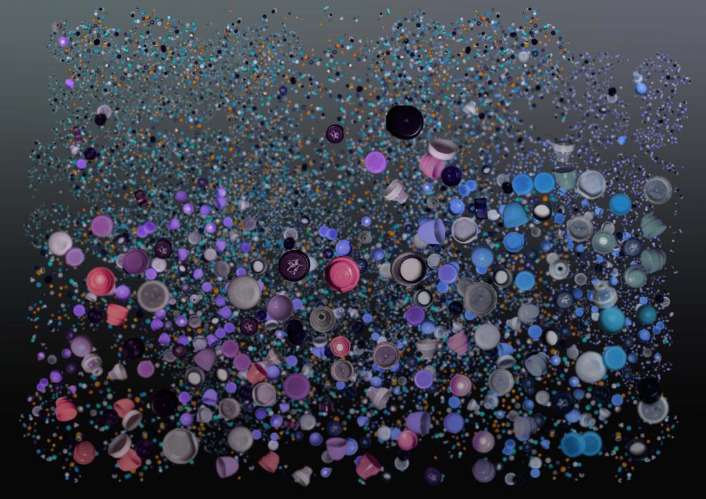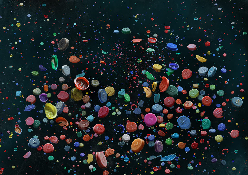

Compared to Barker’s work, my piece is very similar to hers – the light in the image comes from above, the positioning of the bottlecaps add weight and direction to the image, no real patterns or repetition is really visible, most of the shapes are organic and flow into the rest of the photograph, the images have depth because of smaller bottlecaps placed in the background, there’s a large range of tone and colours, but they overall tend toward darkness, most of the colours are also quite saturated and helps a viewer to understand that the pieces are about plastic in some way or another.
On the other hand, our images differ quite drastically too. Barker’s piece feels more as if the light in the image is natural, and that this manufactured photograph was something found in nature. The lines and shapes created by the placement of the bottlecaps also feels more natural, as it flows better with the image, much like the negative space, the random density of caps throughout adding to this effect. When it comes to the colour palette of Barker’s image, the colours are a lot more saturated and full as compared to mine – it looks dull in comparison.
I wanted to create a piece of work very similar to Barker’s, and I think while I did a pretty decent job at imitating her style, I don’t believe I captured the guise of realism that she does with her work when compiling all of her photographs together, as mine still just looks like it was done on photoshop.
