Final Edits


Comparison


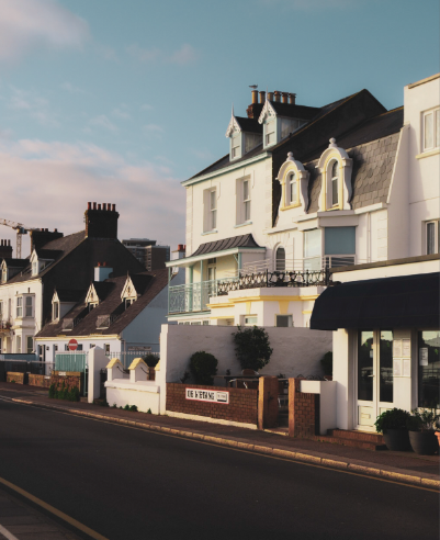
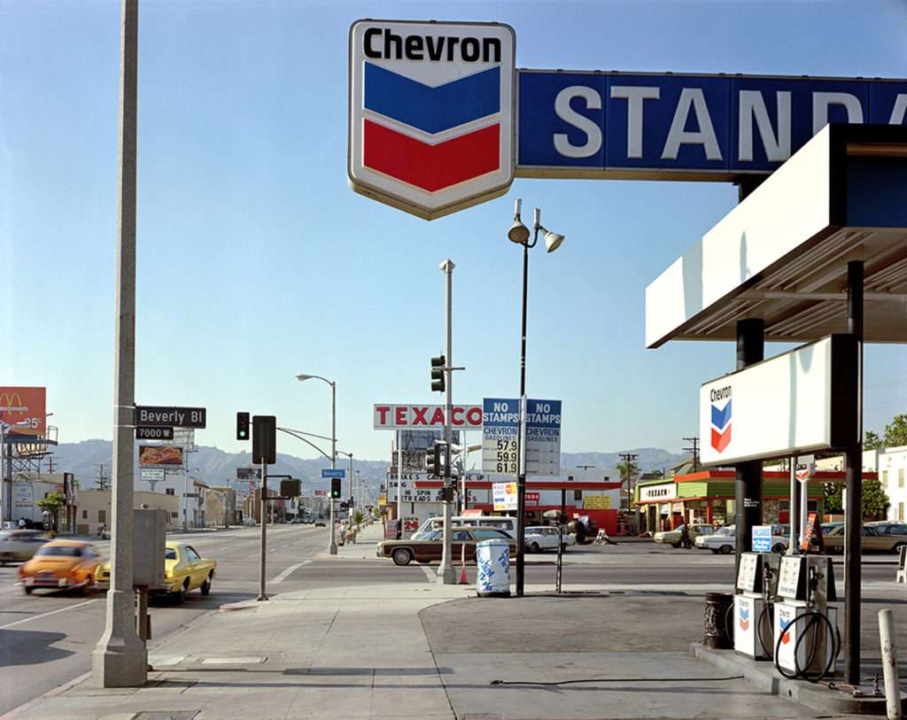
This photo was inspired by the photographer Stephan Shore, who takes vintage style photos of urban American landscapes, focusing on the different colours in his images. His photo includes a photo taken by the side of a long road, acting as a leading line, guiding our eyes to the back of the image where the mountains are located. It was taken in 1972, when Stephen Shore set out from his native New York City to Amarillo, Texas, on the first of what would become a decade’s worth of road trips across America. I found the exaggerated cool shades in this photo very effective, as well as the way the colours portrayed the place the photo was taken (the red and blue at the top of the image having similar composition to the USA flag). Moreover, I was inspired by the lighting in the image and the gritty look of the photo overall. The image I ended up with a similar composition, the photo being taken on the side of the road and presenting the viewer with an urban landscape. The use of empty space Shore’s image (the sky) is another aspect I found very successful in making the photo look intriguing and is something I included in my own work. However, I decided to focus on the warm tones instead of the cool tones like Shore did, editing my photo in a way that enhanced the warm colours. Although this being different, I was clearly inspired by his idea of intensifying the tones in his image. Furthermore, he edited/ took his photo in a way that showed the buildings off in a crisp and clear well- whilst I decided to add to the warm appearance of the photo by lowering the clarity of my photo, blending the details together. Moreover, his photo includes a leading lune, taking us to the background in the picture where the mountains are situated. In contrast, I positioned my camera towards the urban landscape, ignoring the ocean behind me which could’ve been a good addition to the image. The mountains in the back added contrast to his image, the rural aspect of the landscape slowly being taken over by our architecture.


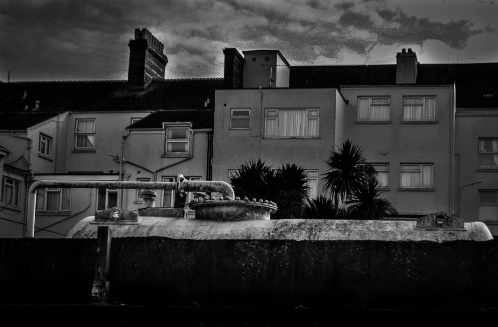
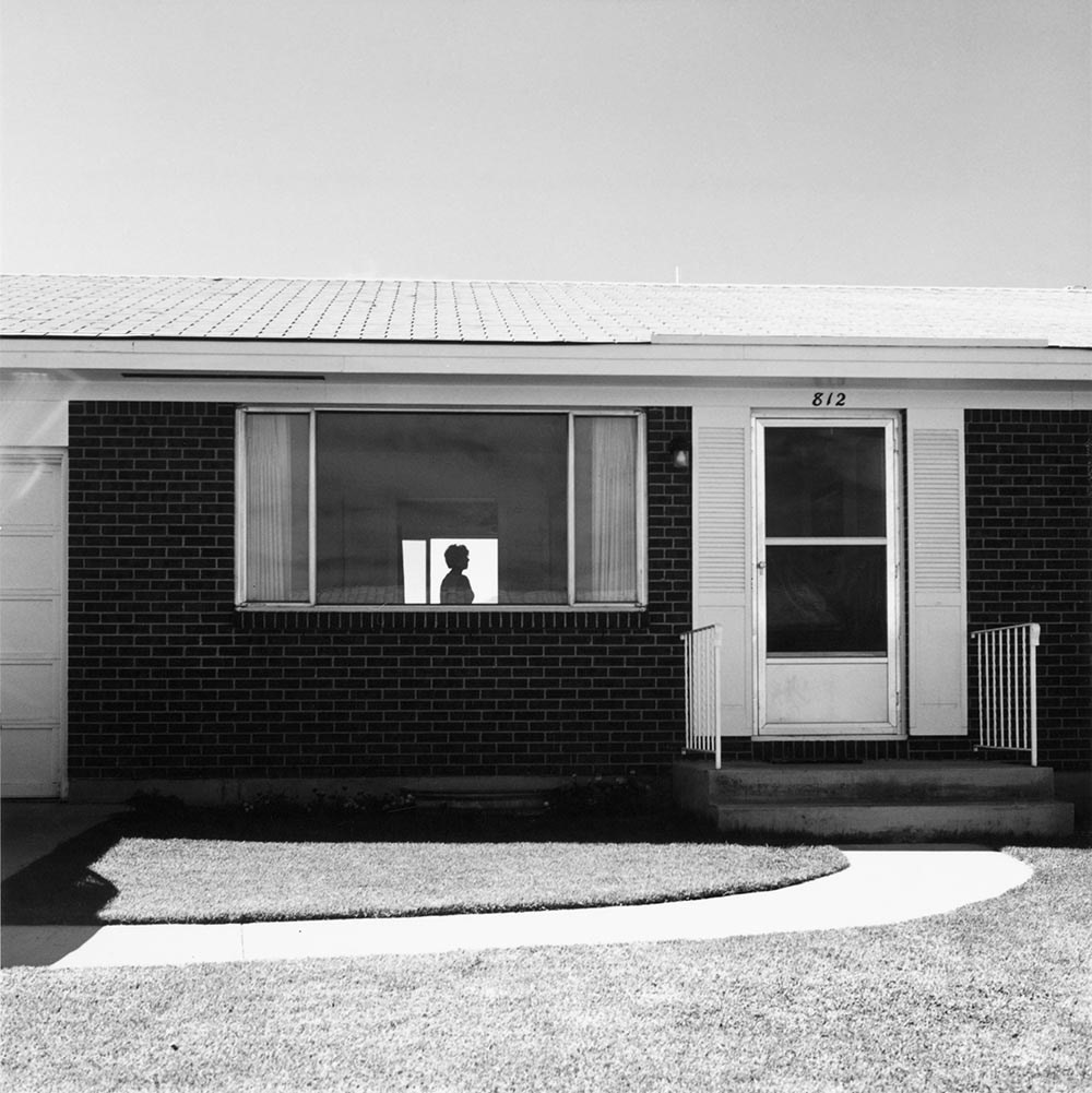
The inspiration for this paragraph was Robert Adams, a well known urban landscape photographer who captures repetition in his pieces, presenting our architecture as a desolate and boring design. His photo includes a flat house, with a lonely figure standing in the middle of a room located behind the large, uncovered window. I was inspired by the simple composition of his image, as it captures the building in a face on manner, the photo not showing the end of either end, hiding the true size of the house. I recreated this by taking a face on photo of building situated behind a rusty tank, not capturing either end of the house- portraying the idea that our architecture is taking over the world and we can’t even see the start or end of it. Our photos contrast in the aspect of nature, my photo including some palm trees being towered over by the buildings, while Adams’ photo doesn’t include any large plants. However, both of our pictures include a version of controlled nature (mine being the garden trees and his the short grass at the base of the image) reprinting the idea that humans are also showing dominance over the nature we leave around us, not letting it grow into its naturally wild state. His photo was also captured in black and white, which I recreated using Lightroom, editing my picture into black and white as I liked the way his photo showed off the different tones by having a very varied tonal zone. However, another aspect of our images that are different are the skies, his being a plain, calm sky with no clouds and mine being a dramatic sky with the clouds adding to the wide variety of texture in our images. This is something I could change since his photo has a much calmer appearance, letting the audience easily take in the shapes in his image (especially the silhouette) while mine is much more dramatic and dark which could distract the viewer.
