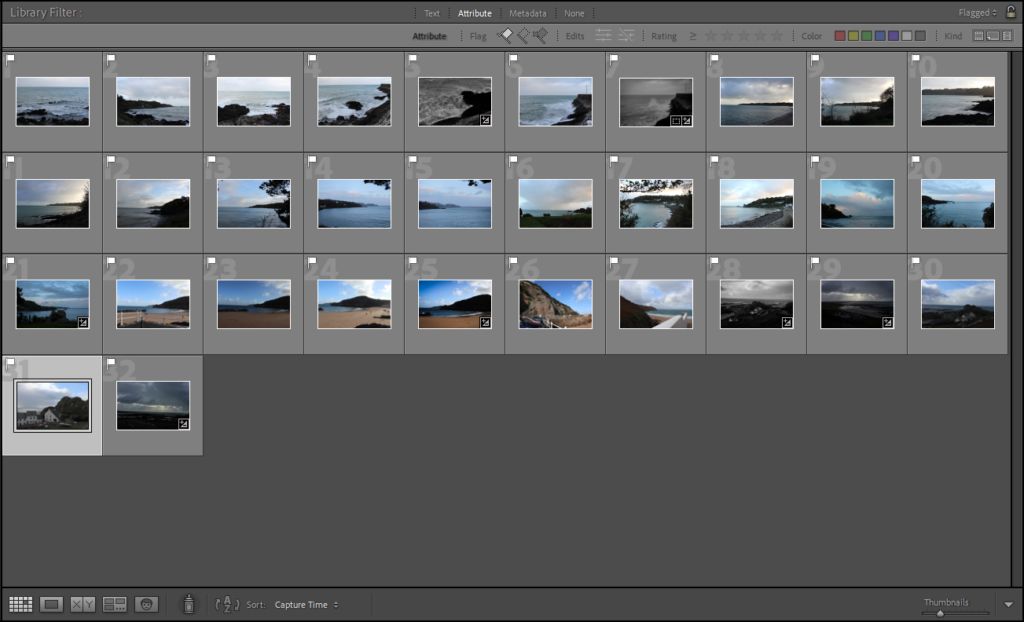
For my first photoshoot on landscape I visited different locations in Jersey such as Greve de Lecq, Plemount, and St Catherine’s, as well as some locations off island. I focused my images on the theme of ‘The Sublime’ capturing rocks, seas, coastlines etc. I tried to change my aperture and exposure to create different looks in the images, drawing viewers in.
contact sheet:

comparisons:
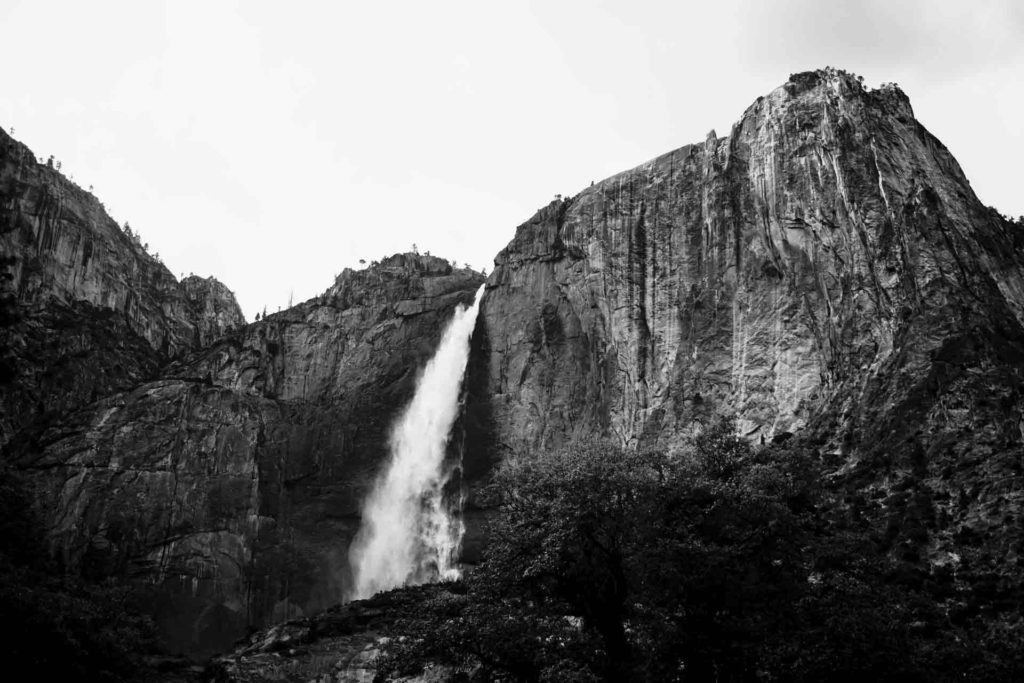
Ansel’s images:


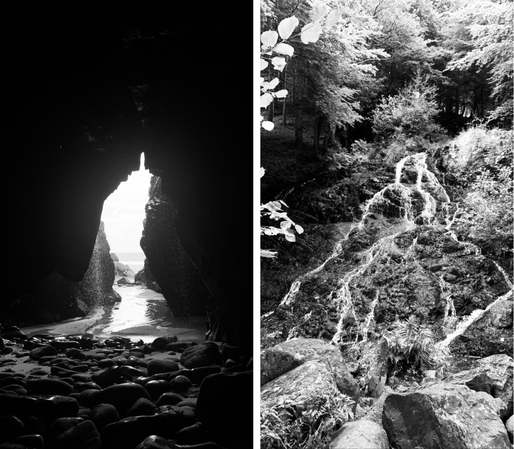
My images:

I like how my two image link with the triangle shape in the centre of the image, but contrast as one is a cut out in the rock and the other is pure rock. They also contrast as the background in the image on the left is very dark with the light seeping through into the cave, however on the right the background is mainly lighter with the centre darker. I also like how they both include water falling off the rocks.
Ansel’s image:

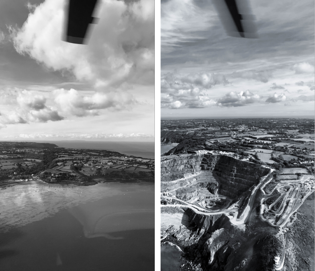
My images:

Overall I think that my images represent Ansel’s with a more modern twist, I think that because my images are black and white it makes them feel more detailed with different tones and depth. I like how my images turned out as they draw viewers in with their intriguing landscapes. I think that in both images the blade at the top on the image is where viewers eyes would first be drawn to. In the image on the left I think that the clouds then create a path for our eyes to flow down into the main part of the image and onto the land. I think that because of this it makes the image easy to analyse and focus on. I also like how there is two different tones in the sea showing the water and the sand almost making it look as if it is being protected as because we are an island we are quite venerable. In the image on the right I think that the different paths and patterns on the land give something for the viewers eyes to be engaged into. Because the image is in black and white it give the land more prominent detail making the image very busy. I like how the image has texture within it as it make for a more interesting image. I also like the contrast that it holds between the light fluffy clouds and the sharp edged crater as well as the rocky cliffs.
