Virtual Gallery

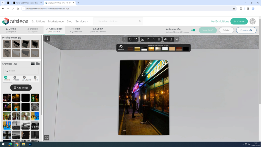
I chose this as one of my favourites because I like the mixture of the colours used and how there is a person in the view who seems mysterious.
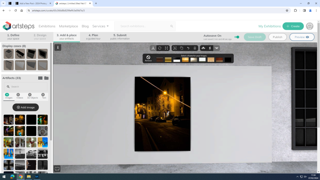
I like this one because of the intense lighting but also the composition and how it wonders off to the left whilst showing the urban buildings.
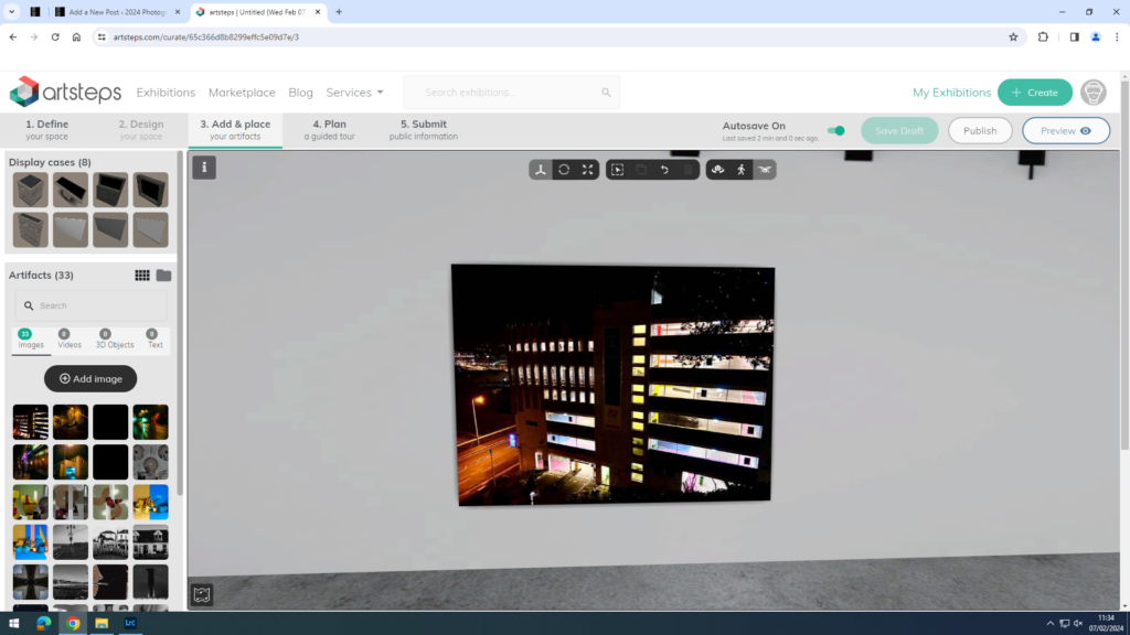
This one was nice to take because to get to this place it look some climbing and angles, and at the end the image came out well, with the street lights and the car park building it reminds me of some of Rut Blees’ work.
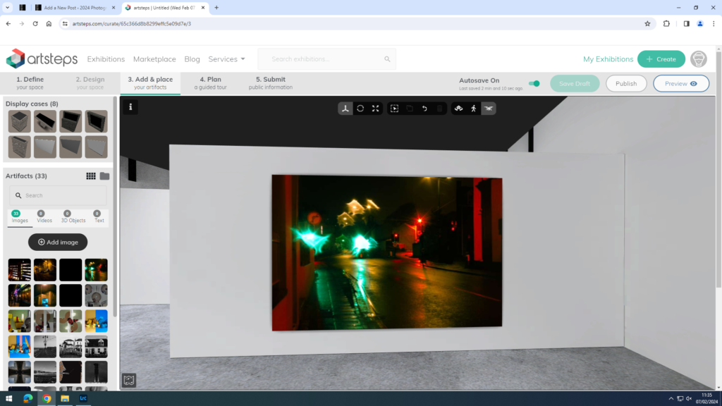
This one in my opinion looks cool because of the water droplet effect it has on the camera, but where it isn’t so intense you cannot see anything but it is to a point in which you can make up what the image is, and creates a nice aesthetic.
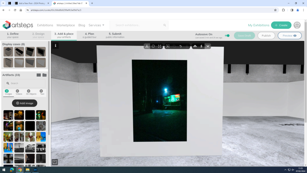
I like this ominous look of the image, and how it seems like there is something wrong or something will appear.
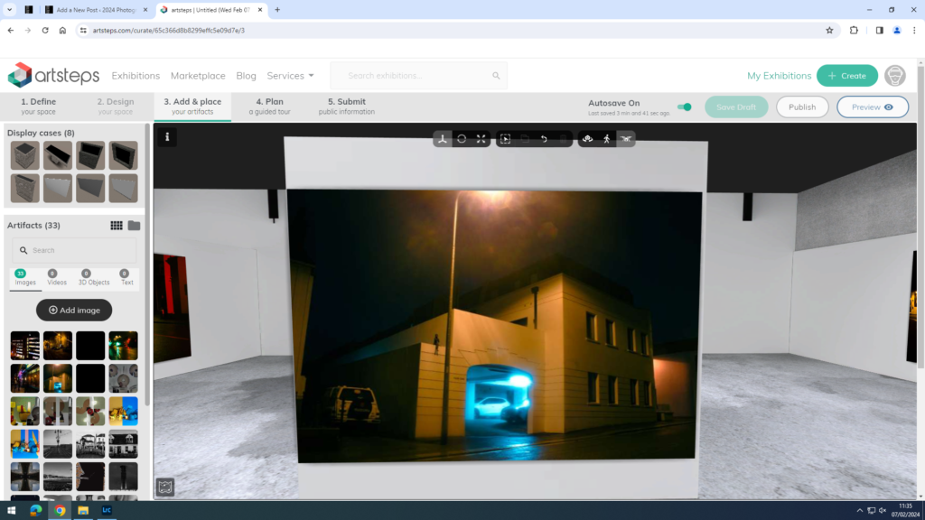
This one I chose to be my favourite because of the architecture and angles, but the lighting works in its favour creating something very nice.

Photo Book

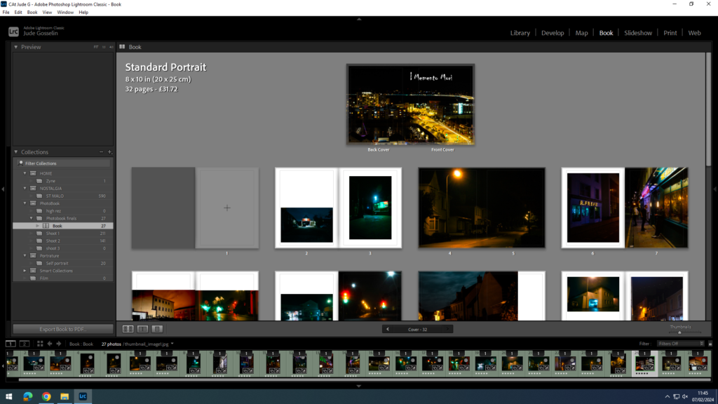
For the beginning of my book I wanted to use a skyline of the main area of what I was going to be mainly taking pictures in, but that it linked into the subject of Urban nightlife.

The title “Memento Mori” Means “remember you must die”, which is a very philosophical phrase that has been used a lot and I think suits the context of my images, as it creates a mindset for the audience of mystery and loneliness, but contrasts it with some of my warm images.

for the first phew pages i’ve started off with some almost scary images, which hold a lot of confusion in them where you might have a think of what it is or even where it goes. But then I wanted it to transition into a context of people in it who you might draw your attention to and also think about who they are.

I wanted to be bold when creating the layout for my images because of how warm they are and how if they where small it would be hard to recognise them. And I’ve also wanted to create a layout which follows your eyes for example the first images here work well because of the panorama effect.

these last images I wanted to have a personal mixture of good and less good images as a way of mixing up the emotion of the person looking at the images, whilst keeping the consistency of an ominous look. But overall I think the layout works well with these images and how I’ve kept the cold images with each other and warm with each other which is more pleasant to look at, whilst having an aim of putting the viewer through confusion but also having them appreciate the images.