Case Study – Coodie Simmons

Coodie Simmons is a filmmaker known for his distinctive style characterized by a raw and intimate approach to storytelling. With a background in music videos, documentaries, and sports content, Simmons has developed a unique cinematic language that combines elements of vérité filmmaking, stylized visuals, and authentic human emotion.

One hallmark of Simmons’ style is his use of vérité techniques, which prioritize capturing unscripted moments and genuine interactions. This approach imbues his films with a sense of immediacy and realism, allowing viewers to feel like they are experiencing events alongside the subjects. Simmons often employs handheld cameras and natural lighting to further enhance this sense of intimacy, creating a fly-on-the-wall perspective that invites audiences into the world of his subjects.
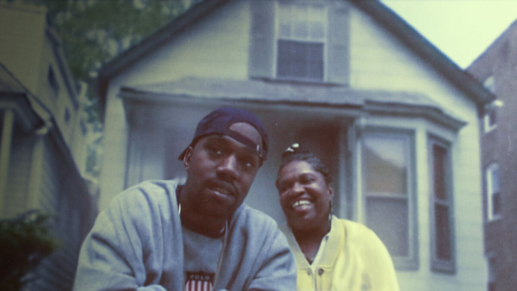
In addition to vérité techniques, Simmons is known for his innovative visual storytelling. He frequently incorporates stylized cinematography, dynamic editing, and creative use of music to enhance the emotional impact of his films. Whether he is capturing the energy of a live performance or exploring the personal struggles of his subjects, Simmons’ visual style is both immersive and evocative, drawing viewers deeper into the narrative.

Simmons’ background in music videos has also influenced his filmmaking style, particularly in his use of music as a narrative tool. He has a keen ear for selecting tracks that complement the tone and themes of his films, using music to underscore emotional moments, drive the pace of the story, and create a sense of atmosphere. This synergy between image and sound is a defining characteristic of Simmons’ work, elevating his films beyond mere documentary into the realm of cinematic artistry.

One of Simmons’ most notable projects is the documentary film “A Kid From Coney Island,” which chronicles the life and career of former NBA star Stephon Marbury. In this film, Simmons employs his signature vérité style to provide an intimate portrait of Marbury’s journey from humble beginnings to basketball stardom. Through a combination of archival footage, interviews, and vérité scenes, Simmons captures the highs and lows of Marbury’s career with honesty and depth, painting a nuanced portrait of a complex and enigmatic figure.

In addition to his work in documentary filmmaking, Simmons has also directed narrative projects that showcase his versatility as a filmmaker. Whether he is telling real-life stories or crafting fictional narratives, Simmons’ commitment to authenticity and emotional honesty remains constant. His films are imbued with a sense of humanity and empathy, inviting audiences to connect with the characters and themes on a deeply personal level.

Overall, Coodie Simmons’ filmmaking style is characterized by its rawness, intimacy, and emotional resonance. Whether he is capturing the thrill of victory on the basketball court or the quiet moments of introspection behind the scenes, Simmons approaches each project with a commitment to truth and authenticity that shines through in every frame. Through his innovative visual storytelling and keen sense of narrative, Simmons continues to push the boundaries of documentary filmmaking, creating work that is both compelling and unforgettable.

Editing of Film

In this screen shot you can see the structure of a section of the film, with the green being the underscore as well as the darker blue being other types of audio, the solid blue blocks are the different videos.

In this screen capture you can see how i have layered the different audios to create an ambient score throughout with Jamies dialogue and different environmental sounds layered on top, the use of the underscore can create a narrative within itself and i wanted to partially explore that using a song that slowly builds up until the end.

And like my case study documentary by Coodie Simmons, i wanted to use editing to portray part of the narrative so that is what i tried in my film.

Evaluation Of Portrait Project

Femininity Vs Masculinity

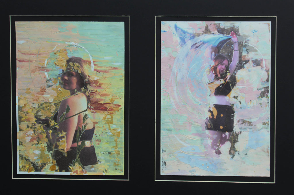
For this project I went in with the idea of identity devoid of gender and also beauty standards and the subsequent insecurity that comes with living in a society with such high standards.

initial exploration of theme

I knew from the start that I wanted to mainly photograph my friends who are all more typically feminine and have experienced insecurities of some kind. Along with taking to photos to then be painted over I wanted to take photos that made my friends feel beautiful in the process and how I see them externally outside of their own criticism of themselves.

First Photoshoot

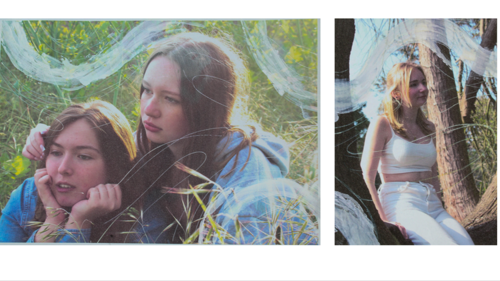
The first Photoshoot was inspired by Sian Davey’s ‘Martha’ work. Davey focuses mainly on her daughter in her life and out with her friends I wanted to do the same when taking pictures on a day out at the beach mainly focusing on my friend Keira.

I think when looking at my images compared to Davey’s work they effectively convey the intimate feel and exploring the personality of my friends, however I do wish I could’ve also taken more images in different situations to further explore my friends interaction with the world.

Second Photoshoot

The second photoshoot was by far my favourite and I think the most effective inspired by Sian Davey’s the garden and Tom Hunters work recreating classic paintings. It was taken in the grass land at Gorey

Photoshoots + Editing

Photoshoot 1

First photoshoot taken on the west side of the island with the intent of getting pictures of the ocean and grounding a general aesthetic that I like for my images, I wanted to focus on isolating and empty spaces- empty pebble beaches / large stretches of ocean / stranded boats. All to create an alienating atmosphere.

Photoshoot 2

A continuation of the first photoshoot getting pictures of open space + old boats.

Photoshoot 3

Focusing on making images relating to Francesca Woodman. with varying backgrounds.

Photoshoot 4

Images of my face made in studio to be used for photo manipulation.

Editing

When editing I had a particular pastel blue value I wanted to achieve throughout the images – very much inspired by the aesthetic values of Laura Letinski.

Changing the boat photos from colour to black and white. I did this mainly as I think it would flow better within the photobook I wanted the colour images to be very blue toned to contrast a lot of the red I am using. I also think the black and white better brings out the cold nature of the metal.

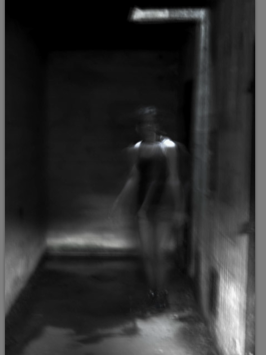
For the Francesca woodman inspired Images I switched them all to black and white to better mirror her work, I think it made the blurring from the slow shutter speed more obvious without getting lost in colour.

Artist Reference – Francesca Woodman

Francesca Woodman

I was inventing a language for people to see the everyday things that I also see, and show them something different” Francesca Woodman

Francesca woodman was an American Photographer born 1958 best known for her surrealist portraits of herself and other women. She committed suicide at 22 but made around 800 images in her lifetime that now are exhibited by her parents. Her figures are often semi nude and obscured, either by furniture, object or blurred in motion by low exposure creating a haunting effect. Most of her images are taken in decaying empty rooms with minimal furniture or carefully selected props. Woodman had a particular interest in mythology and the idea of transformation – there is a constant through theme of escapism within her work. Large amounts of her work are centered around her body using objects such as pegs and glass panes to press and distort her flesh in grotesque and exaggerated.

“Even when wholly present in the pictures as the subject of her self-portraits, Woodman is never quite with us, never quite with herself.

(Townstead. C (2006). Francesca Woodman. London: Phaidon Press Limited.)

Her ability to create unconventional self portraits is an interesting way to present identity, whilst photographs are taken as a direct representation the truth, She often finds ways to obscure her face and body staging her photos to create imagined realities. The nature of her death also changes the way we view her work with suicide being both a taboo subject but also one that draws fascination, whilst the intention of many images she made may have been different they have become an insight into her mind becoming both disturbing but also intimate as an exploration of human fragility.

Influences + Themes

In 1975 Francesca attended to Rhode Island School of Design. She was particularly interested in Fashion Photography, idolizing the work of photographers such as Guy Bourdin and Deborah Tuberville. The influence is notable in how Woodman uses clothing throughout her works.

Many of the characteristics of surrealism can be seen in Woodman’s work with possible influences such as Man Ray. Woodman uses unusual objects to create unfamiliar and dreamlike environments, she puts familiar items in strange contexts to evoke an uncanny feeling.

As Woodman was a student at the time masses of her work is purely experimental and were made to push the boundaries of conventional photography. Themes within her practice follow closely to how she viewed herself and her body with it being the main subject of many of her photos, the distortion of herself often makes her photos alienating and possibly addressing issues such as body image and confusion.

Analysis

The background is a decaying interior of a house creating an almost gothic atmosphere with a blurred figure near a brightly over exposed window blending into the dilapidated textures of the wallpaper, the texture initially making the figure hard to see creating an isolating feeling. Woodman uses long shutter speed and double exposures so she could actively feature in her work and create the blurry distortion she is known for. The ruble around the figure is layed in an organized semi circle making you question how the image is staged adding to the dreamy quality of her work. The texture of the floor boards create leading lines towards the figure as the main focal point of the image.

Most of Woodman’s work are very small scale forcing viewer to look closer at her work in an even more intimate proximity. The small scale details also makes you spend longer viewing her and her work suggesting that they were not meant to be just skimmed over quickly.