Blurb link
Here is a link to my photobook, Through the Eyes of a Child
Book


1. Write a book specification and describe in detail what your book will be about in terms of narrative, concept and design with reference to the same elements of bookmaking as above.
Narrative:
Overall, my story is based around childhood memories through a nostalgic sense/ emotion.
Design
I want my book to be a hardcover:

1) because it will be a strong book that will last longer
2) Hardcovers have a nicer feel to them, and the heaviness of Kawauchi’s adds to the story
The paper I want to use is glossy, because a majority of my images have a composition with light in them. With golssy paper, I think the colours, vibrancy and light will be stronger and more impactful than matt. The shape of the book will be landscape, either 8×11 or 11×14 (inches). I am going to choose a to have end papers to protect the first and last pages, and also give the book a ‘start’ and ‘finish’. If it is possible, I would like to use signatures, like ‘ILLUMINANCE’ due to the fact i don’t want a slope in the pages.
Unlike kawauchi, I want an inconsistent layout of photos. I am using portrait and landscape, and might layer one on another to lead the story. However, I do not want to create a messy or over complicated layout, so I will make sure to design it carefully.
I may add in some handwirtten text about my images, with writing such as why a place is nostalgic to me, or what the memories hold from my childhood.
Treasures of the past
In case I forget
Golden Days
Remember When
Walking in my footsteps
Walking in the footsteps of dreams
Dreamy Bliss
Hidden corners of childhood
Echoes of innocence: Tracing Dreams through childhood footsteps
Dreamy memories
Chasing dreams
Chasing memories
Echoes of Time
Reminiscing in frames


I think that my final outcome (photobook) was successful. There is a strong and clear message that travels through the book, and I think the images, layout, text complement each other well. I think there are areas where I could have improved however. This would include the use of a slightly larger range of subject matter within my images, as well as perhaps a more conscientious use of typefaces. I chose the font because I felt it was simple and clear, but there were probably more fonts that could have been more effective. I feel that my double-page spreads are the strongest parts of the book, but I also feel that my choice to include a continuous interview throughout was very effective. It makes the subject more human and it creates a more direct experience for the viewer to make it feel as if they are speaking to him personally.
I believe I did realise my intentions with this book. I have created a series of images linked by one clear thread. The brief of nostalgia is clearly met through the use of referential archive images, and I think the mirroring between new and old imagery is important to the narrative. I also managed to convey clearly the fact that surfing is essentially my dad’s whole life and something that he is constantly chasing.
I think that I have effectively made reference to my chosen artists, but not all of them. A lot of my images could be compared to those of Arnold Newman. Note the image found on the inside cover.


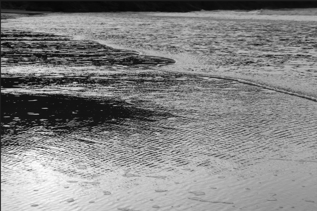
Also, I was able to replicate some of Roni Horn’s style in the final outcome. Her abstract use of water texture can be seen in some of my images.

Furthermore, I think it is fairly clear that W. Eugene Smith’s work has influenced my final outcome. This is because of the use of close up and establishing shots, as well as more formal portraits. Additionally, the use of an interview is reminiscent of his essay techniques.


My conceptual approach links to Smith because I went in with the intentions of creating a study of my dad and his lifestyle, although perhaps I did not manage to produce enough images from other areas of his life, which creates a slight lack of range and complexity.
I used a documentary style when composing my images, but I also added some more landscape and abstract based photographs to ensure it was versatile and varied. If I could do it again, to create more of a documentary approach, I would have taken more environmental portraits to frame my dad in every area of his life which would have created a more rounded and interactive character.
In editing my images, I generally used a few techniques, including Black and White, increased warmth, and decreased warmth. I did this to create a series of images that were linked by their colour schemes. The monochrome ones were dramatic and simple, and the others varied in their elements of drama and nostalgia.
Overall, this project has taught me more about expanding my methods of conveying a narrative. I have enjoyed exploring different types of shots, layouts, and typefaces and I think this has been a valuable creative experience and it will certainly influence my later work.
https://www.artsteps.com/view/65c347f12b0baee5b1c84bba


Overall, I think this was a very successful project, with the final photobook creating a strong narrative for the viewer to go through. I showed development and experimentation, doing multiple photoshoots and using a variety of archives. I think the interview and the physical manipulation of the archives was a good touch, since it caused the final outcome to be much more personal. I think I told the story of my grandparents and the effect of my grandma’s past well. I think my project could’ve been improved if I took more photographs, giving me a wider selection to choose from and therefore, giving me the opportunity to use the best of the best pictures. I think it would’ve been even better to include physical manipulation on my images, not just the archives, to tie my work in further with my main inspiration, Carolle Bénitah.
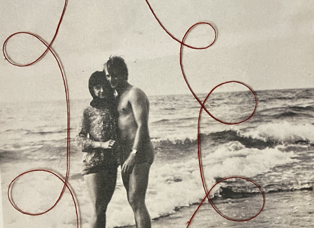

However, the thread arrangements I did on the archives were very successful, and despite being simple (especially when compared to Carolle Bénitah’s work) they added a lot to the pictures and portrayed the metaphors (love and pain) I wanted to show through my work successfully. This is another way I linked my work with Bénitah’s; I included a lot of indirect indications of the story I wanted to tell through my work, as she also used the colour red to show emotion in her work. Moreover, the quotes I included in my photobook (taken from the interview) added a variety in mediums to my photobook, as well as further promoting the narrative. However, I believe I should’ve attempted more complex embroidery, to relate more to Bénitah’s work. The cover was another feature that I think is very successful, the title and picture heavily relating to the photobook, without being a cliché. Using polish for my title and quotes was another factor that made the project more personal. Not only did this project have a good outcome, it helped me connect with my family more.

Narrative: What is your story?
Describe in:


First thing I decided was that I want my layout to be standard landscape and first page to begin with an archive. I also have decided to add border around each archive- making the colour a light beige and having a width of 12pt.

This is the layout I decided on for my first pages, they cover a mix of my first photoshoot and archives. I want to cause the book to appear as though it has three chapters, each chapter showcasing my 3 photoshoots mixed with archives.

I put these two photos next to each other since the new image is a re-enactment of the old one. I will do this multiple times throughout the photobook.

I paired this image with an archives since the new photo causes my grandad to look as though he is staring at the other photo, creating the sense of longing to be present between the pages.

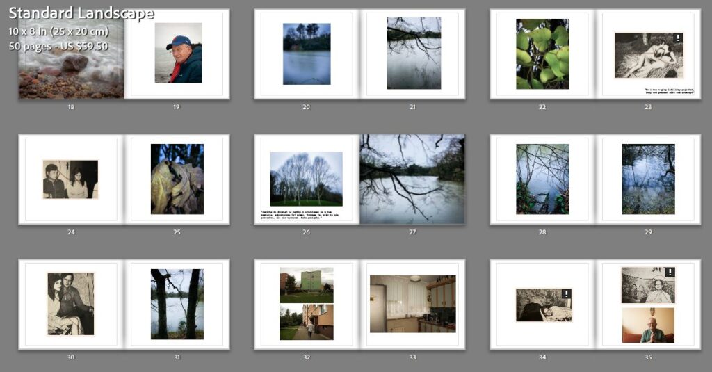

This is my final layout of the pictures in the photobook.

I included my essay at the end of my photobook, using size 15 font for my title, size 11 for my main quotes and size 10 for the main bodies of writing. I used the Courier New font as I think it is very clear and easy to read.

I made the quote slightly lighter, to have contrast between my writing and another person’s views.


Final essay layout.
I firstly added writing on the first page- my name in the top right corner and the title of my photobook in the bottom left corner. I called my book Upływ Czasu, which in Polish means The Passing of Time. I put both the title and it’s English translation- the translation in a slightly smaller font and in a lighter colour.

I also added text (key quotes) from the interview I did with my grandad. I think it is effective since it acts as a more direct indication of the story. I decided to add the quotes in polish, making the photobook more personal.

I decided to not make the text too large, making it a size 15. I again went with the ‘courier new’ font, as I did for my essay.


Final layout of the text.

For this cover, I used an archive that I photographed with a thread arranged on it. I made it a two page spread so that it would be wrapped round the front and back cover. The title is in the top right corner.

For this cover, I used the same archive but only put in on the front cover and the spine. I added another image for the back cover, which gives the effect of the back of the picture. I placed the writing in the top right, a thread running between the two words.

For my title, I made a 55 sized font (courier std) and made it red, matching the deep red thread used on the cover and throughout the photobook.

I kept the spine simple, adding my name and the title of the book, making it size 16 and the same shade of red as the title.

Final photobook cover.
1. Research a photo-book
The book is trying to tell the story about a persons mother and their loss of identity by losing her. She deals with her grieving by looking for her mother in a variety of objects and nostalgic things, but yet also gives them new life by photographing the old. She uses multiple different genres such as Still life, landscape and portraits combined into one photobook. For her photobook she uses a wide range of using each page such as one singular picture on a double page spread and sometimes two small images only covering the middle of the page. She also uses staged and natural images such as some being old pictures of people going about their daily lives and some where they are directly posing for the picture.
2. Who is the photographer?
I Feel that she made this photobook to share her experiences with losing her mother and to also help other people see a different side of a persons inevitable death and appreciate the time that they had with that person. I also feel that she wants the world to appreciate her mother and see her inner beauty like the way she saw it, and to also treasure her mothers legacy so her name goes unforgotten.


I didn’t end up doing my 3 photoshoots in order so this last one was a bit rushed, I am happy with some of the results of this photoshoot but if I had more time I would make some changes such as bringing more objects to school rather than taking pictures in my house.



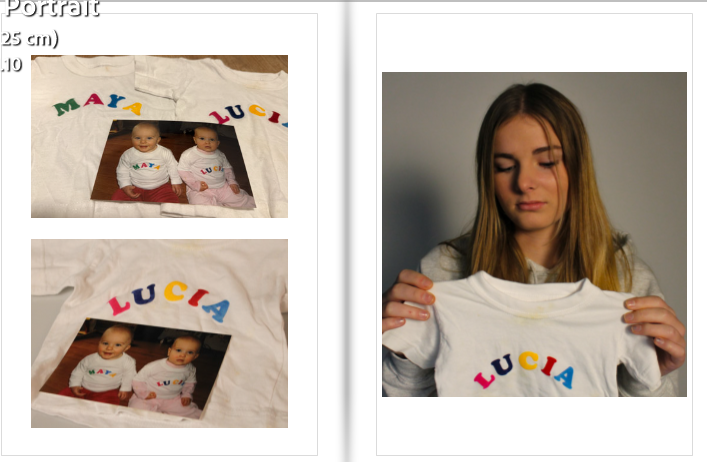
When making my photobook I wanted to tell a story with my layout. I chose the standard portrait layout due to my mixture of still-life and portrait images. I personally feel that the majority of my best images are the portrait ones. I wanted a mixture of formats in my photobook so I did a few on a two page spread.

And I did some with three photos on a page

This is my final photobook before I get it printed
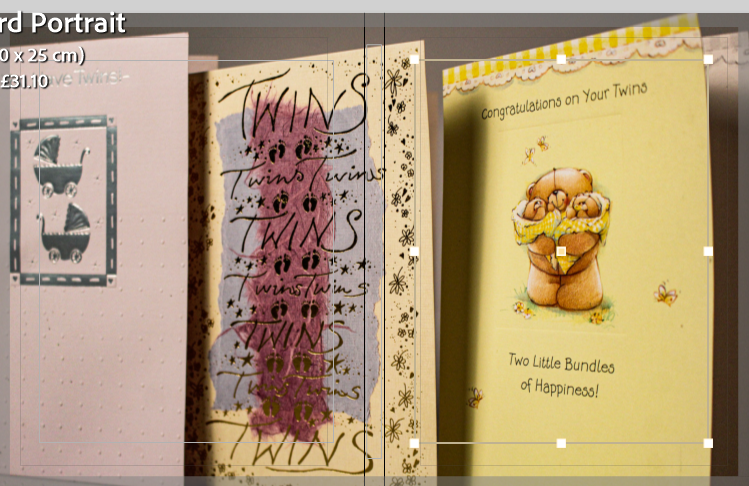
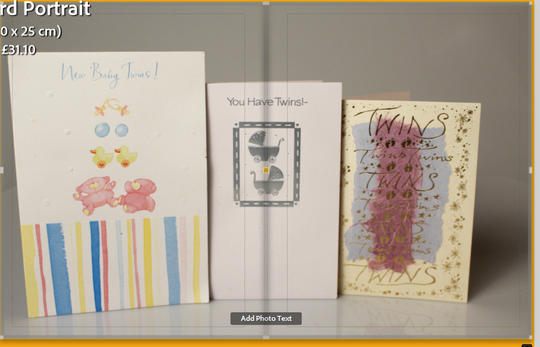




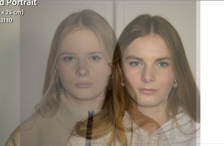


Overall I am happy with my final results, I feel that it tells the story I was trying to portray and replicates part of my childhood. For my next project I have learned that I don’t really want to do still-life images as they are a lot harder to capture the emotion that I am trying to express through my photobook.
Considering all my past photoshoots, I realised that my project from last year of ‘Girl Pictures’ is very similar, if not the same as my personal study project. I’ve decided to take a few of my images from that project and use them in my photobook as I got a good grade from that past project and believe they will benefit me in this one. The only issue with this is when I carried out the photoshoots for last years project, it was around spring time. It was lot dry and brighter outside and therefore colours in my images were very saturated this contrasts a lot with my current images in this project as it is winter, its dull and gloomy outside and there is not a lot of strong natural light. So creating darker, more greyscale tones in my photos. I plan on re-visiting my photoshoots from my past project and potentially editing them more to fit in with my current images.
CHOSEN IMAGES FROM PAST PHOTOSHOOT:


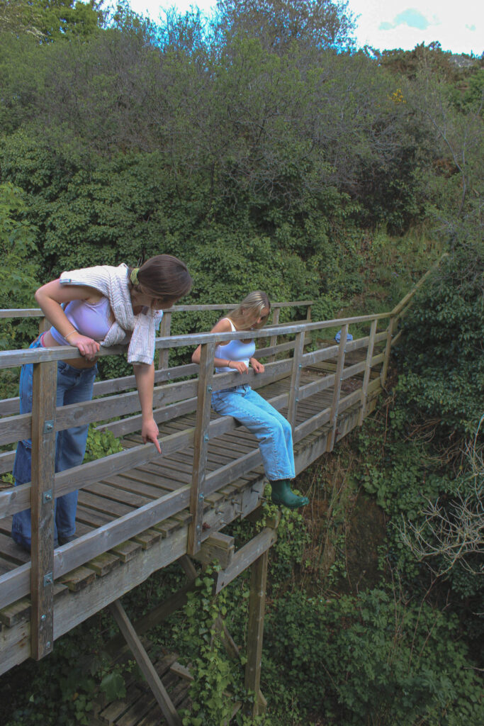


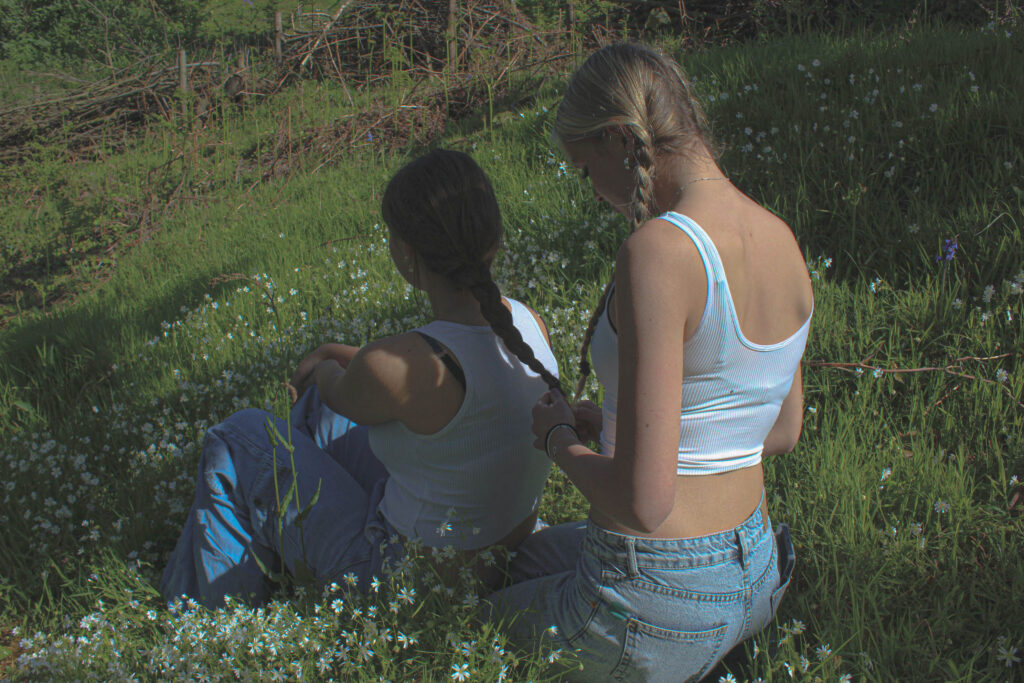

I went back to refine these images and make sure they fitted in alright with my current photobook images. I decreased the texture, highlights and shadows and increased the haze to create the fairy-tale look on the images. This is because my current images all look like this and the lighting from the past photoshoot is a lot more bright and harsh.