How I will be presenting my final prints:
A3:


A4:


How I will be presenting my final prints:
A3:


A4:


‘To photograph is to appropriate the thing photographed‘ Susan Sontag (1971), On Photography
For my personal study I want to follow the theme of architecture through nostalgia with different buildings from old to modern. Through this I want to show the evolution of architecture and how is has changed from what I used to see when I was younger to what I see now becoming more and more modern. Within this I may photography different houses or buildings that have been damaged due to the storm to develop my study as well as the environmental side of building in Jersey and whether or not our heritage is keeping its legacy or if it is slowly disappearing being a main reason to keep my images untouched. ‘Photographs, which fiddle with the scale of the world, themselves get reduced, blown up, cropped, retouched, doctored, tricked out.‘ Susan Sontag (1971), On Photography. Previously I have studied Anthropocene which I feel may fit into my personal study slightly as I photographed some buildings during that topic as well as used it as a way of awareness about the environment and how the use of plastic has rapidly increased. To develop my project I am going to visit the different parts of the island to find building that have been here for a while to newer builds or ones that have been done up to show modern building that are becoming more and more common. I have chosen to focus on two artists, Eugene Atget and Ezra Stoller. I have picked these two because one of them focused on older pieces of architecture whilst the other focuses on modern pieces. As I want to show the evolution of architecture, I thought they fit in well. In response to their work, I am going to capture images of many different buildings all over Jersey from old historical buildings to new modern ones. I aim for my personal study to represent the theme of nostalgia from how the building have developed from building that have been on the island for a very long time or even listed buildings to buildings that are more for the looks or being very modern which are becoming more popular these days. Whilst photography has been developing architecture has too, almost alongside it and that is what I aim to show.
Within Photography, its relationship with architecture is immense. It is said that they are both on the verge of art and a service. I think that this is very clear in more modern buildings that we see these days as they are almost more about how they look as opposed to how they function, they are there to please the human eye and catch your attention as you drive or walk past. In architecture one of the main isms is functionalism. It focuses on the emphasis of the shape, size, materials and its aesthetic etc. This inspires many architects to this day, from recreating shapes, particular features, materials used, and techniques, etc. Functionalism in architecture is all about what the pieces provided us with whether is it natural light, a cosy, safe place that you live in, or something that provided you with a space to sleep. Whilst it will be different for everyone architecture is a massive part of all of our lives even though we may not all realise it, not only does it effect how we live but also how we act alongside our emotions. Another ism that is very involved in architecture is culturalism. Culturalism has a big effect on architecture and has for a many many years. Lots of places all around the world are well known for pieces of architecture like Big Ben in London, the rock houses in Turkey or the Taj Mahal in India. They are all influenced by the culture of the location and how each style of living is very different to each other. I think that they all ‘fit in’ as such with their country/city etc and if we were to swap them they would become out of place and almost lose their meaning and value as different cultures worship different things following into architecture. ‘Architecture belongs to culture, not to civilization’ Alvar Aalto. I think that this is a very influential part to architecture and is what make the buildings etc so special to some people and makes them gain a deep value that so many of us treasure. Finally, the last ism that I am going to talk about is surrealism. Surrealism wants us to get us to think about what the architecture is representing, and its purpose of being created. Whilst in photography surrealism now means a dreamy like photography containing things that feel unreal or representing unconscious ideas it didn’t always mean that. It is thought to be ordinary sights that sparked the appearance of surrealism. Within architecture it shows that buildings can be much more that bricks layered on top of one another. They have a much deeper meaning that many of us do not perceive, and is often only revealed when we have some sort of relationship with the architecture its self. Overall, I think that architecture has become a very influential aspect to photography. Not only has it made us photograph more but also architecture has gone from a backdrop in images to the main focal point or the protagonist. Visa versa, photography has changed how we perceive buildings etc in images and has adapted how we design future pieces, filling our minds with ideas.
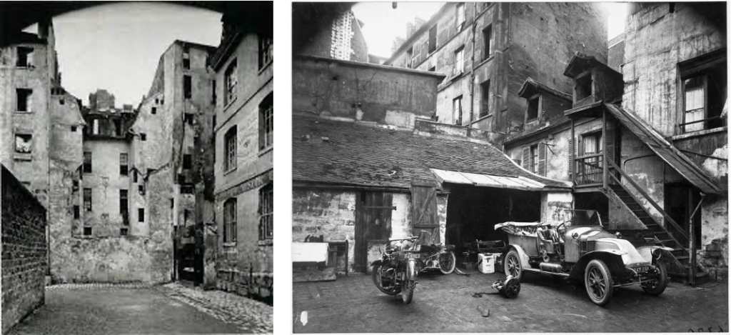
Eugene Atget was a French pioneer in documenting photography. He began making images in the 1880’s and did so to provide artists, painters and architects with studies. Many of his images are based on capturing the streets in Paris before they began to disappear into modernisation which gained admiration from big artists such as Man Ray, Henri Matisse and Pablo Picasso. Similarly, I feel deeply influenced by his motivation for his work as I wish to do the same with Jersey for my study, even thought it is much more modern than Paris was back in 1920. I also feel that Atget photographed to hold memories of living in Paris in his early twenties as he knew change was just over the horizon. ‘A good photograph is like a good hound dog, dumb, but eloquent.’ Eugene Atget. Whilst I don’t think Jersey’s architecture will develop much more rapidly in the next few years, I do believe that it eventually will and capturing it now will produce valuable memories for years to come. Atget was a very influential photographer. He played a large part in the founding of surrealism in photography and his work was inspirational and seen as a forerunner of Surrealism in the 1920’s. Surrealists found his work of empty streets in Paris deeply suggestive leading to the founding of the ism. Eugene’s work made a tremendous and sudden impact on the world of photography and ended up influencing many future photographers including me.
Whilst Ezra Stoller was also a documentary photographer however, he captured completely different buildings. He photographed the newer more modern buildings that had began popping up in developed countries. Stoller was American and had lots of opportunities to capture these developed buildings. As Jersey is not only less developed but also much smaller I have tried my best to capture the newer buildings that are appearing more and more after every building site. I have tried to convey the theme of focusing on the structure of the buildings, and how they please the human eye as well as how influential they are. Stoller has a keen eye for composition meaning that his images turn out to be very pleasing. I think that this means his images are very striking and engage the viewer into the image immediately. In Strollers work I feel that it shows that more developed structures appear more approachable and convey a more inviting effect. I think that I have been able to achieve this effect in my work in my more modern images, however, my more older images provide a more nostalgic feeling as they have been here for longer and are built in a very different way, maybe using older techniques etc.

New Topographics arose in 1975 and is where photographers capture contemporary, urban or suburban landscapes. The movements was a reaction to the increasingly suburbanised world and landscapes around them. People involved were trying to keep the world more natural and used photography to get their message across as opposed to words in the hope that they were more powerful. I think that this also contributes in my personal study as it shows that the world is changing not only in architecture but many other things. As this is one of my aims to show, I think it plays a big part. Another style I aim to show is the Bauhaus style. This style hold the characteristics of simplicity and functionality with the use of authentic materials whilst mass producing. Throughout my personal study I haven’t focused as such on this style but it may show through in some images. A photographer who focused on this style was Gabriele Basilico. Basilico was an Italian photographer who focused on the representation of the city. His photography was later used as a way of documenting the effects of war on the Lebanese capital of Beirut. Within this, he captured many apartment blocks/ complexes either that appear to have been newly built after the war or ones that were damaged and are falling to pieces. I think that his work is very effective in the architecture photography world and they hold great detail that many people may miss at first.

Eugene Atget and Ezra Stoller both created intriguing images within architecture photography leading to inspire me deeply. Whilst they photograph the the same area of photography, their images are very different but both hold great detail. Whilst one is trying to photograph the old street of Paris to produce treasurable memories for many people, the other is providing us with humanly aesthetic images of a world that we are seeing become more apparent everyday. I think that together they show how much the world is developing and what is becoming the new normality. I think that both these artists link to my projects as they show how much architecture has gone from being suitable and efficient to more about pleasing the human eye. In my project I have tried to capture how architecture isn’t just buildings etc but it also effects how we live our lives massively. I think that it influences human activity hugely from how we act and our behaviour, to communication and well-being within the world. It is proven that a well ventilated, greener area can contribute to our mental health and how we feel on a daily basis. Not only can it influence our well-being but also our happiness, being in a gloomy, noisy, dull environment can make us less productive and encouraged. ‘We shape our buildings: thereafter they shape us‘ Sir Winston Churchill (1943) His speech to the meeting in the House of Lords. The way I see it, architecture is much more than just a building. It is more like a frame work for our lives that keep stability and gives us guidance.
bibliography:
https://en.wikipedia.org/wiki/Ezra_Stoller
https://utilitiesone.com/the-relationship-between-architecture-human-behavior-and-construction
https://www.icp.org/browse/archive/constituents/eug%C3%A8ne-atget?all/all/all/all/0
These are the images I chose to include in my photobook, for my final prints, I will be choosing images from all of these.

These are the images that are in the book.

throughout the weeks and couple months i’ve taken over 400 images of the urban nightlife of jersey, which is very docile in some areas and brightly coloured in others. But these where my top 27 that I want to use for my photo book. I like the aesthetic of a my mysterious, wet, lonely areas, but with lots of colour and they have a nice feel to them. It closely relates to the artist I have been studying (Rut Blees Luxemburg) and how she creates her images and what her style is but with my own twist and completely different contexts:
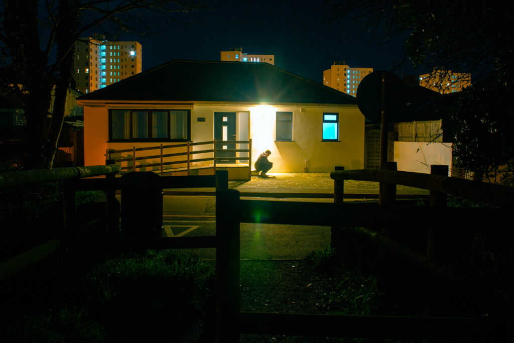


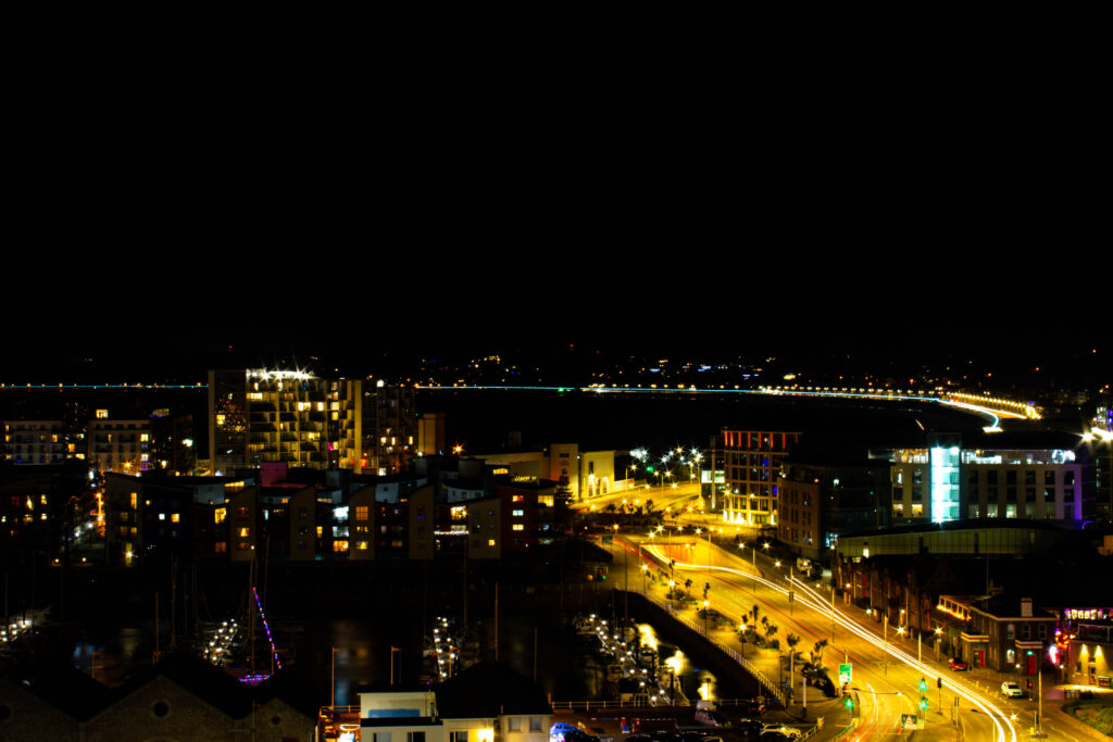

A majority of these images where me going around on my motorbike finding areas that appealed to me with either lots of light or which had ominous lighting.
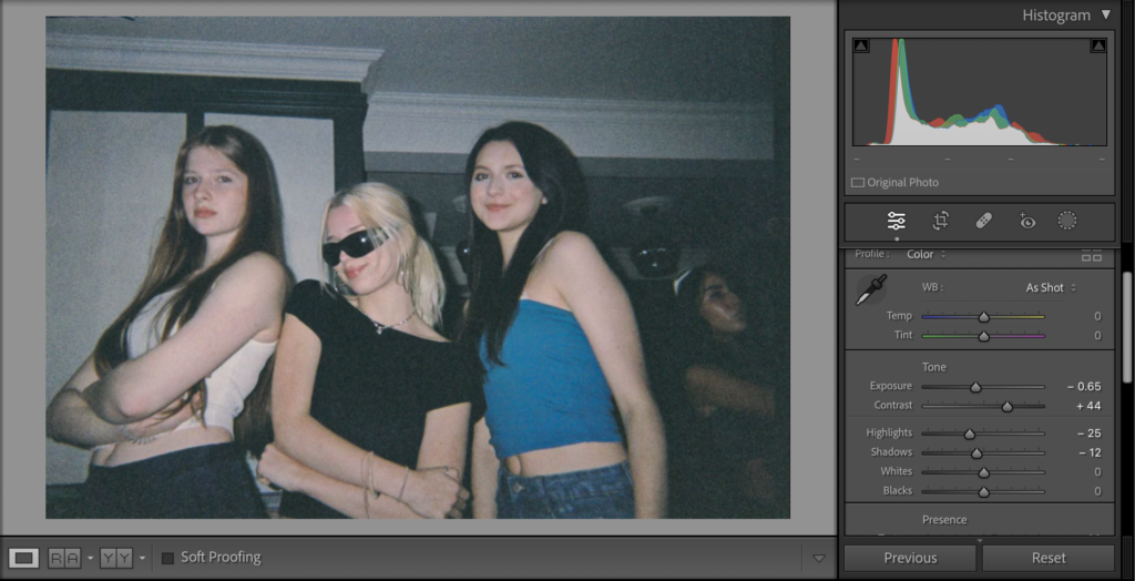
increased the contrast and lowered the exposure
before:

after:
before:

after:

before:
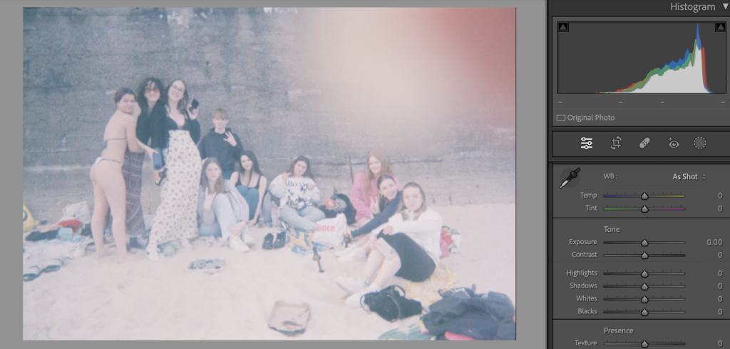
after:

before:

after:

‘Photographed images do not seem to be statements about the world so much as pieces of it, miniatures of reality that anyone can make or acquire.’
-Susan Sontag- On Photography
Girlhood is an idea that has material effects on how childhood is understood and lived, how gender is created and experienced and how identities are constructed. These are all related to the idea of a ‘girl’ which will never fully be achievable as that varies in many ways, more then ever in nowadays society. From the 1640s, “girl” could also mean “sweetheart.” Usually we would relate that word to romance and love; this suggests girls are affectionate. We often think of age as a key determinant of girlhood, immediately relating the word to childhood however, this alone is more complicated. Does girlhood end with adolescence? Defining girlhood is so challenging, it is a social and cultural construct, suggesting that different societies often construct their own unique meaning of girlhood. I think that is what makes it so wholesome.
I have chosen this area of research because I want to project and represent with photographs my childhood and what it was like for myself growing up as a girl. Girlhood is about learning and growth, self-discovery, finding who you are and showing other people that; this is why I want to capture images that express these emotions.
Justine Kurland and Julia Margaret Cameron both present girlhood in their work, however, in very significant ways. Kurland’s being in a soft, fairy-tale- like way of runaways being free through environmental, landscape images; and Cameron’s is presenting original, powerful women through close-up portraits. In this essay I intend to create an understanding of Justine Kurland work from her book ‘Girl pictures’ and Julia Margaret Cameron’s work from her book ‘ Julia Margaret Cameron’s women’ and compare the way they present girlhood.

Justine Kurland’s most successful project, ‘Girl Pictures’ book is an enduring symbol of romance, rebellion escape and freedom. It captures pictures of teenage girls taken between 1997 and 2002 on the road in the American wilderness. Kurland said she “staged the girls as a standing army of teenaged runaways in resistance to patriarchal ideals,”. She portrays the girls as fierce, free fearless and compassionate.
Kurland was born is Warsaw, New York in 1969. Her parents weren’t around so Kurland and her sister lived a somewhat nomadic lifestyle. Only at the age of 15, Kurland ran away to Manhattan to live with her sympathetic Aunt , and decided to focus on becoming an artist. From there, she graduated from The School of Visual Arts in New York with a BFA in 1996. She received her MFA in 1998 from Yale University in Connecticut. Now she has become famous for her landscapes dealing with young, feral unsupervised adolescents in suburban wasteland settings. Often mixing the purity of youth with its unbridled wilderness, Kurland has travelled across the united states to photograph these staged images.
Justine Kurland created ‘Girl pictures’ based on her own childhood experiences, her images almost foreshadow herself; she uses both childhood adventures and current experiences to influence her working style and subject matter. She channelled the angry energy of girl bands into her photographs of teenagers. The first girl Kurland ever photographed was the daughter (age 15) of the guy she was dating at the time. She preferred her company to his. After he left for work in the mornings, they conceived a plan to shoot film stills starring the girl as a teenage runaway. The only surviving picture from the time shows her in a cherry tree by the westside highway:
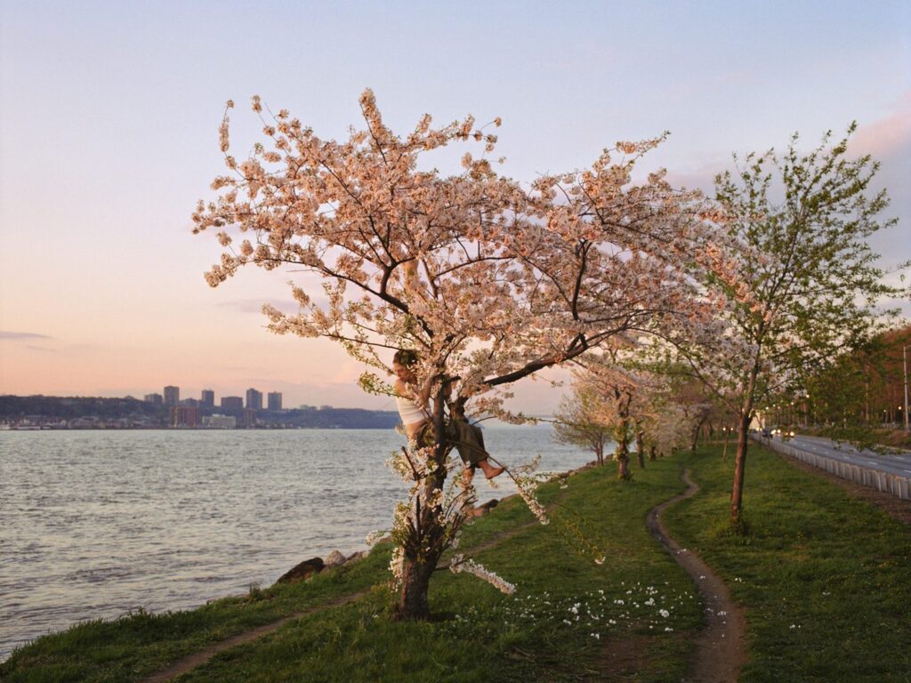
She hovers pinkly between the river and the highway, two modes of travel that share a single vanishing point; portraying the flowing theme of fleeting moments of adolescence and its fearless protagonists in her work.
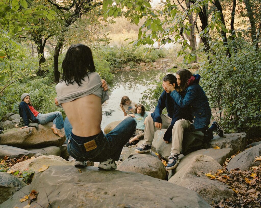


Kurland’s surreal images evoke pagan utopias or post-apocalyptic worlds. Her work is fairly modern to nowadays, based in the 2000s. The girls in their baggy jeans and bare feet. The girls in their leather boots and used sweaters. There’s something about them that feels like so many teenage girls. Personally there is an aura in this book of Kurland’s that feels relatable and nostalgic to my own childhood.

The theme of girlhood throughout Kurland’s work is obvious, however, I have decided to choose these two specific images from ‘Girl pictures’ to analyse. As I spoke about a the start of this essay, we often use age to determine the meaning of girlhood, immediately relating it to childhood; although, I personally believe girlhood is an idea that can be with you forever. These two images infer that perfectly. The image on the left displays three young girls, they appear to be playing in what looks like their garden if not then a rural environment. As a young child it is always exciting to be free to adventure wherever you want. You have imaginary tasks and make up games with your friends, no rules jut fun. Kurland has captured this image of them playing in the flowers and nature having no cares. On the other hand, the image on the right shows three older teenage girls also sat in a field, eating ice cream. The image almost foreshadows the one on the left, implying that the younger girls will still be able to have that sense of girlhood in older years of their life. I can analyse this from these images as in the image on the right, there is cars and a petrol station, an environment that you wouldn’t find young children on their own, in the background; I can guess they have stopped off on a road trip ( again, suggesting these girls are runaways). In the image on the left the girls are purely in an open field, a safer setting for younger children. Kurland has taken these images strategically.

Taking themes from the Bible, mythology, literature, and Renaissance painting, Cameron modelled the women around her–friends, servants, relatives–as Ophelia, Juliet, Queen Esther, Rachel, A Bacchante, Guinevere, and Mary, among others.
Julia Margaret Cameron was born in Calcutta in 1815 to a wealthy British family and she was educated in France and England. She is considered one of the most important portraitists of the 19th century and is known for her soft-focus close-ups of famous Victorian women, for illustrative images depicting characters from mythology, Christianity, and literature. Cameron helped prove that portrait photography was indeed a veritable fine art medium in a context where photography was not yet widely accepted as such.
After showing a keen interest in photography for many years, Cameron took up the practise at the relatively late age of 48, after her daughter got her a camera as a present. She quickly produced a large body of work capturing the genius, beauty, and innocence of the women and children who visited her studio at Freshwater. When Julia Margaret Cameron began taking pictures in the 1860s, photography was largely defined by formal commercial studio portraits, elaborate high art narratives, or clinical scientific or documentary renderings. Cameron, on the other hand, forged her own path as a thoughtful and experimental portrait artist who happened to use a camera instead of paint.
As by the time Cameron got her first camera, all her children were grown-up and her husband was often away on business. From that moment on, Cameron dedicated herself to mastering the difficult tasks of processing negatives and focusing on subjects in order to capture beauty.

Annie by Julia Margaret Cameron
Cameron considered the portrait displayed above to be her first successful piece of art. This portrait shows Annie Philpot, the daughter of a family staying in the Isle of Wight where Cameron lived.
She wasted no time in marketing, exhibiting, and publishing her artistic photographs, and it wasn’t long before she was successfully exhibiting and selling prints of her photographs in London and abroad.
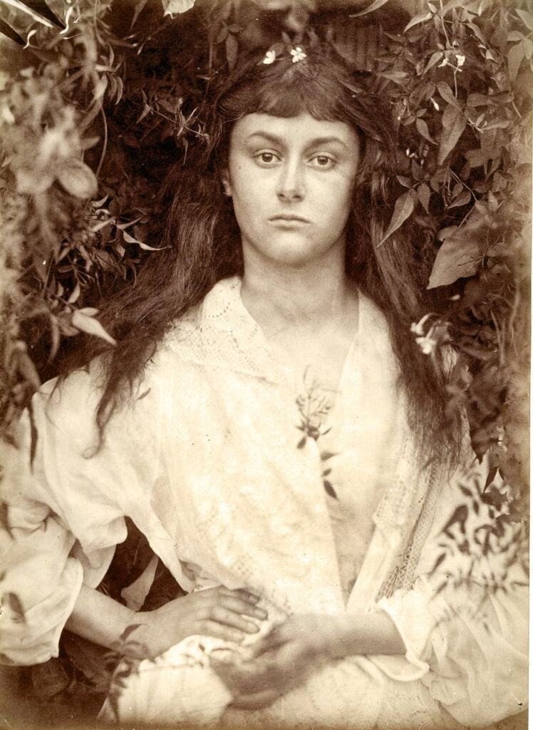


Cameron presents womanhood and motherhood in her work through her soft, dainty portraits. Her images are original and show a very natural side to the beauty of women. In the 1800s ( the years of which Cameron’s childhood occurred) women were the continual victims of social and economic discrimination. Upper- and middle-class women’s choices were
limited to marriage and motherhood, or spinsterhood. Both choices resulted in domestic dependency. While they could find jobs as shop girls or factory workers, women were discouraged from being wage earners by the belief that women who earned wages were “unnatural.”
Justine Kurland and Julia Margaret Cameron’s work differentiate in very obvious ways. One of the main differences is the composition of their work.

Firstly, the majority of Cameron’s work is taken in portrait shots and Kurland’s work is largely based on landscape images. Kurland’s Girl pictures are all distant, based in the middle ground and background. The perspective changes throughout her images, however they are never in the foreground as portraits or specifically of someone, so, there isn’t always a focal point in Kurland’s work as the whole image is equally as interesting but also vast. Cameron’s compositions in her work consist of portraits of women and girls. They are all straight up in the foreground and eyeline of the viewer. The focal point in her work is pushed onto the subjects in the image and not so much on the background.

Colour, Tone and contrast are all a significant difference in both their work. Cameron’s work is monochromatic. A lot of her ‘Women’ pictures are in a sepia tone. This is because she used the most common process at the time, wet collodion glass negatives, The process required a glass plate (approximately 12 x 10 inch) to be coated with photosensitive chemicals in a darkroom and exposed in the camera when still damp. The process of this causes the images to have a haze over them, this is intentional but also partly because she was taking pictures in the 1800s and the technology was no where near as developed as in the 2000s and they were physically developing their images back then. There is also a light vignette around the edges of her work which exaggerates to the softer tones in her work. On the other hand, Justine Kurland’s work is very modernised, her images are very high quality and not obviously edited. Her images are crisp and the colours are highly saturated making it appealing for the viewer. The light in Kurland’s work is all natural, her images appear to be taken in the morning/midday to capture as much natural daylight as she can.

The last main difference between their work is the significant ways they represent girlhood. Cameron captures images of woman and very young girls presenting motherhood and womanhood which are both big factors of girlhood. Her images show delicate woman close together, lying on each other, gazing into the distance. This could possibly represent what it was like for women in the 1800s, they had to stick together and fight for their rights. Being a ‘True Woman’ at that time was such an important responsibility, the ideal of True Womanhood was early imprinted upon young girls, who
were trained to be obedient and exhibit great self-control. Also, Cameron uses a lot of flowers, bushes and trees for the background and as props in her work; those things are very stereotypical girl objects. However, Kurland’s work presents a more modern day view of young, teenage girls. runaways, being free to roam around. In her images, as a viewer you can sense the feel of having free will. Her images are based in the south/ west of America where a lot of the societies are abandoned. Although the relationship between the girls in her images are artificially created by Kurland, they depict the subjects as fluid and nomadic ( Kurland’s view of girlhood). She taps into a rich heritage of tracking co-operative and engaged subjects, forging a bond and representing them sensitively and intelligently. There is a sense of mutual respect here it seems.
Overall, Justine Kurland and Julia Margaret Cameron portray Girlhood in very different ways. Justine Kurland mirrors her childhood of her own runaway trauma in her work. She uses teenage girl students from the area she’s in with her travels and presents them as her own runaway stories. Julia Margaret Cameron staged her photos. Most of Cameron’s photographs are portraits of members of her family, concentrating on their faces. She wanted to show their natural beauty, and she often asked female sitters to let down their hair so she could show them in a way that they were not accustomed to presenting themselves. Cameron wanted to present the women and girls as they were, showing their natural beauty; as oppose to telling a story like Kurland’s images. Cameron’s images are documentary, she wanted to provide a straight forward representation of the beauty of women and Kurland’s images tell a story of the teenage girl lifestyle. They are made by and for women, with an absence of the male gaze and any sense of objectification, almost as a form of quiet rebellion.
https://www.theslateonline.com/article/2023/12/your-world-today-growing-out-of-girlhood
https://www.artnet.com/artists/justine-kurland/
https://en.wikipedia.org/wiki/Julia_Margaret_Cameron
https://scholarworks.bgsu.edu/cgi/viewcontent.cgi?article=1000&context=gsw_pub


I have chosen these images for my final selection to put into the photobook. I may well still remove images from this collection, but these are the ones I will go into Blurb with.
For my personal study, my interpretation of nostalgia will be based around femininity and youth. I am going to take inspiration from a previous project that I have done based on femininity which was originally inspired from ‘Girl Pictures’ by Justine Kurland. Girl Pictures is a photo book based on teenage runaways who become empowered the deeper you investigate the book. When looking at different photographer’s work, I came across a certain photo named ‘Fashion’ by Paul Kookier which caught my eye and has given me inspiration as I believe it captures femininity in a particular way which is not immensely popular. Another photographer which I discovered was Michelle Sank and her photo book ‘becoming’. Becoming is a series of projects made by Michelle Sank put into one book and explores the background of young children who have struggled throughout their childhood. I believe that both photographers capture femininity very well as they have a female’s perspective and outlook.
I am pleased to be doing my personal project based on the nostalgia of femininity and youth as they are all important topics. Femininity is empowering as it can show the amount of power someone can hold through feelings and emotions. I will be taking photos primarily of females as they are getting ready for nights out and while they are out, however, there will be features of males. I aim to capture aspects of youth through teenagers partying and having fun. some of my photos will be staged like Justine Kurland’s images and others will not be, similar to Michelle Sank’s work.
In this essay, I will be conducting how photos can not only be ‘experiences captured ‘, but also so much more. Sontag implies to readers of her book that “the camera is the ideal arm of consciousness in its acquisitive mood.” (Add in Harvard reference Susan Sontag) The use of the phrase ‘acquisitive mood’ suggests that photographs can be catalysts in the pursuit of hoarding memories and experiences creating an overall sense of nostalgia.
Historically, the concept of photography stemmed from art and paintings. Portrait paintings were used by high-net-worth families, for family portraits which were highly staged, and could be manipulated into concealing the truth. However, as photography became more popular and more accessible in the 1800’s, the style of portraits also gained popularity due to the convenience of the process becoming less time consuming and tedious. Photographers like Julia Margaret Cameron, who was known for her ‘soft-focus’ images of men and women during the 19th century is “considered one of the most important portraitists” (add in Harvard Reference Wikipedia) and took inspiration from paintings and believed in the Pre-Raphaelites beliefs. The Pre-Raphaelite’s were a secret society of young male artists which believed that art should represent the real world and should be painted how you see it without manipulation. In which, while researching Justine Kurland, it became known that she not only gained inspiration from Julia Margaret Cameron she also believed in the Pre-Raphaelite’s beliefs.


Justine Kurland was born in Warsaw, New York 1969. And is best known for her nineteenth century English picturesque, styles landscape images. I have been most captivated by Kurland’s book ‘Girl Pictures’ as it shows a juxtaposition of the ideal American dream. Throughout the book, Kurland experiments with a staged genre to explore the subjects of femininity and youth through the eyes of teenage runaways, in which she uses to dive into the tales of “tales of teenage delinquency” (add in Harvard reference from the book) she did this by “trolling the streets around various high schools, cruising for teenage collaborators.” (add in Harvard reference from the book) By getting real ‘runaways’ to model, Kurland introduces a sense of documentary into this book making it all seem more real. Justine Kurland was a runaway herself, which enables her to relate to the images she has taken and portray it through her own subjective experiences which are nostalgic to herself. Furthermore, Kurland gains inspiration through art as she states, “I’m always thinking about painting:” “English landscapes and the utopian idea and photographer Julia Margaret Cameron. (add in Harvard Reference system Wikipedia)
Justine Kurland’s ‘Girl Pictures’ were often staged in desolated areas which could be argued that they are almost disconnected from reality which conveys a sense of escapism. The story of the book evolves the further you investigate it. Towards the beginning of the book, it is staged in quite well populated areas with a scarce number of models. However, as the location settings become more rural, more runaways would “multiply through the force of togetherness.” (add in Harvard reference from the book).
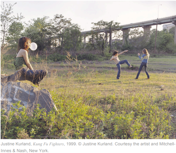
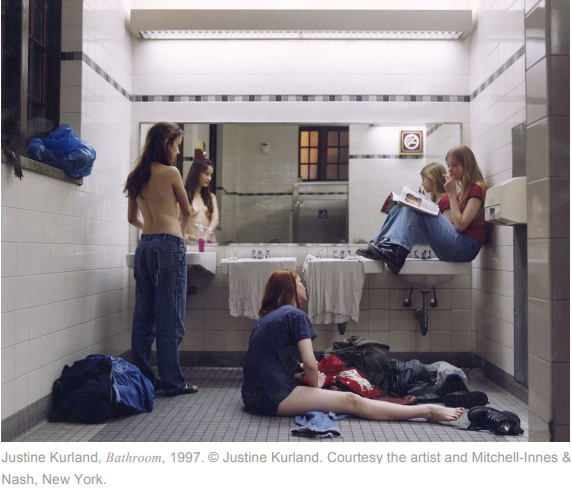

Another artist whose work attracted my attention was Michelle Sank, and her photo book Becoming. Michelle Sank is a South African photographer however, moved to England in 1978, and has called it her forever home from the moment she got there. Becoming is a collection of Sank’s previous projects which include ‘Bye-Bye Baby’ and ‘Celestial Echoes’. I was most riveted by Justine Kurland’s intention of capturing the raw experiences of childhood and growing up. ‘Bye-Bye Baby’ is one of the photo series used within Becoming and “explores the way young boys and girls interpret their understanding of masculinity and femininity.” She mainly produced all of her images in Ireland in which she was able to capture children that are confronted with the issue of interface- the areas within Ireland that are segregated into working class residential zones, who are also challenged with struggles for example, teenage mothers, young offenders and young carers who are faced with looking after sick family members, “Celestial Echoes continues with this theme looking at this phenomenon within older adolescent girls”.
Michelle Sank’s images have a documentary style about them as they are not staged, everyone who features within the photobook has been “invited to present themselves to the camera as they deem appropriate.” which creates a “quiet conflict” aesthetic. “The young people confidently embrace the opportunity to be photographed with attitude and grace. At the same time, they appear vulnerable and doubtful, questioning the complex process and changing realities of becoming an adult.”


Overall, Justine Kurland & Michelle Sank explore youth and femininity through their work from both an inside and outside perspective they both shared elements of trust with their models and had a responsibility to portray characters with sensitivity and respect. Justine Kurland almost relives her childhood of being a teenage runaway through out her book while exaggerating the stereotypes of femininity. She does this by staging her photos with an all-female society. While doing this, she wanted the models to play a caring supportive role to one another, however they started to form their own community and pact on their own terms as they bonded and started to create their own friendships through togetherness, further exaggerating the stereotypes of female friendships as they play with each other’s hair and walk arm in arm together. Due to Justine Kurland’s previous experiences, she would have been able to create more of a bond and a relationship with her subjects over time unlike Michelle sank, as she could be viewed as an outsider looking in. Furthermore, Michelle Sank explores femininity and youth through capturing the vulnerability of children which again, come from tricky backgrounds, however, this time in their own community which they live in. Michelle Sank takes on a documentary role as she looks deeper into the backgrounds of everyone she is photographing and how social structures can affect and make people who they are as individuals, and how someone people can be born at a disadvantage.
I gathered some photographs from personal family archives. I want to incorporate some of these photos into my photobook, fitting into the ‘nostalgia‘ theme through reflection upon my childhood.


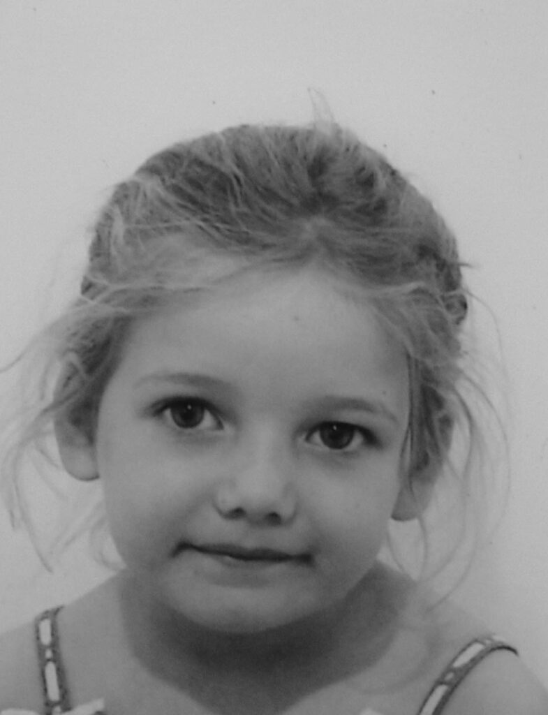
There are some other old photographs I found; photobooth and passport pictures. These photobooth photos are of my mum and dad in their childhood. I thought these might be good to incorporate into the photobook as it shows where I’ve come from, as well as where my dual nationality stems from. I imported them into Lightroom so I could adjust the pictures and edit the contrast.


These are some passport photographs I have gathered of my nana, mum, dad, brother, and myself. I like these as they’re a more standardised portrait where you can clearly see the person’s face. I want to incorporate these into my photobook so I could construct a family tree of photos. I’ll put this on the cover of the photobook or one of the first pages. This is to establish the storyline and shows how the subject of my book is on my family. These are the final pictures I’ve chosen to use for my photobook:


