Making of my Photobook

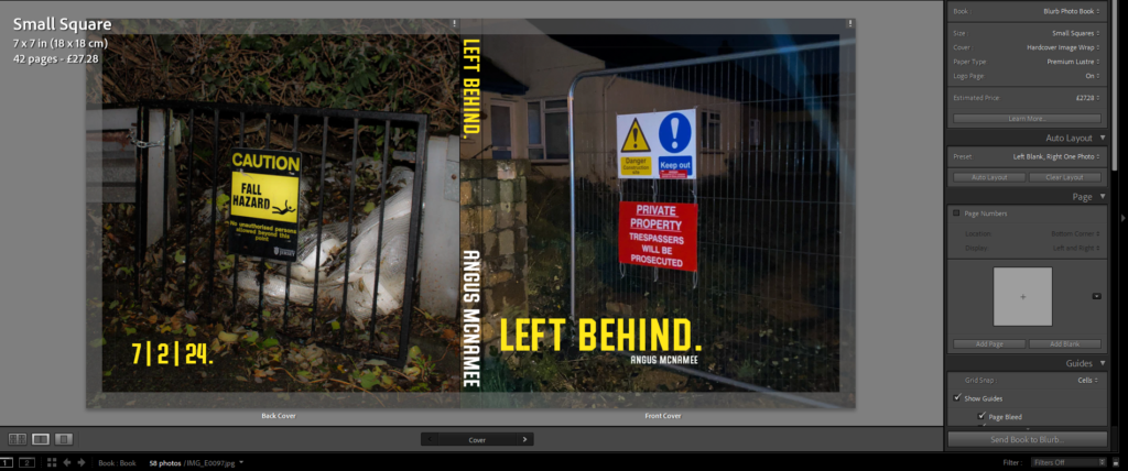
The photobook overall is set to the small square size (7×7 inches) and has a total of 42 pages, a lot more pages I was expecting. The front cover, I wanted the title to be simplistic and nominal, of course I also chose a text colour to stand out from the dark image. I also put the date of publication on the back. I liked the font because it looks bold and serious, similar to the text you’d see on a sign telling you to stay out.

For the photobook, I wanted to feature mostly square photos placed in the middle of the page. I feel this makes the pages feel more professional and nicer to look at, it also makes the images print out at a higher quality. I selected these two images because they both feature a fence and some form of un-welcomeness, with the signs and the dark doorway.

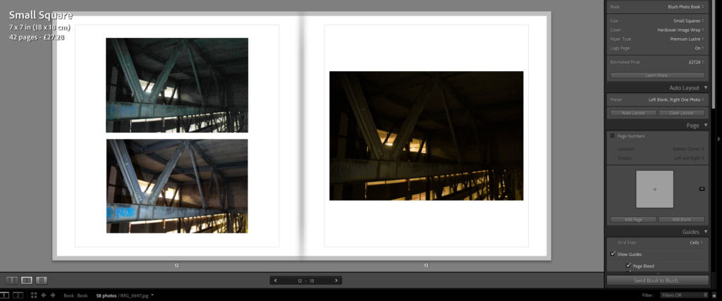
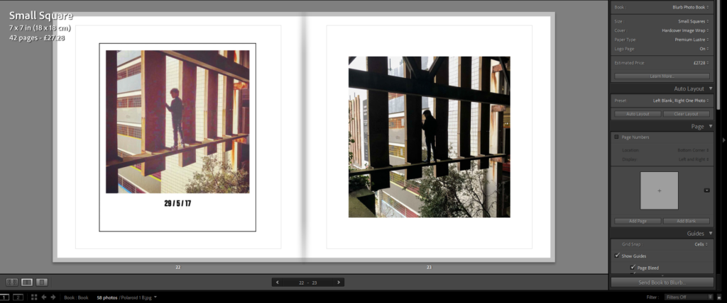
For this page, I wanted to put the images of the same thing but with different colours, I felt it made sense and made the order of the images tidier. I also did this for the page with the polaroid too.

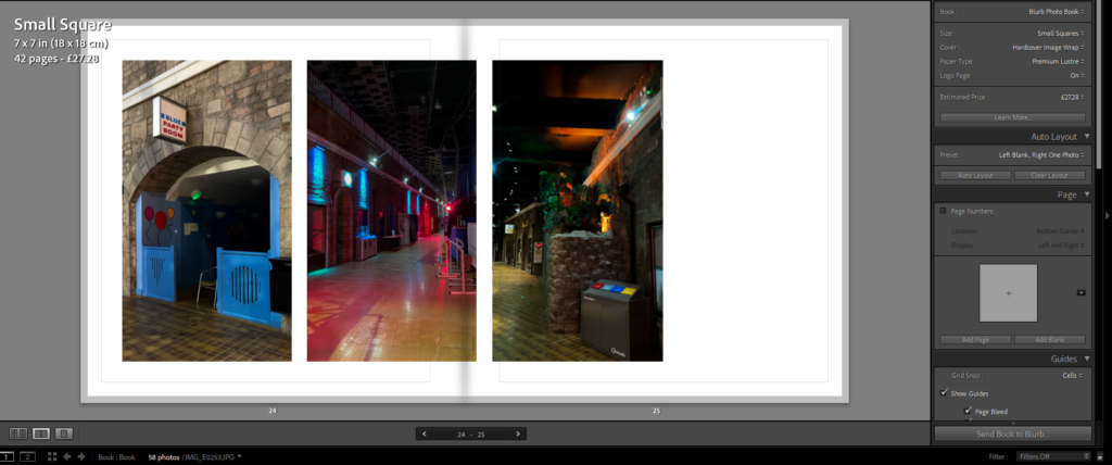
For these pages, I wanted to mix the layout a bit to cause less repetition. They also matched the same sizes too so It made them fit better together. The image that goes through the gutter makes the photo more interesting to look at while not differentiating too far from the general style of the book.

These pages, because they feature landscape photos, have the photo stretch over the middle too. To emphasise that of the long subject in the photo.

Final Photobook Layout

Here is a link to my photobook, Nitimur in Vetitum

When making the photobook I was sticking with my night photography theme so I only edited the night photography ones, when the book came down I realised that some of my photos are a little to dark I believe this is because the monitor that used to edited the photos has its brightness setting up a little bit making the photos look brighter then they actually are however this is only for a couple of photographs most of the photographers are turn out really good and came out the way I wanted them to turn out, there are also some spelling mistakes in the writing on the first page on the book I believe this is because I didn’t get it proof read and I was tried when writing it however its not that bad you can read it and get the message that I trying to say, and as I said it not to bad but there are some grammar and spelling mistakes, besides all the mistakes the book turn out great and I am happy how it came out. If I was to do it again I would proof read the text before printing the book and I would check the brightness on my monitor I would also give my images titles and add more text into the book to fill in pages or add more images I would like to make another and see how the difference between the 2 books and see how much I can improve in making a better and more finished product. The book also dose look a bit thin so if I did make a new book I would add a lot more photo and I think people viewing the book would appreciate that also I would make it landscape not portrait just because I would be something new.