
In my opinion the final outcome of the photobook was successful. There are aspects within it that went very well, how I imagined and some that did the opposite of that. overall I am happy there is a fluent message that flows throughout the book with the arrangement of the images, text within the book, cover etc. there are certain areas where I could have improved, the main one being: Including a wider range of photographs which were collected by me, I think this because overall I had successful outcomes from a variety of photoshoots, but in the final book there seems to be a a bigger portion of archival images and the manipulation of them. But I am happy with the proportion of them as it also fits to the narrative, and since it is a project mainly about my mum then it is essential to include archival images.

First starting with the cover of the photobook, the cover is an opening as well as a brief what the book is going to be about. I settled down for having red as a background colour to represent love, passion as well as being as symbolising both mine and my mothers descent, being Polish. I decided to call it “echo” is I think of myself as a mirrored version of my mum, and I think she too thinks of a child her echoing in a woman she is. I like to think she echo’s in me, that I mimic her. the back cover photo is edited in a way to match the colours of the first image, but also to show that I create a responses to photographs of her. the font is carefully chose to add a welcoming feel to the book as well as a nostalgic one. Overall the cover incited the reader, what’s great is how much the colour of it makes the book stand out. what I regret not doing is using white on the spine of the cover to show these accents that are with the book, the white with red will furthermore represent national polish colours, like the ones seen in the flag. I think without it the cover seems a little bit empty, therefore adding these details would make it more interesting.
When it comes to the photographs themselves in the book, I think they are successful with showing the story behind them, making the story flow throughout the book. this is the area I’m most proud of as the narrative is clear to see, with images of my mum from a young age, then a teenager, and an adult. there is also a shift f focus to the similarities between us but most importantly showing me as a part of her. This shift of focus is also very visible with the black background and darker images, contrasting with the soft feel of the book so far.

I think because behind every image there is a hint of symbolism to the narrative, this makes the book successful. when it comes to the variety of the outcomes I like how there is at lest one digital image alteration as it shows what I’m interested in as well as being able to show I am capable of achieving similar outcomes using complete different methods.
I love how I was able to study inspirational artists that guided the plan and look of the project. this mainly being Jessa Fairbrother, where I took the symbolism and manipulation of photographs from her. To me behind every image within the book there is symbolism being represented, although not all the photographs are manipulated and altered in the same way, most are, and the theme of photograph altering carries through the book, without overly being done.


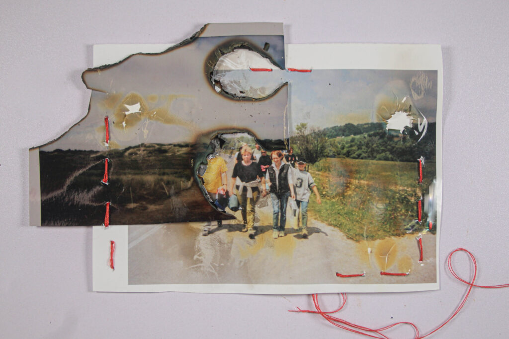
Overall I enjoyed this project due to the freedom I had when it came to image altering, I like how through a variety of experimentation I was able to create interesting-looking images. I enjoyed burning, stitching, staining and cutting the photographs as it made more of a connection between me and the work, through this process it made it more personal to me. This project was fun as I could plan ahead the different photoshoots, which were all different from each other, like still life, portraits and studio portraits. However I would improve adding these in more, the fact that the images are so similar to each other on technical level makes it hard to display this variety of different themed photographs so on the other hand I am uncertain is I love or hate this aspect. I do also think the book would benefit in more little detail when it came to the design, like frames around some images, or more writing. Alternatively what makes this book and project successful is how the images all have a symbolic value to the message, and this storyline flows through the book.