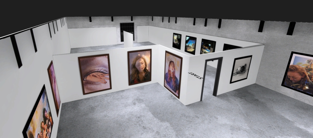
I have created a virtual gallery to show my final outcomes. I did this to present my final photographs in a different format than a book.


When designing the gallery I needed to carefully think of the placement of the photographs, these followed a similar pattern to the book, however the book follows a story line where a specific order of the images responds to the narrative. When displaying them in a virtual gallery I mainly focused on aligning them next to each other based of the similarities between them.

For example the photographs from the same photoshoot fitted well together due to the most similar colour and technical aspects.


I think this virtual gallery turned out successful due to the similarities between the photographs, so it gives an impression that when you walk along the gallery the photographs slowly change with the gradient of the colour. One of the things I would improve is that I should have selected a different room where all the photographs can be displayed in, as 4 of the images didn’t fit into one room.
