Narrative: What is your story?
Describe in:
- 3 words
modernism, historical, architecture.
- A sentence
My photobook is based on the evolution of architecture in Jersey and how it is slowly changing over time.
- A paragraph
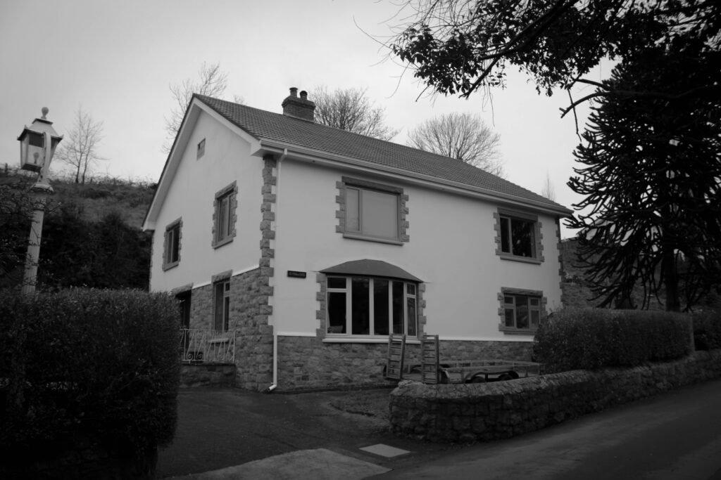
Within my book I want to achieve educating other about how much architecture has changed over time from different materials and techniques to different styles and demands/trends. I think that in Jersey there is a great variety of architecture from old historical building to more newer modern ones. There are many pieces in Jersey to me that are very hidden whether its the area/location or how they are designed to be deceiving, because of this I wanted to try and find architecture that many haven’t seen or noticed before to show the vast amount that the island contains. I think that whilst much of Jersey’s architecture is astonishing, modernisation is slowly taking over. I believe that architecture is becoming more and more about pleasing the human eye as opposed to it’s practicality and may be losing some of its value it once held. Whilst it may not be at the same rate as some other countries I think that we may slowly be losing architecture that holds great value and even memories for some. I do agree that with time changing architecture has to as well for many reasons, however, I also believe that keeping hold of Jersey’s historical and valuable architecture is also very important. I hope that throughout my book the evolution of architecture is portrayed and people may see what I do in terms of it changing.
Design: Consider the following
- How you want your book to look and feel
- Paper and ink
- Format, size and orientation
- Binding and cover
- Title
- Structure and architecture
- Design and layout
- Editing and sequencing
- Images and text
In terms of my books design, I want it to have a matte finish on the cover not only for how it looks but also how it feels, however, I want to have the pages glossy to add to the overall look of my images and make them very bold. I am going to pick the size ‘standard landscape’ as most of my images were taken in landscape and I want my images to be the main focus. With the book being landscape it means I can make my images a little bit bigger and allow for the detail to be seen. For my tile I have picked ‘Building our future’ as my book shows how much architecture (buildings) have changed over such a short amount of time meaning they will only develop even more in the future and become something to be appealed to as opposed to practical and meaningful. When it comes to my images I haven’t edited them much as I want viewers to focus on the main architecture piece itself in its raw form. I have adjusted them slightly to make the images straight and enhance the detail slightly so that the viewer can take it in fully. I chose to put my images in randomly in terms or old and modern so that viewers can compare them more easily, however I did place them precisely to make them contrast each other. In my book I am not going to have any text with the images as they are the priority, but I am going to add my essay ‘What are the differences between Eugène Atget and Ezra Stoller within architecture photography?’ to the back of the book to show where I got some of my inspiration from.


