Here is a link to my photobook: The Girls
Final Selected Images

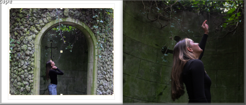
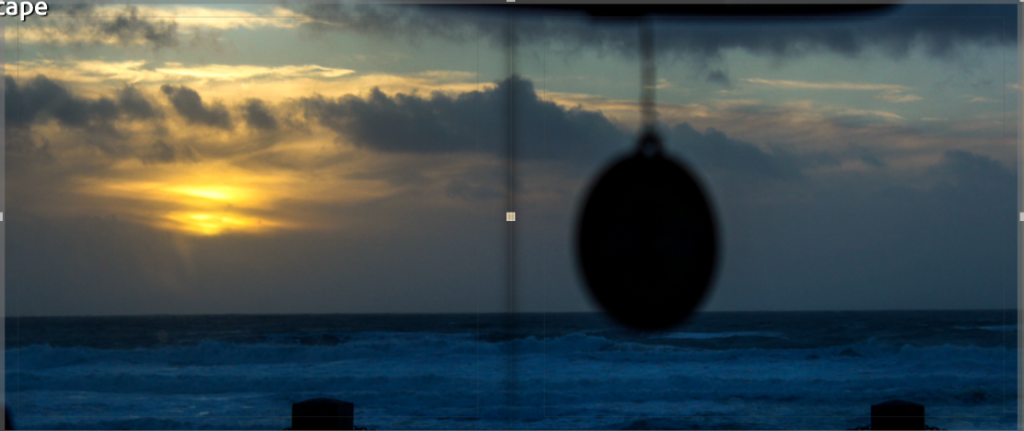
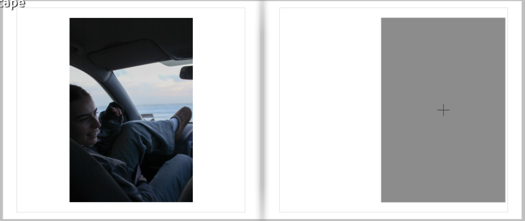
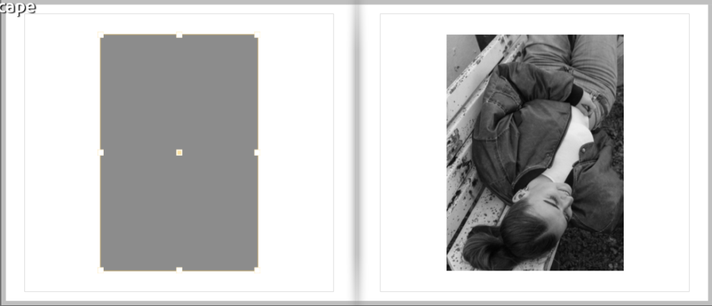
By having my final images selected it makes it easy for me to place and move the images around the book. I choose to use the standard landscape layout as I have a mixture of landscape and portrait images. By having it landscape I can create a two page spread, as some of my best images are landscape meaning that I can display them bigger than some of my other images. I have also chosen to not have the same layout all the way through, this helps to create an ecliptic look with no uniform as some pages have a full bleed whereas others have a boarder around them. The way in which I have chosen to order the images almost as if it is telling a story, trying to match similar images and colours on the page. The way images are laid out helps to create different kinds of moods and feeling throughout the book. The image I have chosen for my front cover allows for me to have space for a title and my name.


