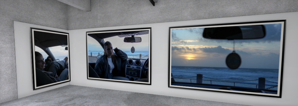
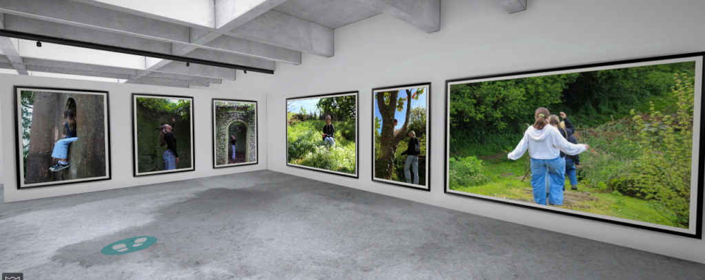
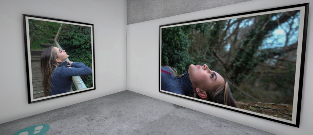
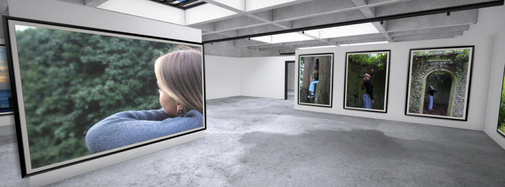









Photobook Gallery


Link to gallery: https://www.artsteps.com/view/65c3433b5223fce69ac21c6e
Archive Gallery

Object Gallery

Landscape Gallery

Contact Sheet

Image selection

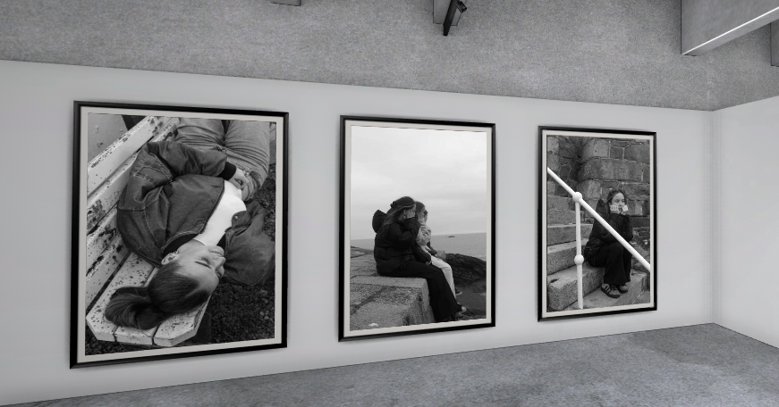
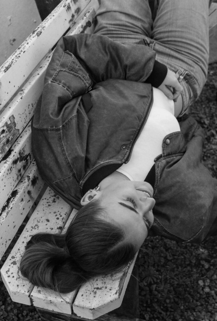
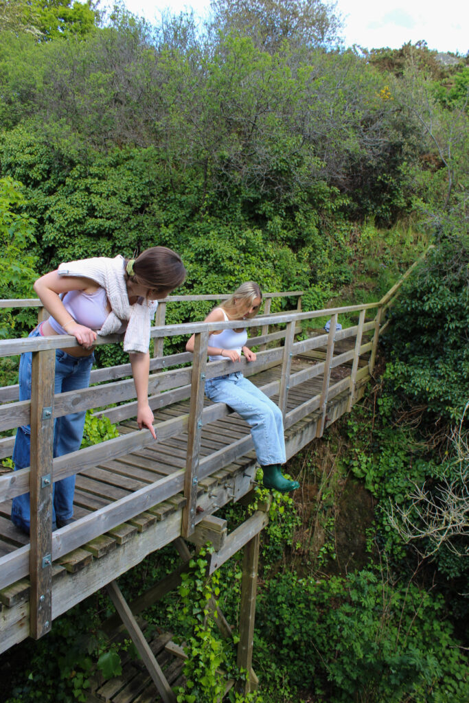
From this shoot I only got a few images which I could use for my final images. The light didn’t go to plan as it was very dull lighting, so I changed them into black and white. This also helped tie the images in with my other shoots with black and white images. As a set I think these images work nicely together.
Editing


Here is the link to my final book: Viennoiserie
Out of all the projects that we’ve done so far, this was one of my favourite, I was able to explore something that is a massive part of my life in a creative sense in way that will be remembered for a very long time in Vienna Bakery.

I loved especially being able to see the processes of making different products like the danishes, the croissants and the pain au chocolats. It was nice to witness how stuff I’ve been eating for all of my life is made and how much hard work is put into them.

I enjoyed being able to create a photobook whilst having the freedom to pick the images that I had produced to put into it.
The theme of Nostalgia is very extensive and it gave us the chance to do what we wanted with the theme we were given. The creative freedom that came with this project is definitely why it is one of my favourites that I’ve done so far. The way I was able to think up my own concept and produce the images that I wanted for the photobook in my own style was very freeing. I think the reason why I wanted to do this project on Vienna Bakery was because I had always wanted to find out more about the processes that the bakery uses, especially since I’ve grown up around the bakery.
In this project, my main influence was Mitch Epstein’s book Family Business, this documentary photography style of working when documenting something you are closely related to really inspired me on this project. Using the same point of view as Mitch Epstein, I used my insider access to my advantage as I know a lot of the workers because I live near the bakery, meaning I grew up around a lot of the workers. and work within the bakery. I, however, think that I also had a slight outsider’s perspective as well, I haven’t spent a lot of time with or interacted a lot with some of the staff that work on the production line, meaning I didn’t feel fully confident asking to do a photoshoot with them.
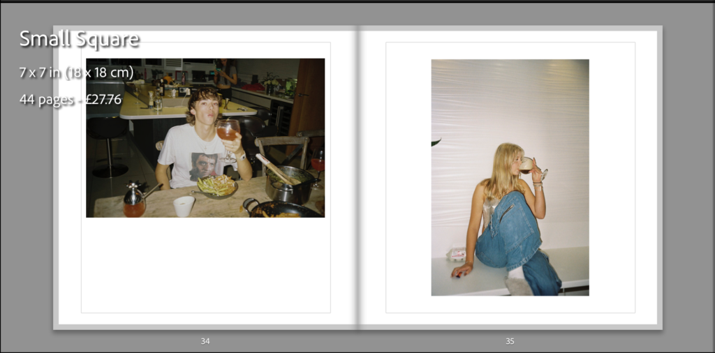
This is the final outcome of my photo book and how I have laid it out, I have done it in a simplistic way which I think is more affective, I have placed some images higher and lower than the others to break it apart from it being a consecutive symmetrical line as I think it keeps the audience attention more. All the photographs have a white boarder around them as it doesn’t cut any of the image out and gives it a simplistic look which works well as the photos aren’t overwhelming and doesn’t over power the accompanying image if they were to be full bleed. I have placed the photographs on matte paper to reflect well on the graininess from the film and have chosen to make the book as a hardback as I believe is gives more structure and a better look to it as in my opinion the soft copy books have a cheaper look and feel to them which I believe wouldn’t reflect well on the type of images I have in my book. The name of my book is called Salad Days which connotes youth in our prime days.
Here is a link to my photo book: Salad Days




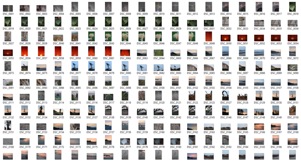

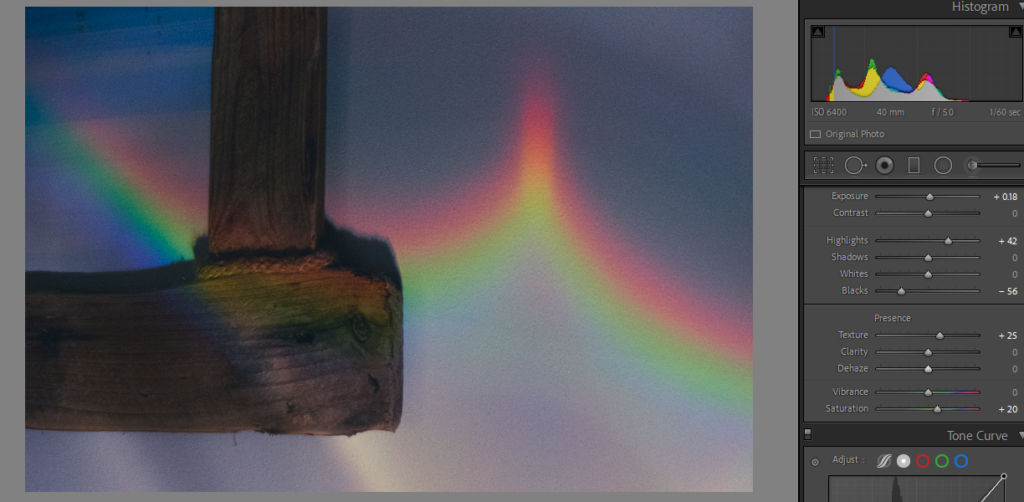
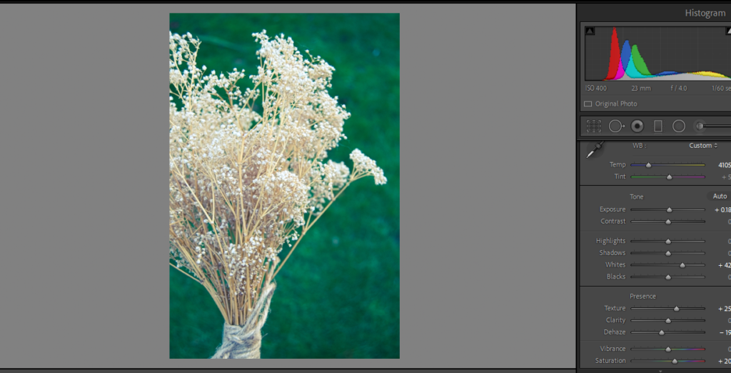
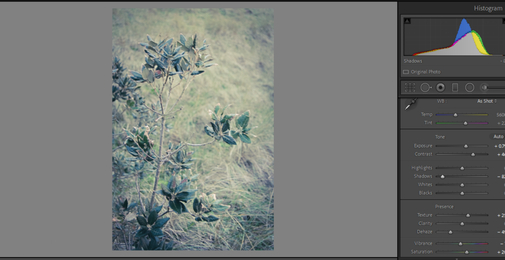
Selecting – I flagged all the images I wanted to choose to edit using ‘X’ and ‘P’
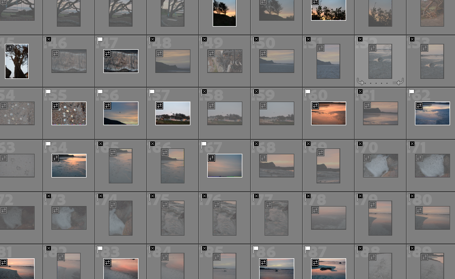
These are the photos I am going to edit from shoot 3:
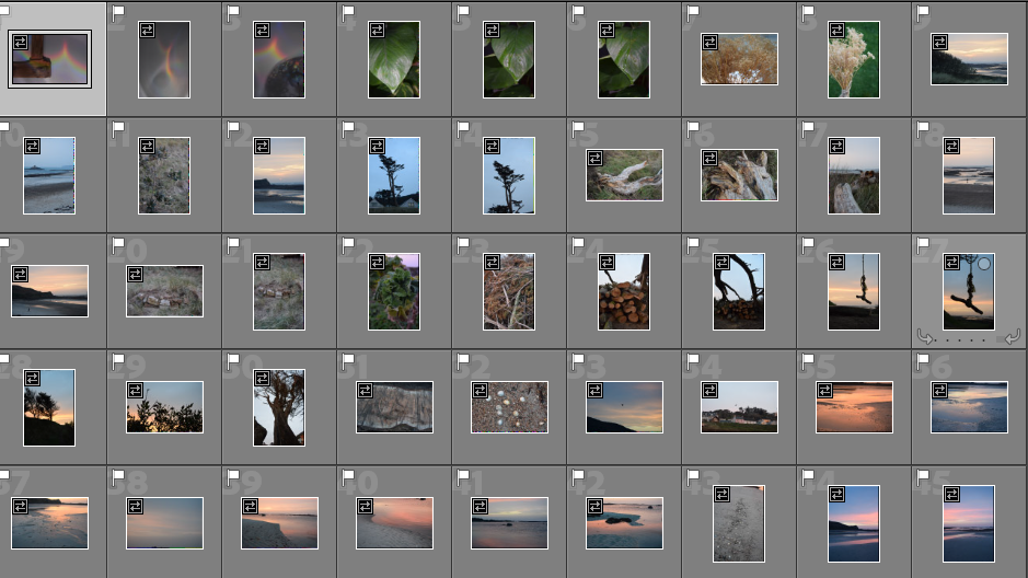
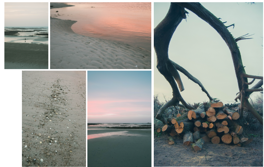
Again, I am trying to show my childhood experiences in places I have grown up at. I will edit these similarly to the rest, keeping the dreamy editing technique.
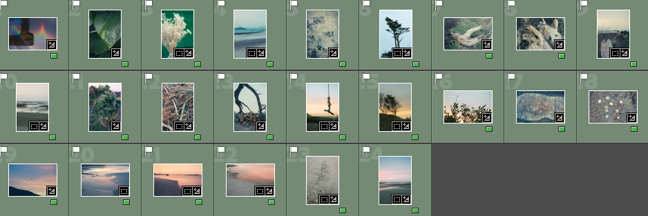
I rated the images from this shoot with red, yellow and green so I can choose which images are the best.
Red Images (unedited or images I won’t use)

Yellow Images (ones that I might use but I don’t think are the best)

Green Images (photos that I will use in my photobook)
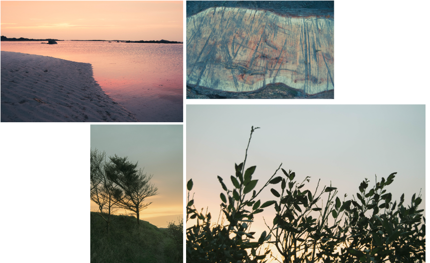
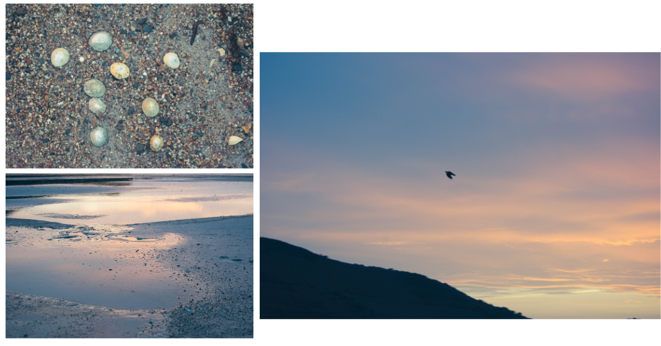
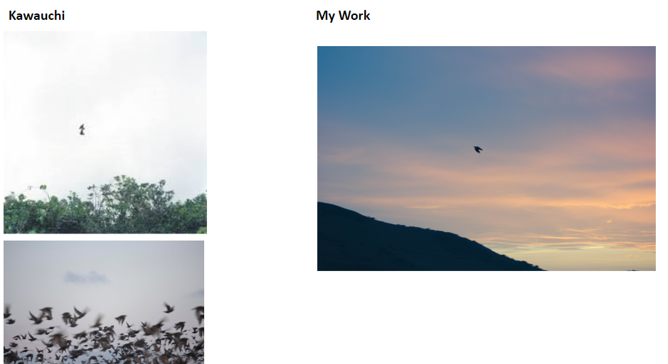
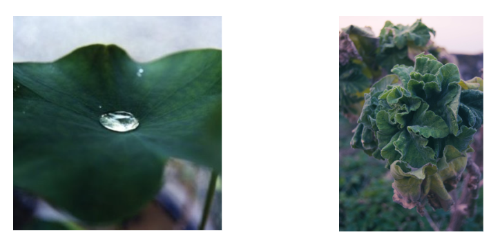
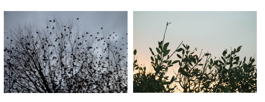


When making this first edit I originally only wanted a single red bird but found that it was too little and hard to spot in the busier image – so I added two others only with outline making them slightly more subtle.


I chose solid colour for the rabbits as it stood out better on the background – I found the more detailed versions took away from the base image. I originally created a version with a single rabbit but found I prefer the 3 together.

Experimentation over archive photograph- Decided it was too busy and tried to idea physically with thread.


Lettering around eye

Carolle Benitah’s Photo Souvenirs – used as inspiration
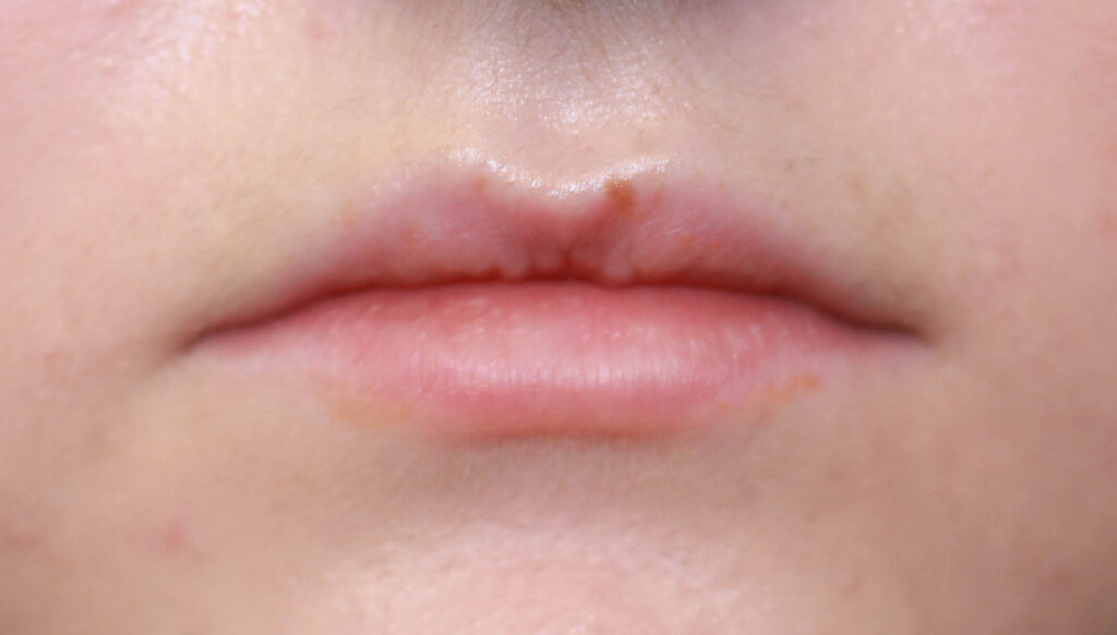

Used two images and adjusted opacity to overlay – hoping to replicate Carole Benitah’s Style.


Further experimentation


Lettering on Tide picture – unsure of including this image in final book.

Overlaid archive photograph with old letter to cut out figure.