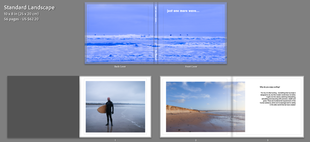


Here was my final layout:


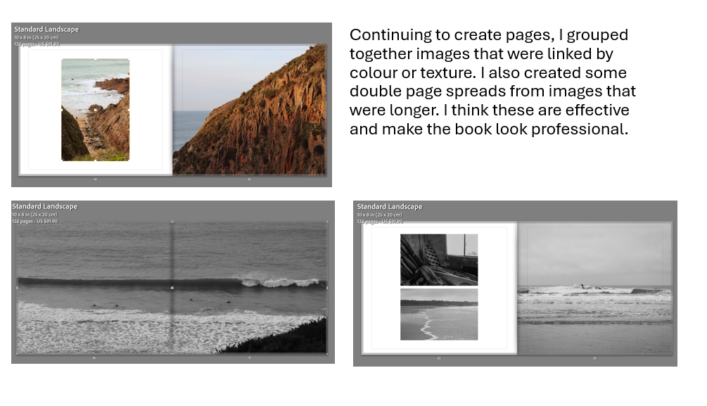
This layout includes a variation of double page spreads, full pages, and bordered images. I think this works effectively as an entire piece because it is minimal but also interesting. I chose to put the sunset and walking away image as the final spread because I think these work well as closing images for the piece. I think the use of colour and texture has been well observed and incorporated. If I could change something about this, I would possibly have tried to create a larger range of imagery, as I feel as thought sometimes it becomes a little repetitive. However, I think I have managed to balance it well.
My final title was ‘just one more wave…’ because it is exactly what my dad says if asked how much longer he will be in the water.
You can view my final book here.
