

Editing process of a handful of my photos taken so far under my ABANDONED chapter in my upcoming photobook.
During my earlier days, I would sneak into a collection of abandoned places throughout Jersey with my friends. I remember key elements that most of the places I visited would share. Such as danger warning signs, dark rooms being dimly lit by your friends torches, cold temperatures and the constant feeling of general unwelcomeness each building gave off, combined with the thought that we were going to be spotted or badly hurt at any moment. I wanted to reflect all of these in my images by adjusting light levels to low, having bad weather and slippery environments, making photos look grainy and damaged and overall giving the photos a sense of eeriness.


I made sure to change the lighting levels in this photo to have the sign appear brighter than the background to bring out the significance of it being the main subject of the photo. Also to imply that a torch is being shined on it. I’ve encountered many signs like this whenever I have snuck into somewhere, always saying something along the lines of “Danger” or “Keep out”. Attempting to deter people and make the site dangerous and less likely to enter, but accidentally making it more intriguing.


I wanted to make this image appear darker, I felt it had a more ominous look paired with the warning sign, to arise a sort of fear for the viewer. I also made sure to make it just bright enough to appear there was a flashlight being shone onto the sign too.
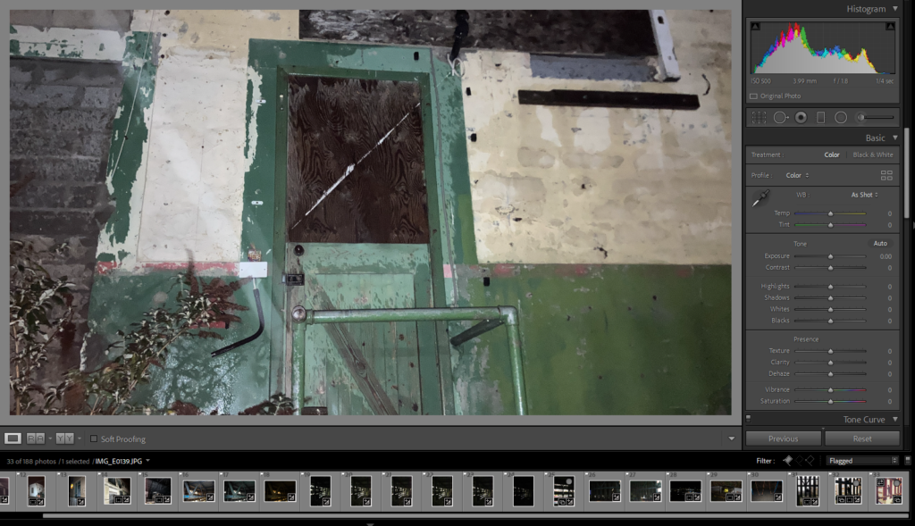

I liked the idea to just cut off the rest of the photo, because the rest was just wall, and make a box aspect ratio. I feel that the less the image shows, the little more mystery it brings about this door. Why has it been boarded up, and when? Where does it go? What caused the giant scratch on it?
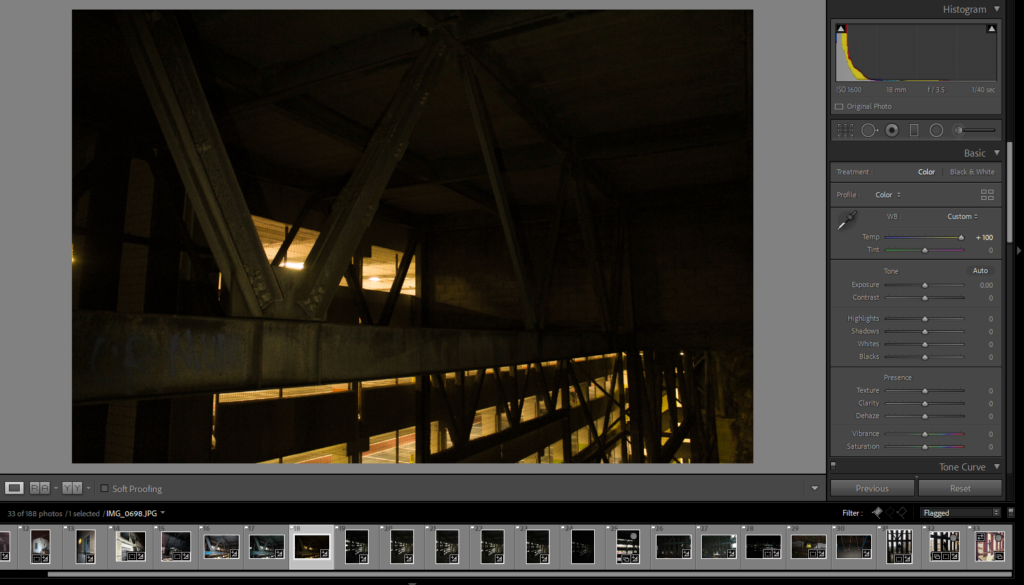
I wanted to bring out the lights in the car park more, and make the steel beams more visible. I felt that by making the lighting more yellow it made the image look more appealing instead of just plain white, I felt it made it more cinematic looking too.


I wanted to also make this have a smaller aspect ratio because it focuses more on the doorway. I made the photo darker because I wanted the photo to look scarier and more serious, it makes the doorway darker and less inviting because you don’t know what is through it. I made sure the photo was straighter as it makes the fence look better and more satisfying to look at.