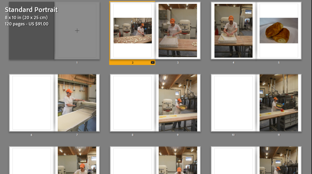
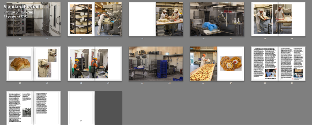
Using the 64 images I had picked to be my favourites and the most suitable for the photobook, I started designing my photobook in the “Book” tab of Lightroom Classic.
I started picking what images should go in what order and resizing them to the pages of the book after picking the format (Portrait).
After narrowing the images down again, I ended up with about 50 pages in my book.
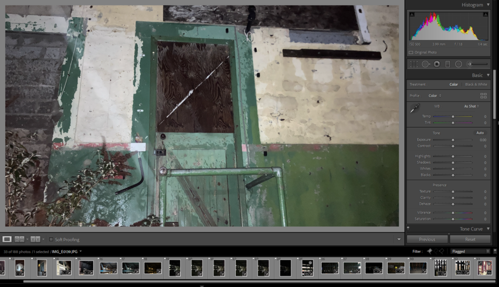
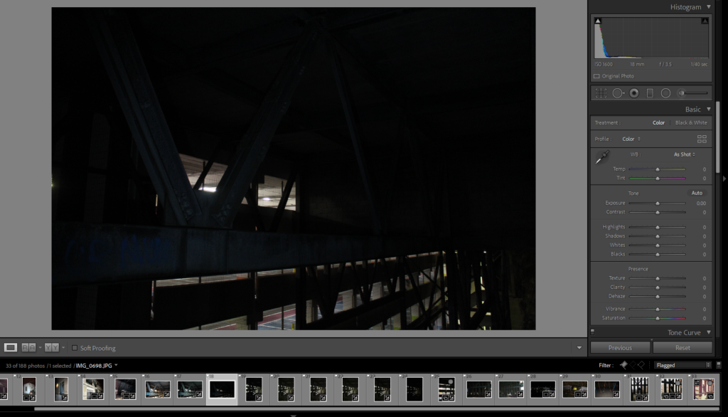
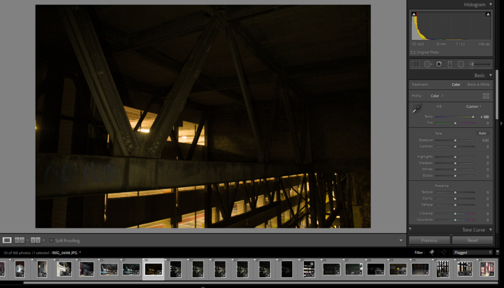
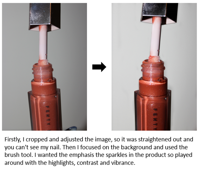
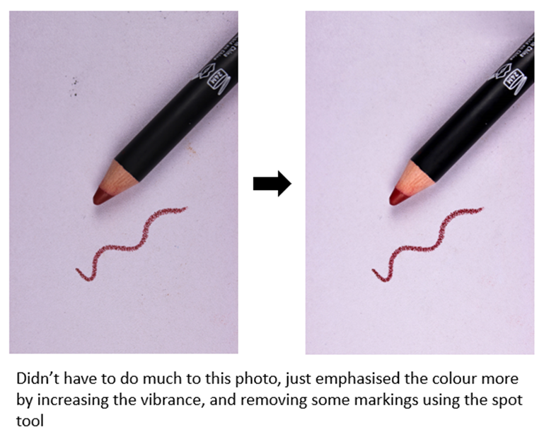
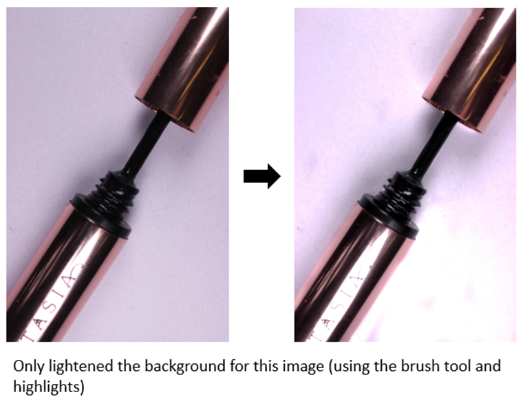
Editing process of a handful of my photos taken so far under my ABANDONED chapter in my upcoming photobook.
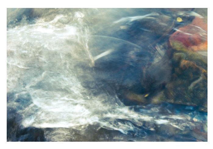
During my earlier days, I would sneak into a collection of abandoned places throughout Jersey with my friends. I remember key elements that most of the places I visited would share. Such as danger warning signs, dark rooms being dimly lit by your friends torches, cold temperatures and the constant feeling of general unwelcomeness each building gave off, combined with the thought that we were going to be spotted or badly hurt at any moment. I wanted to reflect all of these in my images by adjusting light levels to low, having bad weather and slippery environments, making photos look grainy and damaged and overall giving the photos a sense of eeriness.
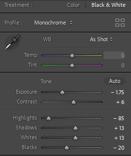
I made sure to change the lighting levels in this photo to have the sign appear brighter than the background to bring out the significance of it being the main subject of the photo. Also to imply that a torch is being shined on it. I’ve encountered many signs like this whenever I have snuck into somewhere, always saying something along the lines of “Danger” or “Keep out”. Attempting to deter people and make the site dangerous and less likely to enter, but accidentally making it more intriguing.
I wanted to make this image appear darker, I felt it had a more ominous look paired with the warning sign, to arise a sort of fear for the viewer. I also made sure to make it just bright enough to appear there was a flashlight being shone onto the sign too.
I liked the idea to just cut off the rest of the photo, because the rest was just wall, and make a box aspect ratio. I feel that the less the image shows, the little more mystery it brings about this door. Why has it been boarded up, and when? Where does it go? What caused the giant scratch on it?
I wanted to bring out the lights in the car park more, and make the steel beams more visible. I felt that by making the lighting more yellow it made the image look more appealing instead of just plain white, I felt it made it more cinematic looking too.
I wanted to also make this have a smaller aspect ratio because it focuses more on the doorway. I made the photo darker because I wanted the photo to look scarier and more serious, it makes the doorway darker and less inviting because you don’t know what is through it. I made sure the photo was straighter as it makes the fence look better and more satisfying to look at.
Raised By Wolves is about probes the gap between dreams and reality in the lives of teenage runaways living on the streets of San Francisco and Los Angeles, and bout a neglected community which people don’t think about, and the youth which are getting lost in addiction and substance abuse, this project let the people be heard and seen when they hadn’t been before. Jim Goldbergs work always shows a divide in society predominantly focusing on the side which most people don’t see and making people see it this aspect of his work is truly moving n the sense he gives people voices and allows them to tell their story’s when no one else would listen.
His work is documentary, made to make people think twice about how other people live and to not take things for granted.
Jim Goldberg
Jim Goldberg is an American photographer who likes to focus a lot of his work on the neglected and ignored populations he takes time on these projects collecting thousands of photographs to make sure that the photos he choses represents his thoughts and views on the subject/ mater he is trying to get across, Goldberg uses film and digital cameras to create his book Raised By Wolves which shows a neglected and hurt population, his work is moving to his audiences as his work has been personalised by the people who he has included in it from people writing notes, drawings and dialog, this shows he is a photographer who wants to make an impact on people and wants to get people to speak up about where and who they come from.
Many awards and grants received by Goldberg for Raised By Wolves are a Guggenheim Fellowship (1985), two National Endowment for the Arts Fellowships (1989, 1990), the Mother Jones Documentary Photography Award (1989), and the Ernst Haas Award for Photography Book of the Year (1995).
Construction Of The Book
Raised By Wolves is constructed by fitting images, drawings and writing that has been scanned in and placed in the photo, there are polaroids and film negatives used in the photo-book, the use of multiple different photography elements gives the book depth and a more interesting approach.
The book itself is printed on thick printing paper, this a card front cover making it a soft copy, which is glossy, the images are mainly taken in black and white, in a high resolution, and the images which are in colour are typically vibrant, the sizing of the book is slightly larger than a A4 piece of paper with 315 pages, some of the images being full bleed across both pages and sometimes one page with may not taking up the full page and being accompanied with handwriting.
My Photobook
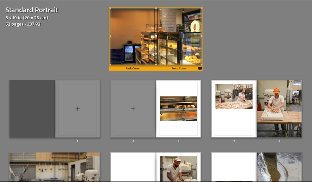
To create the photo book we have used blurb which links to Lightroom Classic allowing us to work in Lightroom and do all editing and placement on one program, I have selected a small square book with a hardcover back and matte paper which I think will reflect well on the images I have taken due to them being taken on film.
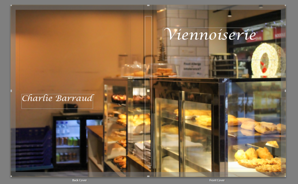
To get the framing up you need to press the black box with the arrow on it which will allow you to pick the bleed and placement of the image you are placing, you are able to adjust it to wherever you want it to be but by using the suggested placement this allows the image to be well centered and have equal white space and measurements.
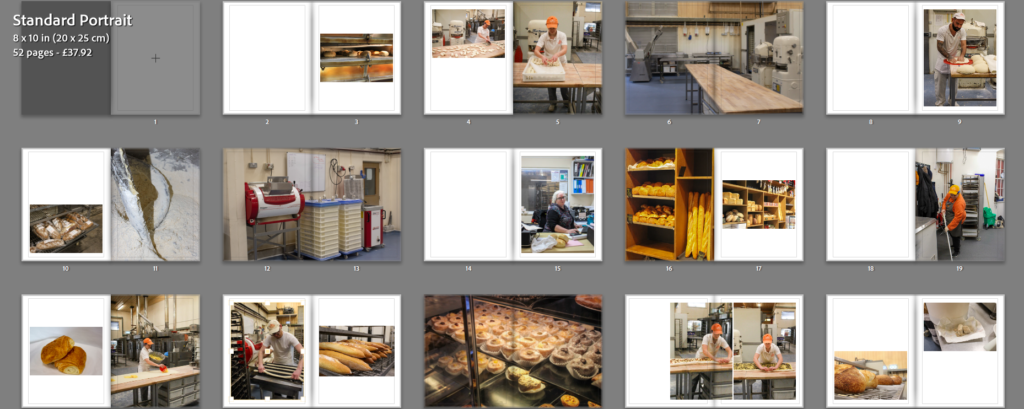
I have placed my photographs in a sequence that i believe fit well due to them being taken at different times of the year, I have tried to make the photographs all flow together.
I have put some photographs on two pages to try to break up the sequence making the book more eye-catching, they are all going to have a white border around except for the ones which have are on a double page spread the reasoning behind this is due to the sizing of the photobook i don’t want to cut out any part of the photographs and by having them in that way with the white border it doesn’t cut anything and i think it gives them a slick look.
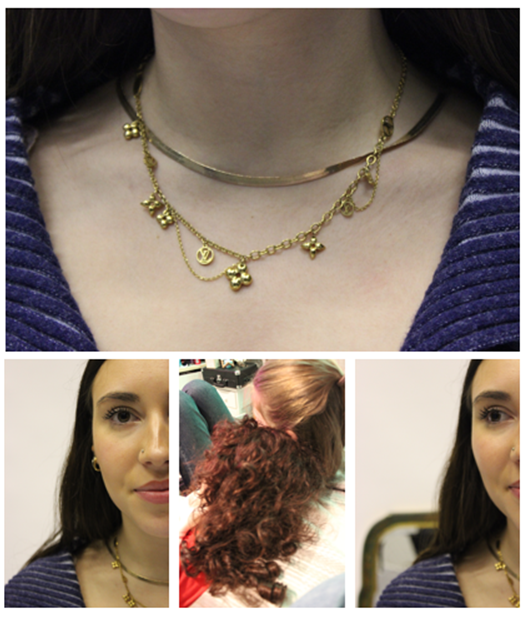
I have placed these two photographs together on a double page spread as the pole in both photos flows together making both photos look like one.
I have picked some of my top images from this project and placed them into a virtual gallery to this I used artsteps, I picked the layout of the gallery and decided where they should go, the photos I picked are the ones I have enjoyed taking and I love the outcome of them as they were all taken on film with the development process it was a bit hit and miss with the outcomes as I only had a certain amount of photos available on the film negative which limited me on the amount I could take meaning I have to take the photographs carefully.
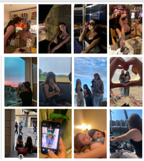
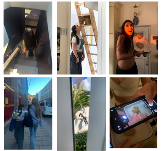
I am happy with the outcome of this project and the shoots I have completed, all the photographs I have used are personal to me as they focus on my friendships and us having fun, whilst I was taking the photographs my intention was to capture people having fun, in places where we all enjoy which hold memories for the individuals, I have made links to the photographer Theo Gosselin as he captured people in their surrounds having fun in a beautiful almost calm setting which I have done to the best of my ability and like Gosselin I have used a film camera for this project which I think gives it a more authentic touch to it as the slight graininess to the photos suggests the photos haven’t been hyper-edited and have a natural feel to them. Within this exam I have enjoyed making the photo book as it is something I haven’t done before and I enjoyed the process of selecting and designing the look and presentation of the book however, if I was to do this project again I would try to get the resolution of the images higher so that I would have the ability to make them larger because due to the medium resolution of the photographs it limited my ability of how large I could make the images on the phonebook as it impacted how they would print.
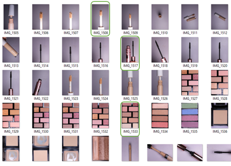
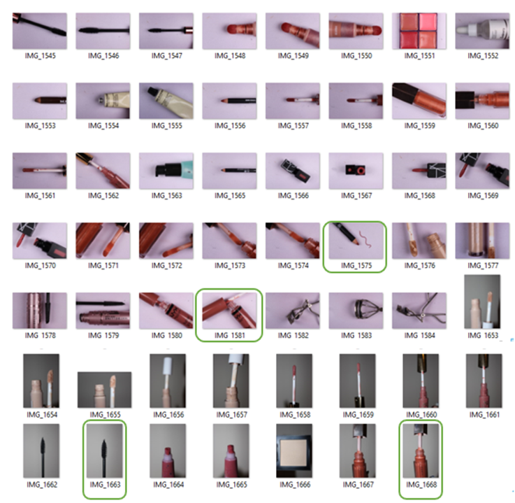
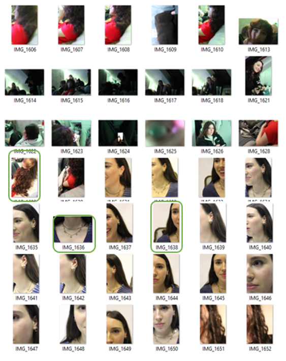
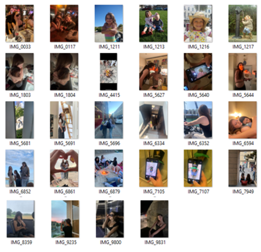
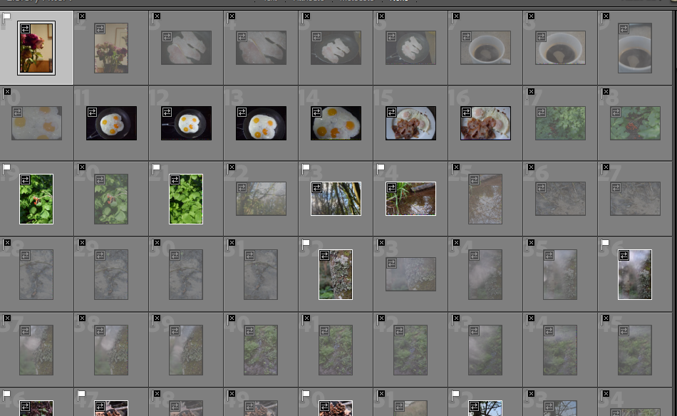
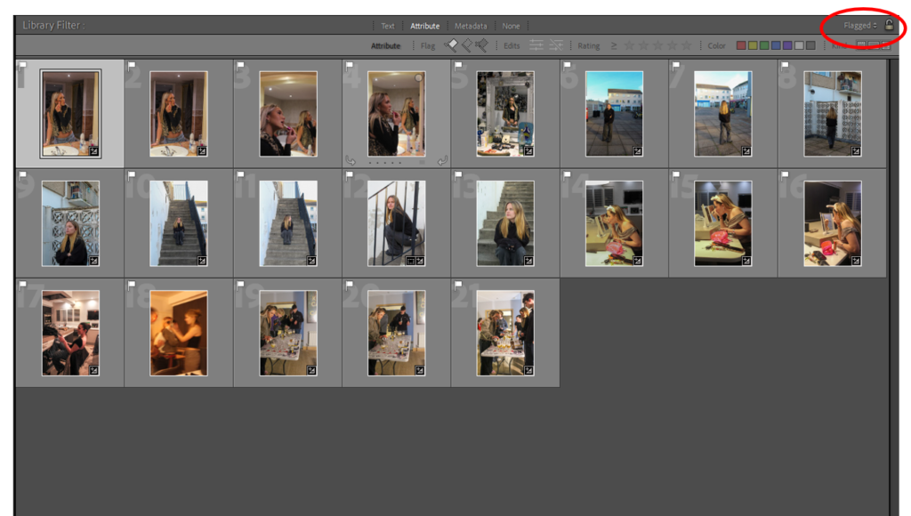
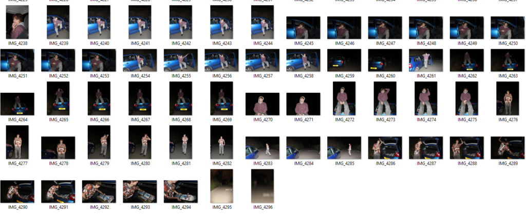
Selecting – I flagged all the images I wanted to choose to edit using ‘X’ and ‘P’
examples
These are the photos I am going to edit from shoot 1:
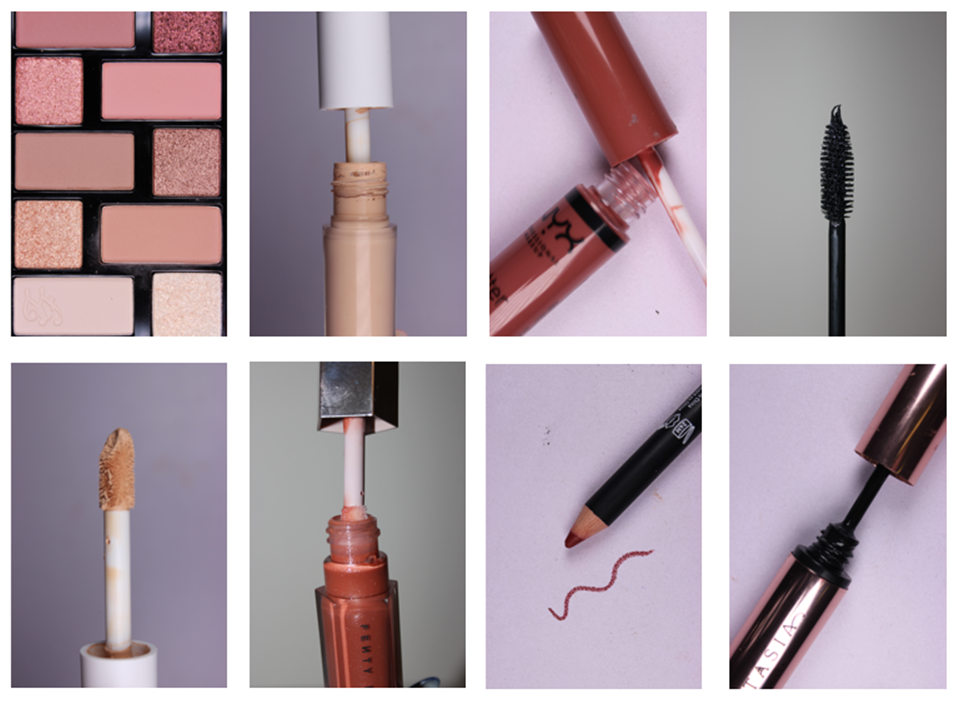
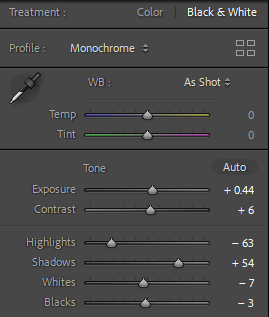
Basic Editing
Although Kawauchi uses the same sized images in her photobooks, I have decided to use portrait and landscape to keep a variety throughout the book. I also feel like the unorganised look of the different presentations could link to my theme of these images being through the ‘eyes’ of me as a child.
I used the preset ‘cool mat’ for these images because it has the blue tones Kawauchi uses, and it means I can start with a basic edit. Each image will have the same colour and hues to start with, keeping a consistency throughout my images. I don’t want any to look as if they have been edited drastically different to each other.
I wanted to achieve a ‘dreamy’ look on some of my images to draw the nostalgic emotion, and present my images how I would have viewed these places as a child.
I rated the images from this shoot with red, yellow and green so I can choose which images are the best.
Red Images (unedited or images I won’t use)
Yellow Images (ones that I might use but I don’t think are the best)
Green Images (photos that I will use in my photobook)
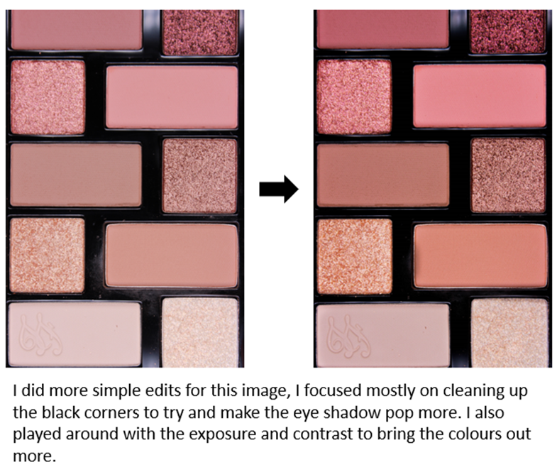
Moodboard of my final basic edited images
Further Editing in Photoshop
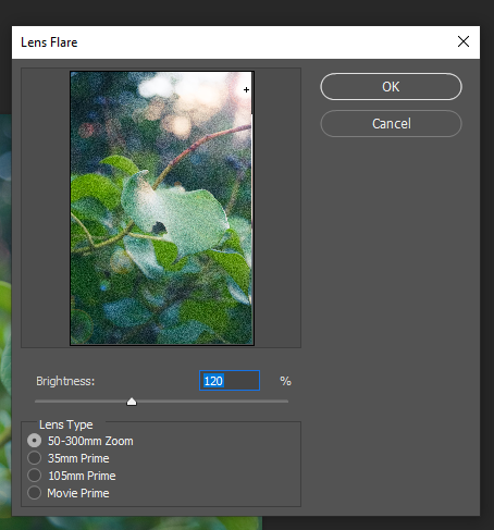
I want to do further editing on some of these images, adding light orbs and sun beams because when I took this shoot the lighting was not the best.
I experimented with ‘Filters > Render > Lens Flare…’ to add a light orb.
Here are some options:
This is my favourite outcome from the edits
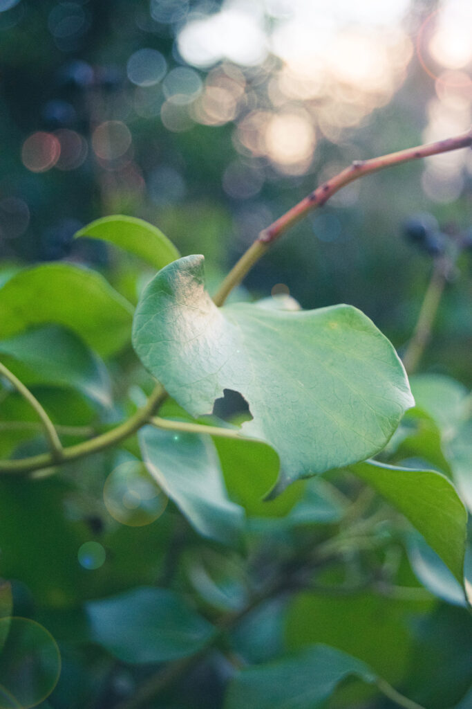
I have done this with a few more Images just to add the same style of light Kawauchi uses, and make the photos brighter. It also captures the magical and dreamy effect I want – from a child’s view
My Images compares with Kawauchi
I’m not sure if I am going to include these images as they are the only ones I have of food. Although they feel nostalgic to me, I am going to wait and experiment to see if they will work within the photobook. I may also take some extra photographs of food that is nostalgic to me, like Kawauchi.
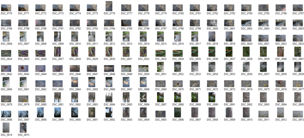
In Lightroom, I went through each image and flagged the ones which I liked and want to edit, which filters them down and helps separate these images from the rest.
photo shoots one:
Contact sheet:
My first photo shoot is based on Justine Kurland’s image ‘Bathroom, 1977’, I took photos of girls getting ready for a night out. I positioned my model in front of mirrors to try and create an idea of not knowing that the camera is there and so its almost from the models perspective and point of view. This was taken place in the evening, therefore I had to use artificial lighting.
Photoshoot two:
Contact sheet:
Photoshoot two is inspired by Michelle Sank, I took my model to Red House Precinct, and staged her in basic positions similar to Michelle Sank’s images. This was taken on a quite dull day which made the natural lighting perfect as the sun was not reflecting off of anything.
Editing process:
Photoshoot three, four & five:
The next photoshoots had no particular inspiration. This took place at a small house party and captures youth in a fun and creative light. These were all taken in the evening, therefore, there was no natural lighting so they were taken with artificial lighting. They were taken after a night out and wanted to make the images as authentic as possible so I tried to capture moments in which the subjects were not paying attention to the camera.
Contact sheet:
Editing Process:
Contact Sheet:
Editing Process:
Contact Sheet:
Editing Process:
Photoshoot six:
Contact Sheet:
Editing Process:
Selection Process:
After editing all of my flagged images, I then proceeded to colour code my best images from each photo shoot to keep everything together and make it easier when picking my final images.
‘To photograph is to appropriate the thing photographed‘ Susan Sontag (1971), On Photography
For my personal study I want to follow the theme of architecture through nostalgia with different buildings from old to modern. Through this I want to show the evolution of architecture and how is has changed from what I used to see when I was younger to what I see now becoming more and more modern. Within this I may photography different houses or buildings that have been damaged due to the storm to develop my study as well as the environmental side of building in Jersey and whether or not our heritage is keeping its legacy or if it is slowly disappearing being a main reason to keep my images untouched. ‘Photographs, which fiddle with the scale of the world, themselves get reduced, blown up, cropped, retouched, doctored, tricked out.‘ Susan Sontag (1971), On Photography. Previously I have studied Anthropocene which I feel may fit into my personal study slightly as I photographed some buildings during that topic as well as used it as a way of awareness about the environment and how the use of plastic has rapidly increased. To develop my project I am going to visit the different parts of the island to find building that have been here for a while to newer builds or ones that have been done up to show modern building that are becoming more and more common. I have chosen to focus on two artists, Eugene Atget and Ezra Stoller. I have picked these two because one of them focused on older pieces of architecture whilst the other focuses on modern pieces. As I want to show the evolution of architecture, I thought they fit in well. In response to their work, I am going to capture images of many different buildings all over Jersey from old historical buildings to new modern ones. I aim for my personal study to represent the theme of nostalgia from how the building have developed from building that have been on the island for a very long time or even listed buildings to buildings that are more for the looks or being very modern which are becoming more popular these days. Whilst photography has been developing architecture has too, almost alongside it and that is what I aim to show.
Within Photography, its relationship with architecture is immense. It is said that they are both on the verge of art and a service. I think that this is very clear in more modern buildings that we see these days as they are almost more about how they look as opposed to how they function, they are there to please the human eye and catch your attention as you drive or walk past. In architecture one of the main isms is functionalism. It focuses on the emphasis of the shape, size, materials and its aesthetic etc. This inspires many architects to this day, from recreating shapes, particular features, materials used, and techniques, etc. Functionalism in architecture is all about what the pieces provided us with whether is it natural light, a cosy, safe place that you live in, or something that provided you with a space to sleep. Whilst it will be different for everyone architecture is a massive part of all of our lives even though we may not all realise it, not only does it effect how we live but also how we act alongside our emotions. Another ism that is very involved in architecture is culturalism. Culturalism has a big effect on architecture and has for a many many years. Lots of places all around the world are well known for pieces of architecture like Big Ben in London, the rock houses in Turkey or the Taj Mahal in India. They are all influenced by the culture of the location and how each style of living is very different to each other. I think that they all ‘fit in’ as such with their country/city etc and if we were to swap them they would become out of place and almost lose their meaning and value as different cultures worship different things following into architecture. ‘Architecture belongs to culture, not to civilization’ Alvar Aalto. I think that this is a very influential part to architecture and is what make the buildings etc so special to some people and makes them gain a deep value that so many of us treasure. Finally, the last ism that I am going to talk about is surrealism. Surrealism wants us to get us to think about what the architecture is representing, and its purpose of being created. Whilst in photography surrealism now means a dreamy like photography containing things that feel unreal or representing unconscious ideas it didn’t always mean that. It is thought to be ordinary sights that sparked the appearance of surrealism. Within architecture it shows that buildings can be much more that bricks layered on top of one another. They have a much deeper meaning that many of us do not perceive, and is often only revealed when we have some sort of relationship with the architecture its self. Overall, I think that architecture has become a very influential aspect to photography. Not only has it made us photograph more but also architecture has gone from a backdrop in images to the main focal point or the protagonist. Visa versa, photography has changed how we perceive buildings etc in images and has adapted how we design future pieces, filling our minds with ideas.
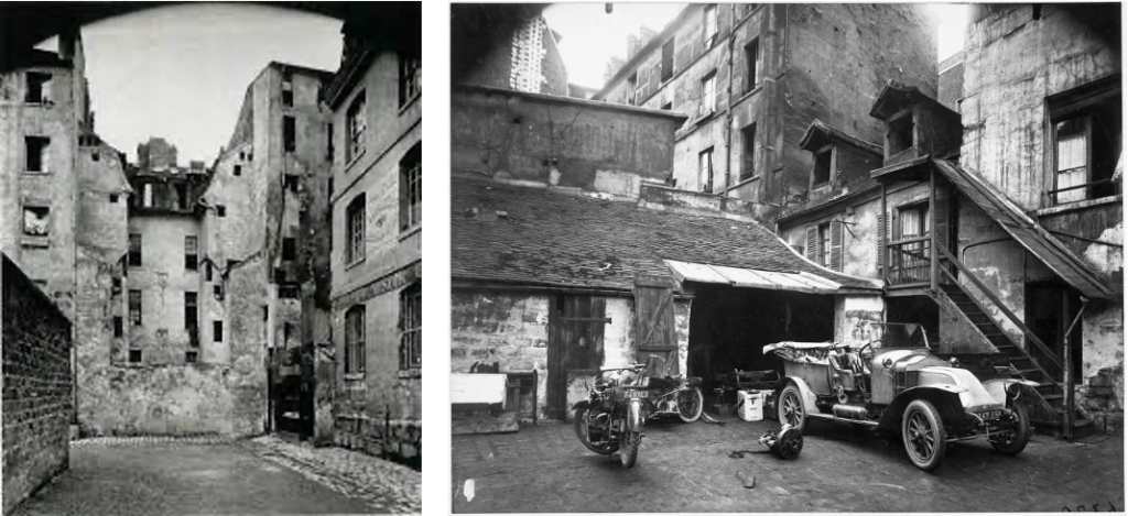
Eugene Atget was a French pioneer in documenting photography. He began making images in the 1880’s and did so to provide artists, painters and architects with studies. Many of his images are based on capturing the streets in Paris before they began to disappear into modernisation which gained admiration from big artists such as Man Ray, Henri Matisse and Pablo Picasso. Similarly, I feel deeply influenced by his motivation for his work as I wish to do the same with Jersey for my study, even thought it is much more modern than Paris was back in 1920. I also feel that Atget photographed to hold memories of living in Paris in his early twenties as he knew change was just over the horizon. ‘A good photograph is like a good hound dog, dumb, but eloquent.’ Eugene Atget. Whilst I don’t think Jersey’s architecture will develop much more rapidly in the next few years, I do believe that it eventually will and capturing it now will produce valuable memories for years to come. Atget was a very influential photographer. He played a large part in the founding of surrealism in photography and his work was inspirational and seen as a forerunner of Surrealism in the 1920’s. Surrealists found his work of empty streets in Paris deeply suggestive leading to the founding of the ism. Eugene’s work made a tremendous and sudden impact on the world of photography and ended up influencing many future photographers including me.
Whilst Ezra Stoller was also a documentary photographer however, he captured completely different buildings. He photographed the newer more modern buildings that had began popping up in developed countries. Stoller was American and had lots of opportunities to capture these developed buildings. As Jersey is not only less developed but also much smaller I have tried my best to capture the newer buildings that are appearing more and more after every building site. I have tried to convey the theme of focusing on the structure of the buildings, and how they please the human eye as well as how influential they are. Stoller has a keen eye for composition meaning that his images turn out to be very pleasing. I think that this means his images are very striking and engage the viewer into the image immediately. In Strollers work I feel that it shows that more developed structures appear more approachable and convey a more inviting effect. I think that I have been able to achieve this effect in my work in my more modern images, however, my more older images provide a more nostalgic feeling as they have been here for longer and are built in a very different way, maybe using older techniques etc.
New Topographics arose in 1975 and is where photographers capture contemporary, urban or suburban landscapes. The movements was a reaction to the increasingly suburbanised world and landscapes around them. People involved were trying to keep the world more natural and used photography to get their message across as opposed to words in the hope that they were more powerful. I think that this also contributes in my personal study as it shows that the world is changing not only in architecture but many other things. As this is one of my aims to show, I think it plays a big part. Another style I aim to show is the Bauhaus style. This style hold the characteristics of simplicity and functionality with the use of authentic materials whilst mass producing. Throughout my personal study I haven’t focused as such on this style but it may show through in some images. A photographer who focused on this style was Gabriele Basilico. Basilico was an Italian photographer who focused on the representation of the city. His photography was later used as a way of documenting the effects of war on the Lebanese capital of Beirut. Within this, he captured many apartment blocks/ complexes either that appear to have been newly built after the war or ones that were damaged and are falling to pieces. I think that his work is very effective in the architecture photography world and they hold great detail that many people may miss at first.
Eugene Atget and Ezra Stoller both created intriguing images within architecture photography leading to inspire me deeply. Whilst they photograph the the same area of photography, their images are very different but both hold great detail. Whilst one is trying to photograph the old street of Paris to produce treasurable memories for many people, the other is providing us with humanly aesthetic images of a world that we are seeing become more apparent everyday. I think that together they show how much the world is developing and what is becoming the new normality. I think that both these artists link to my projects as they show how much architecture has gone from being suitable and efficient to more about pleasing the human eye. In my project I have tried to capture how architecture isn’t just buildings etc but it also effects how we live our lives massively. I think that it influences human activity hugely from how we act and our behaviour, to communication and well-being within the world. It is proven that a well ventilated, greener area can contribute to our mental health and how we feel on a daily basis. Not only can it influence our well-being but also our happiness, being in a gloomy, noisy, dull environment can make us less productive and encouraged. ‘We shape our buildings: thereafter they shape us‘ Sir Winston Churchill (1943) His speech to the meeting in the House of Lords. The way I see it, architecture is much more than just a building. It is more like a frame work for our lives that keep stability and gives us guidance.