
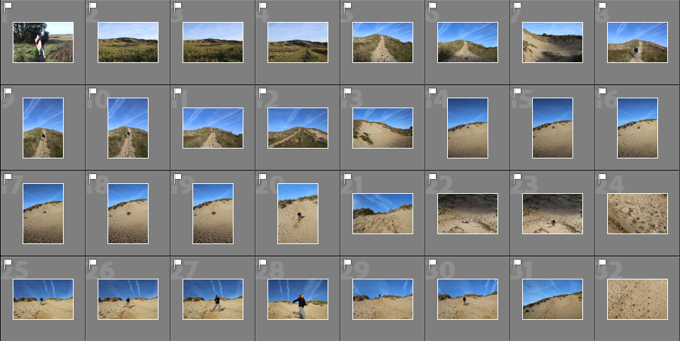
I went through all of my images and flagged the images that I thought were the strongest to make it easier for me to edit them.

CHOSEN IMAGES FROM THIS SHOOT:


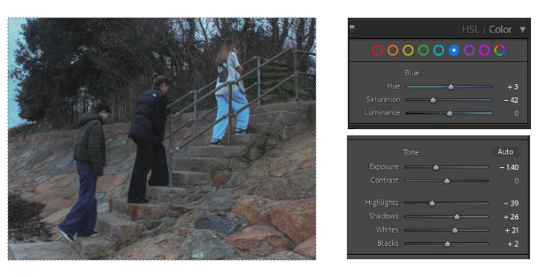
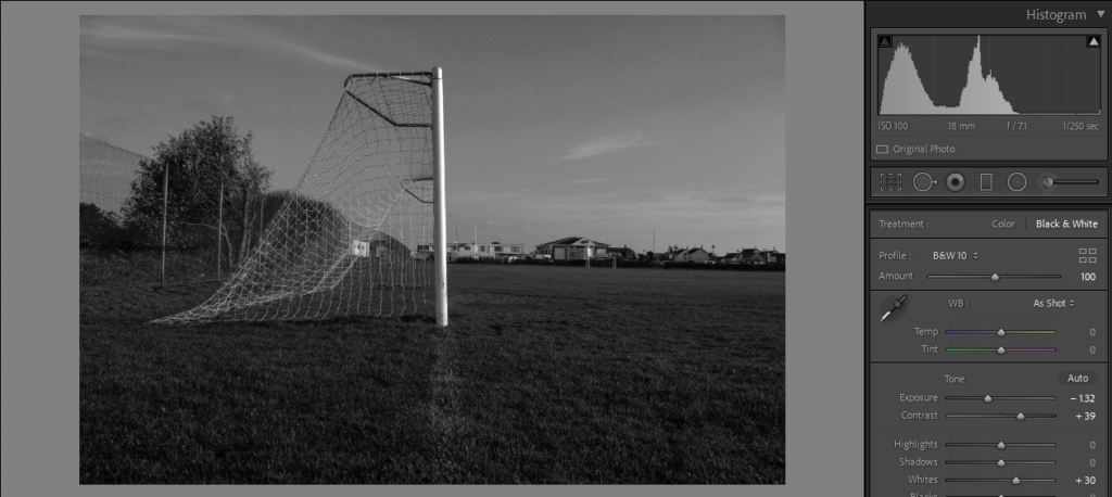
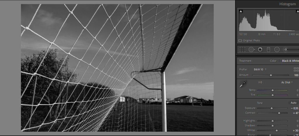
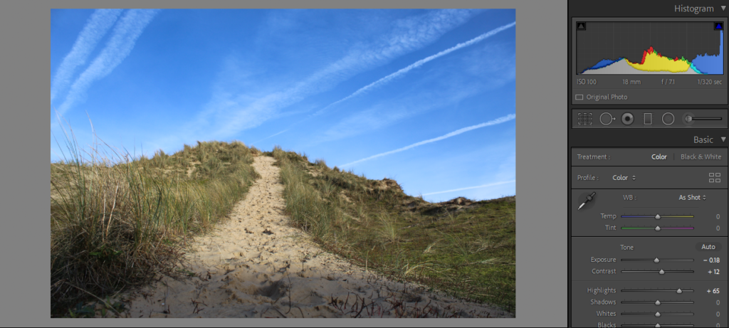
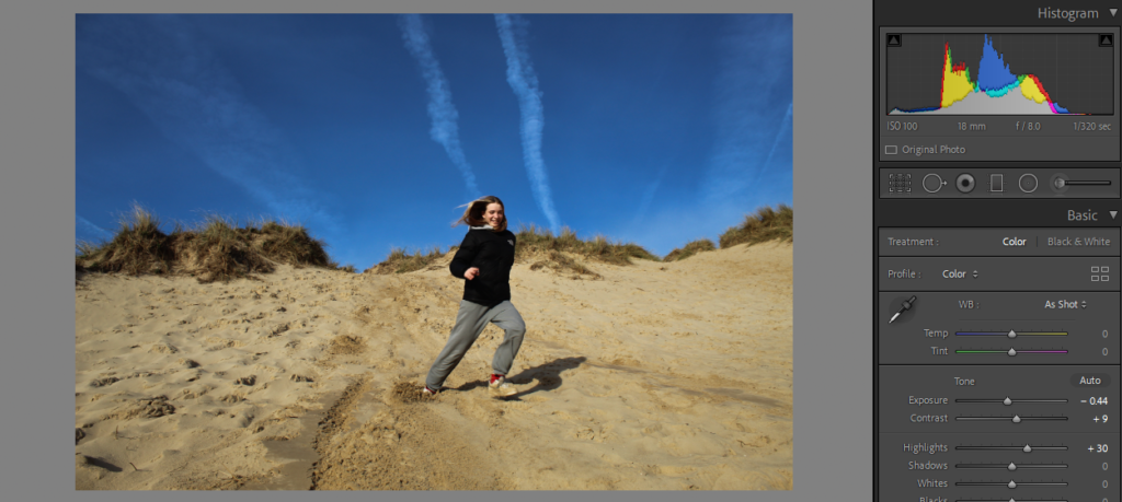
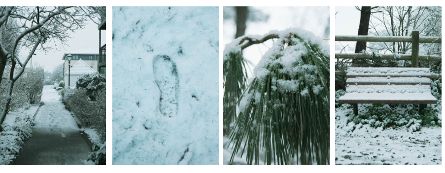
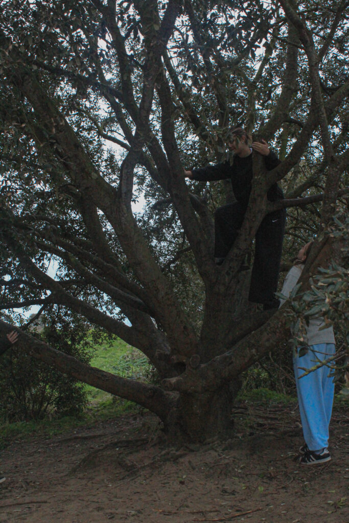
I decreased the exposure and highlights in this image as it was originally very overexposed and the highlights were bright. I also noticed that the blue tones in the image were very overpowering, the blue trousers and sky in the corner were strongly saturated and did not match the rest of my images so I tempered with that.


These three images are very similar, I edited them all but I am going to compare them to find the final image I want to use. I would put them next to each other in my photobook, however they are a bit too similar, if they had slightly obvious differences I’d pair them up. I also like how there is an obvious foreground and background. This is exaggerated by the luminance of the sky in the background but it also correlates with the blue trousers and brings the image together.

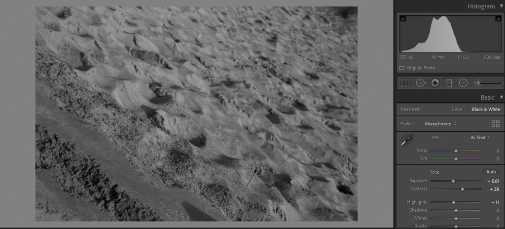
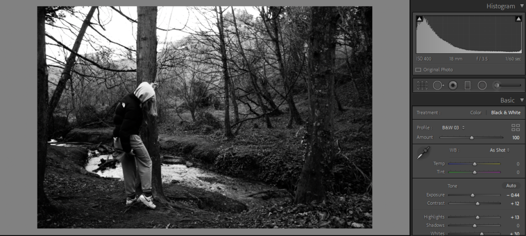
This is one of my favourite Images from this shoot. I feel it is one of the strongest as well. I started with straightening the horizon. I then decreased all the shadows and dark tones and increased the grain in the image

These two images I compared as they are also very similar but I feel they will look good next to each other, they display the theme of girlhood in my work well.
Task
Narrative: What is your story?
Describe in:
Design: Consider the following


Cover editing
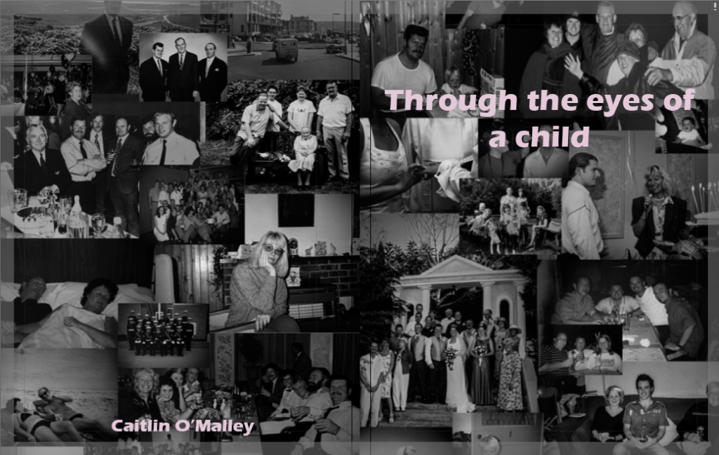
I edited the covers using publisher, turning my archive images into black and white before rearranging them in a collage. I plan on putting image one on the cover of the image since it depicts my parents and more recent photos while putting image two on the back cover due to it mainly being of my grandparents.


Layout


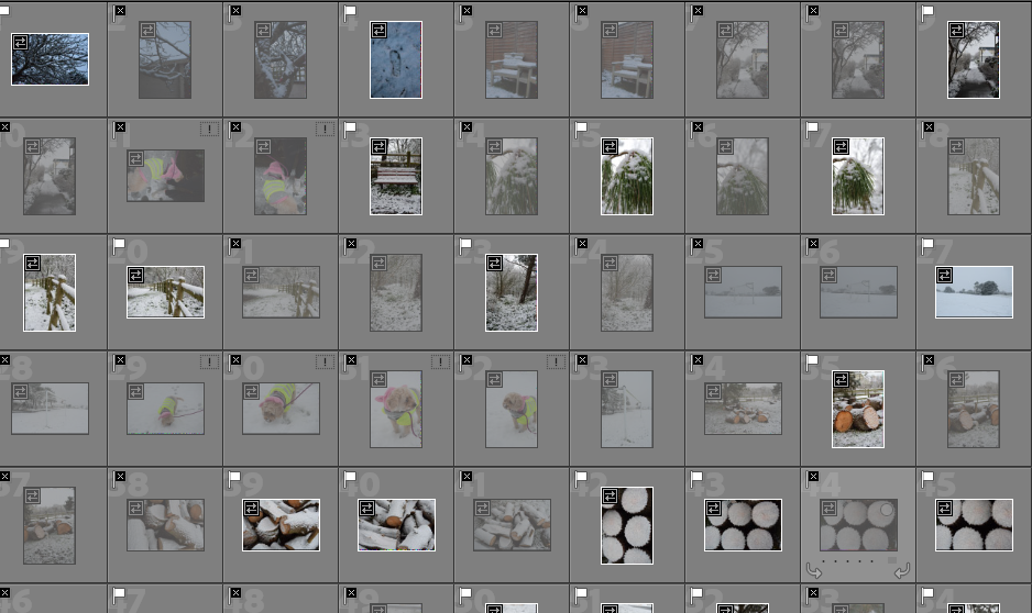
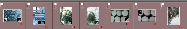
Selecting – I flagged all the images I wanted to choose to edit using ‘X’ and ‘P’
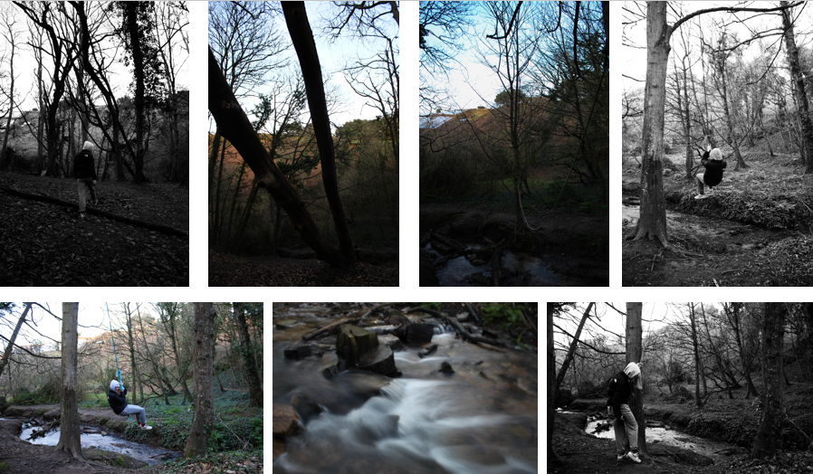
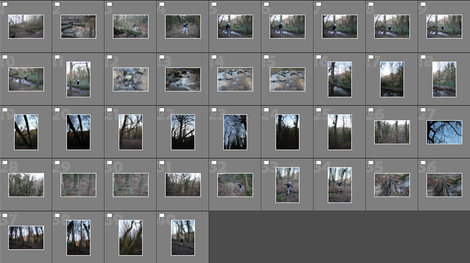
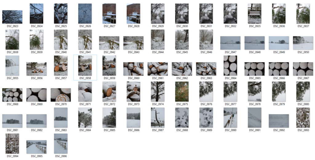
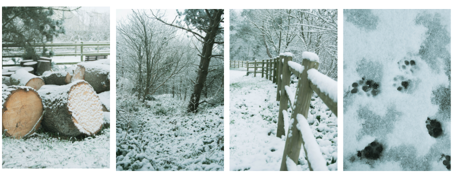
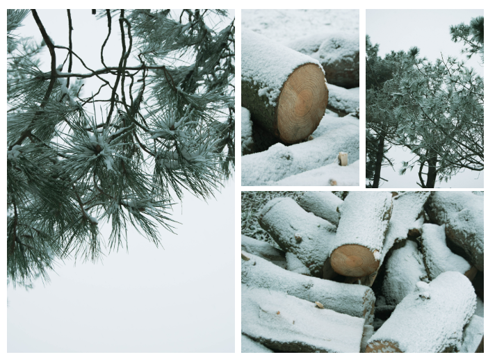
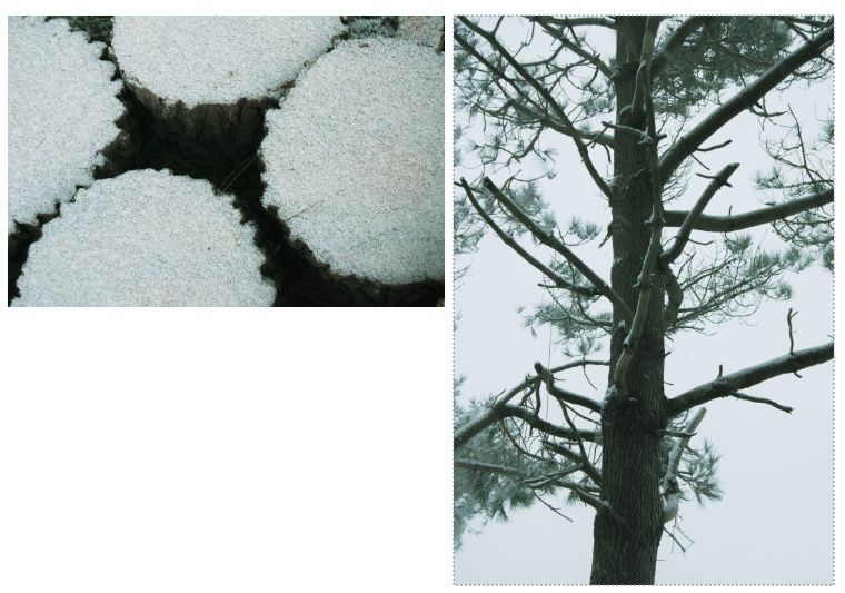
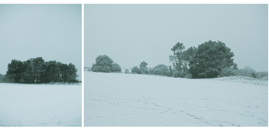
These are the photos I am going to edit from shoot 2:
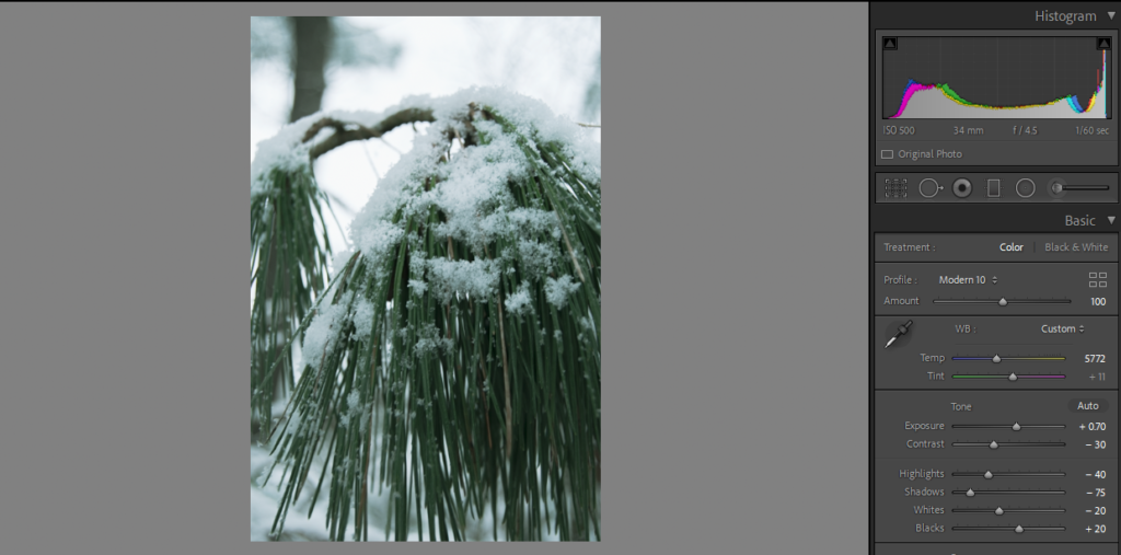
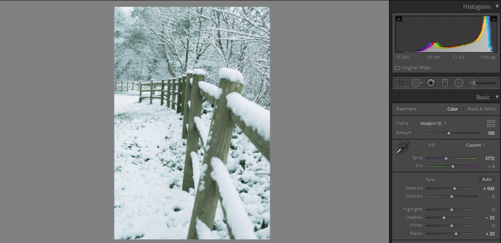
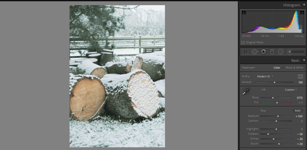
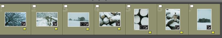
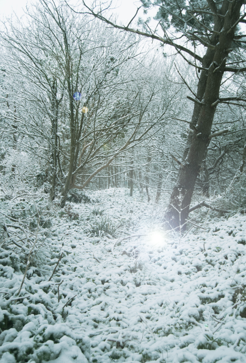
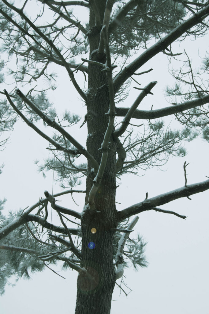
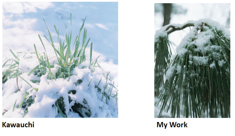
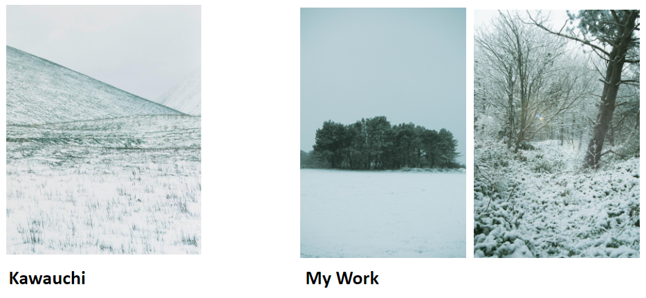
I used the preset ‘Flat and Green’ for these images because it means I can start with a basic edit. Each image will have the same colour and hues to start with, keeping a consistency throughout my images. I don’t want any to look as if they have been edited drastically different to each other. Kawauchi’s snow images are very white and exposed, I attempted to do this but less intense because I want to keep my editing style included.
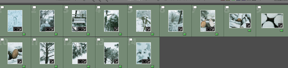
I rated the images from this shoot with red, yellow and green so I can choose which images are the best.
Red Images (unedited or images I won’t use)
Yellow Images (ones that I might use but I don’t think are the best)
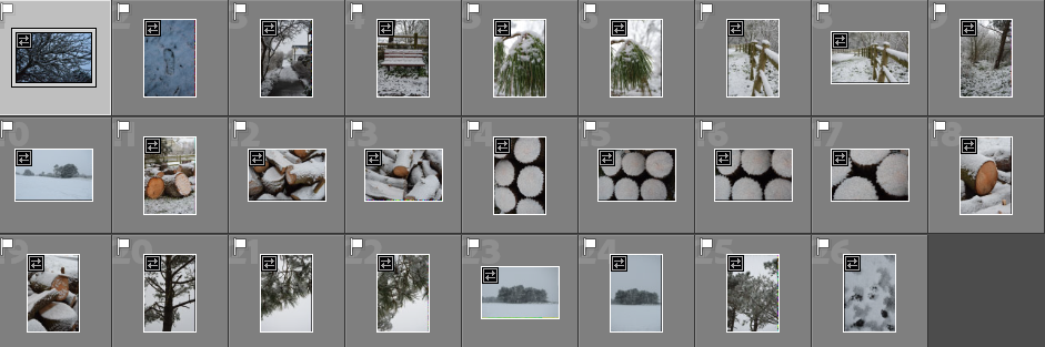
Green Images (photos that I will use in my photobook)
I want to do further editing on some of these images, adding light orbs and sun beams because when I took this shoot the lighting was not the best.
I experimented with ‘Filters > Render > Lens Flare…’ to add a light orb.
For this edit I duplicated the layer, added the light in a place where orbs were ‘created ‘reflected’ at another point on the image. I then used the Polygon Lasso Tool to select half the image. I then created a layer via copy. I hid the duplicated layer, and blended the seam with a low opacity eraser. This leaves some small orbs in the corner, subtly adding to the nostalgic sense.
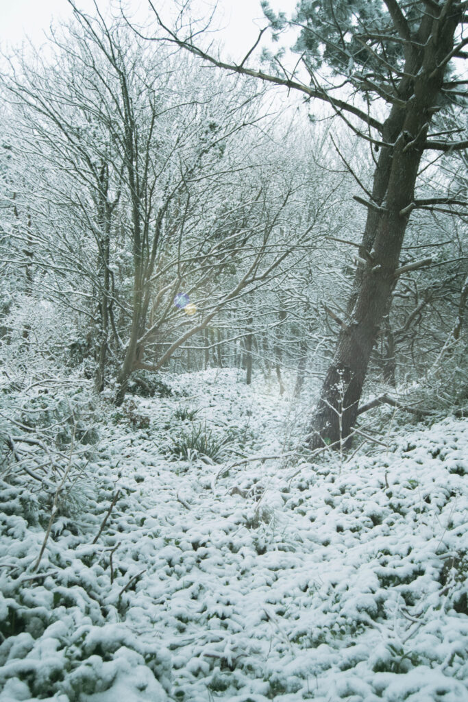
I have done the same with this image

Editing process of a handful of photos in my Fort regent photos collection for my upcoming photobook.
Fort Regent, what was once an iconic leisure centre, full of excitement and fun, is now a mere fossil of the past. While it remains open, Fort Regent hasn’t received much attention for the past few years, the hallways and corridors which used to have echoes of children laughing and cheering are now silent. The jungle gym which used to be full of children, empty. And all the cafe’s and restaurants, closed. Fort Regent, since it peaked many years ago, has only declined and will likely never reach the point it used to be at ever again. I wanted to go up and take some photos to revisit some old memories and to show the aging of the fort.


The sign above is my best example, the moss on it has been collecting for decades and started to cover some of the words too, I adjusted the colours a little to exaggerate this. In addition I made sure the trees behind it were visible too, to give off a more dead look. Of course I changed the lighting levels to bring the sign out more and darken everywhere else as it is the main subject.


I wanted to darken this image to bring the coloured light out more, this light would constantly change colour and I always used to like it, so I wanted this photo to show that.

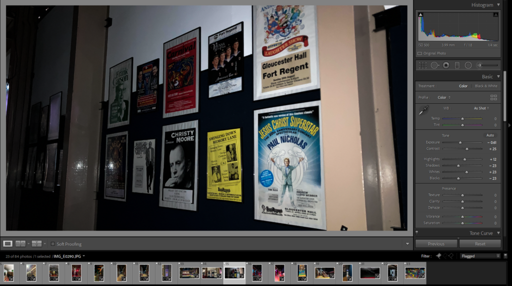
This is a collection of posters, about shows and events that would take place at the fort, since not many things have happened lately a lot of these posters are very old. I wanted to darken this image and make it look like a torch is being shined on the posters, to almost make it look as if the viewer is looking into an old dusty cupboard full of old pictures.


I wanted to make the lights in the hallway brighter and more vibrant, to reflect that of how I remember them when I was younger. I also remember the very dark ceiling and a bunch of random tools and gear left out in the hallways.

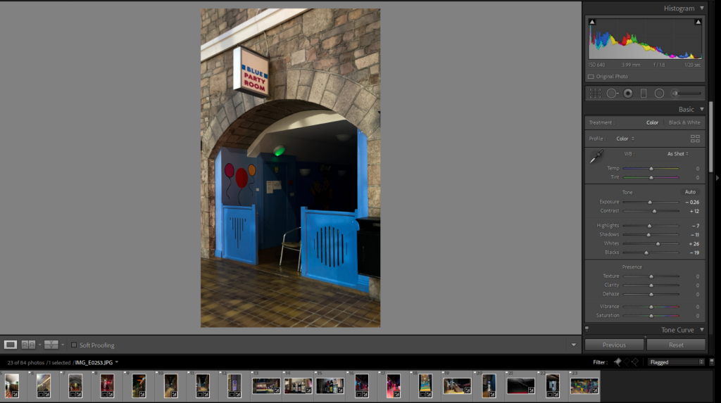
I made sure to zoom in on the party room, and to make the entrance slightly darker. This was in attempt to convey the idea that the room has not been lit for a very long time because the party rooms are, as far as I know, not used very much these days.
This is my Virtual gallery for my nostalgia mock. I did this by uploading my images onto the website art steps and then positioning them around the gallery.


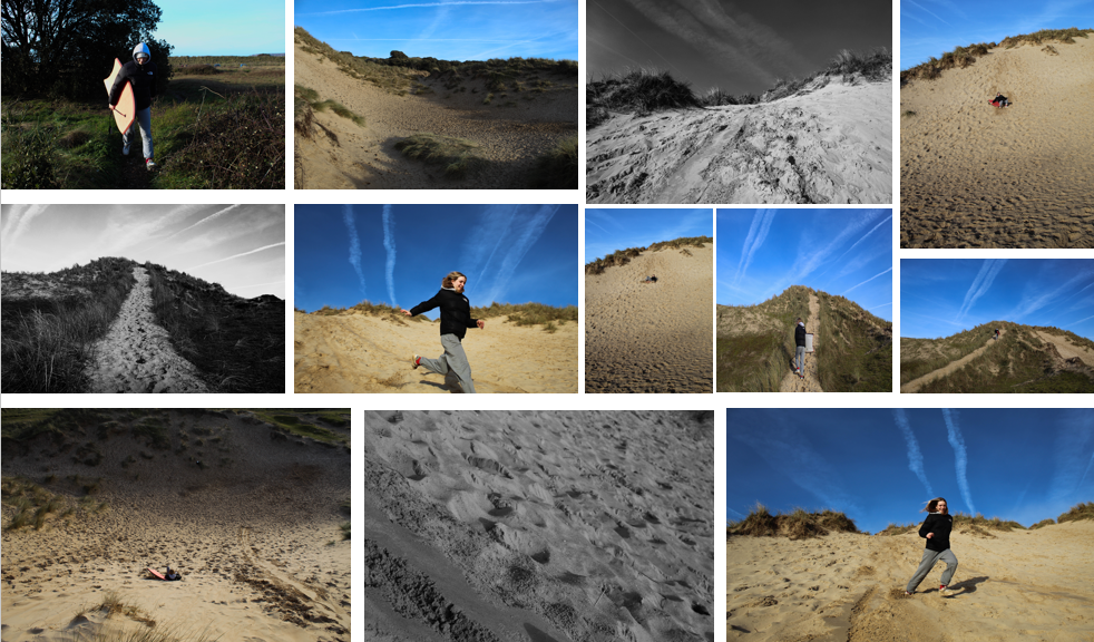
The aim of this photoshoot was to get some staged images and some candid ones, this is because I wanted to capture my friends in a natural state but also stage them to exaggerate the girlhood theme. I wanted images of my friends in trees and looking playful.

CHOSEN IMAGES FROM THIS SHOOT:

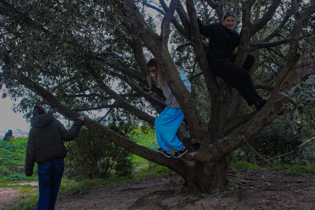


I put these images next to each other to compare them as they are very similar and I want to use only one of them for my final photobook. The top image presents girlhood better as there are three girls in it, all in and around the tree however I prefer the tone and composition of the image on the bottom. The tree is more central and creates a nicer focal point.


These two images are very similar however I like the composition form and space of both of them. Therefore, I plan on maybe putting them next to or above one another in my photobook.

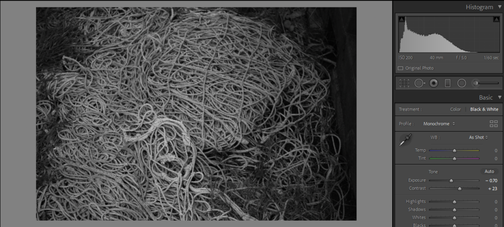
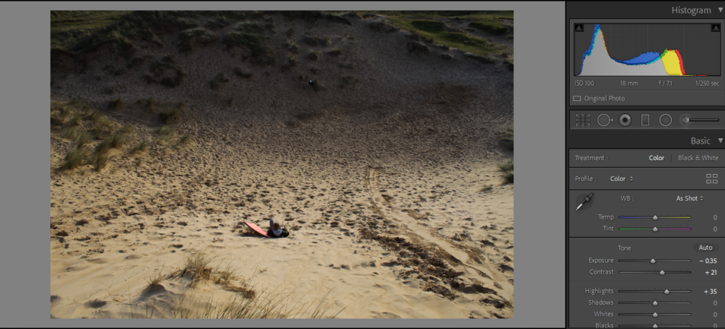
I decreased the exposure in this image but brought the shadows up a bit. This was because the image was very overexposed so I wanted to define the image more. However, with heavy shadows, it caused the seaweed to take over the image a lot as its the darkest component in it. Bringing the shadows up just lightened that a bit.

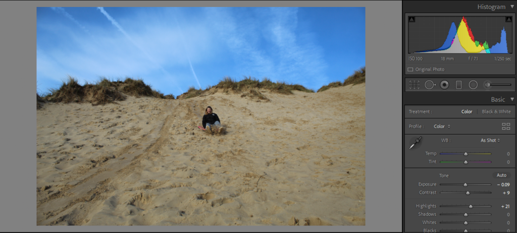
I started by rotating the image to straighten the horizon, I then cropped the image and this made it all more central. I like this image as it has very clear broken up foreground, midground and background. The foreground of the sand, midground is the two girls and the background is the sea horizon. The focal point of this image is the two girls and they also contrast the image as the tone of the background and surrounding of them are lighter and colourful and they are a darker tone so stand out.
Using Artsteps, I made a virtual gallery using my favourite images from the project that were also in the photobook.
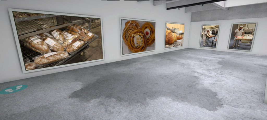


link: https://www.artsteps.com/view/65c208d2251693181698b754?currentUser