final images:

Layout plan:
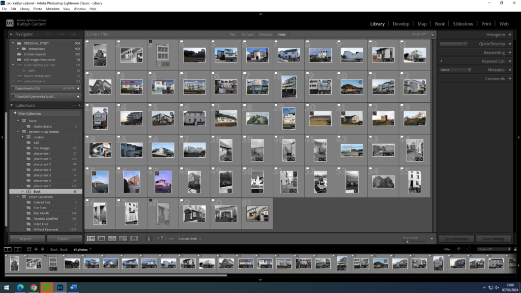
In order to help me with my layout that my images will be in in my final photobook, I decided to print out all of my final images so that I could easily test out moving them around and seeing which images looked best after one another to ensure that I was happy with they way they were all placed. As my personal study is about the evolution of architecture I thought about making my images almost represented a time line, with the older images at the start of the book to the modern images being towards the back and the one in the middle being not particularly old but not modern either. However, when I was in Lightroom Classic designing it I decided that I preferred it when my images weren’t in a specific order. I think that this meant I could finalise my layout and be sure that it was exactly how I want it. As I had a lot of images I didn’t end up using all of them as I didn’t was to have an amount that meant the viewer would become overwhelmed.
Overall I am very happy with my final layout for my photo book, and I think that all of my images are a big contribution to my book. I like how they all stand out and each have a different story.
