How have Justine Kurland and Petra Collins explored youth and femininity in their work?  

“At once child and adult, innocent and sexual, protected and vulnerable, threatened and threat, in the shadows and spot-lit, girlhood occurs as a kind of ongoing moment between two reactive states.” – Claire Marie Healy (2023), ‘Girlhood’ 

Youth is a time of discovery and self-exploration, marked with a sense of vulnerability and curiosity; whereas femininity encompasses concepts associated with being female, linking emotions and experiences that are unique to women. Despite them being two very different concepts, each helps define the other as every girl grows into a woman. As a result, there has always been a fascination with the teenage years of girls, especially in the 21st century after the rise of social media and the ever-growing list of societal pressures, but the way teenage girls act, dress, speak, or react is still regularly questioned. Two photographers who have explored this in their work are Justine Kurland and Petra Collins, through their images they invite viewers to reflect on their own experiences and perceptions of girlhood while challenging societal norms and expressing their thoughts about the complexities of growing up as a girl. 

In an article with ArtForum, Justine Kurland spoke about her inspirations, “I’m always thinking about painting: nineteenth-century English picturesque landscapes and the utopian ideal, genre paintings, and also Julia Margaret Cameron’s photographs. I started going to museums at an early age, but my imagery is equally influenced by illustrations from the fairy tales I read as a child.” – Meghan Dailey (2000), ‘1000 words: Justine Kurland’. Kurland credits a lot of her innovation to Neo-romanticism, an art movement that originated in the 20th century as a reaction against the dominant trends of modernism, it seeks to capture a sense of nostalgia, longing, and idealism; it draws inspiration from the romantic movement of the 19th century which emphasised emotion, individualism, and a connection to nature. Kurland’s photography often features young women in dreamlike and natural settings, her images evoke a sense of exploration and innocence. She uses natural light and soft colours which adds to the romantic and nostalgic atmosphere of her photographs. Whereas Petra Collins’s photographs depict young women in intimate moments, she incorporates elements of surrealism, creating dreamlike qualities that align with the Neo-romantic aesthetic.   

Born in New York in 1969, Justine Kurland is a renowned contemporary photographer who is known for her captivating images that explore the themes of youth and femininity. Kurland’s images often depict girls and young women in natural surroundings such as forests, fields, and abandoned urban areas. She seeks to capture the moments of freedom, curiosity, and self-discovery of the girls while still holding onto the innocence of youth in hopes of challenging traditional gender roles and societal expectations placed on young girls. Part of her art is the expression of strength and resilience in her subjects, she portrays them as active agents rather than passive objects. Utilising unconventional situations, Kurland offers a unique perspective on the experiences of young individuals as they navigate their surroundings and identities. Her famous book “Girl Pictures” address the complexities and contradictions of growing up in a society that simultaneously idealises and restricts girls, she highlights different themes of rebellion, vulnerability, and friendship throughout the series of images. The photobook follows American runaway girls as they explore their newfound freedom; the images are visually striking and can allude to a dreamlike aesthetic. Natural light and careful composition are all taken into consideration as a way of creating a powerful visual narrative that invites viewers to reflect on their own experiences of youth and femininity. All the images were taken between 1997 and 2002 yet they feel timeless, Justine got young girls to pose as runaways under highway underpasses or next to neglected lakes, she named them her “standing army”. In an interview with AnOther, Kurland described why she felt it was so important for her to create these images, “– you can create a world for yourself, one that’s bearable to live in. I built on and corrected some of the tropes surrounding the representation of teenagers; these pictures were not solicitous renditions of hypersexualised children.” – Belle Hutton (2020), ‘Girl Pictures: The Story Behind Justine Kurland’s Teenage Runaways Series’ 

“Boy Torture Love” from “Girl Pictures” (Aperture, 2020), Justine Kurland

Another photographer whose work delves into the realms of youth and femininity is Petra Collins, born in 1992. Her images and concepts offer a unique perspective on the challenges and experiences faced by young women in today’s society. Collins focuses more on identity, body image, and sexuality while capturing moments that challenge conventional beauty standards. She heavily critiques the ‘male gaze’ and objectification of women and instead uses her work to reclaim agency over female representation. The images question and challenge the norms that have arisen from social media, advertising, and fashion along with encouraging viewers to question their preconceived notions. Through tackling societal issues, she also incorporates the themes of mental health and vulnerability, her images often depict young girls in moments of weakness, and resilience, but also self-discovery as she aims to create a space for reflection. The visually captivating and thought-provoking images that Collins creates are infused with a sense of nostalgia; she incorporates elements of fashion, surrealism, and pop culture while using lighting and colour to enhance the emotional impact of her work. My favourite collection from the Canadian photographer is “The Teenage Gaze”, it includes intimate portraits shot from 2010-2015 of teenage life from a creative adolescent perspective, it is a stereotype-free view of young girls which portrays the raw and unfiltered spirit of girlhood. The expression of her art is built on moments of joy, vulnerability, confusion, and rebellion in a transformative phase of life. Collins spoke about her inspirations in an interview with Vogue, “My goal is just to create images that generate a conversation about things that aren’t spoken about. I want to change the ways young girls look at themselves and the way women at large are looked at…. So, when I was 15 and started working, it was a time when I was going through puberty, and beginning to discover my sexuality and photography and film were a means of working that out.” – Gabriella Karefa-Johnson (2014), ‘Petra Collins on Her New Photography Show “Discharge,” Teenagedom, and the Female Gaze’.    
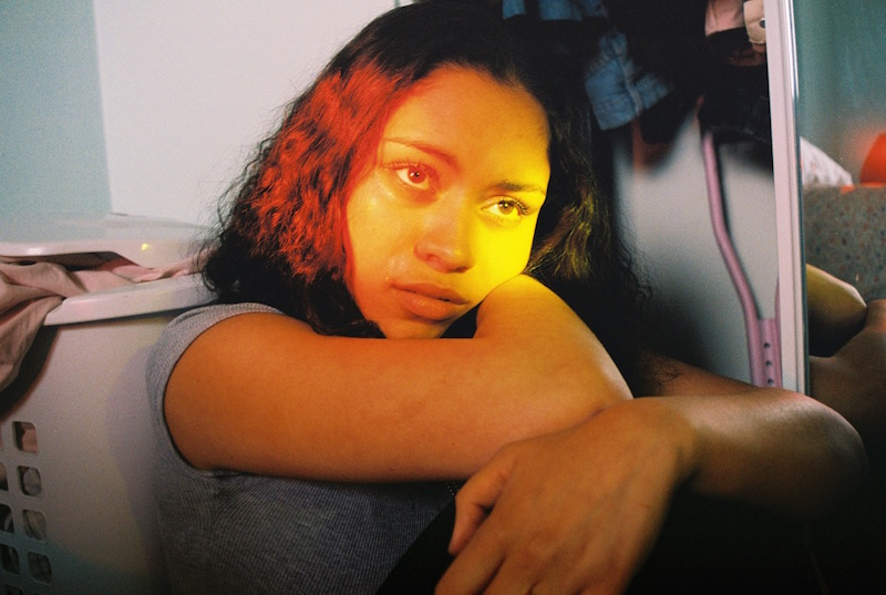
From “The Teenage Gaze” by Petra Collins

Justine Kurland and Petra Collins explore youth and femininity in their work by rewiring the view on teenage girls, they steer far away from stereotypes without their work being too out of the ordinary. They both depict the realities of growing up as a teenage girl without the sexualisation, instead challenging societal expectations placed on young girls. While Kurland’s work evokes a sense of nostalgia and romanticism, Collins focuses more on identity and body image while critiquing the ‘male gaze’ and the objectification of women. Through their images, these photographers invite viewers to reflect on their own perspectives and experiences of girlhood, while encouraging them to challenge societal norms and pressures that continue to shape the lives of young women today.  

Bibliography  

  1. Dailey, M. (2020) ‘1000 words: Justine Kurland’. ArtForum: https://www.artforum.com/features/1000-words-justine-kurland-162362/ (accessed Feb 2024) 
  1. Healy, C. M. (2023) ‘Girlhood’, London: Tate Enterprises Ltd. 
  1. Hutton, B. (2020) ‘Girl Pictures: The Story Behind Justine Kurland’s Teenage Runaways Series’. AnOther: https://www.anothermag.com/art-photography/12463/justine-kurland-girl-pictures-aperture-rebellious-teenagers-the-runaways-book (accessed Feb 2024) 
  1. Karefa-Johnson, G. (2014) ‘Petra Collins on Her New Photography Show “Discharge,” Teenagedom, and the Female Gaze’. Vogue: https://www.vogue.com/article/petra-collins-photography-show-discharge-teenagedom-female-gaze (accessed Feb 2024) 
  1. Koons, J (2022) Neo-Romanticism: History, Characteristics, and Notable Artists’. MasterClass: https://www.masterclass.com/articles/neo-romanticism (accessed Feb 2024)   
  1. Kurland, J. (2020) ‘Girl Pictures’. New York: Aperture. https://aperture.org/featured/justine-kurland-girl-pictures/ (accessed Feb 2024) 

Experimentation: the Lightroom Brush tool

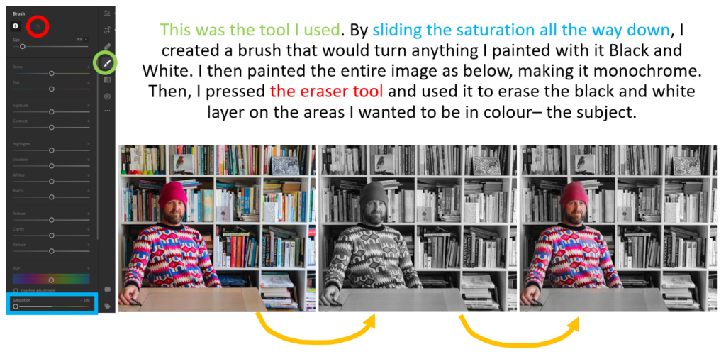
I decided to use the Lightroom brush tool to edit this image.

I liked the way the colours worked here, but I thought that it would be effective to make it look as though the rest of the image was black and white whilst having my dad and his brightly coloured clothes in colour. I think this is symbolic of the way that he always dresses colourfully and is always focused on the fun side of every situation. He always seems to be the most colourful person in the room, with the rest fading into black and white. I am happy with the outcome of this image, but I am not fully sure if I will use it in the final project.

How is the work of Rinko Kawauchi inspired by Japanese Aesthetics and History? 

‘It’s not enough that [the photograph] is beautiful. If it doesn’t move my heart, it won’t move anyone else’s heart.’ – Rinko Kawauchi 

Ever since photography made its way to Japan in the Edo period (1615-1868), it has evolved and inspired many photographers around the world. It’s simple, yet fascinating style, has the ability to draw a multitude of emotions and feelings through its compositions. In this study, I will be exploring the photographer Rinko Kawauchi, investigating how she uses her camera to present inexplicable comfort and surrealism. Additionally, I will analyse Japanese photographers such as Masahisa Fukase and Daido Moriyama,discovering how their work has influenced and advanced Kawauchi’s work.  

Photography began on the southern island of Kyushu, and knowledge about the subject was scarce. This meant that early enthusiasts relied on their own encounters with foreign professionals to gain the skills. The Daguerreotype, was the first successful photography process, whereby a highly detailed image was created on a sheet of copper and plated with a fine coat of silver. There was no use of negatives and this process was a direct-positive process. This method reached Japan in 1846, but it took different clans around four years to create a successful Daguerreotype. Photography was completely black and white during the nineteenth century. Japanese photographs, that were typically used for tourism, were frequently treated with applications of colour. They transformed basic images to bright, eye capturing images through the use of oil paints: turning cherry blossom trees pink and draping wisteria blue. Japanese photographers carried these traditions through the years, even after the invention of colour photography, because it was part of the culture to have to freedom to colour images freely, using their imagination [1]. The idea of a portable souvenir was popular for visiting travellers, and the tourists seemed to be interested in perceived ideas of traditional Japanese culture, rather than their society. The unique aesthetic of Japan caused a need for escapism for the tourists, avoiding the modernizing industrial society. The photographs captured a beautiful utopia, displaying temples, shines, cherry blossoms and more. From Mount Fuji; a popular tourist destination that presented an almost fantasy world [2]. A century later, photography was used as an ‘eye witness’ for the bombing in Nagasaki, 1945, capturing the devastating events.

Unknown, Cherry Blossoms by Shrine, c. 1890-1910, hand-colored albumen print, Ronin Gallery. 

In 1863, Felice Beato, an Italian-British photographer, ventured to Japan, joining his friend in Yokohama. Their mission was to commercialise “Japonisme” for the western viewers that visited the country. In his time working there, he introduced the hand-coloured photographs, working with popular and talented Japanese painters [2]. In the late 1960s, Yoshio Watanabe, one of the most well-known photographers, (after photographing Ise Shrine in World War Two), raised the question, “What should a photographer be?”, when the Tokyo demonstrators were in mass protest of the renewal of the U.S.-Japan Security Treaty. Two eras of photographers advocated for a public evaluation of the wartime accountability associated with the medium. This resulted in the exhibition Shashin 100 nen-Nihonjin ni yoru shashin hyogen no rekishiten (A Century of Japanese Photography). This was one of the most crucial photography shows in the twentieth century and it displayed one hundred years of Japanese photographers’ works. This art movement was the first presentation to reflect on their contributions to Japanese fascism during World War II. The book produced from this movement was the first great volume to give Japanese photography an international audience. [3] 

Felice Beato 

Rinko Kawauchi was not raised in a creative atmosphere, and she would find herself escaping to read at the library. Although she wasn’t interested in images as a child, she was interested in koro-pok-guru. Books would take her into a different reality, and this was the start of her creative journey. Today her photos now correlate to the experience she had as a child, leading the viewer on a journey and escaping the harsh life surrounding us, transporting the viewer into Kawauchi’s mind and how she sees the world in a more beautiful and still way [4]. Her interest in books is seen in her priority of creating an experience through a photobook; such as Illuminance. She states that ‘books connect us to the present’ [5] because of the choice the viewer has in flipping the page; it allows you to have control over your experience. Through this, Kawauchi intends for the reader to grow a ‘connection to (her) images’ [5]. Whilst in high school her first photograph was taken with a compact camera. It was an image of the sea, and she felt that she had no connection with the camera. Having taken photography classes, she later found an emotional experience which linked her to her images. She was self-motivated to create her own style because she felt she couldn’t express her work through a commercial photography job [4]. The necessity for her own style and meaning could have been influenced by the Japanese aesthetic Wabi-Sabi; the aesthetic defined as the beauty of things, “imperfect, impermanent, and incomplete” [6]. Kawauchi’s movement, captured in her stills connects with this aesthetic, framing the everyday experiences, whether ugly or beautiful, death or new life. Wabi-Sabi considers things to be beautiful in their transience, correlating to her work, such as Illuminance, holding a timeline of journeys throughout fifteen years of her life. Witnessing the blooming of a flower, the light hitting steps, or the death of an animal, Kawauchi uses this Japanese aesthetic to present her ethnicity and the beauty of life through her work. 

Kawachi’s work has a theme of fragility throughout Illuminance, and other series of hers, which is presented through her use of light. Many of her images are flooded with warming light or reflection, illuminating the photograph. The effect of this presents subjects in her images as frail, rather than hard and stable, linking with her motif of telling the story of life through her work. The fast-paced movement of life could be viewed as delicate, because time disappears quickly, and death is always in the imminent future. This idea connects with Kawauchi’s work, capturing stillness during times of movement in life, and might be her attempt to pause and admire what is in front of her. I am exploring nostalgia in my work, presenting the loss of childhood memories and the reflection of places that revive these memories. Kawauchi’s use of metaphors and meaning throughout Illuminance has inspired me to use light and compositions to grasp the emotional and visceral feeling of this loss. Being able to hold a moment in your hand on a piece of paper in a book, with its physical qualities, creates an intimate and personal escape for the reader to take a moment and step away from life, falling into the emotions that the images provoke. This feeling correlates with Wabi-Sabi and the aesthetics of the impermanent moments.  

Rinko Kawauchi – From ILLUMINANCE

Kawauchi has been widely influenced by historical photographers, such as Masahisa Fukase and Daido Moriyama. Both photographers have left an impactful mark on the capturing of the Japanese landscape, with their influence on Kawauchi’s work being clear. Although her work is unique for its unique style, there are obvious imprints of the typical elements of these two Japanese photographers. Fukase is well known for his very personal, emotional images. One of his series named, ‘Ravens’, published in 1986, was influenced by an melancholy experience which he endured. His divorce triggered the series to be developed, resulting in a range of emotional photos. The series took eleven years to make, collecting a sum of images that portrayed the feelings he felt. I find this very similar to Kawauchi’s work, because his images tell a story beyond the composition [7]. It is not just one or two shoots that completed the series, but images from a journey over the course of a mournful part of his life. There is a similar theme of solitude, morality and the passage of time, seen in both of their works, capturing the ordinary as extraordinary and meaningful; they transform their experiences into a use for introspection, embracing the impermanence discovered in everyday life [8]. Fukase has the ability to capture the movement of life in collections of still images, influencing Kawauchi to do the same, attaining emotional depth and beauty.

“Karasu” (Ravens), 1977

‘To focus on reality or be concerned with memory, choices that, at first glance, seem opposite are, in fact, identical twins for me’ – Daido Moriyama 

Daido Moriyama was also a popular Japanese artist in the 1960’s and 1970s, who inspired movement. He is admired for his raw and gritty street photography. Moriyama’s work is primarily black and white, enriched with depth, shadow and rather chaotic compositions, heavily juxtaposing with Kawauchi’s more soft, milky and contemplative style. However, although their work is compositionally opposite, there is a resemblance of their shared interest with the ordinary and the visceral. Moriyama’s tendency to capture the frenzy of movement and chaos in the streets has the possibility of inspiring Kawauchi’s preference for spontaneous and candid shots, both inciting the rawness of authenticity in human experiences. Moriyama’s style can be viewed as avant-garde, provoking movement and new ideas. Moriyama breaks the traditional norms of Japanese photography with his contemporary approach, distinguished by his bold angles and dramatic subjects. His style was primarily inspired by the influence of American artists, such as Andy Warhol, which left an obvious mark in his adventurous take on photography [9]. This drastic change from the tradition of Japanese photography is what could have aided Kawauchi in finding her own aesthetic style, different from many Japanese artists, creating a uniqueness to her work. 

Daido Moriyama – TSUGARU

Overall, it is clear that Kawauchi has developed a distinctive style, inspired by her Japanese culture and the surroundings that she has been brought up in. From reviewing her interviews, I believe that in some ways, her work is exploring the creative realm that she used to escape and enter other realities as a child. In an interview she stated, ‘Our family was under pressure… and I felt it too, so to escape reality I did lots of reading’ [4], which presents the beginning of her escapism through the creative realm. She also stated, ‘People often say that I have a child’s eye’ [10], implying that Kawauchi has an awareness of her need to revive her childlike imagination in her photography. The aesthetics of her culture obviously plays a key role in influencing her work, such as the early Daguerreotypes coloured to create a romanticised, idealistic and colourful worlds that are presented as utopias. Her work holds a resemblance of these historical images, shown through her attempt to present her world as serene and peaceful, similar to these postcards created to draw the viewer in. The aesthetics of Wabi-Sabi flow throughout history, and into her work, inspiring Kawauchi to evolve the Japanese style into her own contemporary approach.

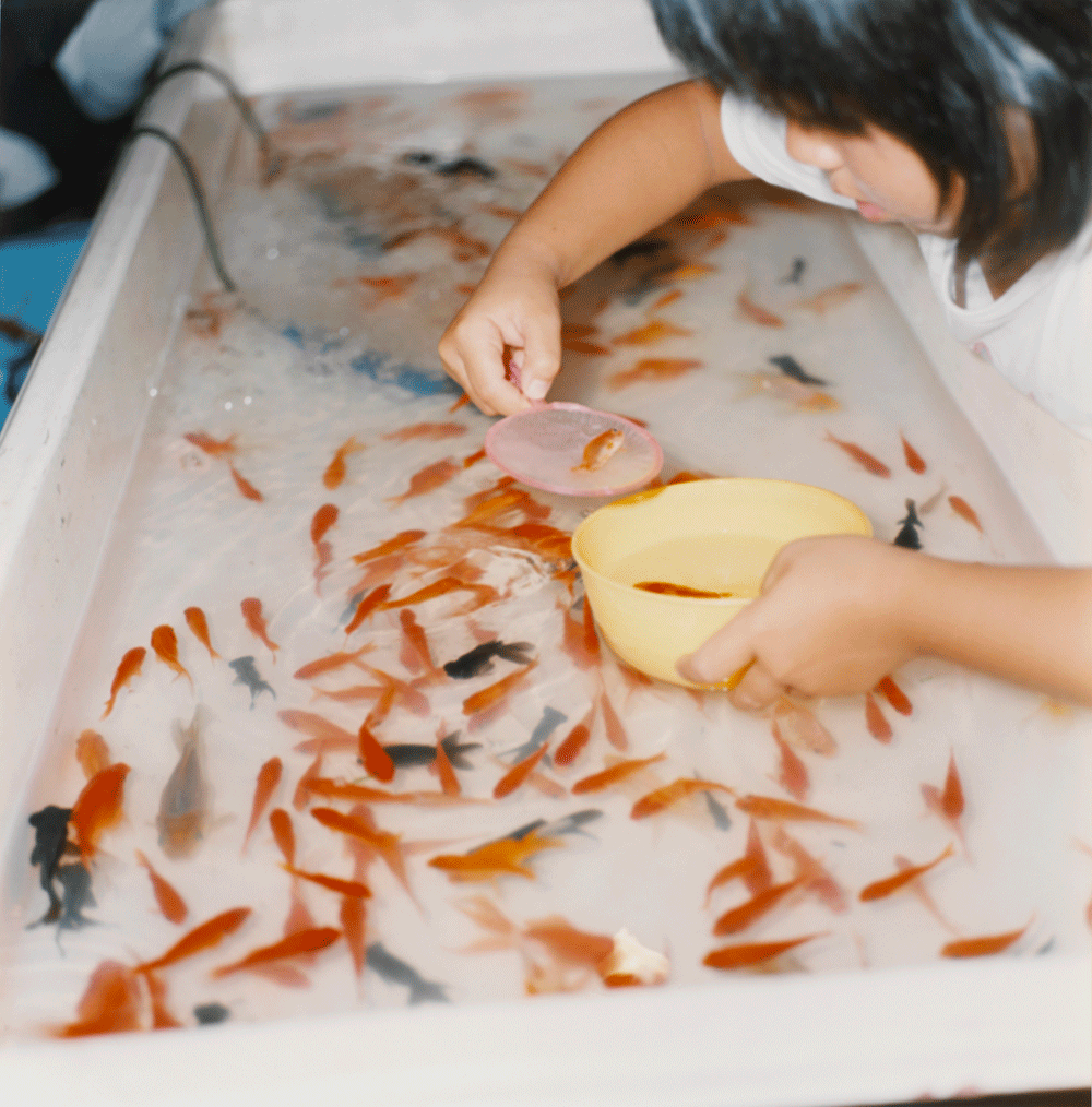
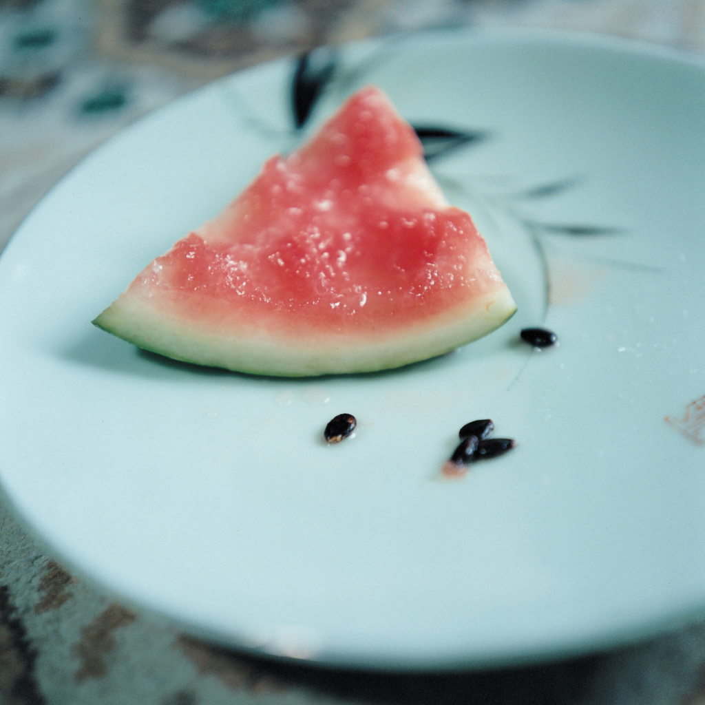
Examples of Kawauchi’s ‘childlike’ images:

Bibliography 

[1] Anon, (n.d.). Early Photography in Japan – DANIEL BLAU. [online] Available at: https://danielblau.com/early-photography-in-japan#:~:text=The%20story%20of%20photography [Accessed 5 Feb. 2024]. 

‌[2] www.roningallery.com. (n.d.). Imagining Japan: Early Japanese Photography|Ronin Gallery. [online] Available at: https://www.roningallery.com/blog/imagining-japan-early-japanese-photography-2

‌[3] SFMOMA. (n.d.). A Century of Japanese Photography: Historical Reckoning and the Birth of a New Movement. [online] Available at: https://www.sfmoma.org/essay/a-century-of-japanese-photography-historical-reckoning-and-the-birth-of-a-new-movement/ [Accessed 5 Feb. 2024]. 

‌[4] Kawauchi, R. (no date) Rinkokawauchi.com, Rinko Kawauchi. Available at: https://rinkokawauchi.com/en/wp-content/uploads/sites/2/2018/01/2010_RK-SSAW-SS.pdf (Accessed: 05 February 2024). 

[5] Rinko Kawauchi. (n.d.). Available at: https://rinkokawauchi.com/en/wp-content/uploads/sites/2/2017/12/2017_Unseen-Magazine-4.pdf

‌[6] Wikipedia. (2023). Japanese aesthetics. [online] Available at: https://en.wikipedia.org/wiki/Japanese_aesthetics#:~:text=Japanese%20aesthetics%20comprise%20a%20set

‌[7] MACK. (n.d.). Ravens Masahisa Fukase. [online] Available at: https://mackbooks.co.uk/products/ravens-br-masahisa-fukase#:~:text=Fukase [Accessed 5 Feb. 2024]. 

‌[8] Hundred Heroines. (n.d.). Rinko Kawauchi – Japanese Photographer. [online] Available at: https://hundredheroines.org/heroine/rinko-kawauchi/

‌[9] thephotographersgallery.org.uk. (2023). 7 things to know about Daido Moriyama | The Photographers Gallery. [online] Available at: https://thephotographersgallery.org.uk/7-things-know-about-daido-moriyama

[10] Mocha, M. (2015). Rinko Kawauchi: Life’s Murmured Whispers. [online] Midtown Mocha. Available at: https://midtownmocha.blog/2015/02/22/rinko-kawauchi-lifes-murmured-whispers/#:~:text=%E2%80%9CPeople%20often%20say%20that%20I [Accessed 5 Feb. 2024]. 

‌ 

photobook plan

For my final phonebook I want it to be showcasing my images and having the viewer be able to focus on them clearly. For this reason I am going to put my images quite big on the pages and only have the photos as well as my essay at the end. I think that it is important in a photobook that the images are the focus and they are a clear representative of what the book is about with little or no writing so that the viewer can also add there own thoughts but are clearly shown the theme.

mood board:

deconstructing a photo book

1. Research a photo-book and describe the story it is communicating  with reference to subject-matter, genre and approach to image-making. 9 what it is about, i.e., landscape, how images were made)

The book that I have been researching is based around the night time walks during the summer months in Colorado. All of the images that Adams’ has produced in this book have a very Urban feel to them. Often the settings are very obsolete and open, allowing for our own thoughts. Throughout the book it feels very isolated, peaceful and quiet almost as if the world has gone to sleep. Whilst lots of his images include houses, only an odd few include people which makes it feel almost as if we are looking in on peoples lives but only when they aren’t around. I believe that his images are more documentary than staged as these images were produced purely from an evening walk. I would say that the image look as if Adams had gone out for a walk with his camera and he photographed his surroundings without a main intention of that the images would turn out like. I think that his approach to image-making was almost effort-less as they appear to be quick snap shots of what he saw as opposed to deep meaningful images with lots of information behind them, however, I do think that they could have a hidden meaning. They almost feel as though they are a empty space where you could hear you own thoughts and take a break from the busy lives going on in the day time.

A few of the images from the book:

2. Who is the photographer? Why did he/she make it? (intentions/ reasons) Who is it for? (audience) How was it received? (any press, reviews, awards, legacy etc.)

The photo-book contains a larger number of Robert Adams’ images and is called summer nights. I think his purpose of making the images is to show that at night time the whole world goes quiet. Many of his images, to me, represent that if you were there at the time you can hear your own throughs and it is a space where you can relax as everything is peaceful. Because the images convey this, it means that it allows the viewer to create their own opinion of the images and what they might mean on a personal level.

3. Deconstruct the narrative, concept and design of the book and apply theory above when considering:

  • Book in hand: how does it feel? Smell, sniff the paper.

I think that the book feels quite grainy, and smells almost like glue or like a stationary store.

  • Paper and ink: use of different paper/ textures/ colour or B&W or both.

The book has end paper at front and back (paper that is stuck to the back of the front page), it is thick, good quality paper for the images and has a matte look opposed to glossy which I think works really well as the images are in black and white which defines the detail and adds to the tones in the images.

  • Format, size and orientation: portraiture/ landscape/ square/ A5, A4, A3 / number of pages.

The book by Adams was a standard landscape book containing 50 of his images. The book had around 85 pages as it also included an interview and other various things.

  • Binding, soft/hard cover. image wrap/dust jacket. saddle stitch/swiss binding/ Japanese stab-binding/ leperello

Adams’ book did not have a dust jacket (paper cover over hard back), however, it did have a paper strip around the bottom of the book almost like a mini dust cover, it was also a hard back cover which had a linen type wrap, I think that this really made the book stand out.

  • Cover: linen/ card. graphic/ printed image. embossed/ debossed. letterpress/ silkscreen/hot-stamping.

As I just mentioned Adams’ book has a linen cover almost like it has been woven. I really like that he has done this as it makes the book feel more sentimental and homey. I also think that the linen cover matches nicely with the matte paper and finish on the images.

  • Title: literal or poetic / relevant or intriguing.

I think Adams’ title was a literal title and was very self explanatory. However, I do that that it could have deeper meanings if we looked into the detail in the images as well as the title. It almost feels like Adams’ has let us add out own interpretation to the book.

  • Narrative: what is the story/ subject-matter. How is it told?

I think that Adams’ book is told in a way that makes us feel as if we are going on a walk with him, and it feels like we are there with his as he takes the images. I think the story is about what the world looks like when we aren’t looking at in or are asleep, giving us a new perspective. Adams’ images appear to have just been taken when he sees something he likes the look of as opposed to stage which makes me think that he wants to tell the story in a very pure way that others can add to etc.

  • Structure and architecture: how design/ repeating motifs/ or specific features develops a concept or construct a narrative.

In Adams’ book the layout of the images are all very similar, they each have their own page and are presented at a good size meaning we can view all of the detail in the images.

  • Design and layout: image size on pages/ single page, double-spread/ images/ grid, fold- outs/ inserts.

Throughout Adams’ book the images are very big and clear on the page. This make it feel to me that the images are very open as such and very inviting, with lots of detail throughout them. I like that he hasn’t crammed lots of images on to a couple pages but he has let each image have its glory and really showcase what each images contains allowing the viewer to take it all in.

  • Editing and sequencing: selection of images/ juxtaposition of photographs/ editing process.

In Adams’ book he has provided us with a large number of his images. 25 years after he made the images he re-visited them and adjusted them completely as well as gave it a new title to improve his work. Whilst his images are edited I don’t think this aspect is very obvious and the images still have a sense of pureness.

  • Images and text: are they linked? Introduction/ essay/ statement by artists or others.  Use of captions (if any.)

In the book there is an interview with Robert Adams and Joshua Chuang where they talk about Adams’ purpose for this book and what he wanted people to achieve from it. Adams’s said ‘I like to think of the way people encounter pictures in books—by themselves, in quiet, at length’. I think that this fits with my idea of the viewers having their own thoughts whilst looking at the images and being able to relax and have a peaceful area.

layout plan

final images:

Layout plan:

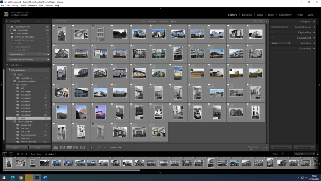
In order to help me with my layout that my images will be in in my final photobook, I decided to print out all of my final images so that I could easily test out moving them around and seeing which images looked best after one another to ensure that I was happy with they way they were all placed. As my personal study is about the evolution of architecture I thought about making my images almost represented a time line, with the older images at the start of the book to the modern images being towards the back and the one in the middle being not particularly old but not modern either. However, when I was in Lightroom Classic designing it I decided that I preferred it when my images weren’t in a specific order. I think that this meant I could finalise my layout and be sure that it was exactly how I want it. As I had a lot of images I didn’t end up using all of them as I didn’t was to have an amount that meant the viewer would become overwhelmed.

Overall I am very happy with my final layout for my photo book, and I think that all of my images are a big contribution to my book. I like how they all stand out and each have a different story.

Photoshoot 2

Contact Sheet

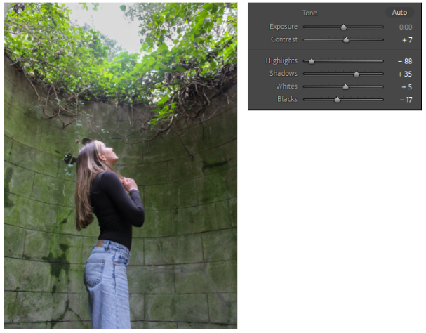
On this shoot I went to the top of Boyle Bay in the the forest where there are small fort towers. I tried to capture the trees and forest in the back of the images. I positioned my model in different areas of the forest to start to create a story and composition.

Image Selection

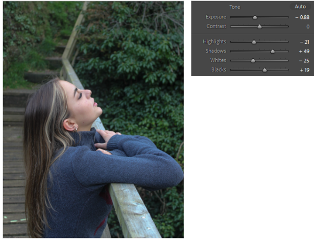
By selecting my best images it gives me a better view of which images go well together as a composition. Changing and adjusting the lighting and exposure of the images helps to create more of a feel/mood to the images.

Editing

Photoshoot Evaluations

Inspiration

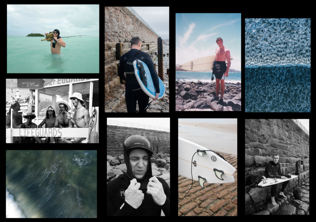
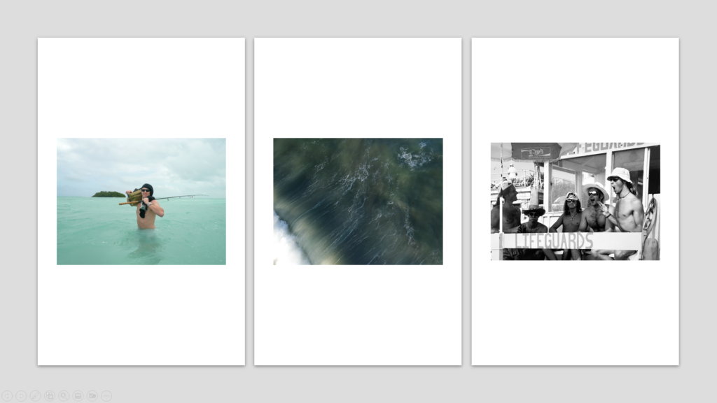
My focus for this project on the topic of Nostalgia was to create a series of images highlighting my fathers connection to the ocean. Inspired by artists such as W. Eugene Smith and Wade Carroll, an American photojournalist and an Australian surf photographer and filmmaker. Smith has been described as “perhaps the single most important American photographer in the development of the editorial photo essay.” W. Eugene Smith similarly explores the notion of family history/relationships. One of his well-known series is called “The Country Doctor,” whereby he documented the life of a small-town doctor and his interactions with patients and their families. Smith’s approach to documentary photography in terms of family relationships aided me to produce a response producing a series of images capturing the relationships and emotions within my family, more specifically the relationship between me and my father. Wade’s connection to surfing is definitely an important aspect of his photography. He has a deep love for the ocean and the surfing culture, which is beautifully reflected in his photographs. Wade’s work was my main visual inspiration for the images produced, the similarity in terms of the subjects and compositions are apparent in my outcomes

W. Eugene Smith

Wade Carroll

Outcome

Overall, I’m pleased with how my images turned out. I believe both photoshoots were a success and my opportunity to access archived images of my father enabled my photo project to present a deeper understanding into my fathers past life and his connection to the ocean throughout the years. This then enabled me to incorporate a sense of nostalgia throughout as this subject evidently has an importance to me as it took up a large part of my childhood, forming the relationship we have today. The second photoshoot, being of my father in the present day, enabled me to document his on going love for the ocean. I believe I was able to successfully present a series of images that are of visual and emotional quality. The issue of a broken wrist saw me unable to present any in water/action style shots, although necessary equipment was available to do so. I believe this would have improved my image variety and more effectively showcased this connection. To improve my shoots/project, I believe more outcomes in general should be presented, along with a sense of image variety.

Selected Images

Essay- introduction draft

Introduction  

Isolation is something that we have all experienced in our lifetimes, whether from acquaintances or environments we have all lived estranged; the work of Francesca Woodman and Carolle Benitah perfectly explores this relationship with loneliness in how they present themselves through self–portraits. Much of Woodman’s work can be seen as surrealist and unconventional for 1970s photography. “Even when wholly present in the picture as the subject of her self-portraits, Woodman is never quite with us, never quite with herself.” (reference using Harvard System of referencing) She often uses this Surrealist landscape she has created to maintain a sense of escapism throughout her work. Similarly, Benitah uses photo-manipulation to change the outward appearance of herself in relation to family and heritage. When looking at these two photographers it is important to consider that they are both women photographing themselves, and how the perceptions of their work may be skewed as a result. “In the past, photographs of women were made by men for a capitalist economy to favour the male gaze and feed female competitiveness.” (reference using Harvard System of referencing) When viewing Woodman and Benitah’s work it is apparent it was not made with the objectification of their bodies in mind but made with the intent of reflecting on their experiences as people and women – specifically the isolation that may come from that.