photoshoot three

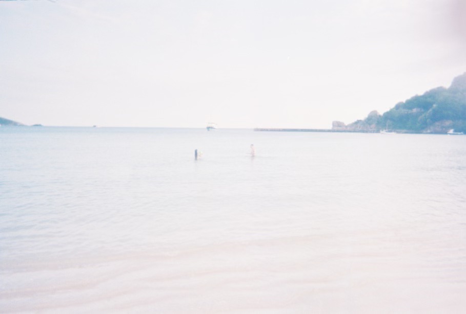
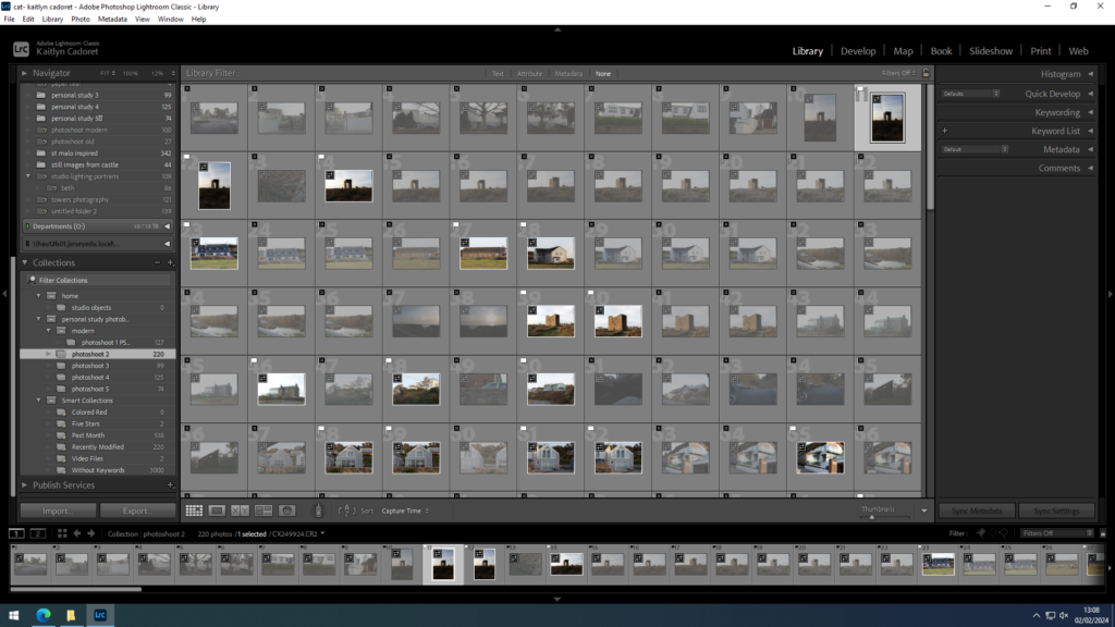
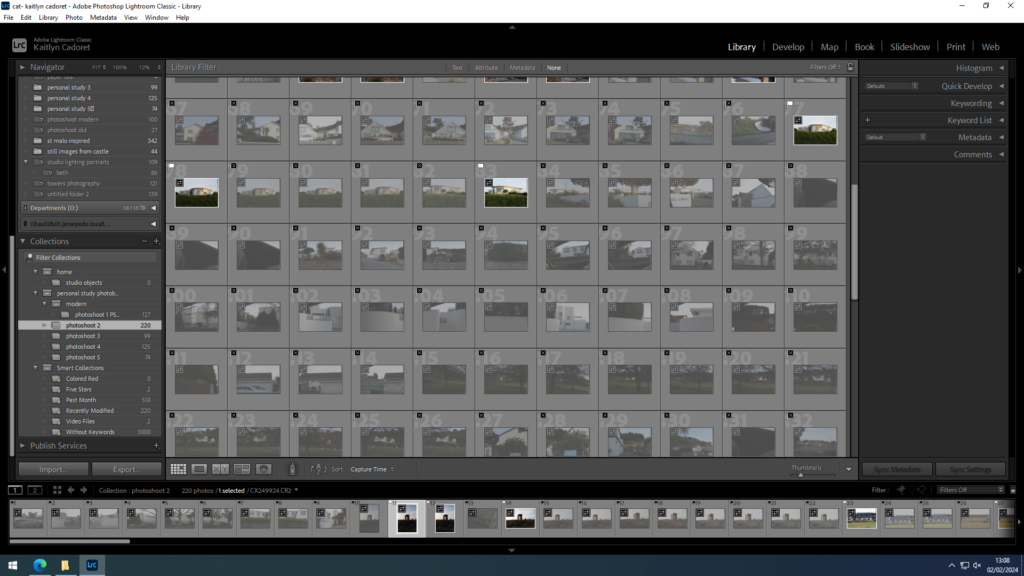
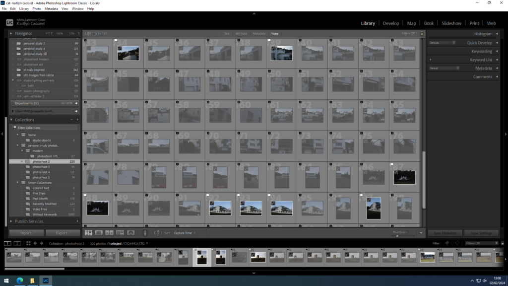
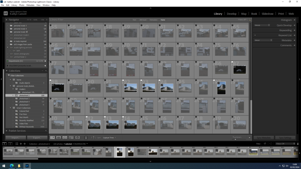
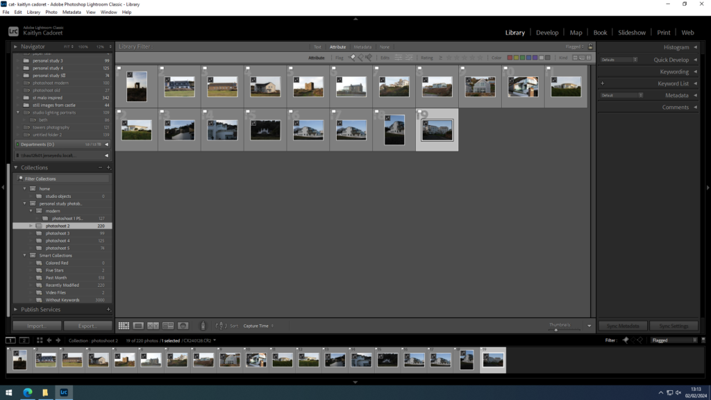
For my third shoot I also decided to focus on more modern buildings. I went out to Gorey as they are many along the coast that I wish to photograph for my project. Whilst I focused on modern buildings, I also photographed Mont Orgueil Castle (Gorey Castle), as I thought it would fit in perfectly with some of my older architecture images. Once I had made my selection I wasn’t left with very many images as I wanted them all to be perfectly how I had imagined it.

contacts sheets:

final images:

Overall, I think that I made some good images in the shoot, however, I think I could have tried to make a few more as I only ended up selecting a small amount as I wasn’t happy with all of them.

Photoshoot 1

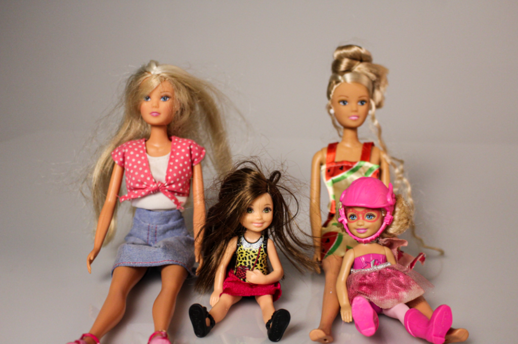
For my first photoshoot I decided to take pictures of still-life objects such as toys, clothes and cards. I choses to do this photoshoot as these objects have sentimental value to me and remind me of my childhood with my sister. I took them in the studio placed on the white infinity curve with a direct studio light above them. When I was editing these pictures I wanted them to have a more yellow temperature to show the oldness of the items and how they have aged and soiled overtime.

Overall I am happy with the way that these images have turned out and I feel like they have a nostalgic feel to them as they capture my youth. One thing that I would change is next time I would take comparison pictures of toy cars and barbies as i was describing in my plan, but due to how long its been since we played with toys, my resources where limited.

Personal Study- Photoshoot 1- Edits

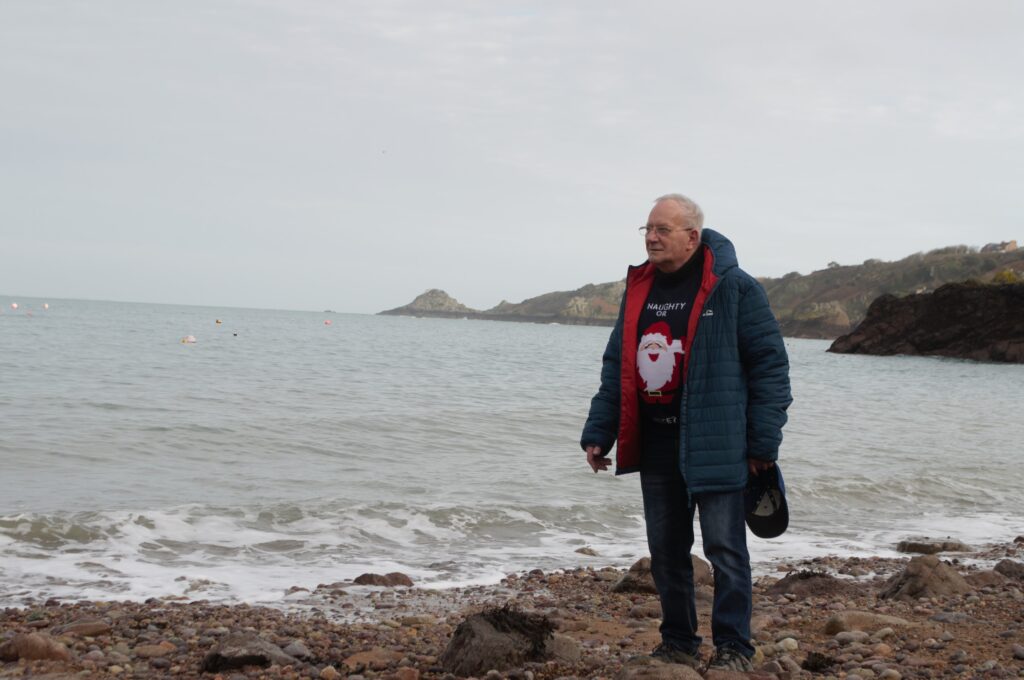
For these edits, I made the temperature of the photo warmer, causing the photo to have a more retro look. Although these are the modern photographs, I want the photos to have a timeless look. I also think making the yellow hue stronger was effective since it brings out my grandad more- otherwise he slightly blends in with the background. I also added a bit of vignette, since it guides our eyes to the middle. I also adjusted the contrast and exposure, making the images darker and having a suitable exposure.

an example of my editing

Edits

Personal Study- Comparison: Then and Now

In my photobook, I want to include some comparisons between then and now, including old snapshots of my grandad (and one of my mum and grandma) and newly created photographs with a similar composition and pose. I want my project to be an exploration of how much changes in time, using these photos as a juxtaposition- showing how age doesn’t necessily completely change anything. I think I produced some effective recreations which will look interesting when compared to each other side by side in my photobook. The recreated versions have not yet been edited and not all may appear in my photobook.

I attempted to have a similar composition in each photo (except the last comparison since it is more of a representational comparison) and I think I did this quite well. The process was an interesting one, and it helped me to gain more insight on how to make my project more meaningful, by portraying both time and timelessness through my photos.

Personal Study- Physical Manipulation of Photos

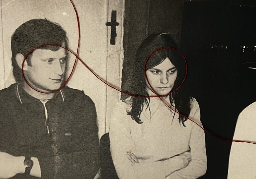
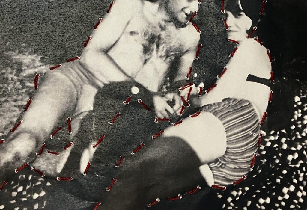
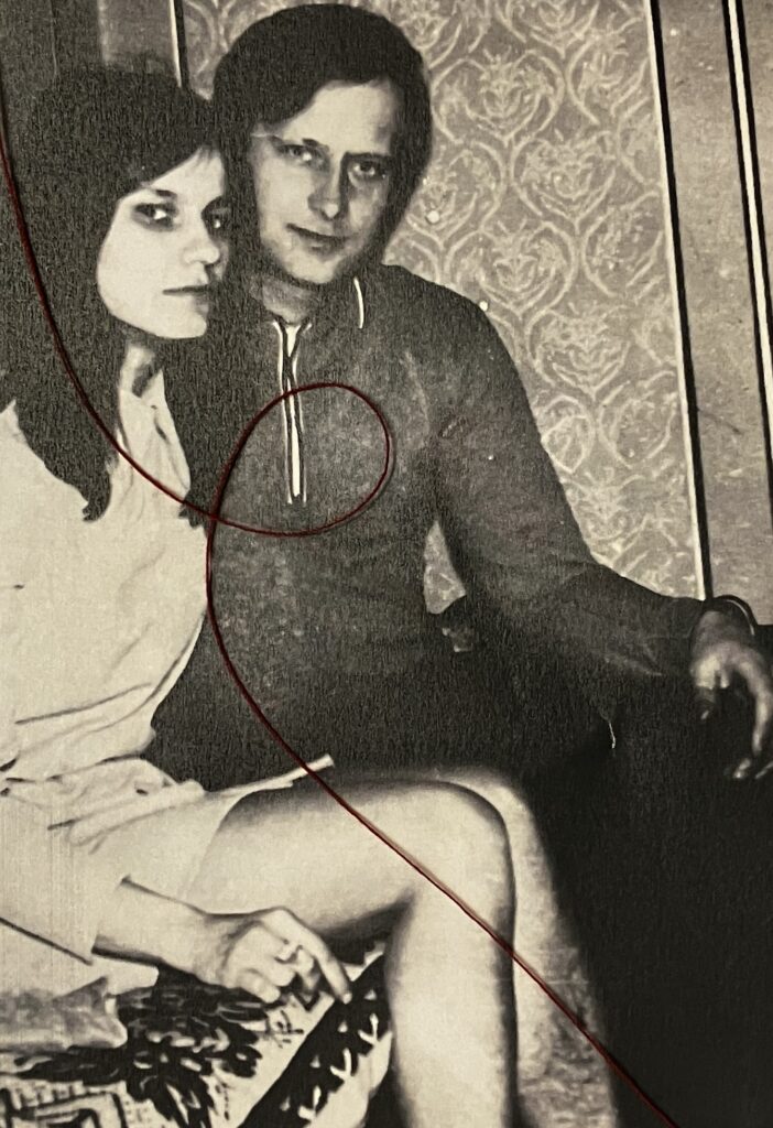
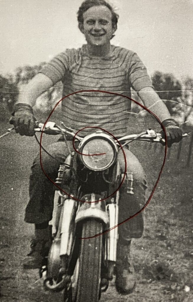
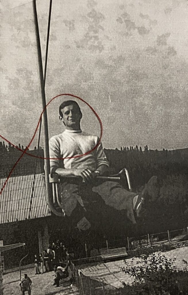
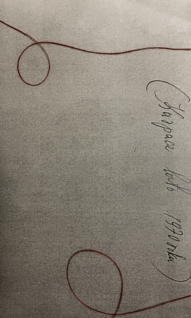
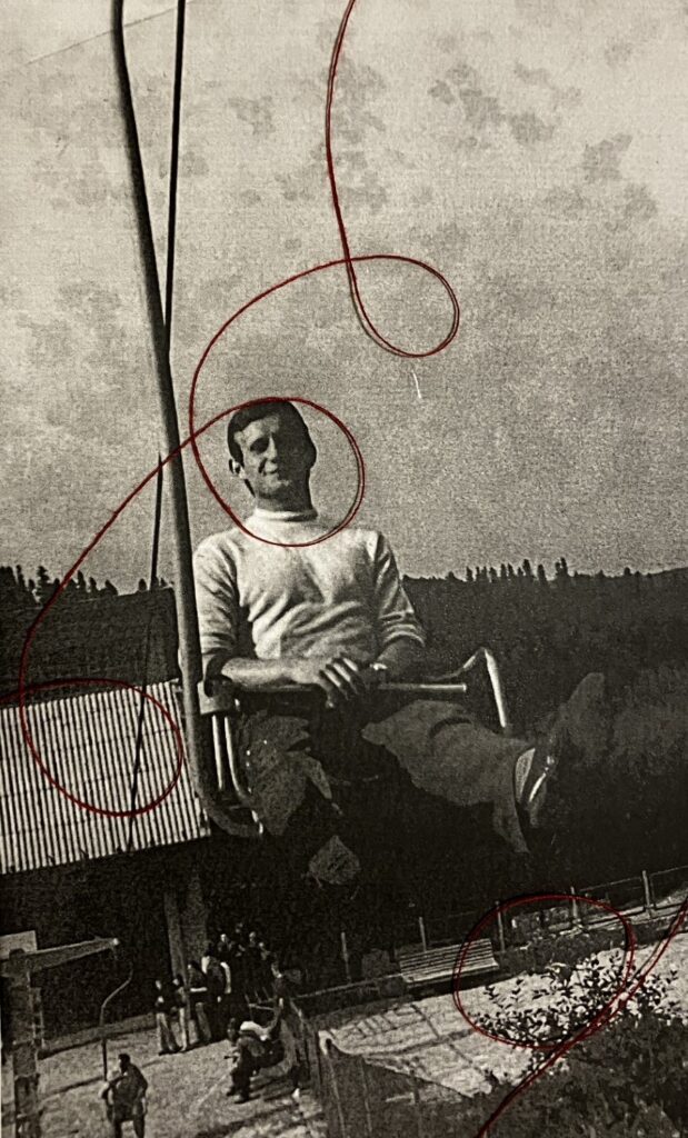
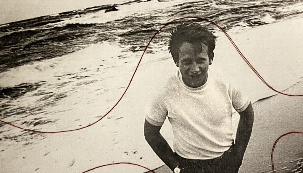
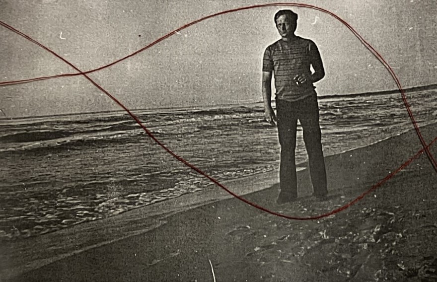
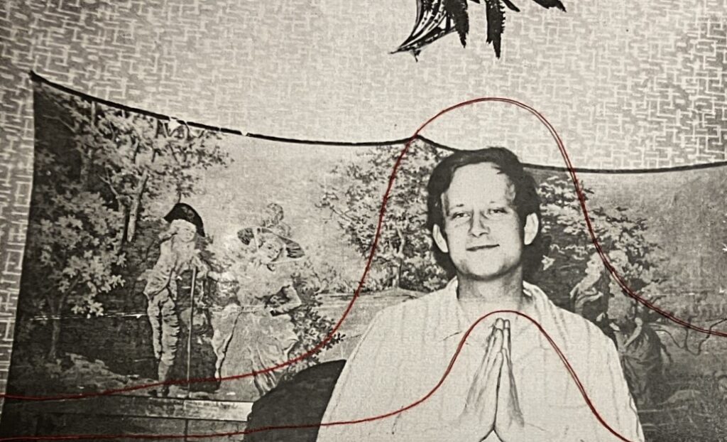
For my project, I was inspired by Benitah since she adds embroidery to archives from her childhood. I did a few experiments of key photos of my grandparents. Instead of sewing them all however, I arranged the thread in different ways to cause the ’embroidery’ to look softer and flow more. Benitah shows a lot of emotions through her embroidery, adding harsh threaded imagery into the photos. I wanted to convey a happier message (mainly) for my work, and therefore used a lot of circular arrangements to represent the feelings of love between my grandparents.

Archives

I decided to use a red thread for my work since it is the colour representing love. Although it may be seen as a cliché, I think it was the most appropriate colour to use. As I said, it is a portrayal of love, however it also represents pain, acting as a foreshadowing for the pain my grandad experienced after my grandmother’s death.

I firstly experimented with this picture, creating two different arrangements of the thread, twirling it around my grandparents. I think both were an effective way of using the thread.

I also created a third experiment, actually sewing into the photograph, creating harsher shapes. I think this one was not effective, the design being too harsh and being disruptive.

This was the second picture I experimented with, and I think I once again both results were effective.

These experiments created a harsher result, since I once again embroidered the photos. I think these are quite effective, especially the portrait of my grandma, adding character to the photos.

I arranged the thread on these photos in a simple yet effective way, the thread adding a leading line to the photos. Despite the shadow of the thread not being intentional, I think it looks quite effective. I experimented on all the archives, sometimes even creating two different arragements on one photo. I added thread to all of the archives I will be using in my photobook, further differenciating them from the new photos I took myself, as well as adding my own touch to them in the style of Benitah.

photos

these are the images that I will be editing and then choosing which ones will be in the phonebook. I have taken these images as they correlate with the photographs in my parents photobook.

photoshoot two

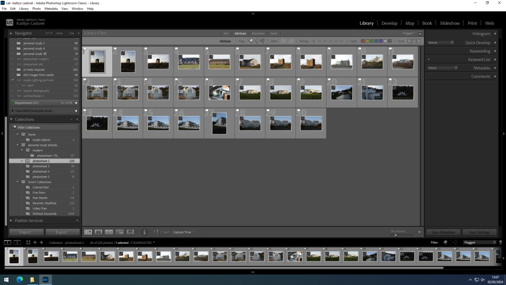
For my second shoot I decided to go more out west (St Brelade’s and St Ouen’s) to photograph some old buildings but mainly modern buildings.

contact sheets:

As I wasn’t very happy with this shoot when I went through them all and made my first selection using ‘X’ and ‘P’ I cut quite a lot of them out either because they were blurry, too close or far away or I just didn’t like them. I then made a second selection to make a final pick of images.

final images:

Deconstructing a photobook

Photobook: The Adventures of Guille and Belinda and The Illusion of an Everlasting Summer – Alessandra Sanguinetti

The Adventures of Guille and Belinda and The Illusion of an Everlasting Summer is telling a story about two cousins, through a series of staged images which documents their childhood.

Alessandra Sanguinetti made this book to show the relationship between the two cousins. Sanguinetti started taking images of the cousins when they were nine as she first met them when she was working on another project. Sanguinetti stated that “something in the pair reminded her of the summers she spent as a child in the Argentine countryside” which were ultimately the happiest times in her life. Sanguinetti then worked with Guille and Belinda over the next 21 years, documenting how they change over time and how their relationship with the camera develops. Sanguinetti would film and take photos of the girls, capturing the special moments. The majority of the images were taken near Sanguinetti’s fathers farm, in the farm house. Sanguinetti focused in key themes such as girlhood, love, and family which is demonstrated by the images within the book. In a way Sanguinetti’s book acts as a photo album for the family as it shows how the girls have grown up and changed through out the years.

The book feels heavy due to its many pages and hard cover, which is soft in texture with a square image in the middle of it which continues when you open the book. The book is structured so there is one image per two page spread. Each image is in a square format on an A4 page, centred in the middle of the page surrounded by a white boarder. This is a constant theme throughout the book which gives the book a family photo album feel. The title of the book is written in gold front along the spine of the book along with Sanguinetti’s name. The book is held together by

Deconstructing a photobook

Photobook: ILLUMINANCE

Rinko Kawauchi’s photobook named ‘Illuminance’ doesn’t have a consistent story throughout. However, each double page spread contains its own story. The book is pieced together by images that Kawauchi has taken throughout a long period of time; around 15 years of work that is both commissioned and personal projects. She lets the viewer interpret the images by presenting the images with no comments. The genre of her photobook is possibly surrealism, childhood memories or just everyday life experiences. She has a variety of subject matters, ranging from light, nature, water, people and more.

‘In Illuminance, Kawauchi continues her exploration of the extraordinary in the mundane, drawn to the fundamental cycles of life and the seemingly inadvertent, fractal-like organization of the natural world into formal patterns.’ [1]

Rinko Kawauchi

“The world is connected by what we cannot see,”

“in times of despair if we hold on to the things we believe are beautiful in life, that energy will change and affect the world in a positive way.” – Kawauchi [2]

Kawauchi’s book seems to be a form of hope, evoking emotions that show what she finds important for her. An example of this was when she ventured out into the aftermath of a tsunami and earthquake in her country. She used her Rolleiflex and captured shots of the scene, in her simple but effective milky-hued style. Her book is possibly aimed at people who feel the same emotions as her about life, attempting to find hope in the small beauties of life.

3. Deconstruct the narrative, concept and design of the book and apply theory above when considering:

The book immediately feels heavy and tick, due to its folded pages and hard cover. Kawauchi has probably done this purposefully, not only to produce a strong long-lasting book, but to represent the amount of images and time it took her to capture all the photos.

The cover has a soft touch to it, with a cotton cover. This creates a warm and safe emotion when holding the book. There is also texture in the title, which is imprinted dots placed together to make the name. The title is a reflective surface, meaning it catches and reflects the light. By doing this, it is presenting a snippet of what is in the book: many images are focused on light. The title is quite literal, because one of Kawauchi’s main photography style if focusing on light, and capturing it in create and contemporary ways. However, the title could also be symbolic of Kawauchi illuminating life, and the beauty of it.

Every image is in a square format on an A4 page, placed in the same spot to keep a consistency throughout. It creates a polaroid feel, adding to the sense of nostalgia, as if you are holding a printed polaroid. The folded pages help give this feel.

The book is held together by Japanese binding, keeping Kawauchi’s culture in every aspect of the book. It is carefully constructed from design to the order of the photos. She has reversed the signatures in the binding of the book to create a folded page. At first it seems confusing, however it also lead me to think there was something hidden in the pages, also linking each photo to each other as if they are ‘attached’. She has also used swiss binding, which I find opens the book up more, possibly making the viewer feel like they are entering her world through the book.

The book carries a recurring motif of circles from start to finish, commencing with what appears to be a solar eclipse and concluding with a photograph from the same series later on. While the sun remains concealed in the initial image, it emerges in the final one, suggesting that Kuwauchi could have created a hidden meaning that this book sheds light on her career or the viewer because they have been immersed into her creative life and skills. Each page establishes a visual continuity with the next, whether through circular forms, hand motifs, shared color palettes, similar textures, or juxtaposed elements. While there isn’t a singular broad theme that is fully explained in her photography, the images collectively evoke a palpable impact, drawing emotions through her distinctive aesthetic. Overall, her artistic output incorporates elements of surrealism, as her images transport the viewer into an alternate realm, evoking novel and profound emotions.

Analysis of a page

(I have included further analysis in my earlier blog post ‘Rinko Kawauchi’)

It took me a while to understand the meaning behind these two images, but I came to understand that both images represent some sort of death. The image on the left presents prolonged death by choice, as cigarettes are used to satisfy its user, but is followed by consequences such as death. The image on the right also shows death, but not by choice. It is also a death generated by humans, with the intention to satisfy a user (the fish will be sold for enjoyment). I think Kawauchi was really clever placing these images together, each creating an idea of possible suffocation, maybe relating to how she feels as a photographer. I also took into consideration that this was her first book sold worldwide, and this could be her illustrating how she felt subject to Japan.

Bibliography

[1] Rinko Kawauchi. (n.d.). Illuminance. [online] Available at: https://rinkokawauchi.com/en/publications/430/#:~:text=In%20Illuminance%2C%20Kawauchi%20continues%20her [Accessed 29 Jan. 2024].

[2] TIME. (2011). Rinko Kawauchi’s Illuminance. [online] Available at: https://time.com/3776240/rinko-kawauchis-illuminance/ [Accessed 29 Jan. 2024].

Photoshoot 1

This aim of this photoshoot was to represent the freedom in having our cars.

Contact sheet:

I took images from different angles, in around the car. The idea was to create some images in dim lighting with subtle lights and long exposure pictures. I didn’t really help myself with this specific photo shoot as it was done in the evening, after daylight. This caused us to have a lack of natural lighting from anywhere, therefore we had to use artificial lighting from our phones, the cars interior lights and street lights. I also tried using the flash on the camera, however, it was way too overexposed and wasn’t the aesthetic I’m going for at all.

Another reason why the lighting was failing this shoot was the fact the camera would not focus, this was difficult to deal with because if I used too much lighting from our phones it appeared too forced, but with not enough light, the camera had nothing to focus on.

CHOSEN IMAGES FROM THIS PHOTOSHOOT:

Image Analysis

Although the camera not focusing resulted in me not having a lot of high quality images, the long exposure created these perfectly blurred images (as shown above) which match the vibe of my personal study, the idea of freedom, runaways. It injects a sense of movement. The blur maintains the aesthetic of my images, it de-emphasizes the unnecessary information yet the viewer can still tell what is in the image.

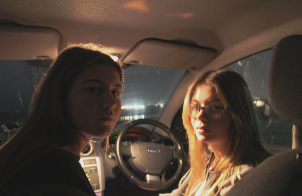
I wasn’t sure on this image at first as the quality is not great on it but I like the composition and the Rembrandt lighting effect on the face.

This is a spontaneous image, I want to capture images that represent girlhood and that is why I like this image and have chosen it as one of my final images. It was taken in a candid way, capturing the eye contact and smiles.

These two images were staged and also a different take from the original plan of my project. However, when thinking about my final photo book, I think it will be interesting to have some staged portraits, in contrast to rural setting candid photos; this will break up the photo book a bit.