Artist research

Theo Gosselin

Theo Gosselin is a French photographer who was born in Normandy France, who only uses a 35mm and 55mm film camera. He likes to focus his photographs on freedom within his friends and family and does not like to stage any photos he likes to capture them in the moment and when they happen. “My friends and our lives became my principal subject, not as a photographer, but as a teenager who wants to capture memories just like everyone else.”

Gosselin grew up in a household surrounded by cameras as his parents were always taking photographs he first picked up a camera around the age of 14 where he didn’t fully understand the concept of taking a great photo but by him experimenting opened himself this incredible door to improve and explore his skills to improve his work and get him to the point he is now at creating and capturing these incredible inspiring and eye-catching images which hook the audience in.

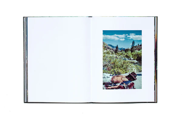
Theo spent lots of time traveling mainly in America where he published his first book called  Avec le Coeur, meaning “with the heart.” which consists of photos of “everything he loves”, this is inspiring as many photographers fall into loopholes of taking and creating photos which other people will enjoy to see but not what they enjoy taking and what interests them. With Gosselins photos he waited till he got back home to develop them which built up the anticipation and excitement to see what his film reveals.

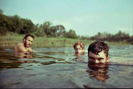
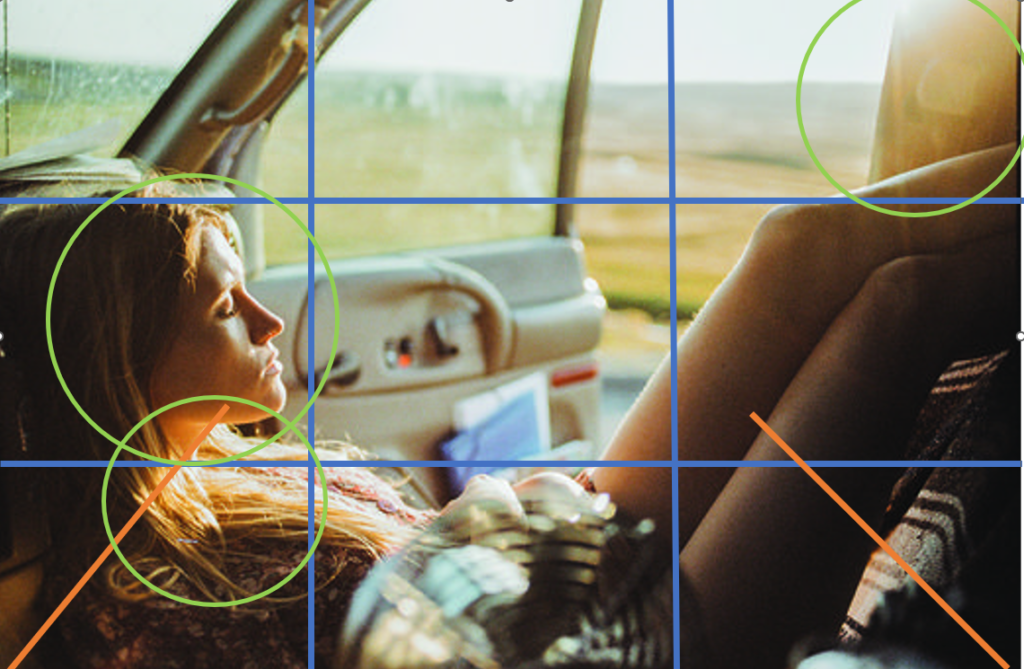
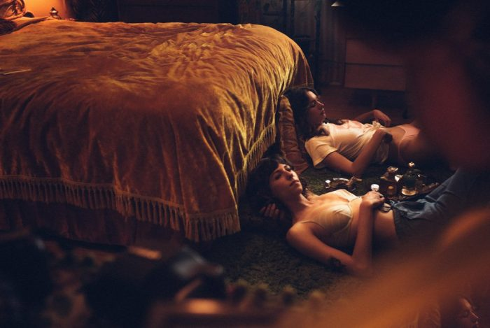
This image the rule of thirds as the main focal point is not in the centre third this creates a dynamic view on the landscape and the main subject being the female on the lower part of the image, leaving space for us to be able to see the landscape without distracting the audience from the main part of the image being the female she can be seen almost like a frame to the landscape as she almost colds around the frame of the image. The lighting makes this image in my opinion due to the way it highlights her hair and sculpts her facial features and highlights them. The depth of colour goes from dark to light creating a tunnel like affect.
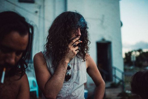
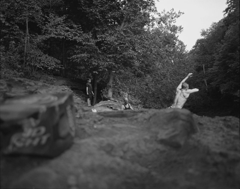
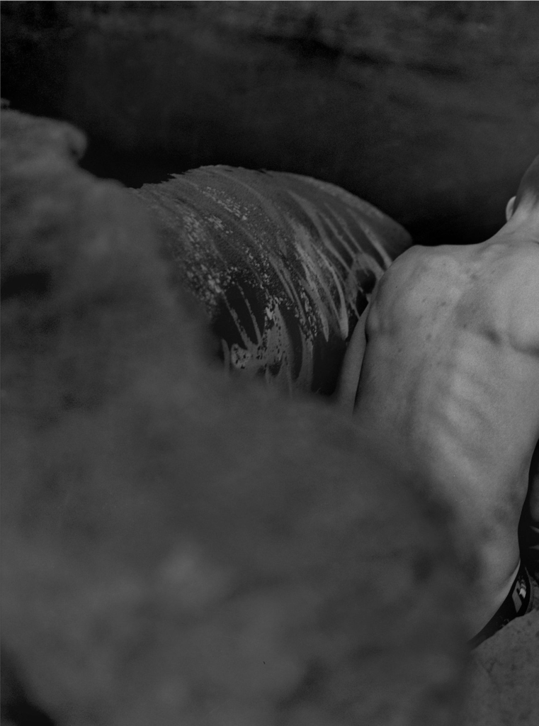
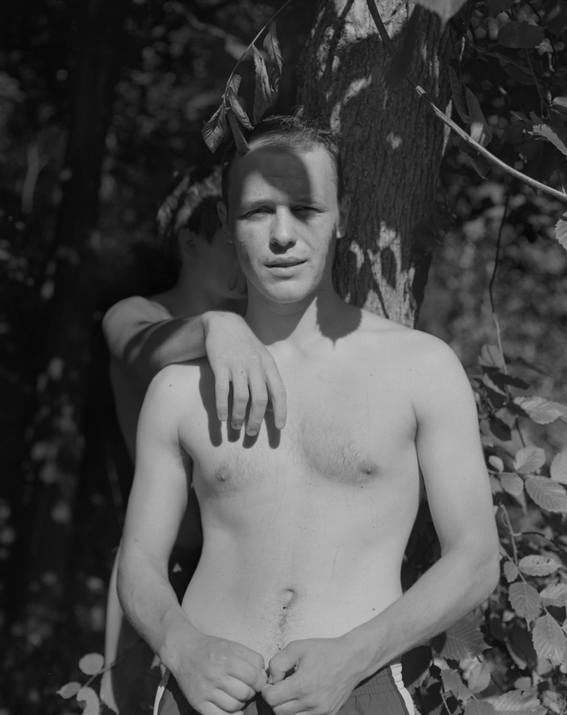
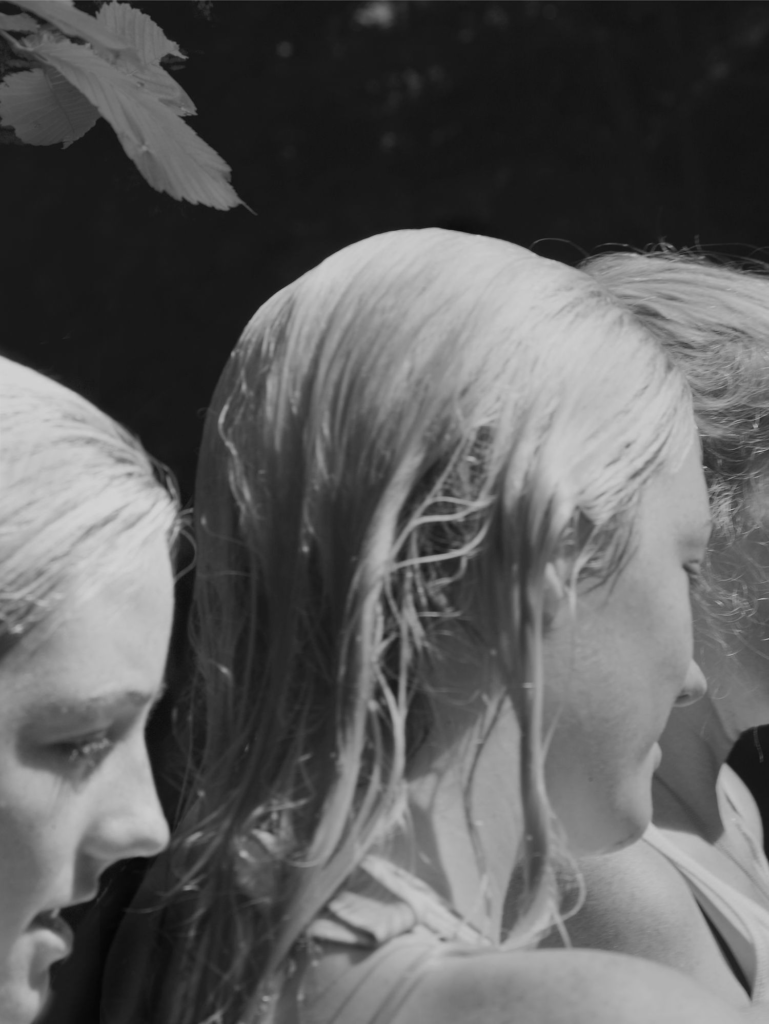
Raymond Meeks is a photographer who is much more well known than Gosselin, his book Halflife reminds me of Gosselin’s work as they both photograph people around the water focusing on the youth of where they are, his work on the book was based around a lake near New York where is was a predominantly white lower class teenage boys, who wasted to show their dominance by jumping off 60ft cliffs whilst doing trick which allowed Raymond to get incredible unique shots, like Gosselin he also uses film to capture these incredible moments allowing a one shot wonder photographs, however Meeks work is taken in black and white film i think this really adds definition to his photographs as it shows the highlights, shadows and texture in his work. Raymond Meeks spent 3 years photographing at this lake as he found when he sat down in winter to edit them he would go from 80 strong photos down to 12 and found himself kept going back to get more to finish his book, where he let his son develop the layout of it as he created links between each images when laying them out. Meeks did not just observe the children at the lake but the energy which the lake held its self and how it became full of joy and excitement as soon as summer came around filling up with sunshine and warm air and how it bought people together from the same background and other backgrounds.

I like how both photographers capture a moment so simplistically and make it look so elegant, the images are freeing as they capture what youthful people should be doing living there life in an environment where they enjoy and are careless around.
Artist Reference- Justine Kurland

My main inspiration for this photoshoot is Justine Kurland’s ‘Girl Pictures’ book. I believe that this book defines feminism very well due to every photo being very unique and capturing different types of people.

Justine Kurland’s main inspiration for this book was from a young girl in which Justine used to date her father. The girl was sent to live with her father after her mother kicked her out for skipping school and doing drugs. Justine then formed the idea of a photoshoot based on ‘alyssum as a teenage runaway’. In which she scouted for models outside various high schools. She also gained inspiration from a TV show about the tales of teenage delinquency.

Justine Kurland’s Girl pictures bring a sense or nostalgia. Every girl in each photo have their own story however come together to live a similar lifestyle. They live without a care in the world, and are truly living their teenage years. Therefore, many of the images in Girl Pictures were taken outside in locations that feel desolate or easy to overlook. They were often staged under bridges or beyond fences or on the sides of highways; places that feel synonymous with warnings.

Image Analysis:

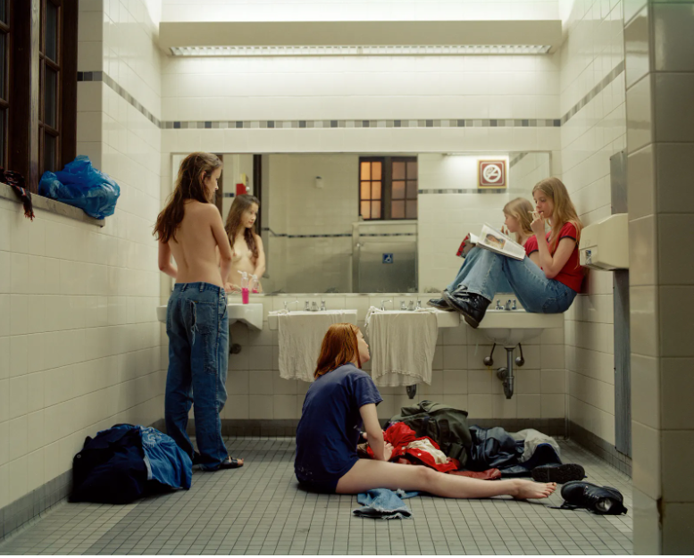
Bathroom, 1997, Justine Kurland

In Justine Kurland’s image, Femininity is shown throughout by a topless girl standing in front of the mirror. This is a defining aspect of the image as it is the anatomy in which all girls have, however, many people view this as being provocative and vulnerable in front of a camera. However, Kurland has composed this image so that you are unable to see the camera and is

Whereas Justine Kurland portrays this image as empowering, as the subject has confidence within her own body to show it off . Another aspect within this image is the bright pink hand soap on the top of the sink counter top which is accompanied by a girl sat near it with a glossy pink magazine which she is reading. Femininity is shown further through the girl sat on the bathroom floor next to a bag which is spewing out with clothes, who looks like she is having trouble picking out her outfit. the image seems to have been taken at dusk due to the orange light shining through the window of the bathroom. However, the bathroom is light up very bright from the lights in the ceiling and above the mirror.

Celestial Echoes- Bye-Bye Baby- By Michelle Sank

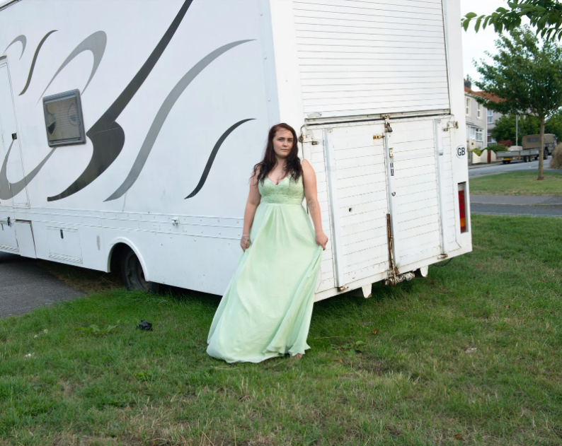
Another artist that I have taken inspiration from is Michelle Sank , with her photo series ‘bye-bye baby’ and ‘Celestial Echoes’. These images deal with the notion of developing adulthood within the British society today. Bye-Bye Baby is exploring the way young boys and girls interpret their understanding of masculinity and femininity. Having left the purity of their childhood worlds, they seem to take on the trappings of the grown ups they mimic and the status set out in popular culture and the media. Celestial Echoes continues with this theme looking at this phenomenon within older adolescent girls.

Image Analysis:

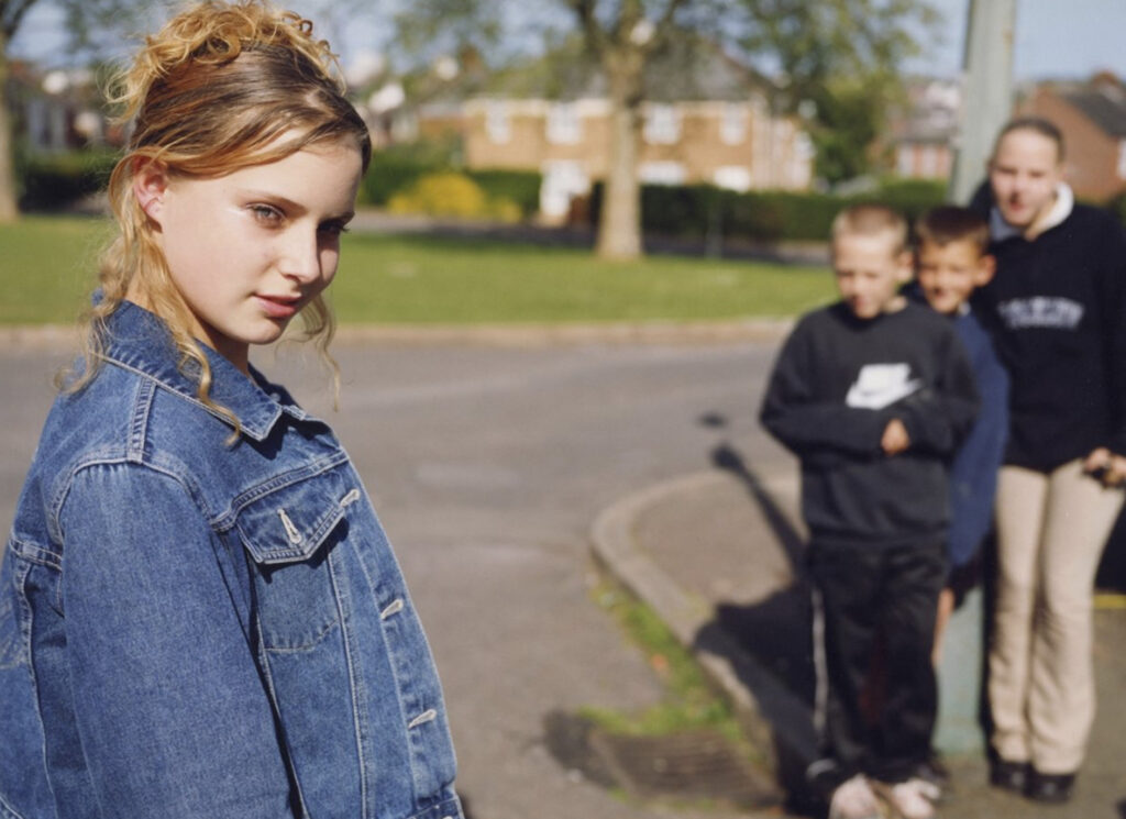
The image above by Celestial Echoes is untitled, however, I think this is a very effective image which captures youth and femininity very well. In the foreground of the image, there is a young girl looking down at the camera which creates a sense of power. The lighting in the picture seems to be natural, but there is more light coming in from the left shown through the highlighting of the outer corner of her eye and the shadow which is created from her nose on her right eye. Celestial Echoes has also added bokeh (blurring) to the background which was most likely done by changing her aperture of her camera. Femininity is also shown through the young boys in the background of the image. By placing the girl in the foreground of the picture she can be viewed as more powerful, whereas the boys are perceived as smaller and less important.

STATEMENT OF INTENT

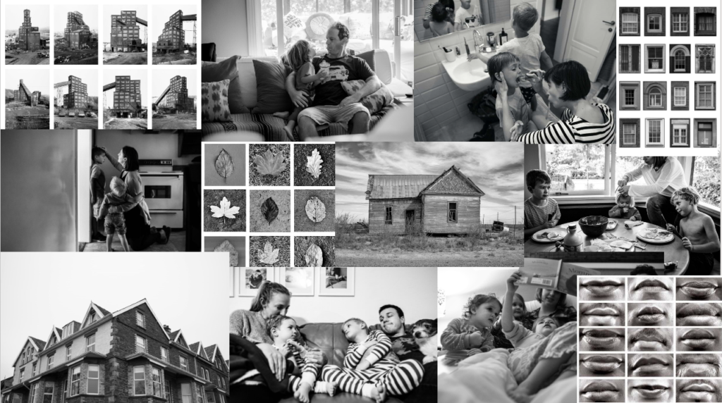
MOODBOARD

STATEMENT OF INTENT

Our personal study project is based around the theme of nostalgia. Nostalgia is defined as ‘a sentimental longing or wistful affection for a period in the past.’ My interpretation of the theme nostalgia in my personal study, is going to be based on exploring my Polish heritage, and how my family in Poland applies to my own sense of nostalgia. Furthermore I will contrast this to my life with my family here, in Jersey. I will be using Realism, within Typology and artist’s such as Hilla and Bernd Becher in order to present my life through photography. In the book August Sander Face of Our Time by Alfred Doblin Sander says ‘Each of us knows a number of people, and we recognize them when we meet by specific entirely personal characteristics that they have. All the people we encounter are only individuals, and each person has a name as well as specific, unrepeatable, and characteristic token of identification’ this supports my personal study by showing my identity and nostalgia through my family.

The main purpose of my project is to take photograph’s of my family neighbourhood, this is to highlight the nostalgic feeling I have towards my family. This will include taking images of their houses and portrait’s of my family members. I will be taking documentary style images, some of my photos will be taken with flash, as I will be attending a family gathering in Poland which gives me an opportunity to take pictures. I will take pictures of the setting and surroundings where the dinner will take place, perhaps I will be able to find some objects that are significant to my family as well as images of my family during the dinner. Here I will also try to and take headshot portraits of my family members, inside and perhaps outside their house depending on the natural lighting, as I will not be using artificial lighting.

Realism within Typology is what I am referencing my project to. The term ‘realism’ can mean to depict things as they are, without idealising or making abstract. This will be presented by my documentary photography that I will take. As well as taking images of my family neighbourhood, I will aspire to also take images of the town I live in, Konstantynow Lodzki. Here I will try to take images of small landmarks that can be used as filler images in the book.

I will develop my project into a book form. This is so it can highlight each documentary image and tell a story through the layout of a book. I am yet to decide whether the images will be in colour or black and white, once the images are taken I will decide. However I’m more interested in colour, I will edit my images in Adobe Lightroom Classic. Within the book I will alternate between portraits and images of people and landmarks and place either in Poland or Jersey. In Jersey I will take images in places that are significant to me. I however won’t be adding any text within the book as my intention is for the images to speak for themselves.

Jim Goldberg – Raised By Wolves

Jim Goldberg, an American artist and photographer, is known for his work with marginalised communities. His photography, particularly his photobook ‘Raised By Wolves‘, reflects the neglect and abuse these struggling communities face, and how they as people respond to it in an unforgivingly realistic and direct manner. I want my personal study to portray a similar feeling, through images of people I’ve met travelling and while I was homeless, the main difference being that it reflects more my own perception of them, and what they did to help or support me.

– Jim Goldberg – Untitled (1977)

Goldberg’s iconic style features monochrome portraits accompanied with handwritten texts from his subjects, telling Sean O’Hagan in 2009, “There’s a thread that runs through all the work that is to do with bearing witness, the photographs are about asking questions, though, not answering them.” This means that Goldberg’s work is more about being an observer of this suffering than a narrator, almost. It turns his images into a more personal account of each subject, allowing them to narrate their own stories, while Goldberg just provides them with a platform and the means to do so. I find this idea to be intriguing, although it wouldn’t necessarily work for this project as a lot of the people I was with I am unable to currently get in contact with them for one reason or another.

Goldberg states his photobooks, ‘Rich and Poor‘, ‘Raised by Wolves‘, and ‘Candy‘, as part of a trilogy, “All three books are about where I grew up, and how I grew up. The books represent a lot of the same themes about race, class, age, love, lust, betrayal–they’re tied together.” He told Magnum Photos. Similarly, I want this to be an underlying theme in my own work, that I create a narrative that hints at how I myself have lived and grown up, whether using subtlety or being direct.

Sources

https://jimgoldberg.com/

https://www.dobedorepresents.com/artists/jim-goldberg

https://www.theguardian.com/artanddesign/2014/jul/03/jim-goldberg-rich-and-poor-photography

https://www.magnumphotos.com/arts-culture/art/jim-goldberg-raised-by-wolves/

https://www.magnumphotos.com/theory-and-practice/fingerprint-tracing-roots-jim-goldbergs-raised-by-wolves/

Personal Study – Artist Reference 1

Michelle Sank

Bio

Michelle Sank was born in South Africa and currently resides in the UK. She is a documentary photographer whose work explores contemporary social issues. Her photographs have been exhibited and published extensively in the UK, Europe, Australia and Mexico, South Africa and the U.S.A. Her imagery is held in the permanent collections of Allan Servais, Brussels, Open Eye Gallery Archive, Liverpool, Société Jersiaise and Guernsey Museum, Channel Islands. She has undertaken numerous commissions for prominent galleries and magazines in Europe and the USA and her work has won awards in prestigious competitions including the National Portrait Gallery and the British Journal of Photography. Sank has four published books, The Water’s Edge – Women on the Waterfront; Becoming – a major monograph featuring her youth portraits taken over five years; The Submerged about the landscape and inhabitants of Aberystwyth, Wales and My.Self about the cultural identity amongst diverse young people in the Black Country. Sank’s work tends to be themed around certain groups of people for example, people who live in her neighbourhood like in her project Breathe or local workers in a certain region like in her project Insula. Most of the time, her images are environmental portraits, on the rare occasion that they aren’t, they are just of the surrounding area of the subject and not the person.

Her Work

As I can’t talk about all her photo projects, I will just mention some of my favourites by her

  1. Insula

“Insula eschews a specific brief though the work responds to the wealth of nineteenth century portrait photographs within the Jersey Photographic Archive that it now joins as a powerful point of interpretation. The beguiling qualities of these new photographs call to mind the position that Lewis Baltz found for photographic series, ‘somewhere between the novel and film.’ As such, Sank’s photographs offer a visual poem to the island” – Gareth Syvret

I will be taking a lot of inspiration from this project as the style of photography is part of what I would like to do during my personal study. The main image style being portraits really says a lot, I think she wanted to show what the people of the island look like, more specifically in their places of work.

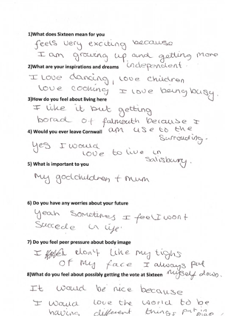
2. Sixteen

“What is it like to be sixteen years old in the UK now? This is the central thread running through the national project Sixteen where some of the UK’s foremost documentary portrait photographers collaborated in opening up conversations with young people about their hopes and fears, and who or what sustains them, giving prominence to voices rarely heard.” – Sank on the project

This project is one of my favourites as it focuses in on people who are around my age, showing their experiences of growing up in an isolated place, which I can relate to from living on an island for my entire life.

3. Bye-Bye Baby/Celestial Echoes

These images deal with the notion of developing adulthood within the milieu of British society today. In Bye-Bye Baby I am exploring the way young boys and girls interpret their understanding of masculinity and femininity. Having left the purity of their childhood worlds, they seem to take on the trappings of the grown ups they mimic and of the status quo as set out in popular culture and the media. Celestial Echoes continues with this theme looking at this phenomenon within older adolescent girls.

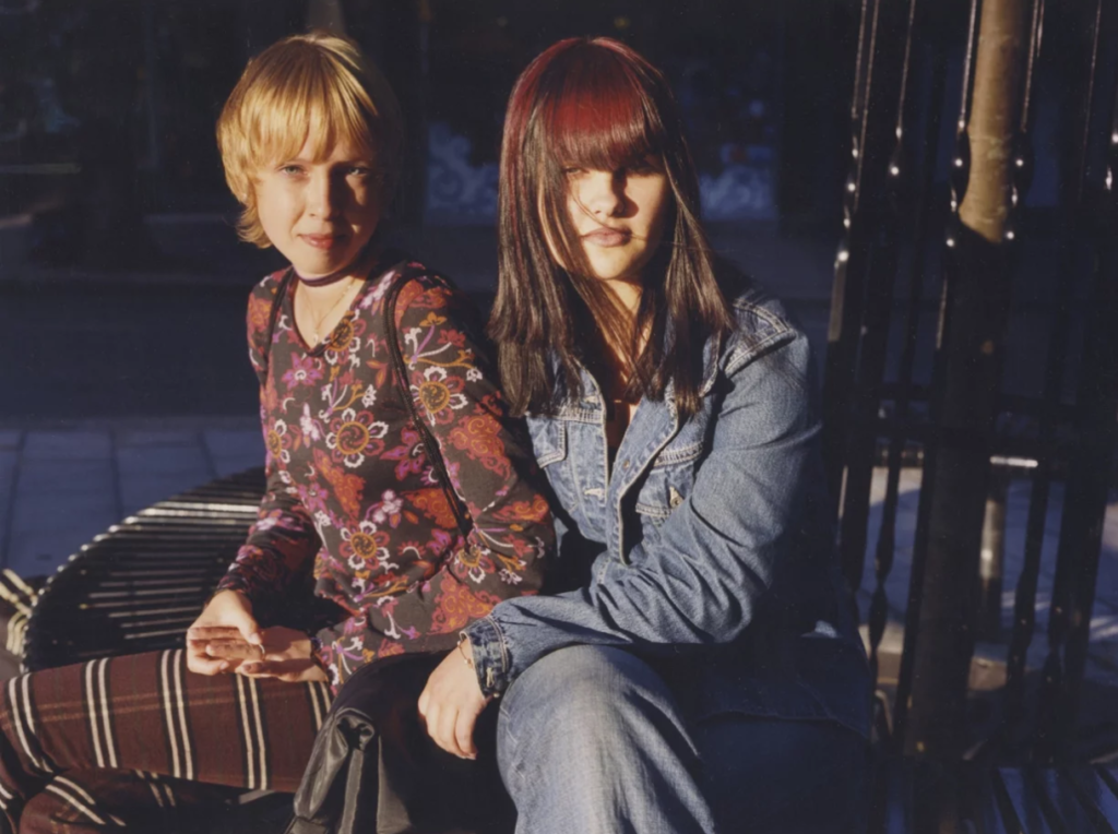
Image Analysis

In this image, the use of natural daylight is intentional, Sank is trying to show the subjects in the most natural way possible, whilst still having light on them, even the girl in the background of the image has light on her. Continuing on from this, even if the girl in the background is slightly blurred, you can still see her and her emotions. For me, I naturally get drawn, visually, to the girl in the background, I think the lighting in this part of the image is more visually appealing, I however do understand why the girl in the foreground of the image is there, she has a more “domineering” aura, it’s almost as if she had asked Sank to put her in the foreground of the image. Contextually, I think the two girls in the image could be sisters, I think the one in the background could often be overshadowed by the other one, making me believe that she could be the younger one, however their ways of dressing contrast this, the one in the foreground looks as though she could be the younger of the two based on her way of dressing, the one in the background is dressed much more conservatively, just a hoodie and jeans, whereas the girl in the foreground is dressed much more “out-there”, wearing a colourful skirt and top. Out of the two, the girl in the background seems to be more mature. About this project, Michelle Sank said “Having left the purity of their childhood worlds, they seem to take on the trappings of the grown ups they mimic and of the status quo as set out in popular culture and the media.” In my opinion, this image presents this ideology and statement very well.

Statement of intent

  • For my project I want to focus on youth, focusing on friendships, friendship groups, love, and freedom to link with the aspect of nostalgia and memories liked with them. This matters to me as friendships are a massive part of my life especially growing up on a small island where sometimes there is not much to do so we try to discover unfamiliar places and when we find them, we create new memories there which link to the place. I wish to develop this project by extending the number of photos I have and diving more closely into my friend’s life’s and what it means to them to be in a friend group, what they think a friendship is and what memories they have linking with friendship.
  • I would like to explore the idea of creating a magazine or a hard back book to present my work. I will start my study by selecting and editing my photos which I already have and start taking and collecting more photos. The main focus of my project is going to be portraiture and some photos of landscape because it links with my view of nostalgia; as places links with memories, if possible,.
  • My photographs will be taken outside using natural lighting with some being taken inside with a flash. The images are going to be in a documentary style looking at teenagers’ life and friendship on a small island and discovering the joy of friendships and what they men to people.
  • the presentation of my book will be easy to follow, the images will be edited on lightroom classic; however, I do not want to manipulate the images in a drastic way I would like them to still look authentic I would just like to enhance the images to make them more eye-catching. To create the magazine, I will be using blurb to create the layout and pages. 

Statement of intent

The theme for the personal study is ‘Nostalgia’. Nostalgia is about a sentimentality for the past. It’s a sentimental yearning for return to a past period. The feeling of nostalgia is often triggered by a familiar smell, sound, or keepsake. So, I want to centre my focus around my childhood and upbringing, while also acknowledging my heritage. I want to do this as I believe this will communicate a sense of self and allow me to explore and piece together aspects of my ancestry unfamiliar to me.

By taking inspiration from previous projects (home, identity, etc) I will be taking portraits of family and photographs of significant objects, as well as occasional landscapes. These will be accompanied by some images from my family archives, to show my early childhood as well as my heritage which are relevant. I’ll include photographs of my family and pictures of me in Madeira when I was little. My personal study will explore my dual nationality, portraying both my English and Madeiran heritage from each of my parents. I want to gather a collection of meaningful photographs while in Madeira over the Christmas holidays, capturing familiar landscapes from trips when I was younger, like family homes for example. I’ll also capture pictures of family, street photography, environmental portraits, etc in a documentary-type style.

I will be presenting my project in the form of a photobook. This allows me to establish a storyline throughout the series of images, and show the progression of my life. This will create the story of my identity, showing both sides of my family, to capture the essence of having my dual heritage. While leaning into my dad’s side of the family, to explore and attempt to portray what Madeiran identity/culture looks and feels like. This is important to me as, living in Jersey, I am far away from my family and do not visit them often.

Artist Reference – Nick Fancher

About.

Nick Fancher is a photographer, author, and educator who specializes in creating in-camera effects, often employing the use of bold colours and dramatic lighting. He is particularly known for his efficient method of working, which is with the use of minimal gear and often in unconventional locations. Nick graduated from Ohio State University with a BFA in photography in 2005 and has authored several books on his techniques including Studio Anywhere 1 & 2 and Chroma. While he is especially known for his editorial portraiture and work in the music industry, his client work includes architectural photography, photojournalism, ecommerce (product, on-figure, and flat-lay), stock and food photography, corporate, lifestyle, fashion, and video. Nick Fancher is based in Columbus and Los Angeles and is available for photo commissions worldwide.

Why I chose him.

I chose Fancher as my first artist reference as I was inspired by his use of gel photography, which is when a transparent coloured material is used to modify lights by being placed over the light sources to create colourful effects. I think that colour is a very important way to show emotions without having expressions. In my study, I plan to recreate his gel lighting techniques as a way of showcasing emotions when photographing objects or people since it enhances the mood of the images.

Image analysis.

I really like the use of lights and colour displayed in this image. The singular line of colour makes the centre of the image eye catching while also leading the viewers eyes to where the model is facing due to our eyes being drawn to the brightest area of the image. The colours also contrast, perhaps depicting certain emotions through the image.

The models outfit is also important in my opinion as the white makes sure she stands out against the darker background and her necklace catches the light causing it to sparkle, drawing attention to the centre once again.

Lastly, the way that the model is standing puts her hands directly below the light perhaps symbolising that she’s close to achieving something. Her facial expression on the other hand creates a sad, almost longing feel to the photo as if she’s desperate to reach something but is being held back (hence her other hand pulling back)