artist study – Ezra Stoller

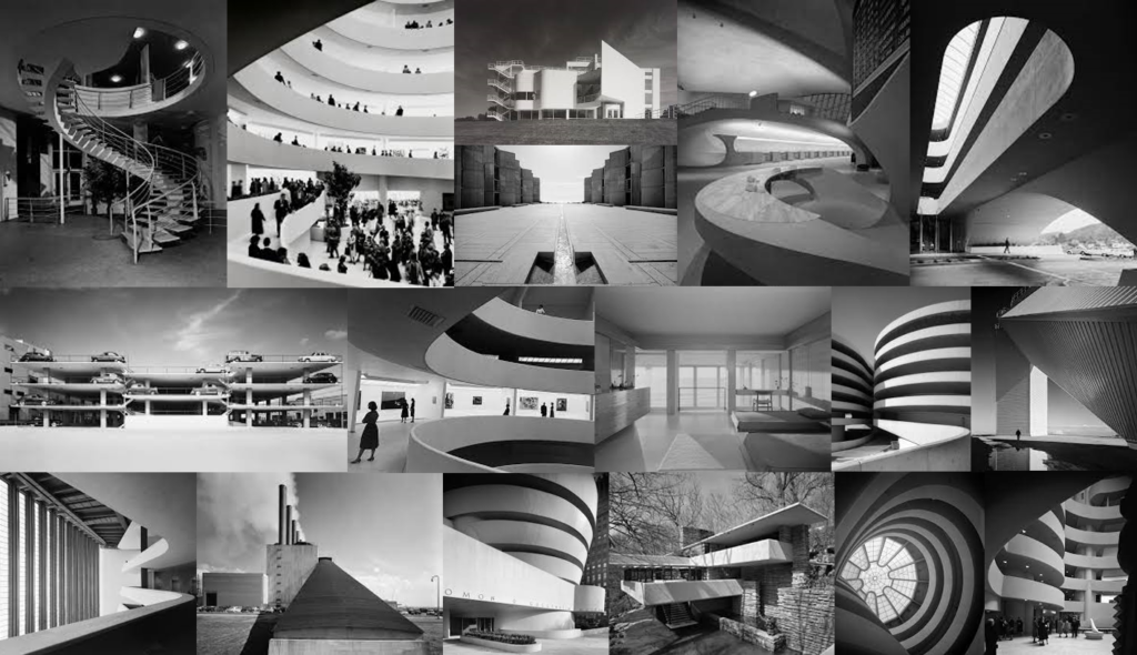
mind map:

about Stoller and why I have studied him:

Ezra Stoller was an architecture student at NYC who was born in Chicago in 1915 and later moved to New York where he grew up. He graduated in 1938 with a BFA in industrial design and went on to take photographs in the Office of emergence Management. He then got drafted and became a photographer at the Army Signal Corps photo centre in 1942. After World War II he continued his career and passion for architectural photography and over the following forty years be became a well know photographer, famously know for his architectural images, and his use of lighting and perspective which allowed him to produce elegant images showing the beauty of architecture. Many of his images show the three dimensional structures that building hold and he was very focused on his vantage point as well as the lighting that his images would need to turn out the way he wished them to. From my mood board you can tell that lots of his image contain similar lines, shapes, tones, and textures. Stoller was able to uniquely visualise the inspiration that architecture gave off and chose to photograph it to keep it alive. Some of his images are what people recognise building from and he has become a photographer who captured social history and document incredible pieces of architecture. At the time, Stoller work with many of the top architects such as Frank Loyd Wright, Paul Rudolph, Marcel Breuer and many more. Sadly, Stoller passed away on the 29th of October in 2004 but his legacy will forever go on.

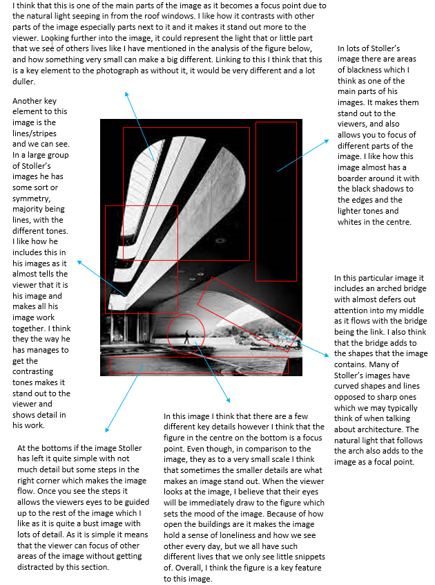
I have chosen to study Ezra Stoller as I think his work is very powerful and I hope to achieve some images inspired by his for my personal study. In his images he includes lots of symmetry which I think draws the viewer into the images making them engaged and they then see the detail that they hold. All of his images are of quite large open building which I think allows for a simple but effective image with room for the viewer to add their own story of interpretation. All of Stoller’s images are presented in black and white which in architecture photography leaves us with images with great detail and different tones. I also think that it means that the viewer can focus on the actual architecture and not get distracted by the colours of the images. Overall I really like Stoller’s work and am heavily inspired by his images and wish to make a successful response to them.

artist zoom-in:
bibliography:

https://aboutphotography.blog/photographer/ezra-stoller#:~:text=Stoller’s%20photographic%20style%20is%20characterized,beauty%20of%20each%20architectural%20subject.

https://aboutphotography.blog/photographer/ezra-stoller

https://en.wikipedia.org/wiki/Ezra_Stoller

Troy Paiva Case Study

Troy Paiva is an American Urban night explorer, who’s work takes place a lot of the time in the desert, where he captures abandoned, rotting, and broken down infrastructures that have been left behind. He is a light painter, by using different colours and types of lighting it creates a specific style of work which he presents in his images.

Troy explains he love taking images like these more for the aspect of his environment he works in, as he says, “I love the surreal feeling of wandering through an abandoned subdivision, alone, in the middle of nowhere, in the middle of the night. Your senses become heightened and you feel the weight of time”. With just this quote alone you can easily link his work to the “sublime” and “romanticism” as this is the whole aim of what his work expresses, abandoned areas with a brightly coloured image creates an array of emotion within the image. Troy’s belief and work relates a lot around his favourite statement of “Ozymandias”, which is a reference to an Egyptian pharaoh, who described in a poem, where his statue crumbles down, as a way to expose praise to the subject of art’s ability and preservation. So in Tory’s work he photographs abandoned, broken areas, and within his images he almost preserves it through his brightly coloured lighting.

Troy’s early life was a graphics designer, whilst still taking a couple photography classes, and even used to teach how to pain. As he grew up like many people at the time, he learned different skills in the artistic world, especially photography. By discovering light painting in photography he was hooked instantly and began to develop his work, which worked in favour of his environment, which was abandoned, mysterious areas.

Justine Kurland

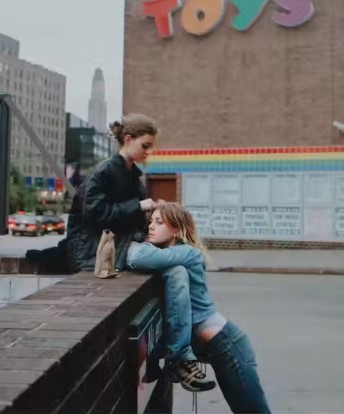
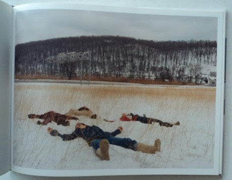
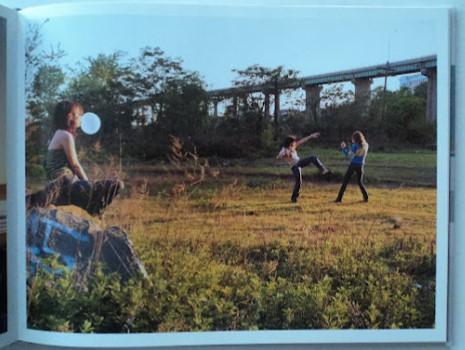
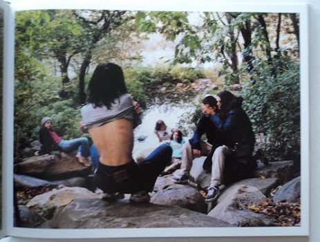
Justine Kurland is an American fine art photographer that first gained public notice with her work in Another Girl, Another Planet (1999). The show included her large c-print staged tableau pictures of neo-romantic landscapes inhabited by young adolescent girls. She also produced a series of images called ‘runaways’ inspired by her past experience with being a runaway when she was young which influenced her to find other young people in a similar situation and recruit them as models. In total, Kurland published 69 pictures of girls in her series “Girl Pictures.” The staged photos take place in urban and wilderness settings, with girls depicted as runaways, and show how they are hopeful and independent. Kurland has acknowledged the parallels she created in her work, specifically her competing desires to both escape and fight back; to document and allegorize; and to capture “vaporous abstractions” like the carefree freedom of her “runaway girls.”

She also published a book titled ‘SPIRIT WEST’ that is described as being neither reportage nor fantasy: rather a kind of disturbed normality. The beauty of the nature is overwhelming, but is regularly disturbed by an ugly viaduct or unsightly building.

“particular appeal of Ms. Kurland’s work is in its deadpan tension between the matter of fact and the mythic.” – Ken Johnson

Image analysis:

-Broadway (Joy) 2001

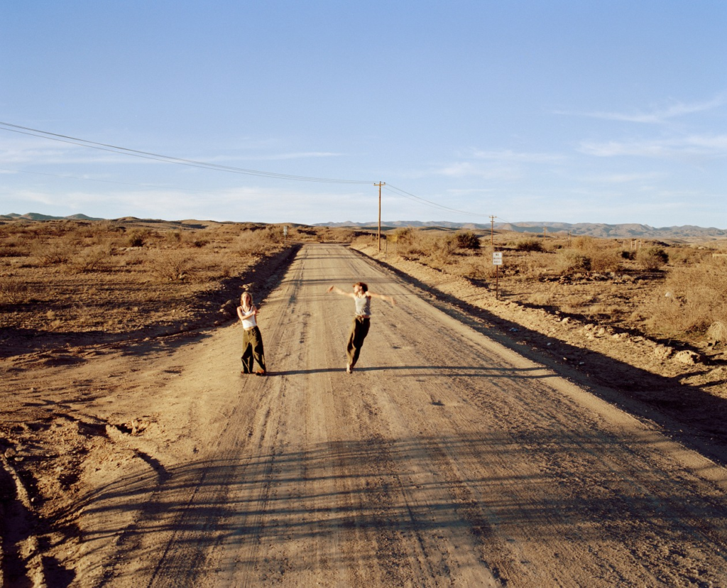
In Broadway (Joy) (2001), the camera is angled down on two girls as they dance on a desert road. The surrounding environment seems vast and endless with the only indication of society is the dusty road and the phonelines that stretch across the desolate landscape. Although they are surrounded by a barren and unpopulated area, which in comparison to they seem small, their energy fills the frame. One of the girls, on the right, is in mid air with her arms waving around, her blurred arms becoming like wings representing her found sense freedom. To create this effect, Kurland will have used a slower shutter-speed to capture that sense of that movement and create an accurate response of the emotions they are showing through their dancing. Despite their faces being unclear, we can tell that they are happy as their body language displays this and overall this image perpetuates joy.

Artist studies

Hans Van Der Meer:

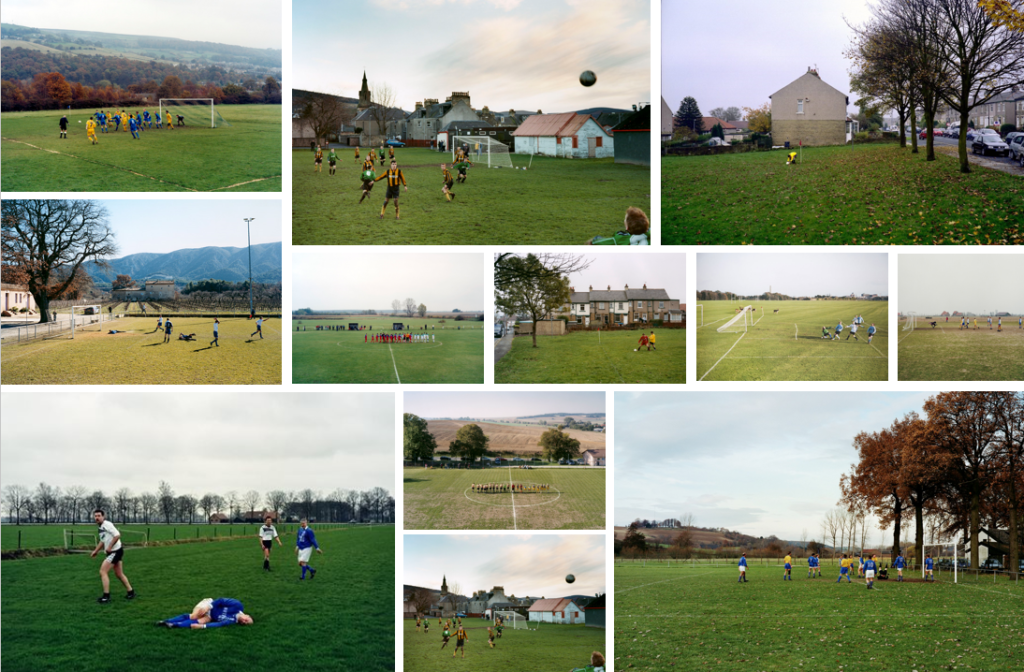
Hans Van Der Meer is a Dutch photographer who has created many projects. I am going to focus on his two projects about football ‘Dutch Fields’ and ‘European Fields’ for my personal study. Through out his projects ‘Dutch Fields’ and ‘European Fields’ Van Der Meer explored the relationship between the football and photography. These projects consist of images of various football pitches, which each tell a different story about the game. In an interview about his project ‘Dutch Fields’ Van Der Meer stated that “football and photography can be such a beautiful combination” as you never know hat happened before or after the moment captured which is why the subject of football was so appealing to him. He started of by taking images of by taking photos of the top armature matches before deciding to peruse taking images of lower league games. Van Der Meer tried to find pitches where the background also formed a part of the story and experimented with taking images from different angles such as high up angles from the stands. However, he found himself taking most of his images standing on the ground.

What intrigues me and draws me to Van Der Meer’s images is the way they have a cinematic feel to them. I also like how Van Der Meer allows the viewer to interpret the images how they want, creating their own story on what happened before or after the image was taken.

IMAGE ANALYSIS:

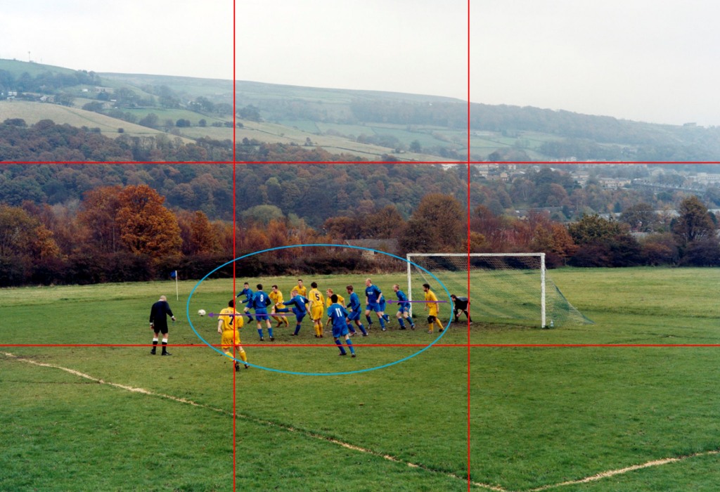
This is a digital image from Hans Van Der Meer’s project ‘European Fields.’ The mis-en-scene presents a football pitch with a scenic background of what looks like a village on an overcast day. It looks as if a corner has just been taken as everyone is crowded in the box. This photo has been taken from a high up angle, possibly from the stands as it looks like you are looking down on the players. The use of light is natural however, there isn’t a key direction in which the light source is coming from as the image was taken on an overcast day. The foreground of the image, what’s going on on the pitch, is in focus whereas the background is slightly out of focus. This suggests that the image was taken with an f-stop of f/5.6 as it has quite a shallow depth of field. The use of colours in the image vary from being dull such as the fields in the background, to quite vibrant. For example the yellow and blue kits and certain parts of the grass stand out more than the colours in the background of the image. The focus of the image is the players who are all trying to get hold of the ball. This image is a snapshot of what happened during the corner however, the viewers don’t know what happens after. It could be said that Hans Van Der Meer has used the rule of thirds and leading lines to draw the viewers to the ball.

I am going to use Van Der Meer’s images as a base inspiration for my photos. I am going to take images of different football pitches in Jersey however, I don’t plan on having people in my photos like Van Der Meer does.

Bernd and Hilla Becher:

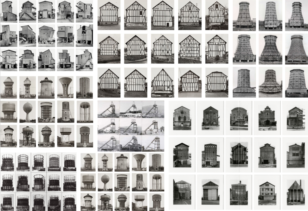
Bernd and Hilla Becher were a German couple who took images of the disappearing industrial architecture in Europe and North America. Bernd originally studied painting before typography. Their photography is different to other photographers as they document the history of German architecture such as water towers, factories, coal bunkers and other industrial structures. The way they presented their work as a typology, which is a system used to arranging various things in to groups based on how similar they look. Once they had taken a set of images of a structure, they would group their images together and present them in a grid formation; creating many typologies.

What stands out about Bernd and Hilla Becher’s work is that the sky is separated from the structure in the image. I also note that the sky is plain and overcast which gives it the distinct look that the sky is separated from the subject of the image. To get this affect, they would take their images of the same structure when it was an overcast day or they would have to take a series of images over multiple days to make sure the sky and lighting was correct.

Barbara Kruger:

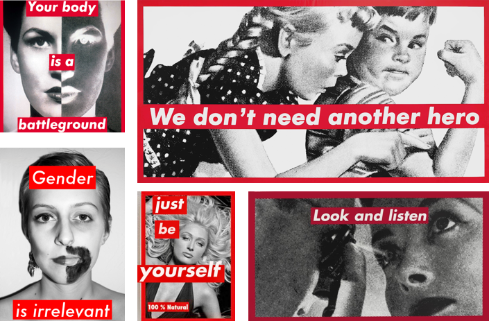
Barbra Kruger is a conceptual artist and collagist who is most famous for her black and white images which are overlaid with red and white captions displaying the power of identity. Kruger’s work is very powerful in my opinion and links to the theme of femininity and sexism which is a major issue in women’s football. Her work depicts how women can be independent and don’t need to follow the rules created by society.

I plan to edit some of my images in the style of Barbra Kruger’s work as I think I could create a powerful set of images and the caption I can create will link strongly with the theme of my personal study as there have been many challenges playing football as a young girl and still are now.