
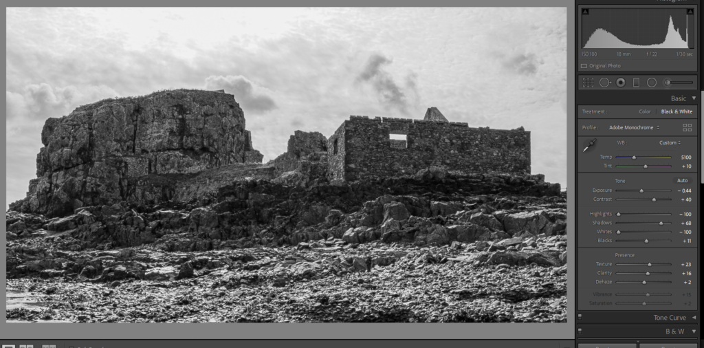
Still Images: I wanted to make sure we had a variety of colour/ black and white images in our film to capture the colours and also represent the change from the past to the present. I made sure to give the black and white images a lot of depth because the letter is going to be scrolling over the images, so they needed to have a lot of darks and lights to stay distinct. I used Adobe Lightroom Classic to edit these.
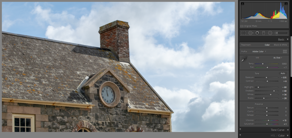
The lighting was quite dull on the day due to the weather, so it was hard to edit the coloured images whilst keeping interesting tones. I added warmth to them because it complimented the grey sky and the colour of the castle.
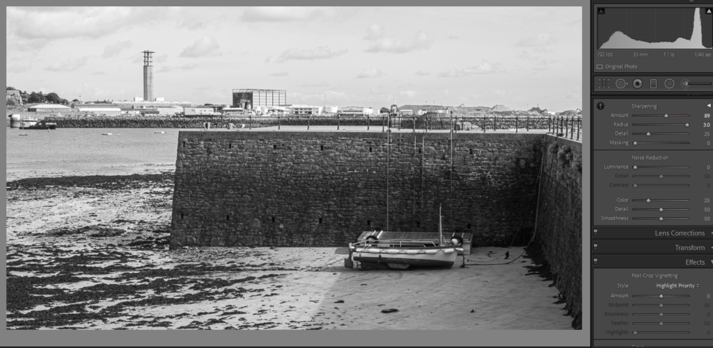
I would say this image isn’t the best, due to the fact the infrastructure is in the background, juxtaposing to the story set in the 1940s that we are telling. I think I will crop it more for the film. This also gave me knowledge for next time, learning to try different angles to avoid this issue.
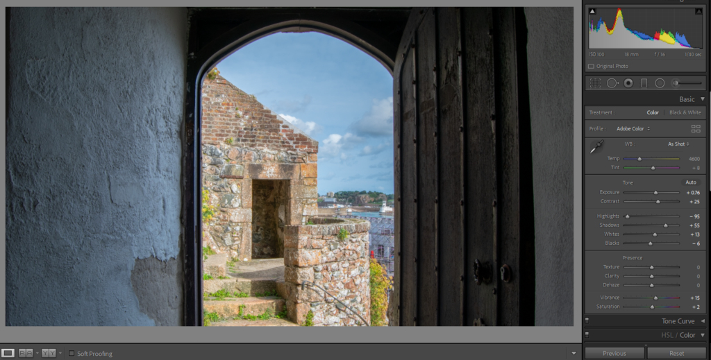
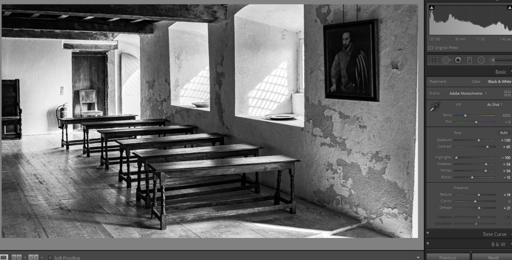
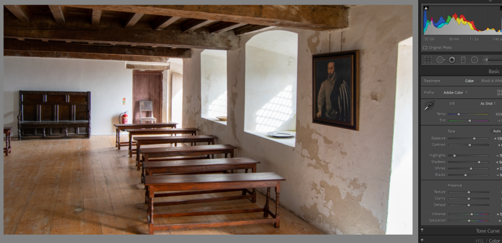
I like the light in these images. I wanted to keep them fairly natural because the sunlight caught on the rustic tones in the room, causing the image to look like it was set in the time of Elizabeth Castle’s peak.
Editing video

For editing the videos, I changed the settings to ‘colour’ to get basic editing tools. I tried to focus on attaining the right light and colour throughout the video.
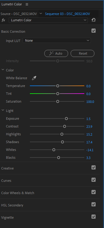
I mainly focused on the ‘Basic correction’ to achieve this because I didn’t want the videos to look over edited. I was also aware that we would have the archived letter over the images, and needed them to be basic enough for the handwriting to be easily read.
