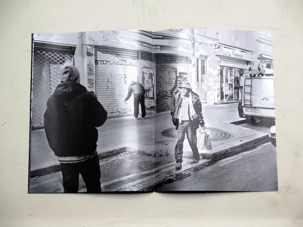
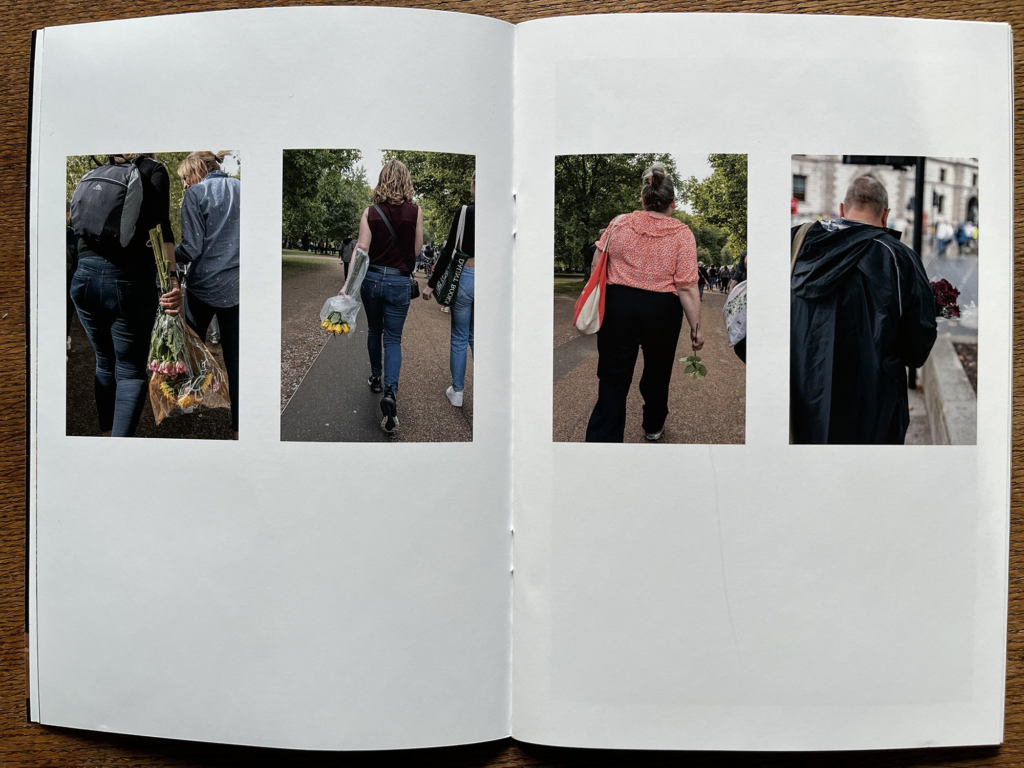
zine evaluation

Overall, I am happy with how my zine turned out and think that it shows the viewer a good story timeline. I think that my images work well together and the colours in them contrast nicely making the images bold. I think all of my images are very clear and have a main focus point on the cyclist. This helps the viewer put the story together and understand it.

Page Spreads

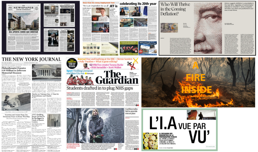
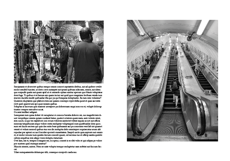
Mind map of inspiration for my picture story from sites like the Guardian and newspapers. The use of large writing to present the story in the title is prominent in newspapers, and I will use this in some of my examples. They also tell the story with wording around the best images that present it, I will try different layouts for this.
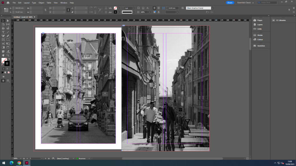
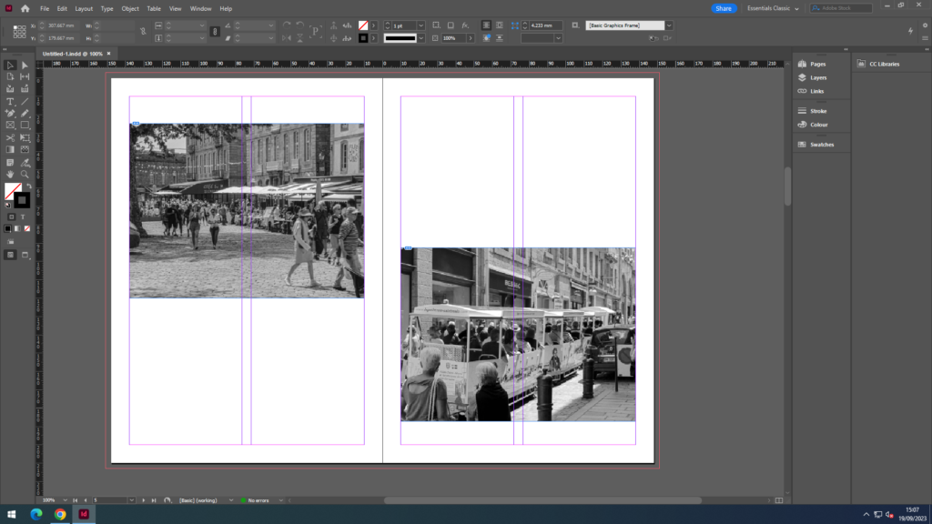
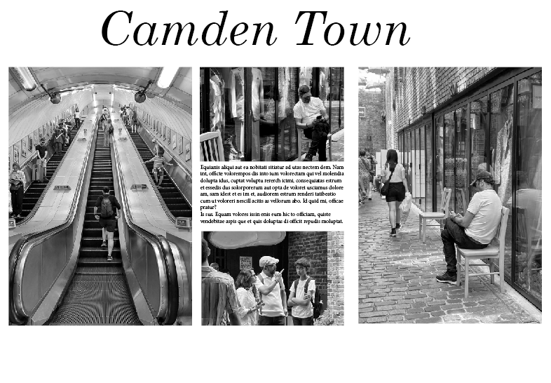
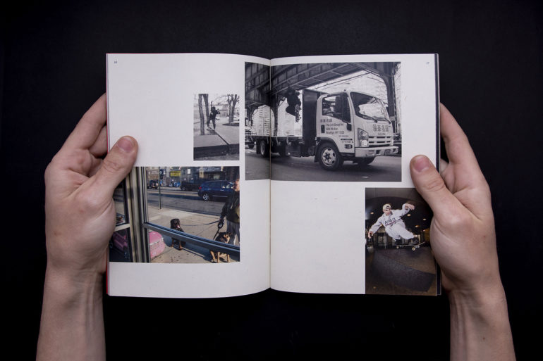
Overall, I think that this is my best outcome. I like the simplicity of the layout, with two main images on the side, and two smaller images that complete the story. I chose to add automated text because it separates the images and includes more to look at.

I originally didn’t have a title, however adding one gave it more of a backstory, explaining what’s going on and where it’s set.

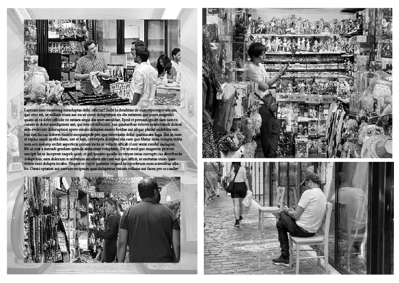
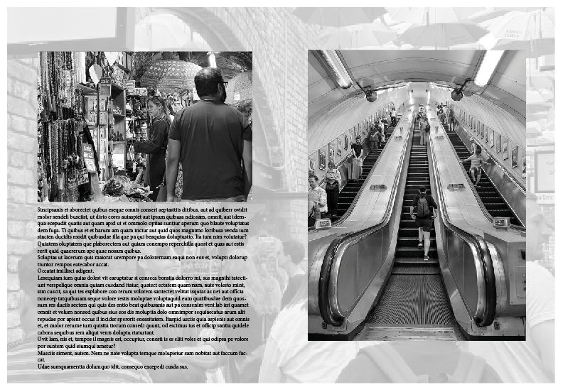
I also experimented with changing the opacity of images and using them as backdrops.

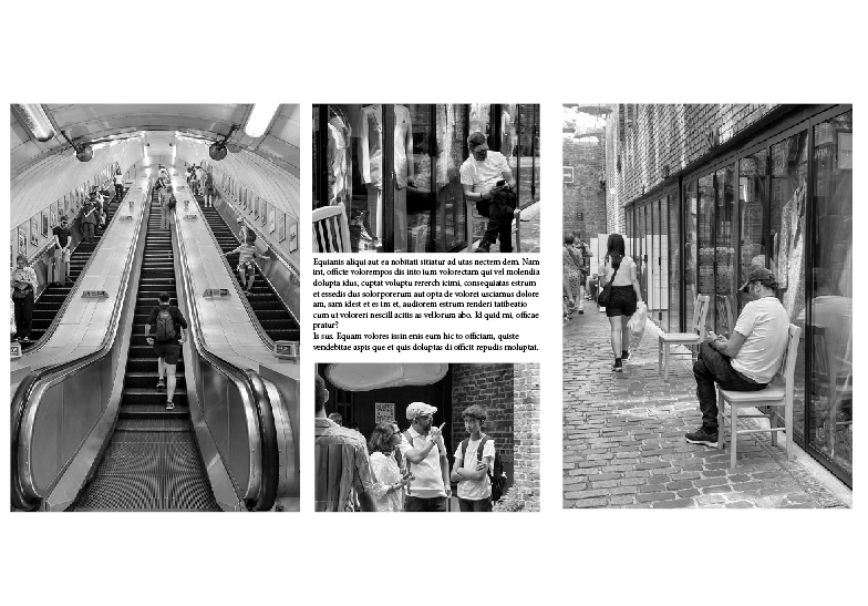
This was my most basic edit, which I liked, however I thought it was too simple and boring. I added an image with low opacity behind it to make it more interesting, but still didn’t think it was my best.

Zine – layout and design

Zine layout

Front cover

For my front cover design, I chose to make the title tinted so you would still be able to view the stained glass window behind.

Page 1

For this page, I chose to have my strongest image on the right and increase the size in order to make it more pronounced to the viewer.

Page 2

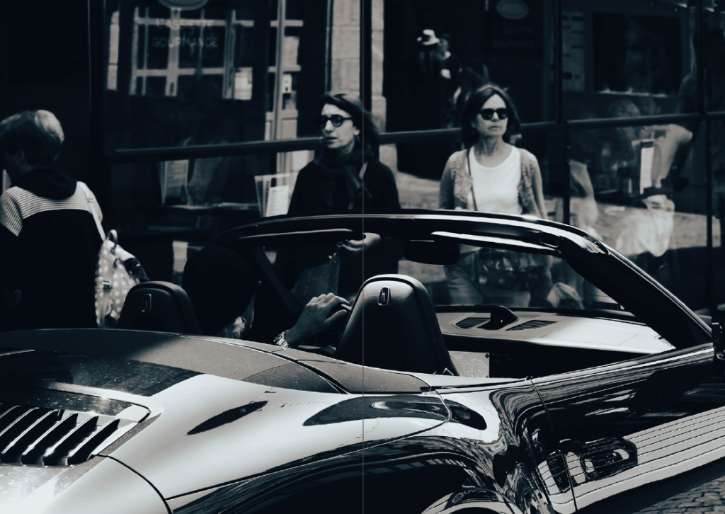
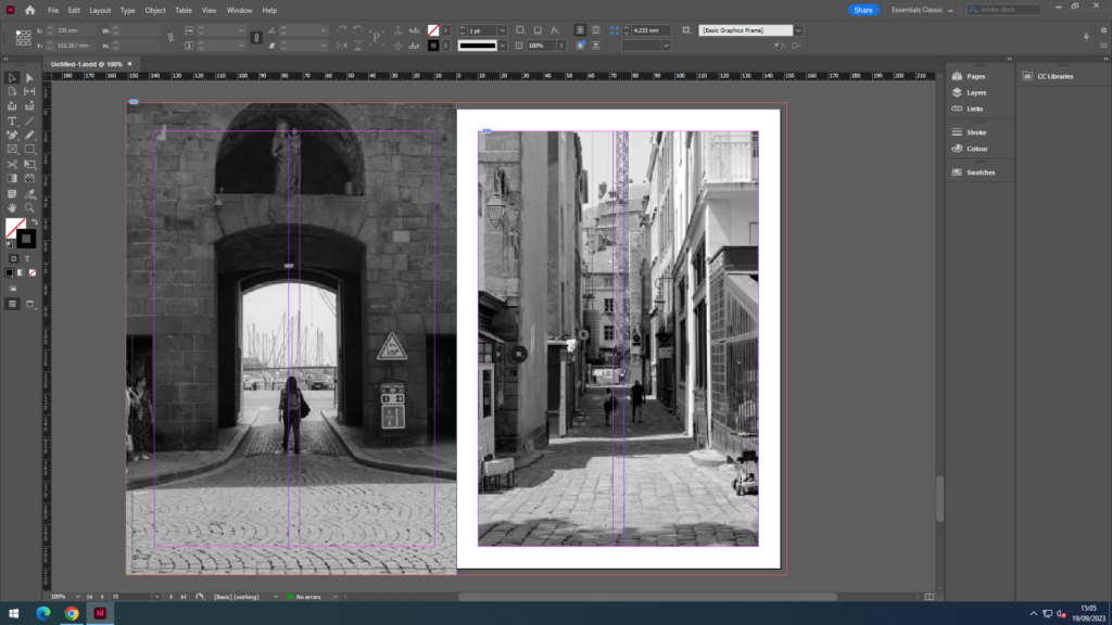
In this page I decided to have the image take over two pages as this way it would let you notice the finer details of the image such as the reflections in the car and windows.

Page 3

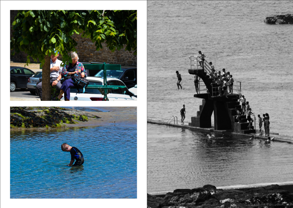
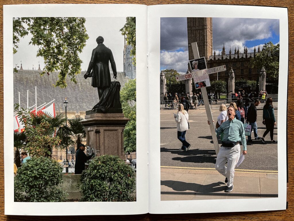
Here I decided to have my two colourful images contrasting the monochrome one by pairing them up against it but making them both smaller.

Page 4
Page 5
Page 6
Page 7
Back cover

For the back cover, I decided to link it back to the front cover by using a photo with vibrant colours as well as copying the label that I used for the title.

Printed & Bound

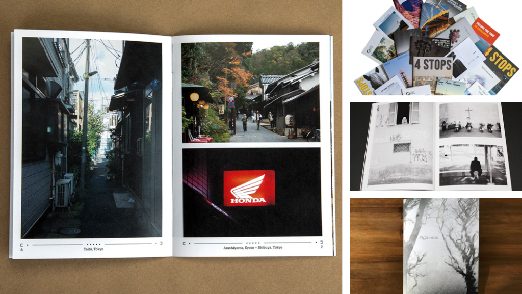
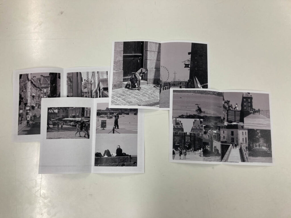
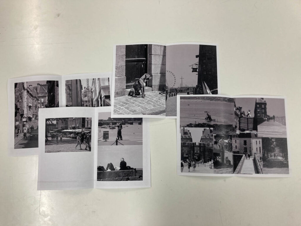
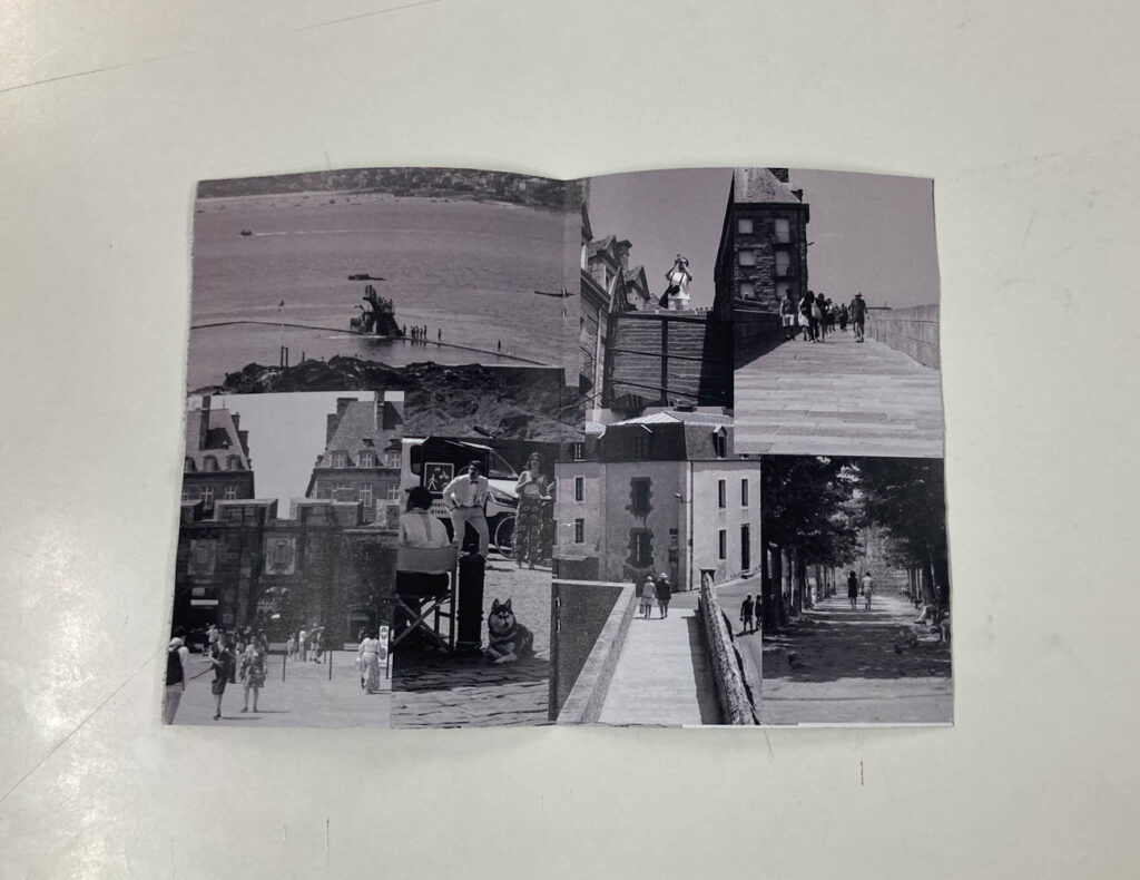
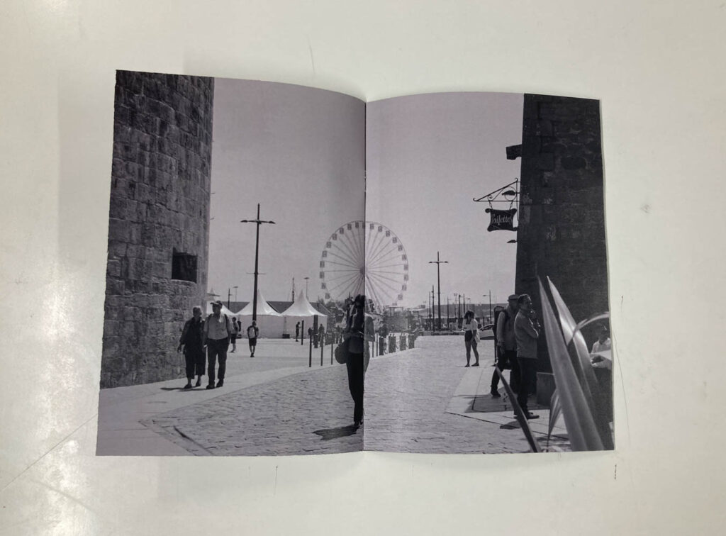
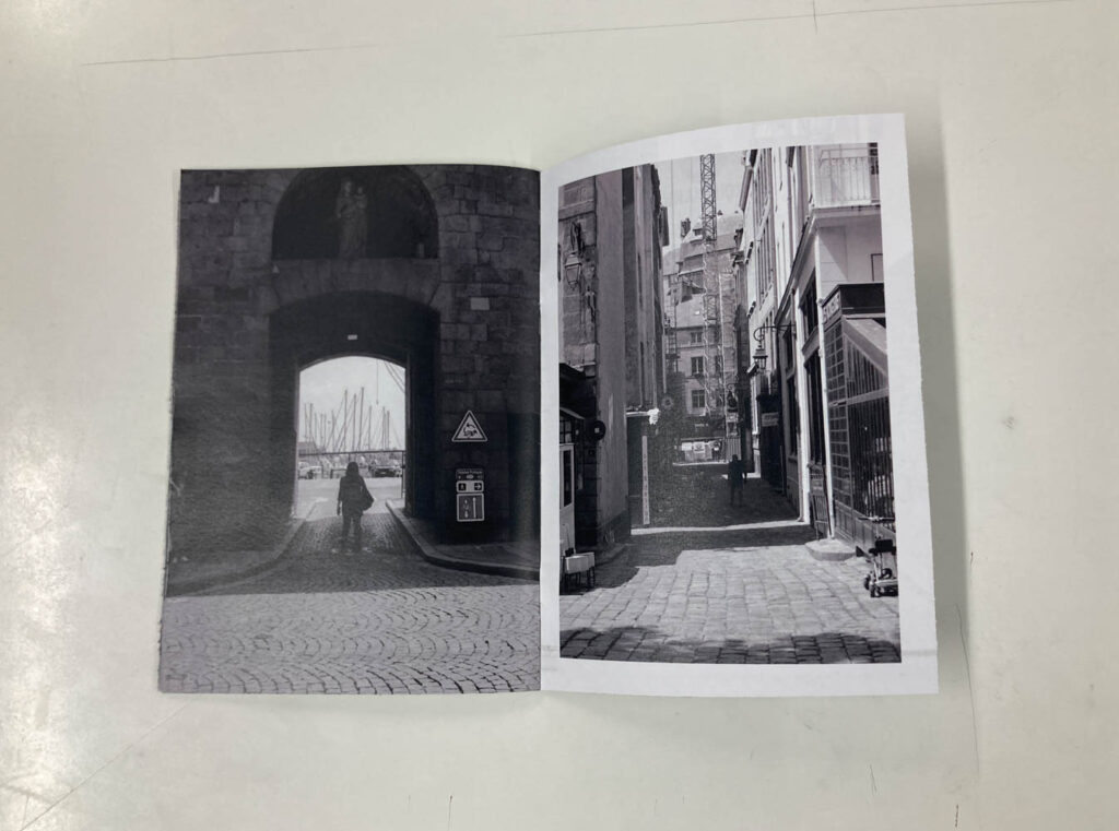
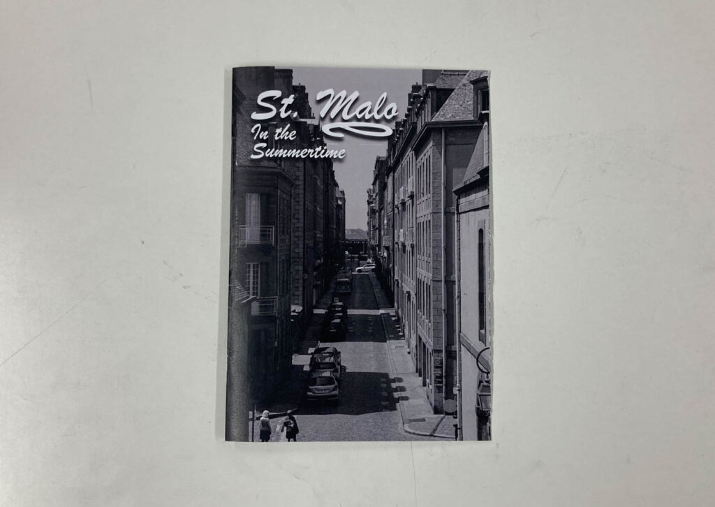
Pages of my zine printed out and stapled together.

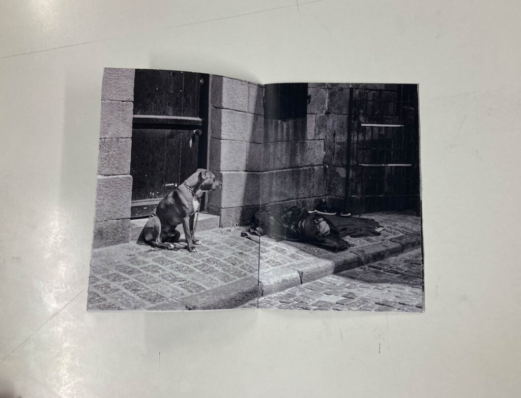
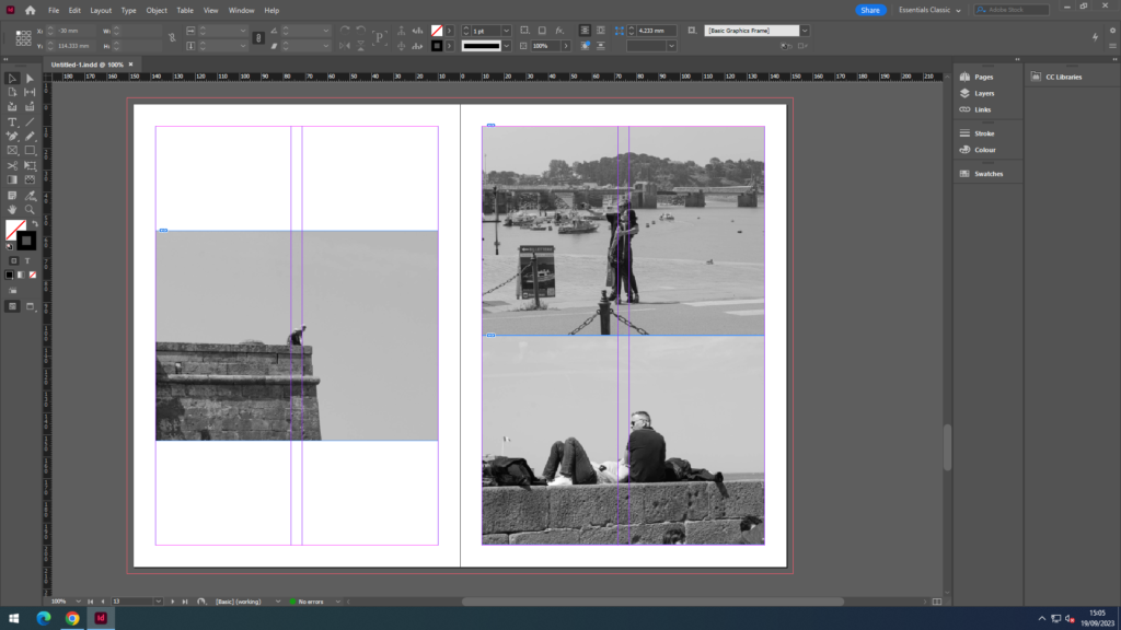
I like this little photo zine, it features all my best photos I took in St. Malo and displays them very neatly and tidy. They are all black and white to match that of a newspaper about St. Malo. The book overall uses A5 pages stapled together. The size makes me think its like a pamphlet sold to tourists in St. Malo.

DESIGN AND LAYOUT

DESIGN AND LAYOUT OF MY ZINE:

DESCRIPTION:

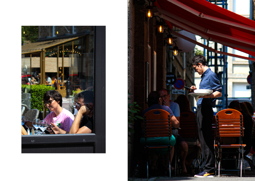
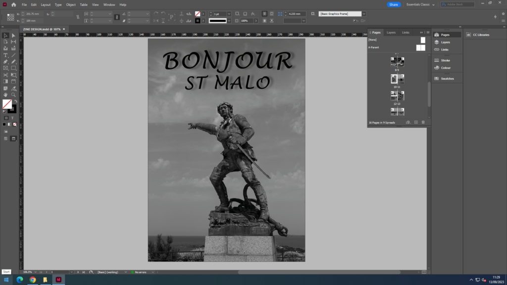
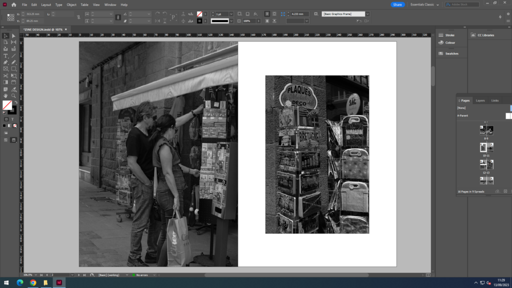
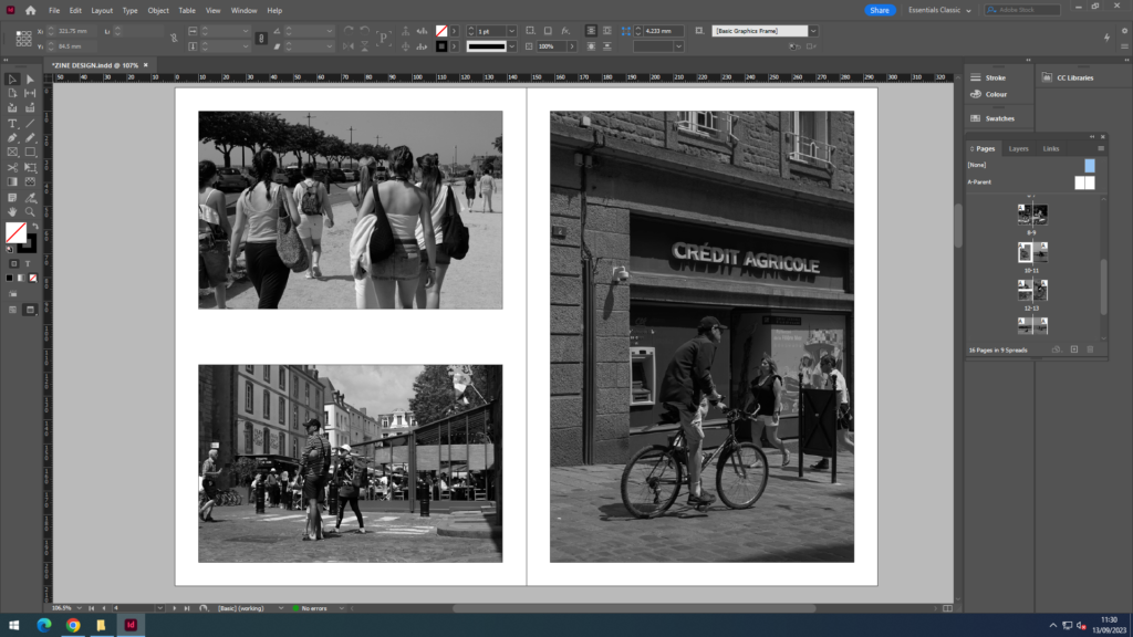
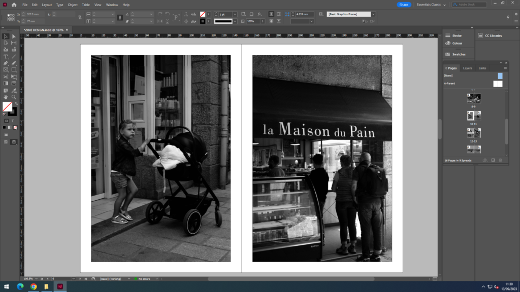
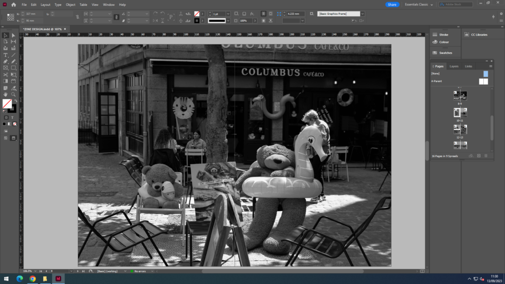
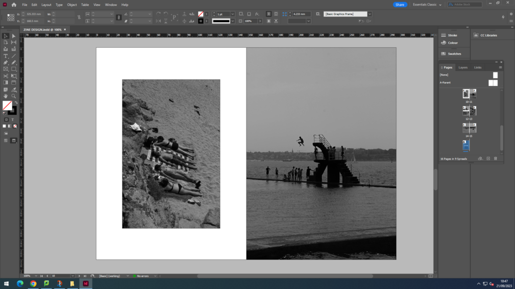
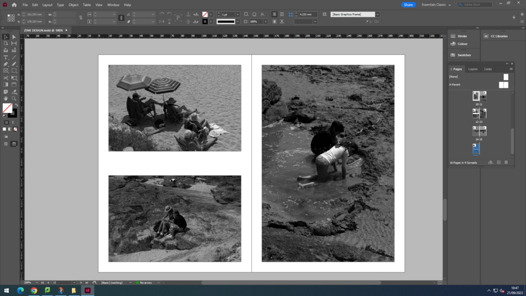
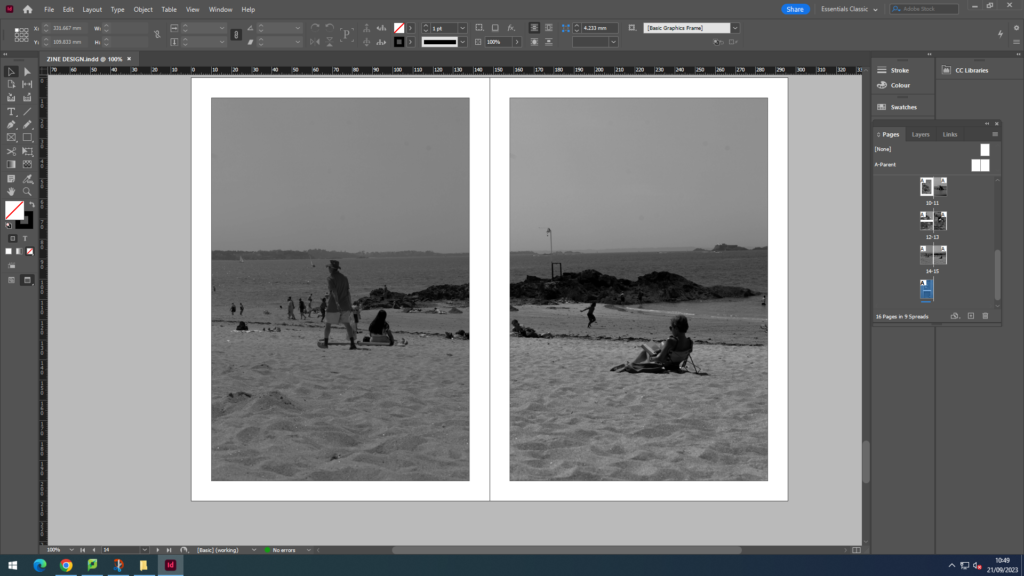
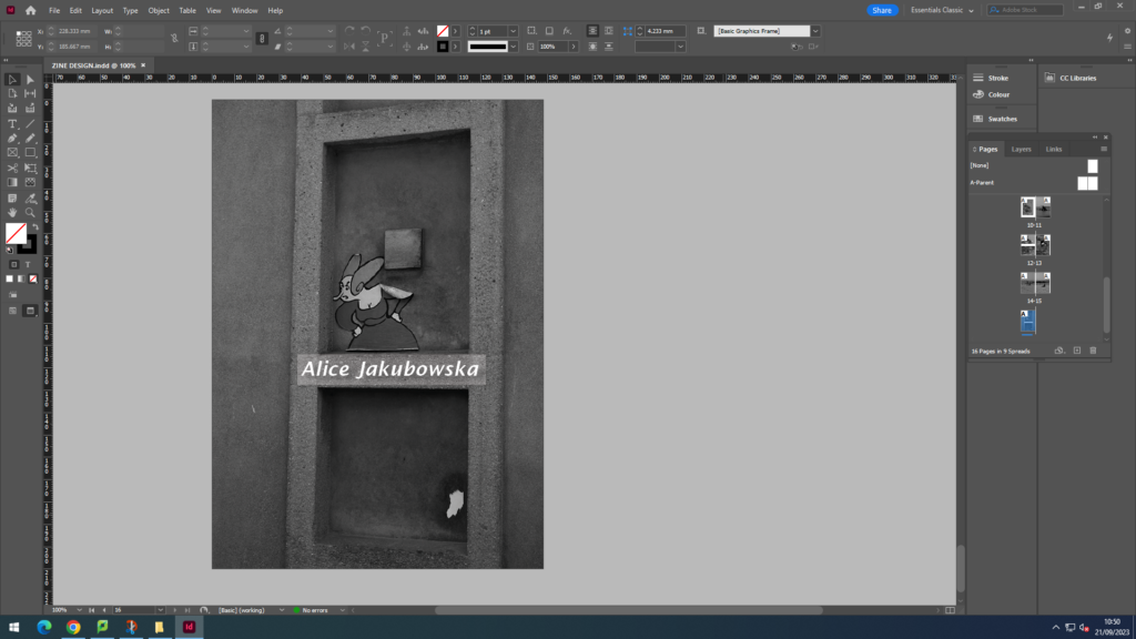
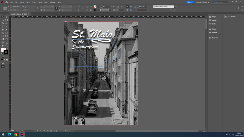
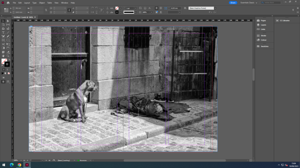
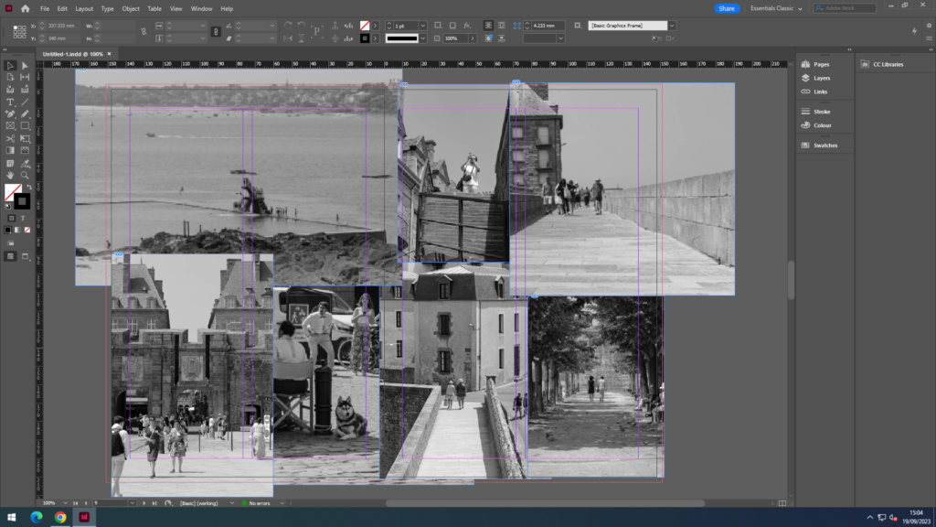
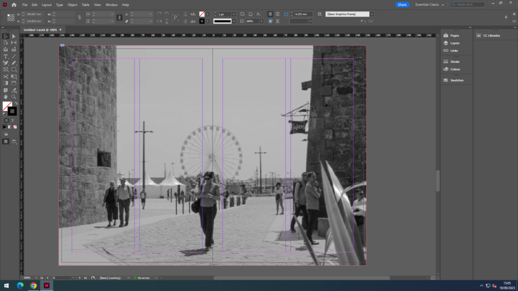
For my front and back page I wanted a simple image, to keep it a minimalistic aesthetic. The statue worked as my front image because the angle of the image made it seem like he was looking at the audience and pointing at the views in St. Malo perhaps making them more excited to open the zine. Furthermore I think my title ‘Bonjour St. Malo’ worked with my image of the statue as it suggested that he was greeting them into further reading the magazine and welcoming them on looking at the attractions in St. Malo. The back page was an image of a cartoon character that was stuck on a wall is a random street, however I think it worked well as my back page as it was simple yet added a little comedy with the yelling female cartoon character. The start of the zine are the street and attractions in the little town of St. Malo. Images included restaurants, tourist stands, and people walking along the street. This was broken by a landscape image of a set up that a restaurant created with some teddy bears. This is so the middle broke up the two halves of the zine. On the second half of my zine I included images from the coast (little beach found in St. Malo). As the weather was nice many people were at the beach with resulted many successful images. Images that I included in the blog included, people jumping from the driving board, groups of people tanning, and kids making sand castle and playing in the water. Overall with my zine design I tried to create a minimalistic and clean zine which didn’t look to overcrowded with image, and looking at the final product I believe I achieved this

RESEARCH ELIZABETH CASTLE

Built on a rocky islet in St Aubin’s Bay, Elizabeth Castle has defended Jersey for more than 400 years. You can take the amphibious Castle Ferry or walk out along the causeway at low tide. Elizabeth Castle is the perfect place to spend a day exploring Jersey’s history.

Theme for the film: Post-war tourist attraction, current site of Jersey Heritage and living history.

SYNOPSIS:

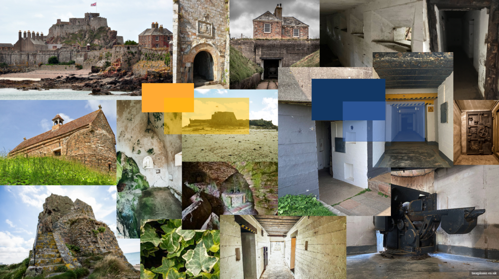
The short film we will be producing at Elizabeth Castle will be about the post historic events and the tourist attractions. The short film will include pictures of the main historic parts such as the; canons, the structure of the castle, and the main outside area (the layout). This short film is to show the evolution of the castle and how it once gave refuge to King Charles II and has now become open to the public and marked as one of the most historic elements on the island.

About Elizabeth castle

To reach the Castle and begin your adventure, walk along the causeway or take the amphibious Castle Ferry. Spend your day exploring this sprawling 15-acre fortress: climb the battlements dating back to the time Sir Walter Raleigh was Governor of Jersey; explore the grounds that gave refuge to King Charles II during the English Civil War; uncover the story of the Castle during the German Occupation in World War II; then discover the oldest part of this site, The Hermitage, where Saint Helier is thought to have lived around 550 A.D.

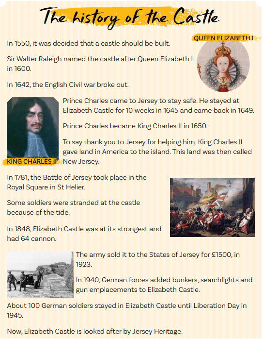
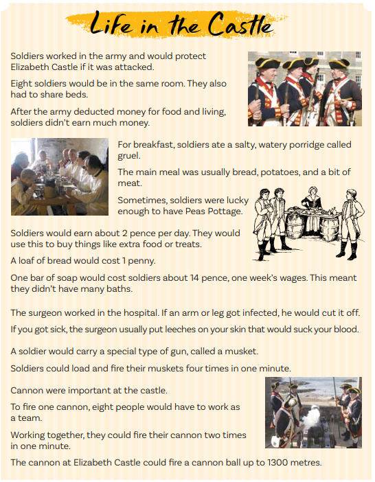
A bit of history on the castle:

After gathering some research and looking at reviews tourists have put about Elizabeth castle it has made it clear to me what attracts tourists the most… therefore I know what to include in my film to ensure the target theme, which is post war tourist attraction, is accurate. One of the most important things being trying to include as much history to draw in the tourists.