Elizabeth Castle Research:

HISTORY

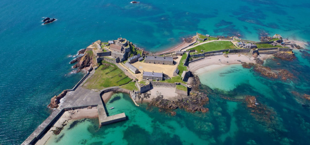
Elizabeth Castle was built in the 16th and 17th centauries off the coast of St. Helier. The castle is around 500 yards long and 60 yards wide. Elizabeth Castle was named after Queen Elizabeth I and started to be constructed in 1594. The Upper Ward was constructed first before later on adding the Queen Elizabeth Gate in 1959. Before Elizabeth Castle was used in a military context, the Governors of Jersey moved their official residence there. When the English Civil War broke out, in 1642 Prince Charles II came over to Jersey to stay safe, he stayed in the castle for 10 weeks before returning in 1645 and 1649, where he stayed in the Governors house.

In 1651, the castle was involved in its first piece of conflict as Parliamentary forces landed in Jersey and bombed the castle with mortar. It was next involved in conflict in the 18th centaury as the Seven Years War took place where the French were defeated by the troops under Major Francis Peirson at the Battle of Jersey.

In 1940, German forces added bunkers, search lights and gun emplacements to the castle as well as building addons to the castle, around 100 German soldiers stayed in Elizabeth Castle until Liberation Day in 1945.

Elizabeth Castle is now used a tourist attraction for many people who come and visit Jersey.

PHOTOGRAPHY NEWSPAPER SPREAD; INDESIGN

VERSION ONE:

VERSION TWO:

DESCRIPTION:

Here was my indesign project, in which I created a photographic zine. In these screenshots you are able to see the process and how the zine evolved into the final outcome. In ‘Indesign’ I was able to experiment with the placement of images, text eg fonts, borders and the background.

As you can see in the both zines I used a range of photos from the shoot including landscapes and portraits. With the layout of the images I tried to incorporate various size images, large and small. While creating this zine I tried create a minimalistic look as most audiences prefer something more subtle, this is why I used minimal text and range of different size images.

In version one of my zine, it looks basic. This is because it was my first time using the software InDesign and I was experimenting with the features. It had a plain white background, and perhaps too many images. I also decided to experiment with the border around the images giving it a slightly black border in order to emphasise the images. Furthermore, as I began to familiarise myself with the software I began working on the background, adding another image in the back and decreasing the opacity, to create some depth in the image I also included black rectangles to give more dimension.

In version two of my zine I decided to add less images. This was so I could achieve this minimalistic look. I also decided to play around and incorporate some French words into my title, in which resulted in ‘Bonjour St Malo’. By creating this title by incorporating French it gives a more clear understanding that this was a French shoot. Due to adding less images I was able to spread the title across the page and add slightly more text, by creating the text box large it felt more spacious then crowded. I also incorporated a bleed, an image which runs across the border, on the bottom left third. This is so we could have a variety of looks. Furthermore I decided to incorporate the French flag into my zine, I incorporated this in the border of the images, using the colours of the French flag, blue, white, red.