Zine layout

For my front cover design, I chose to make the title tinted so you would still be able to view the stained glass window behind.
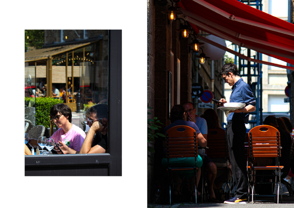
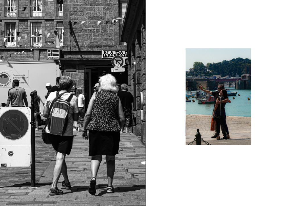
For this page, I chose to have my strongest image on the right and increase the size in order to make it more pronounced to the viewer.
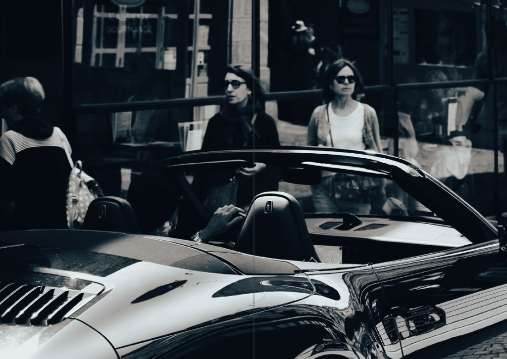
In this page I decided to have the image take over two pages as this way it would let you notice the finer details of the image such as the reflections in the car and windows.
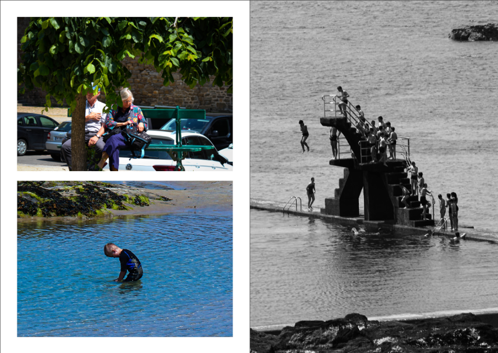
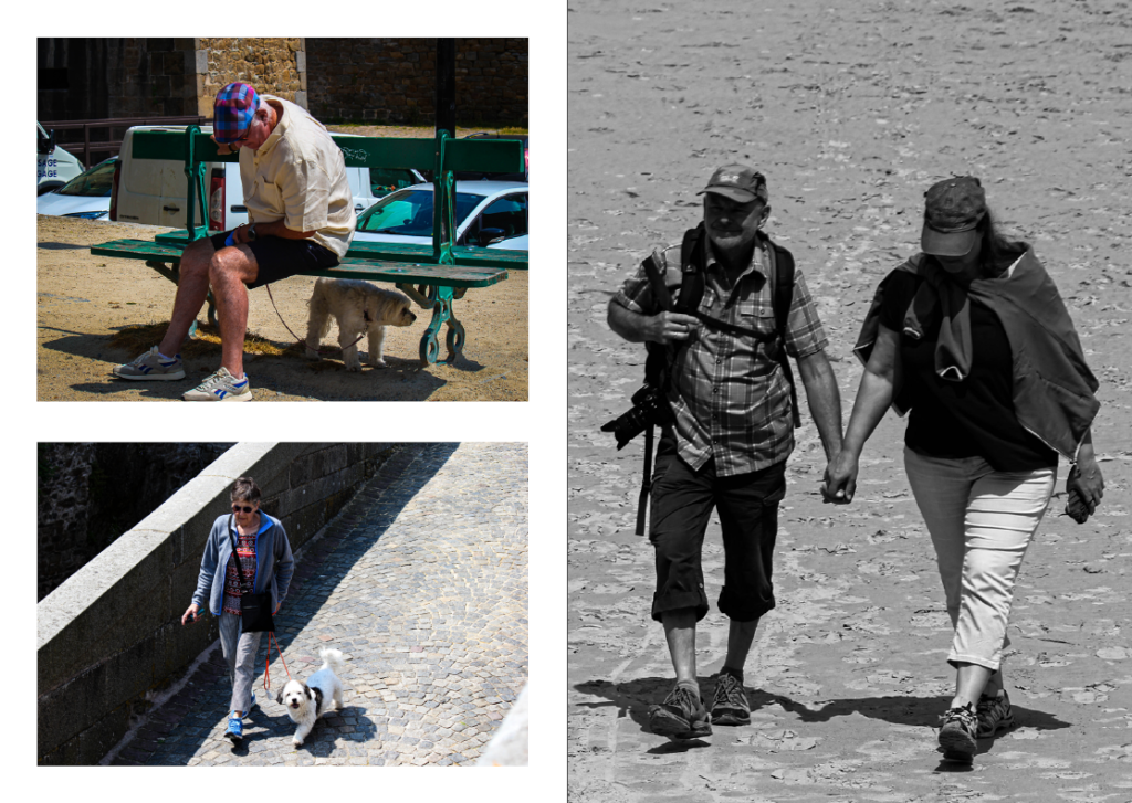
Here I decided to have my two colourful images contrasting the monochrome one by pairing them up against it but making them both smaller.
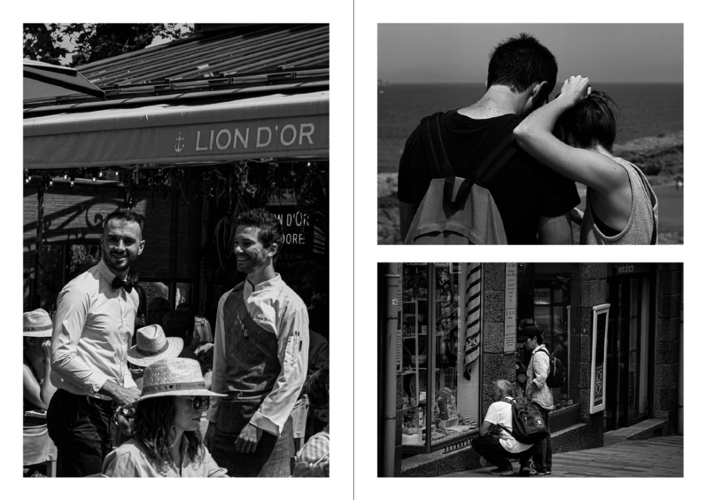


For the back cover, I decided to link it back to the front cover by using a photo with vibrant colours as well as copying the label that I used for the title.
