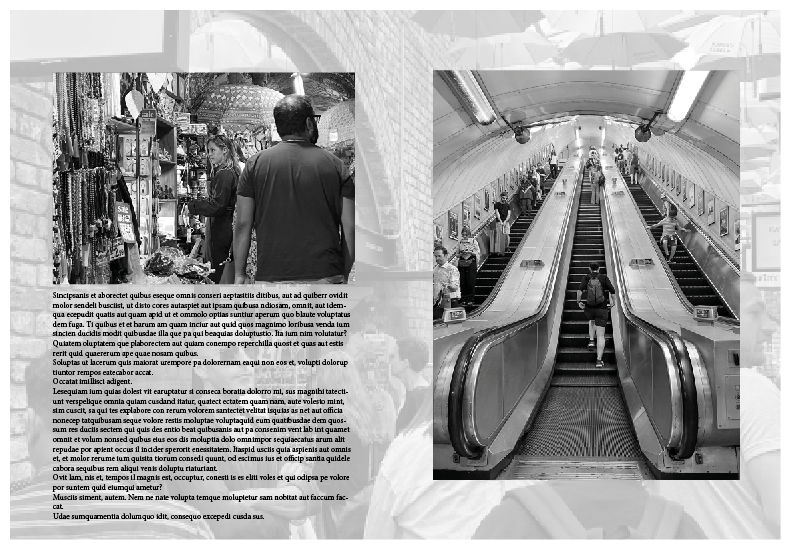
Mind map of inspiration for my picture story from sites like the Guardian and newspapers. The use of large writing to present the story in the title is prominent in newspapers, and I will use this in some of my examples. They also tell the story with wording around the best images that present it, I will try different layouts for this.
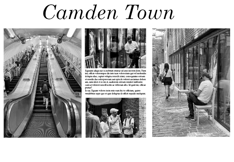
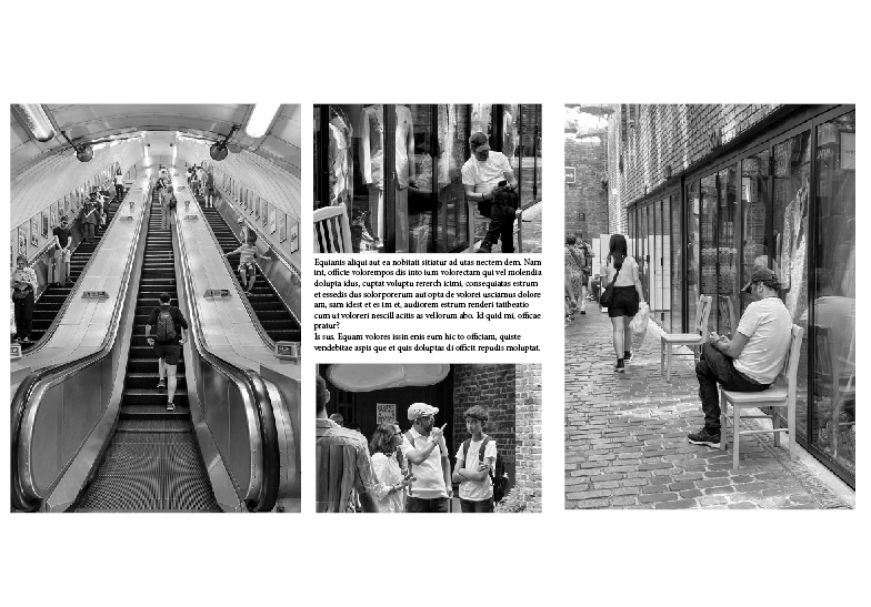
Overall, I think that this is my best outcome. I like the simplicity of the layout, with two main images on the side, and two smaller images that complete the story. I chose to add automated text because it separates the images and includes more to look at.
I originally didn’t have a title, however adding one gave it more of a backstory, explaining what’s going on and where it’s set.
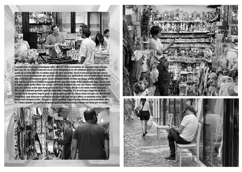
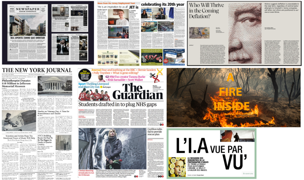
I also experimented with changing the opacity of images and using them as backdrops.
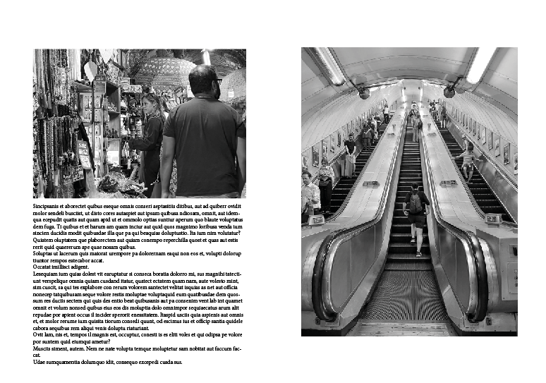
This was my most basic edit, which I liked, however I thought it was too simple and boring. I added an image with low opacity behind it to make it more interesting, but still didn’t think it was my best.
