the order of the images had a a significant part on projecting the story, as I wanted to show relationships from a young age How I plan to tell this story is by specifically focus on the placement and order of the images, starting with showing relationships, and love from a young age, then later, adulthood, etc. I want the viewer to feel like they are growing up with the book, although it is not of the same people, its a part of everyone, and everyone goes through it.

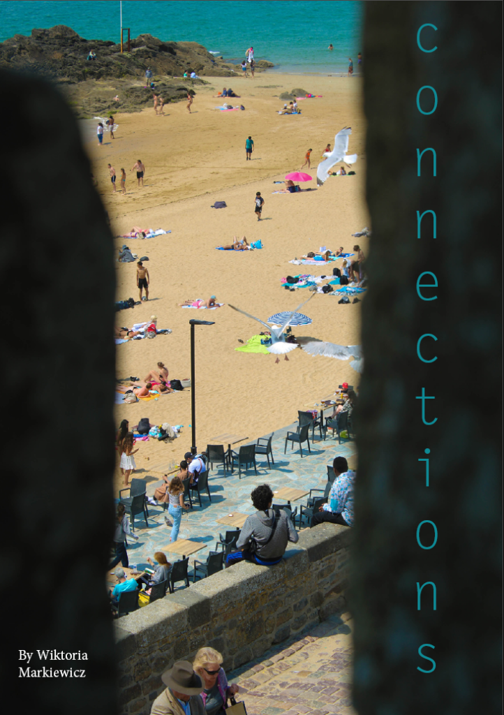
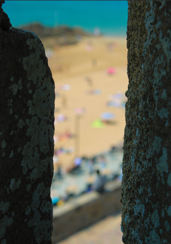
First off I started with including two similar images as the front and back cover, these images are of the same scenery except one is out of focus and the other is in focus. On one it is clearer to see the background of people at the beach and on the other the image focuses on the rocks that are in the foreground.
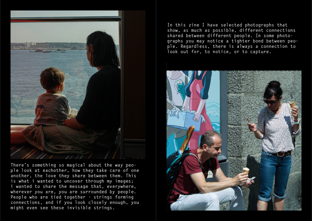
The first two pages are arranged in the way to show what relationships a child encounters from a young age. The first picture being of a mother, represents the first love a child receives which is from their mother. The picture next to it contrasts with what a child sees, which is a love their parents have.
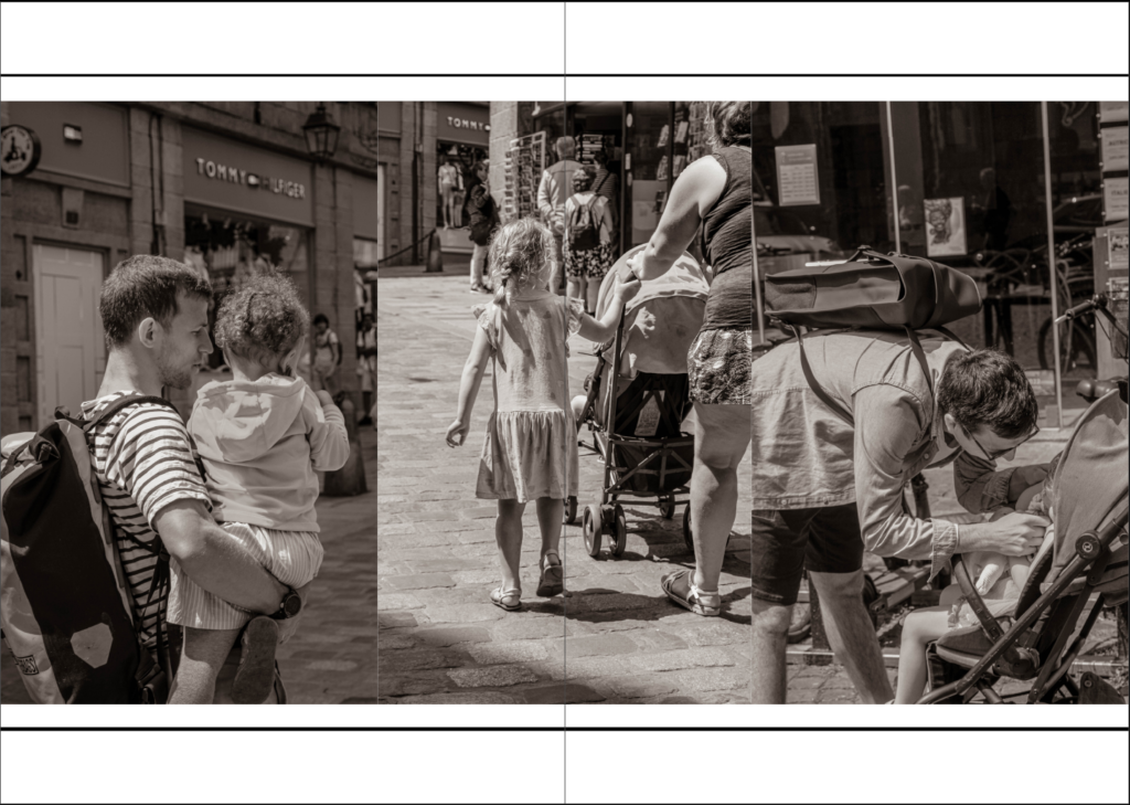
The three images on the next pages are all a collection of my best images of children. I put them in, in this sequence so early on in the zine to show the relationship between child and parents, as this relationship is the first one to experience and usually one that lasts a lifetime.
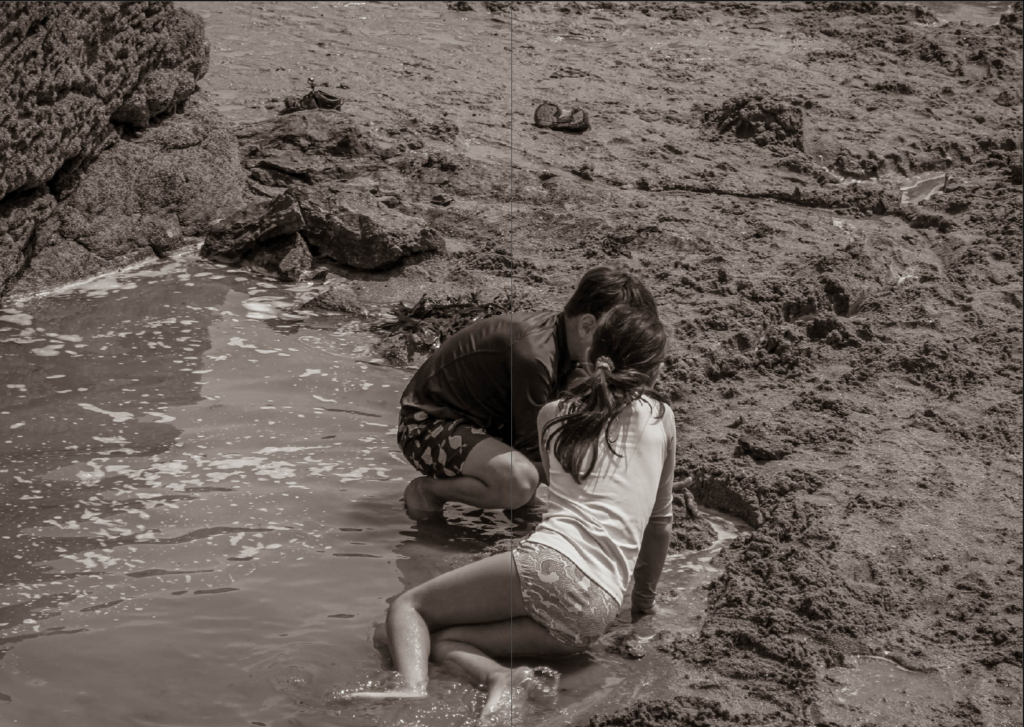
The first image that is a double page spread, is of two children playing together in the sand. I put this image after the other ones because a child will start to develop friendships from this love that is first displayed by their parents.
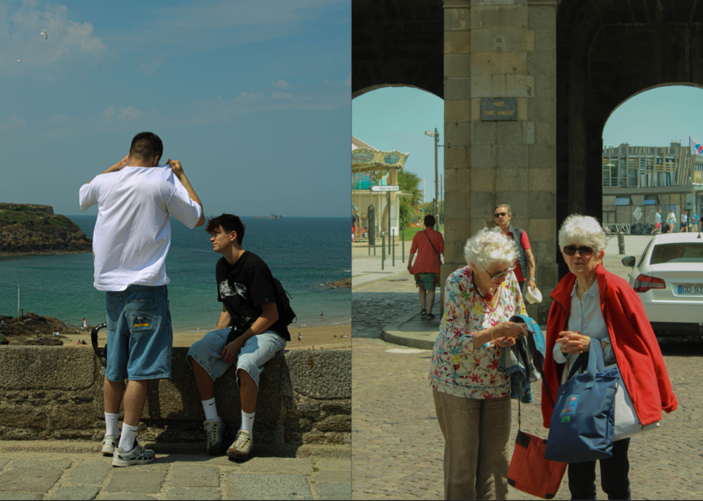
Throughout the teenage years the excitement and need for friends continues, this is why at this stage of life we tend to build long lasting friendships. This is why I included an image of two boys that are in their teenage years contrasting with the image of two elderly women. This signifies the importance of lifetime friendships.
Coming back to the storyline of my zine, I wanted to display images of sadness to have a turning point in the storyline. I really like the image on the left, as it shows that love can exist in different forms. Like the homeless person with their dog, that image shows the love he has for his companion and the long-lasting loyalty and dedication through hardships. What we can take from this image is that love and relationships overcome the tough situations we face in life. The image on the right is showing the emotion provoked by this situation. I want to transport the viewers into this moment.
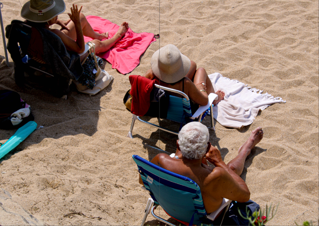
The second double page spread image, is of older people enjoying their day at the beach, taken from above. I have included it in the place in the zine to show what the later years in life are about. This means the relaxation and the nostalgic mindset of life at an older age takes place.
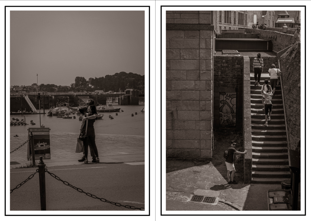
The last images are an ending of the story where people are on the stairs, leaving the area on the beach. This implies they are leaving the story
Below is the finished pages of my zine.
