Evaluation
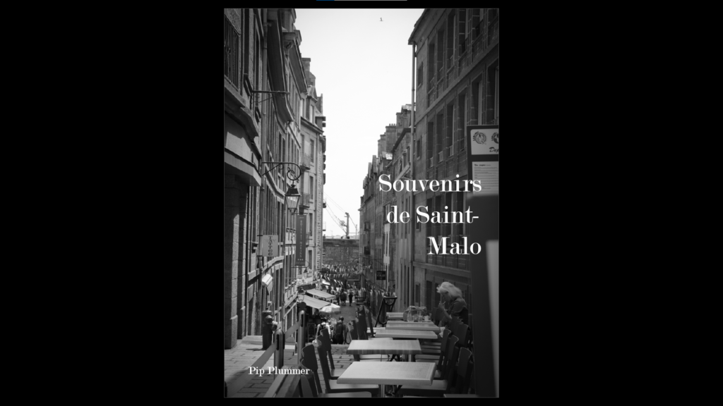
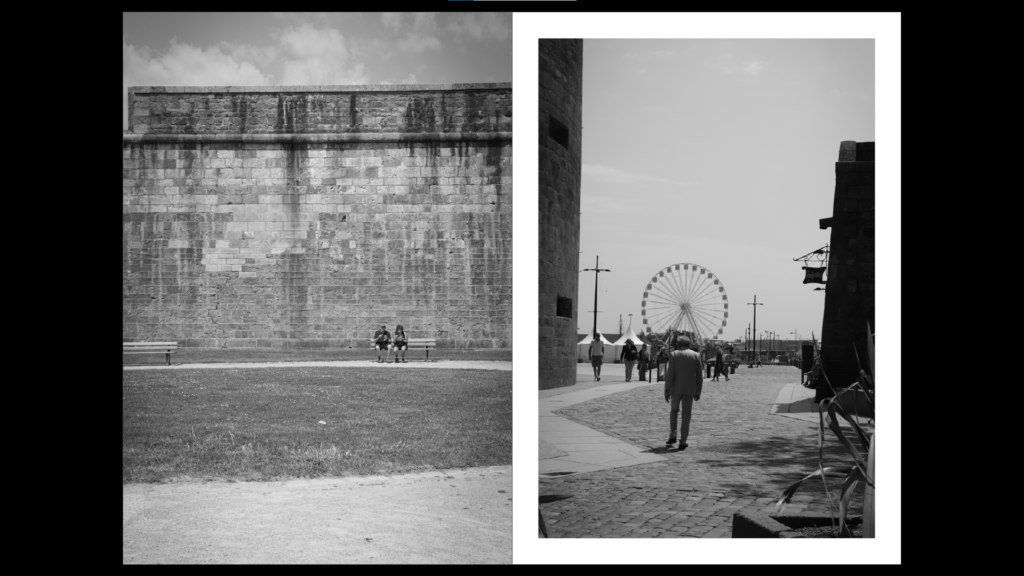
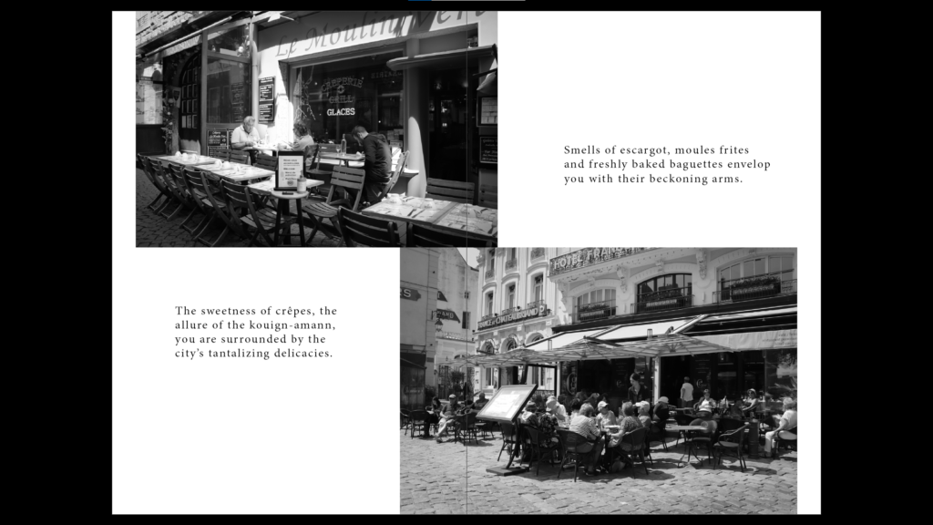
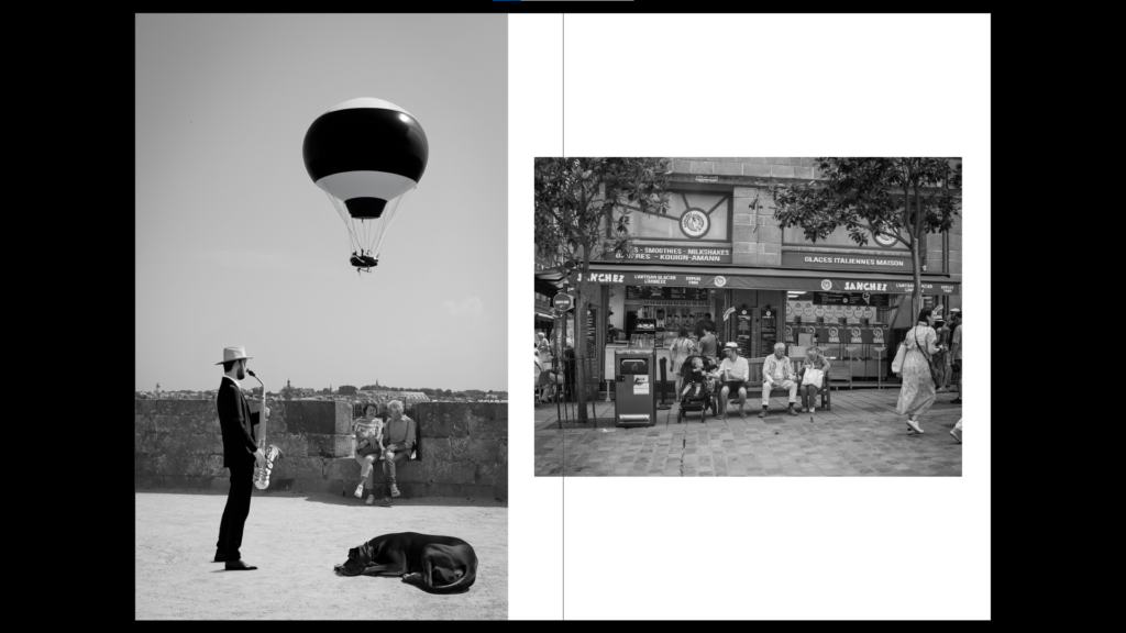
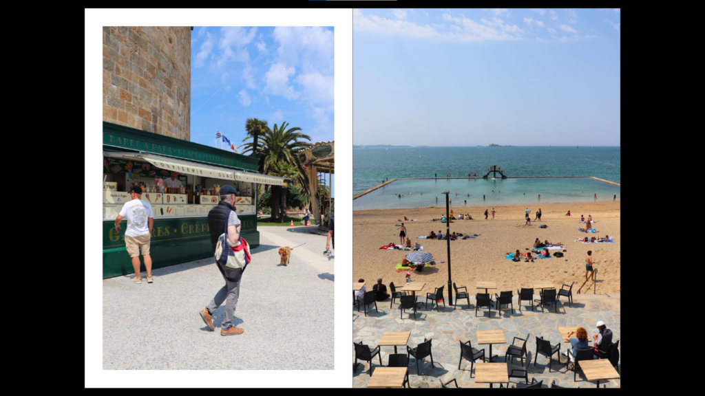
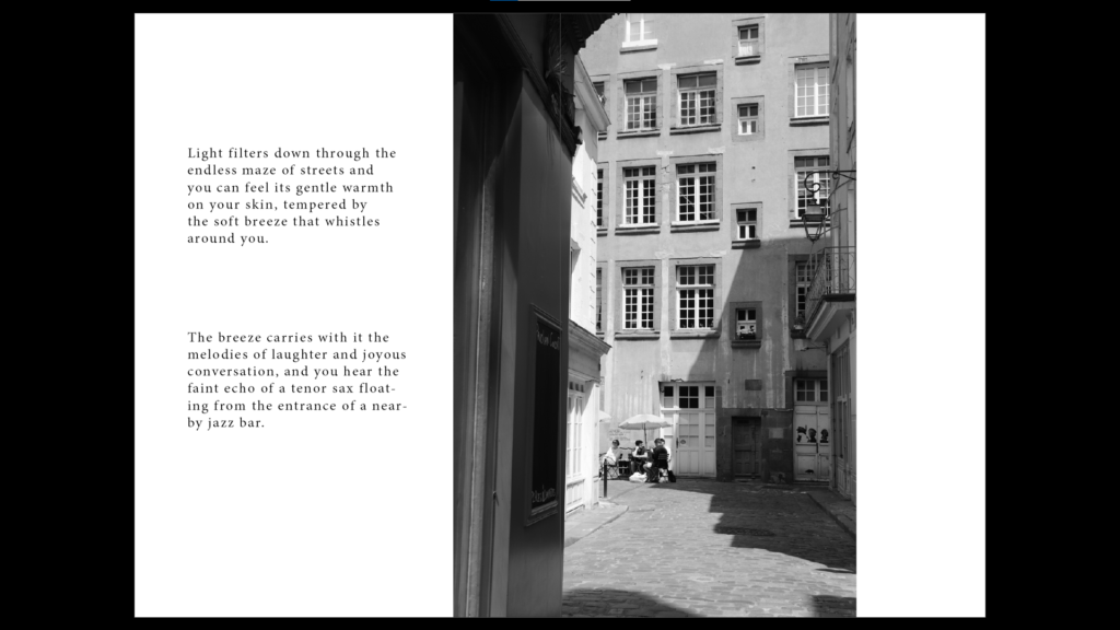
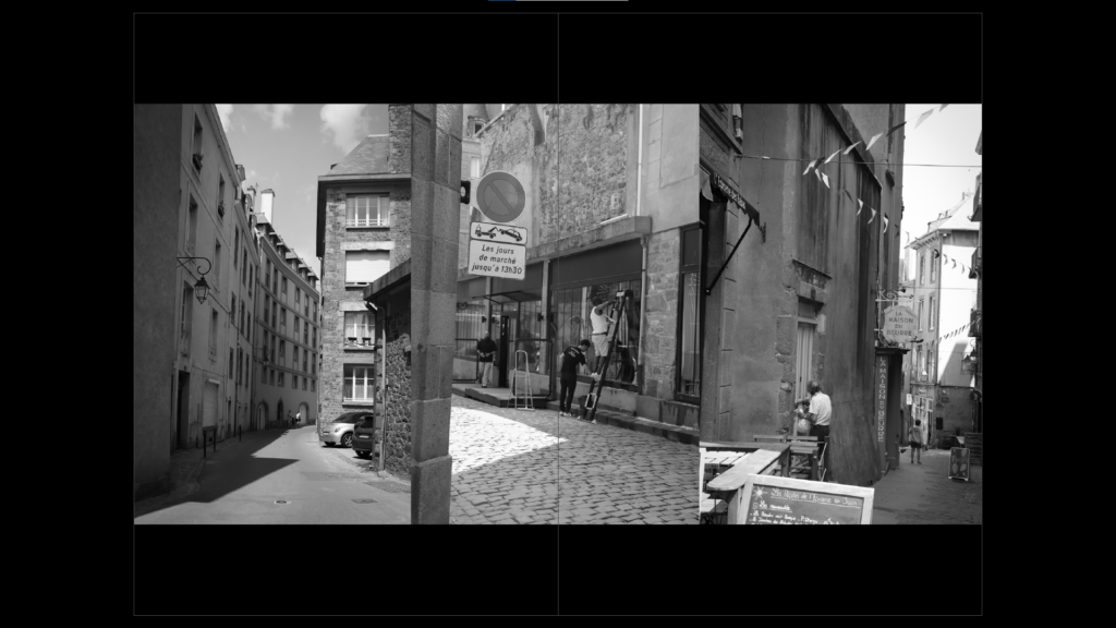
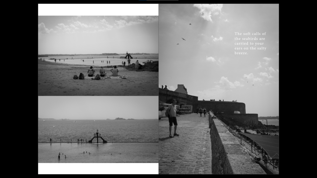
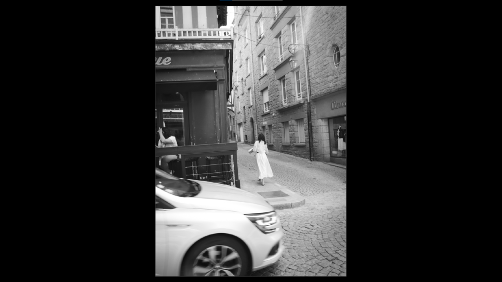
I am happy with the way my zine has come out and I like the fact that the layout is thoughtful. I think the text certainly adds something to the presentation and I think my selection of typography and imagery was successful. If I could do something differently perhaps I would not include the colour page and keep it all black and white, as it may have been a bit more cohesive.
