process using screengrabs and annotation
Experimentation of zine covers

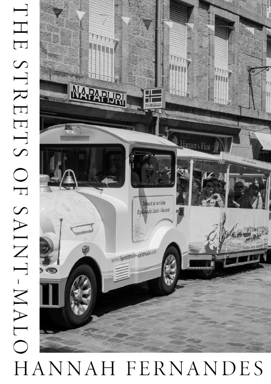
The photo on the right is one of my inspiration photos I found during my research and planning process. On the left is one of my own replications of this design for my zine cover. The following are other examples of this with other final images from my St. Malo collection.
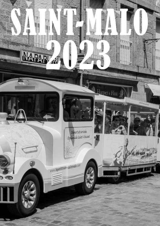


I wanted to experiment with my zine cover and try out different designs before deciding on a final design. Above is another of the inspiration photos I liked during the planning process, as well as my own responses below.
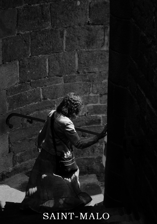

I only managed to create a few possible designs for my cover as the creation process moved quite quickly.
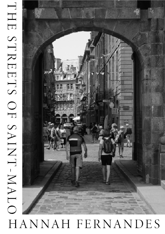
This is the final image I used as inspiration for my zine’s cover. My responses are below, I believe these are my best and favourite designs I have created. The design allows me to incorporate the name of the zine as well as my name, without covering and blocking the image in any way.

Experimentation of zine pages
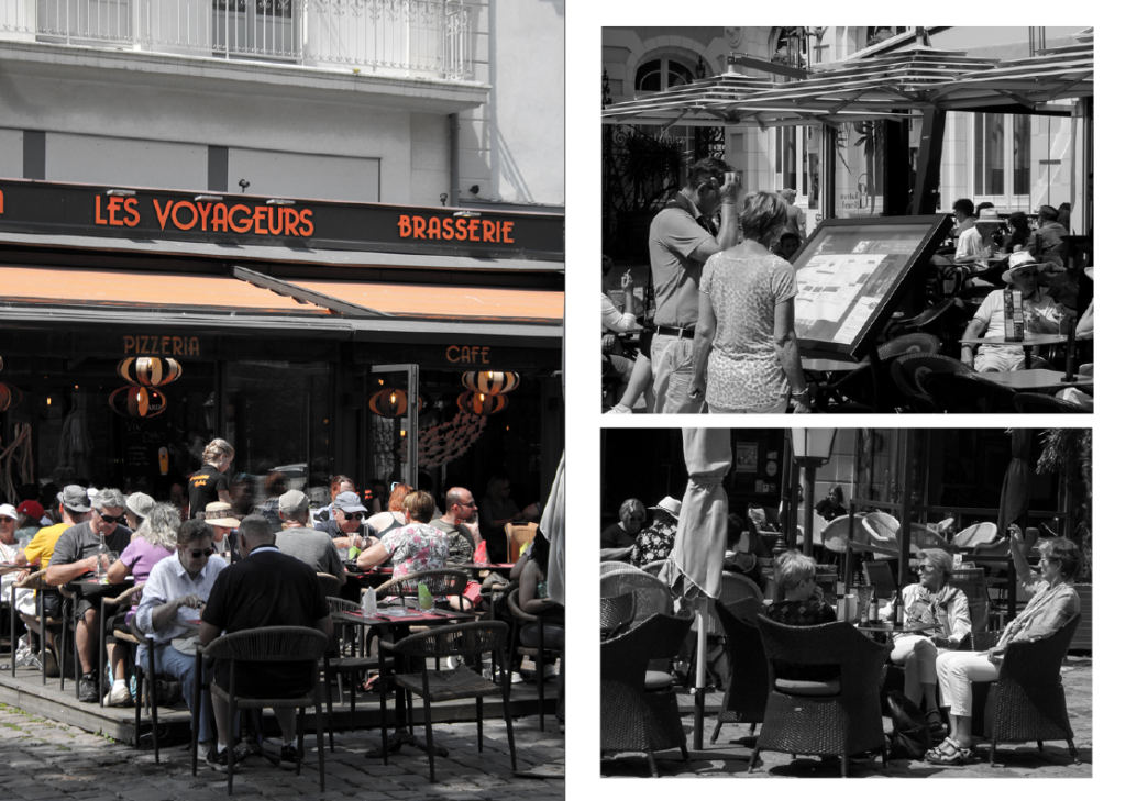
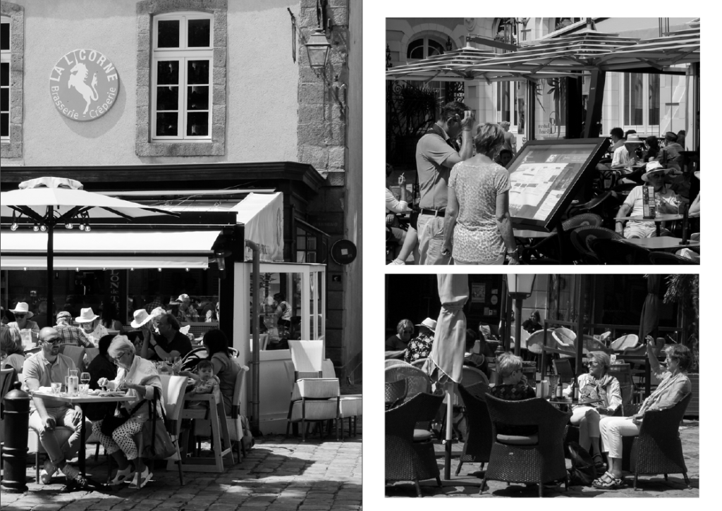
This is a spread where I played around with using different photographs. The top spread is the before, and the bottom spread is the final design. I realised the image in the top spread contained colours and therefore didn’t fit with the black & white theme I was trying to create. I also realised that the photo I chose to replace it with added to the story more than the previous. The final design contains images which I believe show and communicate the subjects’ lives and storylines, overall looking more personal and intimate.

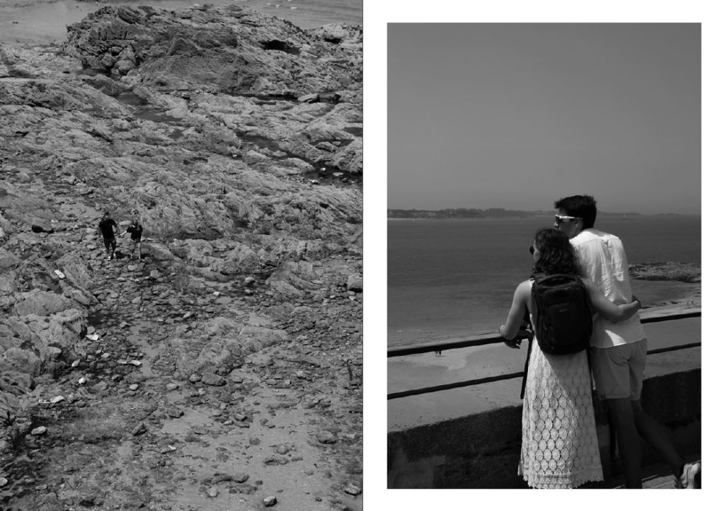
This is more of my photo selection process for the spreads and experimenting with what I think looks best on the page.
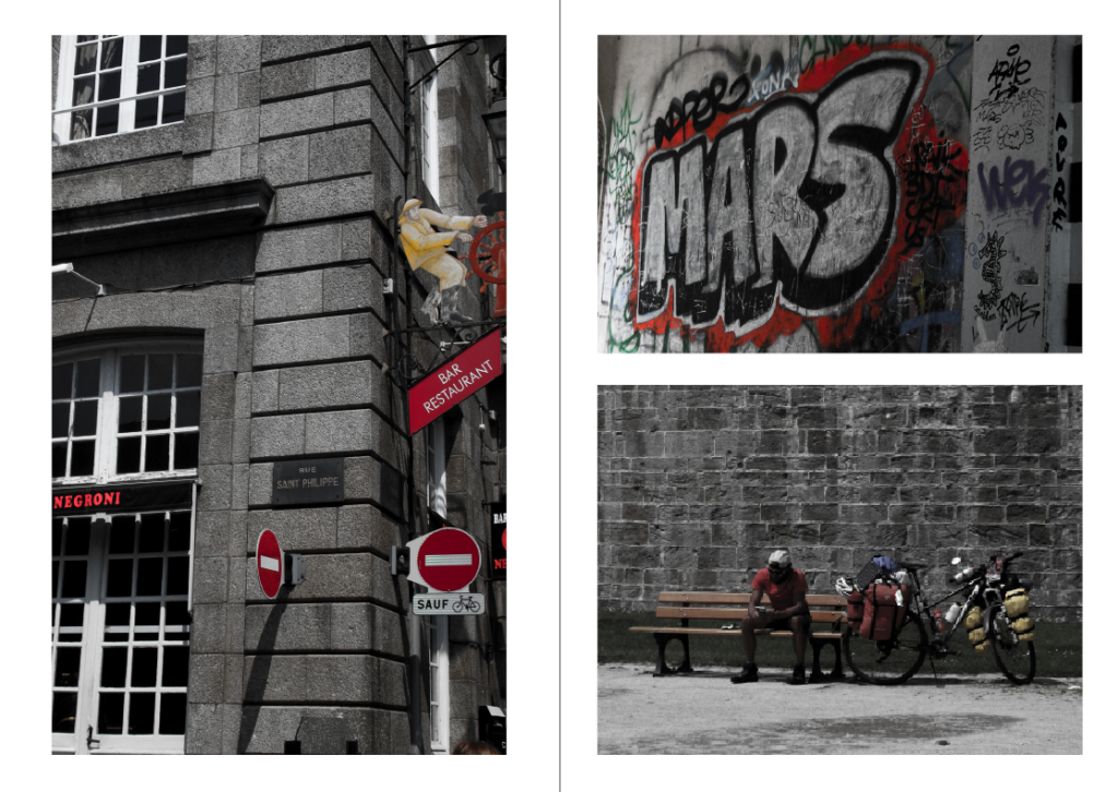
These images are a few of my St. Malo outcomes I edited by turning down the vibrance and turning up the saturation. This presents them as black and white but allows a pop of colour. Specifically I tried to incorporate images with red, white and blue elements (the colours of the French flag). I have chosen these images for the centre page as they don’t fit the black and white them of my zine, allowing some differentiation to the rest.
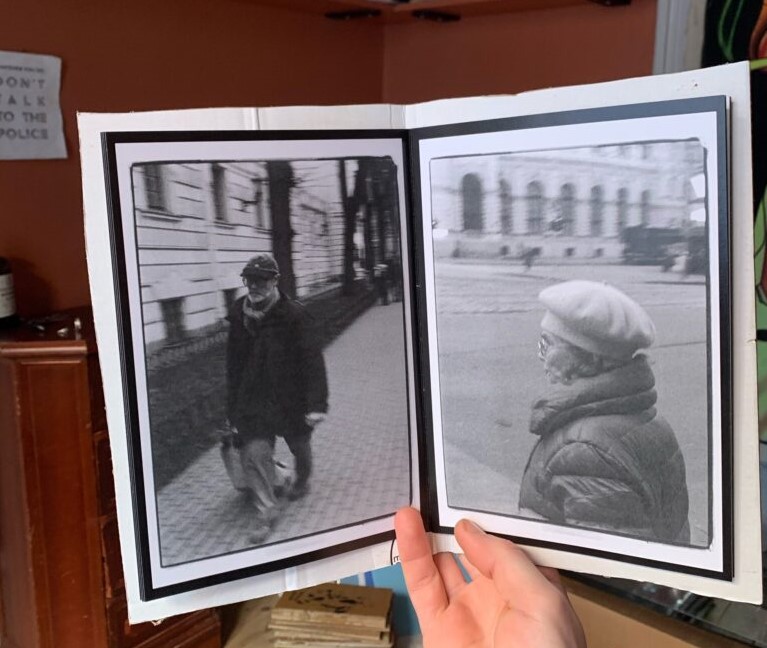
During my research into zines, I looked for inspiration for my zine covers but also my zine pages. This was an example of experimentation with double borders which I wanted to try.
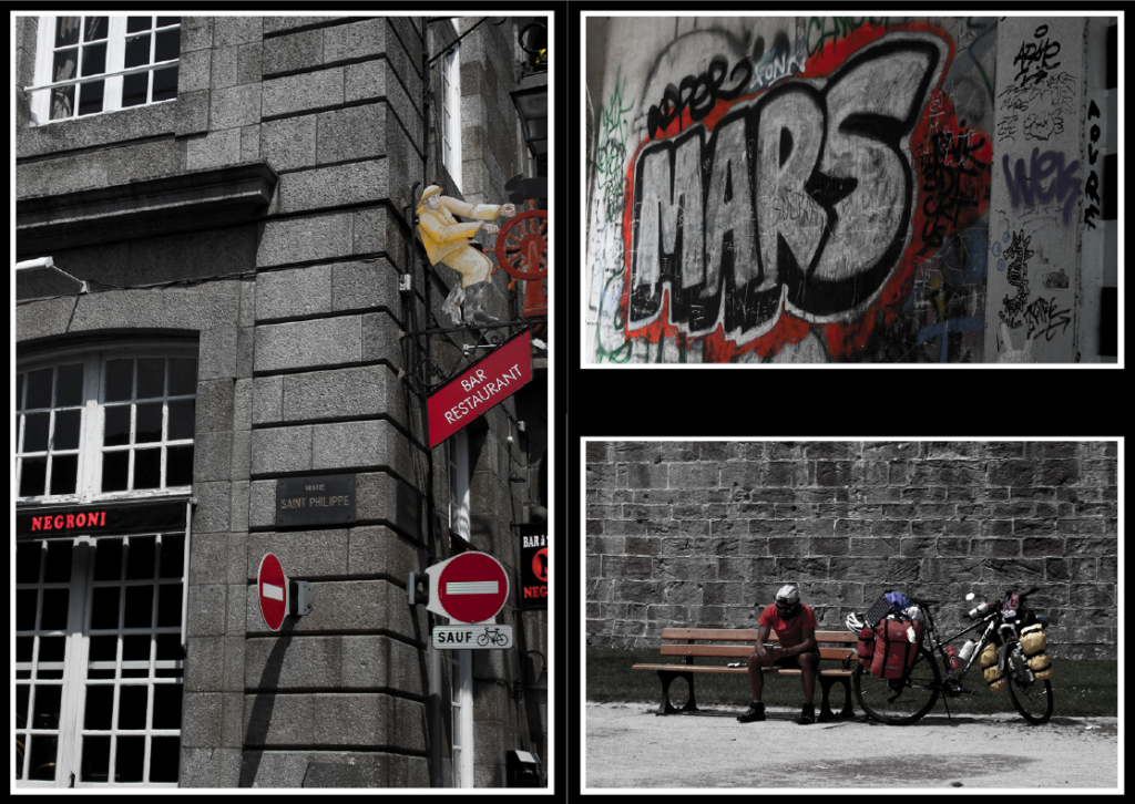
Although I haven’t layered the images in real life like in the inspiration photo, I have used InDesign to create this double border effect. By bordering the images with white and then black, it creates a sense of contrast and draws more attention to the photos and their colours. This differs from the typical layout and theme for my zine, but I think it is acceptable because it is the centre page.
Final pages
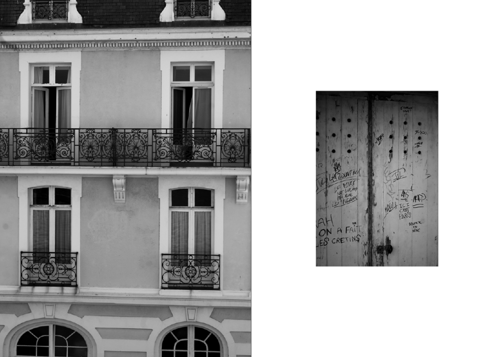
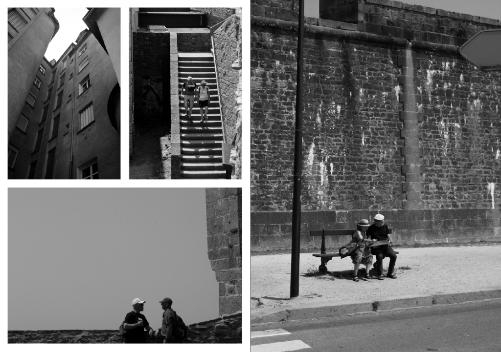
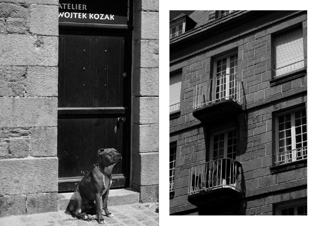
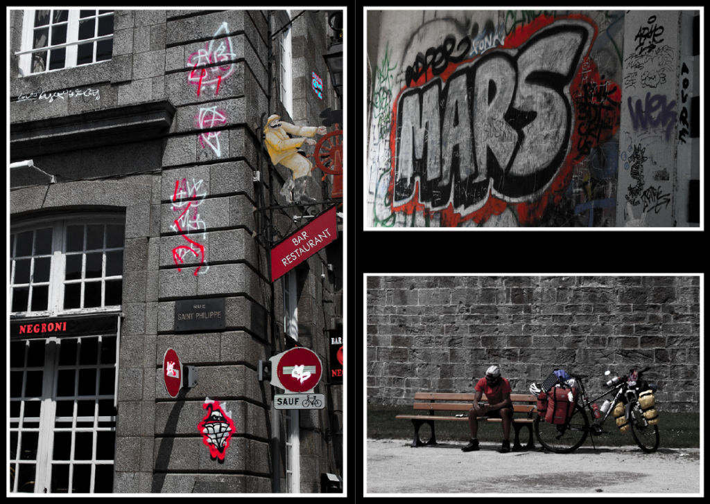


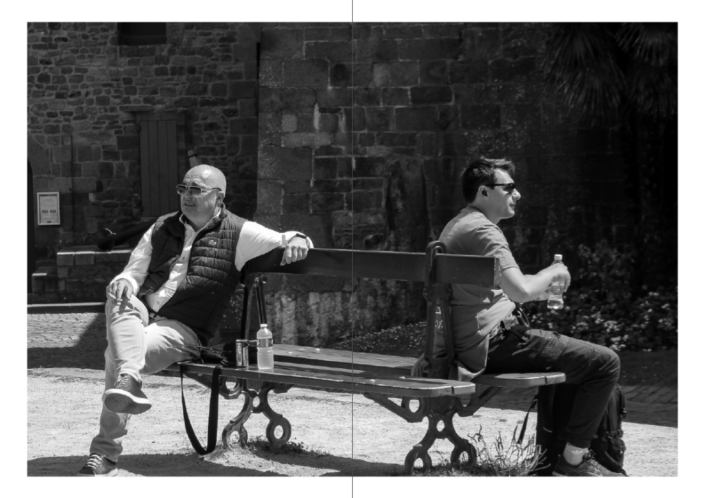
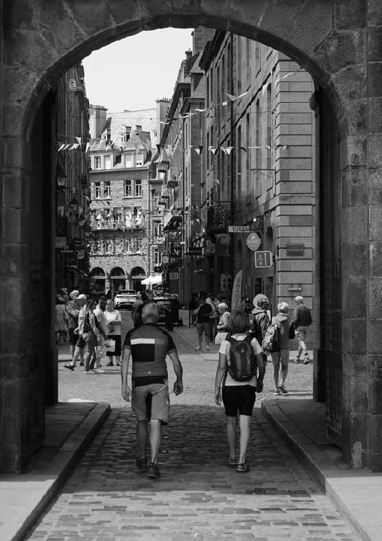
I believe my zine creation process has been overall successful and that I have created a zine which is well-made and enticing to look at. I have varied my page designs as much as possible to make it more entertaining and exciting. I chose a black and white theme for my zine, with pop of colour and a differentiation in design for the centre spread to make it more fun.
