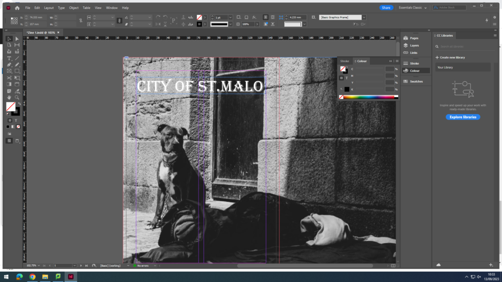
Homeless dog without its owner as the front (and back) cover to attract attention with a title of “City Of St.Malo”.

Double spread of tourists and locals getting food from what looks to be a small business.
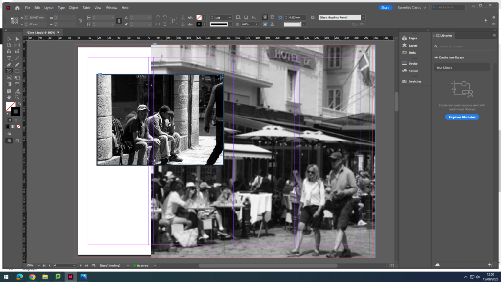
2 images. One being foreign tourists who looks to be trying figure out where they are and cool down from the sun. The other image consists of people eating at a restaurant with a couple passing by. I chose this layout because I thought it looked good, unique.
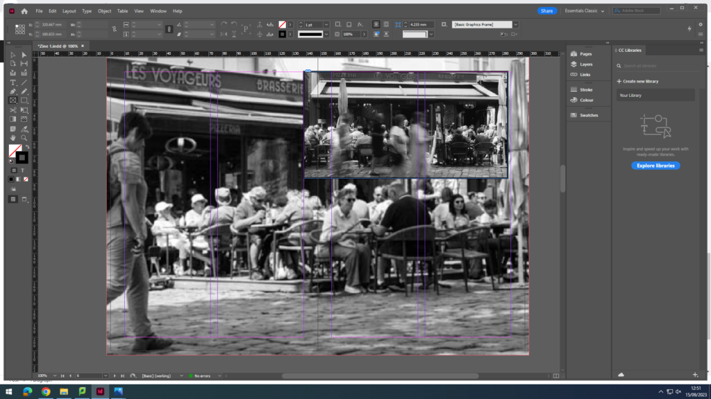
These images are similar as it is of the same restaurant, but I wanted to capture people eating from a low angle and the activity of the restaurant, but also wanted to capture an image of people walking by and making the exposure time longer to create a blurry effect, whilst the people sitting down look normal.
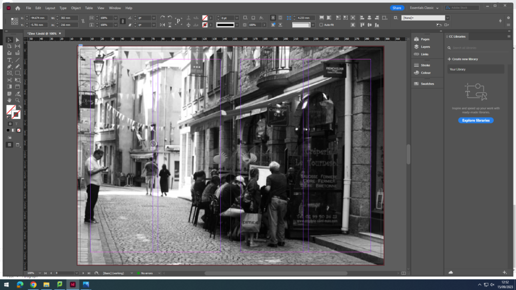
Normal double page spread of an image of a small restaurant with passing people, and added a boarder to make the whole zine look even.
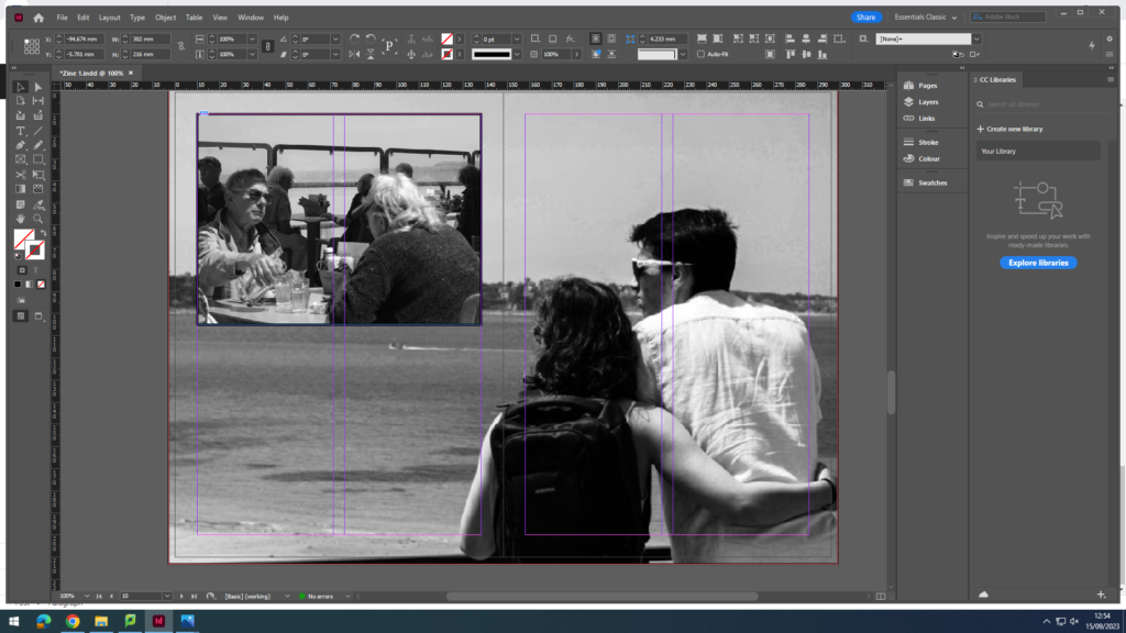
I liked this layout because it involves two couples young and old, gives a good contrast in the images, and shows them enjoying their time at St.Malo.
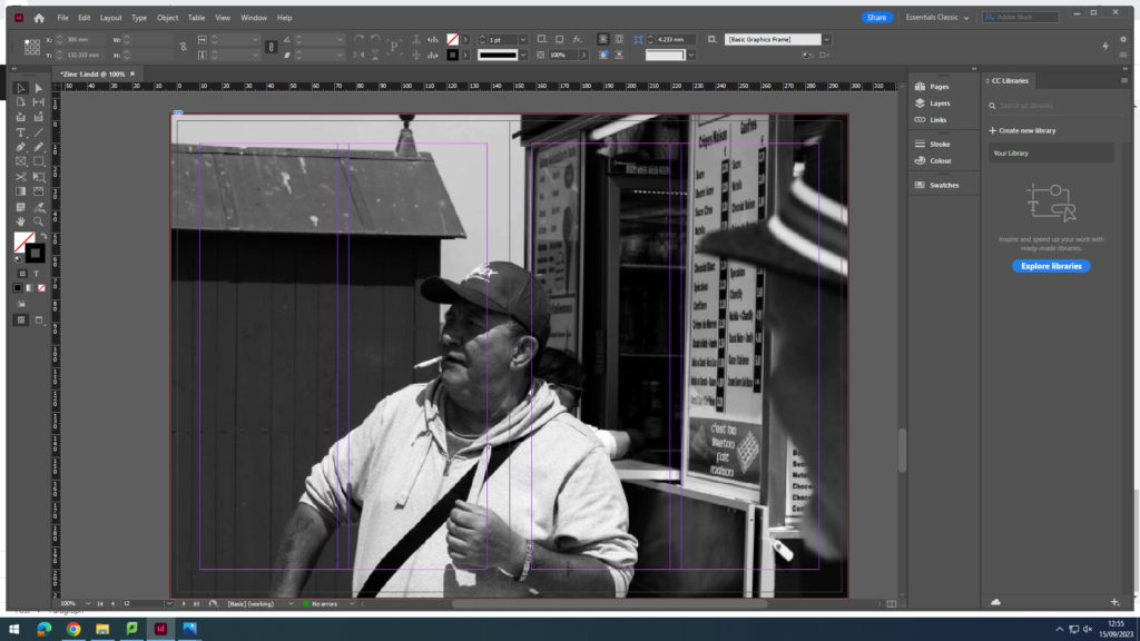
I wanted this image to be double page spread just because of how funny and cool this guy looks, and it shows the variety of people who visit or even live in St.Malo.
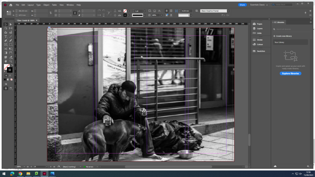
I chose this for the last image to also show the poverty that lives in St.Malo, and how its not all good, there are always areas in places which have this. And there is a dog.
