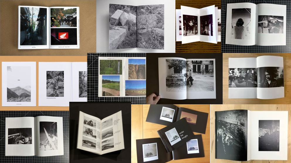
MOODBOARD:

SIZE OF ZINE:
InDesign
Create new document
width: 148mm
height: 210
pages: 16
orientation: portrait
columns:2
column gutter: 5mm
margins: top, bottom, inside, outside: 10mm
bleed: top, bottom, inside, outside: 3mm
RESEARCH:
FURTHER READING: Something Tactile: Why Photographers Should Create Zines
WHAT MADE YOU WANT TO MAKE A ZINE?
Creating a zine allows you to express your photography in a different way. The ability to create something so impactful by the composition, juxtaposition, and sorting of images to allow the flow of the story creates a different emotion and understanding in the photographer and the audience. A zine also allows something that is hand-held and physically in your hand that you are able to see; and not through a computer or electronic device. A zine allows people to engage socially and express feelings about their opinions with each other.
WHAT’S THE CREATION PROCESS LIKE? WHAT BIG QUESTIONS GO THROUGH YOUR HEAD AS YOU’RE EDITING AND PUTTING STUFF TOGETHER?
The creation process, personally is the most stressful. While you are placing your images you are trying to create a zine that looks aesthetic and the pairing of images and the flow images in a sequence is crucial. This is because if two images do not work together then the message and the flow is broken; however if you put two good images together is can make a powerful combination and transform the whole page. During the creation process I tried to create a well place, clean zine as far as I created a sequence in pages for it to flow smoothly.
DO YOU FEEL THE EFFORT IS WORTH IT? HOW DO YOU MAKE IT WORTH IT?
You make it worth it by creating a zine you are 100% happy with and proud of. By putting in the effort you are able to create something that is worth it; you need to put both aspects in otherwise then it will be pointless and you wont be happy with the result.
Editions Bessard is a paris-based independent publishing house created by pierre bessard in 2011. Focusing on working with artists, writers and curators to realise intellectually challenging projects in book form:
ANALYSIS:
- How you want your design to look and feel
- Format, size and orientation
- Narrative and visual concept
- Design and layout
- Rhythm and sequencing
- Images and text
- Title and captions
WHEN YOU THOUGHT ABOUT MAKING ONE, WHAT WAS MOSTLY IN YOUR HEAD FOR HOW YOU ENVISIONED IT AND WANTED IT TO LOOK, FEEL, ETC? WHAT DID YOU WANT IT TO BE ABOUT? – Question taken from ‘Why photographers should create zines’
When created the zine I already had an idea of the title which was ‘Bonjour St Malo.’ This title was inspired when I was making my double page spread for a different magazine; however I believe it fits with the requirements for this current zine as using the French language gives further connotations of the St Malo trip. By using the French exclamation ‘Bonjour’ it gives a sense of nostalgia to my zine bringing back the native language. My main idea for this zine was to use images which best describe the tourism of St. Malo; therefore instead of adding text I used images that showed in a visual format what I would be expressing in words. The sizing of images are all the same as I kept the style of the layout sequenced through my zine as I was trying to created a clean polished look. By using a clean design and layout is keeps the magazine more composed and organised. In the design of my zine I used a range of different orientations of my images (portrait and landscape) this so my zine would have more of a diverse image range and create different formats in the zine. I decided not to add any text or captions, this is so the images can speak for themselves.
