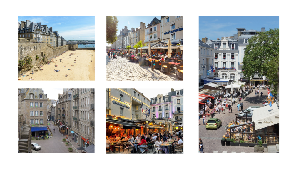
Using InDesign, we will be creating picture stories on A3 page spreads using photographs edited from the St. Malo trip. Here are the settings we’re instructed to use for the page spreads.
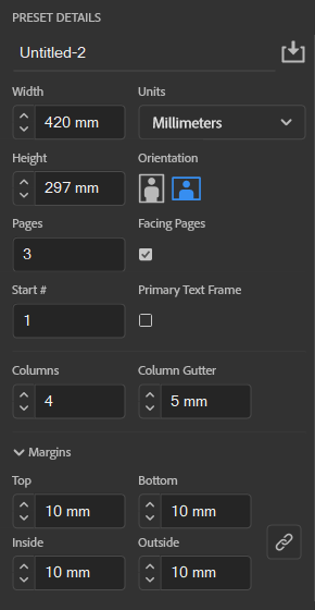
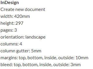
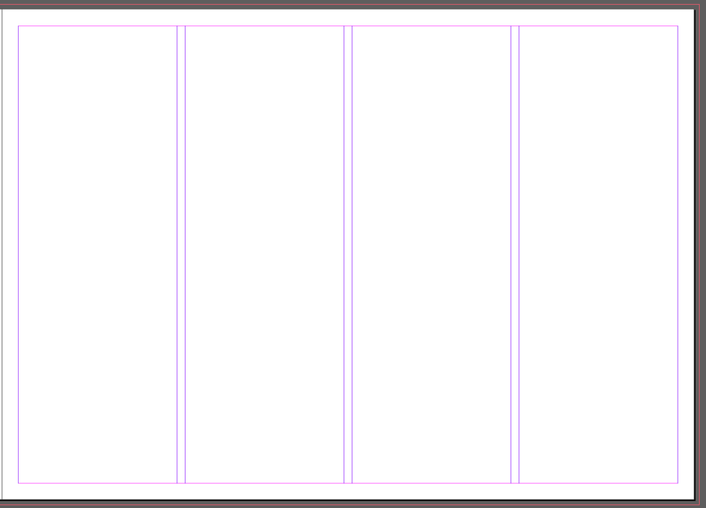
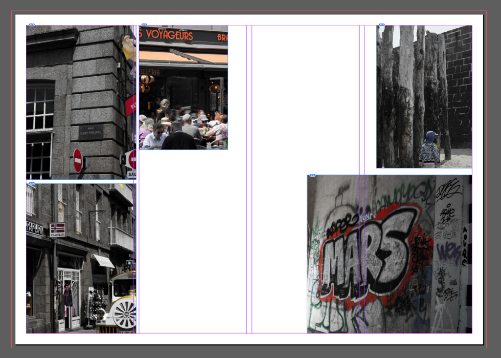
This is what the layout of the page looks like with these settings. This is to aid arrangement of images on the page, and also to allow a border.
First page spread
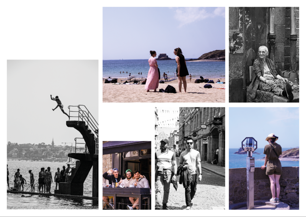
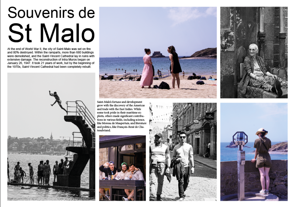
I wanted to put these photographs together as they’re images that I have edited in Lightroom in a specific way.

By decreasing the vibrance, and increasing the saturation, it makes the image black and white but also saturates bright colours in the image. I planned on using all black and white for my images on my page spreads, but I think this makes some of the photographs more interesting, allowing certain colours to pop and grab attention. This also creates a red motif across this page spread, as most of the images I selected have red elements. As well as the red, there are also elements of blue and white which collectively create the colours of the French flag.
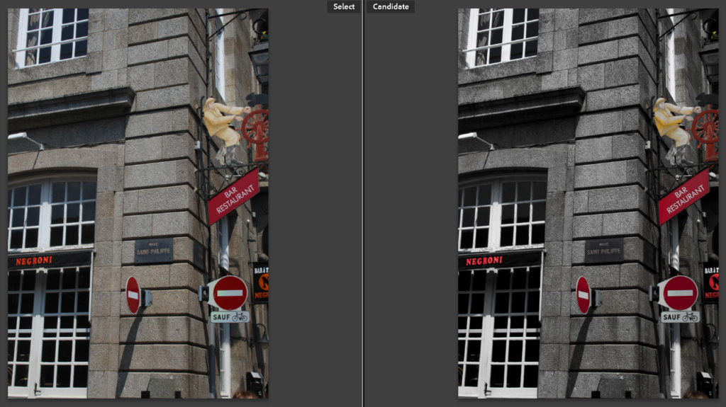
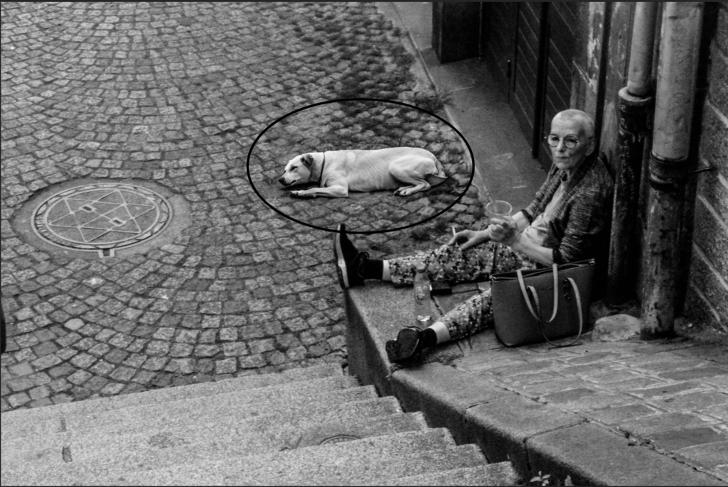
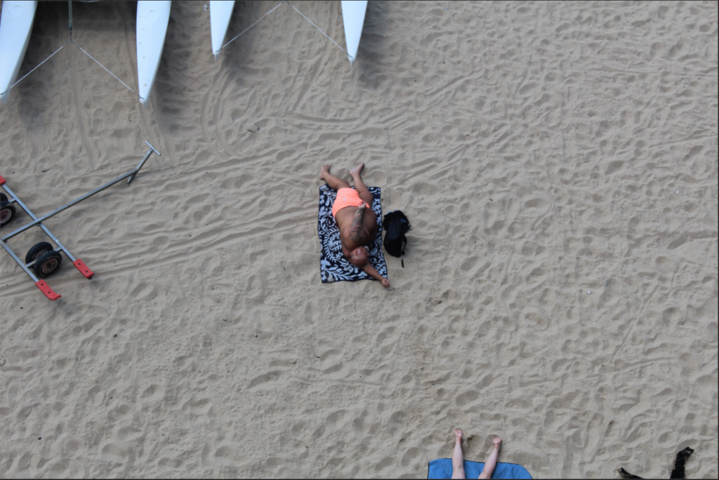
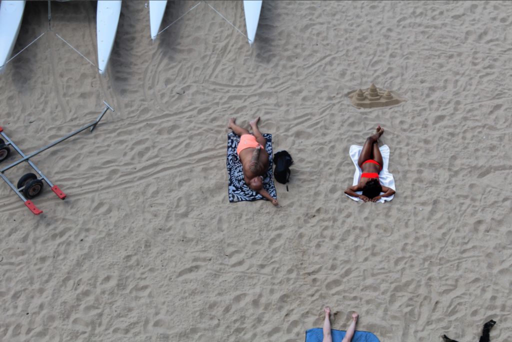
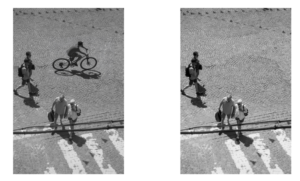
As an example, this is one of the images I used in this first page spread. It shows a before (left) and after (right) of the editing.
Second page spread
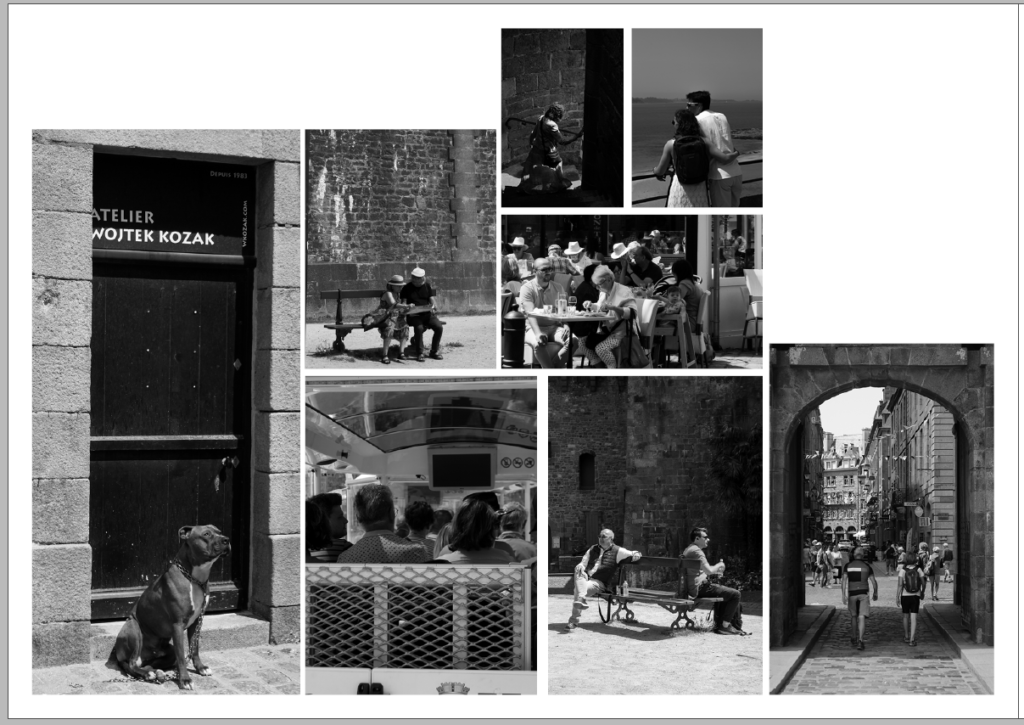
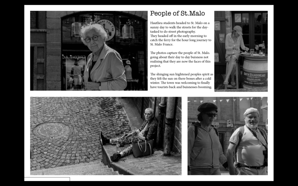
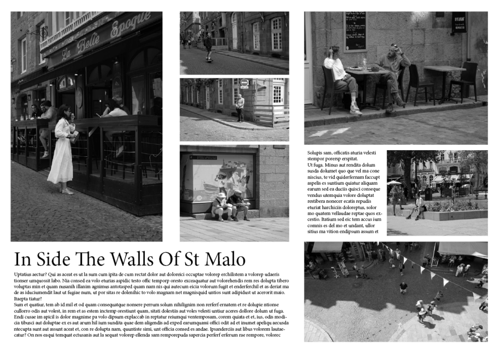
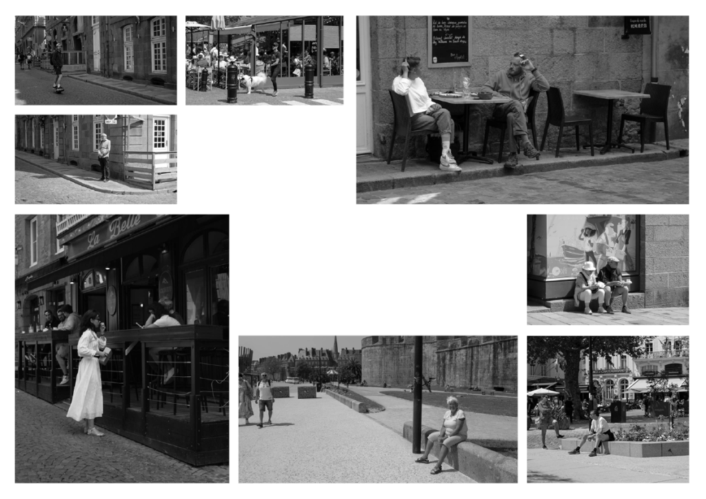
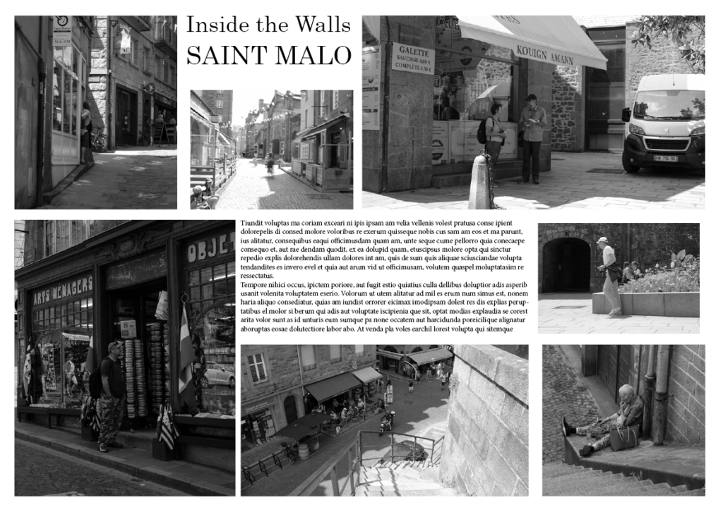
This is a screenshot of my first attempt at trying to select and arrange images on the page in an ordered fashion. However, it just looks disorganised and messy with no cohesion.
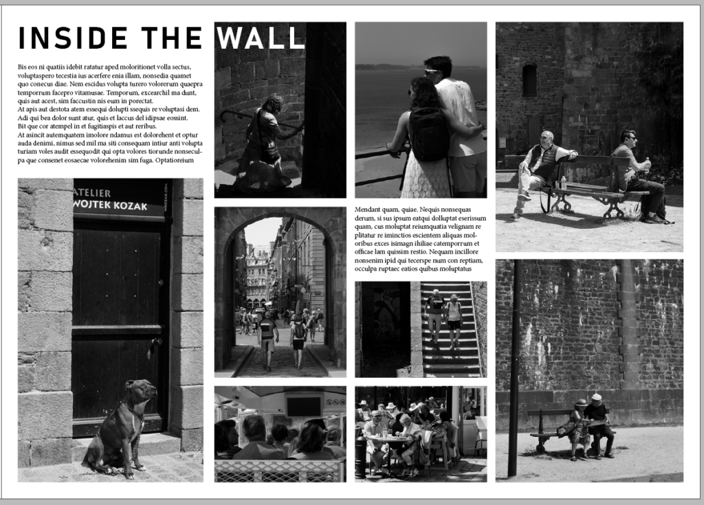
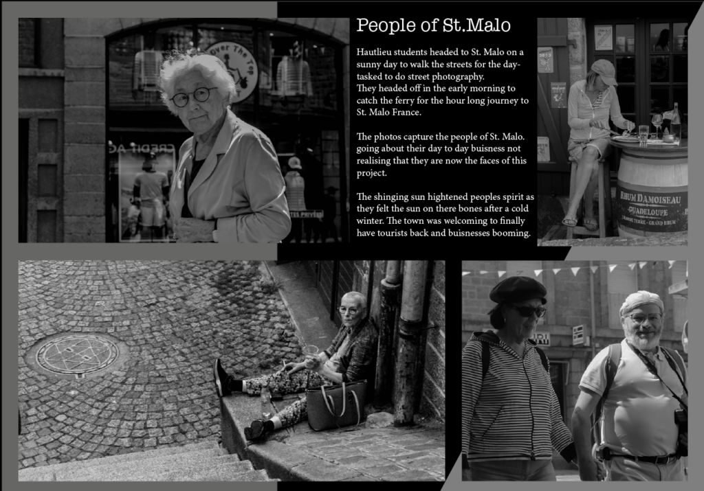
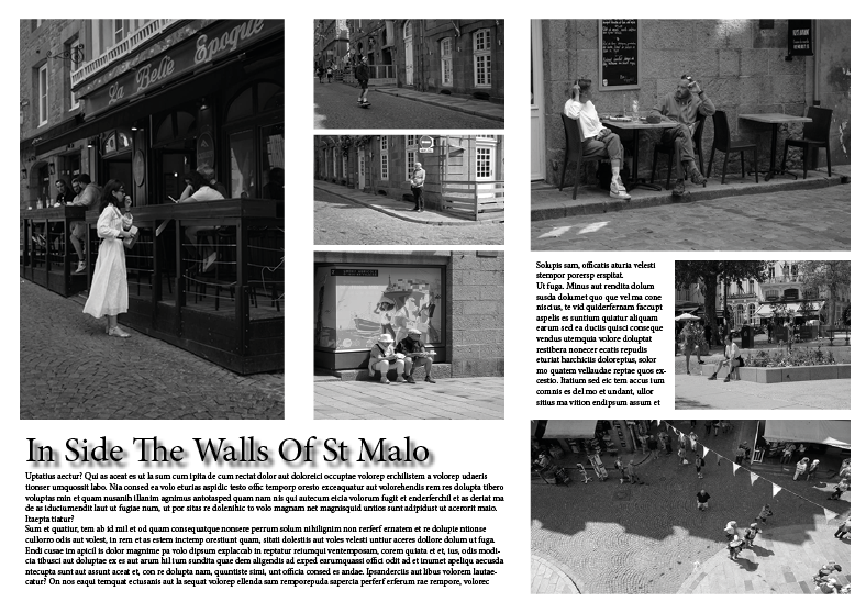
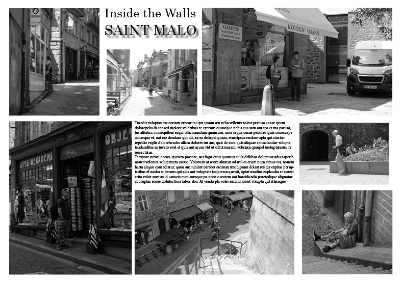
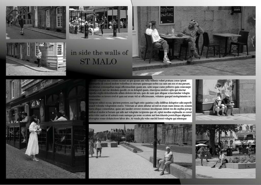
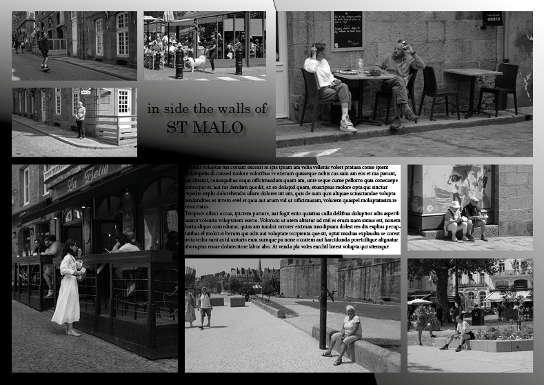
After some advice and experimentation, I arranged the images in a more organised and appealing way as well as adding text to fill any empty space. I creating a title ‘Inside The Wall’ for the page spread, referring to being inside the St. Malo wall which is where I took these photographs. As the title ran over the image on the page, I decided to make the ‘Wall’ part of the title white so that it stands out and is still eligible for readers.
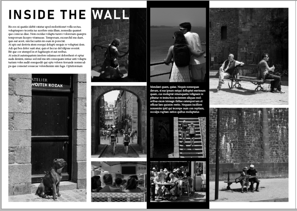
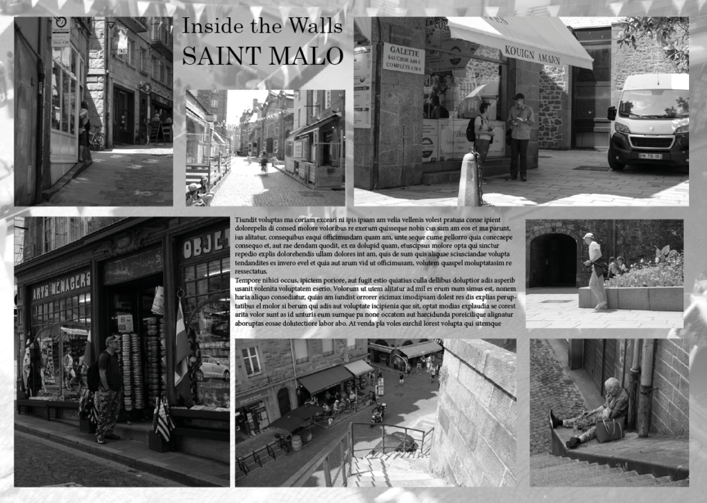
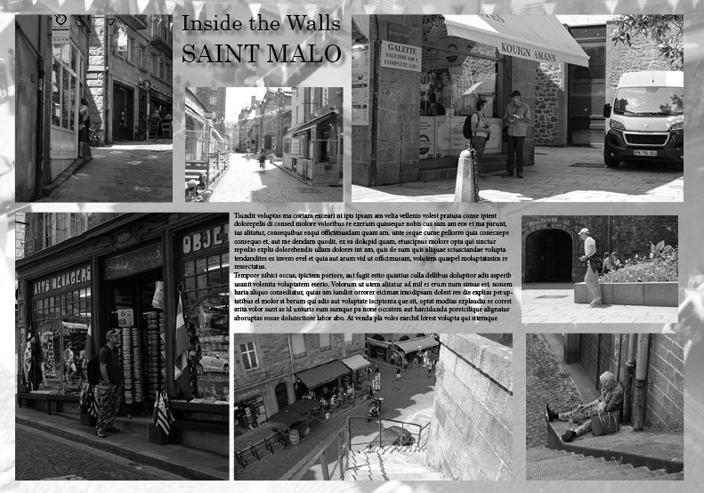
This screenshot of my design doesn’t have many changes from the previous design above. However, I added a strip of black (seen off-centre on the page) as well as making the text white so it is still eligible for readers. This is a small change but is nice as it makes the spread a little more interesting and less uniform.
Third page spread
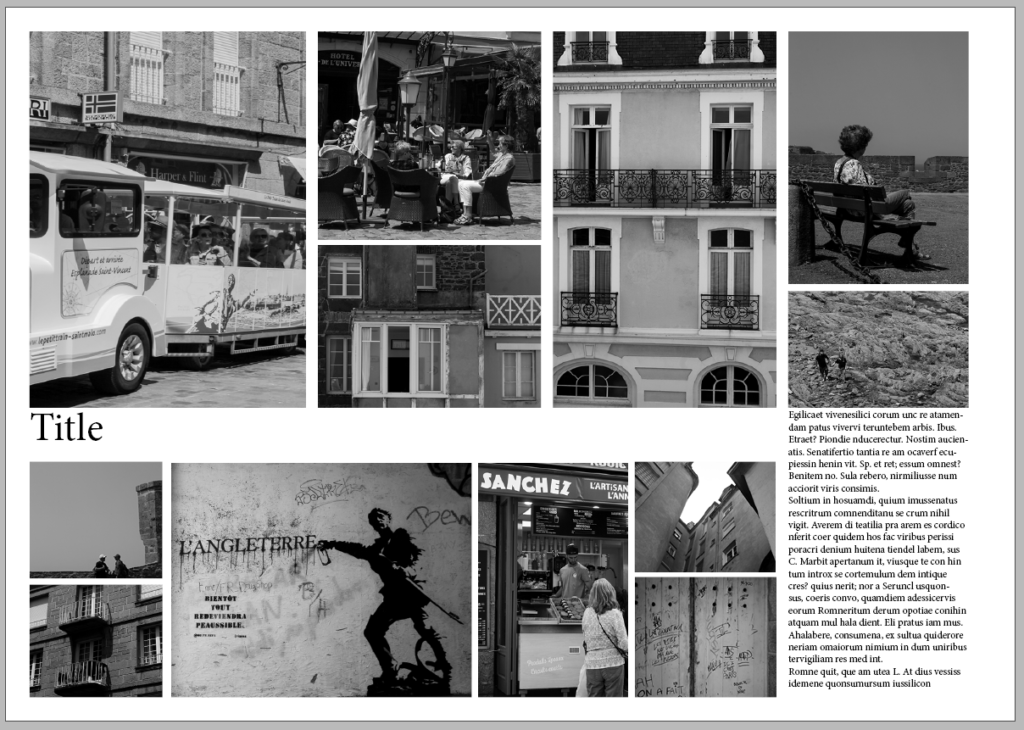
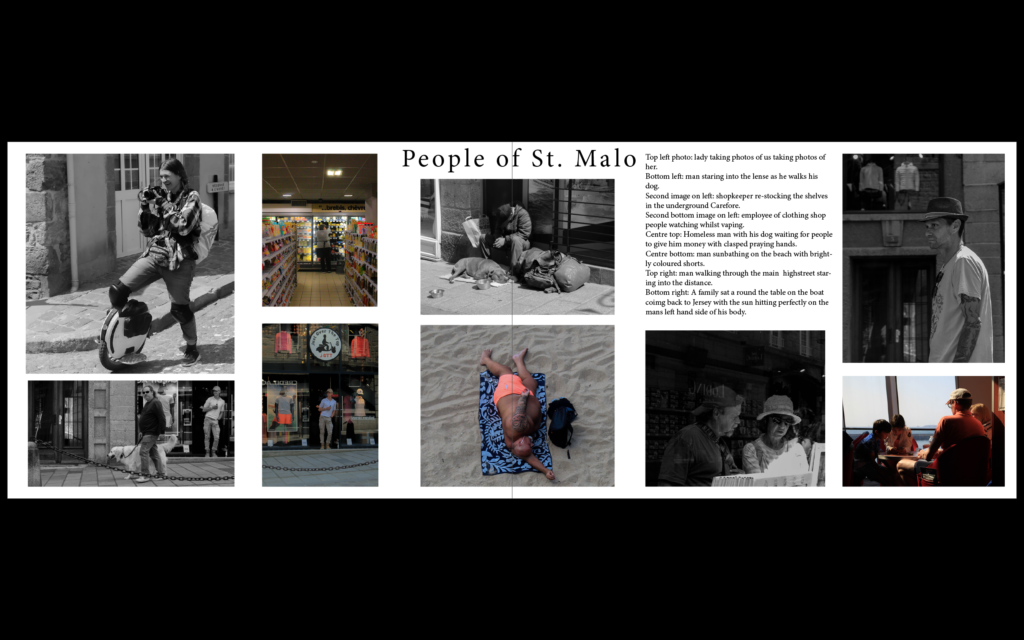
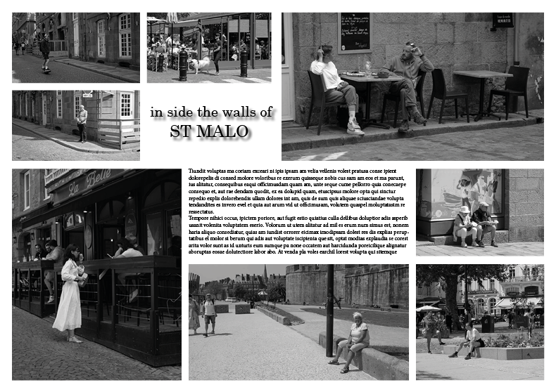
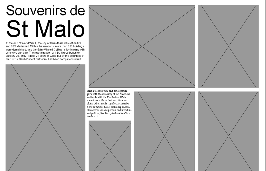
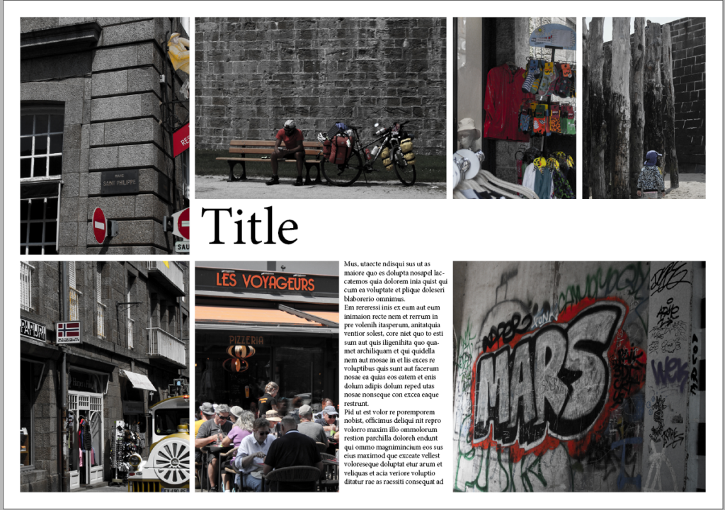
This page spread design shows my chosen layout of images and some added text to fill empty space. I like this layout and think it’s visually appealing as it is very neat and uniform.
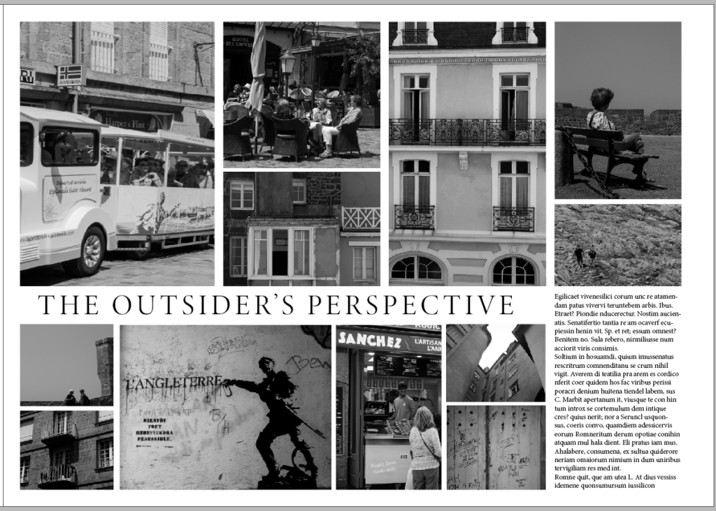
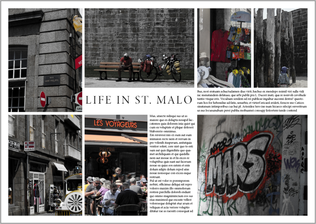
This design is the same as above, with the addition of a title for the spread. I came up with ‘The Outsider’s Perspective’ as I was a visitor in St. Malo taking photographs, which are from my perspective as a tourist.
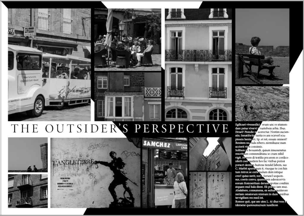
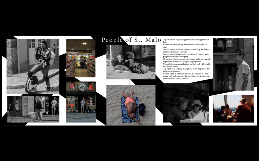
I wanted to add something to make it more exciting like the previous spread. So, I decided to add two diagonal black strips which form a cross. I also now had to make some of the text white so it can stand out against the black, which was quite time consuming. Overall, I think this change made the spread much more interesting and intriguing.

