AI Experimentation

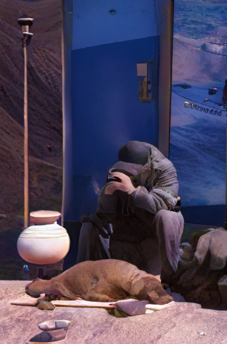
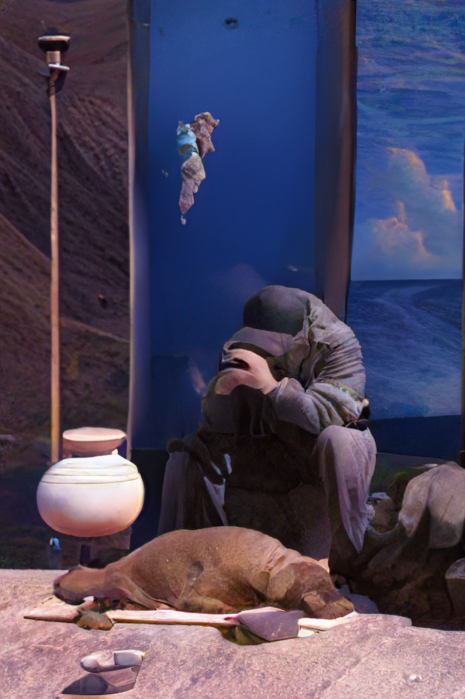
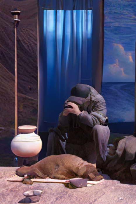
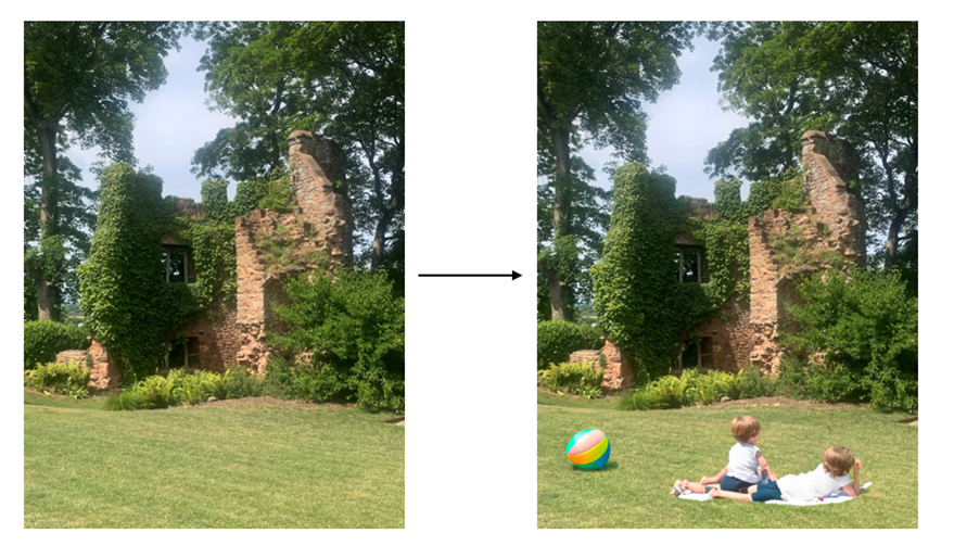
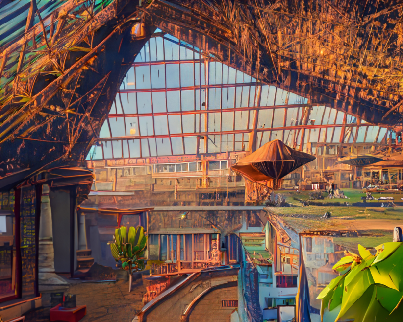
I have used the new adobe photoshop (beta) to create an experiment with new technology. as AI has gained popularity by helping in knowledge and art, it is also a useful tool to use in photography and image making. In the new photoshop program, it is very useful to simply type in a desired object and choose between a couple of generated options. for all photographers and editors, this changes their ways of working to a much simpler one. what is also very interesting to experiment with is making the photographs look unrealistic and quite abstract.

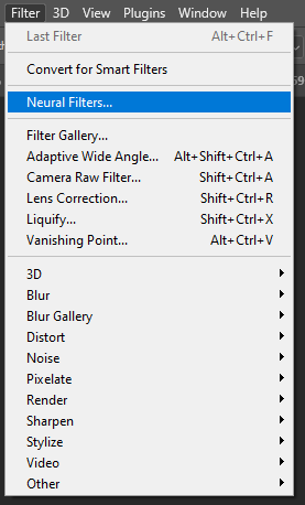
the first step after opening up an image in adobe photoshop (beta) is in the top bar, select Filter->Neural Filters.
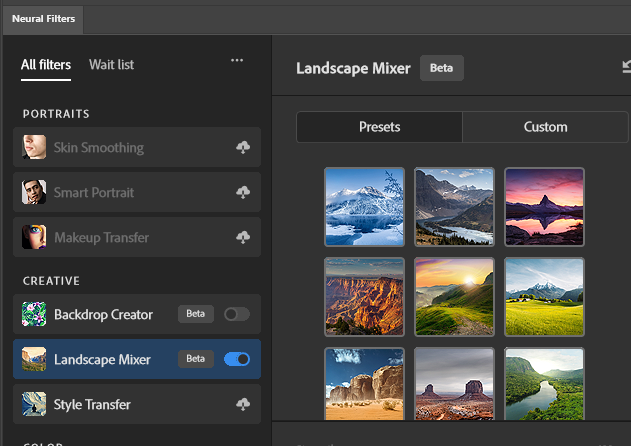
there are many filters that you can choose from that are very helpful, but the ones i decided to work with were the landscape mixer option. there were already presets.
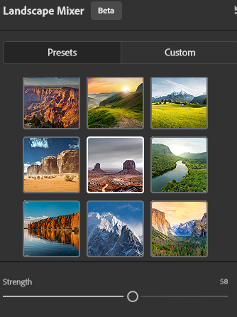
once i have selected a certain landscape preset, the program automatically adds the preset on top of my image. I can control the strength, this allows me to choose how much the preset affects the original image.
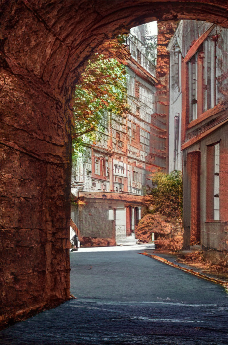
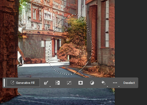
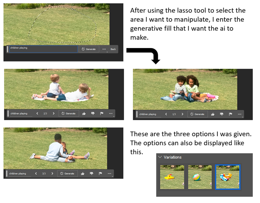
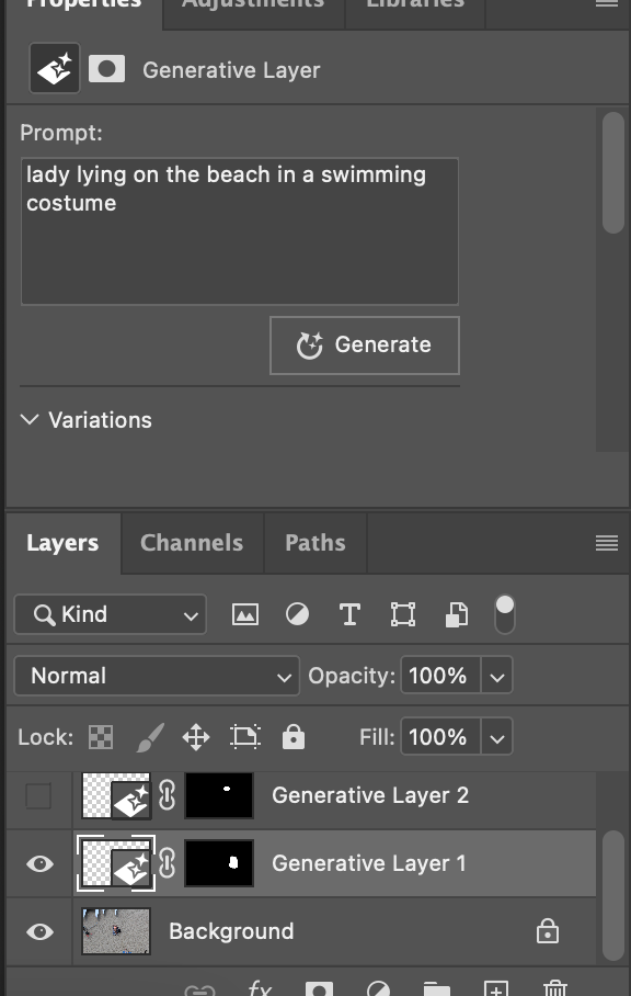
once I am happy with the result, then I select the lasso tool on the left side of the screen. Then I select an area and by selecting generative fill, I am able to write a prompt of what I would like for AI to give me. Then after I can select between three different given options which are all slightly different to one another. Whenever I am not happy with the select I can deselect and repeat the process until I get the results I am happy with.

this incredibly changes the digital image alterations, as instead of having to go through additional process of gathering material yourself, it is all already available for the photographer.
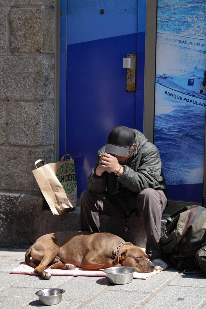
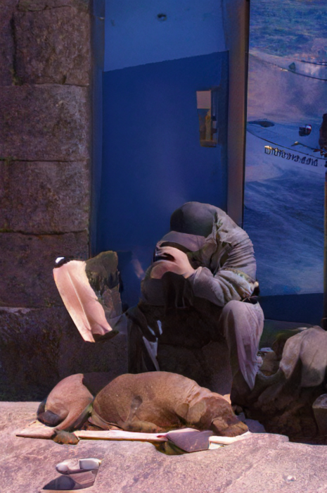
Bellow I have experimented with other images following the same processes as above, I experimented with other presets, and generating other items. for example bellow I have selected a green landscape mixer, then when I was happy with the opacity of it I started generating abstract swirls. this made the image look more abstract rather than real.
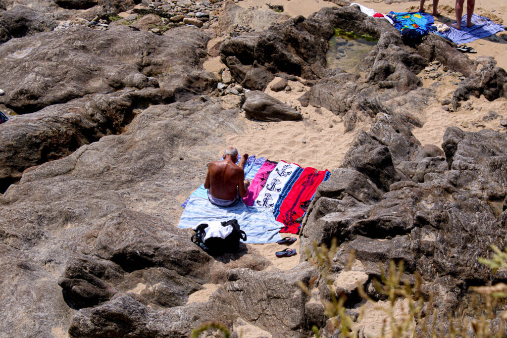
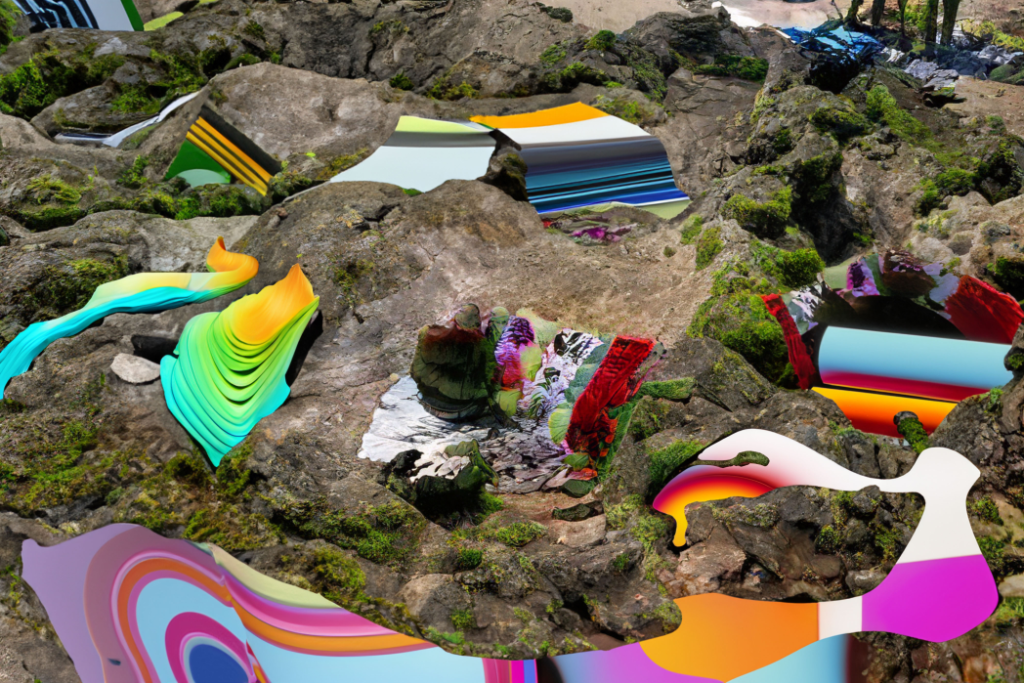
St. Malo plan

plan

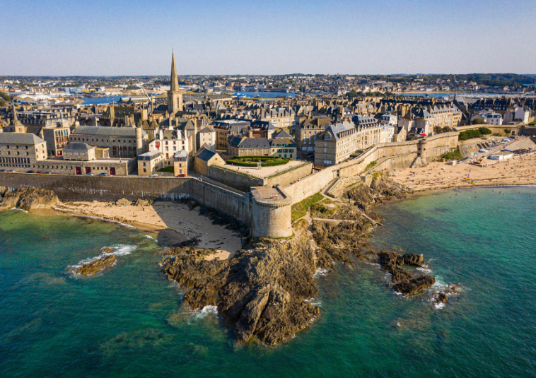
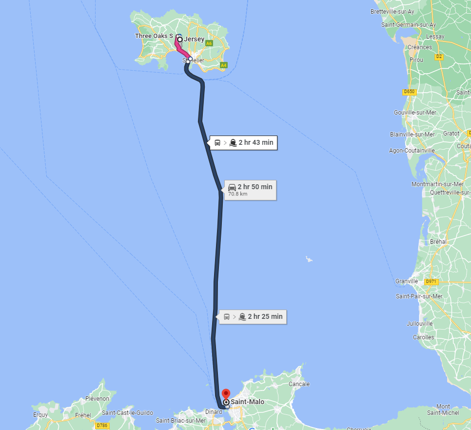
For the St. Malo trip, we will be travelling from Jersey on the 14th of June at 7am and returning at 6pm. After arriving at the harbour in France, we will be walking to St. Malo then break off into groups and walk around the streets of St. Malo taking photos along the way.

Our main goal is to take some photos in the style of street photography, or in other words taking of people in the streets usually without their knowledge.

Street photography mood board

InDesign

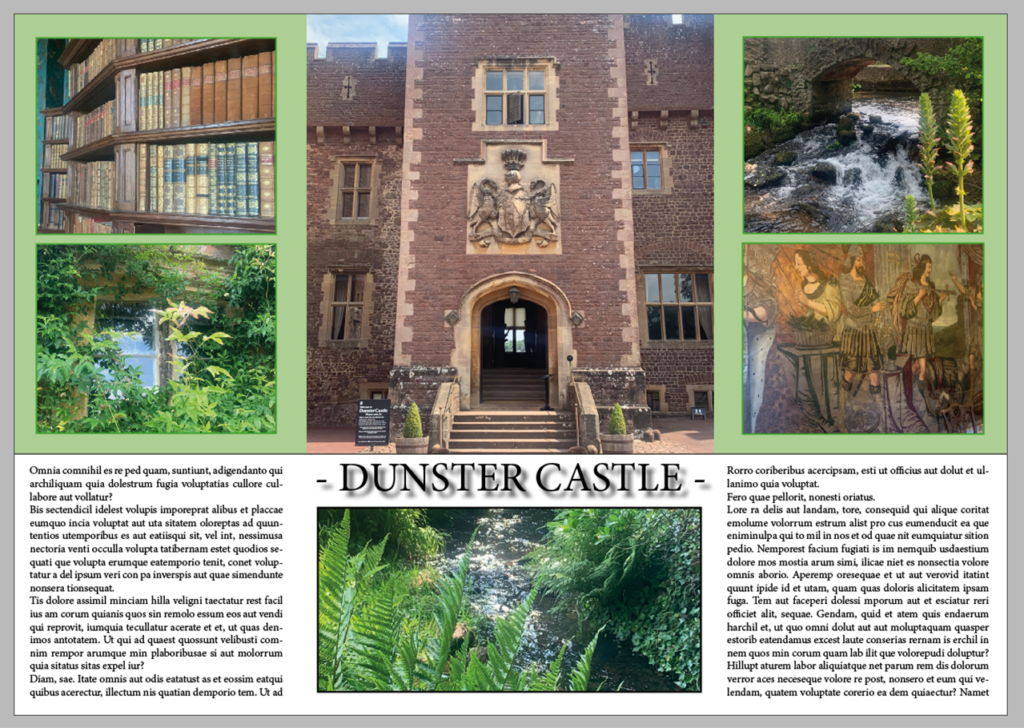
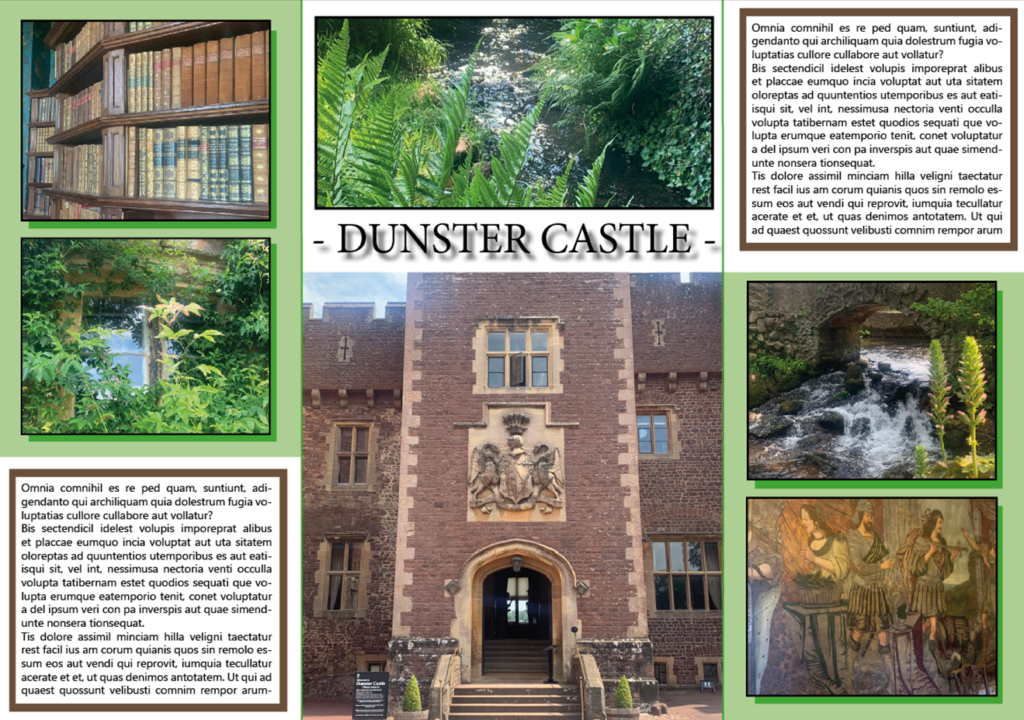
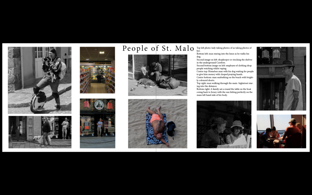
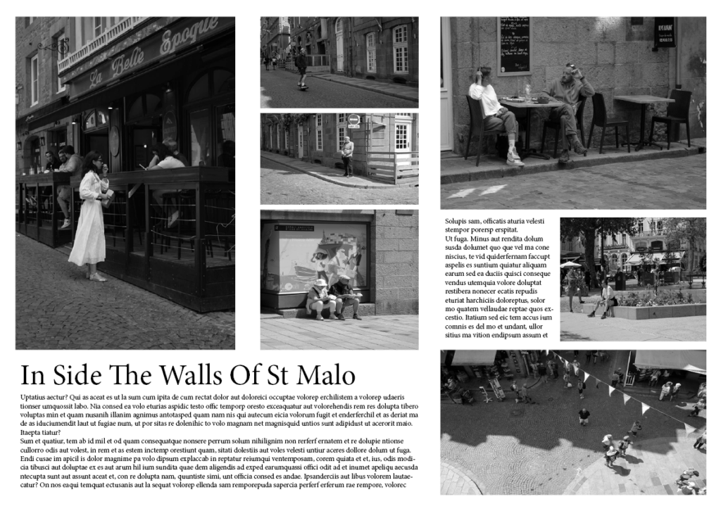
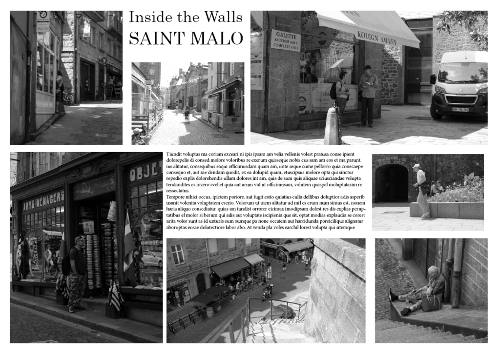
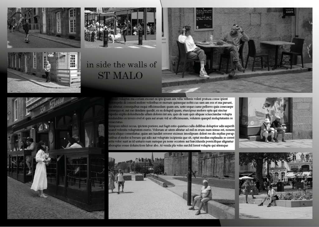
My first attempt of making a photographic spread on InDesign:

What I liked about this first spread is how the pictures have been placed. The colours and photographs create a separation between the main/dominant images and the text and smaller images.

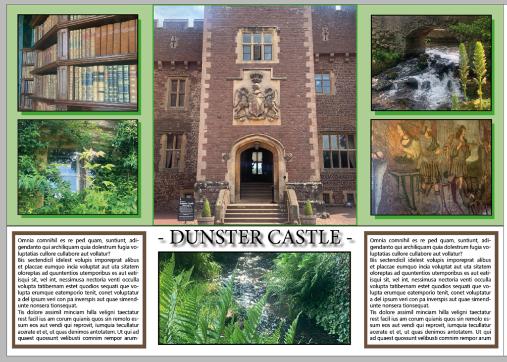
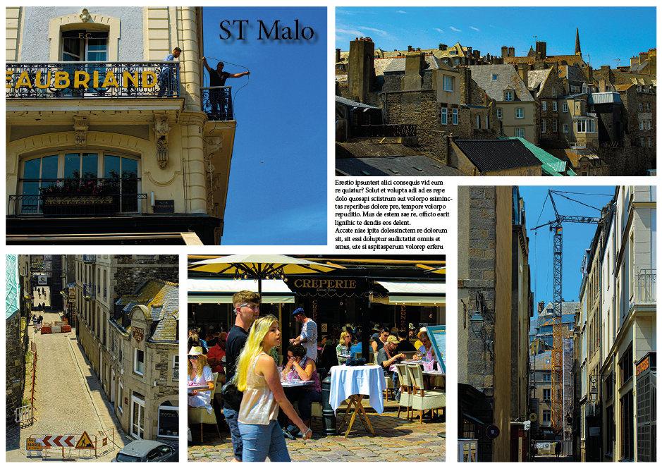
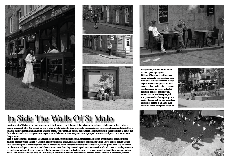
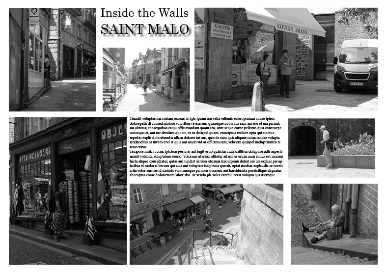
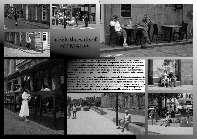
My second attempt of making a photographic spread on InDesign:

I really liked how my first one was placed so decided to copy these and just add onto it. I started off by adding a coloured shadow behind the four smaller images on the top half. I then added a brown border to the text because I wanted to incorporate all of the colours in the images onto the paper.

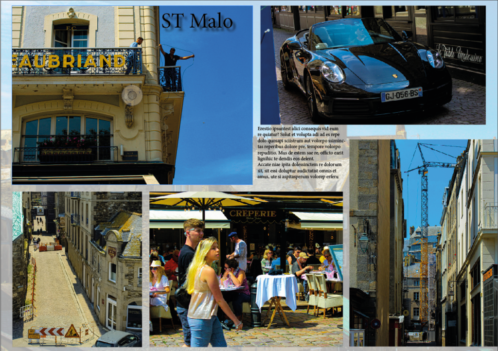
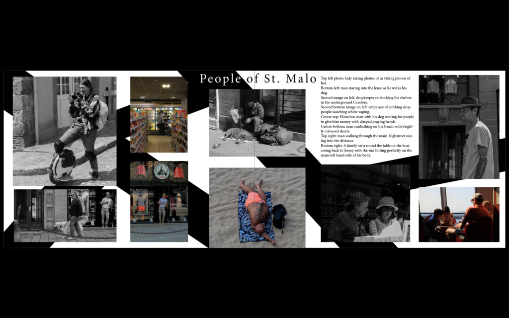
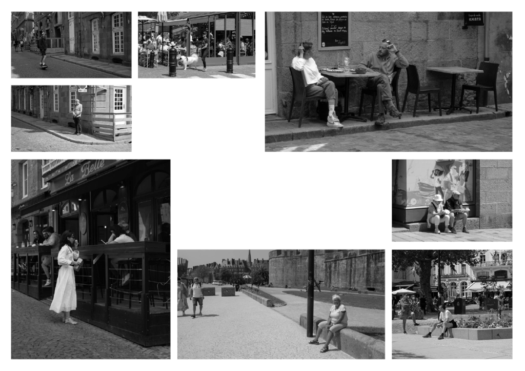
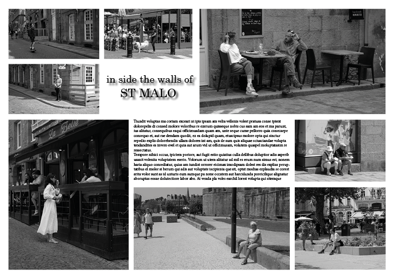
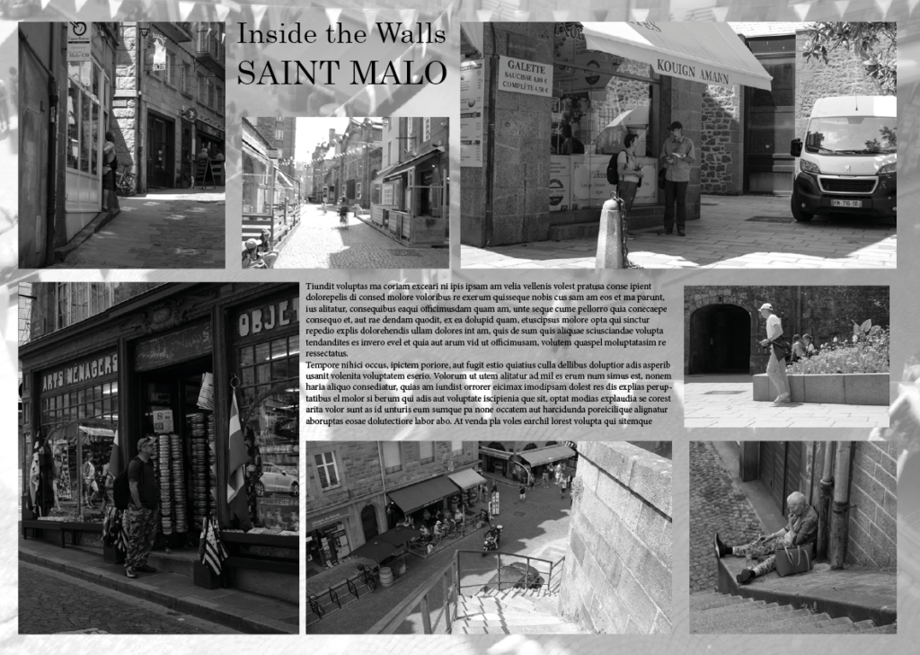
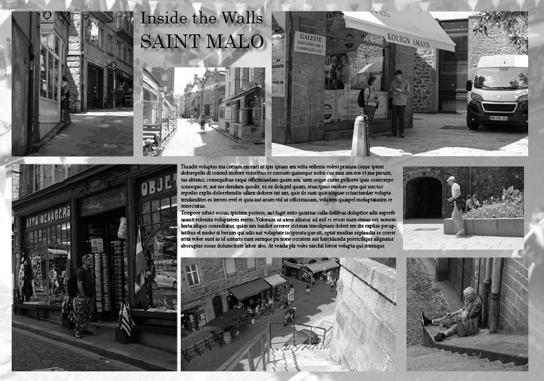
My last InDesign attempt:

I decided to have a small play around with the layout so changed where the text and images were. By doing this I created a diagonal idea with the text and smaller images being on the opposite sides to each other.

A3 page-spreads: design & layout

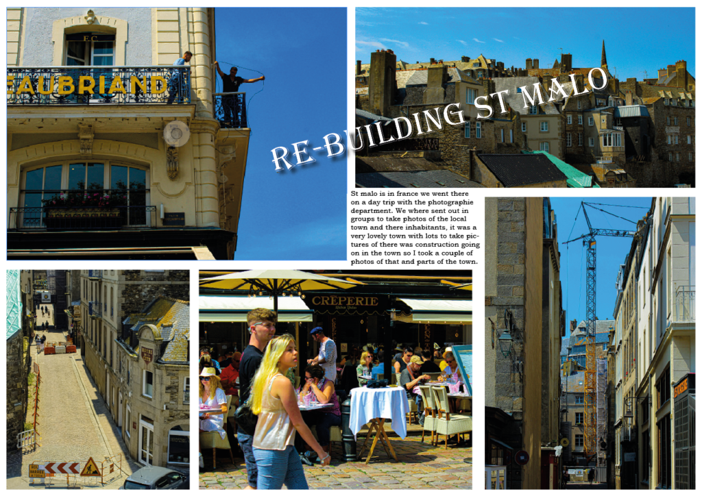
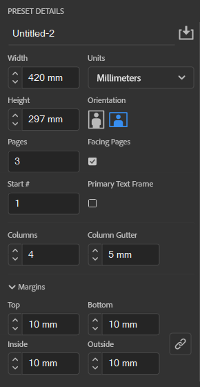
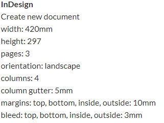
Using InDesign, we will be creating picture stories on A3 page spreads using photographs edited from the St. Malo trip. Here are the settings we’re instructed to use for the page spreads.

InDesign settings

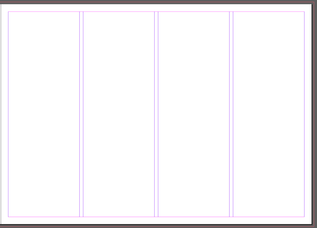
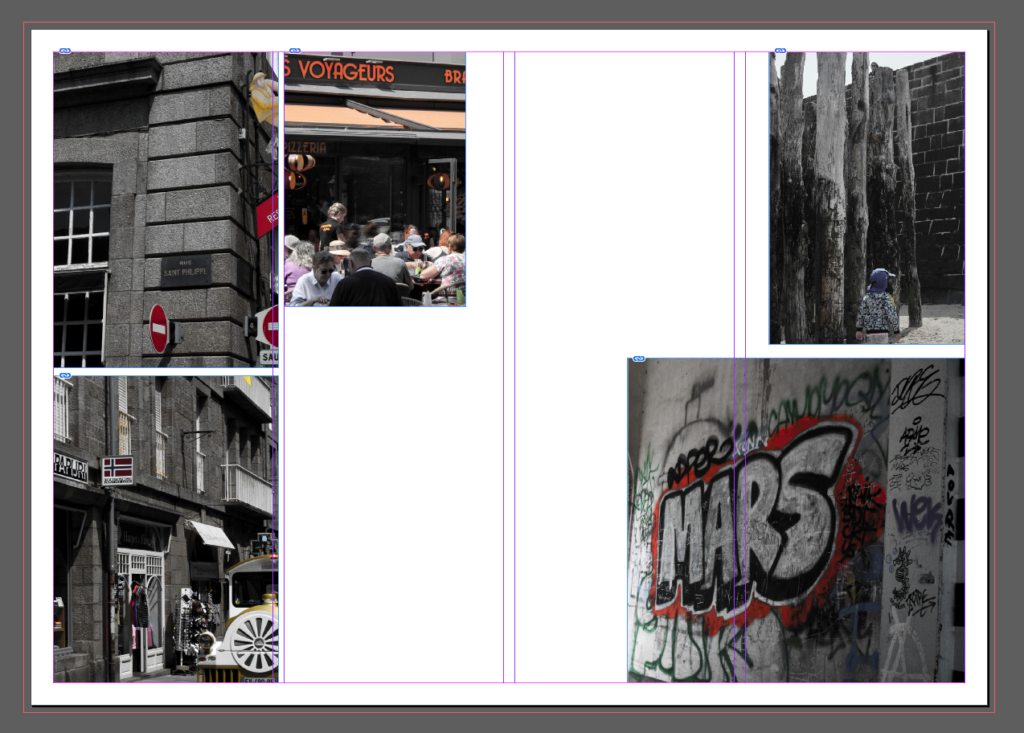
This is what the layout of the page looks like with these settings. This is to aid arrangement of images on the page, and also to allow a border.

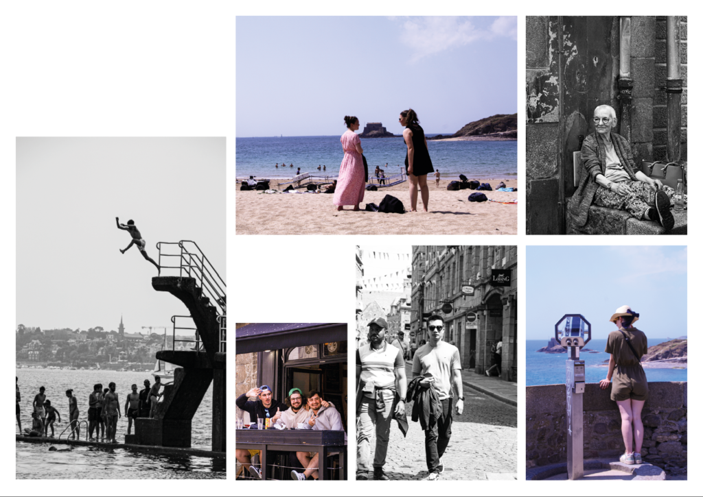
First page spread

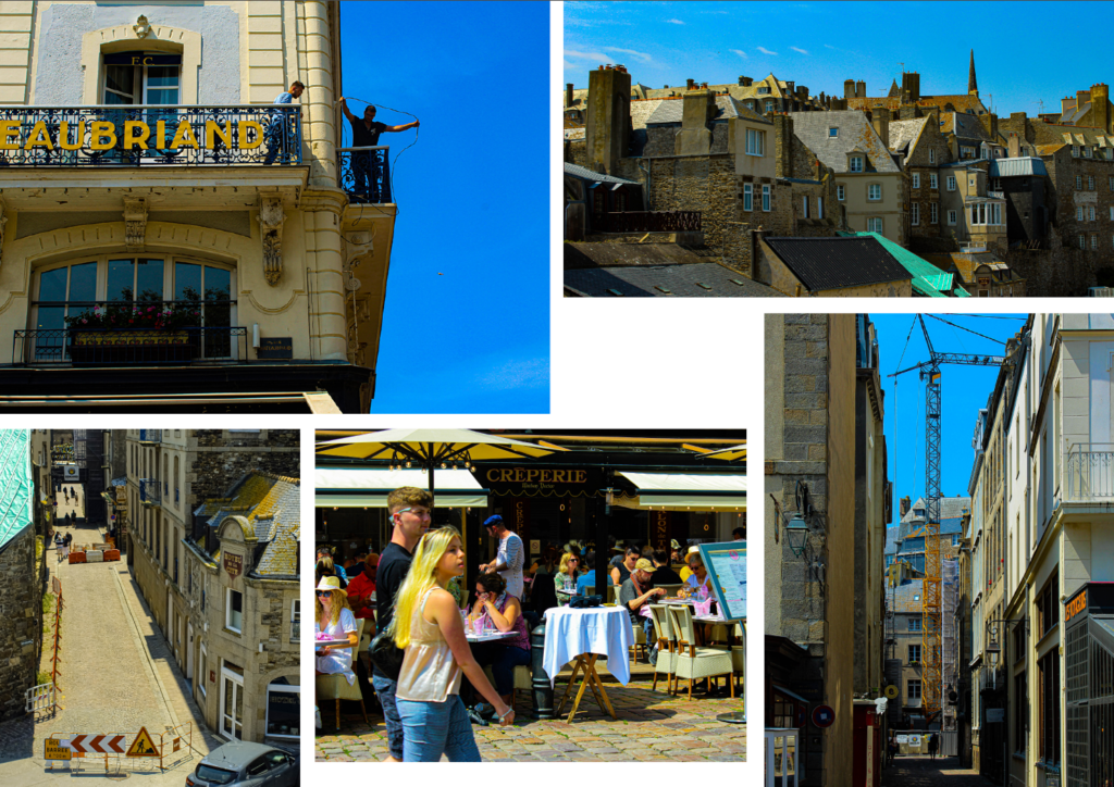
I wanted to put these photographs together as they’re images that I have edited in Lightroom in a specific way.

By decreasing the vibrance, and increasing the saturation, it makes the image black and white but also saturates bright colours in the image. I planned on using all black and white for my images on my page spreads, but I think this makes some of the photographs more interesting, allowing certain colours to pop and grab attention. This also creates a red motif across this page spread, as most of the images I selected have red elements. As well as the red, there are also elements of blue and white which collectively create the colours of the French flag.

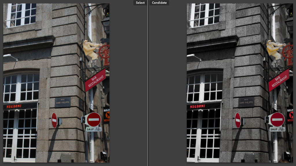
Before vs. after

As an example, this is one of the images I used in this first page spread. It shows a before (left) and after (right) of the editing.

Second page spread

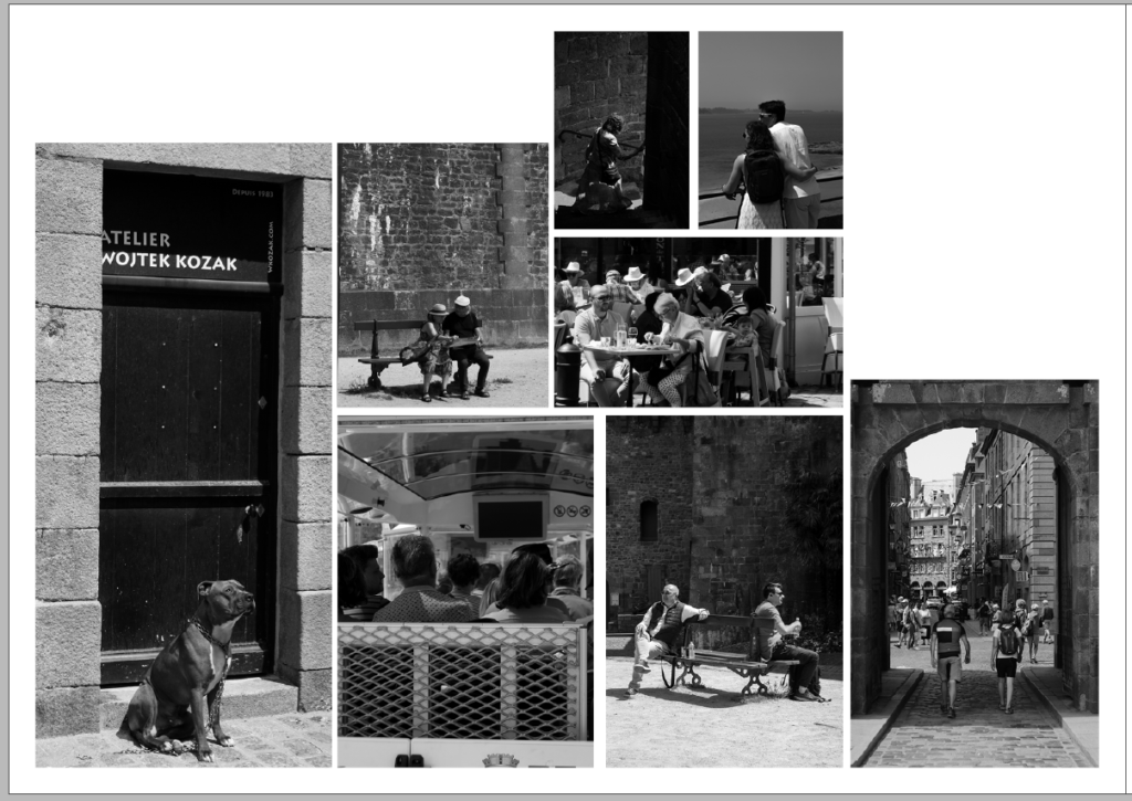
This is a screenshot of my first attempt at trying to select and arrange images on the page in an ordered fashion. However, it just looks disorganised and messy with no cohesion.

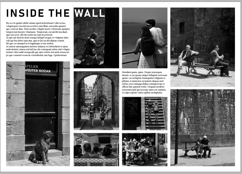
After some advice and experimentation, I arranged the images in a more organised and appealing way as well as adding text to fill any empty space. I creating a title ‘Inside The Wall’ for the page spread, referring to being inside the St. Malo wall which is where I took these photographs. As the title ran over the image on the page, I decided to make the ‘Wall’ part of the title white so that it stands out and is still eligible for readers.

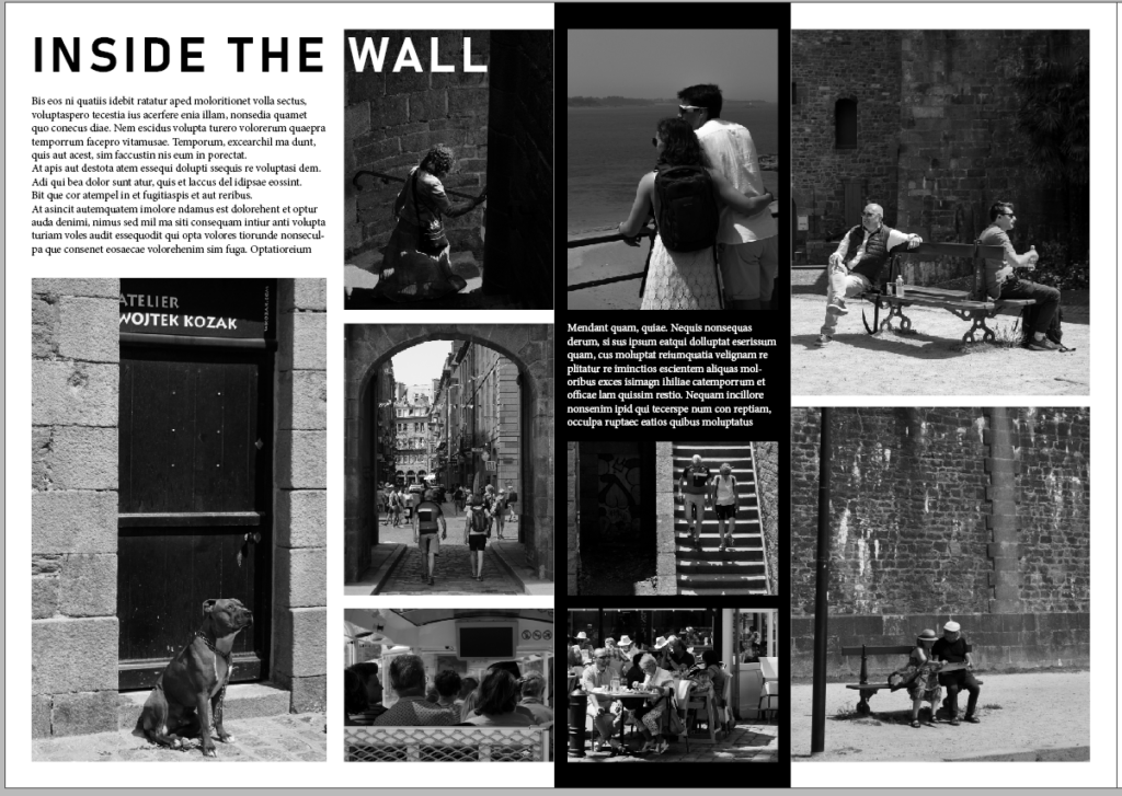
This screenshot of my design doesn’t have many changes from the previous design above. However, I added a strip of black (seen off-centre on the page) as well as making the text white so it is still eligible for readers. This is a small change but is nice as it makes the spread a little more interesting and less uniform.

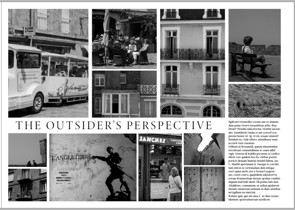
Third page spread

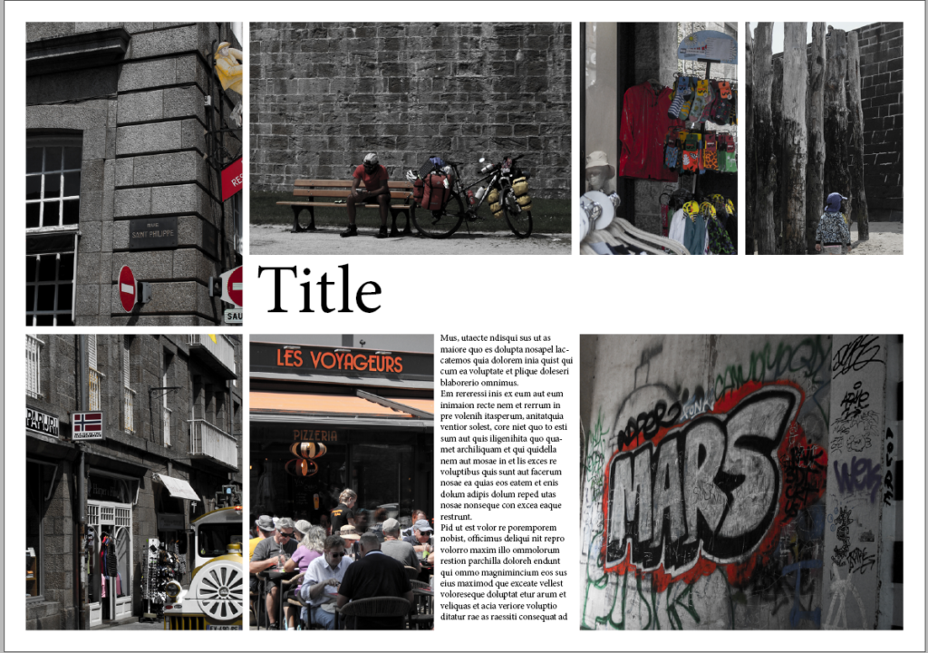
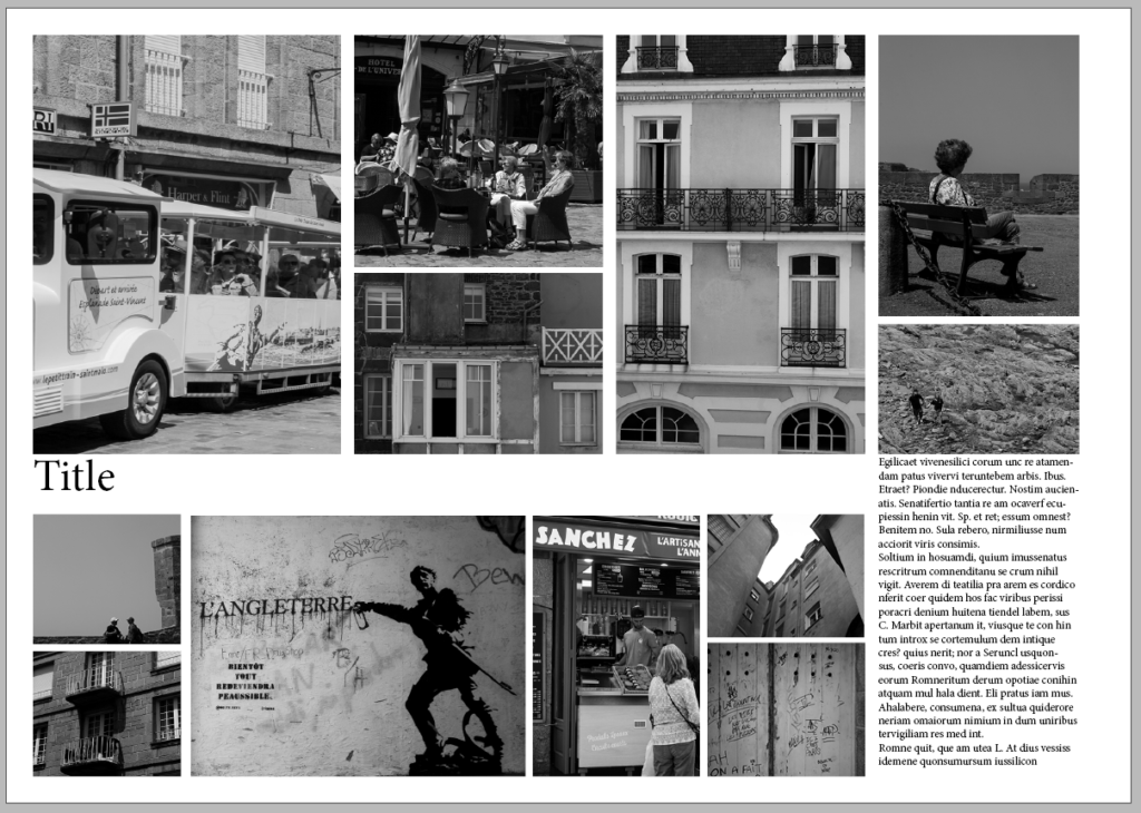
This page spread design shows my chosen layout of images and some added text to fill empty space. I like this layout and think it’s visually appealing as it is very neat and uniform.

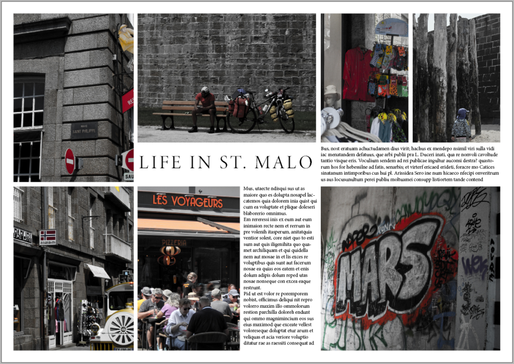
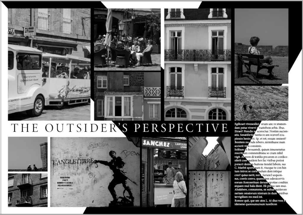
This design is the same as above, with the addition of a title for the spread. I came up with ‘The Outsider’s Perspective’ as I was a visitor in St. Malo taking photographs, which are from my perspective as a tourist.

I wanted to add something to make it more exciting like the previous spread. So, I decided to add two diagonal black strips which form a cross. I also now had to make some of the text white so it can stand out against the black, which was quite time consuming. Overall, I think this change made the spread much more interesting and intriguing.

picture story

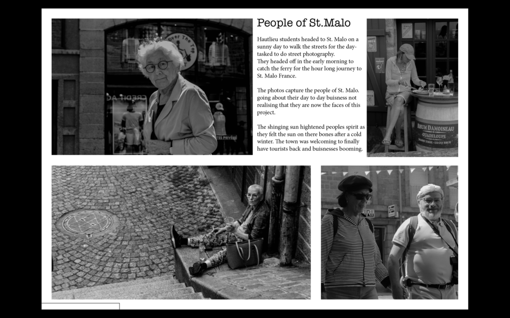
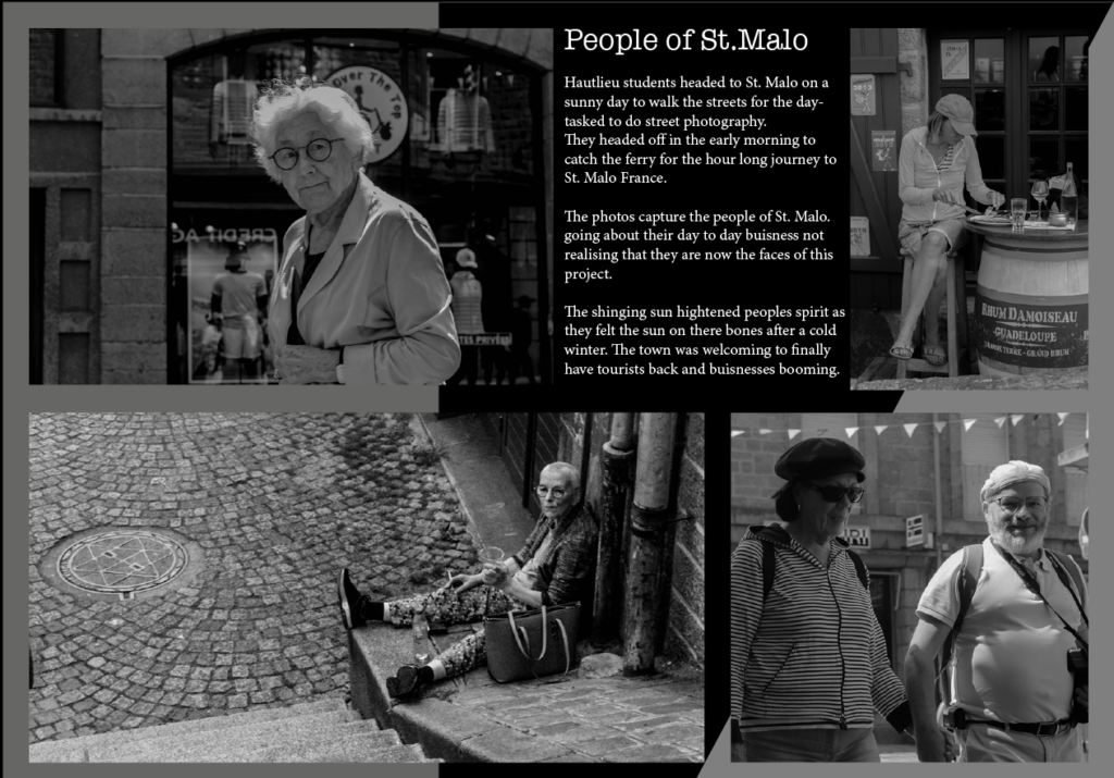
We have been using indesign to create story boards of our images which we look in St Malo, I created two designs with different backgrounds on to experiment and see which one i preferred i liked working on indesign as i was able to play around more with the layout and placements on the photographs more than if i was to do it on powerpoint, i liked how we were able to chose the size on the page we wanted and were able to adjust the images to fit the page well.
My Designs

Photoshop AI

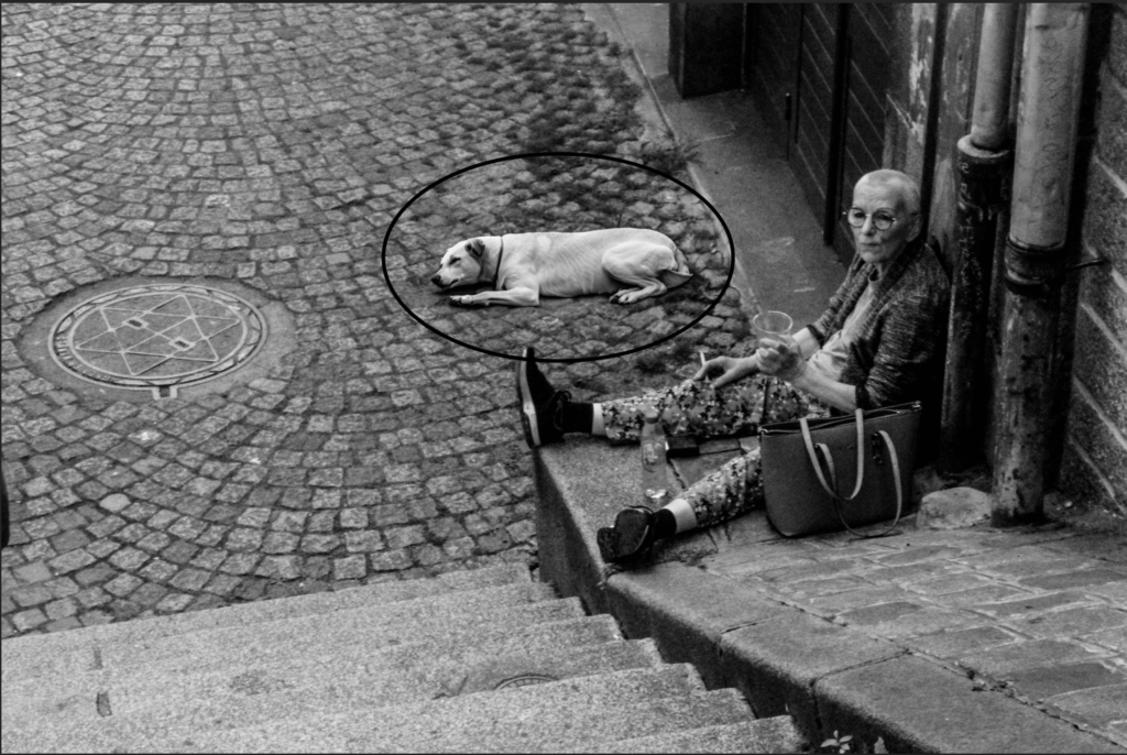
I have been experimenting with photoshop Ai by using photoshop beta here are some examples of photos which i have used ai on.
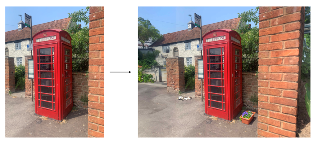
original photo

edited

unedited

Edited

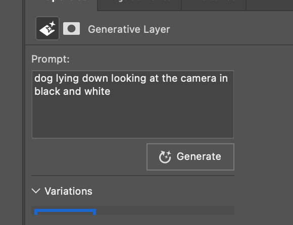
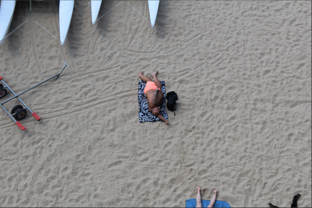
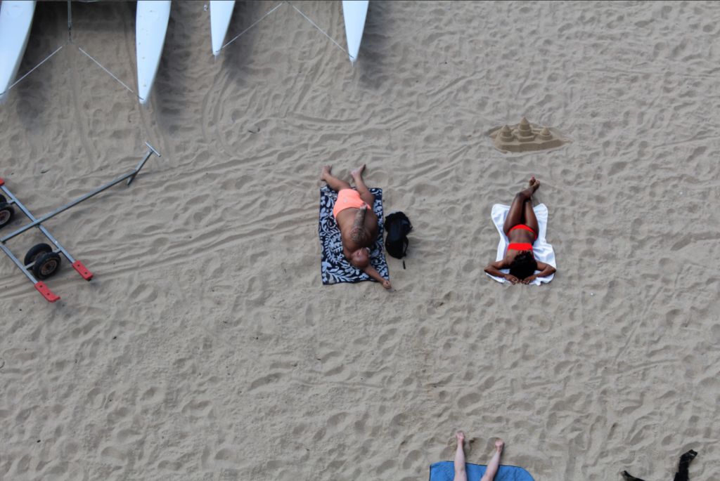
This is what i typed in to get the result of the photo i had to generate it twice till i got an outcome that I liked, the idea behind the photo was to make it more busy as there wasn’t much going on in the photo i thought it looked a bit isolated and simple so there for i wanted to add more to it.

ai experimentation

first edit:

I started off by extending the picture before then adding a flower pot and sleeping cat.

second edit:

Once again, I started by extending the background and then added the car and man walking his dog.

How the experimentation works:

InDesign A3 design spreads

For each design I started out by arranging the images how I want them, leaving space to add a title and text.

Design 1:

Design 2:

Design 3:

For designs 2 & 3 I used the same layout but changed the images around.

Design 4:

For this design I used one of my images as the background. I did this by inserting an image and then changing the opacity.

Design 5:

I experimented with this layout as used the gradient tool to create the background.

InDesign

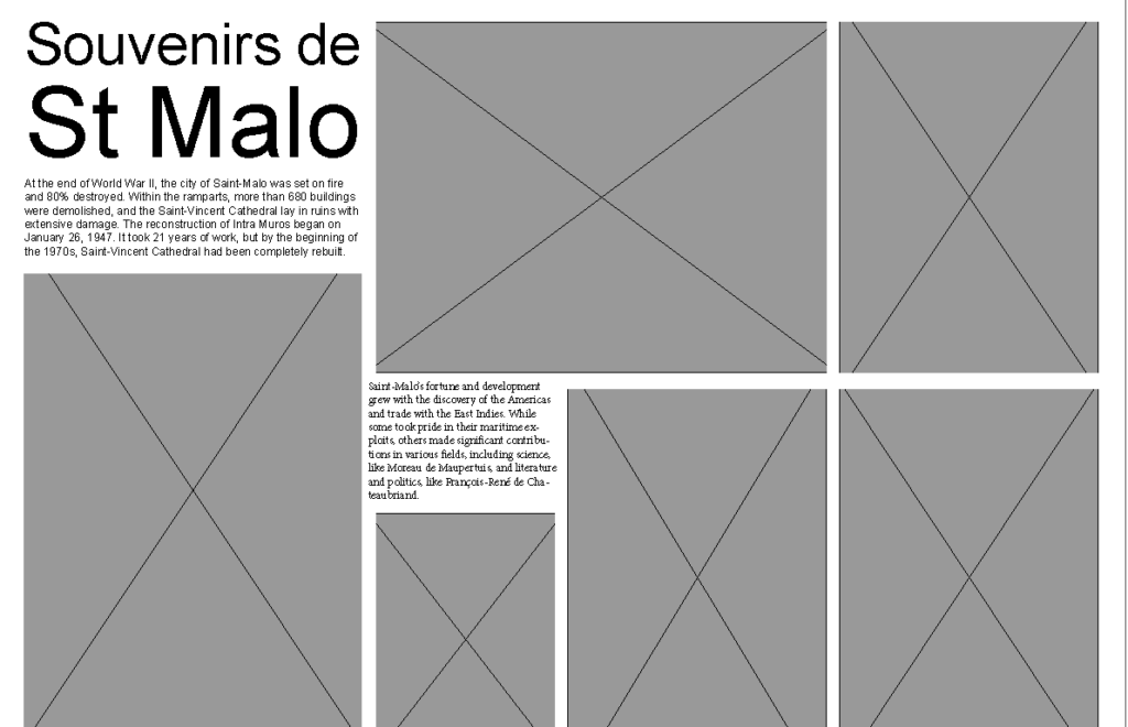
I created this grid on indesign

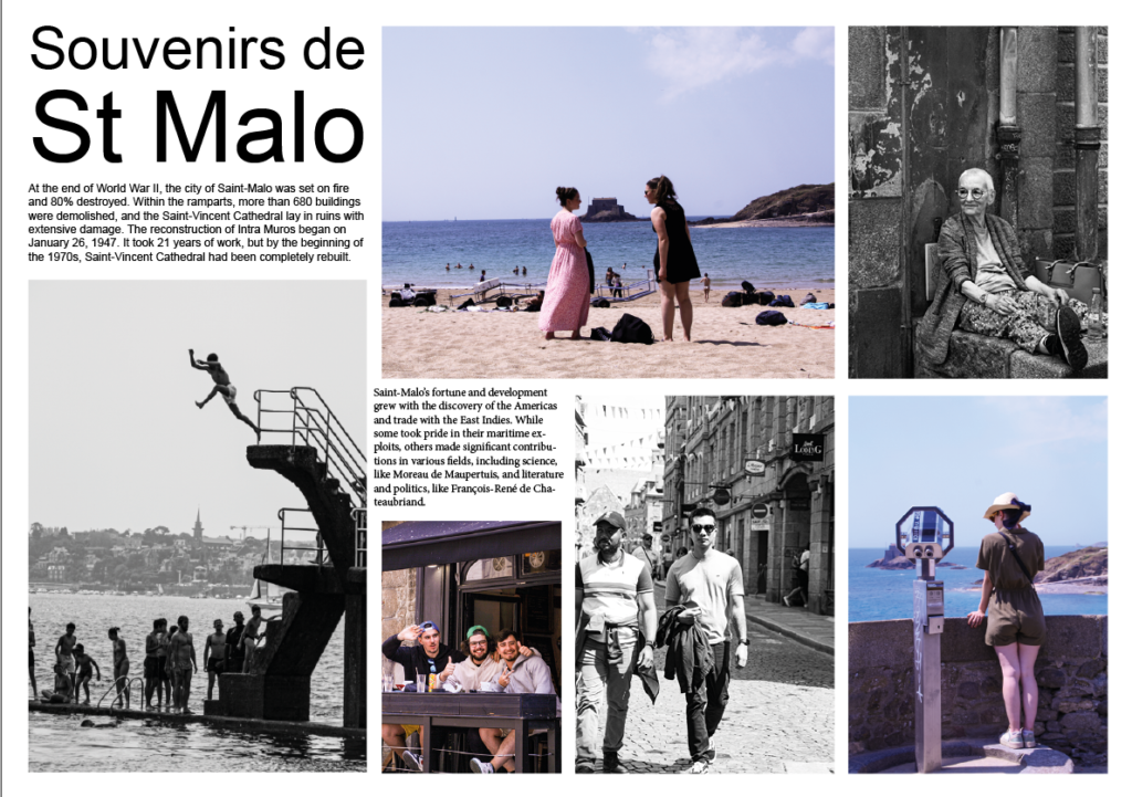
To add the pictures I made these boxes first to help me choose the layout that I wanted. I then added in my text when i was happy with my pictures. For my text I picked the title of Souvenirs de St Malo which translates to memories of St Malo. and then I just put some history about St Malo that I found from google.

This is my final layout