EVALUATION

WHY CHOOSE THE SUBJECT FEMININITY FOR THE IDENTITY PROJECT:

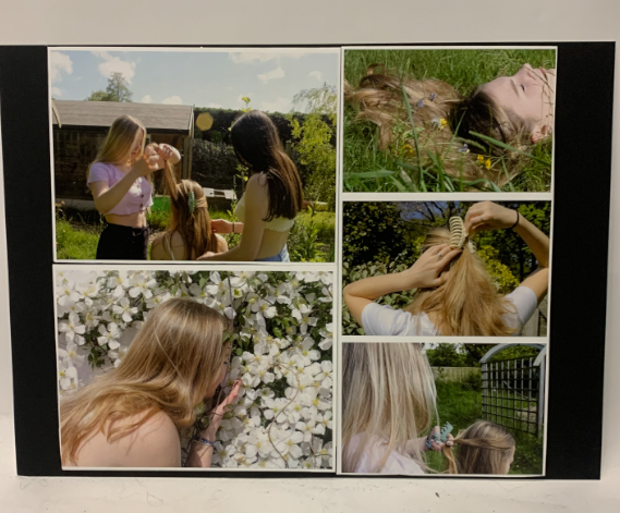
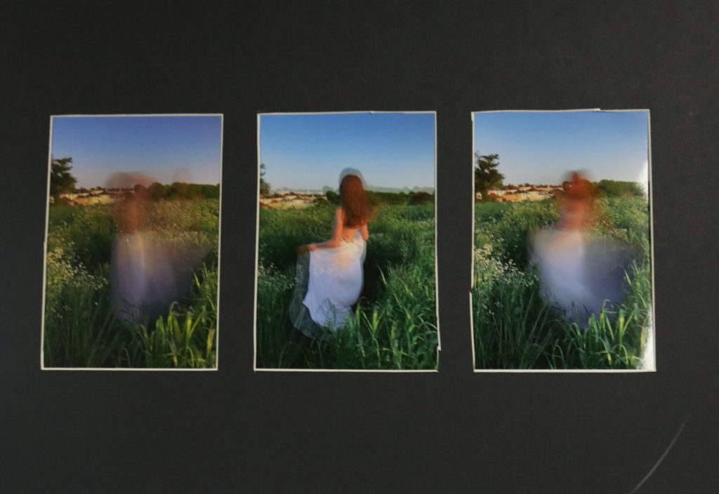
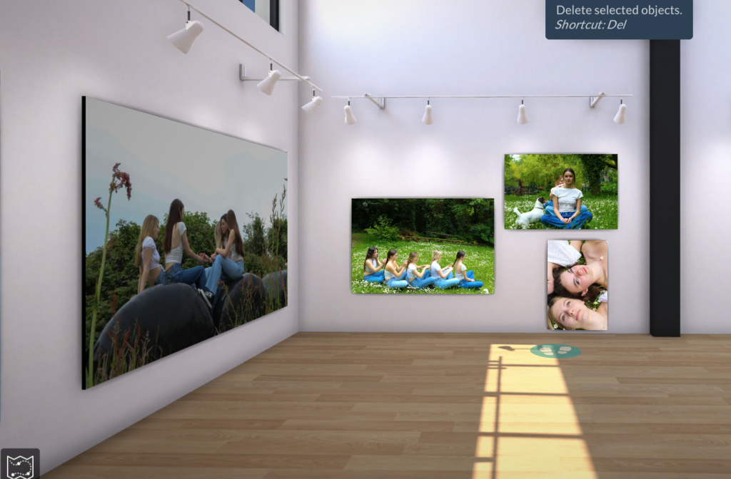
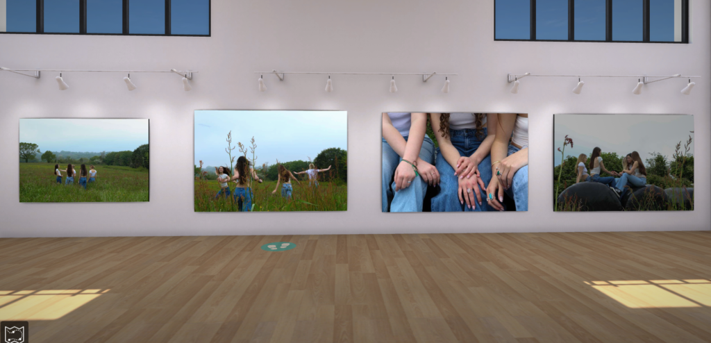
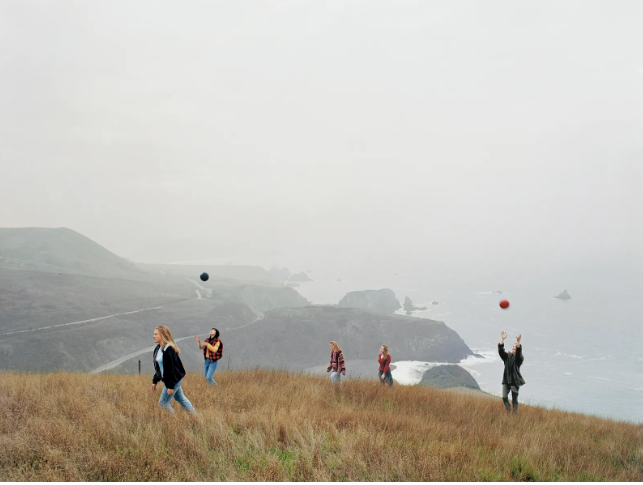
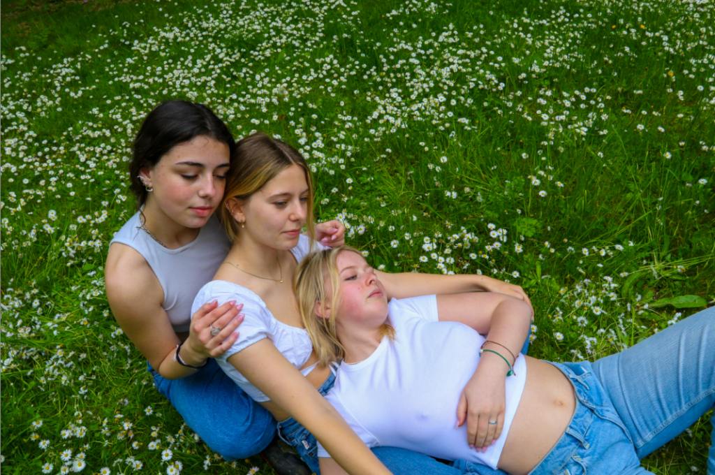
I chose to take my final pictures inspired by Justine Kurland’s ‘Girl Pictures’ and femininity. My aim was to show the stereotypical view of women… represented as soft, gentle and delicate. However, i also liked Justine’s idea which was to present her ‘Girl pictures’ as if girls were trying to run away or escape, being in a group, in rural areas and are shown helping each other throughout the pictures. You could view it in several different ways, the idea that women don’t need men to be independent and survive, the surroundings are very gentle for example lying in a filed with daisies, however, the girls are just apart of the scene they arent trying to be seen as gentle delicate ect. Some quotes from my other artist reference Clare Ray represents this idea: “the way children negotiate their surroundings and respond with an unharnessed spatial awareness, which I find really interesting when applied to the adult body.”, “… each living body is space and has space: it produces itself in space and it also produces that space.” The idea that the you aren’t just living in the space you create the space around you and how it can be perceived. Regarding the project, even though now stereotypes are changing and are less problematic, their is still the dominant ideology of how women should behave and what values they should hold.

HOW DID I PLAN THIS PROJECT:

Going by my photoshoot plan I went to a location that suits the theme of Justine Kurland’s pictures (rural, fields). Going with my friends and attempting to recreate what the girls in Justine’s images were wearing, we chose to do this photoshoot late afternoon to try and get the right lighting however it was still very bright.

PHOTOSHOOT AND EDITING:

Initially, I aimed to create more than one photoshoot, due to time and weather I only completed one photoshoot. Along the north coast is where I took my pictures, my favourites being the ones in a filed with daisies which are a connotation of feminine, gentle and delicate. Within that photoshoot I took around 100+ images so i had a large selection to choose/ edit with. At first, i wanted to leave my images how they were, I was happy with the lighting but still wanted to push myself and see what else would make them look more similar to Justine’s images. As Kurland’s photos almost look vintage, for a couple of my final images I used a vintage pre-set to enhance the more warm tones.

WHAT WENT WRONG IN THIS PROJECT:

I could’ve pushed myself more in this specific project and included different point of views to represent femininity and masculinity, however, as usual I don’t have enough time or transport to achieve what I intend on doing. Its also difficult to find people who are willing to spend a good amount of time participating and being in the photographs. Overall, I feel like I did have a thorough plan which I followed through with and was happy with what I managed to create.

Overall evaluation of whole landscape project:

Concluding the overall portraiture project the femininity and masculinity topic was my favourite as I was inspired and intrigued by Justine Kurland. I have been on top of my blog posts and have spent good amount of time on each of them to make them good quality, whilst also going back into them to improve my work. I’ve learnt a lot about different views of femininity and how it can be represented, and have enjoyed informing myself by reading through websites and theories. I was able to create several analogue pieces, and successfully mounted/presented my images thoroughly and could plan how I would present my work on the blog. Environmental portraiture I struggled in due to time, I did manage to get some pictures however I disliked them so didn’t want to develop them further. In my next project I will try expand my variety of photoshoots and manage my time better.

Evaluation:

Why did I chose femininity for this project?

I chose to do this project based off of Justine Kurland’s ‘Girl Pictures’ as most of the photos within the book go against the stereotypes of femininity. And although in today society it is not uncommon to break stereotypes, back when these photos were taken (1997 – 2002) it was quite rare to see, and Kurland manages to capture this perfectly with the perfect balance of empowering women and also belittling men at the same time. However with my final photoshoot, I decided to feed into the typical stereotype of femininity.

How did I plan this shoot?

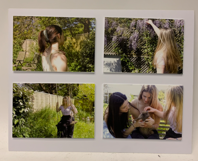
In order to get the best possible outcomes for this photoshoot, I planned to do this shoot on a day where the weather was good with a couple clouds, by having clouds in the sky i believe it adds more texture. When taking photos for this project I got the girls featured in the shoot to wear similar outfits (white top & blue jeans) as white symbols purity and i was wanting to feed into the ideology of teenage girls.

Photoshoot & Editing:

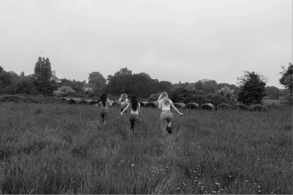
The photoshoot was taken in a field and a lake in St Saviours. I decided upon this field as it had long grass and no buildings in the background which could suggest it is in a secluded area like Kurland’s images. The lake was a perfect place to take some of these images as a number of Kurland’s photos were taken near water.
Evaluation of the whole project:

I believe I have done well in this project, and my skills and knowledge with cameras have improved a lot as I now how to navigate myself around the different camera settings. I am very happy with the outcomes of my images and think I have managed to keep roughly on theme for each shoot. However I do need to work on sticking to my artist references a bit more and need to improve my blog posts by adding more context and information to each one.

Doing studio lighting portraiture was interesting for me as there were many things to do and I enjoyed figuring out the different ways lighting can affect your face. I believe that this was quite a simple shoot to do as the studio within school is very accessible therefore i was able to go down most studios and try to improve my skills.

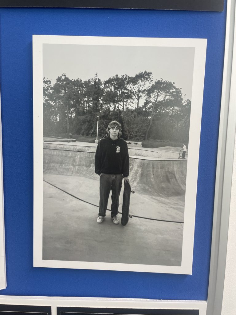
I really enjoyed doing environmental portraiture as it is very social and each image holds a photo. When doing this shoot, I walked into other peoples environments and every photo was able to show someone’s character, lifestyle and personality. However, not all of my outcomes for this project came out as well as I hoped and I believe this is due to me not experimenting with lighting outside of a studio.

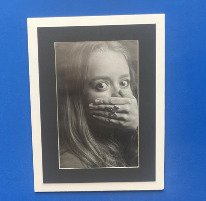
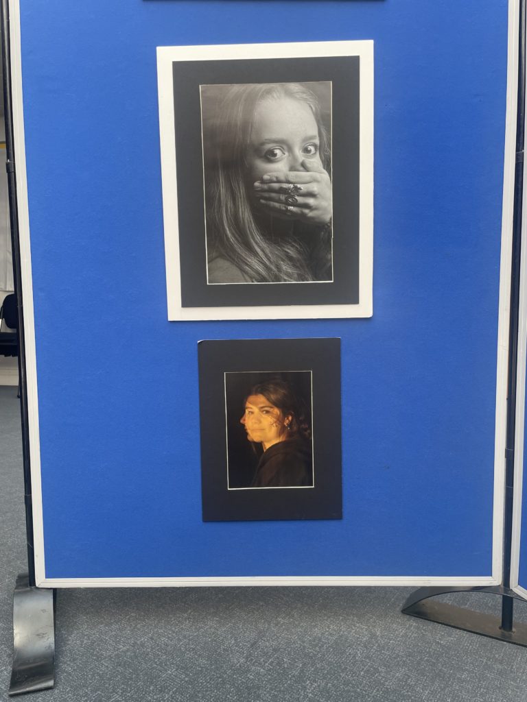
Final Mounted images

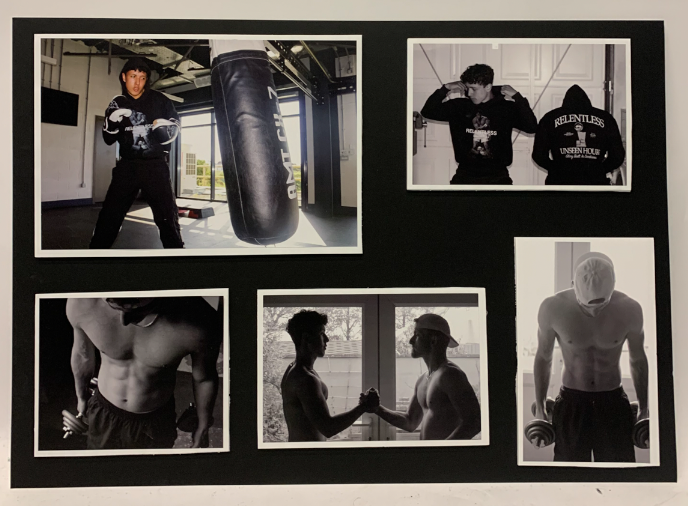
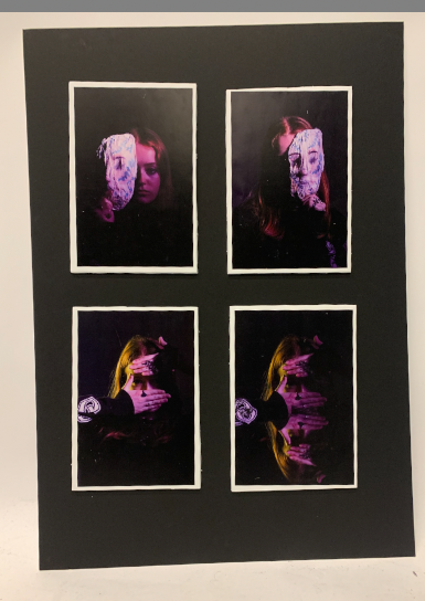
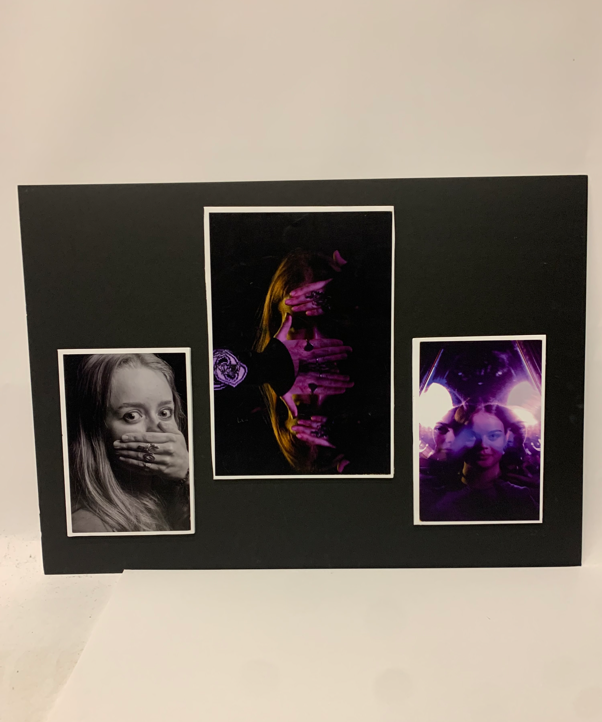
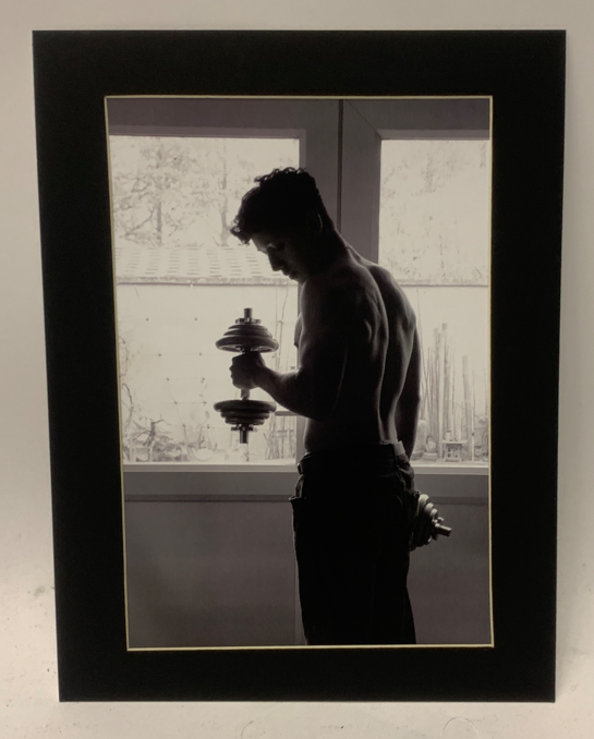
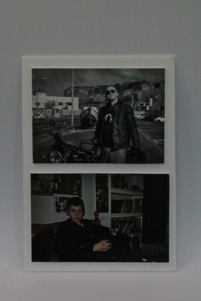
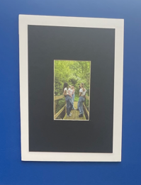
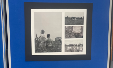
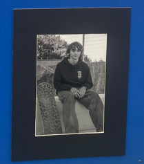
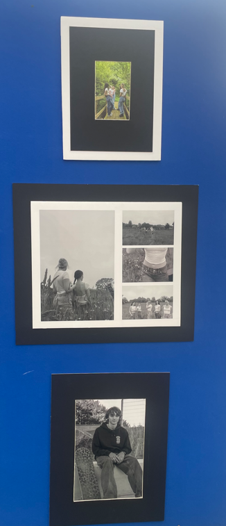
For my images below I Printed them out on either A3 or A4 glossy paper stuck them on a foam board using a spray glue to create a levitating look to them and then cut them out so they have a boarder around them. Then I positioned them onto Black/White card. I used the pictures that I found work well together and are similar in style. And for the Pictures that are on their own I felt had a more individual feel to them and didn’t fit well in a group.

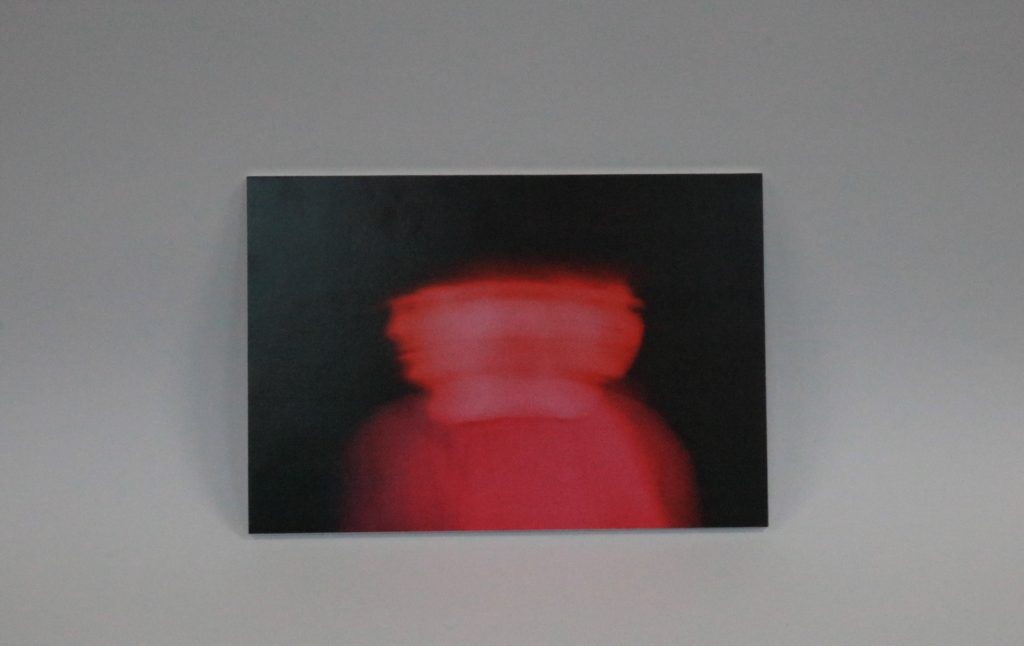
For the image below I did a large window mount.

Femininity vs masculinity photoshoot plan

Who

For this photoshoot, I’m going to try to take some pictures of my friend for the femininity side, and some photos of my dad for the masculinity.

When

I think I would like to take my photos during the day time in order to have natural lighting in my images.

Where

For my Femininity photographs, I would like to take some photos in a field up by my house as well as some images in my kitchen. For masculinity I would like to take some images outside my house and next to the car.

Why

I think using the field or kitchen for femininity would play into the typical stereotype for women as them being seen as fragile or being owned. As for the masculinity I think a common stereotype among the topic is the expensiveness of the car determines how wealthy the guy is.

How

I would take the photos using my own camera

Evaluation

How successful was your final outcomes?

I Feel that my final outcomes are what I was achieving at the start of the project so I think that they are successful in how I captured the modern day pressures on both genders. And how the stereotypes for girls is that they are meant to be soft and emotional where as boys are meant to look masculine and have contrasting qualities to female’s such as being independent and decisive with having an idealistic strong figure and stance.

What references did you make to artists references – comment on technical, visual, contextual, conceptual?

For my references I looked at Anna Gaskells work For my femininity shoot due to her using multiple different females to create a utopian reality by exploring imagination and creativity. I felt that her work really linked to femininity as the girls in her photoshoot wore old dresses and shoes which I feel explored fashion in history and what girls where required to wear in contrast to the 20th century. I also like how she uses more pastel colours in her photos as it gives them a softer tone and warmth to them. For my second photoshoot it was a last minute idea as my brother and his friend came to my house, This means that I wasn’t inspired by a photographer and just went off what I thought would look good.

Is there anything you would do differently/ change etc?

Next time I would put more preparation into my Masculinity shoot as I wasn’t sure if I was defiantly able to do it due to my brother and his friends schedule. I feel that if I researched a photographer that takes similar photos to my shoot I would of had more a sense about what I was doing and someone to base my work off of. I also should of used sandpaper to sharpen the edges of the foam board before I stuck them down on the black card.

Mounting Final Prints

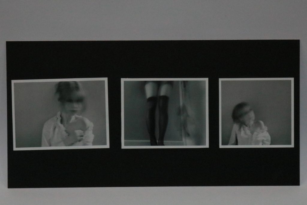
I think they turned out quite good, my plan was definitely helpful in coming out with ideas beforehand. I would want to improve on precision however, since the pictures being even slightly wonky ruins the entire mount. I believe my most successful outcome is set 1, as the middle picture contrast with the more traditional faces as it is only my legs.

Set 1

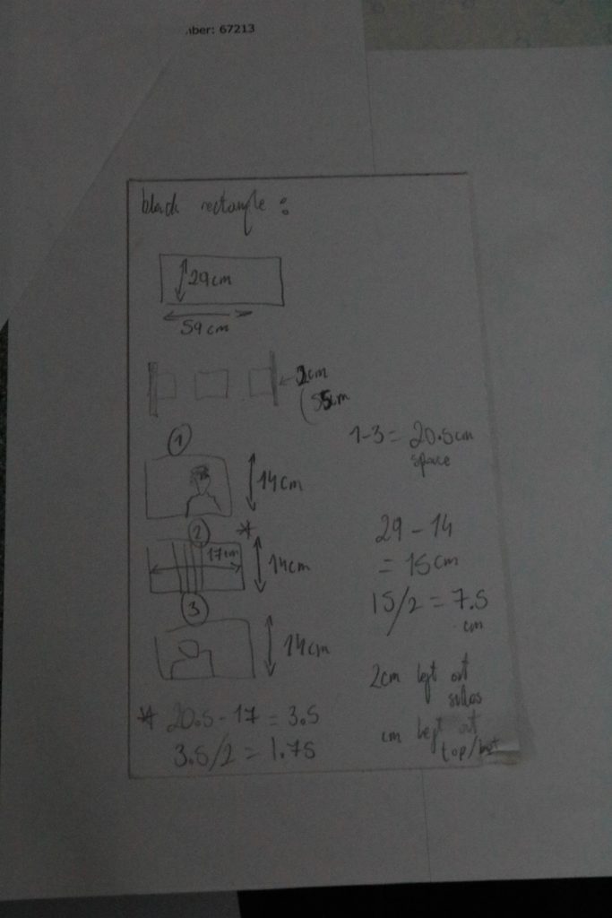
the measurements I wrote down to create this mount.

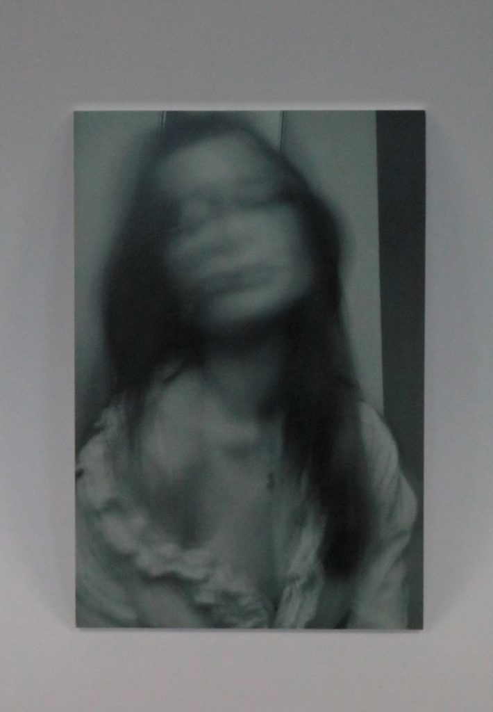
Set 2

Set 3

Set 4

Set 5

Set 6

environmental portraiture and studio lighting evaluation

My process:

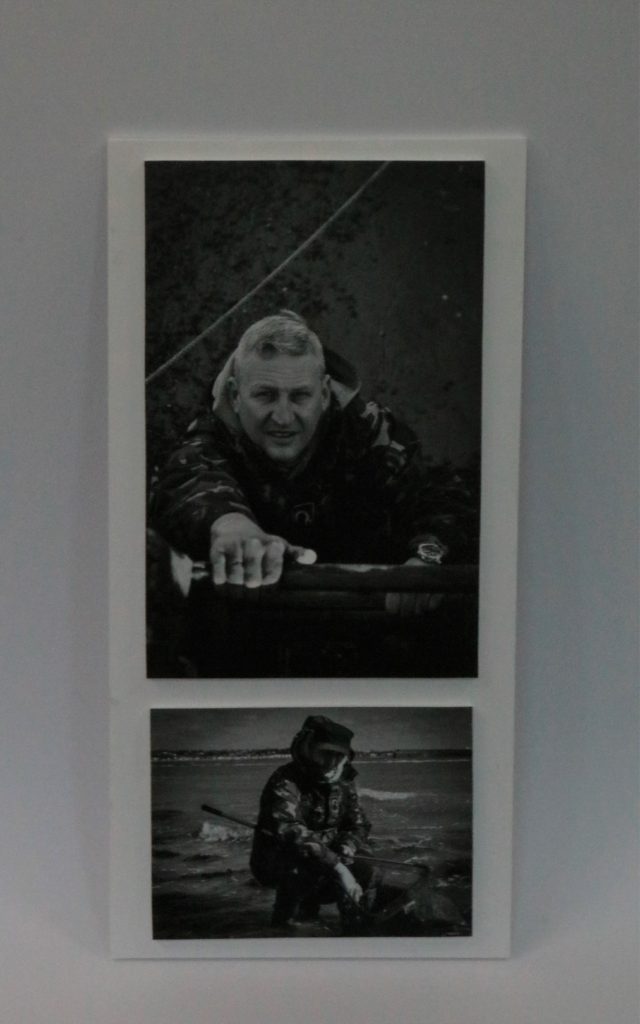
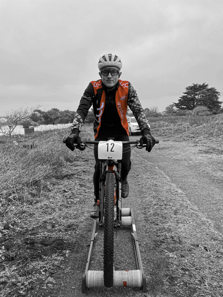
At the start of these my environmental portraiture project I decided to focus on the sport industry. I chose to do this as I know many people who par take in sports and think that that area of photography is very intriguing as it captures a section of their performance. I chose to photography dance and cycling as I think that they contrast together. For my dance images, I used some of my friends who dance and photographed them in their dance studio to add more detail to the image. For cycling, I photographed my brother who rides for a team in Jersey. I decided that photographing him warming up would be the best was to do it as I was able to get him to look straight as the camera to achieve the portrait.
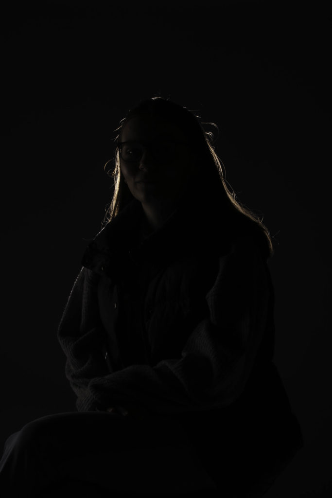
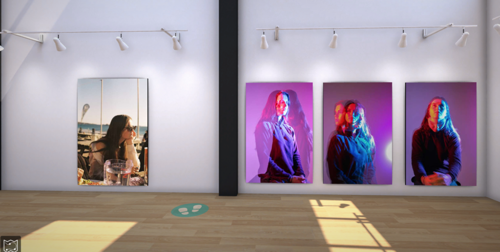
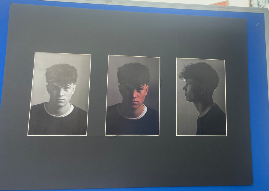
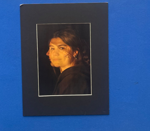
Along with my environmental portraiture projects I also focus on studio lighting. For this project I used my model facing in different directions with different type of lighting to make different images. I chose three types of lighting, chiaroscuro, butterfly and rembrandt. For rembrandt lighting I had my model sit on a stool on a 45 degree angle and I placed my light to her left side to create the triangle effect. For the butterfly lighting I asked my model to sit facing me and placed the light facing downwards almost over her to create the shadows underneath her nose. Lastly, for chiaroscuro lighting I had my model sit at a 45 degree angle again, however, this time I placed the light behind her to add the highlight around her head making her quite hidden.

What went well:

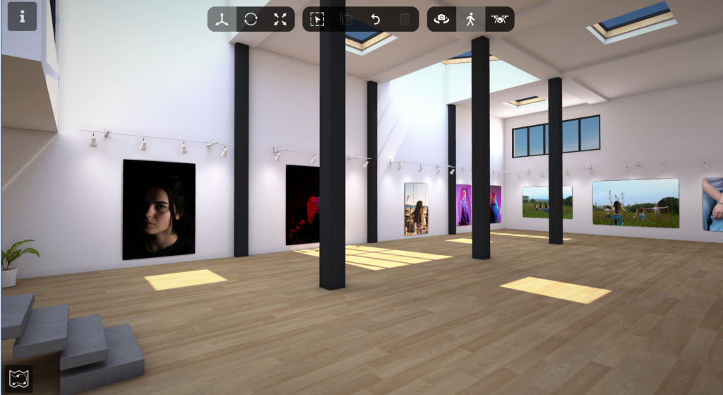
Overall, in these two projects I think that my images turned out well. I like how I tried different edits to see what worked well with my images and chose different colours and ideas with them to make them look the best that they could. I think that my final pieces were the strongest as they allow the viewers to see my images presented with the different backing and framing to make them look finished. I think that my environmental portraits were very bold and the ones that I used in my final pieces were very effective. My window mount of the cyclist in A3 ( as you can see below) was my favourite out of the two as it was very engaging with the contrast in colours which made it eye catching. With my studio lighting portraits I like how they turned out and this that how I mounted and backed them made them work well together. I liked my window mount with the three images as I like how they looked together as each image had elements that were the same and elements that were different. Overall, I think that both my projects turned out well.
Possible improvements:

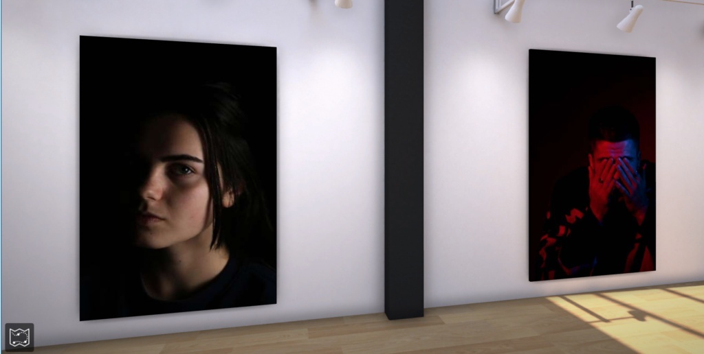
With in both projects I think that there were things that I could have improved on. For my environmental portraiture images I think that I could have photographed either, some more models for example some of the other cyclists, or another industry like stalls at the market for example. If I had done this I think that it would have made my projects stronger as I would have had a wider range on images to work with rather than my limited selection. This would have also meant that I could have made more final prints with a difference rather than mine which were both sport ones. For my studio lighting portraits, I think that I could have also made some more images with different types of lighting by using coloured gels for example or made some more edits with different ideas. This would have also gave me a wider variety of image to use for my final prints so that I could have made more contrasting images. With the images that I did make. I think that they also could have been improved as they all turned out quite dark (as you can see below) which may have been to do with the studio or the lighting that I use. As a whole I think that my projects could have had improvements however I still think that they turned out well.

Image mounting:

Display One:

for this image i framed it by creating a window mount, and then stuck the window mount on a piece of white foam board.

With this collection of images, I aligned one A3 portrait image along side three A5 landscape images onto a piece of foam board with black card behind it.

window mount.

Display Two:

For the image above, I created a triple window mount as all three images are similar however by placing them together it highlights its differences too.

Display Three

window mount on white foam board
window mount

Display Four:

image stuck onto white foam board.

Image comparison and Analysis:

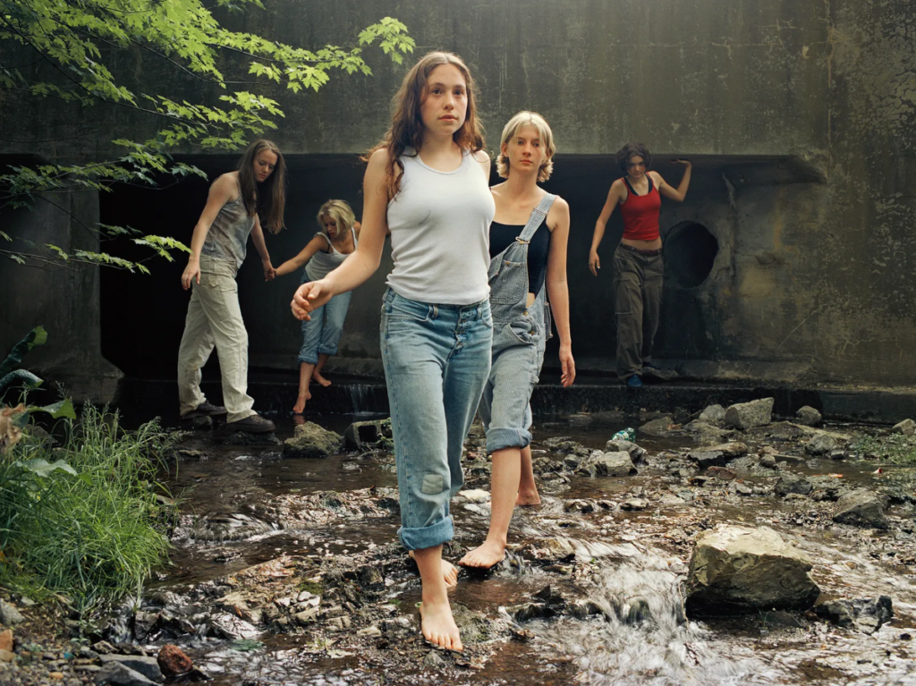
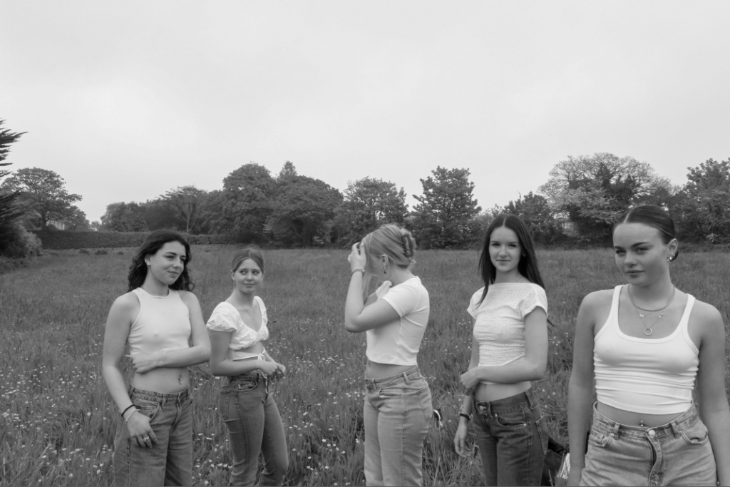
Justine Kurland’s ‘the wall 2000’ was my reference image for this comparison as it has some similarities but also many differences. one of the similarities being how two subjects are looking into the camera and the other three subjects, further away from the camera aren’t looking towards it. However, a difference is the locations of the two images, although both images are clearly taken outdoors my interpretation has an open field behind it. Whereas in the reference photo, the wall creates a feeling that the girls are trapped and their expression and clothing suggest that they are lost.

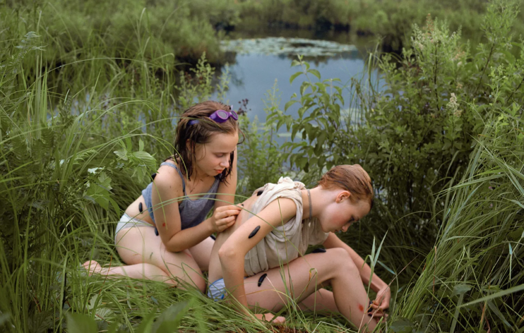
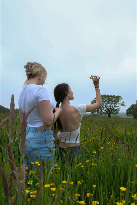
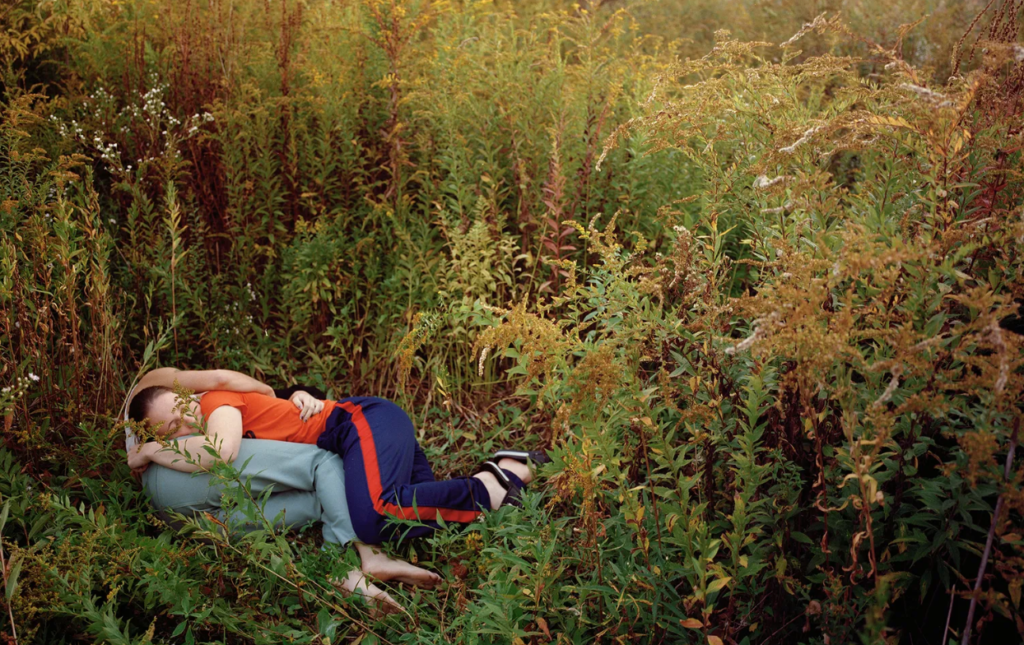
I believe these two images are quite similar as they both involve two girls and one is doing something to another’s exposed back. However, my interpretation is taken from a lower angle without water in the background.

Main image analysis:

emotional response:

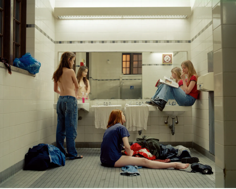
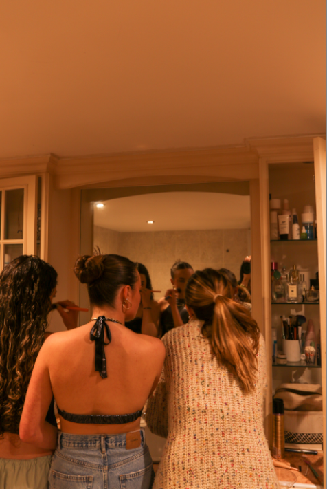
I believe that both images above show and highlight femininity in a beautiful way. In both images there are three girls in a bathroom which seem to be getting ready for something. Which has stereotypical links to femininity as it is known for a group of girls to go to the bathroom together.

Visual & Contextual:

In Justine Kurland’s image, Femininity is shown throughout by a topless girl standing in front of the mirror. This is a defining aspect of the image as it is something that all girls have however, many people could see this as a young girl being vulnerable in front of a camera. Whereas Justine Kurland views this as empowering, as the subject has confidence within her own body to show it off. Another aspect within this image is the bright pink hand soap on the top of the sink counter top which is accompanied by a girl sat near it with a glossy pink magazine which she is reading. Femininity is shown further through the girl sat on the bathroom floor next to a bag which is spewing out with clothes, who looks like she is having trouble picking out her outfit. the image seems to have been taken at dusk due to the orange light shining through the window of the bathroom. However, the bathroom is light up very bright from the lights in the ceiling and above the mirror.

When comparing my interpretation of ‘Bathroom 1997’ to Kurland’s it shows a more stereotypical idea of femininity which is less rebellious, the main focal point of the image is three girls doing their make-up. There is no natural light visible in the image, making the only light source available being the lights in the ceiling which aren’t very bright, creating a orange tint across the whole image. Towards the right of the image, you can see all of the products aligned in the shelfing which further adds into the stereotype of females.