The Origin of Photography

FILM NOTES

‘Fixing the Shadows’ from BBC Genius of Photography, Episode 1.

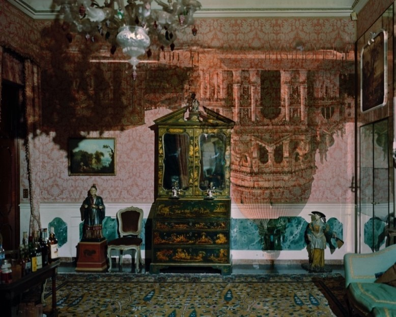
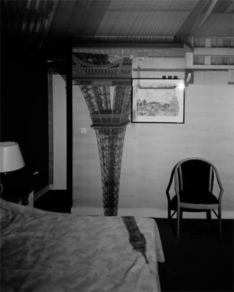
camera obscura/ pinhole blacked out room small hole creates upside down image – abelardo morrell 2006

tried contact prints on leather 1802 british inventor tom wedswood

Henry fox Talbot paper coated with silver salt – shoebox camera – mouse trap

created both a positive and negative

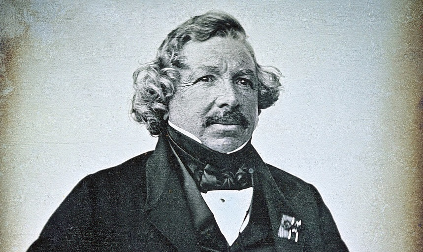
1839 Louis Daguerre – classically trained painter would do presentations – diorama theatre

-described as mirror of a memory

Daguerreotype sits om top of plate doesnt sink in like paper – very detailed

weakness of degaratype cant make multiple of same image
Camera Obscura & Pinhole Photography

Camera obscura is an early example of photographic experimentation and a method used by painters since the second half of the 16th century. Used to reflect a scene to be copied onto another surface allowing the artist to trace and create more accurate renderings.
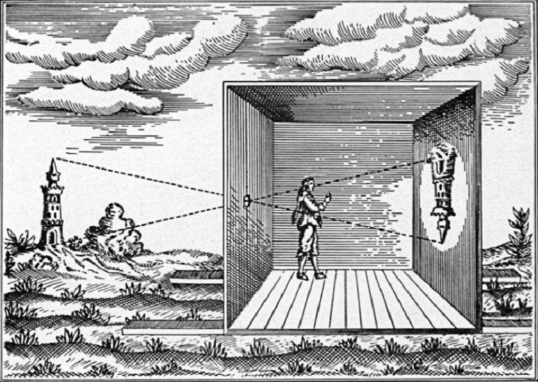
To create a camera obscura a room is made completely dark blocking of windows and other sources of light, a hole is added on one side facing the area you wish to project. The image is projected onto the opposite wall upside down.

The camera obscura was later adapted to become more portable – a small box painted black with a mirror to be veiwed the correct way up.
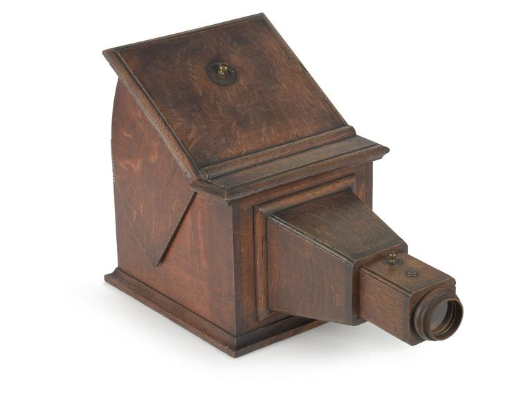
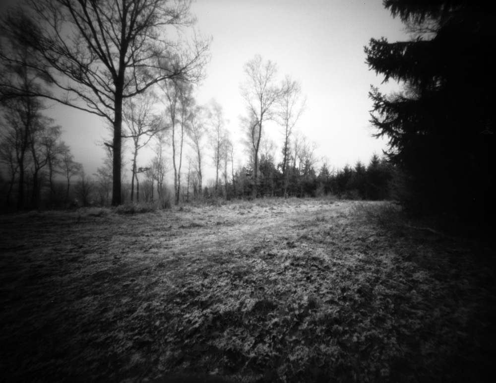
A camera obscura without a lens is referred to as pinhole photography. A pinhole camera is a simple light proof box with a tiny aperture on one side that uses the camera obscura effect and light sensitive material on the other. The images produced by a pinhole camera have an almost infinite depth of field and a wide view.

The classic Camera Obscura whilst being the basis for modern photography is not widely used anymore however some still use it as a tool for painting and as a nod to the photographical process. Abelardo Morrell a more modern photographer uses the camera obscura to create natural montages by using hotel rooms and making them into a camera obscura to reflect the view outside onto the walls describing it as being inside a camera.
Heliography
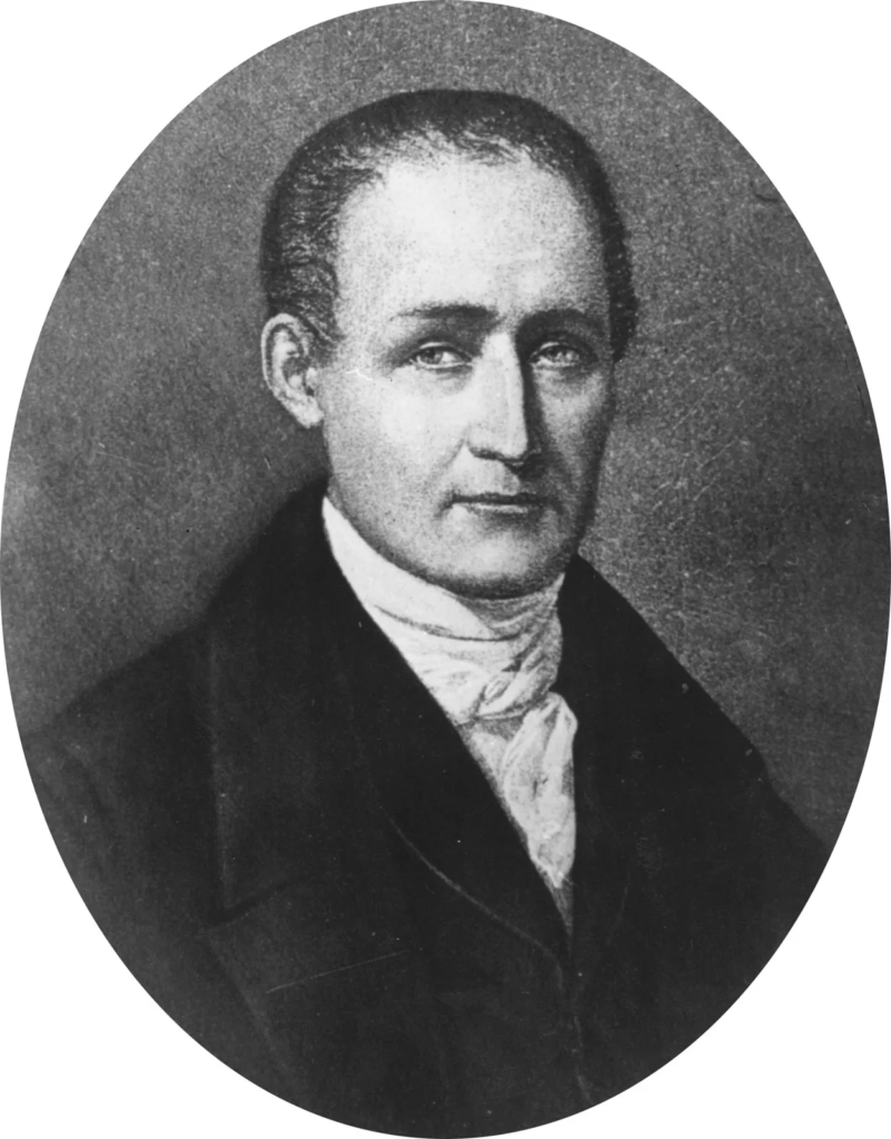
Nicéphore Niepce a French inventor born in 1765. creator of the heliograph – helios meaning sun and graphein meaning to write- sun-writing. Niepce was an incredibly important figure in the birth of modern photography.

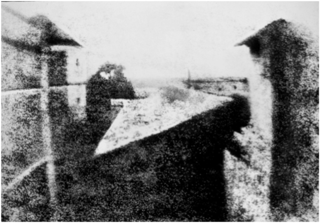
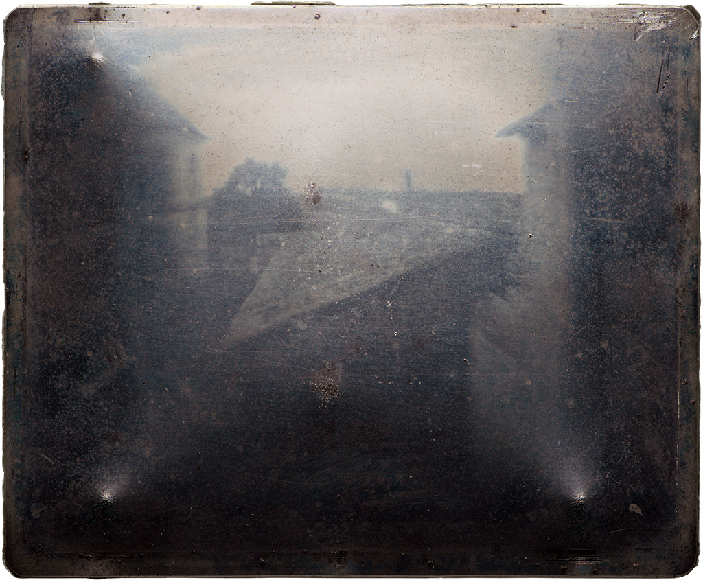
In France at the time the practice of  Lithography was popular Neipce found himself unable to obtain the correct stone needed and thus began experimenting with metals and light sensitive chemicals. To create a heliograph Niepce would take metal or glass and coat it with asphalt, this would then harden depending on the light exposure available. The plate is then washed with lavender oil so the only remaining area left is the hardened chemical of the image. Using heliography Niepce created the first known permanent photograph  “View from the Window at Le Gras” in 1826.
Daguerreotypes

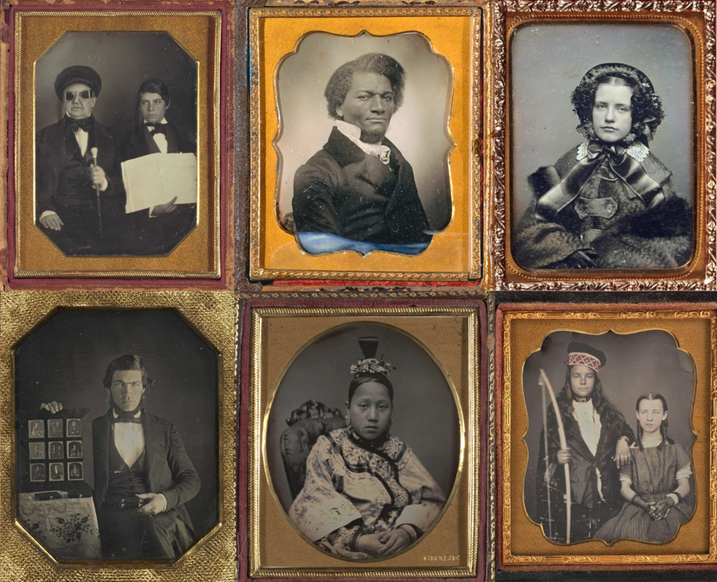
Daguerreotype mainly used in the 1840s – 1850s was the first publicly available photographic process. The Daguerreotype was introduced worldwide in 1839 invented by Louis Daguerre a classically trained painter who would hold presentations and was a developer of the diorama theatre. Daguerre also worked closely with Niepce. and his process captivated the public being describe as a “Mirror of a Memory”.
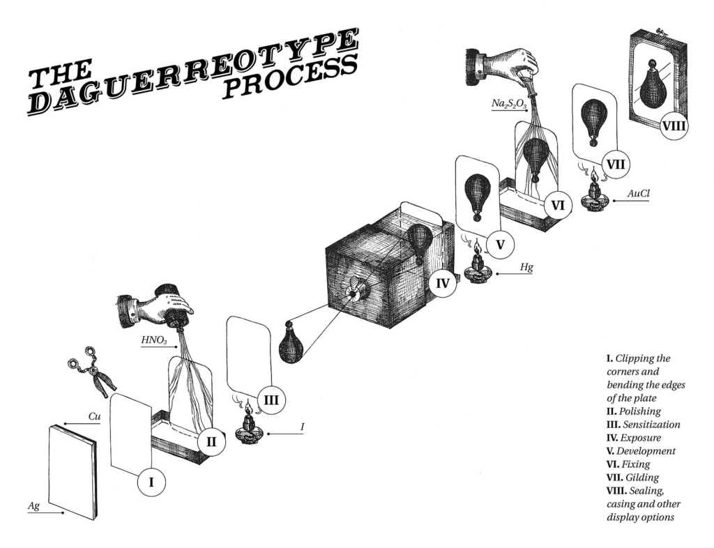
To make a daguerreotype a photographer would take a silver plated copper sheet and polish it to a mirror finish then treat it with chemicals to make it light sensitive and expose it in a camera obscura. The image was then fixed and sealed behind glass to protect the fragile materials. The image created would sit on top of the silver surface and would appear either positive or negative depending on the angle it was viewed at. Daguerreotypes were incredibly detailed and sharp as the images didn’t sink in like paper however they were heavy and images could not be reproduced.
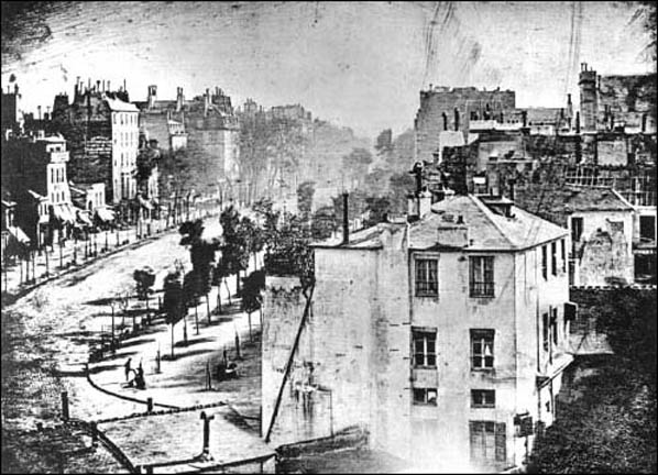
The Boulevard du Temple is one of the earliest daguerreotypes produced by Louis Daguerre and one of the first photographic processes to contain people it captures a man standing still having his shoes shined due to long exposure time of the daguerreotype he was captures as he stood motionless for 10-15 mins whilst other people on the street were moving and could not be captured.
Calotype
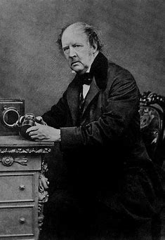
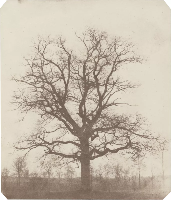
A Calotype also called a talbotype was a photographic process invented by Henry Fox Talbot in the 1830s.

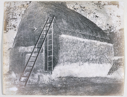
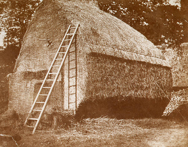
In this technique Talbot used a piece of paper coated with weak sodium chloride or ordinary table salt, and exposed it in a camera obscura. The areas hit by light became dark creating a negative image this could then be contact printed onto another sheet of light sensitive paper to make a positive. In 1852 Talbot discovered that a solution of gelatin mixed with potassium dichromate could be used to make the images less soluble to light which compared Niepce’s Heliograph would not continue to expose after the initial exposure. Unlike the daguerreotype, the Calotype could be repeated to create multiples of one image and sank into paper making it light and harder to damage the image. Talbot’s methods quickly succeeded Daguerre’s with their more accessible nature.
Robert Cornelius

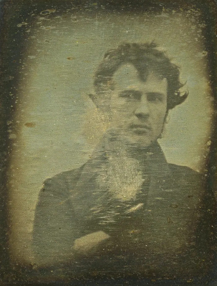
Robert Cornelius’ self portrait taken in 1839 is known accredited as the first ‘selfie’. Cornelius pioneered American photography and operated two of the first photography studios in Philadelphia from 1831 – 1834. Late 1839 Cornelius attempted to perfect the daguerreotype and took a picture of himself in his families work yard, the quality of the photographic plate and technique required him to be motionless for 10-15 mins. Selfies as of recent have become popular as it is the most accessible from of self portrait with most people having cameras in their phones, being a quick and easy way to express yourself.
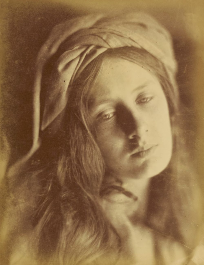
Julia Margaret Cameron

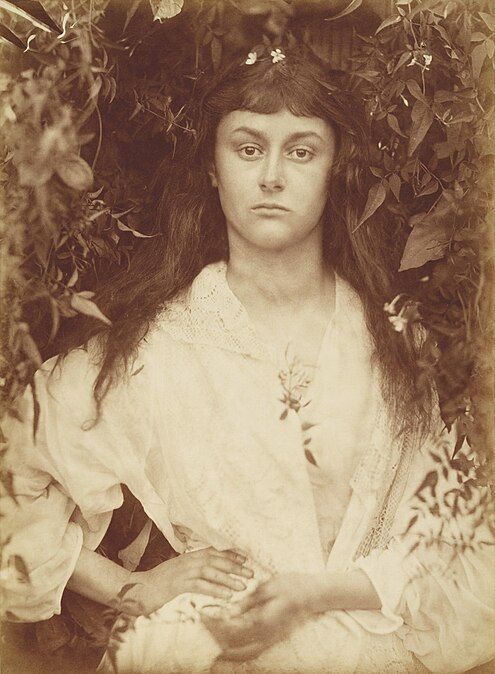
Julia Margaret Cameron was British photographer born in 1815. best known for her soft portraits depicting famous Victorian men and women. Cameron was well educated and familiar with medieval art and many painters that became the inspiration for her photography such as Rembrandt and Raphael inspiring her use of light and composition. A contemporary interest may have also been phrenology – the measuring of the human skull to study personal character. She also used photography to express her Christianity. She was introduced to photography methods such as Talbots Calotype and the Daguerreotype by her mentor and astronomer John Herschel.

Cameron’s idea of capturing ‘genius and beauty’ –

 “particular qualities or essences—typically, genius in men and beauty in women”.

– Mike Weaver a scholar who wrote about Cameron’s photography in 1984
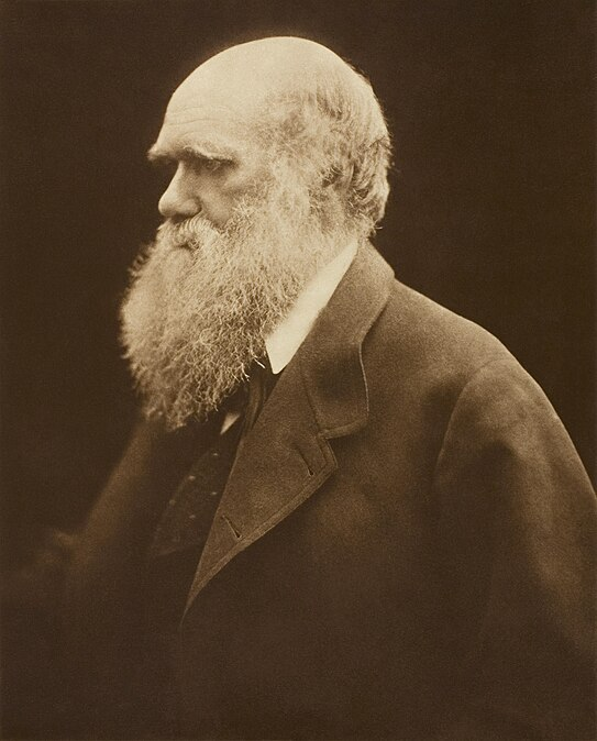
Cameron’s portraits of men are sharp and almost a form of hero worship whilst her images of women are softer.

Cameron also made images with many links to Christianity specifically in the way she depicted children as ‘Cherubs’ connoting the idea of innocence. she also made images depicting the Virgin Mary.
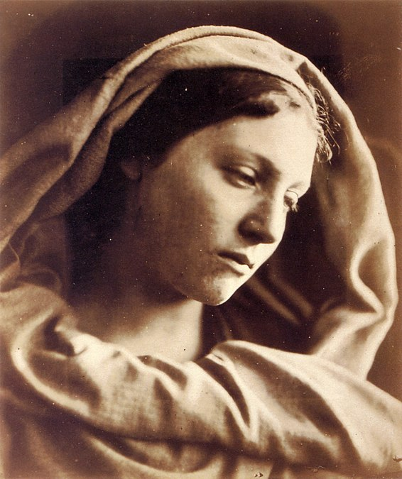
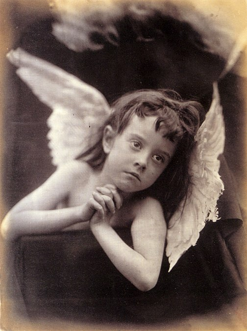
Cameron was one of the first to create stories with her photography creating posed images.

bibliography-

Daguerreotype – Wikipedia

Diorama – Wikipedia

Threshold Concept #2 (photopedagogy.com)

Heliography | Encyclopaedia – Photoion: Photography Courses & Workshops In London

Review on ‘playtime’ By Will Lakeman

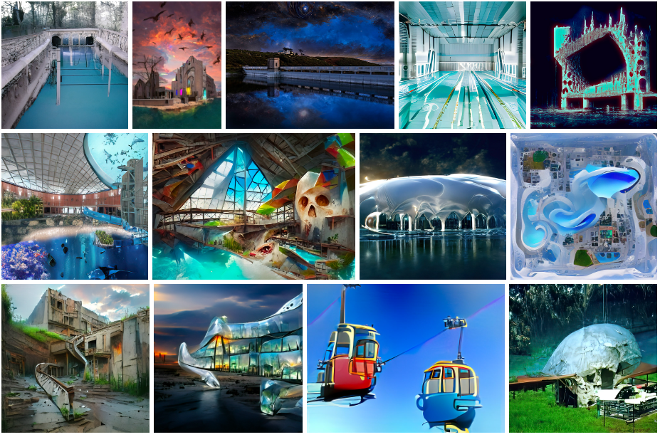
“These images are the generated of using Artificial Intelligence applications in an attempt to recreate my dreams. The input is usually (not always) my own images, processed with a range of machine learning software applications.”

Lakeman is a photographer who has nurtured an obsessive interest in ‘the Fort’, and has spent his adult life revisiting weird dreams of this iconic building and its heyday in the early 1990s. With the works accompanied by a custom soundscape, smell and touch, Playtime encourages visitors to revisit their own dreams

Review

I enjoyed ‘Playtime’ by Will lakeman. I liked the fact his childhood memories of fort regent are turned into his dreams. By creating these interesting, fun, and playful images to show what fort regent once was. By using AI technology he can make these dreams a reality in an image by using different online software such as Photoshop Beta version and dream studio.

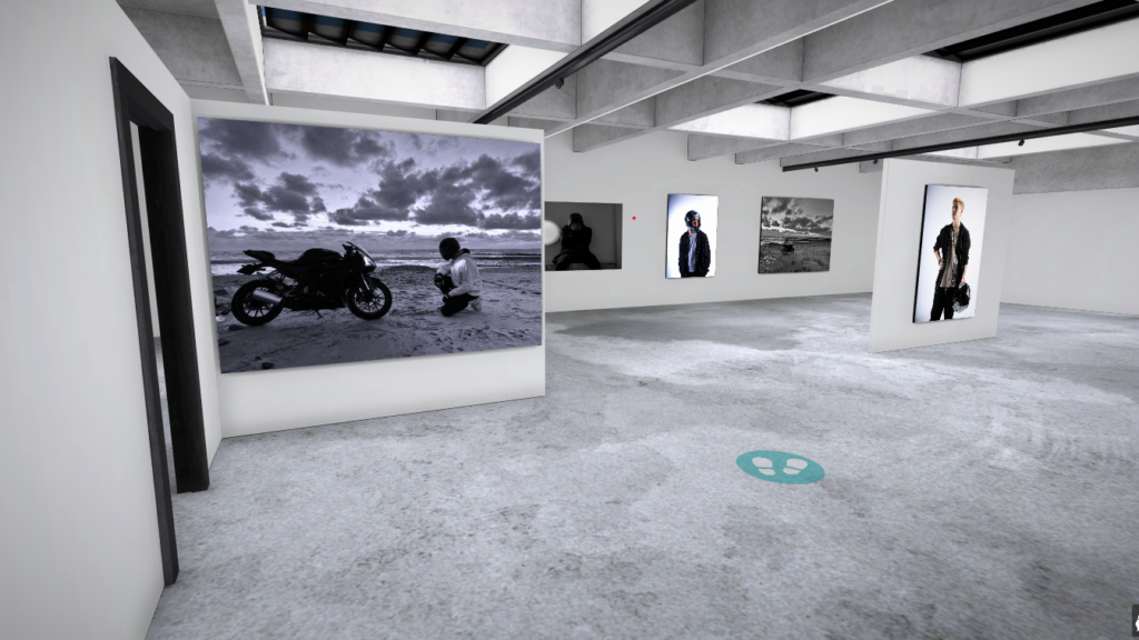
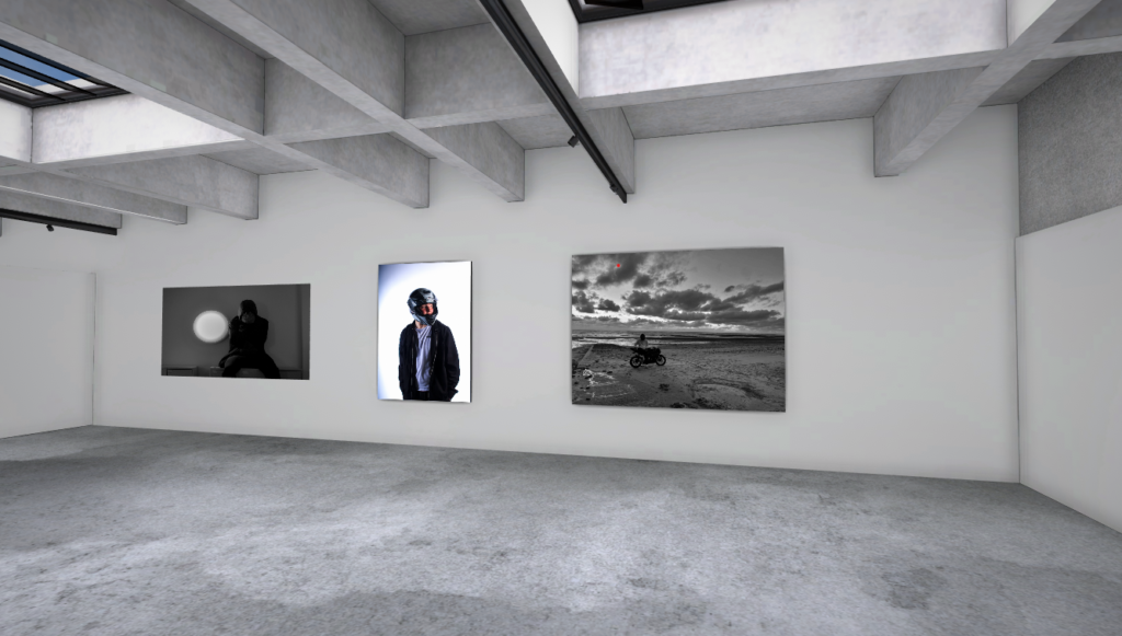
virtual gallery

Link:

https://www.artsteps.com/view/646f148534f82661d6a1d2fc/?currentUser

Virtual Gallery outcome:

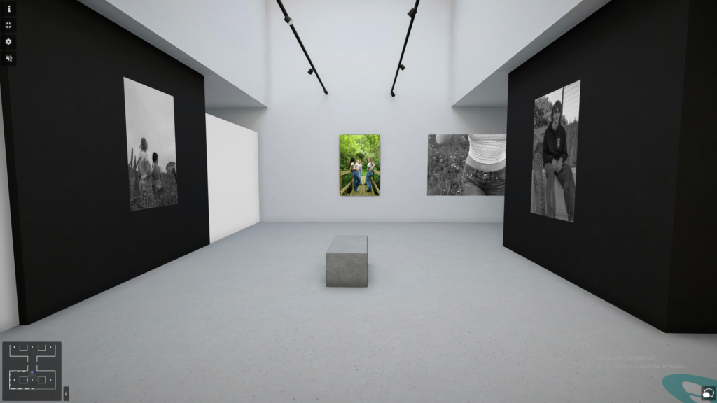
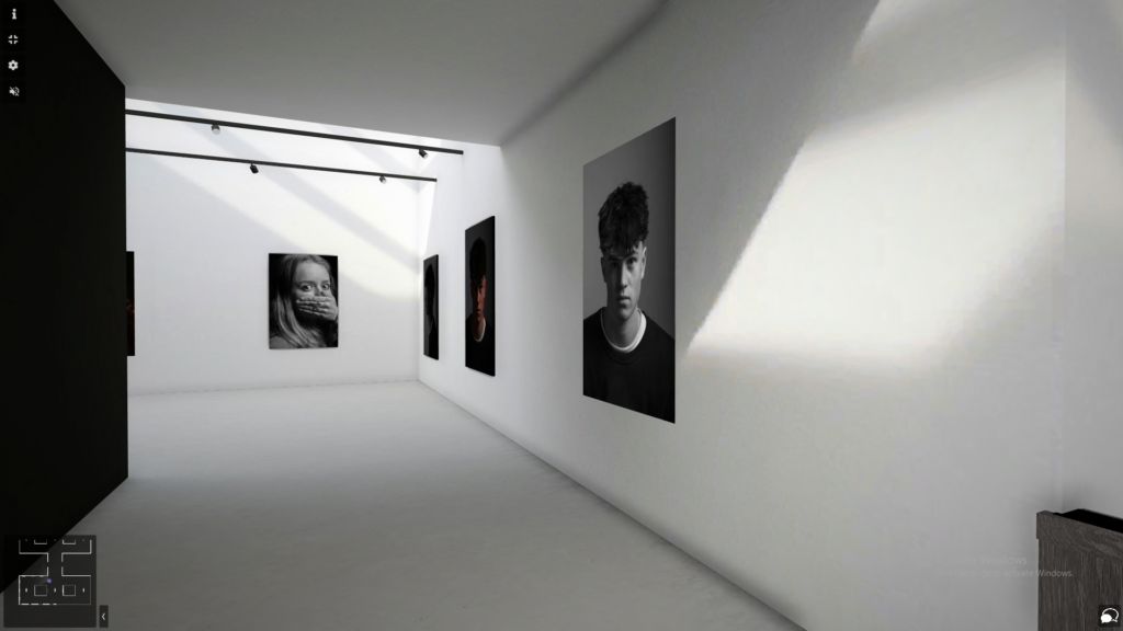
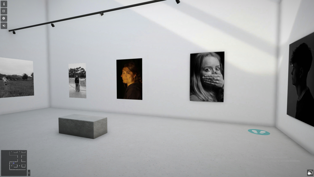
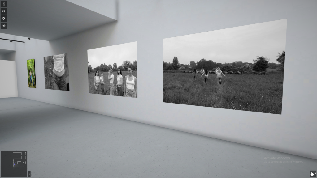
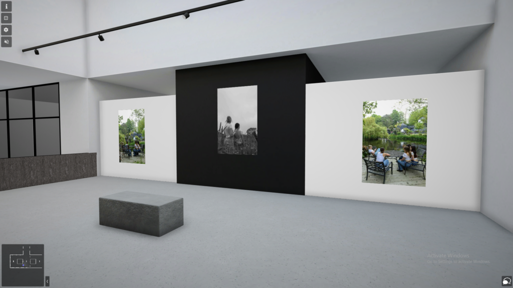
I have created a virtual gallery with some of my favourite images, covering all three topics of; femininity, studio lighting and environmental portraits. I have made this gallery by using art steps, in which I designed and created the gallery and then added my own images in and chose where to place them. By creating my own gallery made it a lot easier than trying to edit each photo to make it fit onto the wall in photoshop like I have done in previous projects.

Claude Cahun: Image analysis

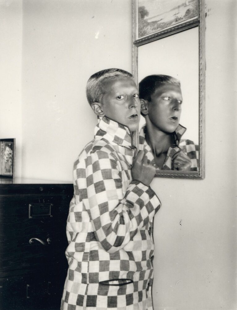
Claude Cahun, Self-portrait, 1927

How was this image taken technically?

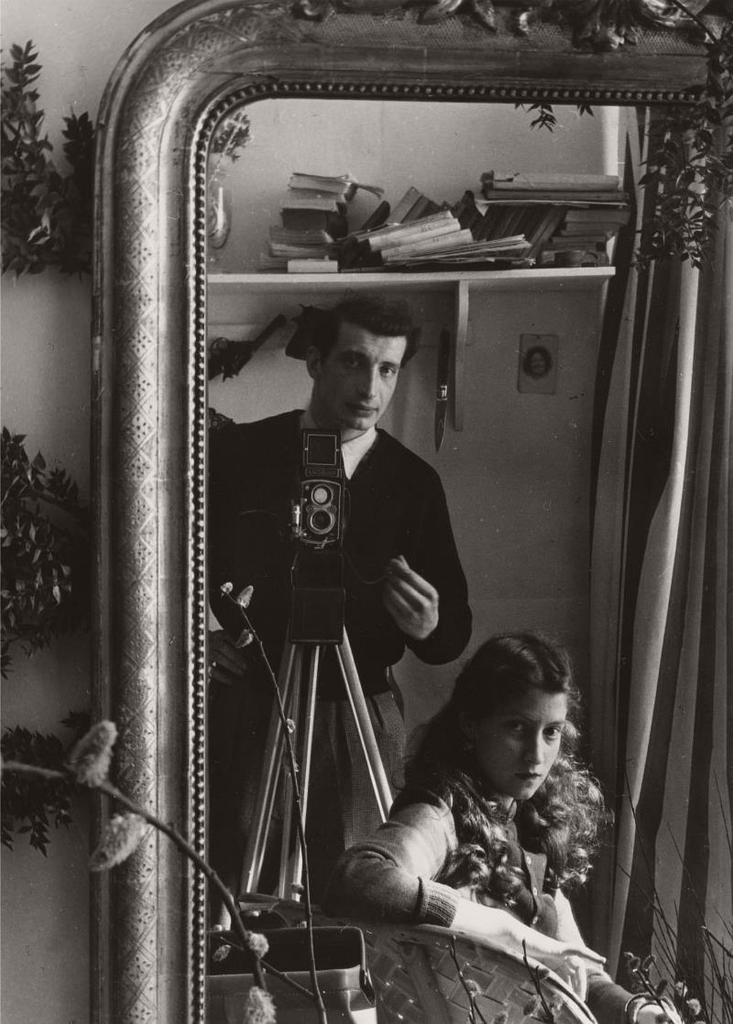
This is an analogue self-portrait of Claude Cahun, dressed and styled in her characteristically androgynous manner. She faces away from the mirror and stares directly into the lens. Natural light appears to be the main light source, presumably coming into the image from an unseen window or door. She hides her neck from view of the camera, thereby exposing it in her reflection.

Why was the photo taken like this?

It is possible that the image was taken in this way, as was Cahun’s trademark, as a direct comment on traditional femininity, as the playful use of reflection and the suggestive nature of the image both suggest an allusion to artifice and contradiction. Perhaps Cahun is criticising the vanity and falsity of feminine culture, and perhaps, as is typical of her work, she is using her own appearance to amplify this more modern and open-minded outlook. Furthermore, in classical art, mirrors are often used as symbolism for feminine beauty or narcissism but here Cahun subverts this meaning to reject these traditional views on gender.

Realities disguised as symbols are, for me, new realities that are immeasurably preferable.

Claude Cahun

Evaluation


How successful were my final outcomes?

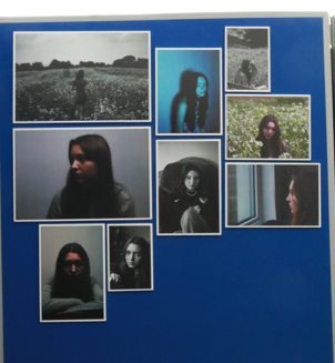
I’m happy with my mounted outcomes, I experimented with window mounts and foam board. On the contrasts, my final images for femininity are not exactly what I wanted as the images ended up being too complicated with the background. However I think the images do link to my artists. The long exposure photos were my least successful, however I do like the Clare Rae images. I might re-take some of the images with the long exposure to add to my collection. I feel like my images present what I wanted to show about femininity and how female identity is lost amidst the societal stereotypes these days.

What references did I make to artists references

As Clare Rae and Francesca Woodman being my two artist references, I think I managed to link to their work through combining their two styles together. Overall I think I captured their styles through a slightly different view, but still holding the main ideas of identity through feminism. My main idea that I really wanted to show was that through the permanent stereotypes people think about women, identity can be removed, especially considering the past dominance of ‘The Male Gaze’ through art and photography. I showed this through hiding the identity of my subject, but also connecting her to nature to present females as natural, separating them from the constant fake images they hold on social media.

Is there anything I would do differently?

The only thing about my feminism shoot that I would change would be where I shot the images. Even though I really like the outcomes and they linked well with my artist references, I think some of the images were overcompilated to look at due to the background. To change this I could have taken more photos in a more basic setting such as the sand dunes.

Evaluation on the whole project:

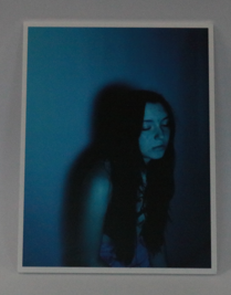
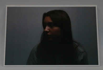
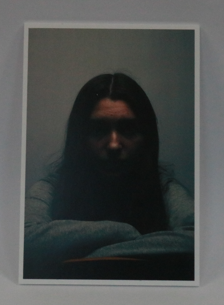
My favourite part was learning about studio lighting and more in depth camera settings. Experimenting with the Rembrandt, butterfly lighting and the colour gels was really interesting as each one created a drastically different effect of the subject. I also really enjoyed experimenting with long exposure in the studio and I think some of my best images were from those shoots.

I struggled more with the environmental portraiture and I feel like I could have pushed myself more and gone into public places to get my images. However I really liked the idea of capturing someone in their working spaces. I wasn’t too happy with my final images from those shoots because I only used people I knew.

I’ve also enjoyed the feminism project because it is a large issue in todays society that isn’t talked about as much as it should be. Presenting the issues through photography meant I could show a creative and more subtle side to the issue, and I think I managed to achieve what I wanted to.

Artist comparison

Femininity vs masculinity

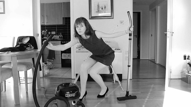
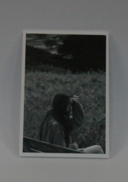
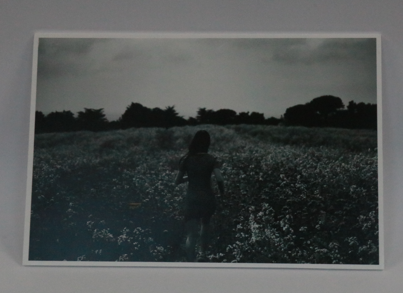
For my artist, I chose Shannon O’Donnell. Her work often consists of showing the way femininity is stereotyped and i tried to replicate this in my image.

Some similarities between both mine and Shannon’s photos are the links between stereotypical femininity. Shannon’s picture depicts a ‘traditional’ type of femininity by using house hold chores and dressing up in a typically feminine way, wearing dresses and heels. In my picture, I followed the stereotype of femininity by using flowers and nature which are often symbolic feminine stereotypes, since women are usually thought of as delectate or fragile like a flower. Another similarity between our images would be the colour scheme of our photos, both images are in black and white creating quite moody pieces. Also, both models in the image are wearing dresses, which is a typically feminine choice of attire throughout different centuries.

Some differences between our works include the location of where they were taken, mine image was taken in a flower field whereas Shannon’s was presumably taken inside her home, this results in different meanings behind the images. Secondly, the exposure on my image is lower making my image appear more dramatic where as Shannon’s is lighter, making her image seem almost comical. One final difference between the two photographs is the fact that Shannon uses props in her image which makes her message very clear to the viewer.

Overall, I like how my image is very different to Shannon’s, while still keeping hold of some of the key aspects of her image. If I were going to redo anything about the image i would of likes to use some props to help present the meaning to my image more clearly.

Evaluation

How successful was your final outcomes?

I am happy with the way my mounted outcomes turned out. I used a window mount and foamboard to mount my images. In my opinion, my images linking to the theme ‘femininity vs masculinity’ had a strong outcomes and they link back to my artist study, Justine Kurland. My environmental portraits came out better than I though they would as I wasn’t sure how the background I made, with all the surfboards would turn out. My least favourite images from the portrait project were the images I took in the studio because I found it hard to get the lighting correct at times. Overall, I would say that I have a strong range of final outcomes.


What references did you make to artists references?

comment on technical, visual, contextual, conceptual?

My artist reference was Justine Kurland and I was focusing on her ‘Girl Book’ images. I think that I managed to portray Kurland’s work in to mine and took inspiration from her images to build up an idea of my own. When comparing my images to Justine Kurland’s, I could see clear similarities such as taking the images in a rural area, getting the model to wear similar clothing to the ‘run away girls.’ I also wanted to capture the idea that girls can go out and explore instead of ding the stereotypical thing of staying at home. Overall, I think that my images linked back to Justine Kurland’s work but, the final outcomes would have been better if I had more than one model in the images.


– Is there anything you would do differently/ change etc?

For my Justine Kurland shoot I would have changed how many models I had as the images would of linked back more to her work. I also, would have left myself more time to get a second photoshoot done. I had a plan but didn’t have time to execute it.

evaluation

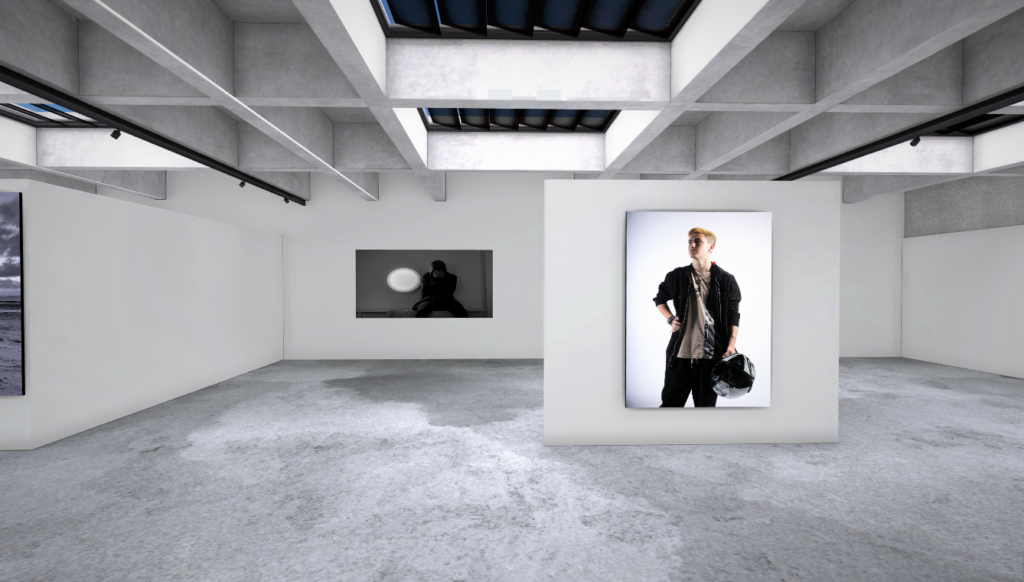
Virtual Gallery

virtual gallery was one of the first things I did it turn out ok it was the first time I have done a actual virtual gallery I recon if I had more photos then the gallery wouldn’t look so empty. however the gallery has a sort of simplistic look and some may enjoy the simplistic theme. how made the victual gallery I went onto a website called artsteps and used one of the present galleries and downloaded my photos into it and set them up then I took screenshots and that’s it.

Final Images

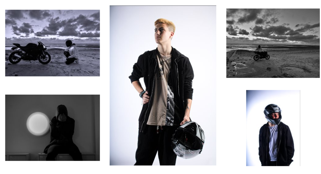
I believe my final photo turned out alright I wish I put some more in the print folder however I didn’t really like any other photos these photo where not my best work I recon I could have done better on the editing and had more locations and gotten more people to model I also wish I got a a group photo with my friends and there bikers however maybe I can do that next time or later in the year.

Final Photo Analysis

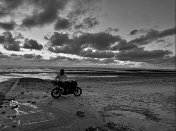
with this photo me and my friends went on our bike down to to st ouen’s beach then he went into different poses and positions this photo I like because its simple but a the reason I took this photo is masculinity and motorbikes are predominantly men, when taking the photo I took later in the day to get a dramatic effect and to get a good gradient through the image I choose the beach because its out of the ordinary to see a sport bike on the beach, the textures in the image you have the sand with footprints in them the concrete slipway turning into cobbled stone and then you have the see in the distant background. I took the photo on a wide lens to get a big scene and I think the photo did what it suppose to do

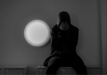
this photo I took earlier in the year around the school the model in the photo is sitting on some lockers I told the model to put his hand in front of his face and look down I turned the expose down for light not to mess up the light. I think I turned out good when you look at the photo you would the person in it is sad or depressed or you feel nothing no matter what the photo I believe is good

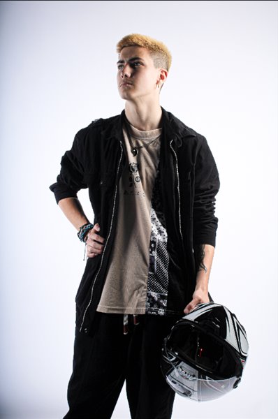
photo was taken in the studio with this image I tried to make the model look stoic and masculine and it worked the model is in a masculine pose and since predominantly most moto bike riders are male that’s why he’s holding a helmet. The lighting for this photo was a bit of experimenting around with the lights, the lights get a perfect shadow around the models jawline which is considered masculine, I believe I took this photo on a portrait lens however I don’t know for sure. I also got a bit of the models tattoo in the photo that could be related to bravery another masculine trait which was the hole idea of this photo.

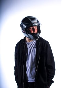
this photo is a self portrait taken in the studio my friend took the multiple photos this one out of all of them was my favourite when talking this photo the photoshoot was originally meant for my friend however we decided I should have go and that’s why I am wearing his jacket and my helmet and I think it turned out alright even though it wasn’t planned. I didn’t take this photo my friend did I told him to take a lot of photo and he told me too look all round the room then I picked from the best there not to man texture in this photo just my cloths and the shininess of the helmet.

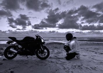
with this photo me and my friends went on our bike down to to st ouen’s beach then he went into different poses and positions this photo I like because its my kneeling in front of his bike, there also at equal heights so there’s nice levelling in the photo. The photo has a almost like tunnel effect where the rider and bike are the walls and the beach drags the photo out the texture of this photo of footprint in the sand and the bike and the riders cloths. I took this photo later in the day to get a dramatic effect with the clouds and its works with the black and white editing

Artist Mood board

Rineke Dijkstra

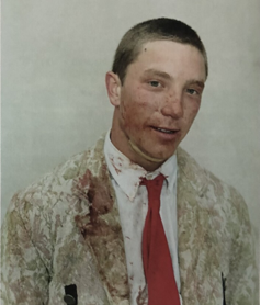
Rineke Dijkstra was born June 2, 1959, in the Netherlands the photo above this is from her bull fighters photos this is a photo of one after a fight and its seen as very masculine sport the photo is very simple however it tells us a lot about the man in the photos character for instance he has blood on him and he’s got a slight smile on his face so you can tell the man enjoys the sport this photo is very good at showing who bullfighters are.
Jeff wall

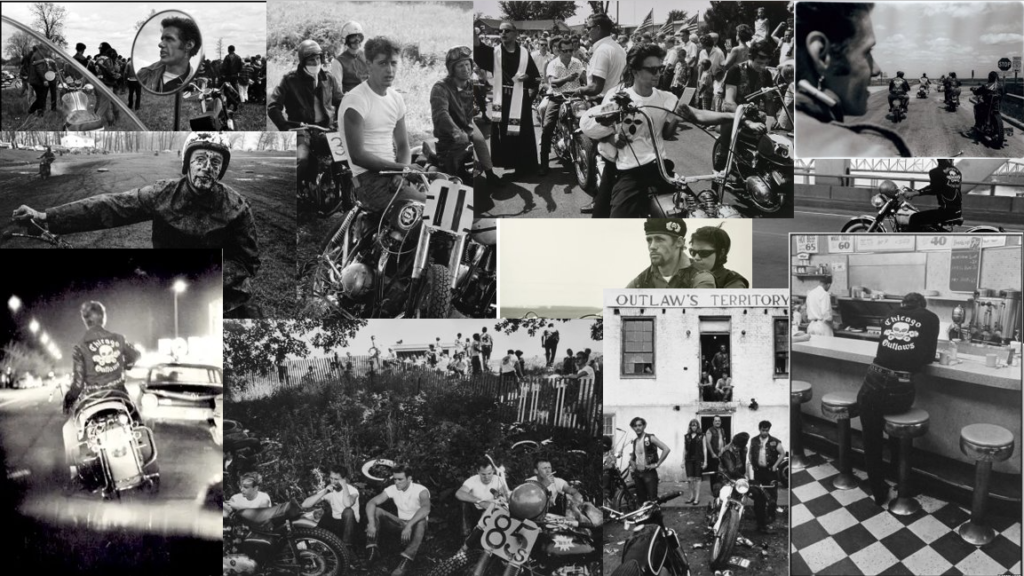
Danny Lyons (bike riders)

Conclusion

In conclusion I believe my photos could have been better and I definitely could have done more but besides that they turned out good but not the best however the virtual gallery turned out ok as I have said before if I had more photo in there it wouldn’t look so empty but it still turned out ok, the artist montages turned out good and I tried to follow Danny Lyons sort of theme however the photos have a different feel to them considering they weren’t taken on black and white camera and the bike in the photo is modern and the ones in Danny Lyons are considered old to us. however the photo are good editing I could have done better however I have 2 photographer that I like Jeff Wall and Danny Lyons.

Best Femininity vs Masculinity photographs

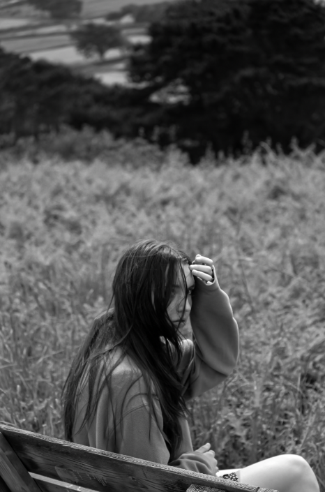
Photo 1

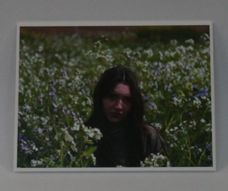
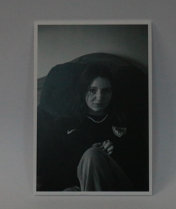
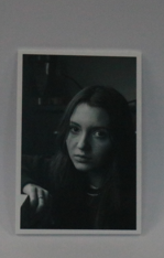
I believe that this is one of my best femininity images because it includes feminine aspects as well as overall looking appealing. I like the depth of field in this image too as well as the black and white drawing attention towards the model at the centre of the image. I also like how the contrast makes the image more eye catching.

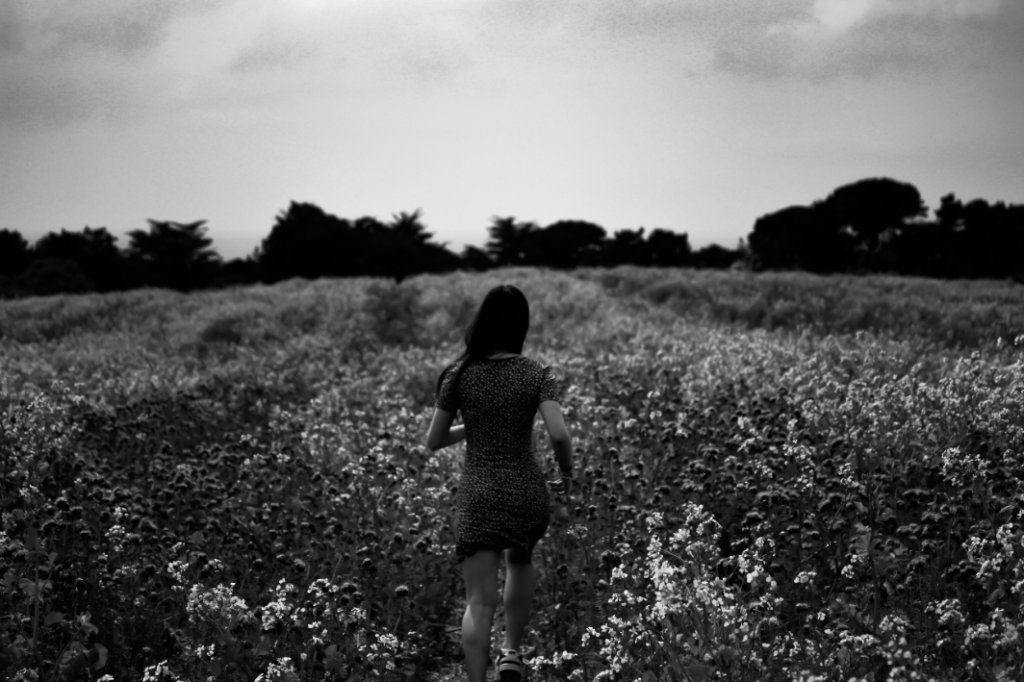
Photo 2

This image is good due to the depth of field and low exposure. The contrast between the model and the background is also nice as it makes her stand out as a focus point for the image.

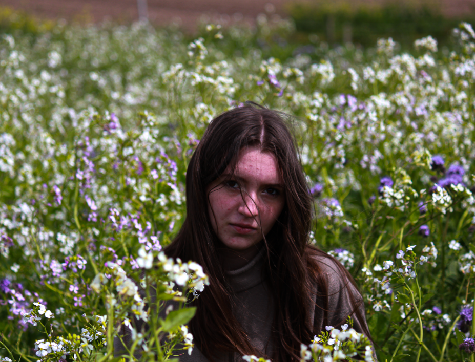
Photo 3

Once again, I like the depth of field in this image as well as the contrast between her dark hair and the bright flowers. I also like how saturated the image is as it makes the image seem more feminine due to the brighter colours.

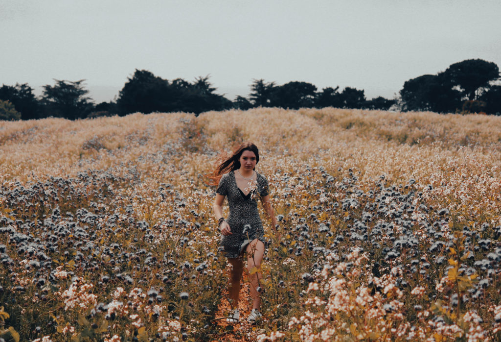
Photo 4

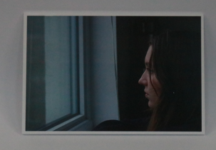
With this picture, I like how the warmer tones in this image produce a more autumn feel to the image. This makes the picture have more of a creative aspect to it since autumn is often associated with creativity and harvesting. I also like how the warm tones on the bottom of the image contrast to the use of cooler ones on the top.