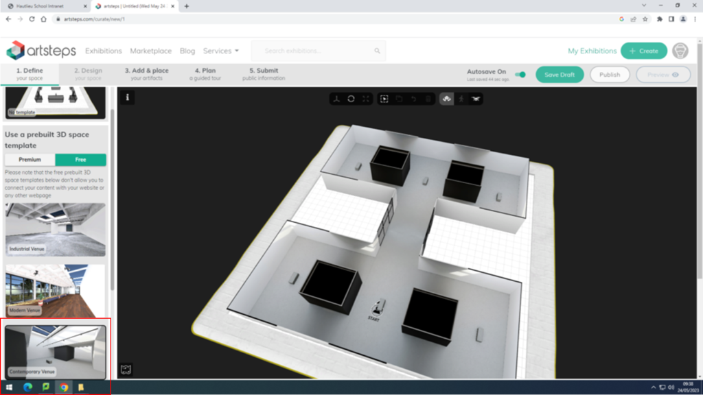
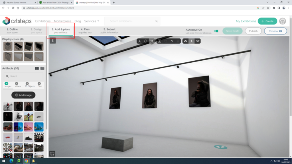
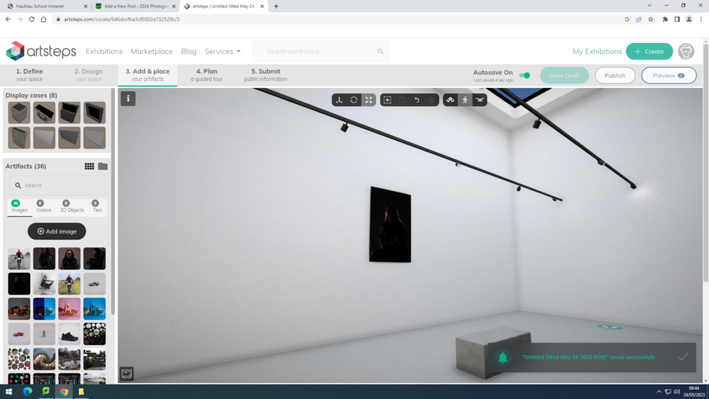
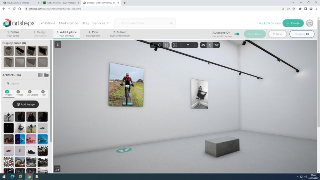
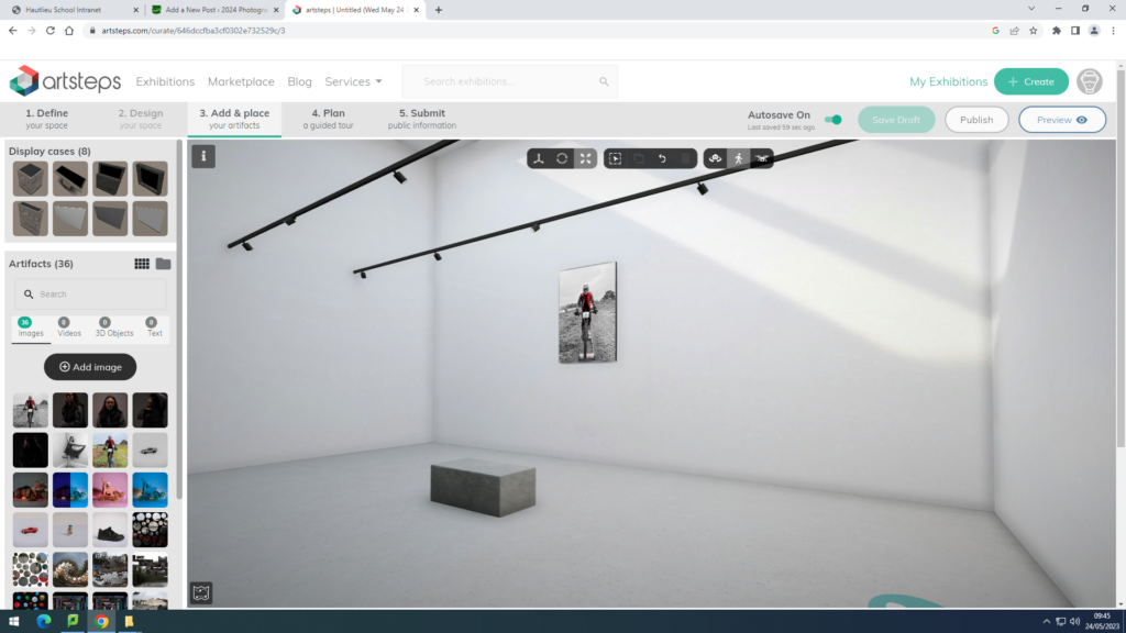
For this virtual gallery I used my images from my environmental portraits project and my studio lighting project. I have edited some of them previously on Lightroom classic and photoshop. I have then opened them up on www.artsteps.com, and chosen my gallery that I wished to use. For these images I chose to use the contemporary venue as you can see in my first print screen. I then clicked add and place as you can see in the second print screen that I have added in. I began to add my images into the gallery and I paired them with one that went well together, for example[le I put some of the studio lighting ones together and did the same with two of the environmental portrait images. I like how my gallery has turned out as I think that as my images are all quite dark, they contrast with the pure white background very well to make them stand out. However, if I were to redo my gallery I would make sure that my imager were bigger before adding them into the gallery as they are very small and could use the space better if they were larger. I also think they if they were bigger it would mean that the viewers would be able to see the detail more clearly as well as the different tones and depth that they each have. Overall I think that my gallery has worked out well but it could have been better if they images were bigger.
