Final evaluation and critique of portraiture

How do I feel about my final outcomes?

Overall, I am happy with my outcomes for this project as I feel that I was able to access a range of techniques and styles to build up a portfolio that will reflect my various talents in different fields of portraiture. I enjoy the more documentary style imagery and I feel like I was able to explore this on a few occasions over the past few weeks. Additionally, I was able to experiment with studio photography which was fairly new to me and I have created outcomes that I am proud of. I think that there were certainly improvements that could have been made across this project, and sometimes my plans were not executed as I would have liked, however I can say that I have also created work that was really successful.

What areas were the strongest/weakest?

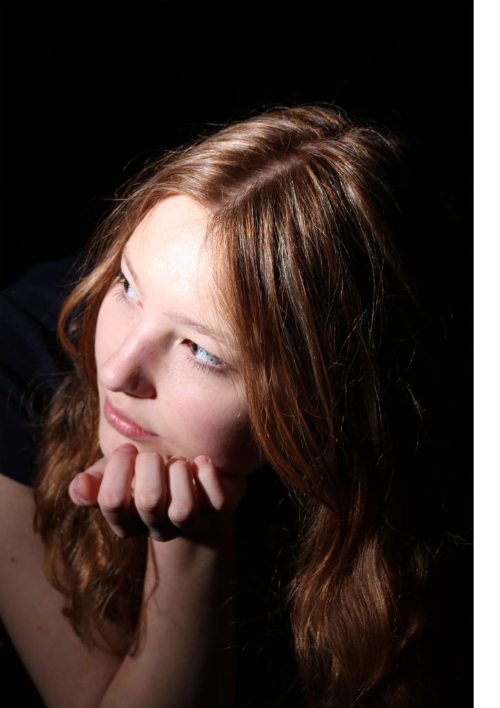
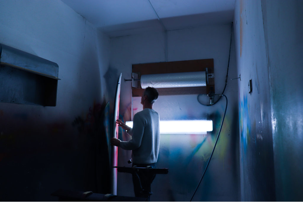
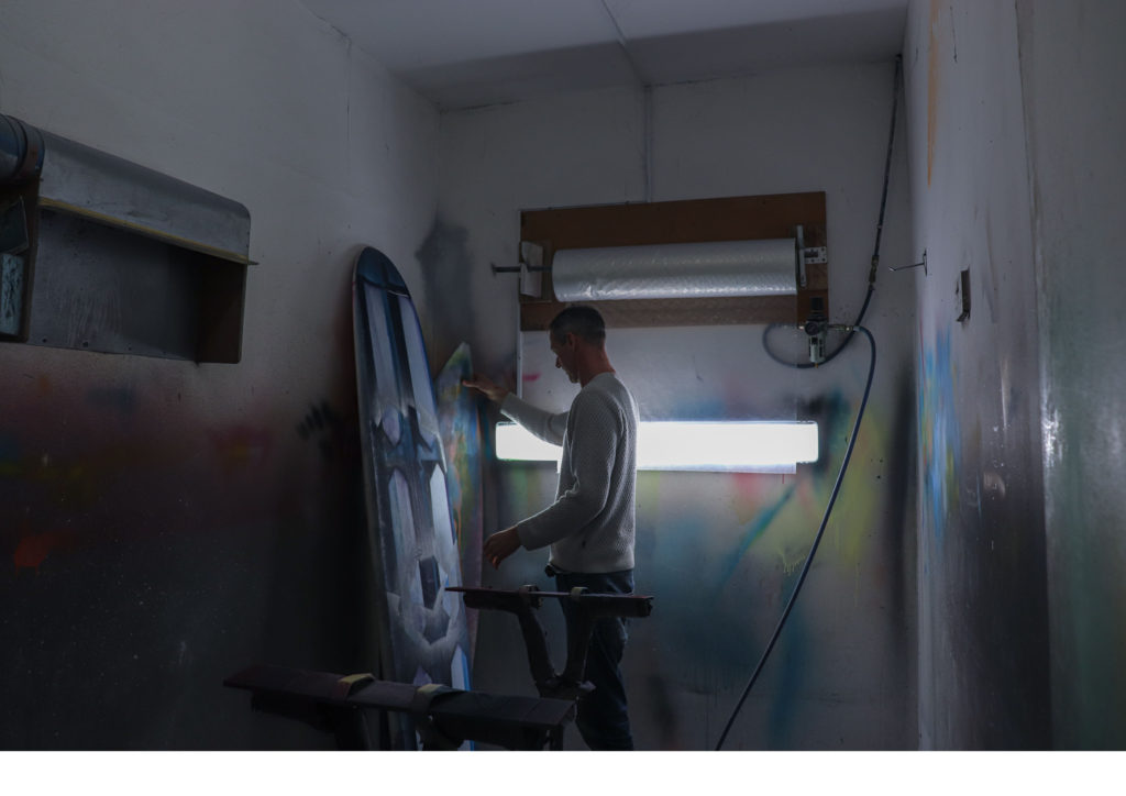
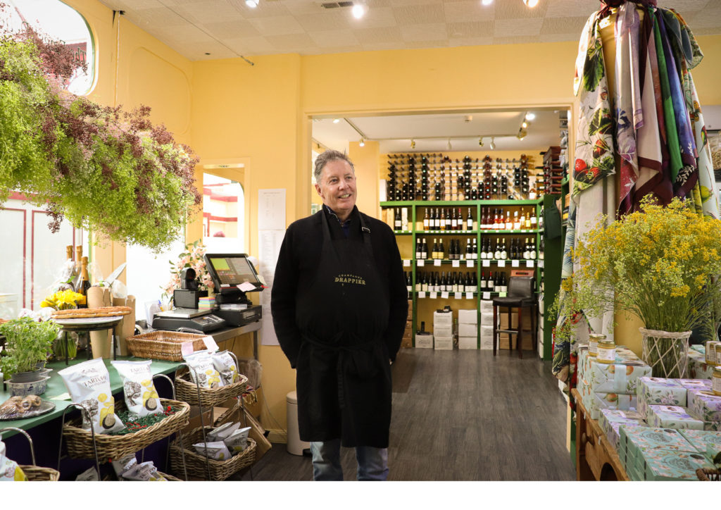
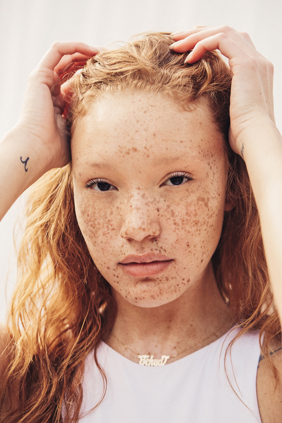
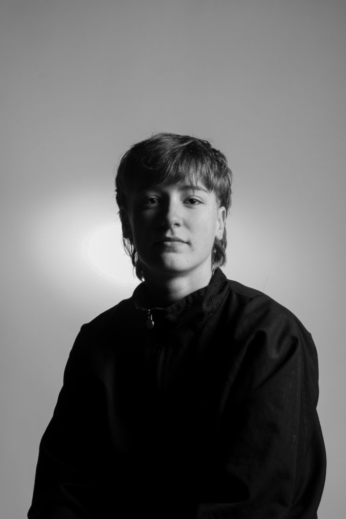
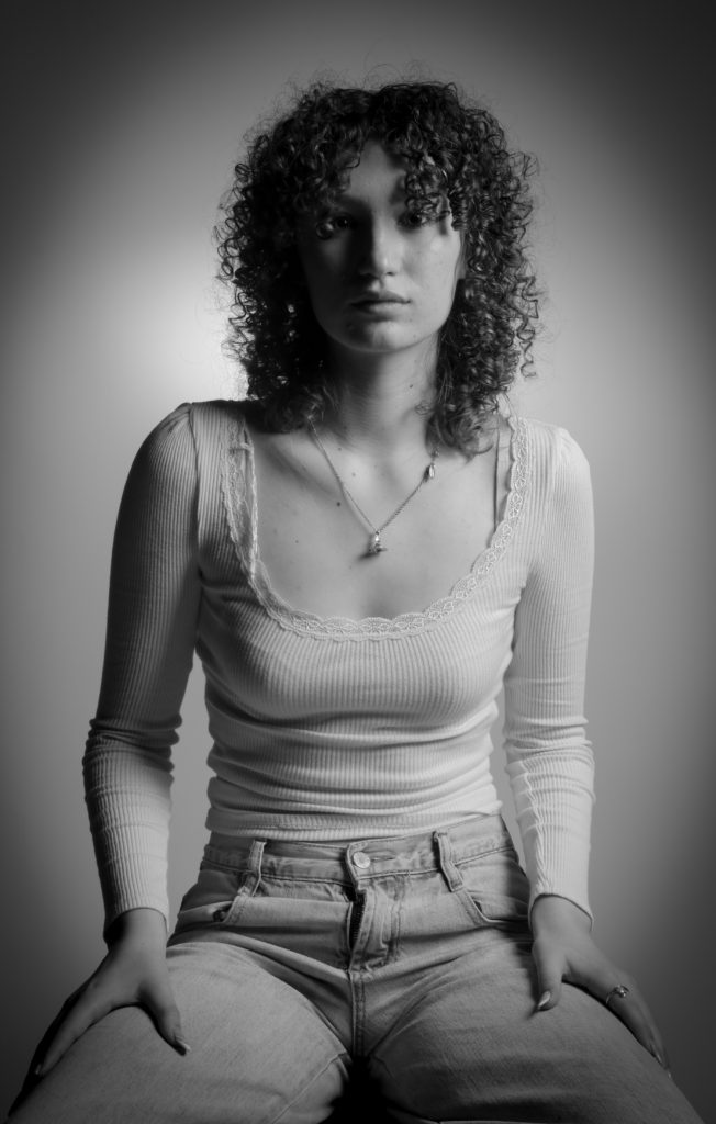
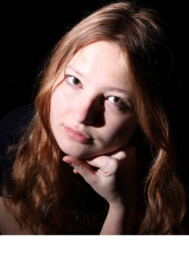
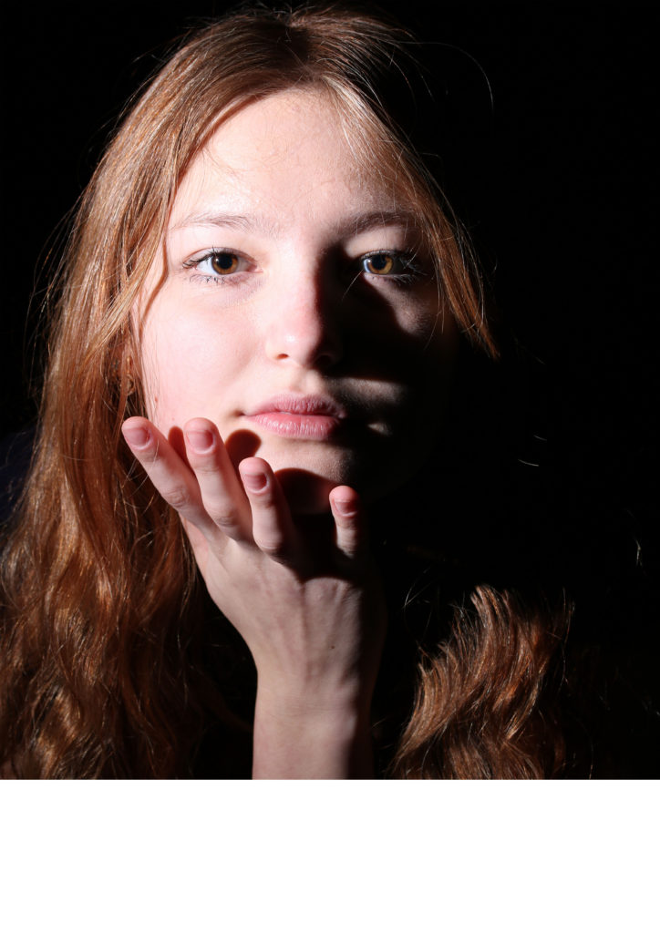
I think that my strongest work is from studio shoots (the best shown below) as well as my environmental photoshoot with Ryan Hervé.
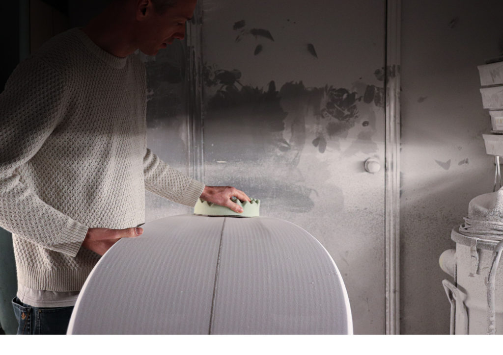
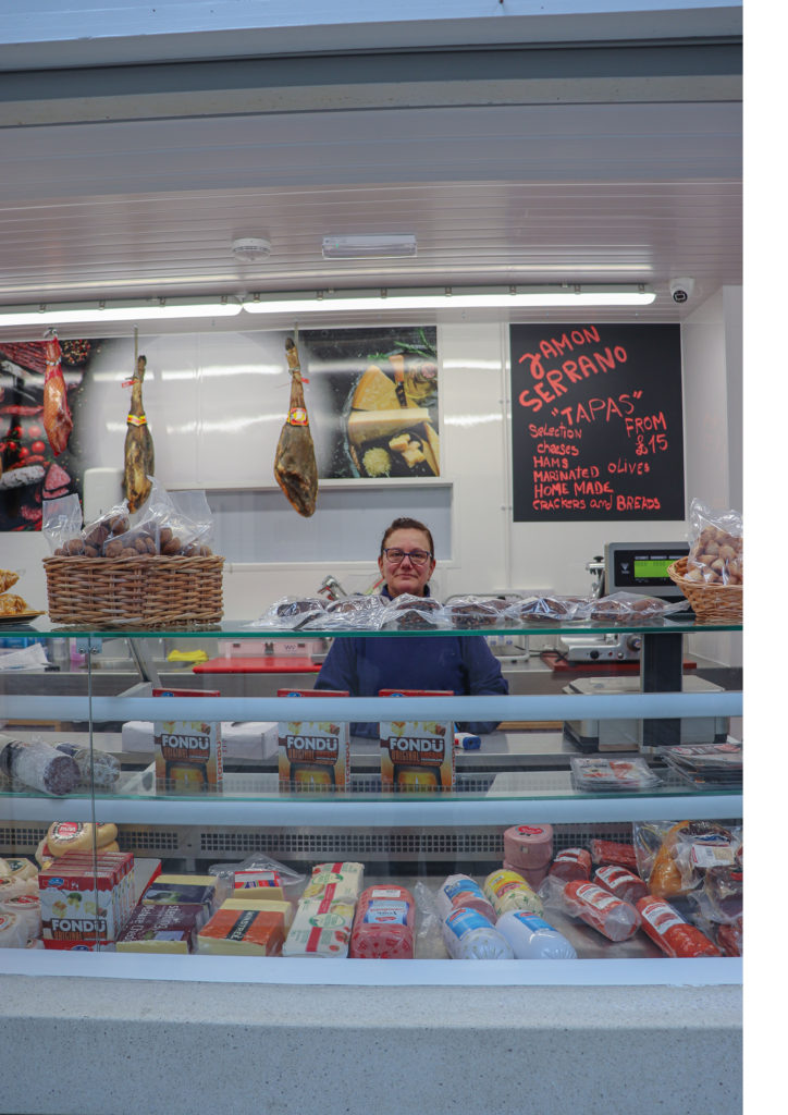
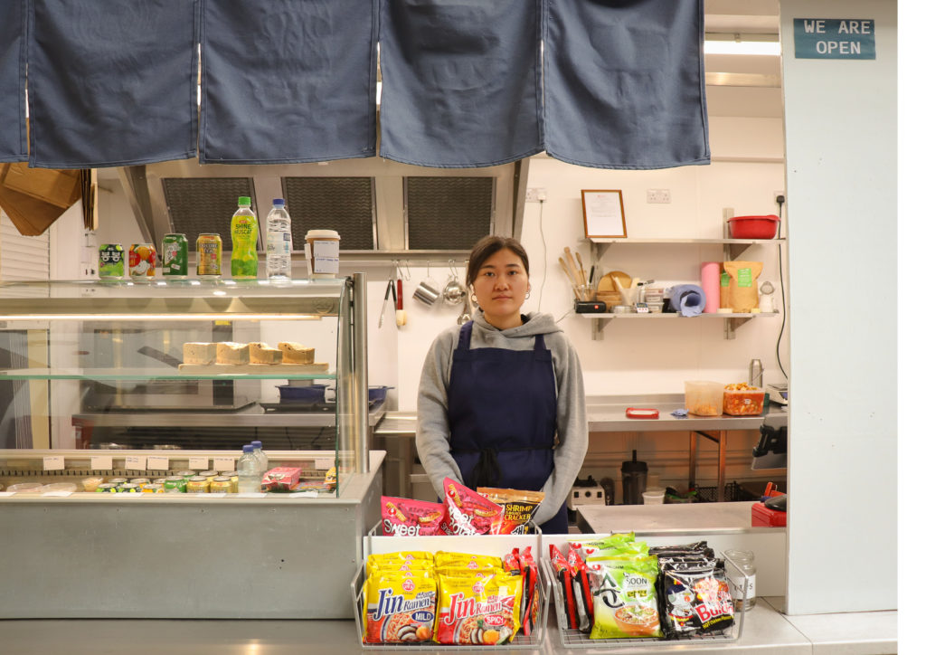
I am also really happy with my environmental portrait series from the Central Market in St Helier as it was my first experience of asking to photograph strangers and I think the outcomes were really worthwhile.
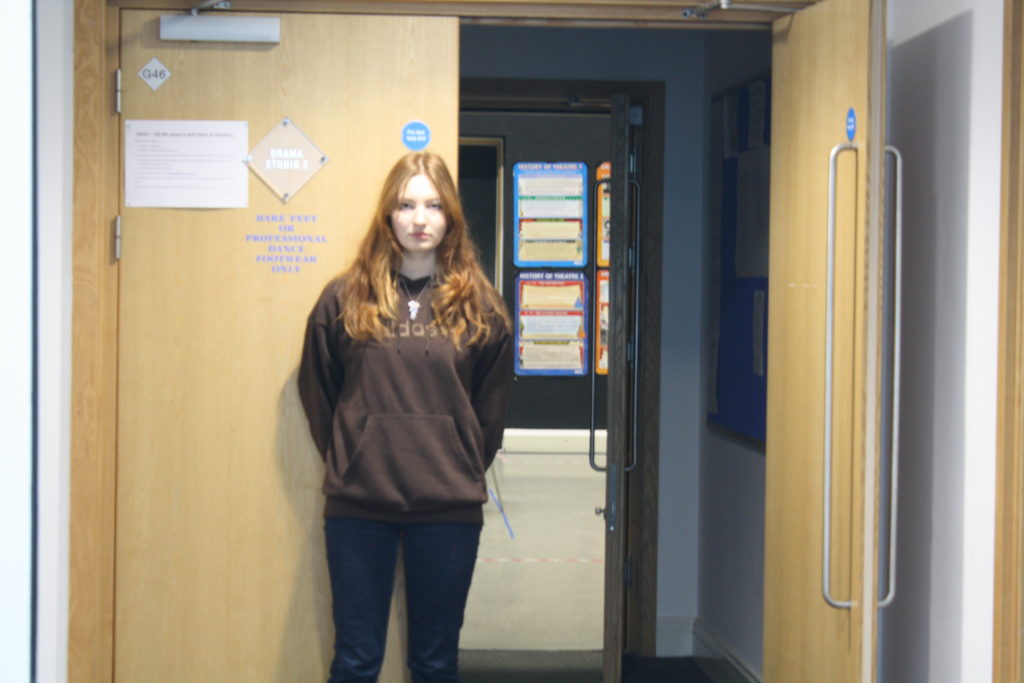
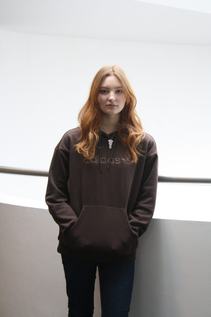
The weaker areas from this project I think are from my school photoshoot as they are not lit well and just not very successful technically.
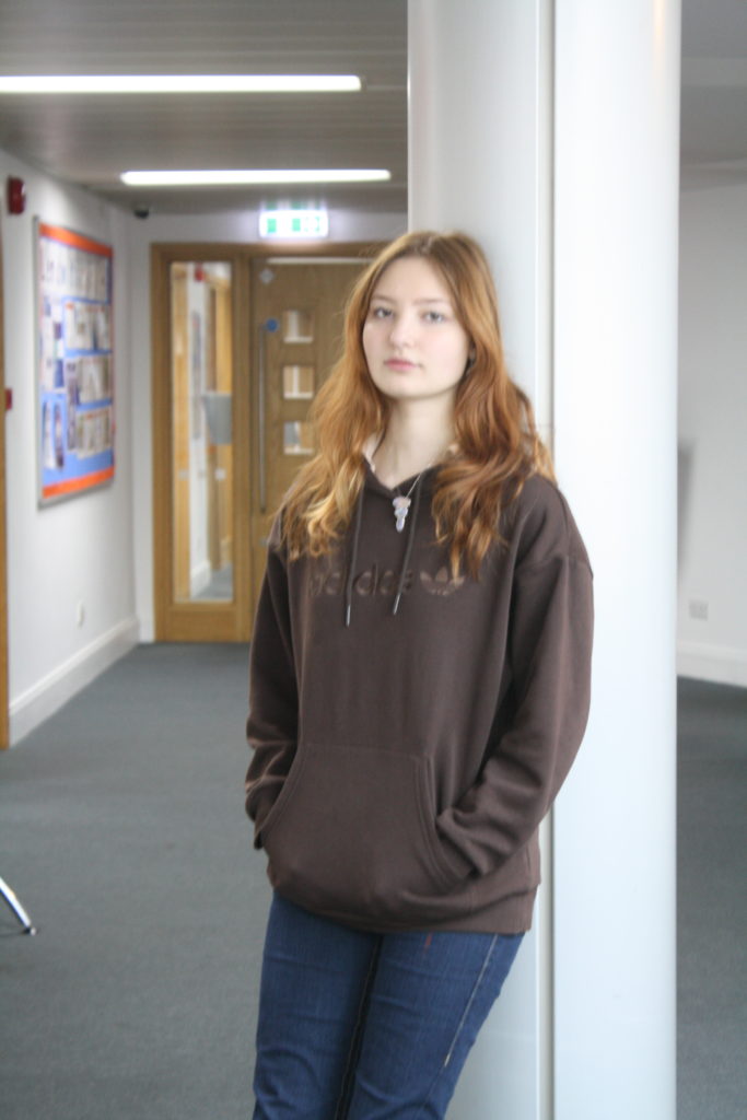
I also feel that there were a lot of photos taken in studio shoots that were mistakes or not successful because I was not fully knowledgeable on how to operate the equipment and lighting. I do however recognise that this was part of the learning process as I soon became much better at this.

Were my images successful in relation to my chosen artist references?

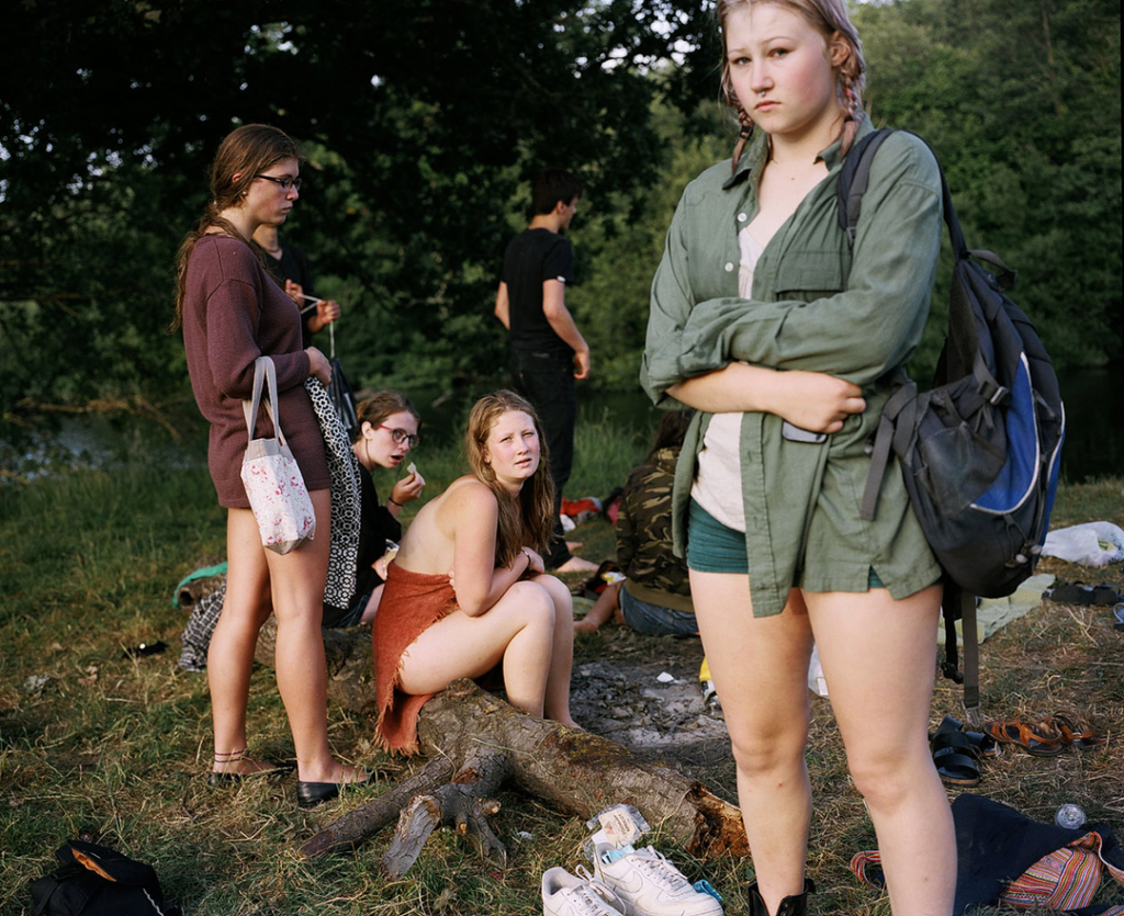
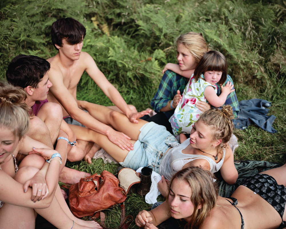
I think that, as I was unfortunately not able to work from every one of my artist references, I was not entirely successful in any endeavours to create work that is clearly inspired by my chosen artists’ work. The most successful photoshoots with regards to artist references were, in my opinion, my Sam Contis shoot, my self portrait shoot (inspired by Nilupa Yasmin), and my Justine Kurland inspired shoot (with this one there were images that could also be likened to the work of Michelle Sank/Doug Dubois). The reason I think that these were more successful than others is because I thought about my references and thought a little more about the meaning behind the artists’ work as I was taking my images. My artist comparisons can be found here. I definitely think I could have worked harder to produce images that were more similar to my artists’ work, through more thoughtful choices in either setting, costume, or lighting, and perhaps by taking more time to go out on multiple shoots.

Overall comments

On the whole, I am pleased with my outcomes but feel that I could have worked harder and been more confident in my choices. I think the reason my ideas were not executed as well as I had hoped was because I did not take the time to plan and review my artist references to a sufficient standard before taking my images. I took too long to come up with ideas in the beginning, perhaps due to a lack of personal inspiration, and I think this was my biggest error on the Identity project. However, I have managed to produce some work that I am really proud of, especially with regards to the idea of environmental portraiture.

Artist comparison

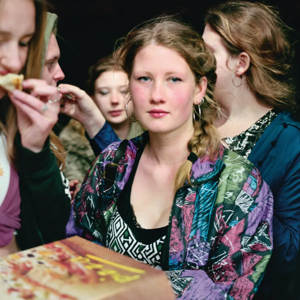
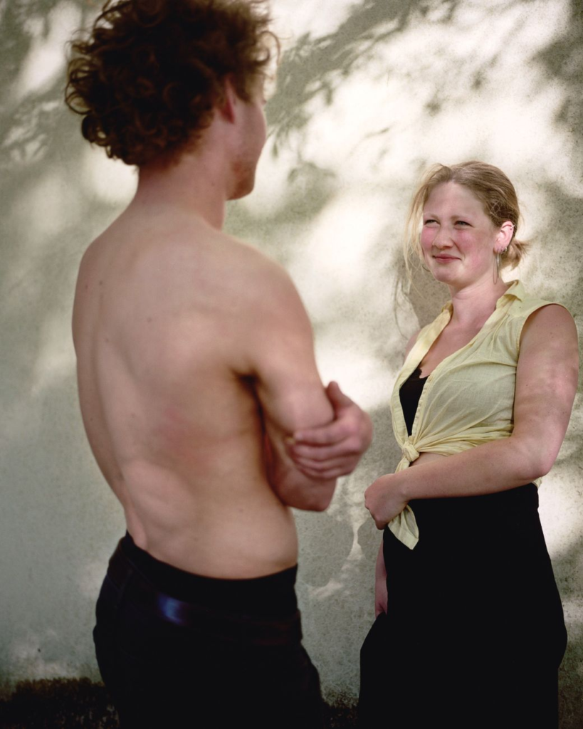
Kayla Varley

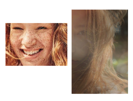
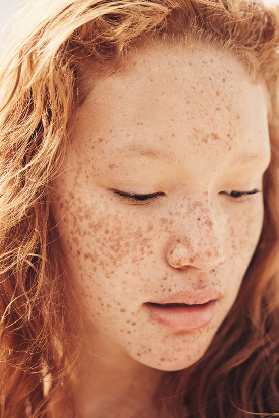
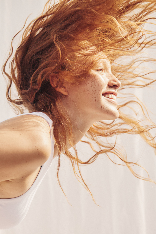
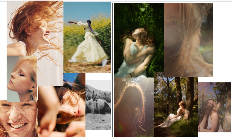
Bellow I have created a comparison between mine and Kayla Varley’s images. As I studied and analysed her images earlier, I have been inspired to use aspects that I have learnt in my own photographs.

As the images I put together on the left have a bigger variety as they are of different people and different photoshoots, this is what creates a big difference between the single photoshoot I have done and different photographs that Kayla Varley produced. The similarities are that many of both mine and her images are that most of the outcomes are posed, meaning they are aimed and not “accidental” photographs, rather then capturing the moment, they are more constructed and planed. although her photographs are quite fun and usually of moving image, like the portrait of a woman with sand falling through her fingers, in the bottom right corner, or the moving photographs where women are laughing or you can see the movement in their hair, some of my images show that, especially the ones against the light. Describing mbellow my image with one of Kayla’s :

although aesthetically these images have a big difference between them, Like the colours, tones, pose, location, focus, other camera setting and editing, I want to include this relationship between her outcome of this specific photoshoot , and my outcome. this is because the following images of hers inspired me the most:

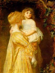
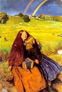
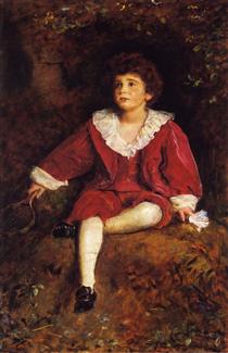
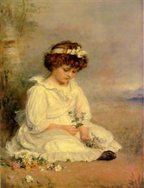
John E.Millais

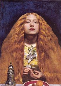
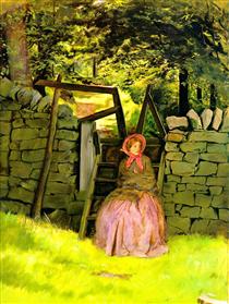
Doing further artist research I’ve discovered John E.Millais’s artwork which links very well with the idea behind my images.

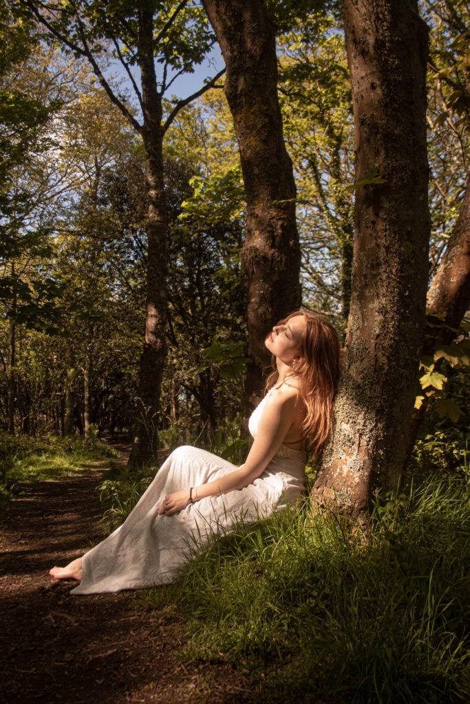
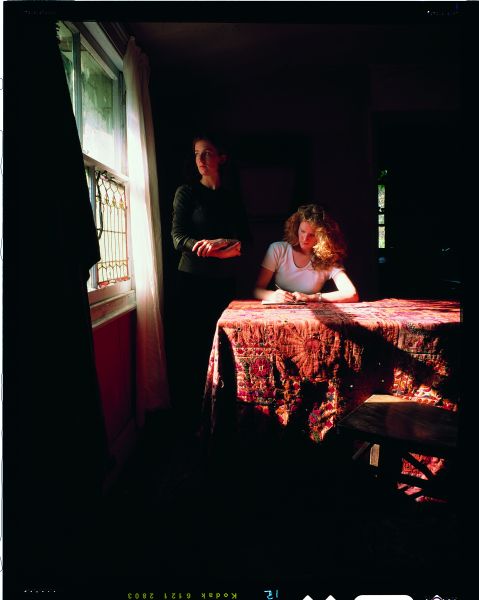
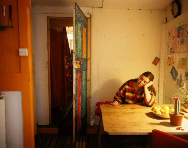
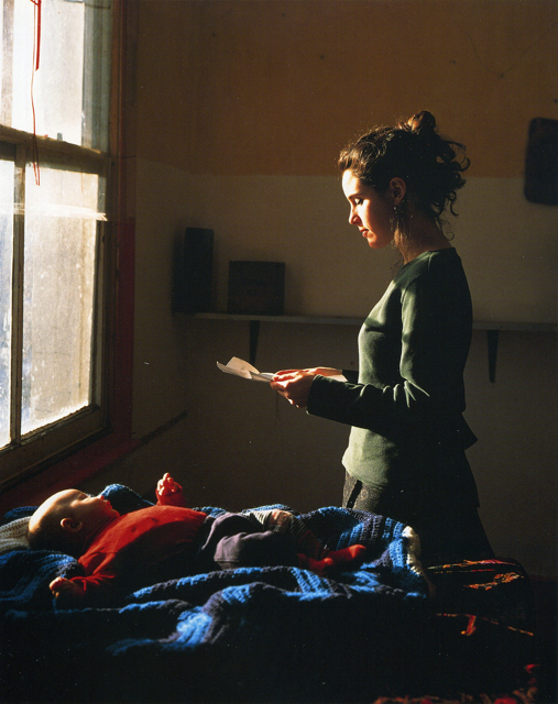
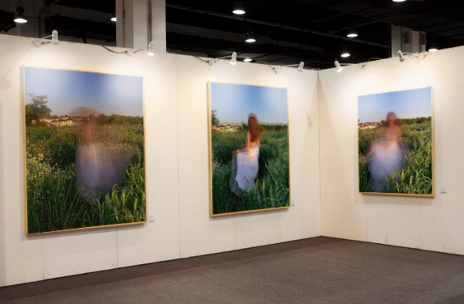
What I wanted to achieve with my final images is to represent a body of work that relates to performative arts, performative photography. I didn’t want ordinary photographs which are just a portraits created in the studio , where the model is serious and looking straight at the camera. I wanted to show a meaning of femininity in my final photographs, therefore I thought including an aspect of performative photography, regarding the posing, would write more of an interesting story.

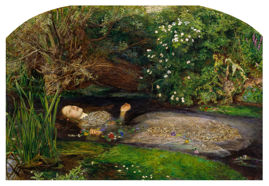
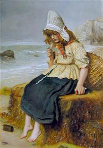
Comparing my phot graph with a painting of Millais, there’s a bigger similarity between them rather then Kayla Varley’s work. As I got influenced but not one but many other artists, my photographs include a variations of different aspects that relate to different artists, for example what I have taken from Varley’s photographs, is the idea of movement, fun and femininity. This is why a series of images look more like hers. Although it was the same photoshoot, I have many outcomes that differ from each other, this is why the above image would link more to Millais artwork.

What is so similar between the artists is the idea of drawing inspiration from women. Millais artwork mainly includes women an children, and this is why I decided to model for this photoshoot so that I can have a female, not only representing women, and definition of femininity, but also a link to typical view of tableau artwork, where women would be the main inspiration used. Since I was producing a photograph that was influenced by historic realistic art, there’s a lot of element, especially in that photograph that show that, like the element of nature, the photograph is in fact in nature, performative art, dress, and a female model. another aspect that I regret not including is flowers, maybe holding flowers or having them in a photograph, this is because flowers are seen as a very feminine signature item, because of their beauty and history.

Overall I think I have shown aspect of both artist in different outcomes, however still including aspects of my own work into them, like the editing, composition, and framing. I like how well many link to a historical realistic artworks, but are more “modernised”. What I could improve is the outcomes that related more to Varley’s work, as these have less similarities.

Further artist research

Jhon E.Millais

Millais actually spent most of his early childhood was spent in Jersey, to which he retained a strong devotion throughout his life. Millais was originally born in Southampton, England, in 1829, but was of a prominent Jersey-based family. Most of his early childhood was spent in Jersey and he grew up here. even at a young age he started becoming successful, because of his passionate mother,  when he was eleven he became the youngest student to enter the Royal Academy Schools.

Another thing that is very important to mention is that he was a part of the Pre-Raphaelite Brotherhood (later known as the Pre-Raphaelites), this was a group of English painters, poets, and art critics, founded in 1848.  The Brotherhood believed the Classical poses and elegant compositions of Raphael in particular, this had been a corrupting influence on the academic teaching of art, hence the name “Pre-Raphaelite”. The group continued to accept the concepts of history painting and mimesis, imitation of nature, as central to the purpose of art. The group sought a return to the abundant detail, intense colours and complex compositions of Quattrocento Italian art

Millais produced a picture that could serve as the embodiment of the historical and naturalist focus of the group, Ophelia, in 1851–52.

Ophelia
John Everett Millais Around 1851

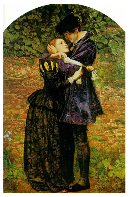
 His later works were enormously successful, making Millais one of the wealthiest artists of his day. He achieved popular success with A Huguenot (1851–52),which depicts a young couple about to be separated because of religious conflicts. He repeated this theme in many later works. All these early works were painted with great attention to detail, often concentrating on the beauty and complexity of the natural world.

A Huguenot (A Huguenot on St Bartholomew’s Day) 
1852

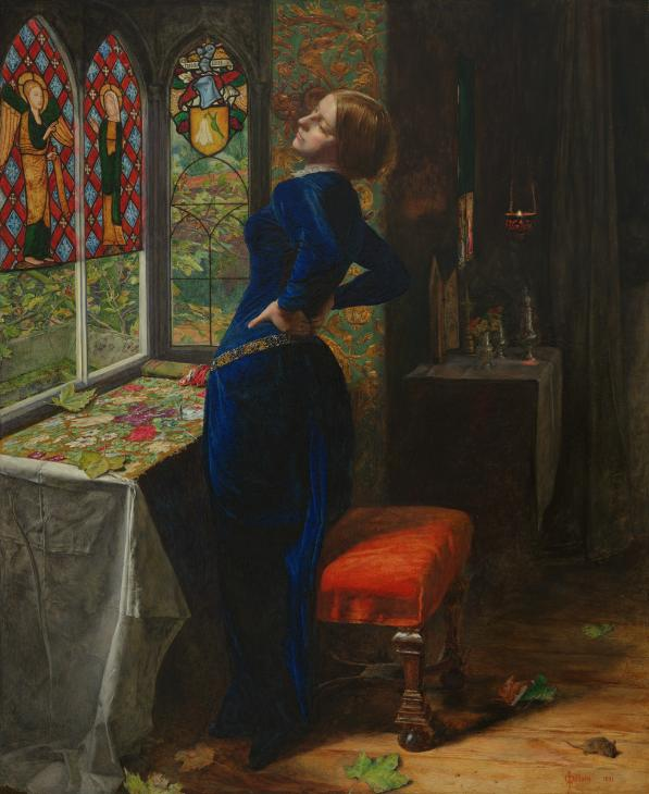
the image above “Mariana” presents a woman isolated in a remote farmhouse, waiting for her lover. Like other Pre-Raphaelite artists, Millais drew inspiration from earlier works of literature, particularly those with a focus on female beauty and sexual yearning.

Millais’s painting ‘Mariana

What I most like about Millais’ work is the story telling behind his paintings, every painting has a purpose and meaning, his attention to detail and cooperating it into the painting is also another reason why his work inspires me. as he draws his inspiration from literature, theatre and other forms of stories that were already published, the narrative of the painting flows without knowing the full story behind the artwork.

Although Jhon E.Millais is a painter, rather then a photographer, his painting are like photographs in the 18th century. They a closely related to performative arts, that later turned into performative photographs, they are now a modern body of work.

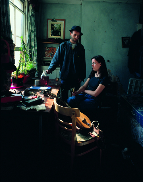
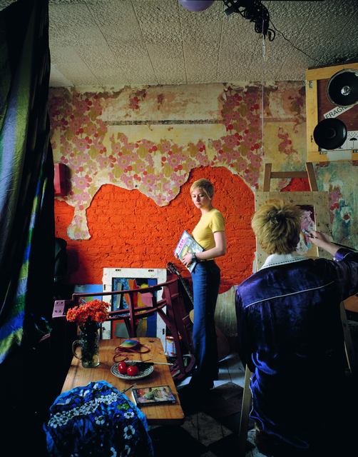
Another artist, photographer that follows a similar style of tableau, however showing this in a modern form through photography, is Tom Hunter.

What makes his photographs so similar to Millais’ is that Hunter explores drawing on art historical references. He reconstructs stories, memories and myths to paint a psycho-geographical landscape.

There is a huge link between the artists, regarding the fact they are 2 different body’s of art, where one is a painting and another is a photograph. Hunter draws inspiration from paintings such as Millais’ artwork, therefore this is a similarity between them. They are centuries apart, Hunter is a contemporary artist, it’s interesting how the world, especially the art world changed, when cameras were not invented yet, painting and drawing was the only picture that could be produced, and as this changed to after cameras, this realistic artist style slowly dies as there’s not a big request for paintings as such, because a camera can do just that, quicker and more efficiently. This is why I am so interested in performative photography as, regarding now, photography is usually used as documentative purposes, photography that is for artistic purposes , to me should do what artworks do , as they are a form of artworks. This is to question a persons views, opinions and existence, so that a person is moved by a picture as they are fascinated by the meaning of it. That’s why photographs that “tell a story” are so meaningful to me, they show that even though the world changes, story telling through, painting, drawing, photographs, didn’t change.

These images would spark my intention toward them, as anyone can write a story to an image, however Hunter helps the viewer to do that, the photograph is interesting as every detain in the photograph seems important.

Performative Photography

What is performative photography?

‘Contrary to this idea of the photograph as a trace of something that has passed, in Performative Photography, the camera instead becomes an instrument of human experience, including the discovery, tracking and recording of a contemporary event.’

Performance was seen as distinctly separate from art that could be collected and shown by art museums in the 1960s. Performance was seen live and it was challenged as a traditional notion of art by more modern styles of art developing. However today performance has evolved to be seen as more a set of strategies accessible to modern artists, one that is not inherently different from other art forms and not beyond what a museum can show.

Performance arts had a fundamental role in the 20th century and consists of five simple elements: time, space, body, and presence of the artist, and the relation between the creator and the public. The main goal of performative art is to create a reaction, occasionally with the assistance of improvisation and a sense of aesthetics. Themes are used in these types of art, life experience is typically a common theme, or the need of denunciation or social criticism with the spirit of change.

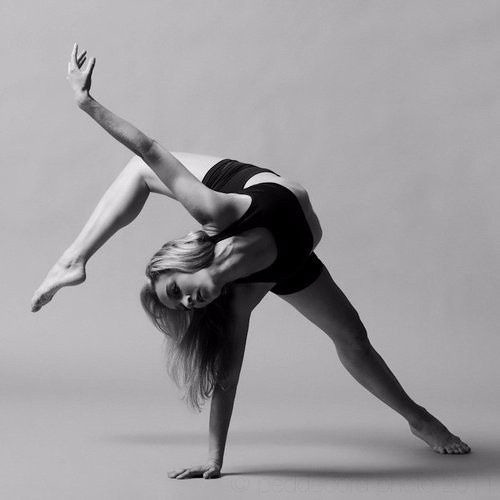
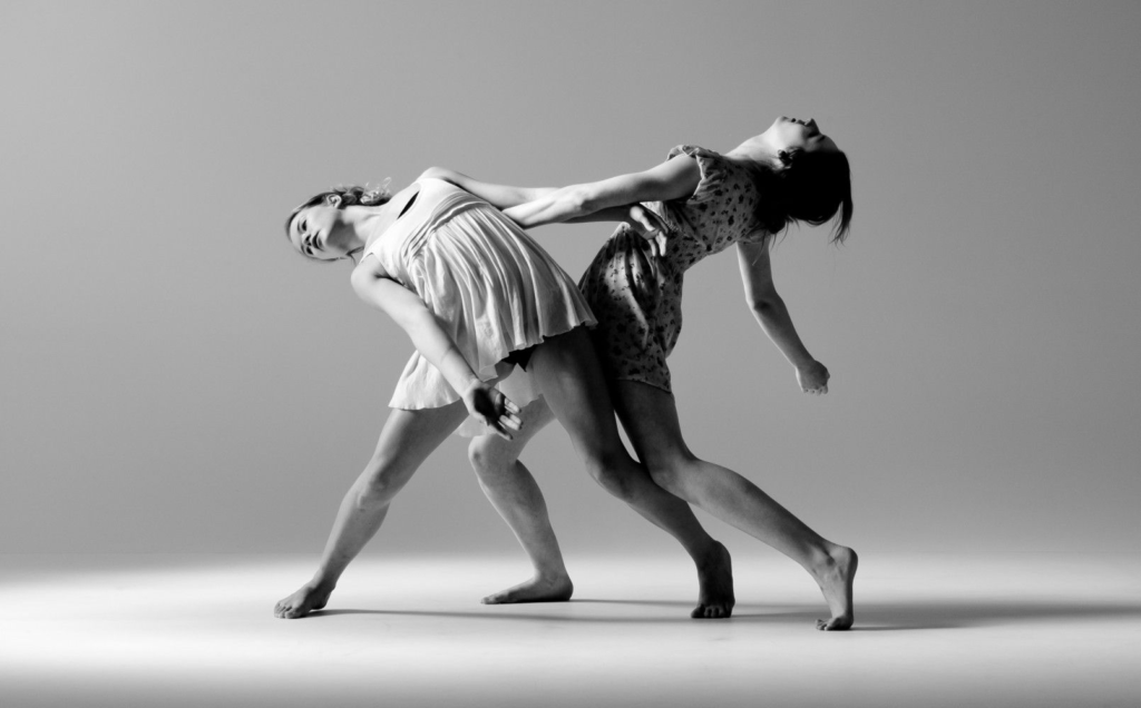
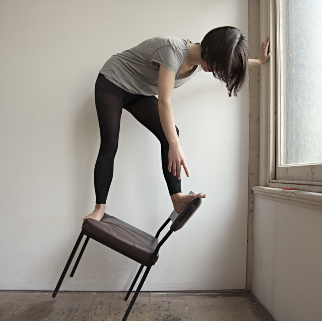
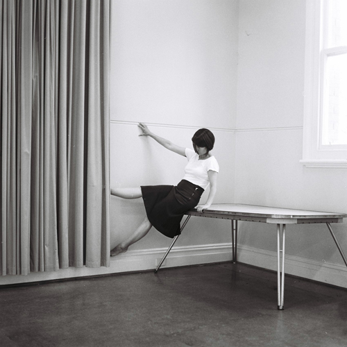
Clare Rae and Francesca Woodman both use performative photography to present themselves and their ideas through photos. They present themselves in a style that matches with preforming arts such as contemporary dance. Woodman especially shows this through the movement and captured time in her long exposure images. The idea of performing for their art to present themselves and their thoughts that strongly represent feminism.

Contemporary dance compared with Rae:


Rae holds a similar style to this, showing how performing arts links with performative photography and that over time the two have joined to present the human experience and record time and beliefs.

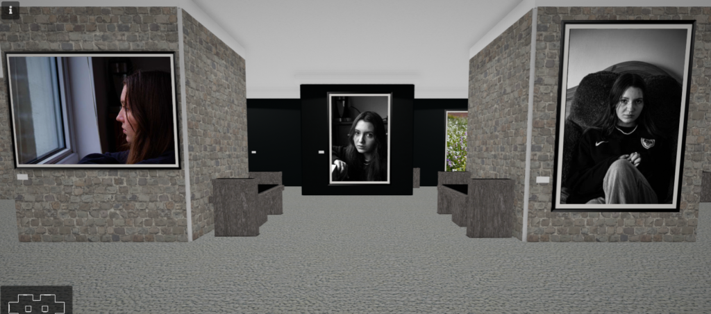
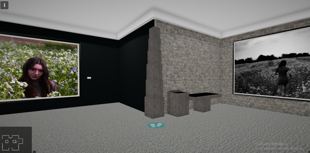
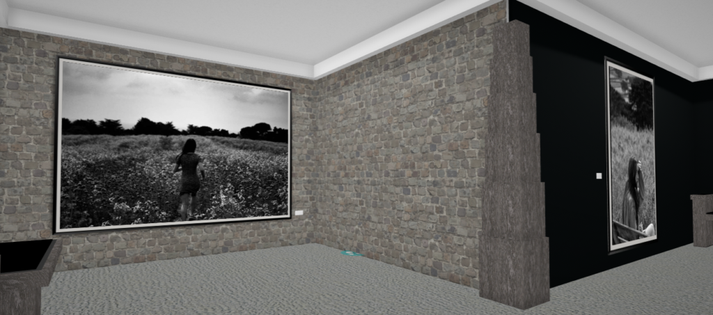
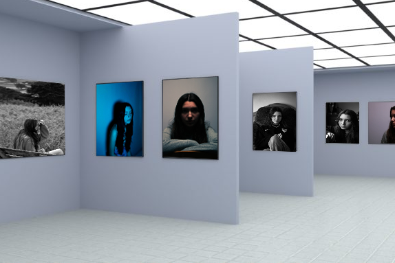
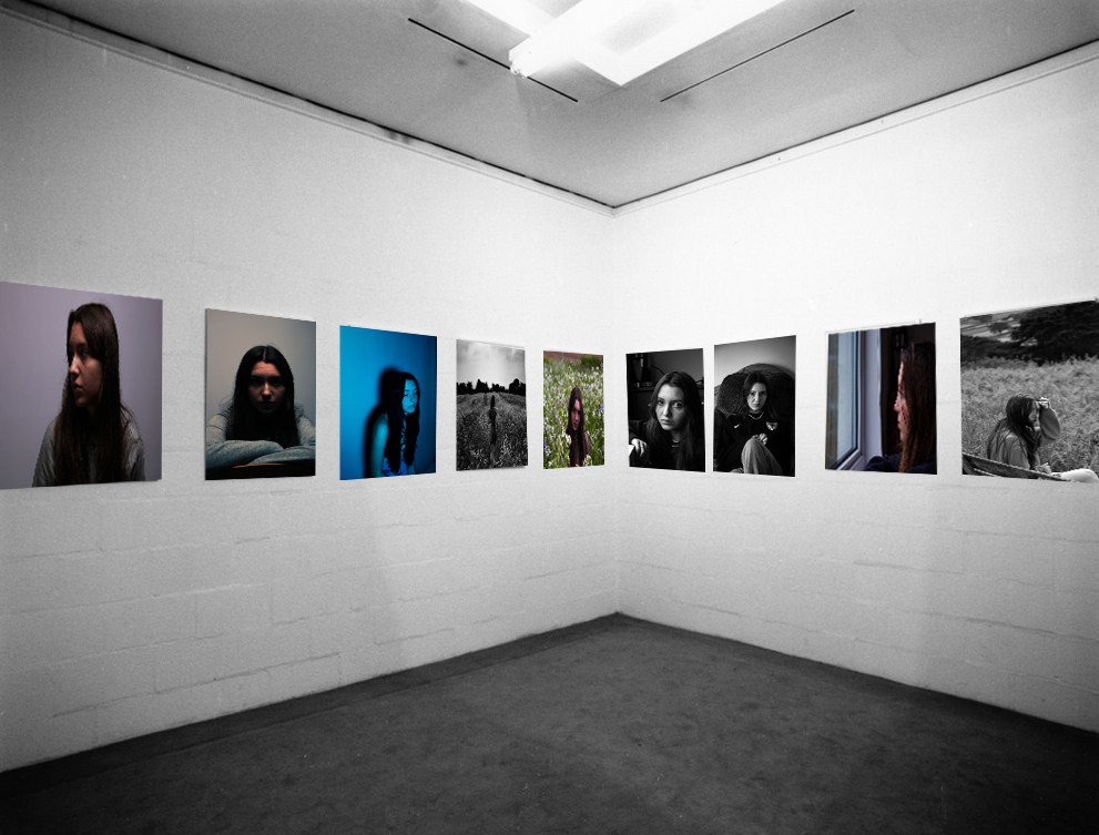
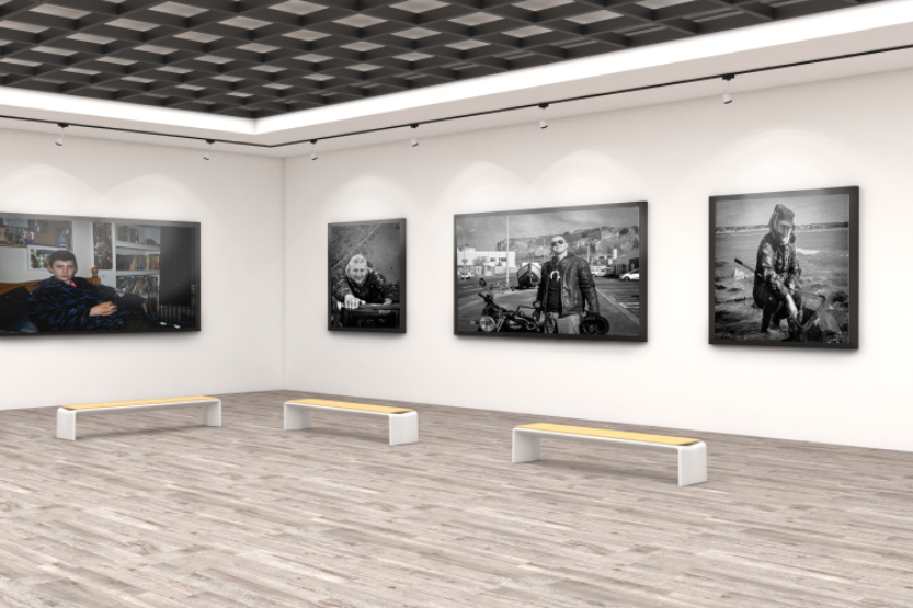
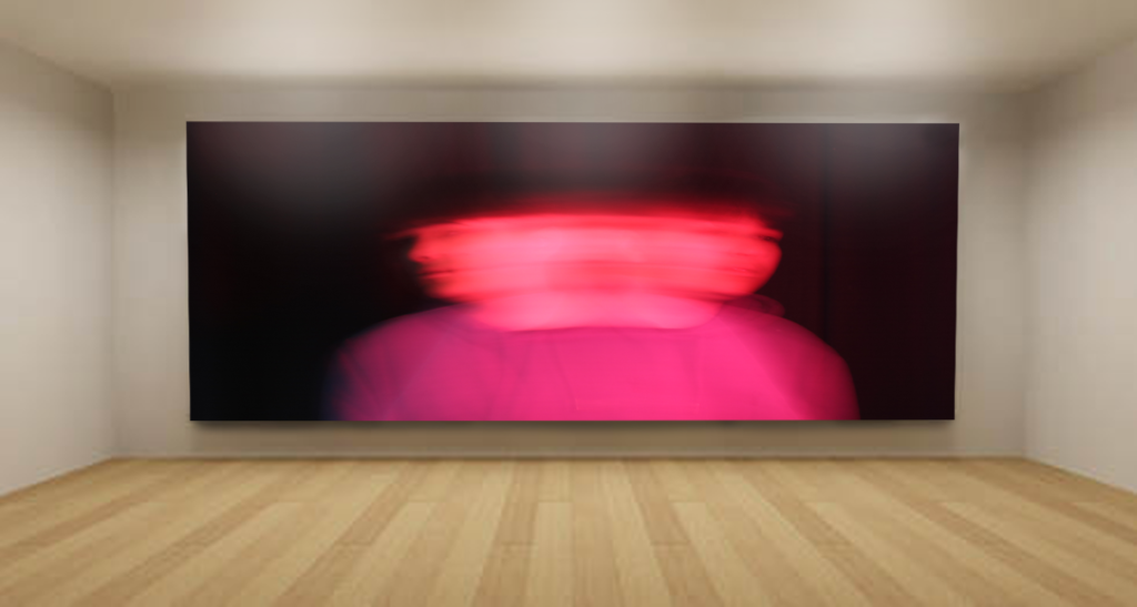
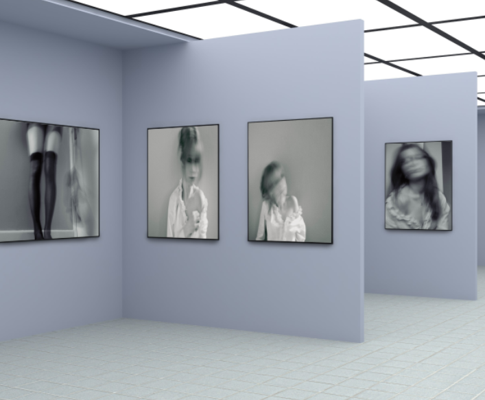
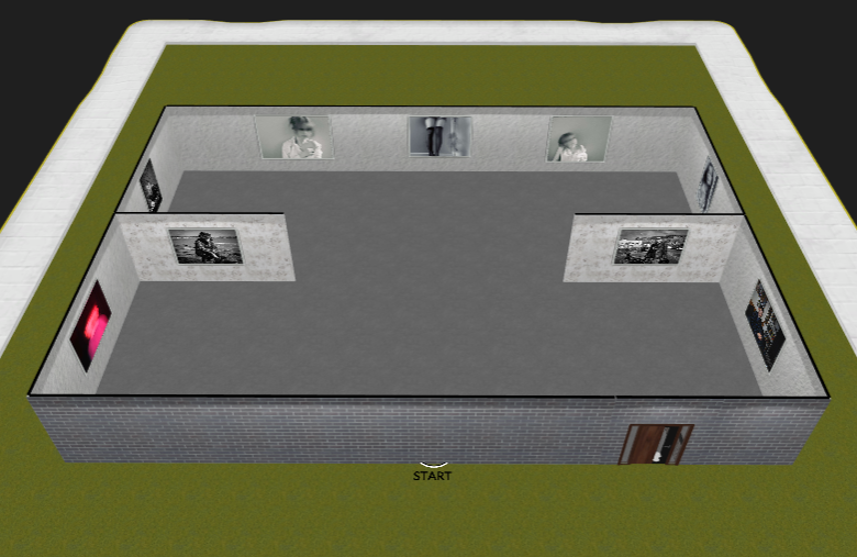
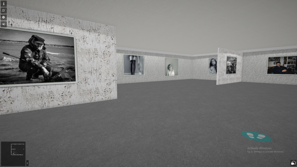
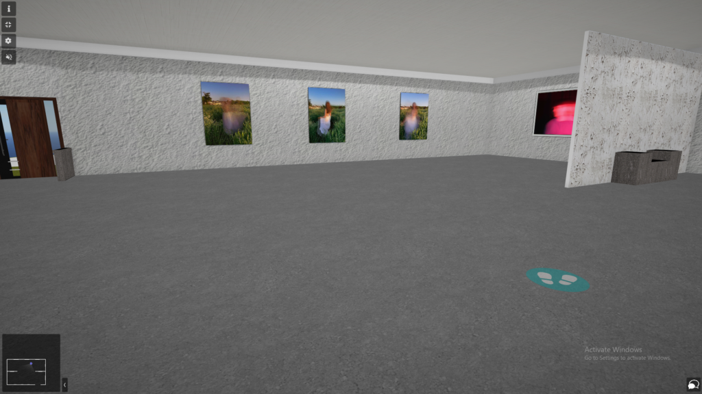
Virtual Galleries- Portraits

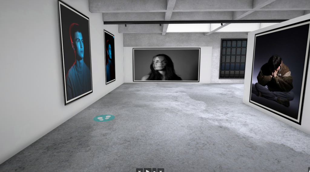
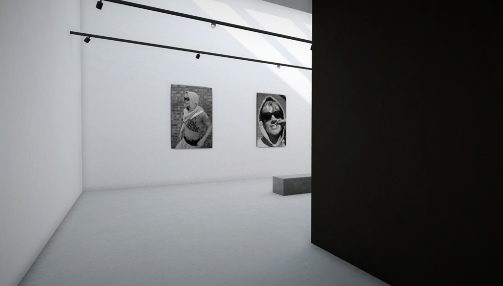
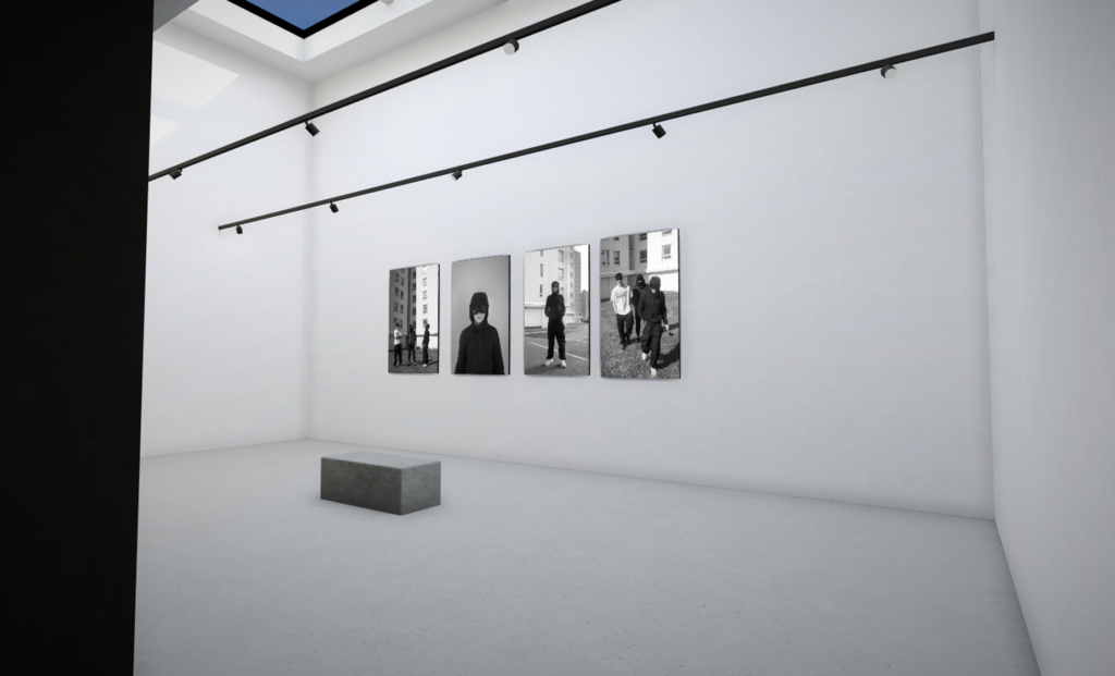
Gallery of Environmental Portrait Finals
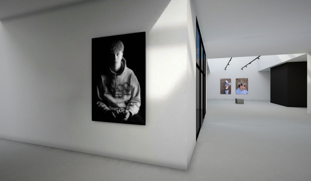
Gallery of Headshot Final
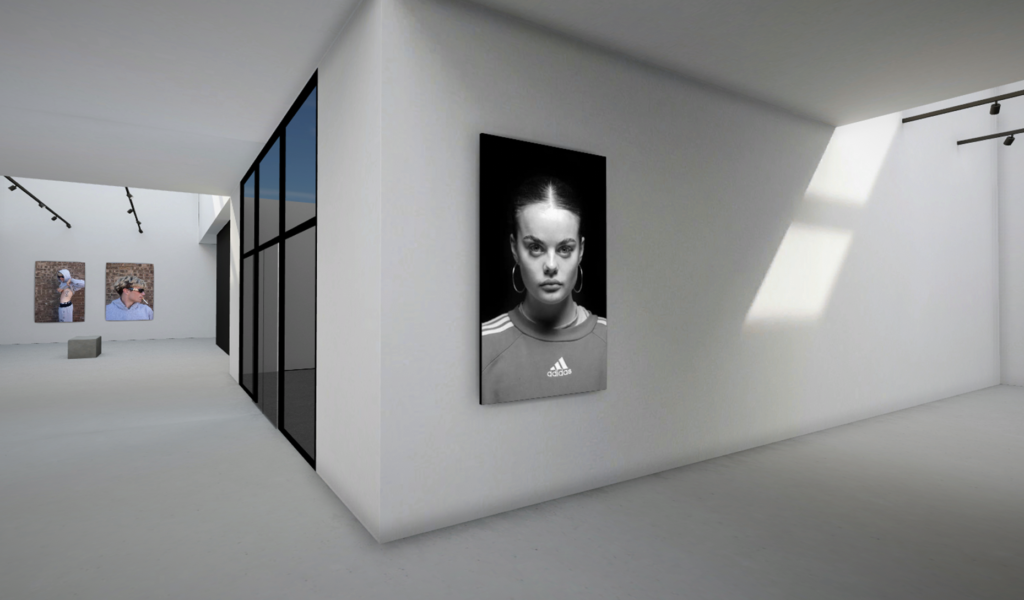
Gallery of Femininity Finals (1)
Gallery of Femininity Finals (2)

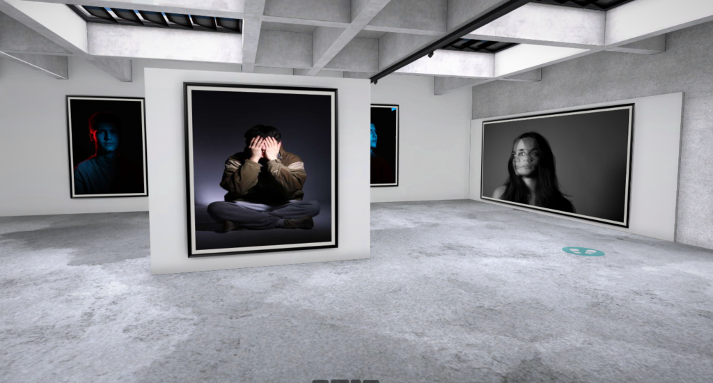
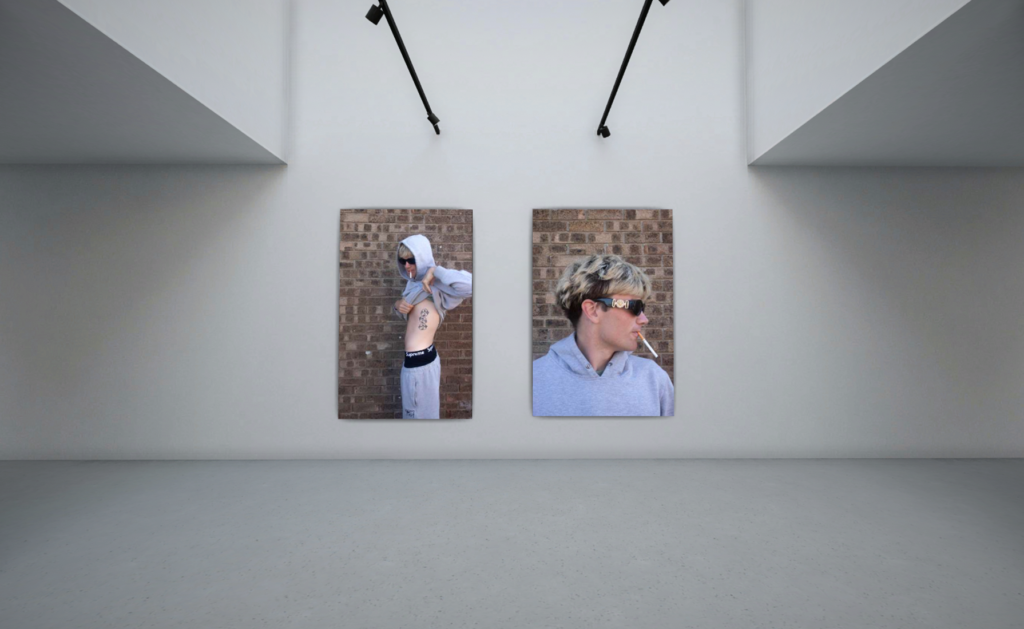
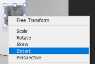
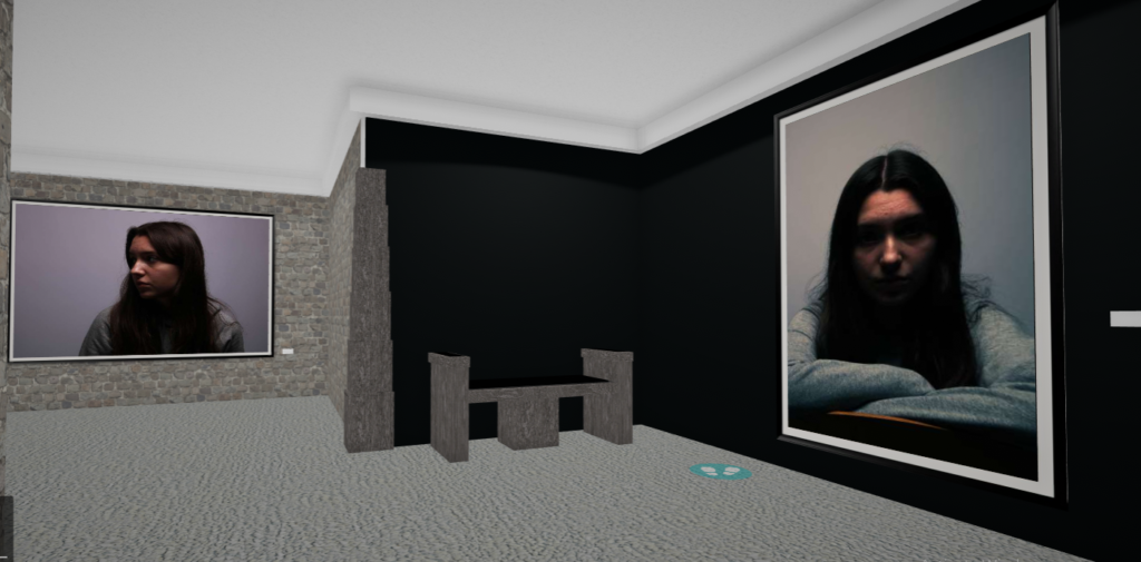
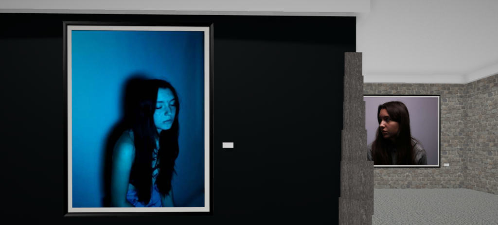
I created these galleries using photoshop, using the ‘distort’ option from the ‘free transform’ tool to fit each image into a frame. I also used the brush tool, using white and black (setting the colours to a low opacity) to create shadows and highlights, making them appear more realistic.

Link to Virtual Gallery created in artsteps:

https://www.artsteps.com/view/646dc67d80ca2a08c6d258bb

Photoshoot 1 – Plan

For the second photoshoot I was inspired by the work on Sian Davey’s ‘Martha’. I wanted to capture photos of my friends just existing creating a small look into their world. Like Sian Davey I want to focus on one friend specifically as she does with her daughter.

When- bright daylight/ evening – summer glowy light

Who- My friends – focusing on keria

Where- on the beach as its a frequent activity

Sian Davey’s ‘Martha’

Final analysis

How did I planned the project:

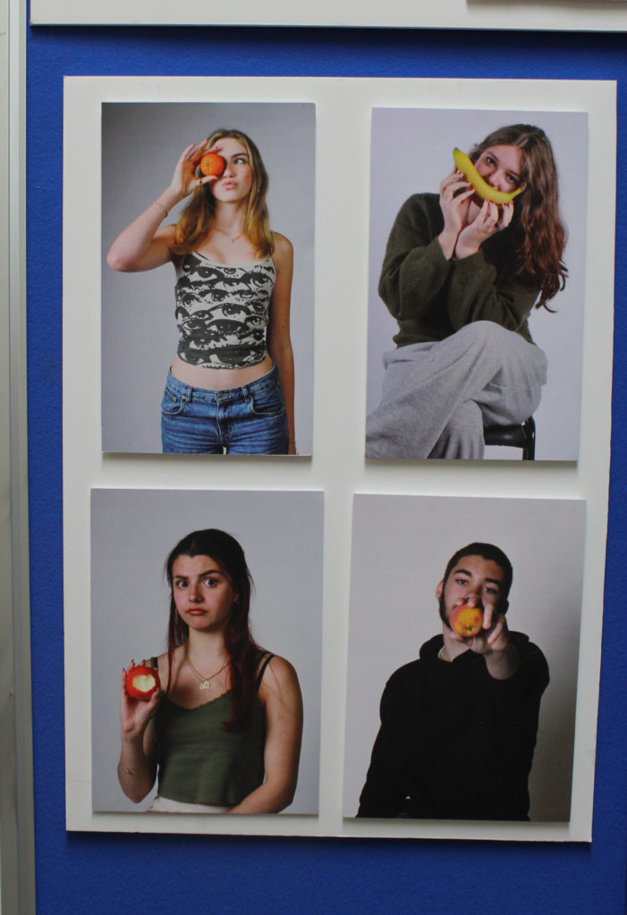
Majority of my final outcomes I have used are from photoshoots throughout the portraiture project. However, my more recent fruits portraiture project was done to reflect aspects of femininity and masculinity. I collated a group of my friends and then brought in some fruit that I had at home. I explored different ways of photographing the models i.e., different poses. By planning my photoshoots to be taken in the studio, I could control the lighting as well as the backdrop. The plain background allows the attention to be focussed on just the models, more specifically the fruits. Overall, I think the outcome is quite playful and vibrant.

What went well:

I am happy with my final outcomes and believe that I have displayed a range of my work from throughout the photography project i.e., multi-exposure, lighting techniques, environmental portraiture.
What could I improve on:

During my fruits portraiture photoshoot, the band was practising in the studio so I couldn’t turn off the lights. This resulted in the peach photograph appearing slightly dark or dull. If I could do it again, I would try edit all the photos better so that they were all as vibrant as the orange photo.

I could’ve tried to select more images, or been more selective and chosen better outcomes, so that I could reflect more of my work that I have created throughout the project.

Mounting images:

I like the way I have mounted the images, I think I’ve effectively presented my images in a way which makes them visually appealing.

I have double-mounted these A5 images on foam board in a grid formation. These are images I created in theme of the masculinity vs femininity theme. By creating mood-boards when given this theme, it inspired me to carry out this photoshoot. I enjoyed creating these photographs as they have elements of symbolism and overall they were fun photoshoots.
The apple has been associated with mythological figures and goddesses throughout time, and therefore becoming a symbol of femininity. Another interpretation is the biblical story of the forbidden fruit. This is because the model has eaten the apple, therefore becoming a symbol of Eve.

In my self-portrait of the banana, I am posing with it as if it is my mouth smiling. Bananas have been called the ‘happy’ fruit, therefore symbolising happiness.

The orange is associated with optimism and energy, which is reflected by the colour and vibrancy of the photo as well as the playful pose. Whereas the peach just has playful connotations.

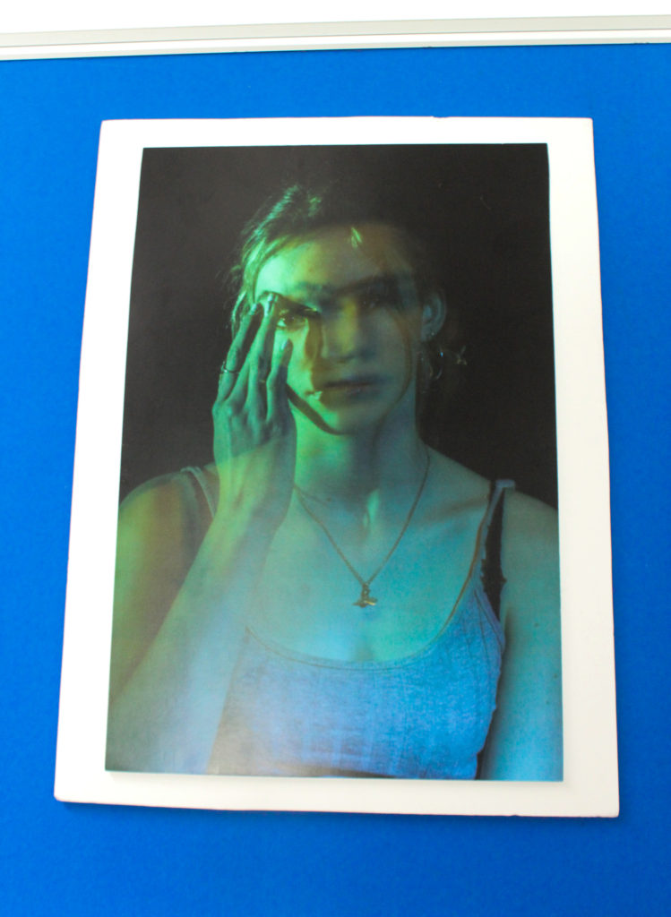
I have double-mounted this image on foam board. I printed this image as A3 as a stand-alone image as it is quite effective.

This is my favourite multi-exposure photograph I have taken from when exploring with using lighting in the studio. I like how each exposure is a different colour, and because there is multiple exposures they blend to make a really visually appealing result.

The model has her hand raised, touching her face. I think this adds a small touch to the image, making it less boring by adding an aspect of asymmetry.

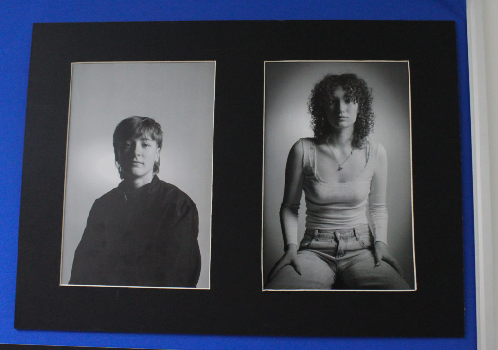
I created a window mount to display these A4 images. These are a couple of my final outcomes from a photoshoot I did when exploring lighting techniques. These are evidence of Rembrandt lighting and I think they are my strongest outcomes from the project.

I have edited these images in black and white to dramatize them, but also to reflect the lighting technique. With colour, there is more occurring in the image, and this takes focus away from the lighting technique I have employed.

I mounted these images on foam board, then taped them on some black card to give them a 3D sort of effect. The black background suited these images best due to the dull lighting during the photoshoot as well as the dark colours in the images.

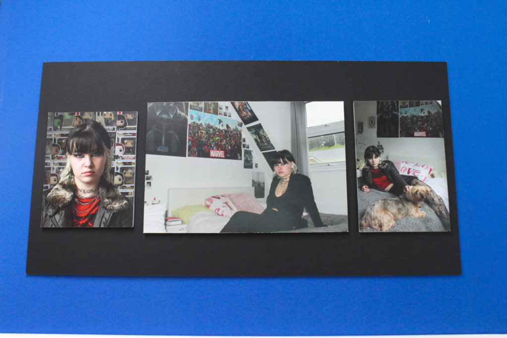
These are some of my photographs from the environmental area of the portraiture project. I photographed a friend in their room in order to reflect parts of their personality. Before the photoshoot, I asked them to dress a certain way and to make their makeup more eccentric in order to exaggerate their everyday appearance.

The image on the far left is A5. In the image, I had asked them to stand in front of a collection they have. I especially like the way this image is framed and that the background is this collection being shown. The middle image is A4, it’s inspired by elements of Lissa Rivera’s identity work and poses she uses, however I have taken my own spin on it in the environmental sense by photographing the subject in their room. The image on the far right is A5 and also included posters and other aspects of my friend’s room, as well as including their dog. I think it is clear that this photograph also reflects some of Lissa Rivera’s work through the posing.