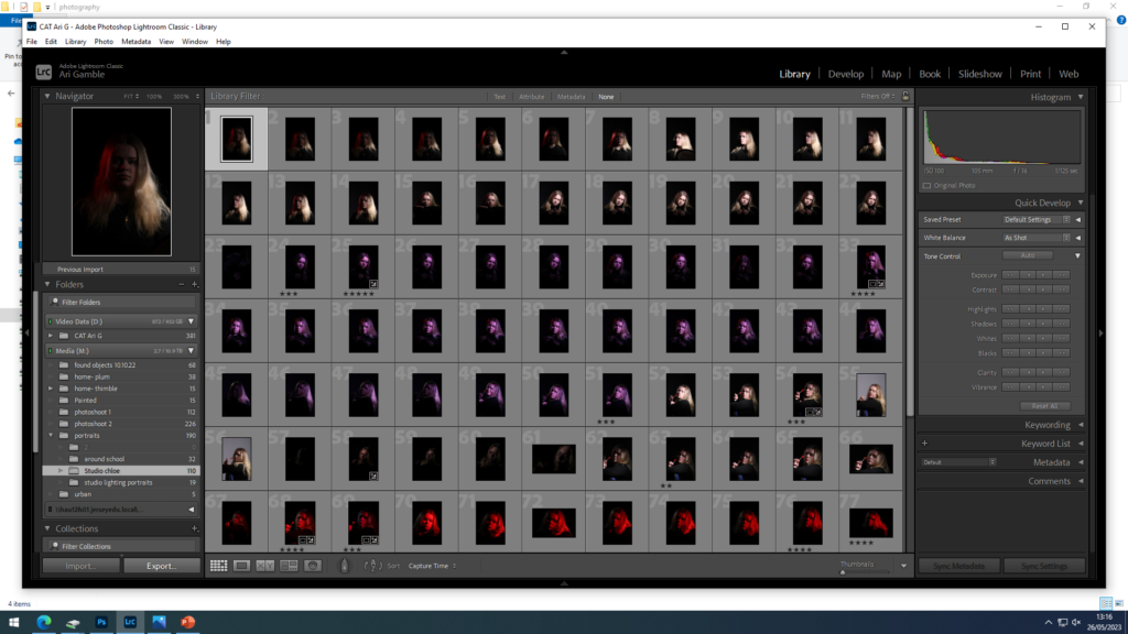
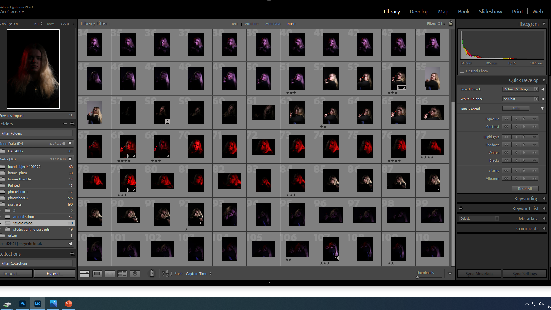
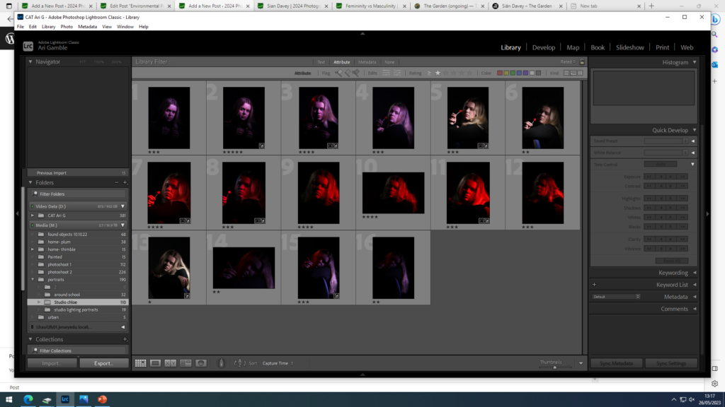
selected images that best showed my experimentation with lighting.


selected images that best showed my experimentation with lighting.
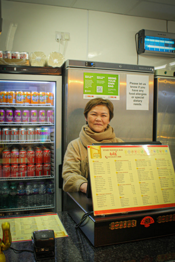
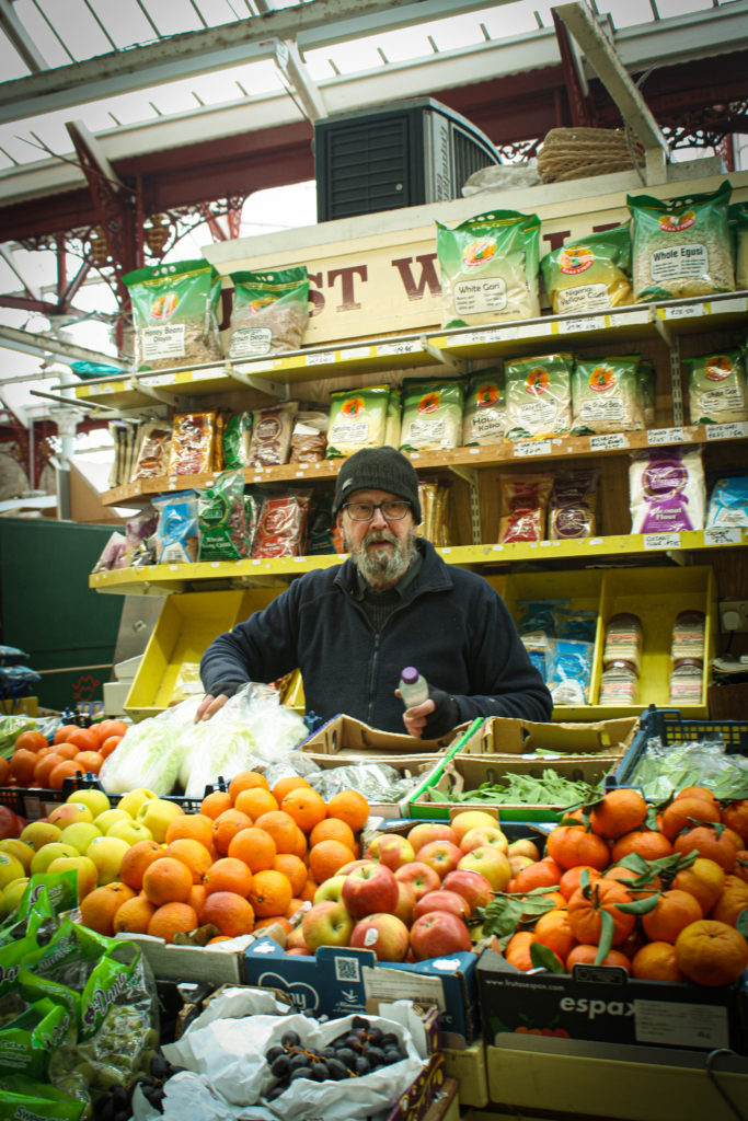
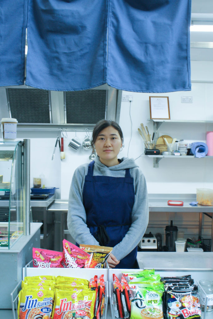
Looking back at the beginnings of the portraiture outcomes, I gained a good understanding of environmental portraiture, as I have done a lot of research on the topic, I knew how to approach this task. I remember this was also not a comfortable photoshoot to do, as I approached strangers in their working environment. However because I did that I was able to make many different photographs, and the outcomes varied from each other, the downside of this was that I needed to be quick so although there was a big variety, there was roughly 2-3 photographs per person produced. this narrowed down my picks as some images came out blurred. The easiest part about this was to create a theme between them and edit them in order so it suits the place and person.

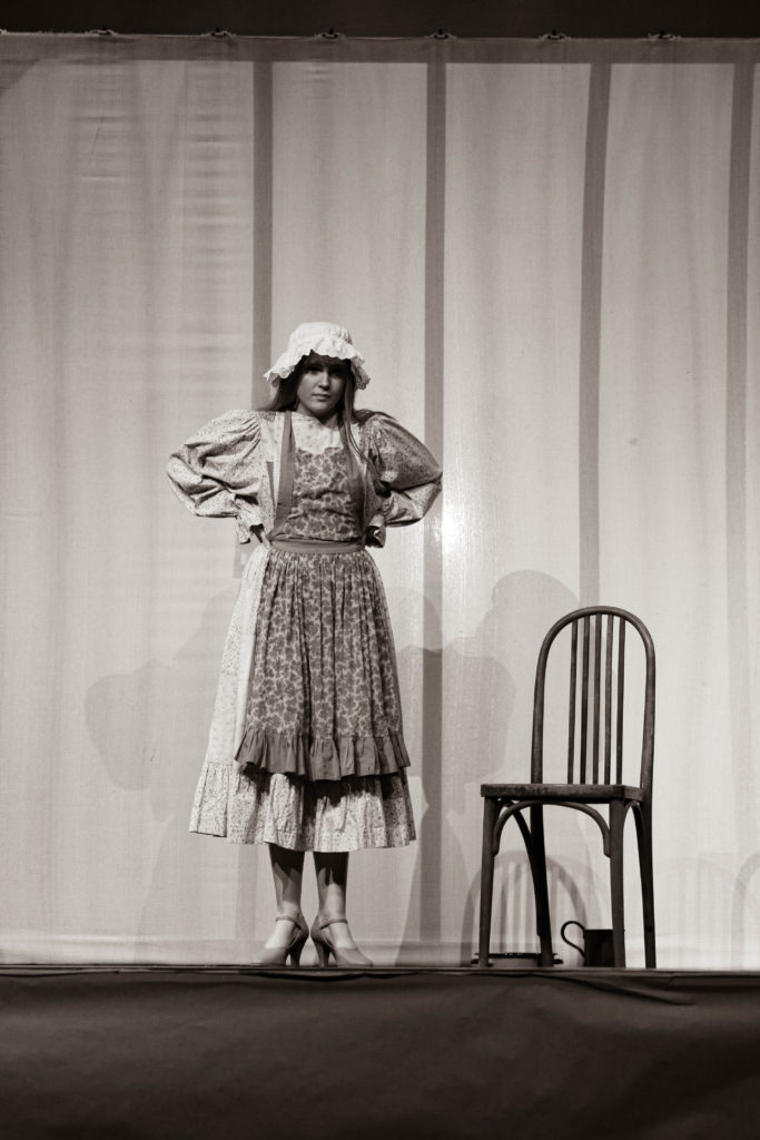
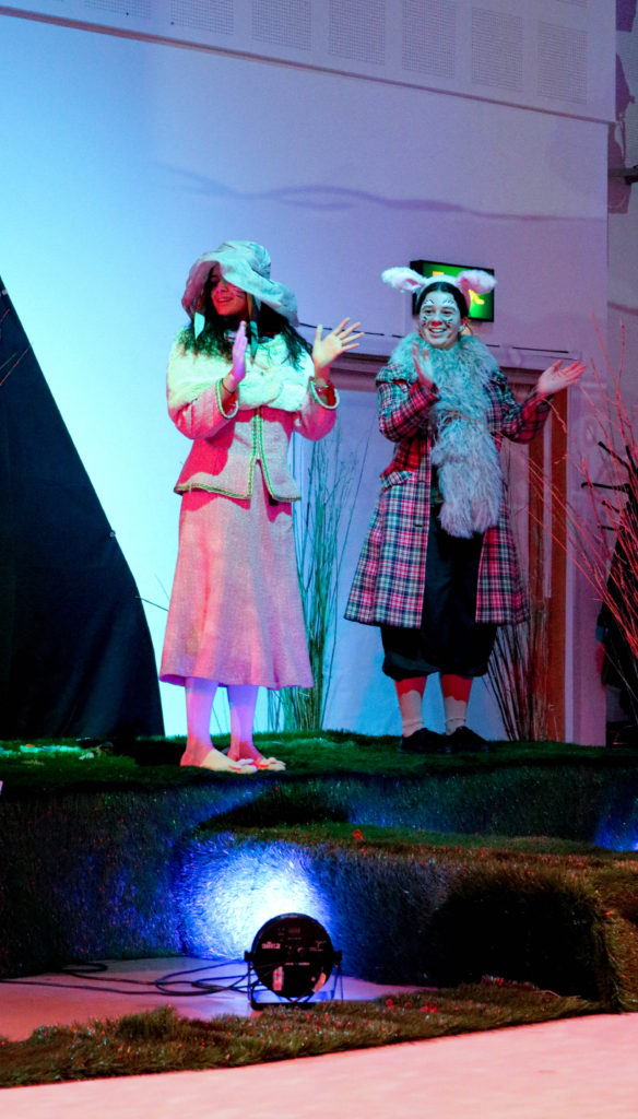
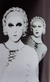
another form of environmental portraits i have created was of the school show. this was another difficult photoshoot, as when it came to taking the pictures i had to not only focus on producing images for my blog and for artistic purposed, but also to produce images for the school. I am happy I did it as it allowed me to have outcomes that give me a contrast to other items, and are different then other images , produced by me or others. when looking at images usually produced by me, they followed my style, therefore what I didn’t like about this was that the subject I was photographing was not my style at all, rather a documentative photography. however the outcome the photograph I am most proud of and like the most is the bello image on the left, this is because it may even be a sort of performance act as the actress stood still for a while, giving me time to capture it, other images from the shoot have more movement in them, but this one is rather calm.
Out of the whole environmental portraiture project, I was most disappointed in not creating a photoshoot responding to Michelle Sank. as I ran out of time, I still wanted to create images that look similar to hers. I found her work very interesting. hence I did a detailed study of her work. although i didn’t produce a response to her work, I still learned many values from studying her.

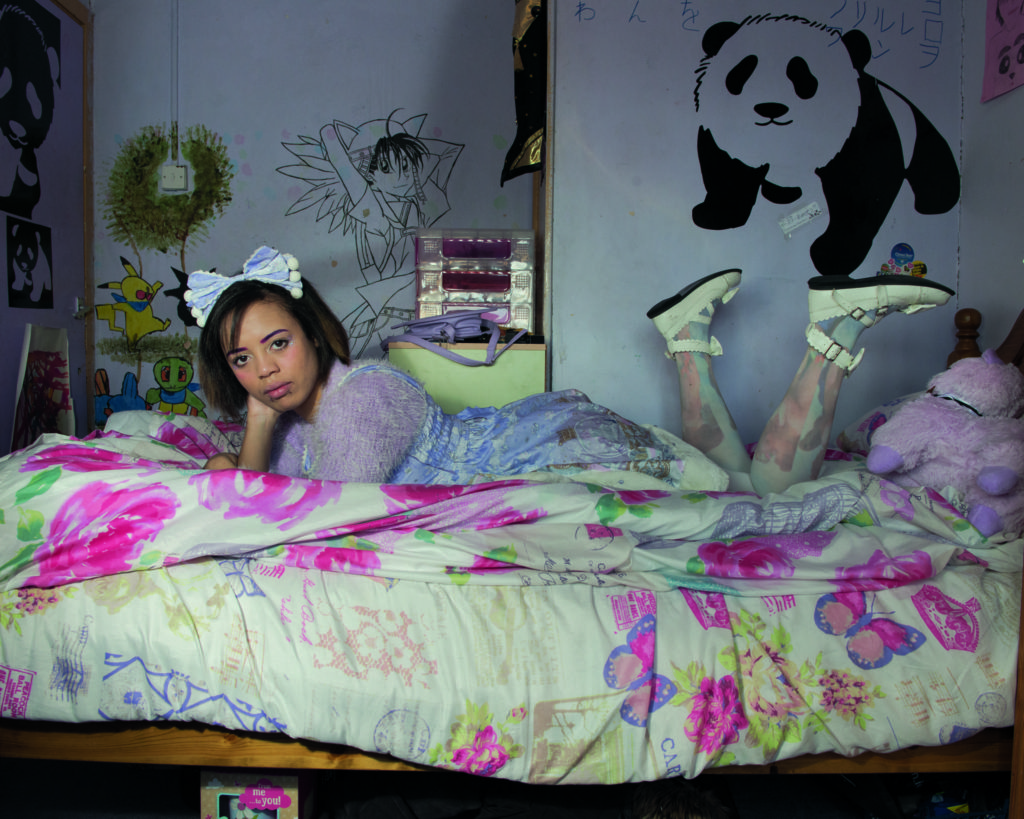

Another outcomes I think are les successful are the environmental portraits done around school, this is because to me the simply look like ordinary photographs, and I haven’t put much effort or thought before taking them. to someone these may look like good photographs as they can create a new story to them, but because I know the original thought wasn’t intriguing, they loose value.


Focusing on studio portraits, was a good learning experience for me, as I was able to focus on the importance of different camera setting and the different effects they would have on the subject being photographed.
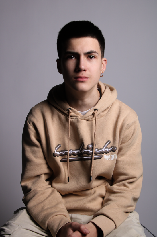
I prefer the bellow pictures rather then ideas exploring different lighting.
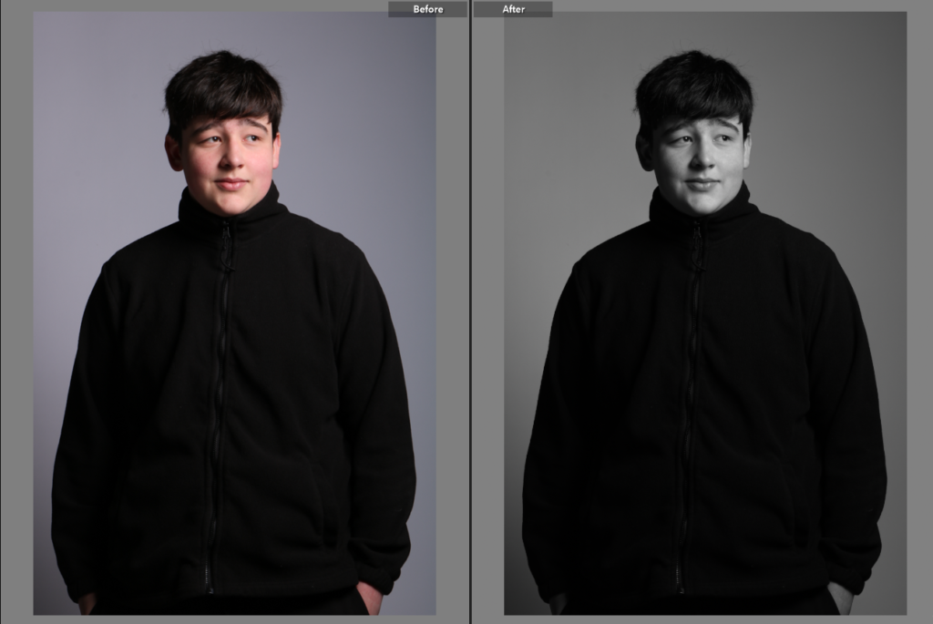

Although the bellow pictures show the main lighting ideas, i think depending on the person being photographed , different lighting would suit other in different ways. I like learning and exploring these different lighting as I was able to make a decision on which one I prefer to use. this is why my favourite image from bellow is the one on the far left, which was Rembrandt lighting.
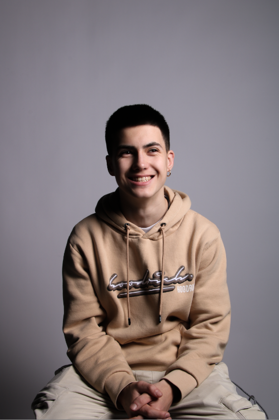
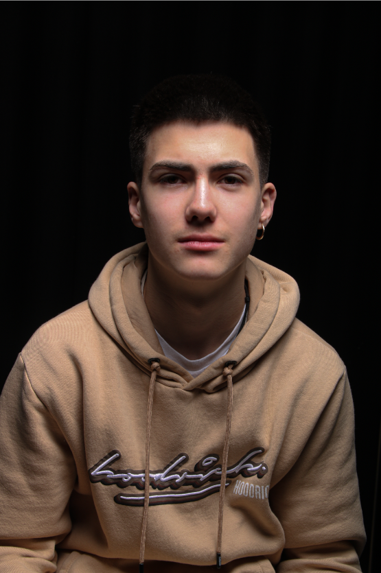
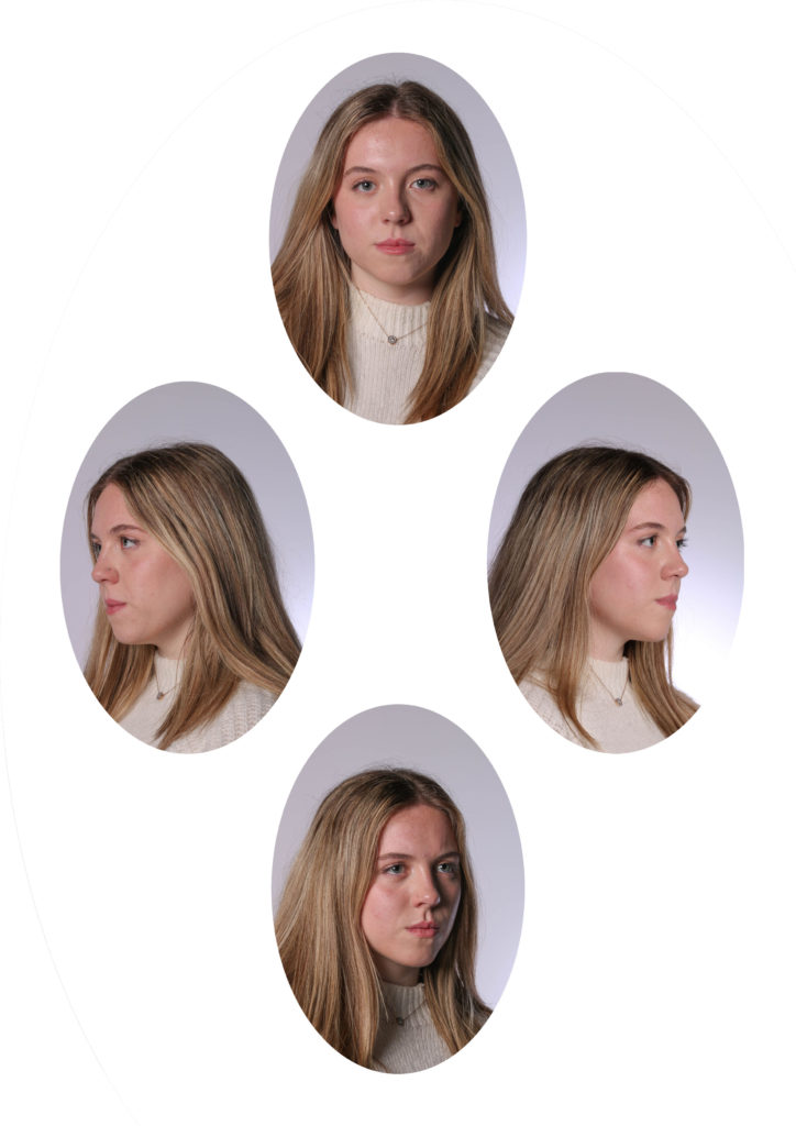
As I had a go at producing a diamond cameo example, I think it turned out quite successful as comparing to the example image that I was basing it of, it looked very similar. What I would have done differently is to make an outline on the photograph as it blends in with the website, or have shadows around the oval faces, so that they stand out more.
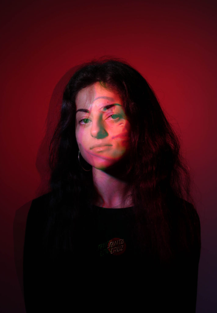
I really like colour in my photographs, therefore when it came to experimenting with coloured gels it was very fun. I am disappointed that I haven’t produced more outcomes, maybe with a different models and poses. as I stuck to quite strict , straight and serious poses. I am happy that I was able to change these pictures then later as a digital shutter speed experimentation, because this is what made them a bit more interesting photographs.

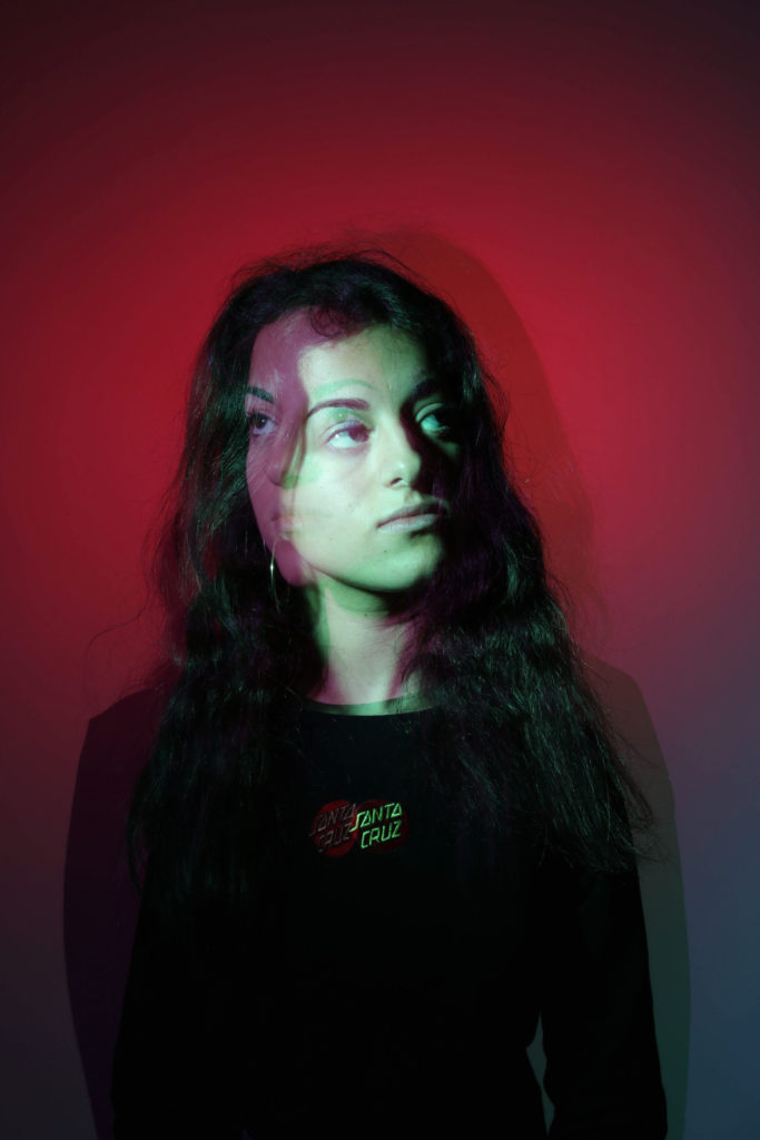
As I experimented with shutter speed, I’m glad I did a digital version as well as a real life version of the outcomes. I have learnt the adjustment that are needed to be made in order to create the bellow image on the camera. it was quite tricky to do as there were many fails during my first attempts, however the second time I have got around to experimenting with the technique again, the outcomes were much better. with this photoshoot I didn’t have many intentions of how it would turn out, simply because it is hard to predict how a photograph will be taken by the camera, but i am the most happy with the image bellow.
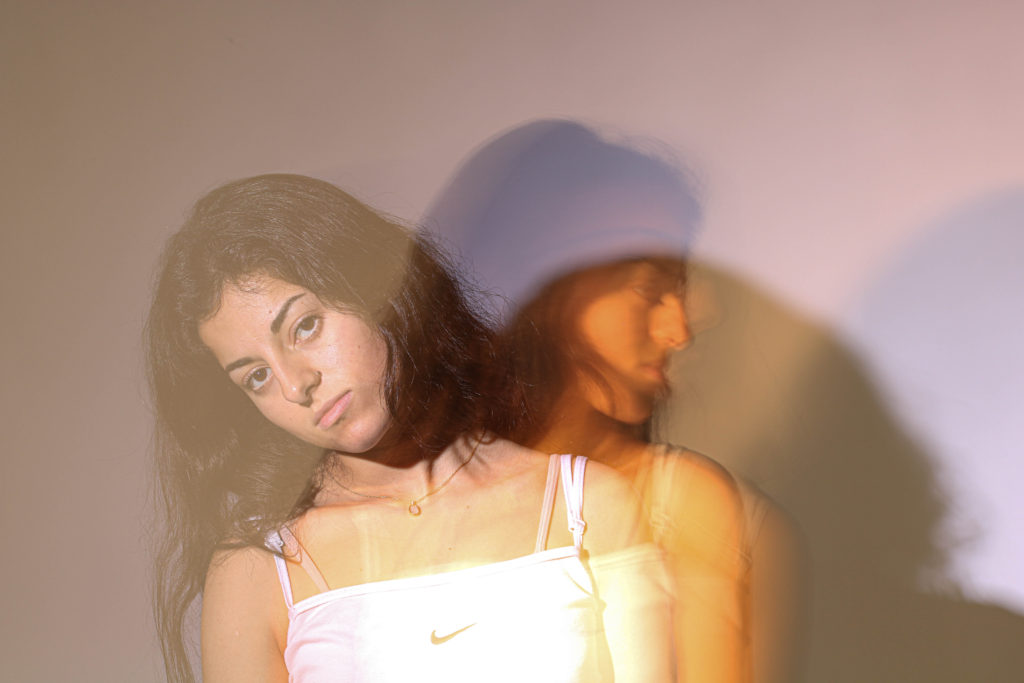
Photographs that I have taken to relate them to an artist reference study were so successful that I decided to include the bellow one as my final image. although I didn’t produce an overall many photographs from the shoot, I has 1-2 that stood out. Why I like about the whole response as a whole is that I was inspired to try something similar to the artist, but I haven’t done everything exactly the same. I like how I was able to be influenced by the idea but though of another approach to the effect.


Finally the last photoshoot responding to femininity and self identity had outcomes that varied aesthetically. This was because of the style of editing I have chosen. the bottom 3 images didn’t really relate to the artist study I have done, although I have been inspired by the artist before, the outcomes didn’t look exactly like the artists work. However why I love these photographs, especially displayed in a sequence bellow, because of how well they fit with what I was trying to achieve. What my intentions were was to make photographs that feel very feminine as well as meaningful and images that have a storyline that flows. these have these qualities, however the only thing I would change I the technical aspects when taking the pictures. I wanted to achieve a dreamy effect and these do just that, but technically taking photographs against the light is quite tricky on the camera. it was hard to add on a dreamy, soft looking filter on top of an image without it blurring it as it was. this is why the far right image is not in much focus especially on the face it is hard to figure out the image, as there’s only shadows for the main features of the face.
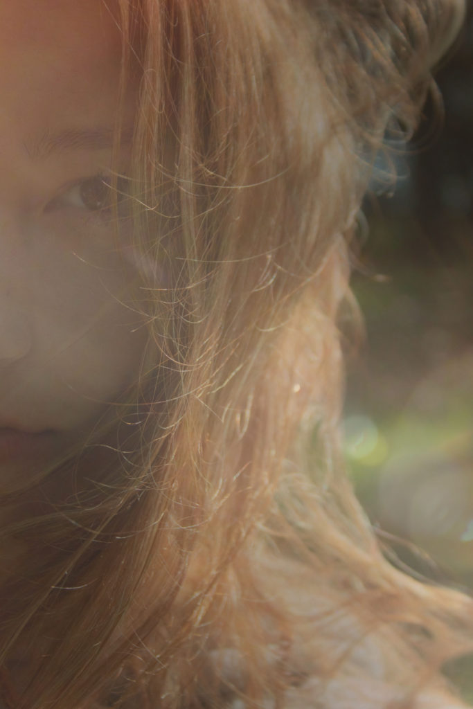
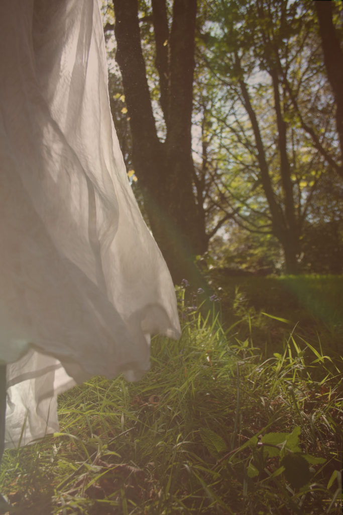
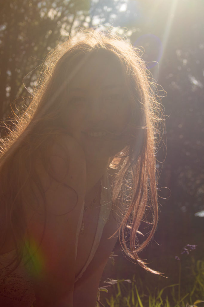
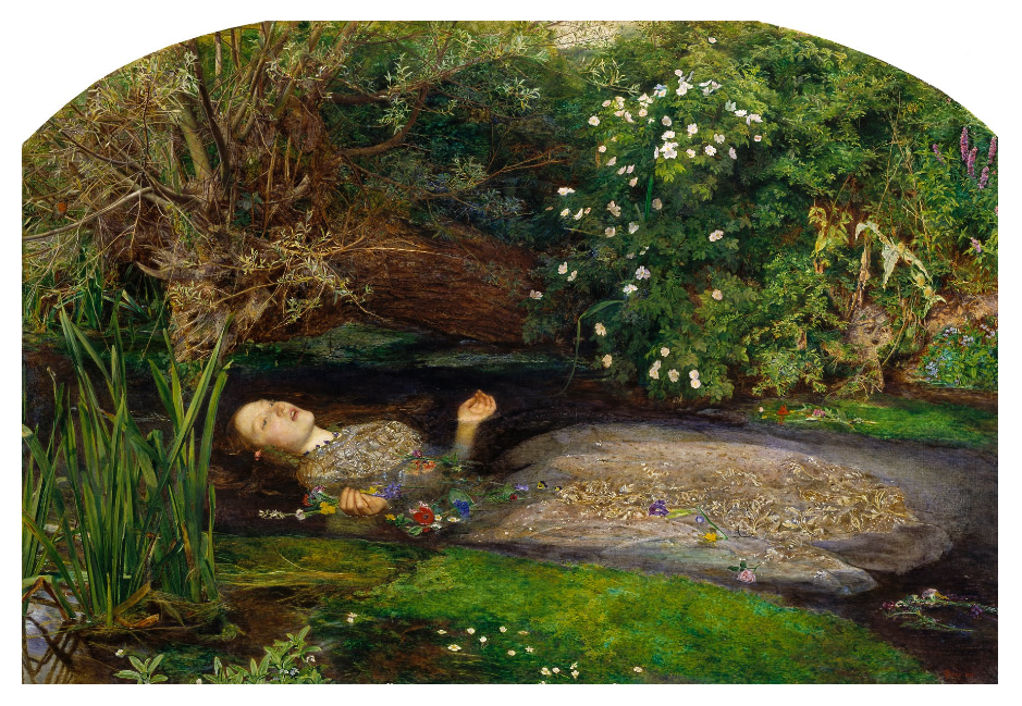
What I’m most happy with was how the bellow image links so well to a classical historic painting of this field. I was aware of the traditional artwork that used to be made, and I thought that that would link to responding to femininity, especially because I was exploring traditional view on women and the exaggeration of it. I think this image was very successful as it responds to the artist very well and even looking at the technical aspects, is a good quality photograph. This photograph also met my expectations as it showed a traditional look on women, especially how they were seen in art, and historic art.
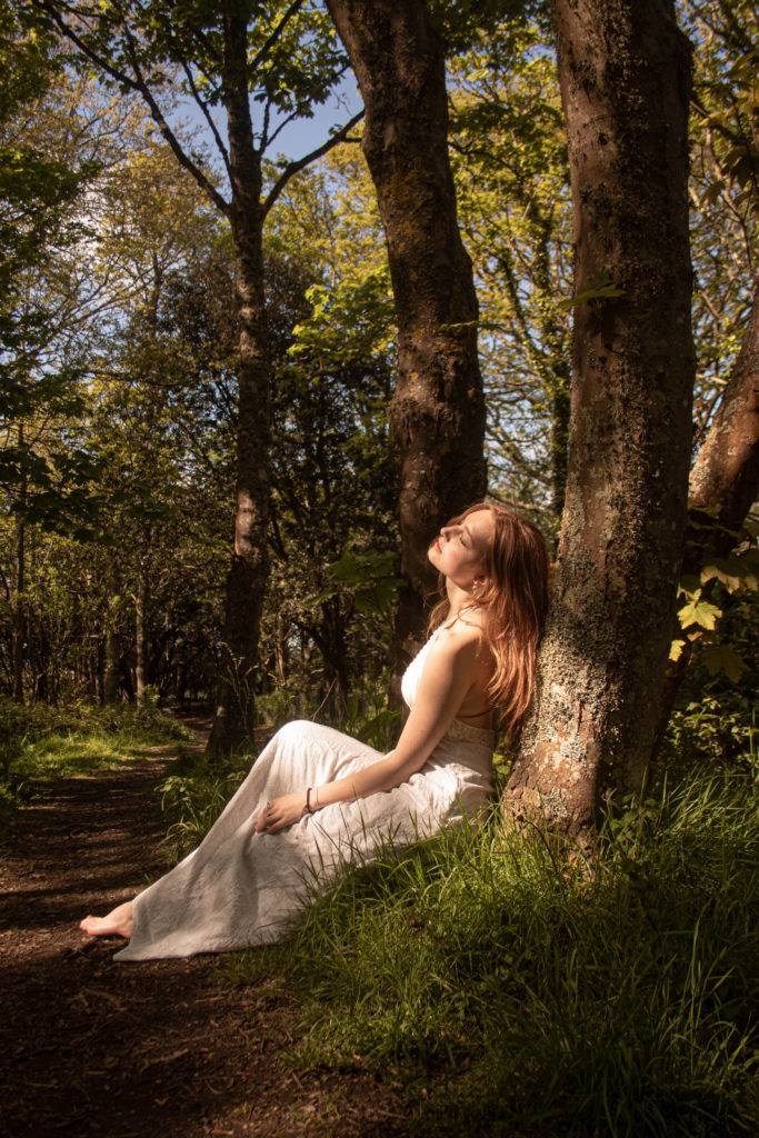
Overall the outcome I’m most happy with out of the whole portraiture project are the photographs most recently produced, as a response to femininity and self identity. This is because I have given the most meaning to them and story. However what I noticed is that the most unsuccessful photographs were the ones that I don’t have a good relationship with. where I might have not thought about them well enough or meaning.
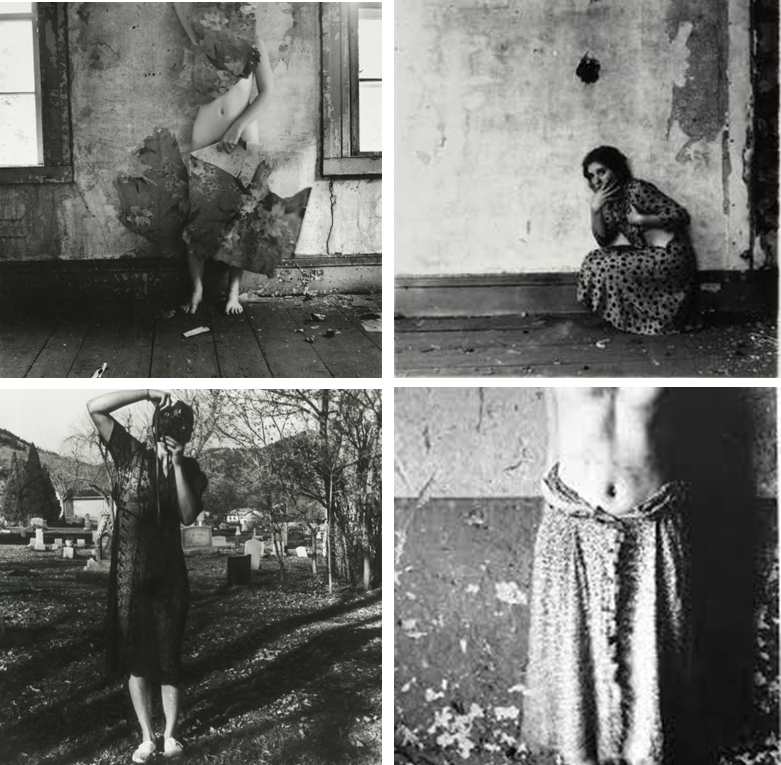
Francesca Woodman (born in 1958, Colorado, America) was known for her black-and-white self-portraits and images of other female models. Despite her short career, which ended with her suicide at the age of 22, Woodman produced over 800 prints during her life. Influenced by Conceptualism and featuring recurring symbolic motifs such as birds, mirrors, and skulls, Woodman’s work is often compared to Surrealists such as Hans Bellmer and Man Ray.
I have chosen Francesca Woodman as my artist because looking at all her photographs I was drawn to how unique it is.
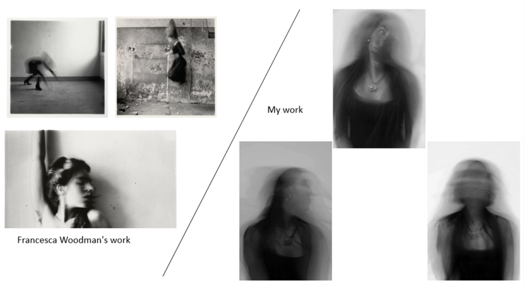
Francesca Woodman photos:
my photos:

FRANCESCA WOODMAN
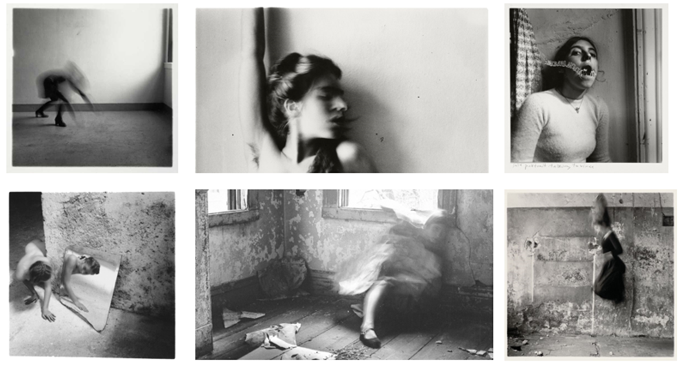
Francesca Woodman (April 3, 1958 – January 19, 1981) was an American photographer most famous for her black and white portraits of either herself or other females. She often used long exposure to merge the model with the background or cover some of the nudity in her photos. She made her first mature photograph at the age of thirteen and created work that has been critically acclaimed in the years since her death. Over her short career, she took over 800 photographs.
She grew up in an artistic environment as her Father was a painter/photographer and her Mother a sculptor, her brother went on to become a professor of electric art. Her family spent most holidays in their farmhouse in the countryside near Florence, Italy and many of her photographs were taken there.
Her photography often included dreamlike and surreal imagery that blurs the lines between reality and fantasy. She also often included the environment around her whether it was furniture, wallpaper, etc. Her monochrome style could represent nostalgia and timelessness which links to her recurring theme of identity.
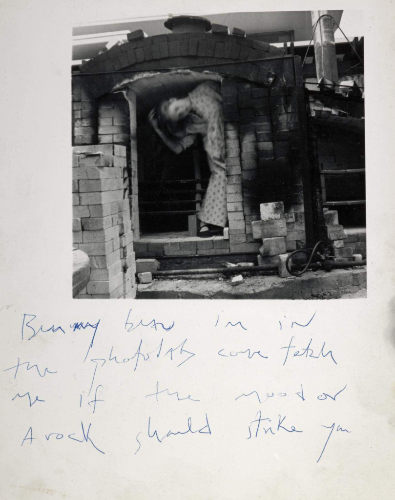
She gifted her boyfriend at the time many of her photos which often included intimate messages written around them.
COMPARISON
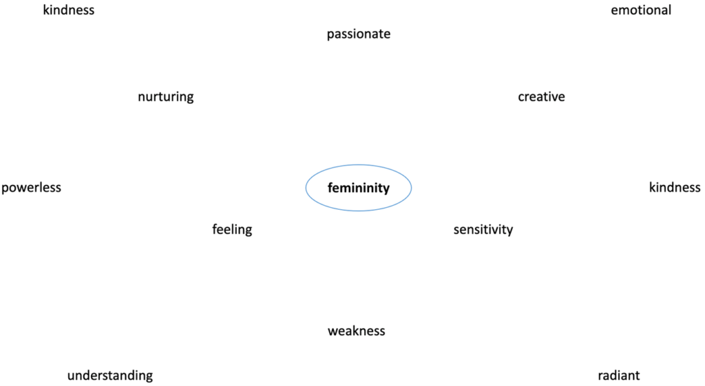
Masculinities and femininities are structured and expressed through other axes of identity such as class, race, ethnicity, age, and sexuality. Femininity and masculinity can carry many diverse meanings with numerous interpretations and can employ different scripts. to which persons see themselves as masculine or feminine given what it means to be a man or woman in society. Men are stereotypically seen as being aggressive, competitive, and instrumentally oriented while women are seen as being passive, cooperative, and expressive
Within photography, femininity and masculinity can be shown in many different ways there isn’t always one way for it to be shown, you can have a male in a dress and makeup, female wearing a suit etc. The wonderful thing about the connection between photography and femininity and masculinity is that people can express themselves as an individual for who they are.
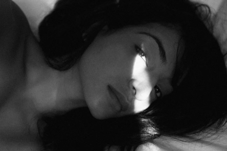
femininity:
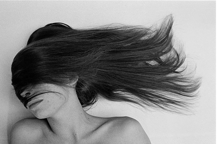
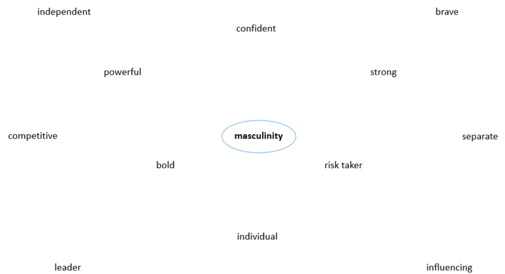
masculinity:
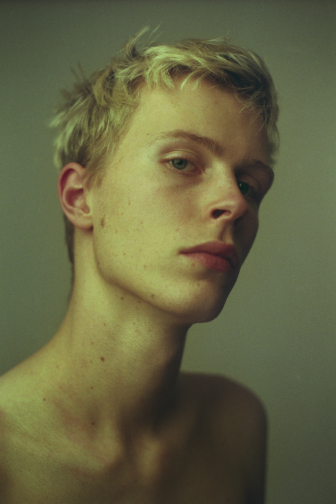
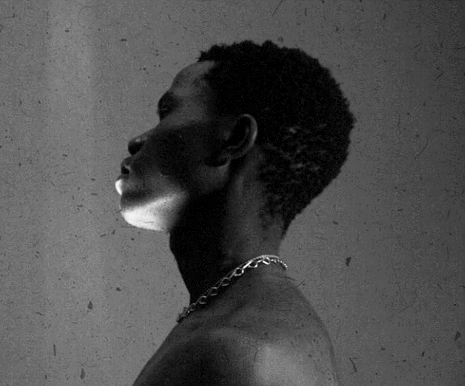
identity:
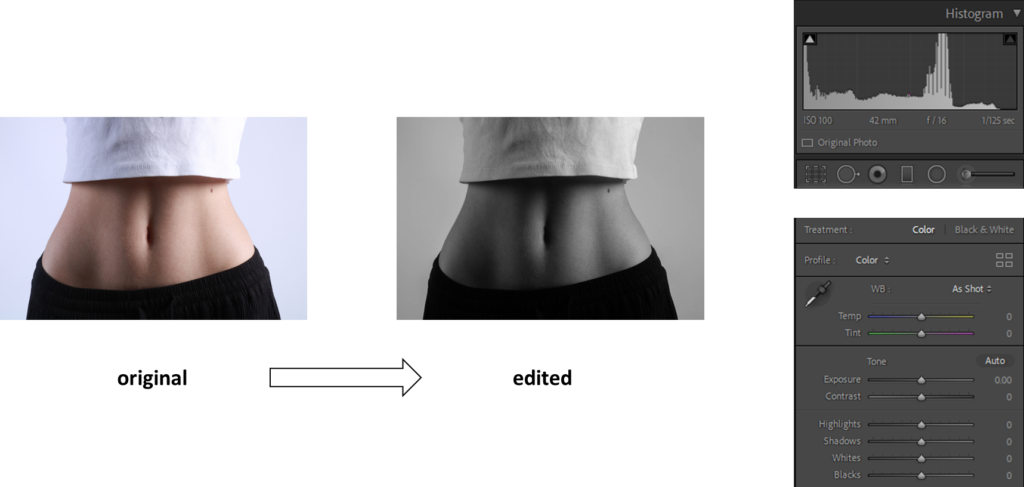
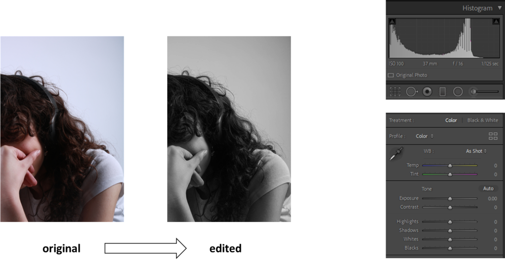
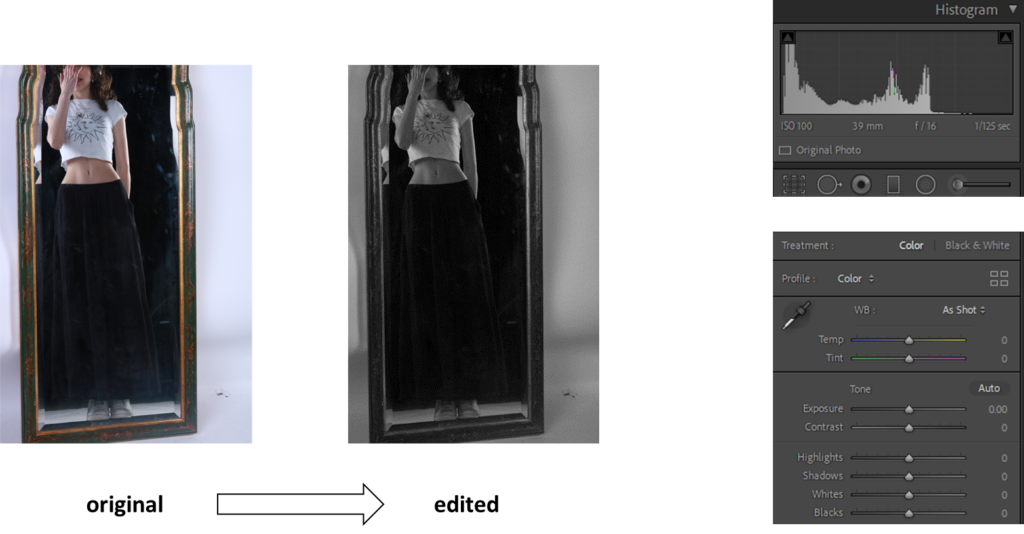
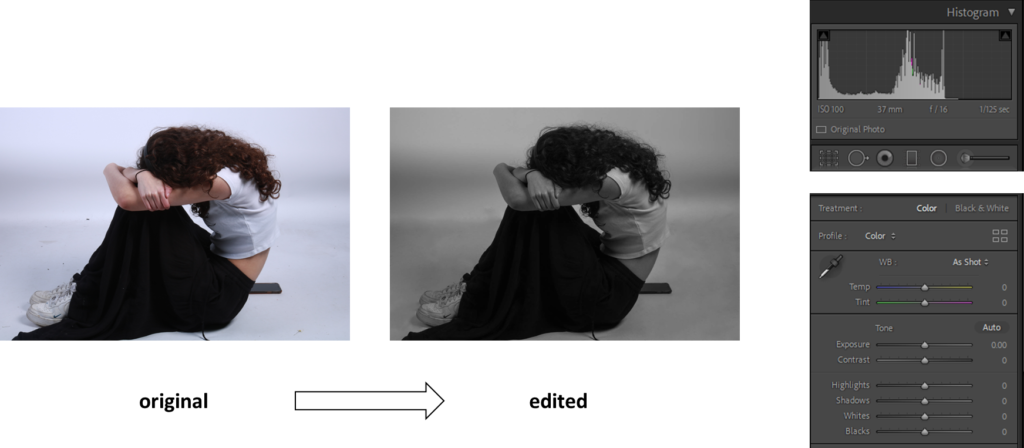
studio/ exploring lighting:
environmental photos:
what did I do?
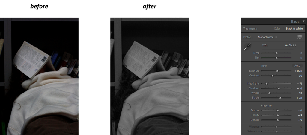
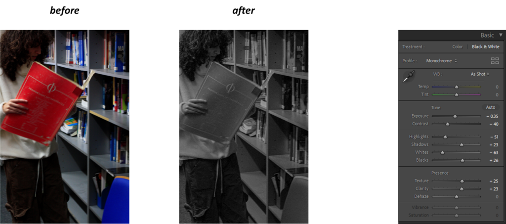
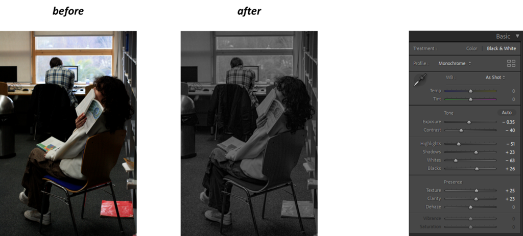
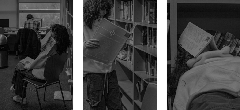
For the environmental photos I went to the library and asked my friend if I could take pictures of her sitting and/or standing while reading a book. I then went onto Lightroom and edited the photos into black and white, I lightened her hair so you could see the details in the curls within her hair.
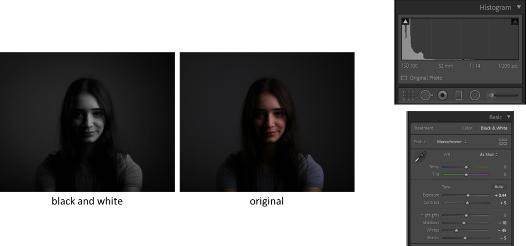
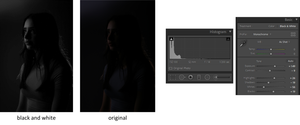
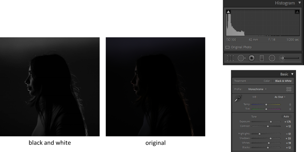
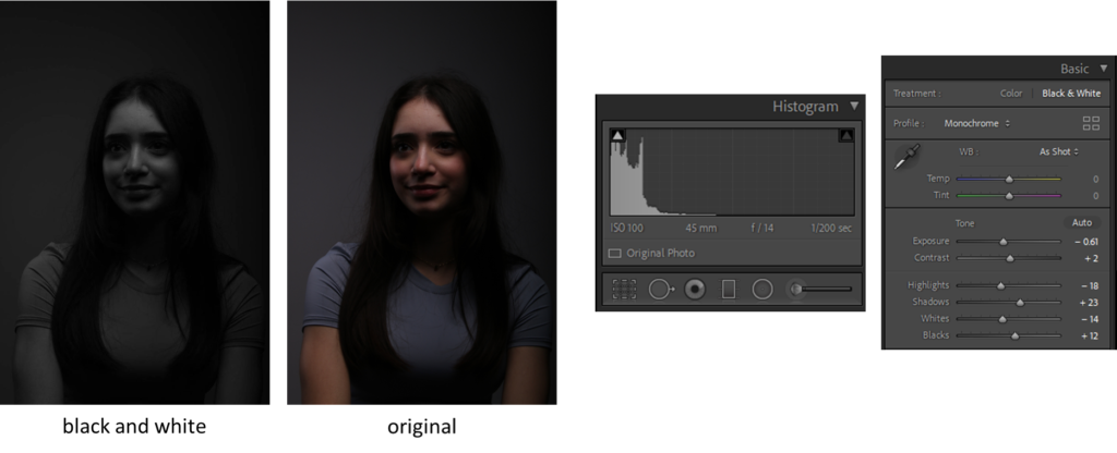
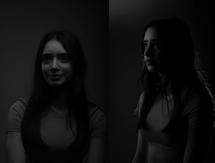
For the studio photos/ exploring lighting I asked my friend if I could take photos of her in the studio, we used techniques such as the butterfly effect, chiaruscuro and rembrandt lighting, after taking the photos I edited them on Lightroom turning it into black and white.
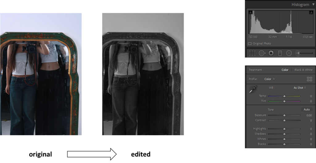
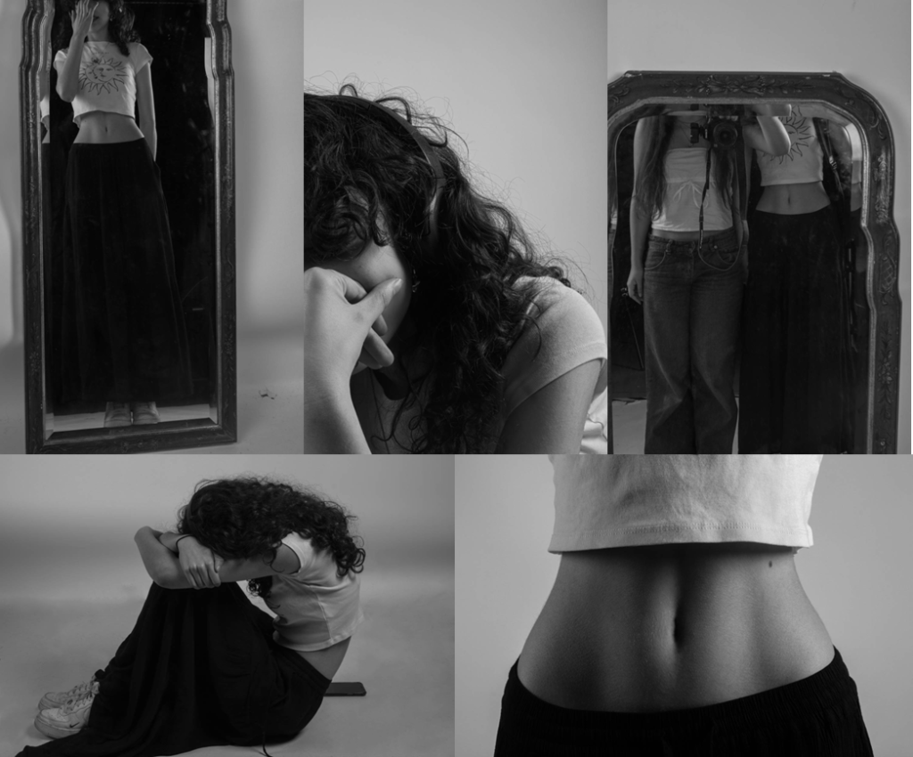
For the identity photos I took pictures of the same person I used for the environmental photos, I took pictures of different body parts and a reflection in the mirror. The reason I didn’t include any photos of her face is because I feel like keeping her face hidden would make the photos more mysterious, I thought keeping the pictures of body parts fitted femininity better.
what was successful
What was successful about the environmental photos was that i was able to take pictures in a place that my friend and I love to go to in our own time. I like how the black and white makes the image pop more.
What was successful about the studio photos/ exploring light was that I was able to do all of the techniques and have a positive outcome.
What was successful about the identity photos was that I was able to get the photos that I was aiming for in the end.
what could’ve been done better
What could’ve been done better about the environmental photos was that I could’ve taken more photos in other places other than the library.
What could’ve been done better about the studio photos/ exploring light is that I could’ve explored more with different colour lights for a more unique look.
What could’ve been done better about the identity photos is that I wish I took more variety of different photos so I could have a wider range of photos.
overall
overall I think I manged to complete some photos of what I was aiming for, However I hoped to have more photos overall.
My photos:
environmental photos
studio photos
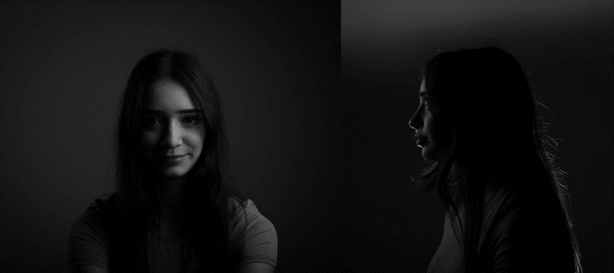
identity photos
Born 1964 in Brighton Sian Davey has been working as a photographer since 2014 previously a psychotherapist she uses photography to explore the deep connection with her family and others around her.
Martha
Her project Martha focuses on her teenage daughter and her life in a close and intimate way the photos appear relaxed.
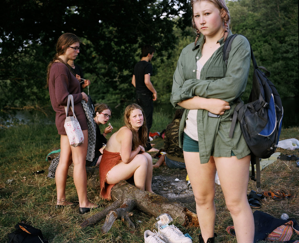
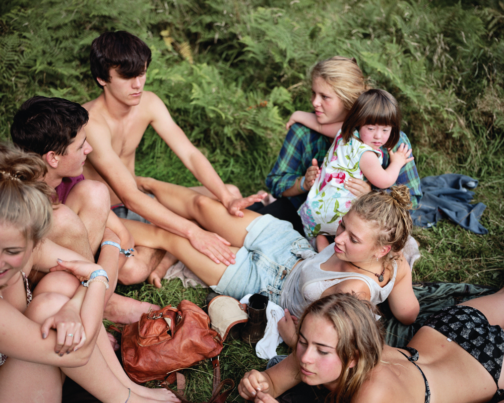
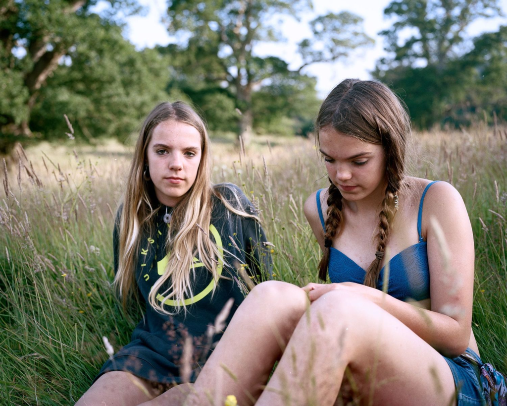
Sian Davey describes her work Martha as an exploration to understand the relationship between her and her daughter. “from the onset it was clear this was a collaboration” – Sian Davey Photowork interveiw. Her work with Martha clearly shows an intimate relationship where to viewer feels included as well creating a sense of unity. The Martha project was created over the span of 2 years which Sian Davey describes the change in her daughter growing up and the struggle to gain access to her life outside of home and maintaining a trusting relationship along side understanding delicate boundaries. ‘Matha’ – reflects an aspect of life parents are often shut out of making it feel much more exclusive and precious. Outside of just Martha Davys also had to gain a trust to her friends as they were often present in Marthas life – The project then became a huge social collaboration.
“The process had this quality of me cultivating the skill of oscillating between invisibility and visibility, letting my intuition guide me in judging when it was ok to be there or not.” – Sian Davey Photowork interview
Davey spends so much time getting to know each person and building a relationship to capture the true state of the person not what they want her to see or think about them displaying only the person not her and the work behind it.
Analysis
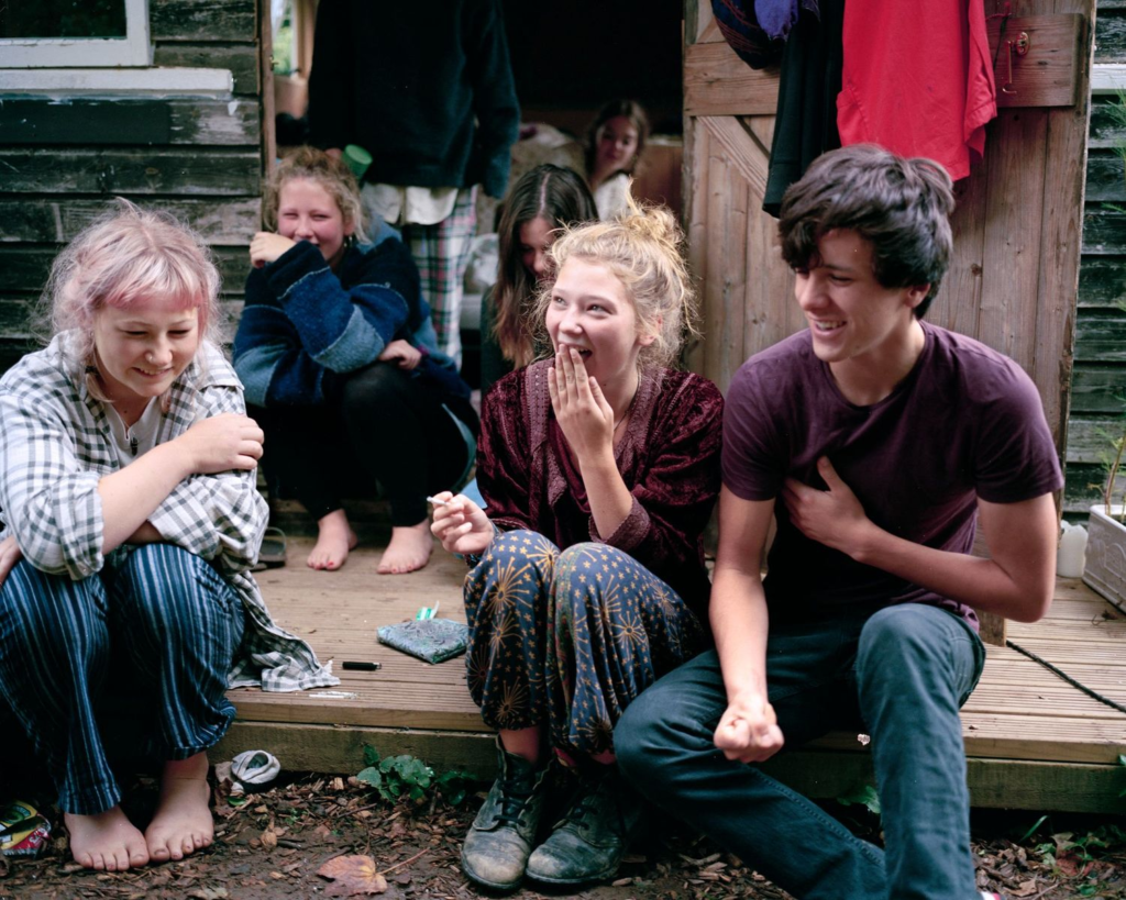
Davey usually shoots in bright light with a shallow to mid depth of field to focus purely on the subjects she captures and not the background. The colours in the images are always more natural reflecting to real world with little manipulation to the photographs. The compositions to her images always appear random possibly because of the situation of her taking them with little to no planning to capture people in their natural states showing the relaxed environment.
Emotional response
I really enjoy ‘Martha’ as a piece of work it is like looking in through a window into someone’s life you can see the connection she shares with those around her and that is explored throughout the project – you feel as if you are invited into the setting aswell.
The Garden
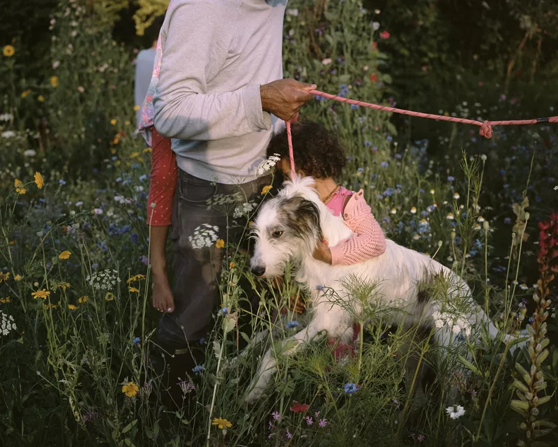
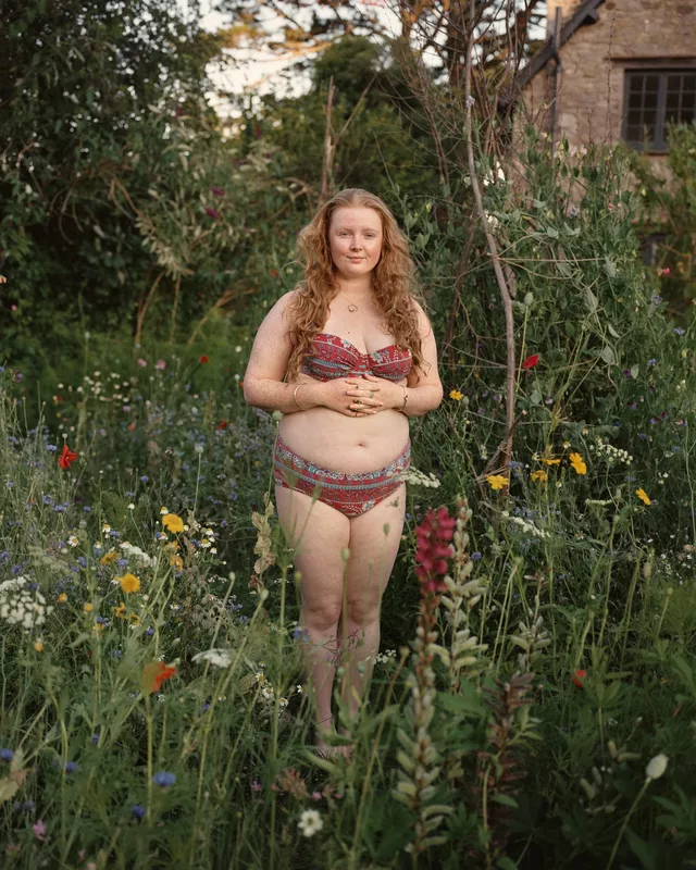
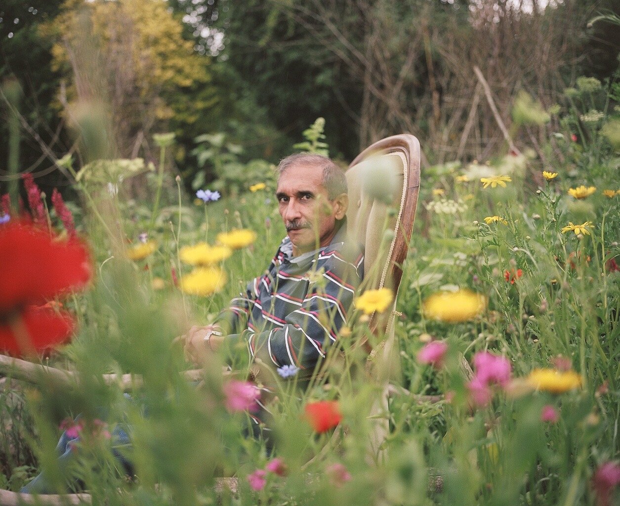
“Why don’t we fill our back garden with wildflowers and bees, and the people we meet over the garden wall – we’ll invite them in to be photographed by you.” – Davey’s son Luke – blurb of ‘The garden’
‘The Garden’ is a currently ongoing work for Davey taking their abandoned family garden and planting hundreds of wildflower seeds over the course of 2 years to create a shared space with neighbours, family and people they literally met along to way, typical of Davey’s work focusing on the person and them connecting with the camera and her on a deep emotional level. Davey again used this project to connect with her son with it being his idea they worked to clear out the graden and explore wildflowers to further understand biodiversity and make a thriving garden. The latter part of the project then included getting people to be photographed learning of their life stories as Davey often tries to do with her subjects and photographing them in the shared space they had created, Capturing their emotional connection to the camera.
“We collected stories from the people we met over the garden wall, which over time came to feel like intimate, confessional space.” – blurb of ‘The garden’
Analysis
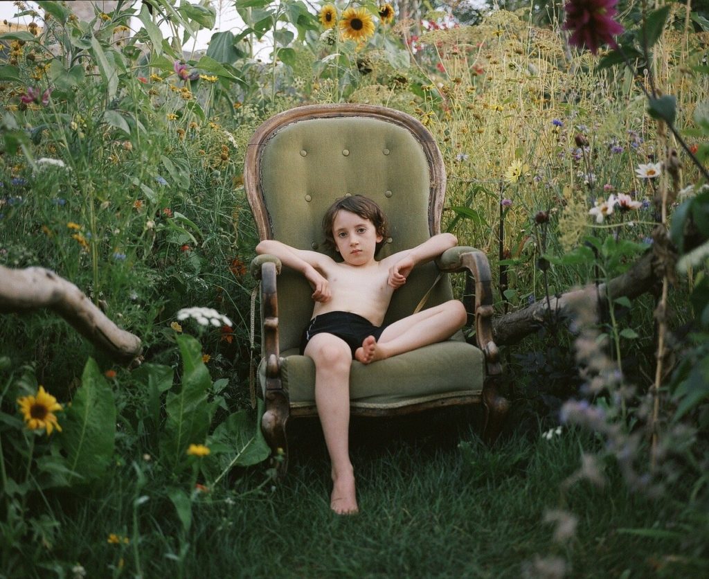
‘The Garden’ uses soft colours and over exposure to create a light environment. She shoots with a shallow depth of field to centre the focus on the subject it creates soft edges to all the flowers as well making it appear more calming and about the feeling instead of the detail. emotionally I think it highlights the natural beauty in the people captured focusing on only them.
As a photographer I find Sian Davey’s work inspiring with her clear talent for getting people to connect with her and the camera I also prefer the more candid photos to posed and her work lends itself well to that.
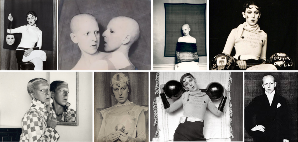
Claude Cahun (also known as Lucy Schwob) was born in Nantes, France, to a middle-class Jewish family in 1894. Lucy Schwob later became Claude Cahun to be gender neutral as an artist and a writer. Claude Cahun was a Surrealist photographer whose work explored gender identity and the subconscious mind, The artist’s self-portrait from 1928 epitomizes her attitude and style, as she stares defiantly at the camera in an outfit that looks neither conventionally masculine nor feminine.
What is the male gaze?
‘In feminist theory, the male gaze is the act of depicting women and the world in the visual arts and in literature from a masculine, heterosexual perspective that presents and represents women as sexual objects for the pleasure of the heterosexual male viewer.’
Typically, the male gaze has been women presented through art created my men, for men’s use. It invokes the sexual politics of thee gaze, suggesting a sexualised way of looking at women. It empowers men whilst objectifying women. The female is usually positioned as an “object” of heterosexual male desire. Her own feelings are supressed by the male desire.
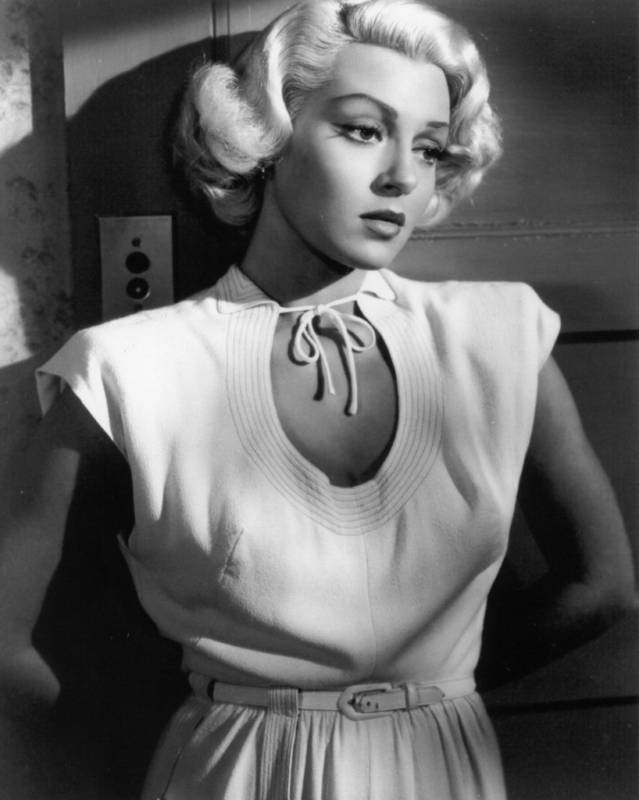
Laura Mulvey created the idea of feminist film theory, the concept of the male gaze in the film industry in her 1975 essay ‘Visual Pleasure and Narrative Cinema’. Mulvey, adopting the language of psychoanalysis, argued that the traditional Hollywood films respond to a drive known as “scopophilia”. Its the sexual pleasure involving looking. Mulvey believed that a lot of the popular movies are filmed to satisfy the masculine scopophilia. Instead of using the common term of the ‘male gaze’. Mulvey calls the concept a heterosexual, masculine gaze. She stated that women are typically characterised by their “to-be-looked-at-ness” in cinema. Woman is “spectacle”, and man is “the bearer of the look”. The Postman Always rings Twice is an example of the male gaze because the films lead female character is viewed through close-up shots of her body.
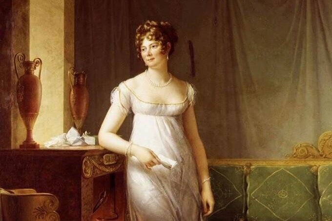
The male gaze in art history is understanding the preferences of a heterosexual male. The relevance of the male gaze in art history became relevant in the. For art history specifically, the idea of the male gaze is referencing the desire of men to create idealized images of women for their enjoyment. Also, this does not mean a strictly sexual enjoyment, the male gaze is the idea that male artists, painted for a male audience. In the early Renaissance the theory proved itself when they realised that art could be something that was bought and sold. During this time the only people who had money were men, making it obvious that artists would paint works that appealed to their target audience.
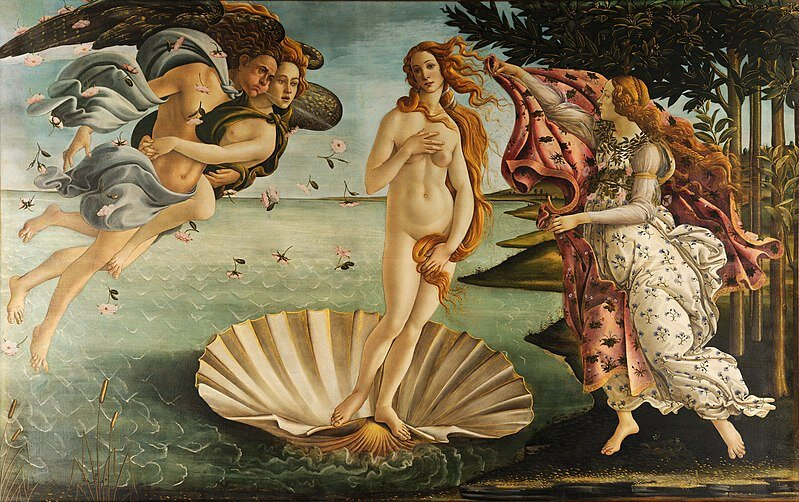
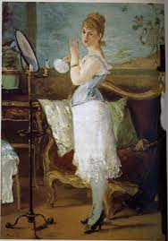
This is seen in todays photography such as magazines and advertisement. My photoshoots contradict the male gaze as my images are taken from a female perspective with the concept of presenting women as strong and independent individuals, lost in todays society and stereotypes.