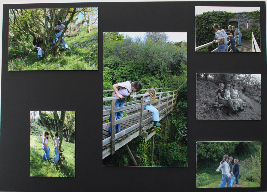
This is my first final outcome. I used the black board to display my final images from the femininity project. First I mounted all the images onto white foam board. Then I tried different ways of laying them out until I found the positions I liked, I then used tape to stick them down to the black board. I referred back to my mock up plan to base my layout from.

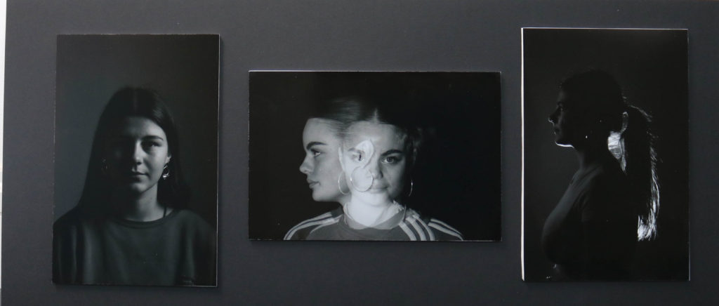
This is my second final outcome. These three images, I feel, are my strongest images from my portrait project. All three images are from different photoshoots and experiments. the left image is demonstrating Chiaroscuro lighting ( the contrasting shadows with the highlight on each half of the face). The middle image is from my double exposure shoot, where we experimented with the multi- exposure setting on the camera to create quirky images. The image on the right shows rim lighting. I enjoyed this photoshoot as it was interesting to try different compositions, my final outcomes were successful as well. These three images on a whole work well together as a final display. The monochromatic theme of black and white works well against the black board background.

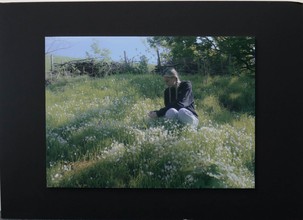
This is my third final outcome. This image is my favourite image from my femininity project, so i decided it was strong enough to be displayed on its own. I mounted the image onto white foam board, then used tape to stick it onto the black board. The setting is perfect with the flowers and grass to match the countryside, nature theme. I like the composition of the image, there’s an obvious centre of interest, which is Anna; she is contrasted with her surroundings of nature. Her black jumper emphasises this idea.
I think this image represents femininity very well, from a stereotypical feminine point of view. Stereotypically, women are seen as emotional, submissive, quiet, graceful, passive, weak, sensitive, nurturing, and dainty. This is displayed through anna sitting amongst the flowers.
