How successful was your final outcomes?
Over all, I am very proud of how my final images turned out. I think giving the pictures boarders was the right call as it makes the final pictures look more appealing. I also like that I created a variety of images, some with colour and others without since it helped me learn some new techniques during the editing process of the images. In my opinion, however, my strongest pieces came from the lighting project. This is mainly due to the fact that they are, to me, the most visually appealing since they focus solely on the model without any distractions in the background of them.
Did you realise your intentions?
For me, I had a basic idea of where I wanted the project to head but my ideas weren’t set in stone and sometimes changed throughout the project. An example of this was when I changed my idea about the border on my photos, originally planning to not add them at all but later deciding that border would frame the image making it more visually appealing. What I did know was what, who and where I wanted to take my images throughout the projects which didn’t change.
What references did you make to artists references?
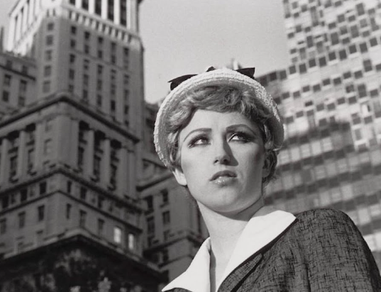
I did try to focus my image on multiple artists such as Shannon O’Donnell, Cindy Sherman, etc, but my images were always following the basic ideas of their works, taking my own twists and interpretations on the concept of femininity vs masculinity. A good example of this would be how I presented femininity in my project compared to how my chosen artists did. Their images often focused around either women empowerment or typical ideologies of women, where as my images mainly concentrated on stereotypical things often associated with being feminine, hence the abundance of flowers and nature. While this is slightly different to the artists I selected, I still kept the overall theme of what is considered as femininity throughout my photos similar to what the artists did. On a more visual side of the project, I experimented with the use of black and white images to match the old timely look presented in my artists work, as a result making my images more moody and dramatic than their colour counterparts.
Is there anything you would do differently/ change etc?
If there were anything I could change or do differently it would probably be to experiment more with the mounting part of the project. While I think that using the foam board as a border is simple yet appealing, I think that I should of changed a couple of the mounting styles to be window mounts or used card instead of foam to have more of a variety for my images. Another thing I would change would be to print out more images, since I had a tough time picking out my best images from each project. Finally, I would of liked to focus more on the artists style, while I enjoyed and liked my own pieces, I still feel as though they don’t entirely link to said artists and if I were to do this project again, I would like to create more of a noticeable link between them.
How did you find the project?
Overall, I really enjoyed this project and feel as though its pushed me to do better. I enjoyed all the research that went into it too since personally the whole idea of femininity vs masculinity is something that genuinely interests me. I was a fan of the lighting project too as it helped me learn new techniques for how I take my photos, and I just think that the colourful images turned out well on the whole. Lastly, the environmental project was one that I felt went well, since my images showcased the natural environment of her room, however, I would of liked to take images else where, perhaps at school or her work.

