WHAT DID I DO?
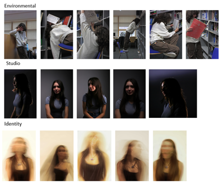
Environmental – For this mini project I photographed a friend in a library in multiple different poses and places as that is where she spends a lot of time. I wanted each picture to be different and dynamic while it still working well with each other. I also wanted to try incorporate the school life scenario as that is what my model represents
Studio – For this one, I set my model up in the studio with the lighting placed around her in different places for me to try out. I instructed the model on different natural poses to try and took the photos in a which which complimented the model and lighting. I experimented with Rembrandt, butterfly, and back lighting.
Identity – For this set, I had my model sat in the studio and instructed them to move around while I take the photos. I had set the shutter speed low to allow as much light in as possible which creates the blurred movement effect. I wanted the model to try different expressions/movement such as screaming, smiling, spinning, etc. so keep the photos different from one another and link with my theme of identity.
WHAT WAS SUCCESSFUL?
Environmental – I think this project was very successful, I really like how the environmental portraits looked in the end. I think they were different to what most environmental portraits and I really like how well they worked together as a set. I think each pose was unique and contrasted well with the theme behind the shoot of capturing the models personality, interests, and life. The pictures also feature a range of different textures, colours and elements which is not usually included in portraiture.
Studio – What I really like about this project is how they all work together and how I have used the light in multiple different ways while keeping it looking simplistic and elegant. I especially like the back light so we can only see her silhouette because it creates a striking contrast between the background and the model which generates a dramatic yet mysterious look. I think I have effectively been able to show off all the different types of lighting and my standard portraiture skills.
Identity – I think this project turned our really well and I especially liked the long exposure which creates the sense of movement and motion while keeping them dramatic and distinctive. There is also a ghostly and blurred effect on the photos which I really enjoyed, they created abstract patterns and shapes which links very well with the theme of identity.
WHAT COULD’VE BEEN DONE BETTER?
Environmental – I think some of the images look a bit crowded with all the background colours and objects so to make the project better I think I would take a few more simplistic images to contrast well with the more crowded ones.
Studio – To make the images better, I would make sure the photos are not as dark so I don’t need to edit them as much later on.
Identity – Similarly, I think these images were very light and yellow when I did intend for them to be darker so to make the images better, I would’ve played around more with the lighting until I got to a point that I liked the lighting and the effect. I think if I had done this then the images would link better to Milica Marković. Additionally, I could’ve linked my photos more to Claude Cahun and their style of portraiture.
OVERALL ANAYSIS OF PORTARIT PROJECT
Overall, I really like how this project turned out, I loved learning about new lighting techniques (e.g. Rembrandt, butterfly) and camera setting (e.g. long exposure). I also really enjoyed exploring the femininity vs masculinity theme, I was able to have complete creative control and produce exactly what I wanted. However, I do think my environmental project could have been built on more, I think I should have done another photoshoot to complete it.

