Lighting techniques
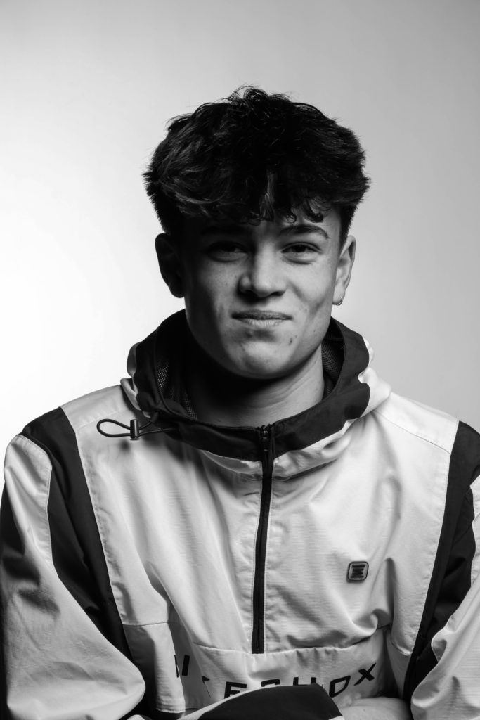
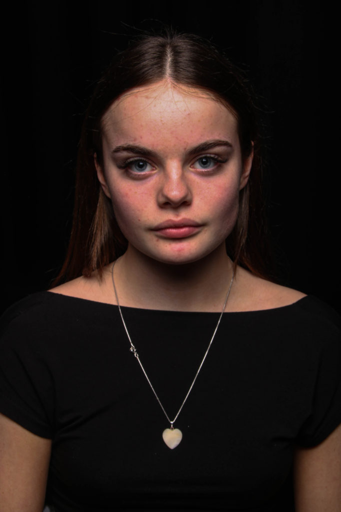
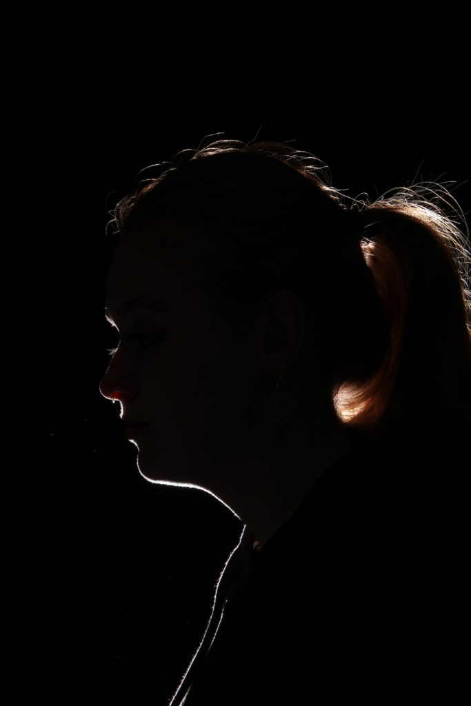
For lighting techniques I did lots of experimenting in the studio to try and replicate different types of lighting for example Rembrandt lighting, Butterfly lighting and playing around with silhouettes. Most of these images were successful however the silhouette images weren’t as successful as I’d hoped as I think our light source wasn’t sufficient for the amount of light required to make a sharp silhouette.
Double exposure
When looking at double exposure I discovered that there are two techniques that can be used to create this unique style of image. This includes changing the setting on the camera to allow multiple shots that then get layered together, or using photoshop to layer images and changing the opacity of them until you get the desired effect.
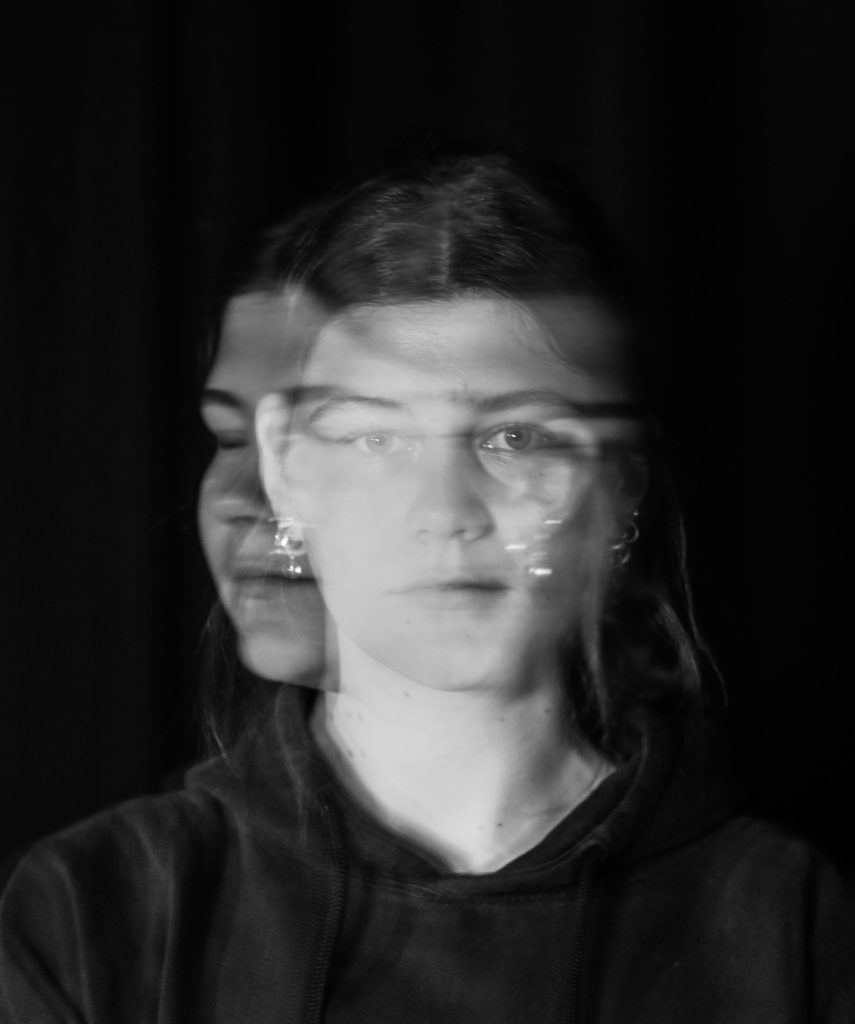
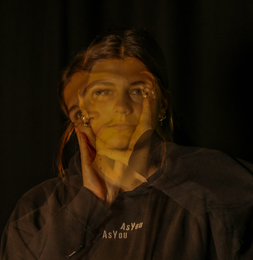
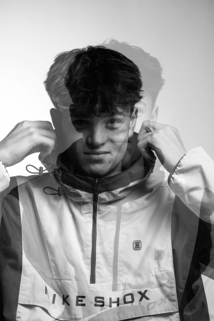
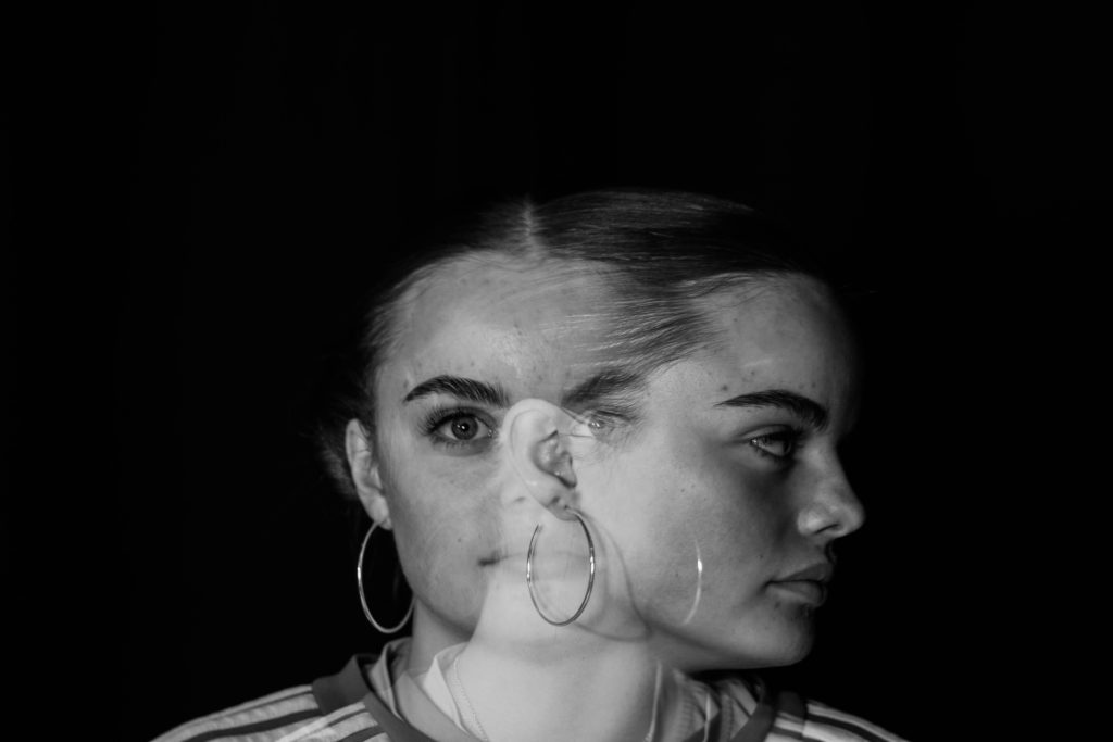
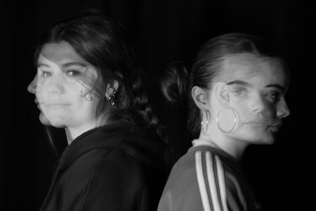
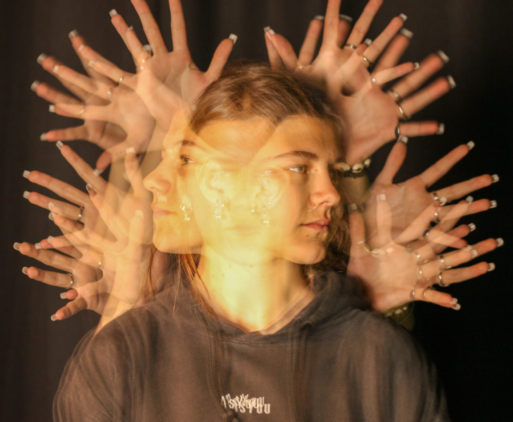
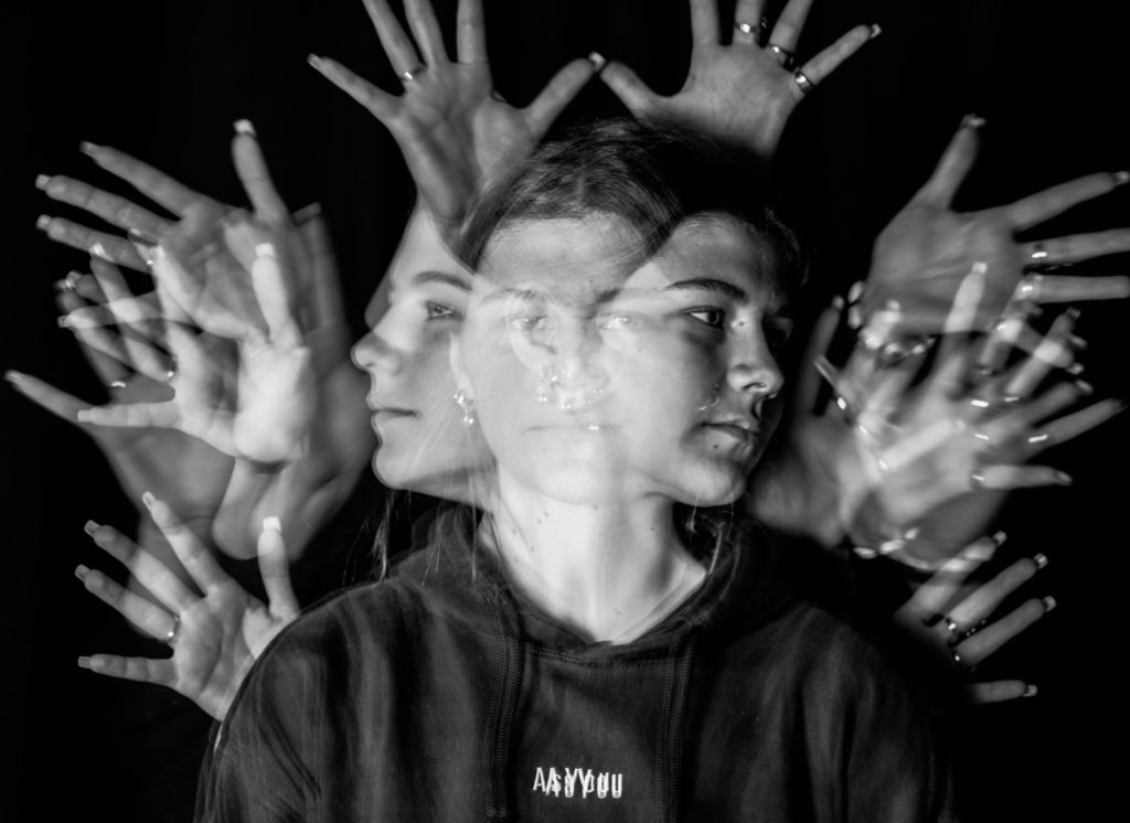
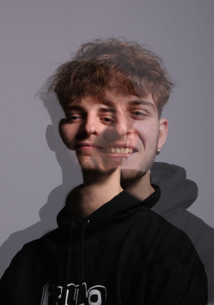
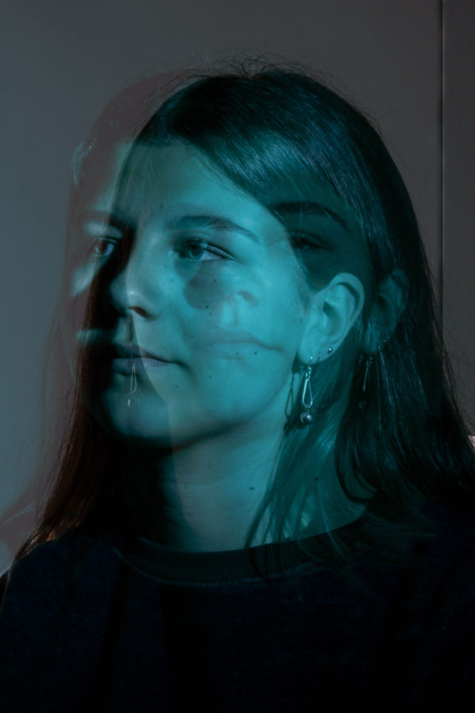
In my opinion, I think these images I produced turned out to be very successful and I really like this style of image and enjoyed learning how to set the camera up to take photos like this.
Environmental portraits
For the environmental portrait project I tried to capture people in their natural environment so took my camera around with me and for some images shot my friends doing their everyday things such as messing around with friends outside, sitting around a table at one of my friends houses and around school.
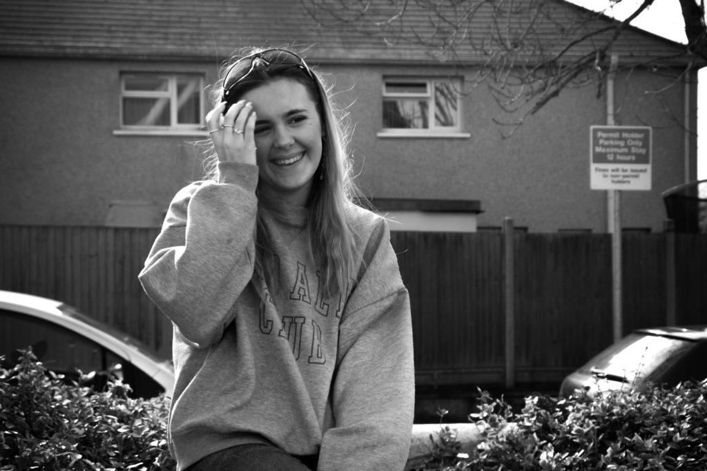
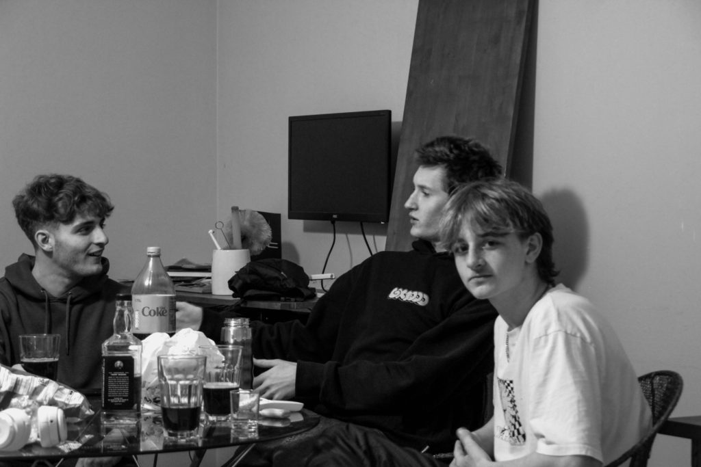
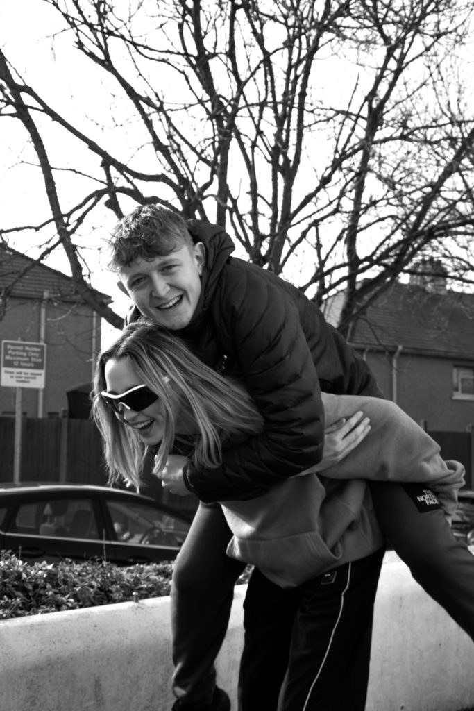
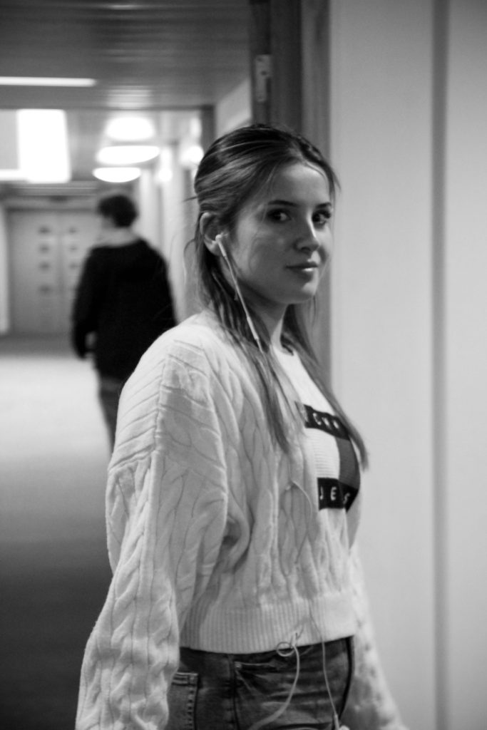
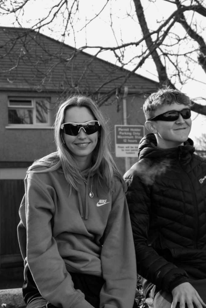
For other images I used other people, for example, my parents. I attempted to shoot them doing their jobs/hobbies such as my mum, on the left, is a flower farmer so I decided it would be appropriate to shoot in her polytunnel as that’s where she spends a lot of her time. For my dad, on the right, he spends a lot of his time in his log shed cutting up wood so I decided to get some images of him here as I think both of these settings show aspects of the persons personality and tells you a bit about them. For this reason, I think these images are very successful outcomes as they enable you to learn about the person being photographed and learn their story.


Binary opposites
I decided to look at binary opposites for part of the femininity vs masculinity project and produced some images that use the binary opposites of:
Boy/Girl and Black/White
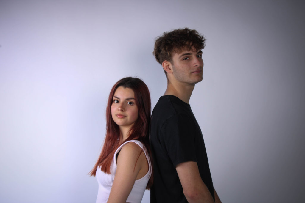
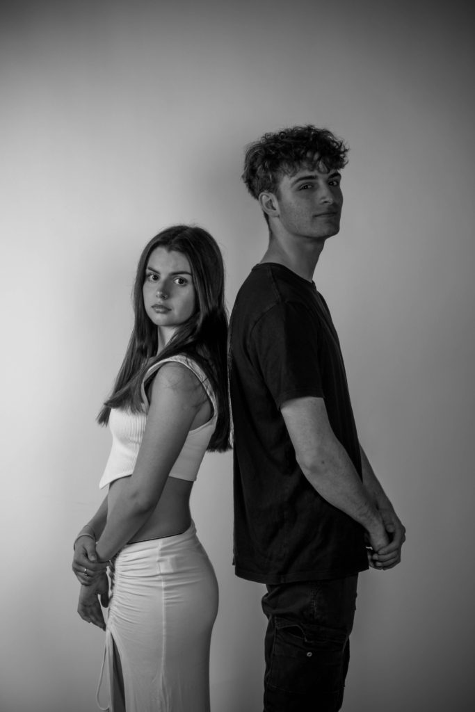
For the Black/White opposition I not only edited the image to be monochrome but also made the girl in the image to wear white and the boy to wear black so that the opposition was obvious and to make a clear contrast between the two people.
Inspired shoots
For my inspired shoot I chose to look at the artist Clare Rae. Her weird style of images caught my attention because of the awkward positions she captures and so I thought it would be interesting to try and create some images inspired by this.
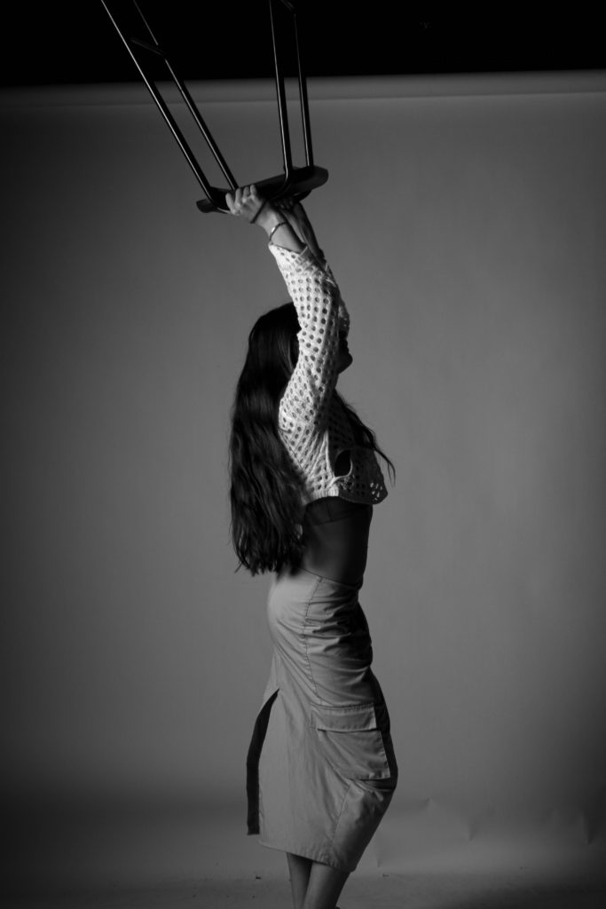
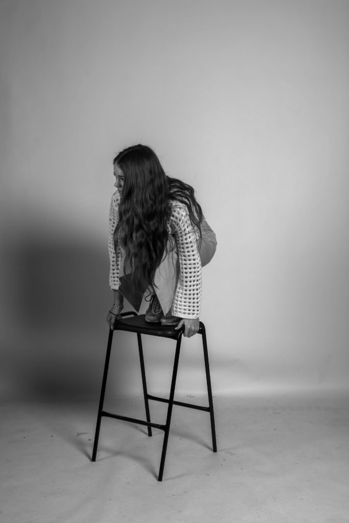
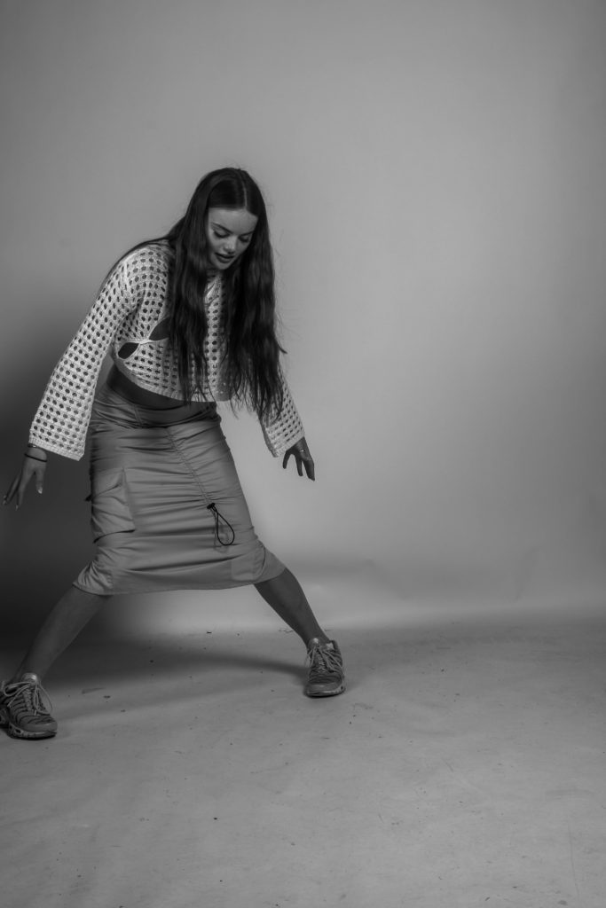
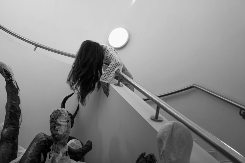
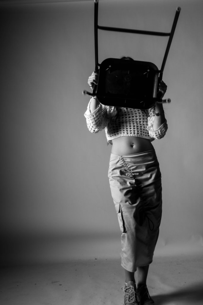
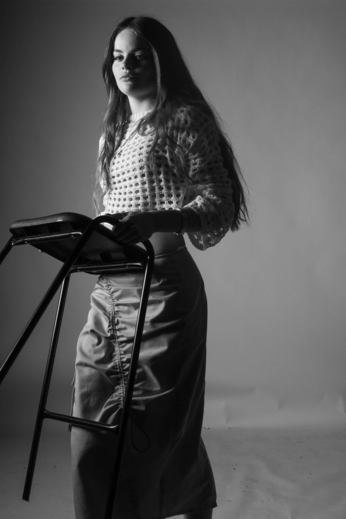
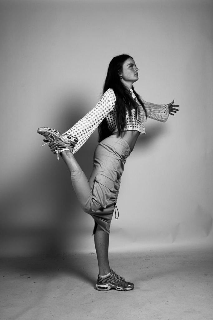
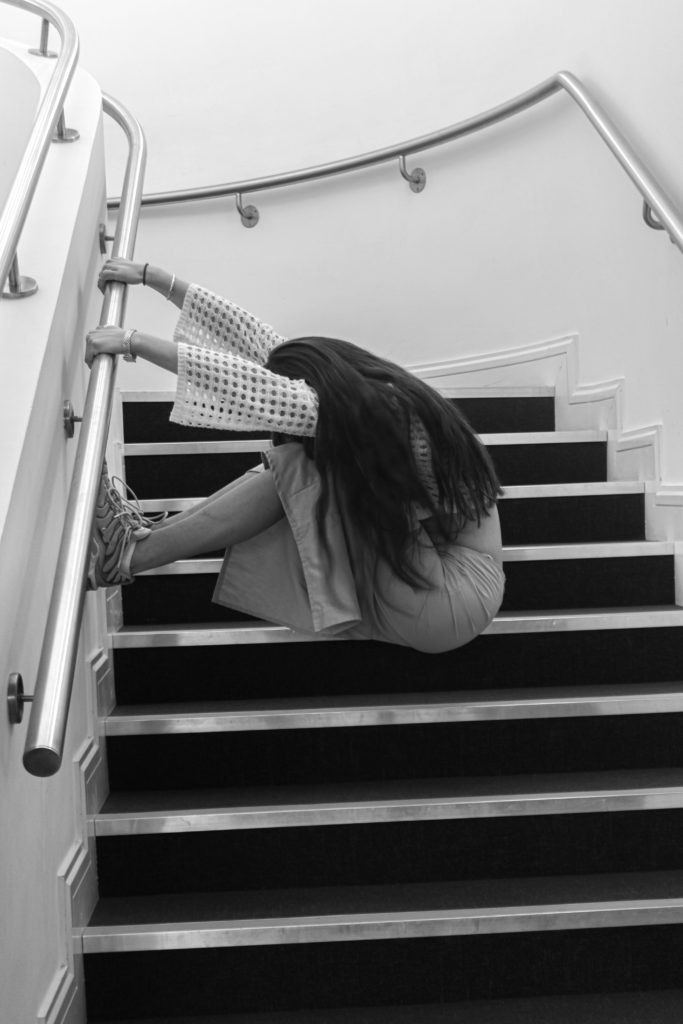
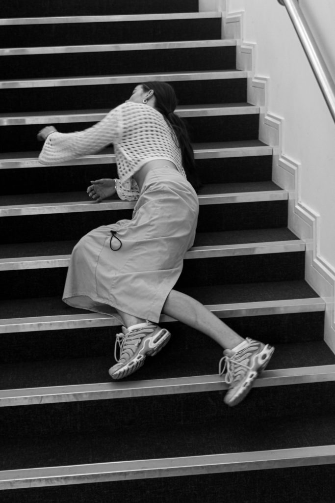
For these images, I took most of them in the studio and used a chair as a prop to climb on and experiment with strange ways of standing and posing. Then after that we decided to take some shots on a staircase as Clare Rae has some with a similar setting.
Femininity
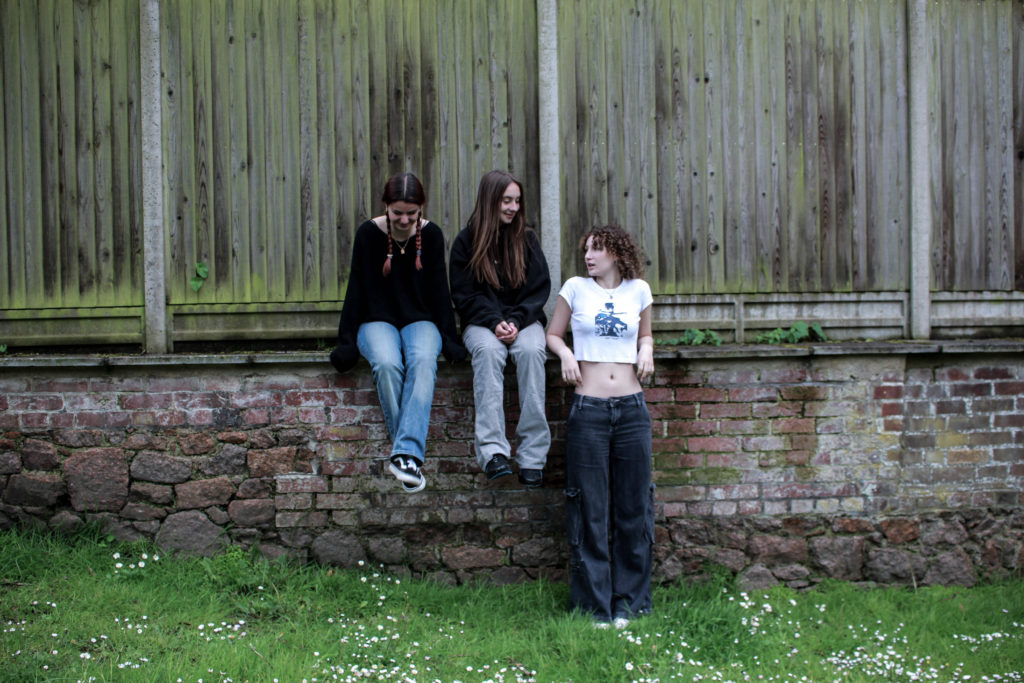
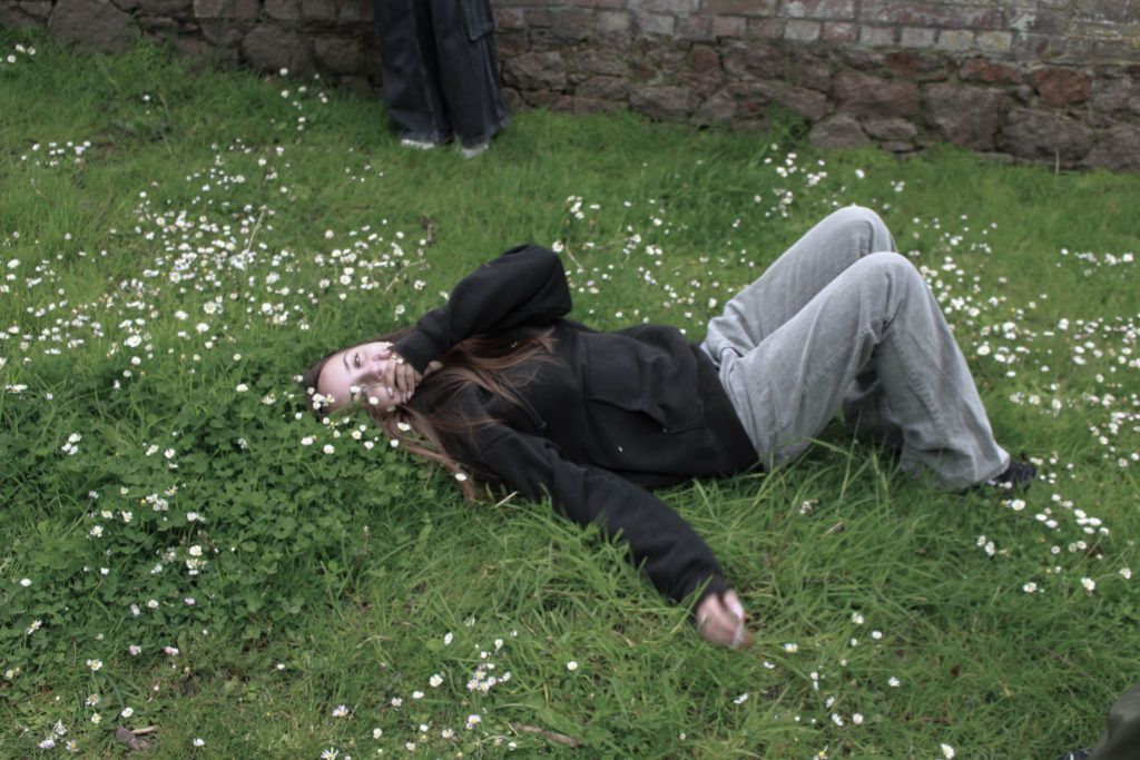
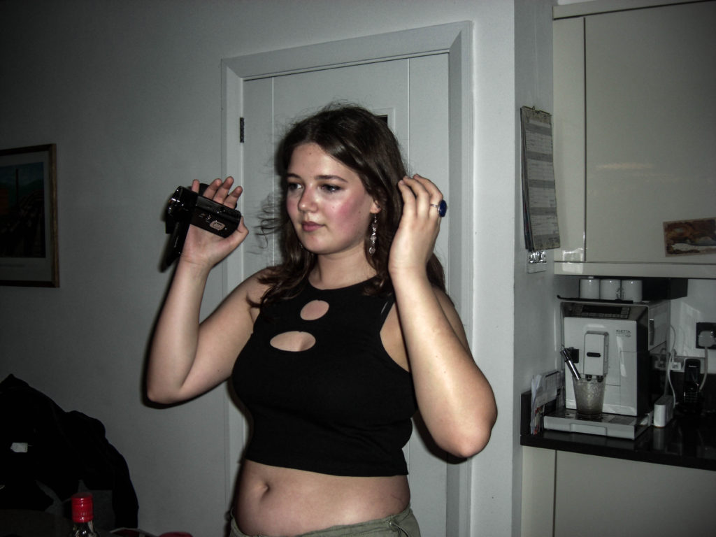
For my Masculinity and Femininity project I decided to create documentary style images inspired by Justine Kurland’s book however I decided to do this around the girls in my friend group. I ensured these images gave the authentic documentary style feeling by brining my camera with me whenever I went out and capturing genuine moments without staging it. This enabled me to capture genuine emotions and create a genuine feeling of fun and friendship.
Summary
Overall I think this project was very successful as I produced some really effective outcomes. My favourite part of this topic was looking at ‘Girl pictures’ by Justine Kurland as I really like her style of her work and I enjoyed shooting + editing the inspired images. I also enjoyed playing with aspects such as double exposure as I found it interesting to experiment with the cameras and use components I hadn’t used before to create some really interesting final outcomes.
