Virtual Gallery and Evaluation

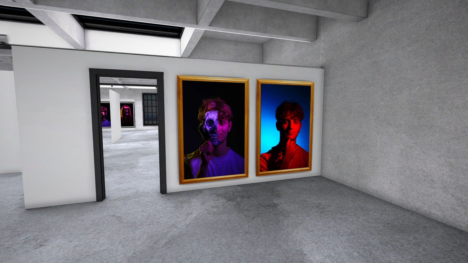
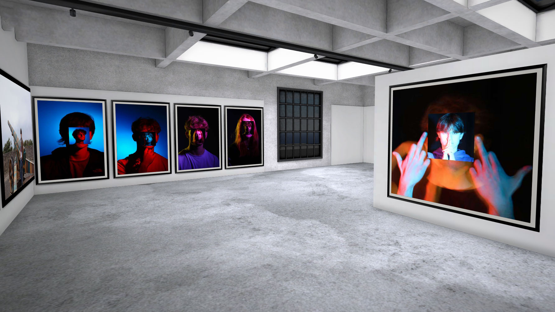
I decided to make a virtual gallery featuring some of my best photos covering my Masculinity, Headshot, Studio and Environmental Portrait projects. Unlike last time, where I would take screenshots of the gallery template and edit my images into the frames later using photoshop. I actually instead made an account on the gallery website to create my own gallery to import my images in to showcase them on the walls. A much easier and quicker method I should’ve used in the first place:

Evaluation

Masculinity: I like my images on masculinity a lot. I feel they turned out very good in terms of sharpness and quality. I do feel I could have improved in quantity however and doing my Dijkstra inspired work too which I never got around to doing. But I’m still very happy with the photos I ended up with.

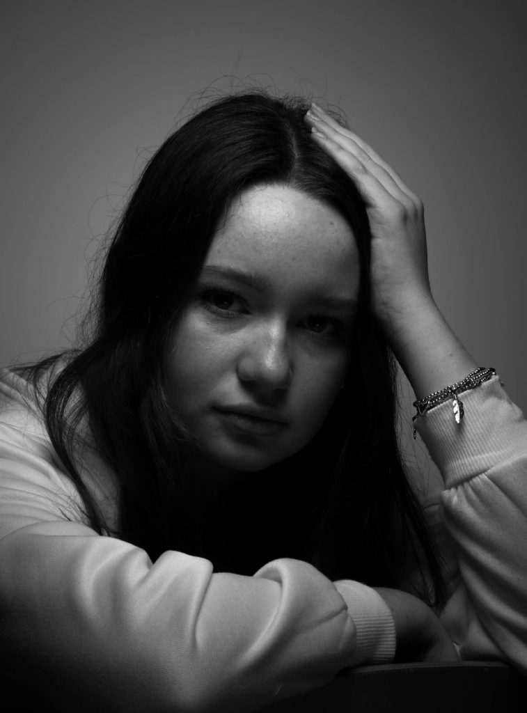
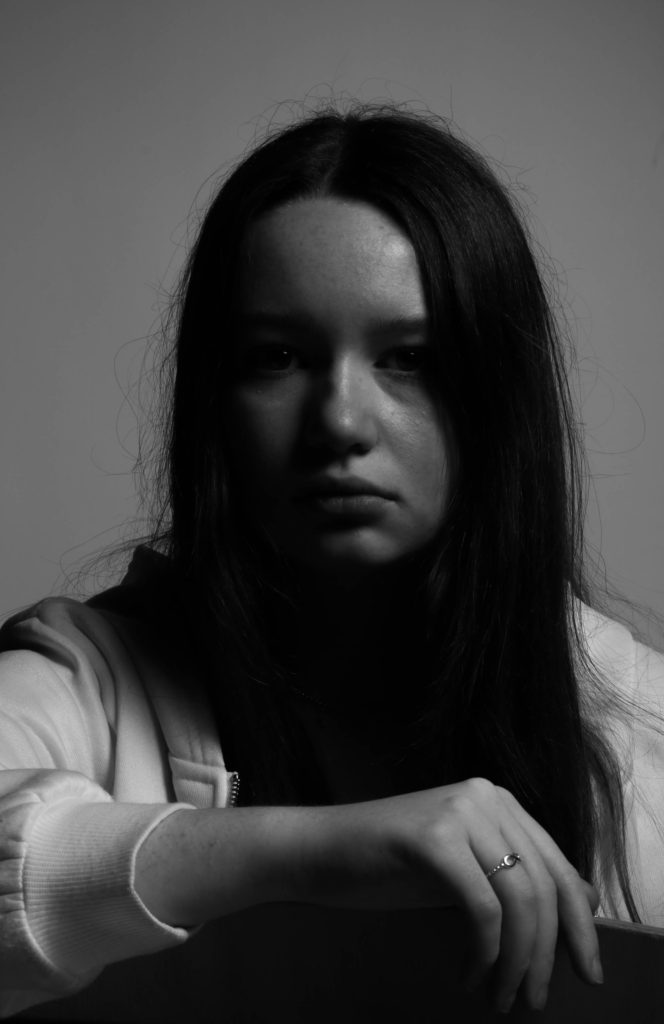
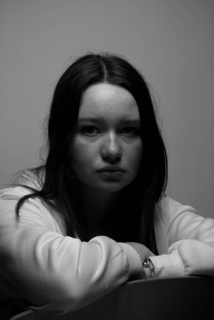
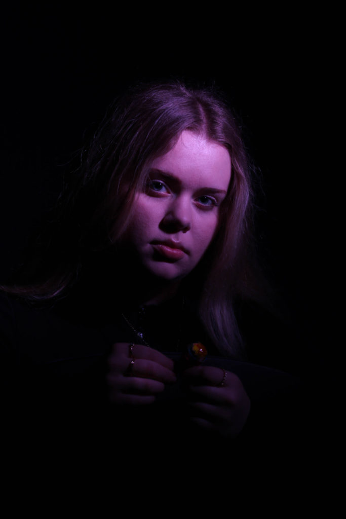
Headshots: I think these are one of my best photoshoots, I loved the overall quality these images turned out having. And the process of taking these photos was actually quite fun. The colours we used I think were very good combinations and lit up a perfect amount of the photos while still keeping them dark. Having three models is also very good in quantity too. I think editing them by covering the face of one image with another was very good too.

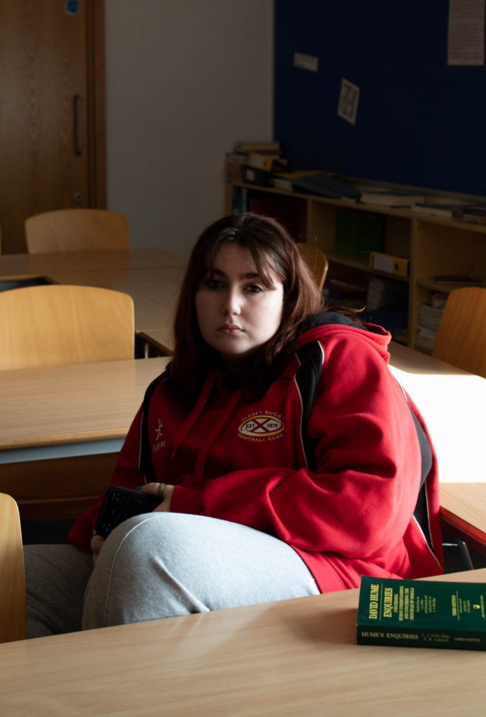
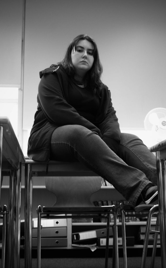
Studio: I really like these images as I feel they have really good quality. Jude’s hoodie would come out very well detailed and textured despite being in a dark environment which I really like. Some photos showed half of his face which I really like too because they made them look so much better. Some we took had Jude facing away from the camera which also came out very nice. Something that I wish was better, and this kind of still annoys me, is that the photos were higher quality. I’m not sure whether it was the settings I saved the photos to in Lightroom or the camera lens being a little dirty but something kept causing them to appear lower in quality and a little blurry. I will make sure to prevent this next time.

Environmental Portraits: Out of all the four, this one is easily the worst. Most photos just didn’t turn out very well and had the similar blurring situation that the Studio photos had too. Also some photos I took were way to close to the subject’s face. And the photos put simply, were just not interesting. I was told to take my own pictures outside of school but I didn’t get around to doing any so I had only the ones I took in school as a practise. Not a very good situation to be put in. I will learn from this and make sure to not let this happen again.

Photoshoot 2 – Painting – Making + Experimentation

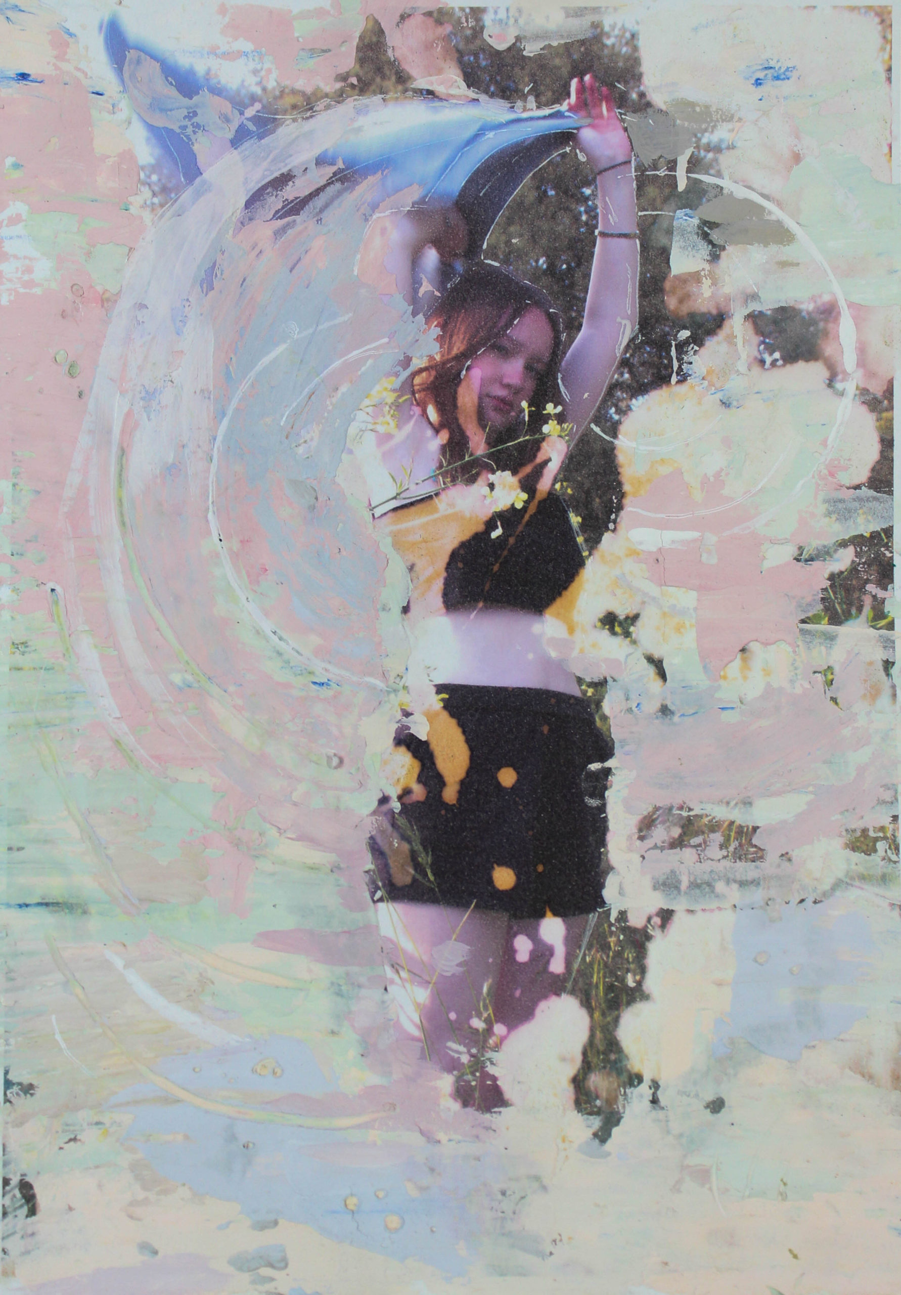
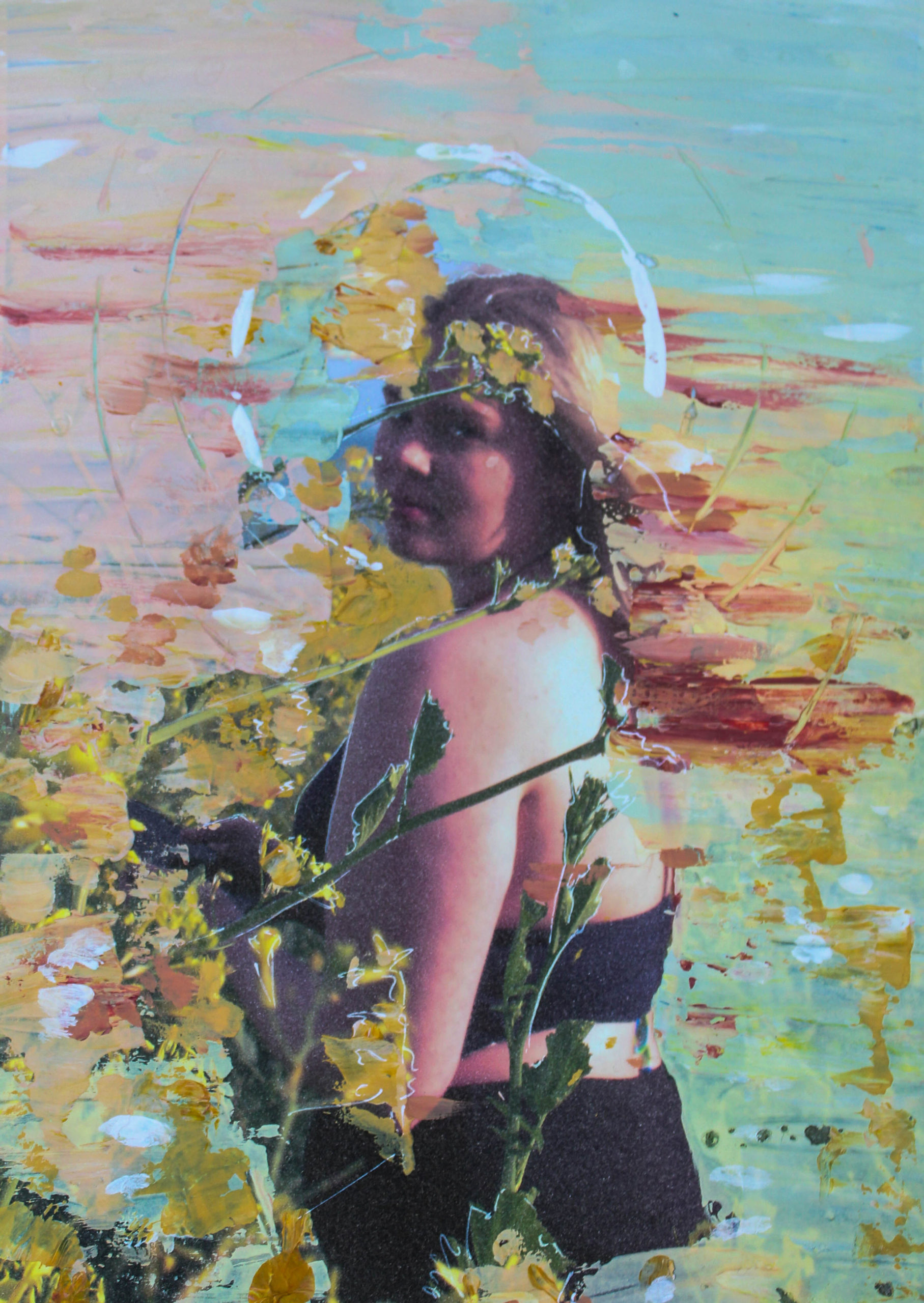
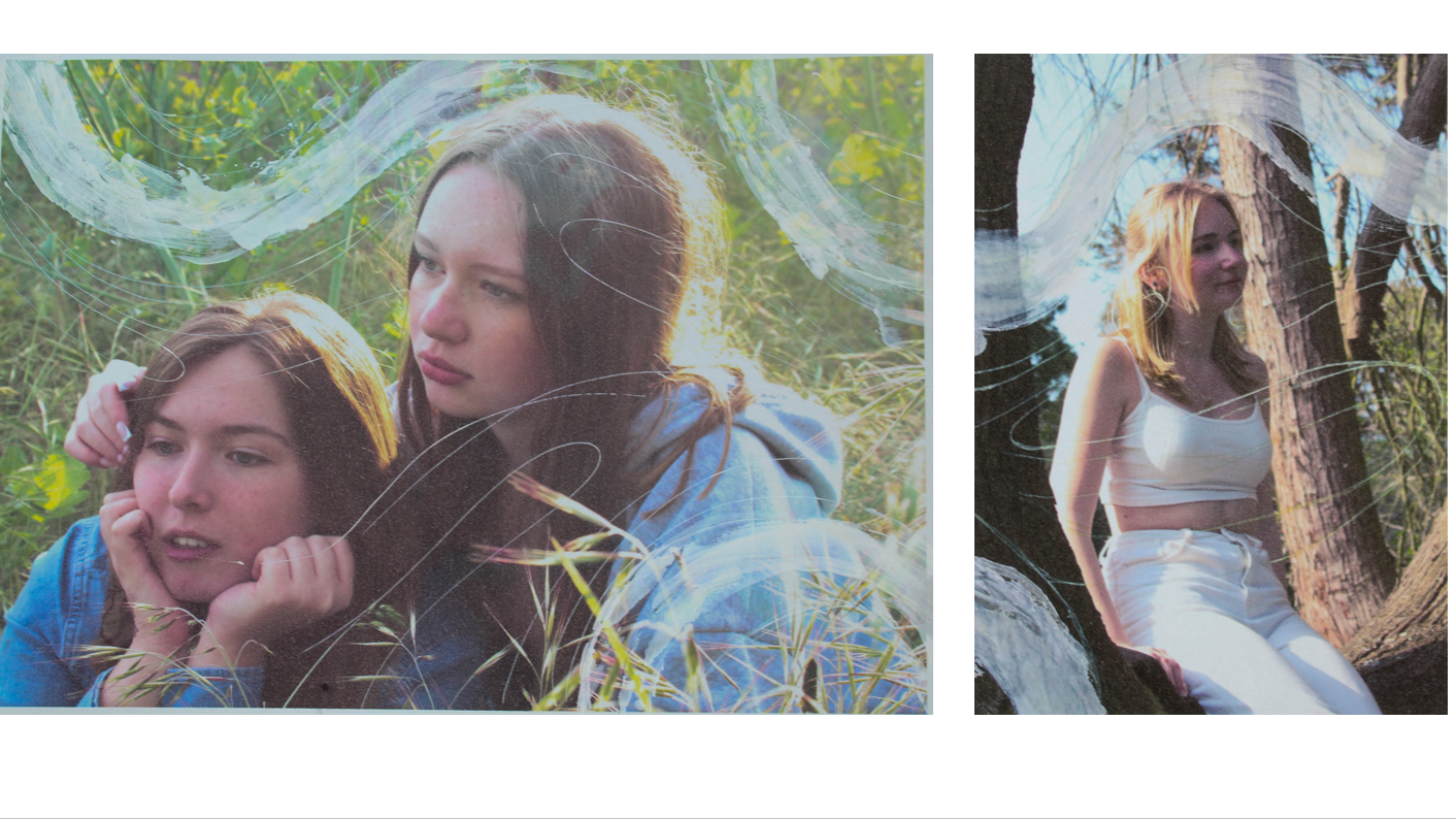
I attempted to paint over my images using pallet knifes to create thick layers of paint for texture. I used more pastel colours as I wanted to emulate the the softer colours and tones used by Sian Davey in ‘The Garden’. painting over the images was also a direct link to the work of Tom hunter as he recreates painting I wished to do it more literally with actual paint whilst also alluding to the original painting.

This first image I think was successful with the level of detail I wanted to achieve but I think the colours came out muddy and was too similar to other images.
on this particular image I experimented with soaking bleach in the paper to lift the colour. I spread the paint on this image to imply movement with the way she holds the clothing.

I used paper cups to create circle around each of the subjects almost imitating halos

I created the lines on each image to flow and connect together to be less overwhelming than the full paint on the others.

Views on masculinity and stereotypes.

Over the course of this project iv used my own views to help inspire my images and to truly understand my images i believe its best to explain my views

As a man, I’ve often thought about the concept of masculinity and how it affects me and other men. According to social constructionist theory, gender is a social construct that is created and reinforced by society. This means that the way we think about masculinity and femininity is not innate, but rather something that is learned through socialization.

One of the most harmful aspects of masculinity is the idea of the “tough guy” stereotype. This stereotype suggests that men should be strong, unemotional, and aggressive. This can lead to men feeling like they can’t express their emotions or seek help when they need it. It can also lead to men feeling like they need to be violent or aggressive in order to be seen as “manly.”

Hegemonic masculinity theory suggests that there is a dominant form of masculinity that is seen as the ideal in our society. This ideal is often associated with power, dominance, and control. Men who don’t conform to this ideal may be seen as weak or effeminate. This can be particularly harmful for men who don’t fit into traditional gender roles, such as gay or transgender men.

Intersectionality theory suggests that masculinity is not the only factor that affects men’s experiences. Other factors, such as race, class, and sexuality, also play a role in shaping men’s experiences. For example, black men may face different expectations around masculinity than white men.

In conclusion, the concept of masculinity is complex and hard to narrow down. While some aspects of masculinity can be positive, such as strength and resilience, other aspects can be harmful, such as the “tough guy” stereotype. It’s important to recognize that everyone is different, and there’s no one “right” way to be a man. Men should be allowed to express their emotions and seek help when they need it, just like anyone else. It’s also important to recognize that masculinity can mean different things to different people.

Evaluation


How successful were my final outcomes?

My final images were not as strong as I hoped hey would be. I used a lot of foamboard to mount my images as I wanted theme to stand out which i feel window mounts don’t do as well. a few of my images ended up with minor scratches as i did not take enough care when cutting and framing. however i do feel as though my images were somewhat similar to joseph Barretts which was my aim as i found his portraiture very interesting when shown alongside his explanation.

Is there anything I would do differently?

I would spend more time doing blog post which correlate to my work as i have very little evidence of the journey of my photos. I also need to take more photos as i do not have valid contact sheets with vast amounts of images, this is due to my habit of deleting images if I do not like them however sometimes it is better to have the images that did not work so well as it can help me learn from my mistakes

Evaluation on the whole project:

Overall i enjoyed portraiture however i do not feel like it was my strong suits as i prefer more creative and urban stances and i feel I didn’t express these in my final images because i limited myself to only using the studio and played it quite safe with my images which made the come out as quite dull and boring and not the most interesting pieces.

However i did enjoy using the different forms of lighting and i believe it has improved my photography skills in and out of the studio as i am now more conscious about the lighting and how the light is reflected.

i also enjoyed the masculinity vs femininity side of it as it is something i like to think about anyway and i had the opportunity to have some great final images however i don’t think i met the bar i was expecting

Origin of photography

  • Camera Obscura & Pinhole photography
  • Nicephore Niepce & Heliography
  • Louis Daguerre & Daguerreotype
  • Henry Fox Talbot & Calotype
  • Robert Cornelius & self-portraiture
  • Henry Mullins & Carte-de-Visit

Camera Obscura

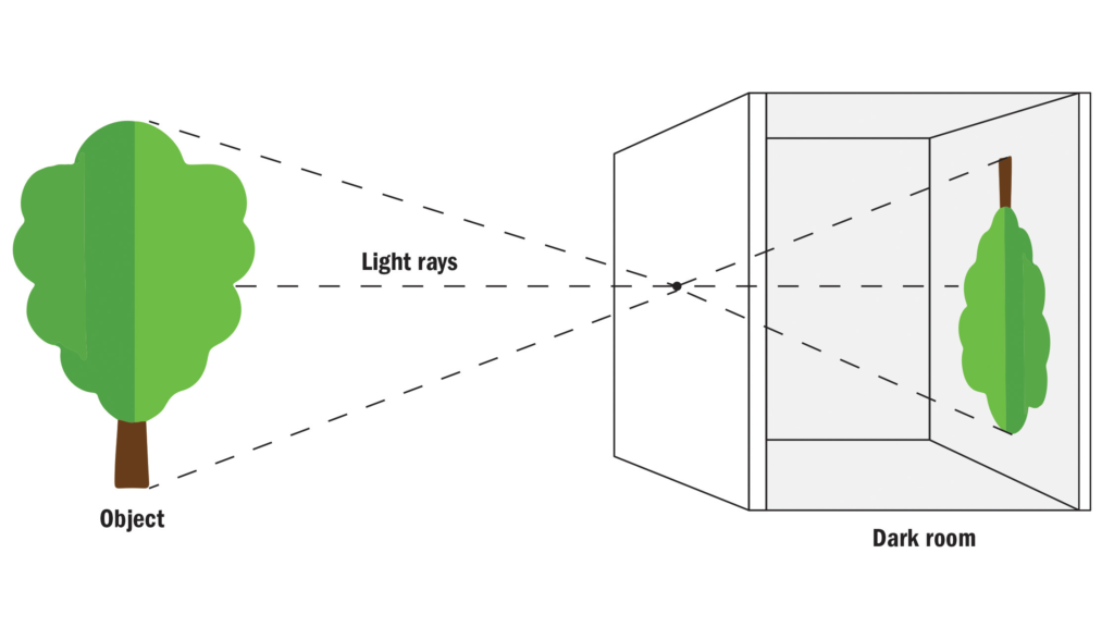
The camera obscura (Latin for “dark room”) is an optical device that creates an image by focusing rays of light onto a screen or sheet of paper. As the name suggests, many historical camera obscura experiments were performed in dark rooms. The surroundings of the projected image have to be relatively dark for the image to be clear

Nicephore Niepce & Heliography

a photographic process that was invented by Nicéphore Niepce. Heliography was developed using two distinct methods. The first consisted of “fixing the views” in the camera obscura, while the other copied existing engraving methods to “reproduce them by printing using known methods of engraving.”

Louis Daguerre & Daguerreotype

Daguerre’s invention did not spring to life fully grown, although in 1839 it may have seemed that way. In fact, Daguerre had been searching since the mid-1820s for a means to capture the fleeting images he saw in his camera obscura, a draftsman’s aid consisting of a wood box with a lens at one end that threw an image onto a frosted sheet of glass at the other. In 1829, he had formed a partnership with Nicéphore Niépce, who had been working on the same problem, how to make a permanent image using light and chemistry, and who had achieved primitive but real results as early as 1826. By the time Niépce died in 1833, the partners had yet to come up with a practical, reliable process.

Henry Fox Talbot & Calotype

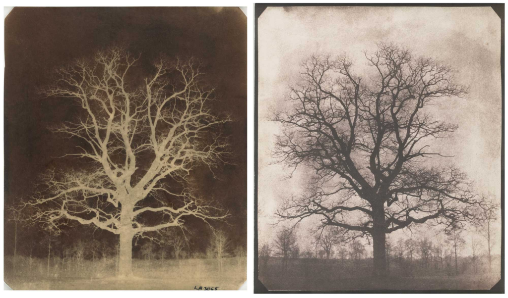
Early photographic technique invented by William Henry Fox Talbot of Great Britain in the 1830s. In this technique, a sheet of paper coated with silver chloride was exposed to light in a camera obscura; those areas hit by light became dark in tone, yielding a negative image.

Robert Cornelius & self-portraiture

In February 2014 a daguerreotype self-portrait taken by the American photography pioneer Robert Cornelius of Philadelphia was considered the first American photographic portrait of a human ever produced, and since this was a self-portrait, it was also possibly the first “selfie.”

Henry Mullins & Carte-de-Visit

Henry Mullins started working at 230 Regent Street in London in the 1840s and moved to Jersey in July 1848. He was popular with officers of the Royal Militia Island of Jersey, for whom it was very popular to have portraits taken, as well as of their wives and children, for the more senior and more affluent officers. The pictures of these officers show clearly the fashion for long hair, whiskers and beards in the mid-1800s.

Artist Comparisons

Masculinity

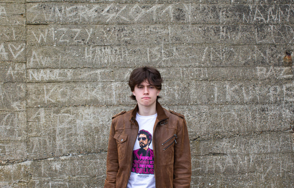
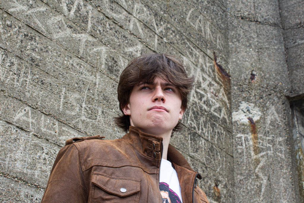
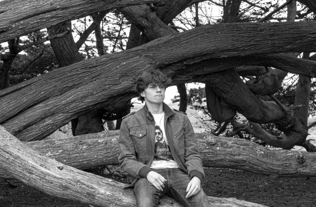
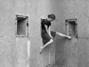
My Masculinity photos were in response to Clare Rae’s work, Never Standing on Two Feet. The inspiration I took was the location, her work was based around the sand dunes and bunkers on several beaches in Jersey. So I went to St. Ouen to take pictures of myself near a bunker and a fallen tree. Her work is still very different to mine but I feel they have the same energy.

My work:

Rae’s Work:

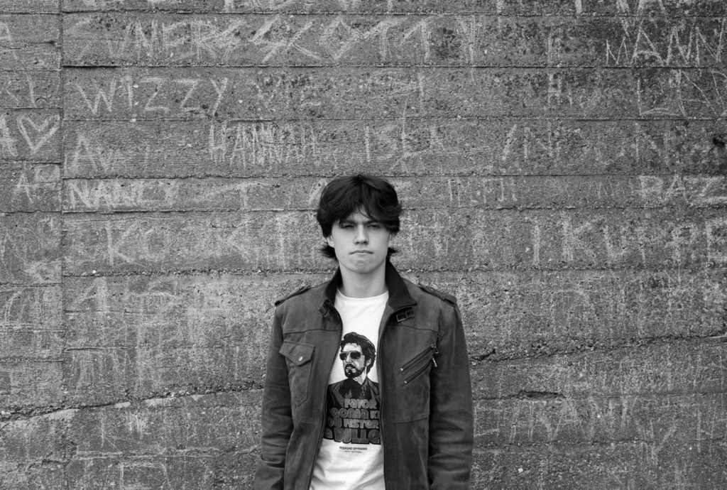
I also made some in black and white to better match Rae’s pictures:

I wanted to recreate Rae’s photos of her with a grey stone background:

(The ones like this)

Which is why I mainly wanted to go and take pictures of me in front of a similar type of wall. I felt mine had more detail with the scratched graffiti behind me:

I think I represented Rae’s photos very well while at the same time producing the photos my way.

environmental

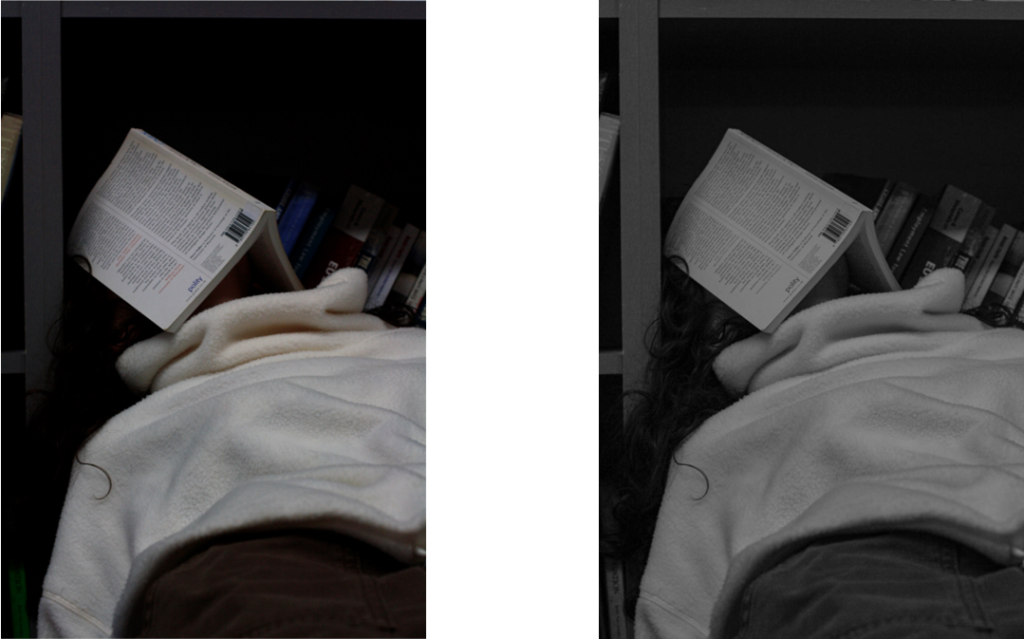
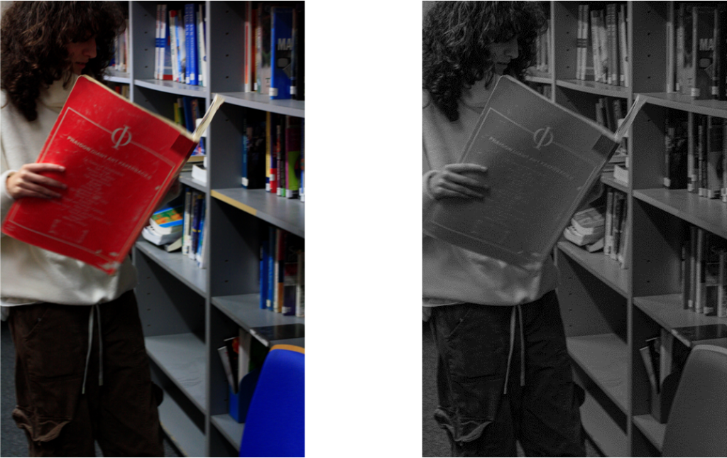
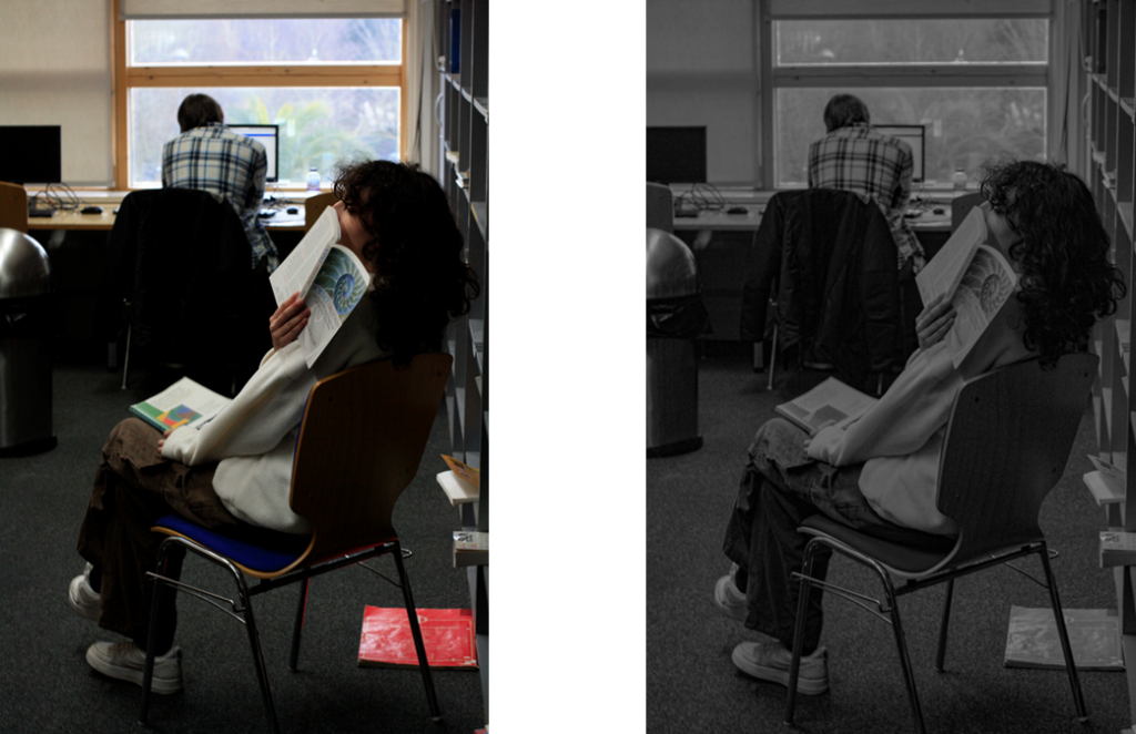
These are the photos that I took for my environmental photographs. I went to the library and asked my friend if I could take pictures of her as she is always spending her free time in there. I carefully picked the photos I preferred the most and edited them on Lightroom to achieve my final outcome.