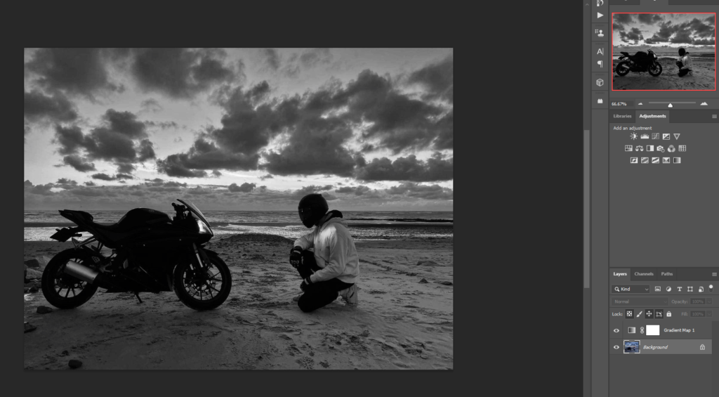
For this photo all I did was gradient maps and I don’t think the photo needs anymore considering if I added more in editing I think it will take away aspects of the photo that I want. for instance I took inspiration from Danny Lyons and his photos are black and white and that’s it so if I added anymore the photo wouldn’t get the same effect that I want for the photo.

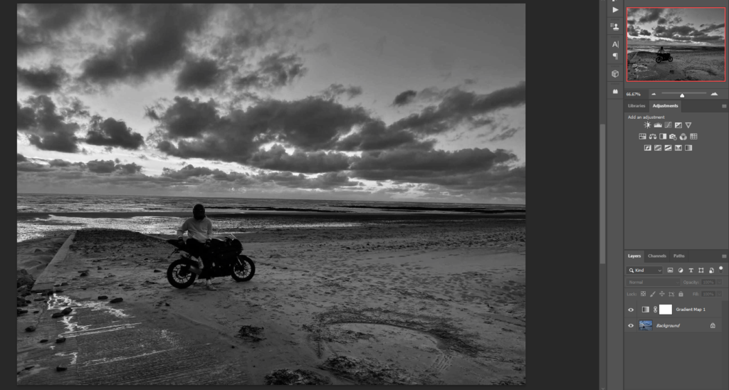
when editing this photo and I wanted it to have a old simplistic effect as I said about the photo above this photo that I took inspiration from Danny Lyons and adding more to the photo would not give the same feel to the photo that i want the photo to feel like when’s someone’s looking at it

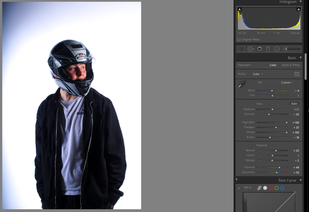
when editing this photo it was me trying to sharpen it up no fancy editing thing but I did wanted to keep the glare in the visor just because I thought it looks good. when editing i stopped for a minute looked at the photo and then stopped when I was happy with the photo.

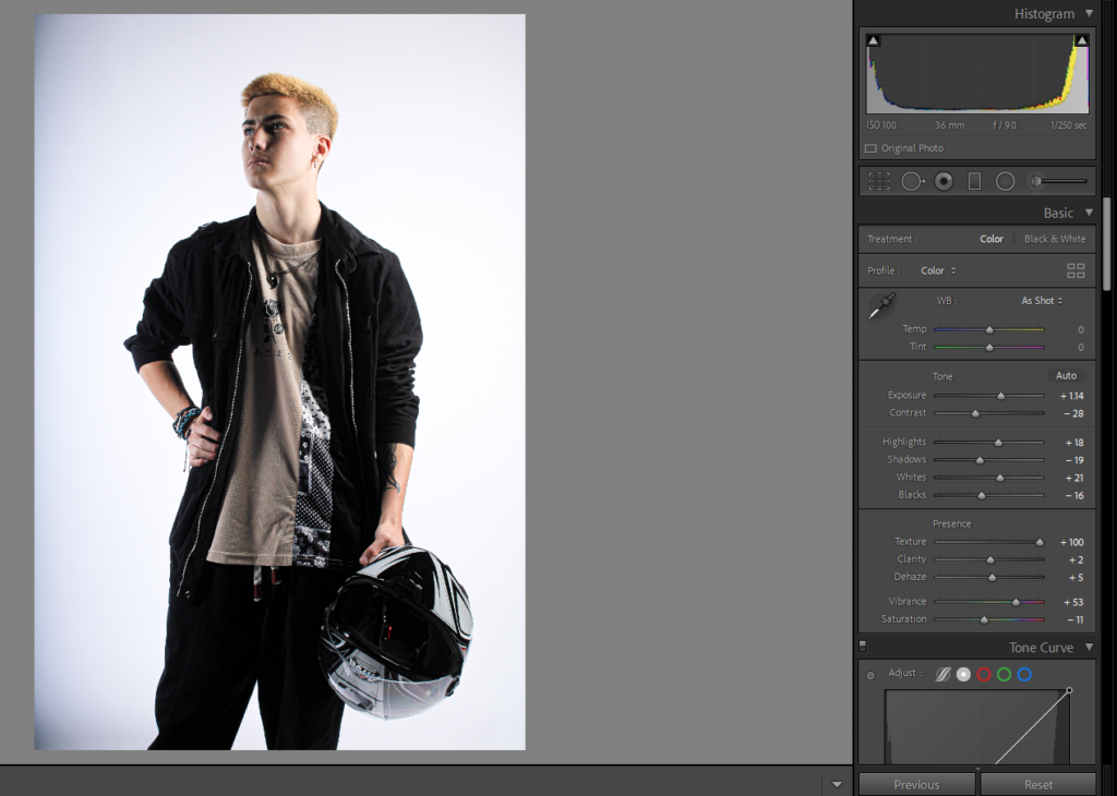
when editing this photo I wanted it to look good because I like the photo its quiet stoic and I believe with the editing I could have done a lot better however the photo turned out ok

when editing this photo I tried to give a depressing effect or sad effect and I believe when people look at this photo they feel or know that the person in the photo is depressed and the light in the photo is a bit hope however this photo is the oldest one in this photo edits and I choose to use this one in the mock because I haven’t gotten to use it in yet and I believe it turned out good.
