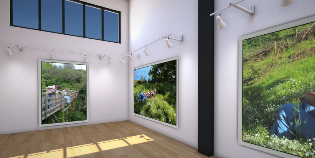
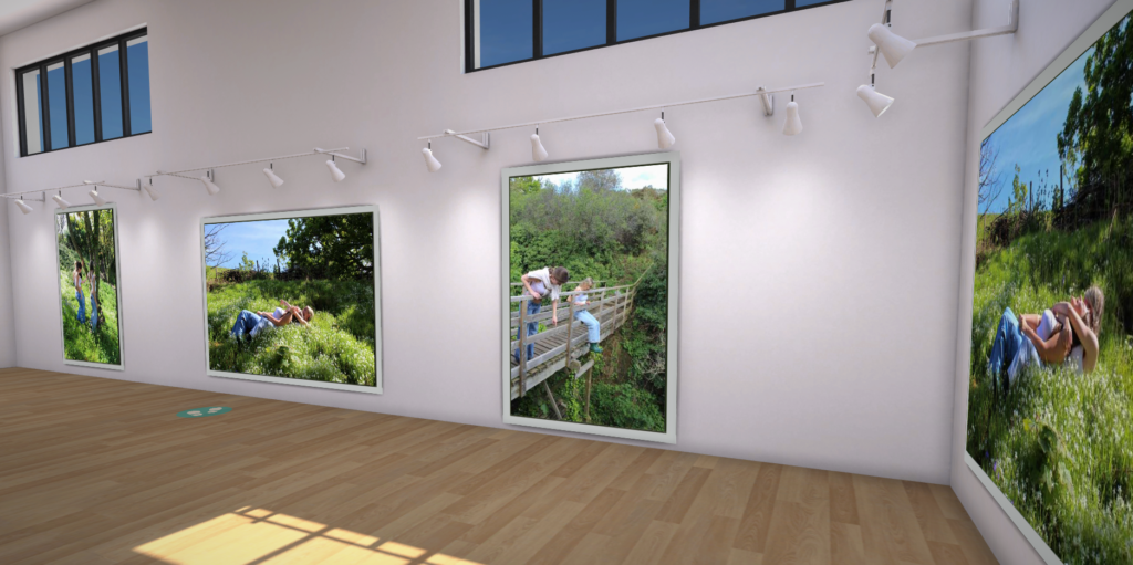
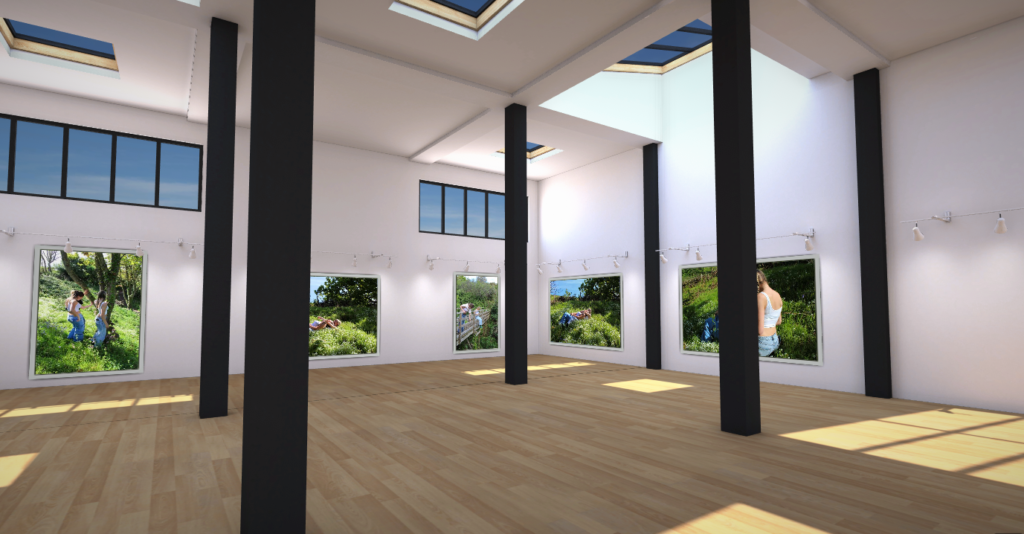


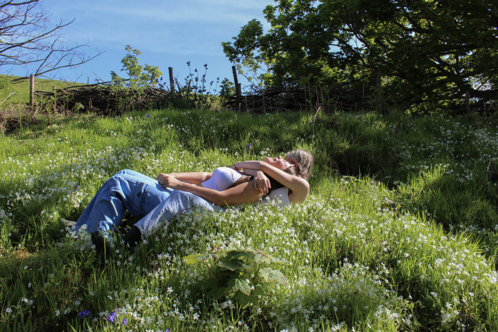
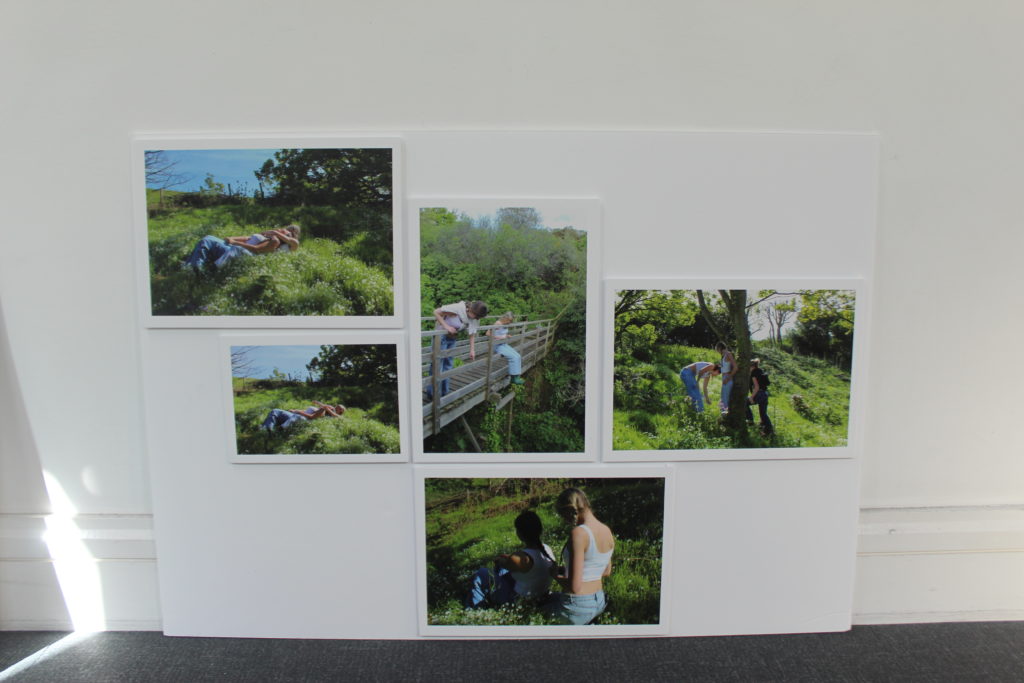
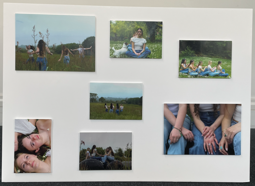
My final outcomes were successful and came out the way I wanted them to. By mounting them up onto foam board to display them in a sequence in which it tells a story. I really like the colours in the images, they create a happy joyful feeling to the images. My artist references were Justin Kurland and Sian Davey. By researching and getting more inspiration from them I started to build more ideas of what pictures I can take and where to take them.
How did I plan this project:
I planned to take inspiration from Justin Kurland and her ‘Girl Pictures’ project. I thought of areas in the island which would fit well and have a similar environment as her work. Living on the north coast of the island I have a pathway down to the cliff paths. On the sides of the paths there are grass areas which we used to create most of the images. In these areas there was trees, flower patches and lots more greenery. We walked further and found a fort which had a bridge which we thought could be a good feature to incorporate.
What could I Improve:
If I were to change or cretic anything I would have done another photoshoot or edited more of my images to be printed out for the print folder. By doing this it could have added more of a story to my group of images.
Image Mounting
I printed my images onto different sized papers to lay them out to see how I want to display them. I wanted my pictures to tell a story. So the way I lay them out is important. Using the images which I put into the print folder I used spay glue to stick my individual images onto. After doing this I put them into the order in which I think works the best to tell a story. I am happy with the way my final outcome turned out I think that it tells a story and shows an adventure. It also shows the idea of femininity and what it is to be feminine.
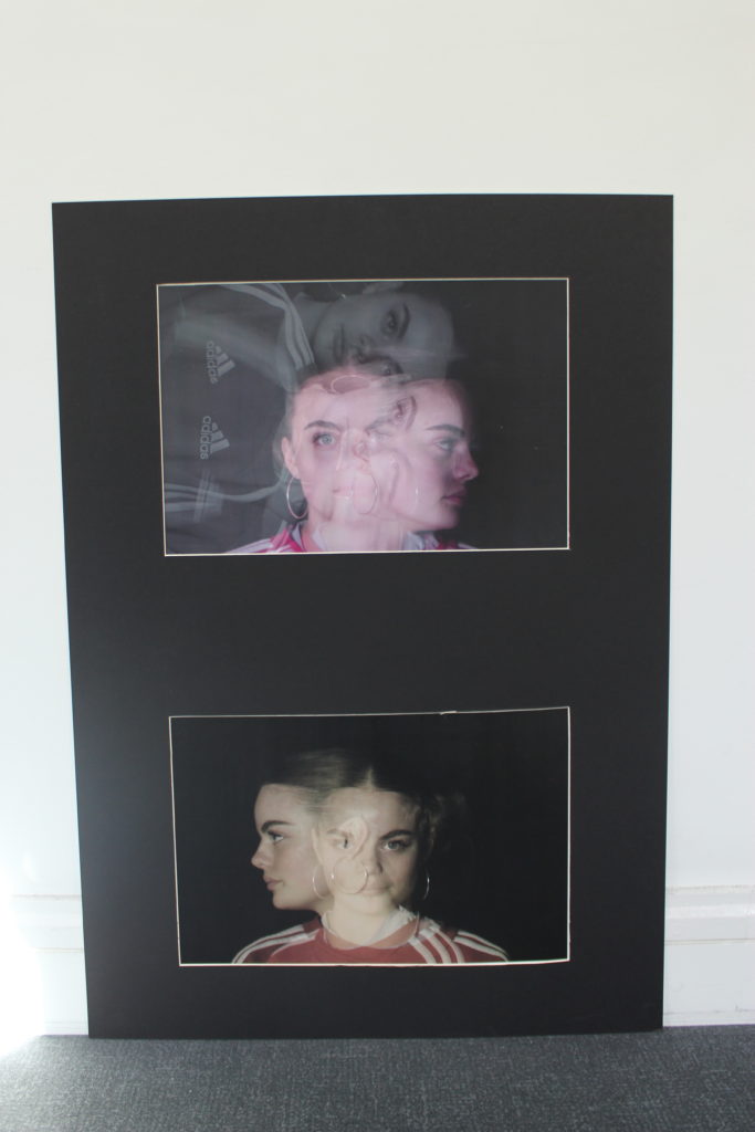
To display my multi exposure images I used a double window mount.
For my final project i picked femininity for the identity project that i could relate to being a female, and when researching photographers i came across Justine Kurland’s ‘Girl Pictures’ which i as inspired by to create my own shoot similar to hers as i liked how she captured the youth of femininity in a unique way and and in such a natural way, for example how she captured people braiding each others hair which children usually do in the playground in their youth years, her photos don’t seem as staged as other photographers although it is obviously staged there is a way on how she photographed the people in such a natural way which is why it appealed to me straight away.
My idea behind this topic femininity was to show the stereotypical representations of females and the youth within young females.
when planning this photoshoot i had to plan the outfits with the people i was using for this i arranged them to all wear blue jeans and a whit top i liked the idea of them all wearing the same thing but the outfits being slightly different showing there style and what they are comfortable in. I also had to factor in the weather as this shoot was highly dependant on the weather i had to make sure the ground was dry and the sky was bright, although when i did the shoot there was a slight bit of mist in the air i believe this worked out for be as in on of Kurlands photos on a hill the sky is misty it also creates a sene of eeriness. However if i was to do this shoot again i would do it of a clear sky day because due to the bright clouds it made the photos slightly over exposed so there for in the editing process i had to turn the exposure down to make them look right and also due to the clouds it didn’t make the grass look as vibrant.
When it came to the photoshoot i wanted the photos to be as natural as possible i gave guidance to the girls of what i was wanting the outcomes of the photoshoot to look like by showing them Justine Kurlands book ‘Girls Photos’ and i let them partially do what they want which worked out in my favour as i got the photos i need to get in relation to Kurlands work but i also got outcomes which were unique to my work and what i had envisioned the outcome to be like. When it came to editing the photos i wanted to keep them natural looking i did this by not making any vast changes with the Kurland inspired shoot on may of the photos i tended to adjust the vibrance exposure and the saturation to create the look and aesthetic i was looking for, i believe that because i made the images more vibrant it made my photos look more alive and joyful and feminine
I really enjoyed this project, i learned a lot about studio lighting and different positions of lighting you can do to get different effects, i also believe that my knowledge and skills on photography have improved a lot since the last project as i feel a lot more comfortable behind the camera and my knowledge on how to work a camera. Things i have struggled with in this project is getting willing people to sit in front of the camera and asking people to help me, i have also struggled with working with natural lighting within portraits and finding the best balance to not get it over or under exposed.
My photoshoot was inspired by Justin Kurland I tried to recreate her images but add a personal twist to the shoot.
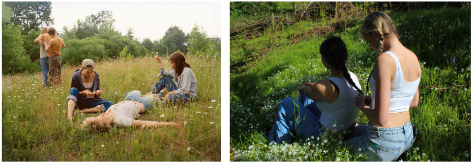


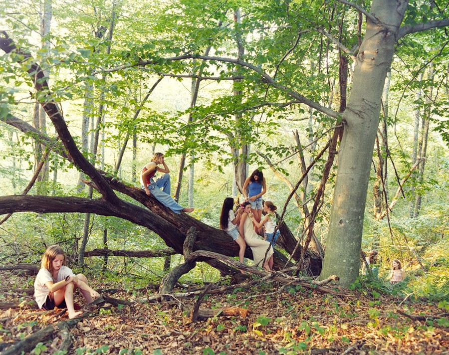
Comparing my images to Justine Kurland they are very similar, regarding the colours, layout and style. My pictures are more vibrant compared to Kurland’s which look like they are vintage and more warmer colours.
Develop settings:
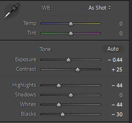
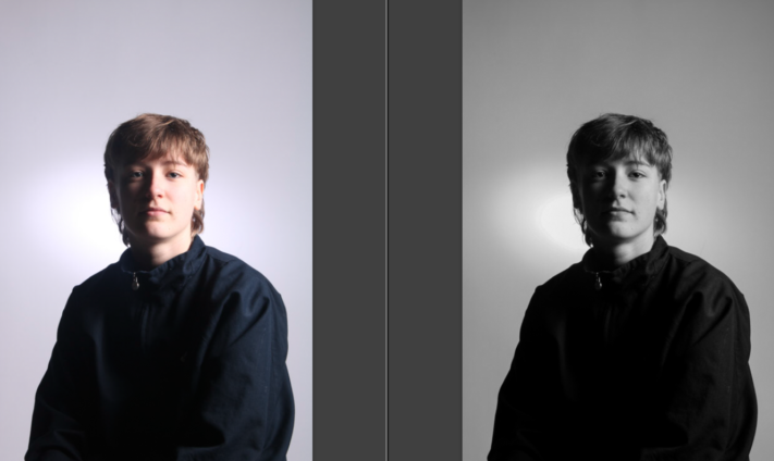
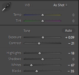
I have edited this photograph in black and white to dramatize it, but also to reflect the lighting technique. With colour, there is more occurring in the image, and this takes focus away from the lighting technique I have employed. This is also done by increasing the contrast and the blacks in the image.
Develop settings:
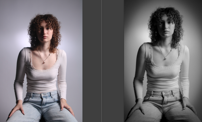
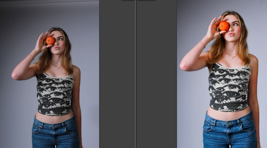
I edited this image with the same intent as the previous, so that the lighting technique I have employed is apparent. However, I have added some vignette to this image to dramatize it further. I also cropped this photograph in order to make it more central.
Develop settings:
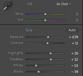
I cropped this image to make it more central as the excess space takes away from the image. I have edited this image to make it more vibrant and colourful, this was especially for the orange to make it stand out. To do this I used the above settings, as well as increasing the saturation slightly.
Develop settings:
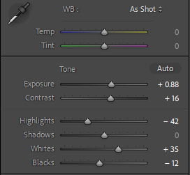
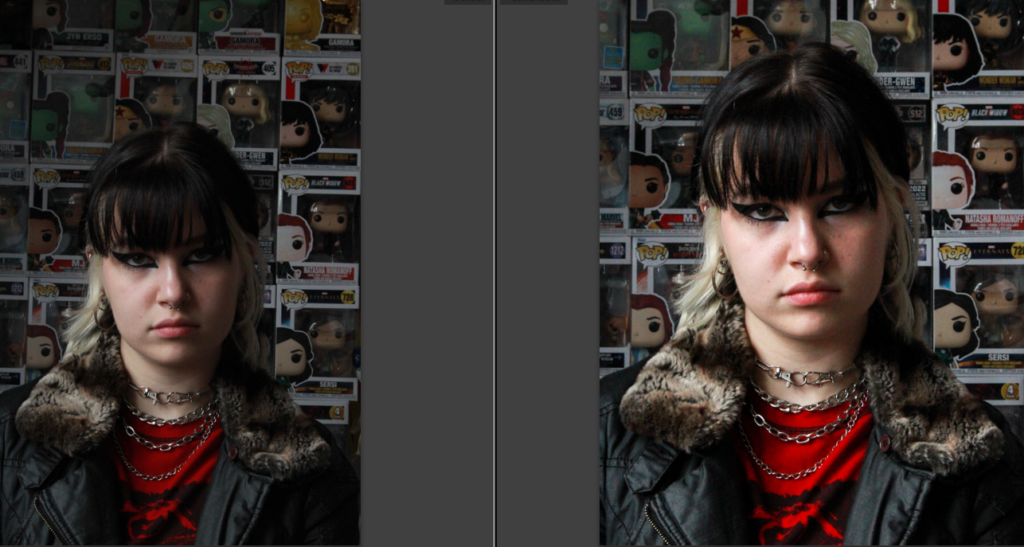
I cropped this image to make the subject more central. While I wanted the collection in the background to be apparent and add to the story communicated about the subject, I didn’t want it to take away from the main focus being the person. I also had to make the image brighter as it was quite a gloomy day as well as being quite late in the afternoon.
I increased the whites in the images to make the toys more apparent, and decreased the blacks in the image as the model is wearing a lot of black as well as having black hair and makeup.
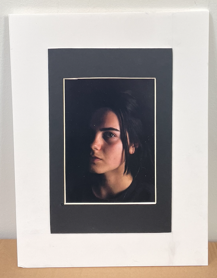
For my final pieces I mounted my images either on foam board or I created a window mount. For my first piece it was an A5 image with no other images to follow along with, therefore I mounted the image on some foam board to create a 3D allusion that the image is coming towards you. Then I have mounted that on some black cardboard in order for the image to look more professional. For the second piece I created a small window mount, I could have included that in the three piece however this image works better individually and you are able to see the photograph for itself. On my third final piece I decided to put the A3 image and my A5 image on the same card in order to have some connection to the photoshoot. I think both images worked together however I believe to improve this outcome I could of had two images on either side of the A3 image in order to make it look visually more appealing. My final piece was the most challenging piece. I window mounted three images on black card. Although the images were different colours I believe they had a narrative to them so they were all able to work together as a final piece. Even though this was the most challenging I believe that the final piece is my strongest one.
NUMBER ONE:
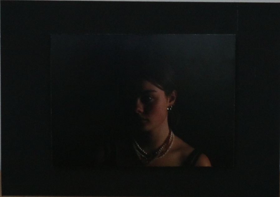
NUMBER TWO:
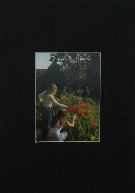
NUMBER THREE:
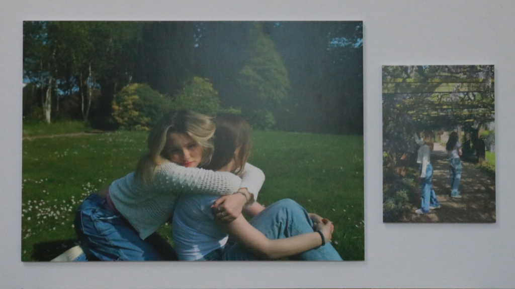
NUMBER FOUR:
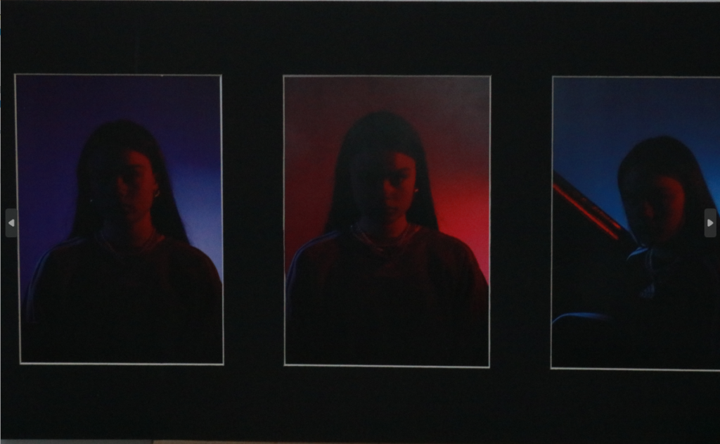
My images were inspired by two photographers, Doug Dubois and Simon Wheatley, as seen in my Final Prints

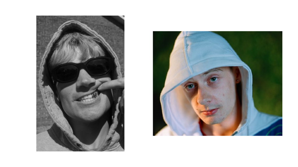

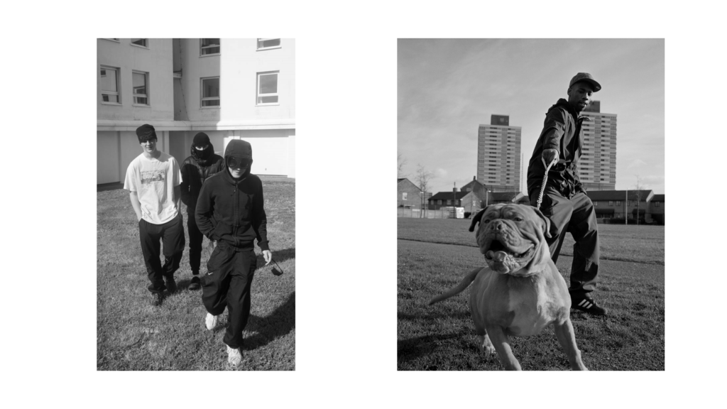
These photos i mounted up by using foam board i placed each images on foam boarded, glued it down and then cut each one out by using a knife and a metal rulers to get a sharp straight line, once each image was cut out i then placed double sided sticky tape to the back of each image and placed them on one single pice of foam board to create this final pice.
The photos below i created by cutting out each window fame, i had to work out all the sizes and measurements for this to make sure the image being placed fitted in perfectly to the mount, after i have marked out all the lines on the board i then begin to cut out the centre square, i use a special knife which cuts out on an angle which makes the white rim around the photo.
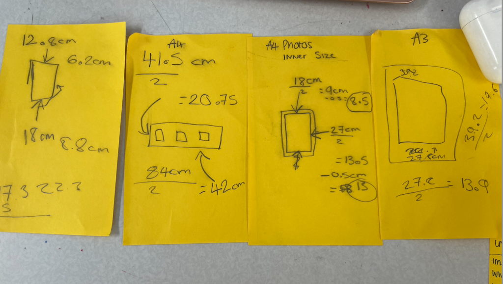
The image above is some of the measurements i used to create the window mounts.
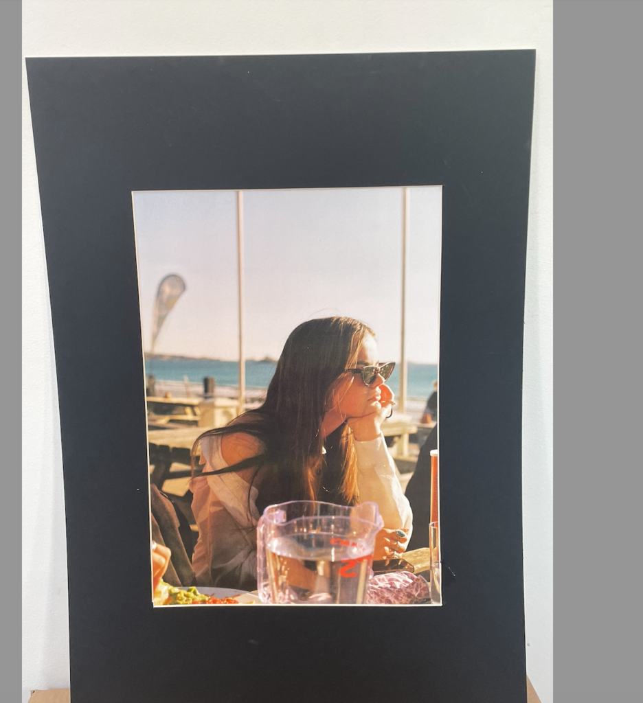
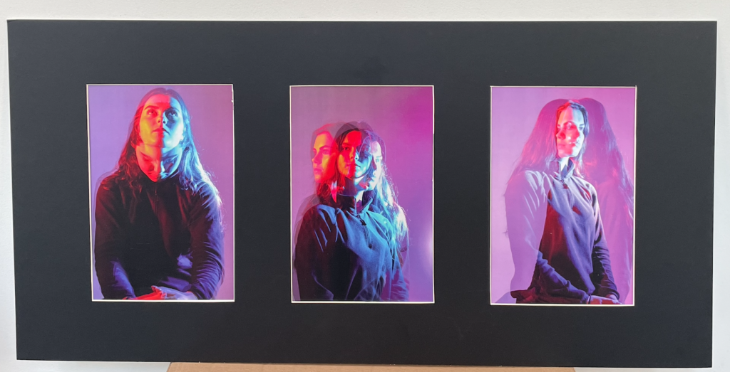
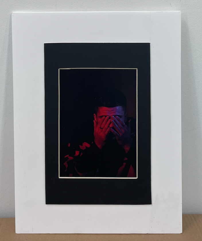
These two photos i placed the window mounted photos on to white foam board to create a second frame the white frame is 5cm wide around the whole image.
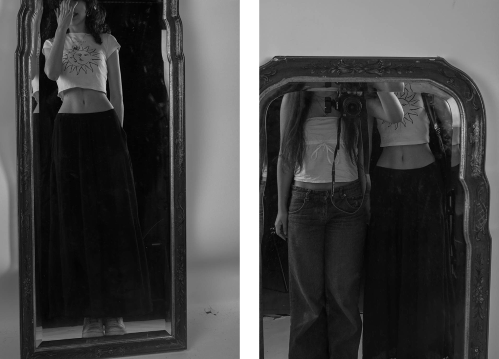
I will place both of the mirror photos together as these are the only two pictures that I have collected that involves using a mirror as a reflection. I think both of these photos will go well together as they also compliment each other .
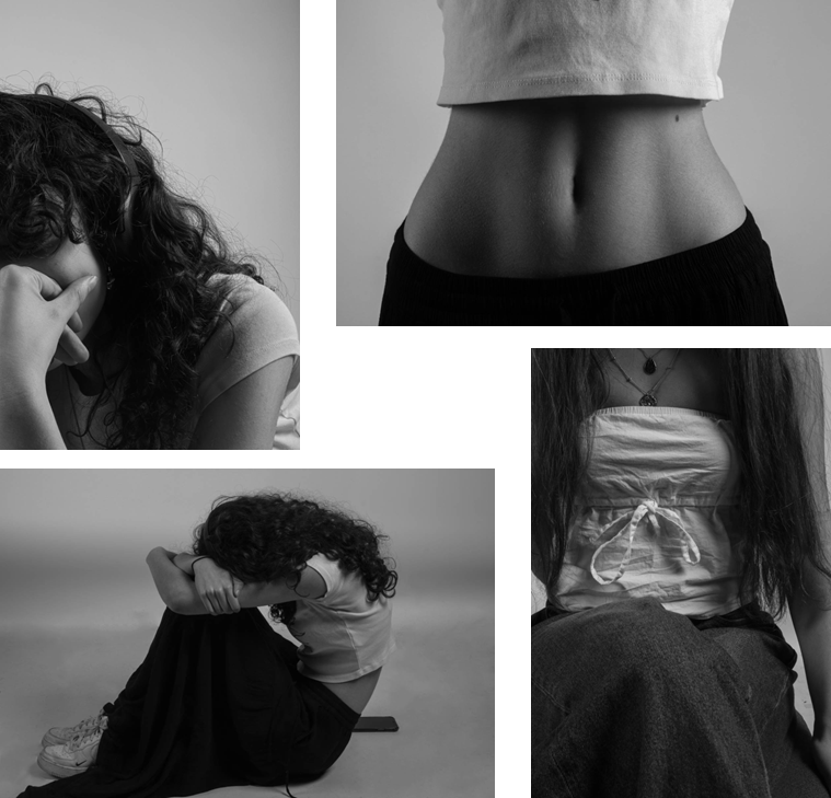
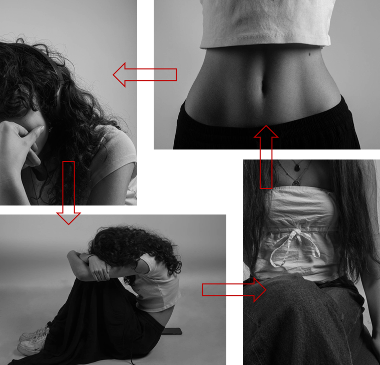
I will position all four of the body pictures together to create a squared collage of the different body parts of a female. I will be placing my photos in this layout because even though together they are shaped as a square the layout of the photos look as if its going round in a repeated circle. This represents femininity and masculinity as its an ongoing cycle which always changes. Here’s an example:
