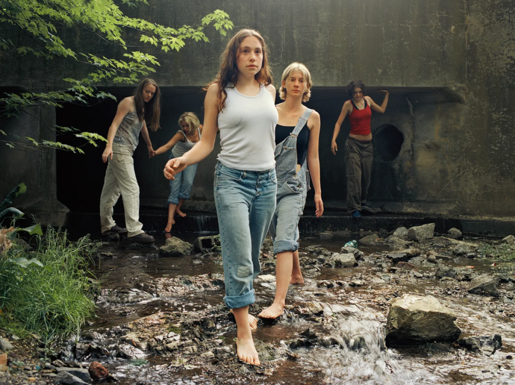
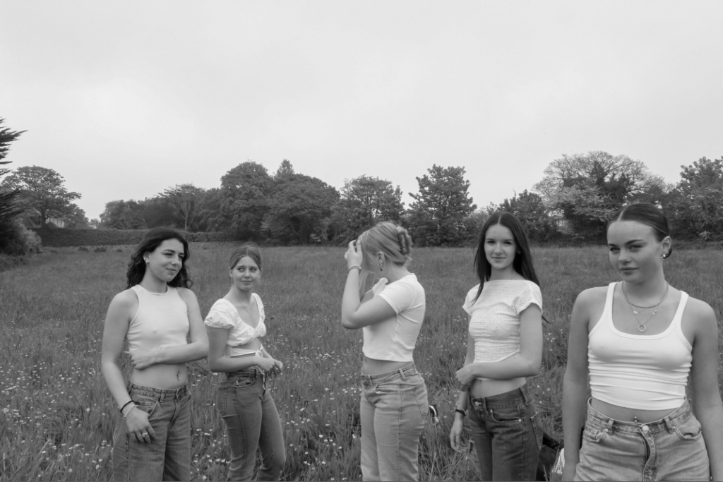
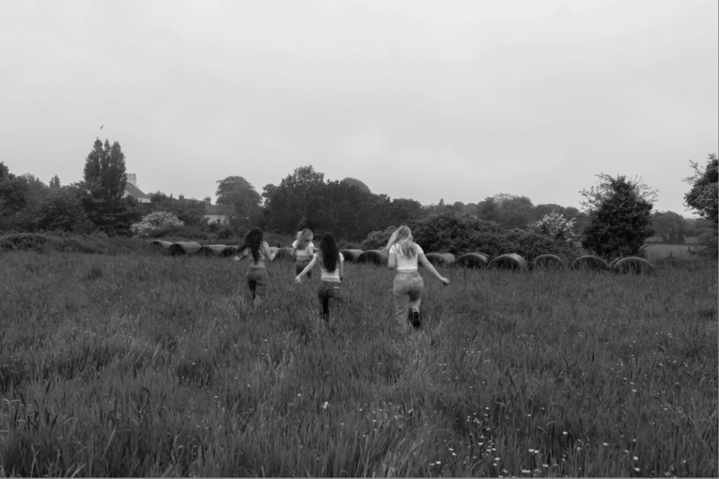
Justine Kurland’s ‘the wall 2000’ was my reference image for this comparison as it has some similarities but also many differences. one of the similarities being how two subjects are looking into the camera and the other three subjects, further away from the camera aren’t looking towards it. However, a difference is the locations of the two images, although both images are clearly taken outdoors my interpretation has an open field behind it. Whereas in the reference photo, the wall creates a feeling that the girls are trapped and their expression and clothing suggest that they are lost.

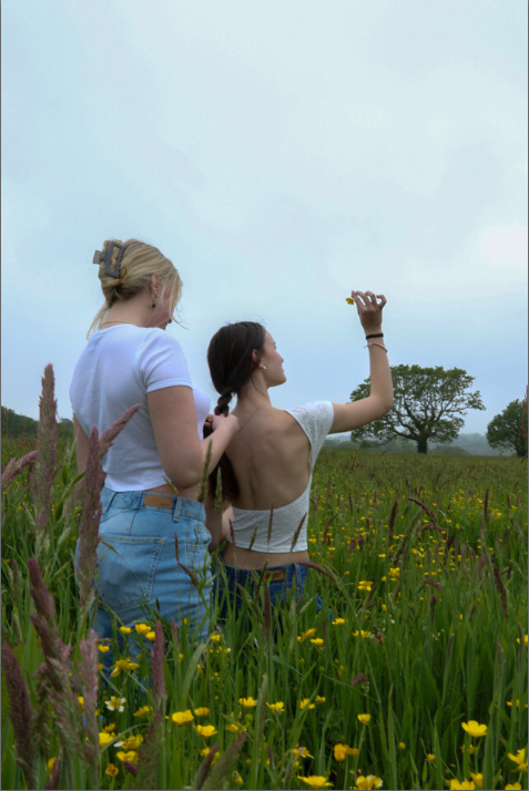
I believe these two images are quite similar as they both involve two girls and one is doing something to another’s exposed back. However, my interpretation is taken from a lower angle without water in the background.
Main image analysis:
emotional response:
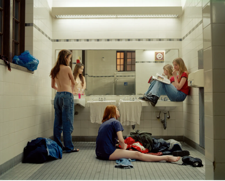
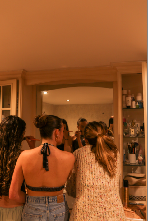
I believe that both images above show and highlight femininity in a beautiful way. In both images there are three girls in a bathroom which seem to be getting ready for something. Which has stereotypical links to femininity as it is known for a group of girls to go to the bathroom together.
Visual & Contextual:
In Justine Kurland’s image, Femininity is shown throughout by a topless girl standing in front of the mirror. This is a defining aspect of the image as it is something that all girls have however, many people could see this as a young girl being vulnerable in front of a camera. Whereas Justine Kurland views this as empowering, as the subject has confidence within her own body to show it off. Another aspect within this image is the bright pink hand soap on the top of the sink counter top which is accompanied by a girl sat near it with a glossy pink magazine which she is reading. Femininity is shown further through the girl sat on the bathroom floor next to a bag which is spewing out with clothes, who looks like she is having trouble picking out her outfit. the image seems to have been taken at dusk due to the orange light shining through the window of the bathroom. However, the bathroom is light up very bright from the lights in the ceiling and above the mirror.
When comparing my interpretation of ‘Bathroom 1997’ to Kurland’s it shows a more stereotypical idea of femininity which is less rebellious, the main focal point of the image is three girls doing their make-up. There is no natural light visible in the image, making the only light source available being the lights in the ceiling which aren’t very bright, creating a orange tint across the whole image. Towards the right of the image, you can see all of the products aligned in the shelfing which further adds into the stereotype of females.
