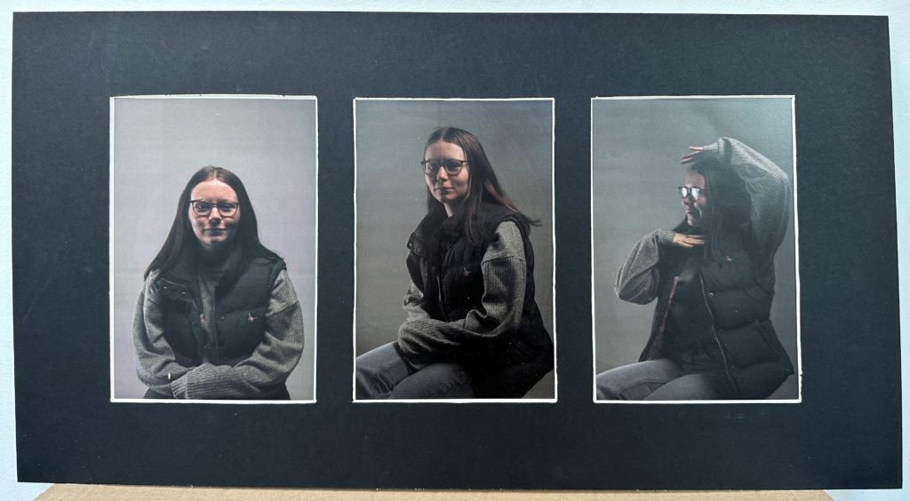
For my first final piece I took three of my studio lighting images and printed them out on A5 glossy photo paper. I then took a piece of black card and measured out on the back the centre of the card and well as measured it into thirds as I had three images. I measured my images as well to make sure that the frame would over lap the image slightly so that the viewer could not see any of the white on the edge of the image. I then cut out the frame and used masking take to stick my images on the back facing forwards. Over all I am very happy with how this piece turned out as I think the three images together looks good ad they are all the same with different poses. I also think that they window mount brings the images together well as they are a greyish colour and the frame is black.

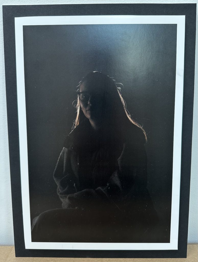
For my second final piece I printed out another one of my studio lighting portraits where I used chiaroscuro lighting to create the ring of light around the model. I printed this image on A4 glossy photo paper and then used spray mount to back it onto foam board. I trimmed this using a knife and a rule and I made sure that I left a white boarder around the image so that when I then stuck it on a piece of black card using double sided tape it separated the image from the card as they were both dark. I am pleased with how this piece turned out as I think that backing makes it look very bold and simple.

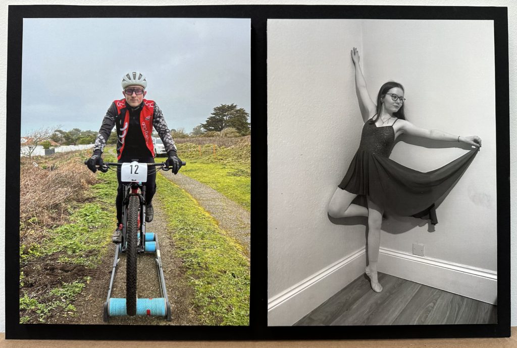
For my third final piece I used two of my environmental portraits. I decided to leave one in colour and edited one to be black and white so that they contrasted together. I printed them both out on A4 glossy photo paper and then also backed them onto foam board however, this time I trimmed it right up to the edge of the image instead of leaving a white boarder. I did this as I thought that the images were already quite light so they would look better without the white boarder. I think backed them on black card to present them together. I like how this piece turned out as I think that they image both stand out with the bright colours compared to the dark tones from the black and white. I also think that both the models contrast with the sports that they are doing.

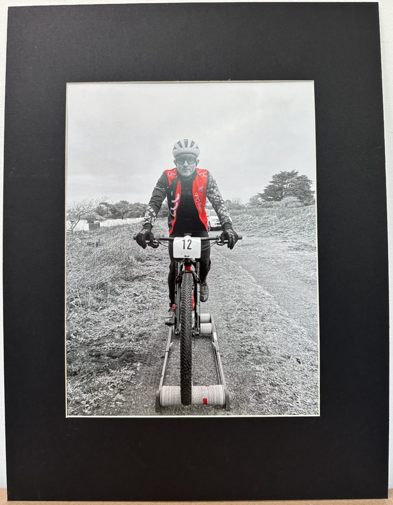
For my last final piece I used the same environmental portrait as my previous final piece however, this time I edited the image on photoshop to make the image all black and white and then used the eraser tool to add all of the red in the image back in. I did this as I thought that the red with the black and white would make the image stand out and catch the viewers attention. To make sure that it stood out I printed it on A3 glossy photo paper. I then presented it in a window mount like my first final piece. I used the same process as the first one but this time I only made one cut out in the centre of my piece of card. I then stuck it too the back with masking tape facing forwards. Overall I think that this is my best final piece that I produced. I am very happy with how it turned out and this that the contrasting colour within it makes it very bold and eye catching. I like the simplicity that the piece has as it make it a clear for the viewer to see the detail that it holds.
