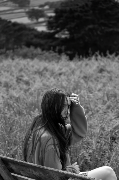
Photo 1

I believe that this is one of my best femininity images because it includes feminine aspects as well as overall looking appealing. I like the depth of field in this image too as well as the black and white drawing attention towards the model at the centre of the image. I also like how the contrast makes the image more eye catching.
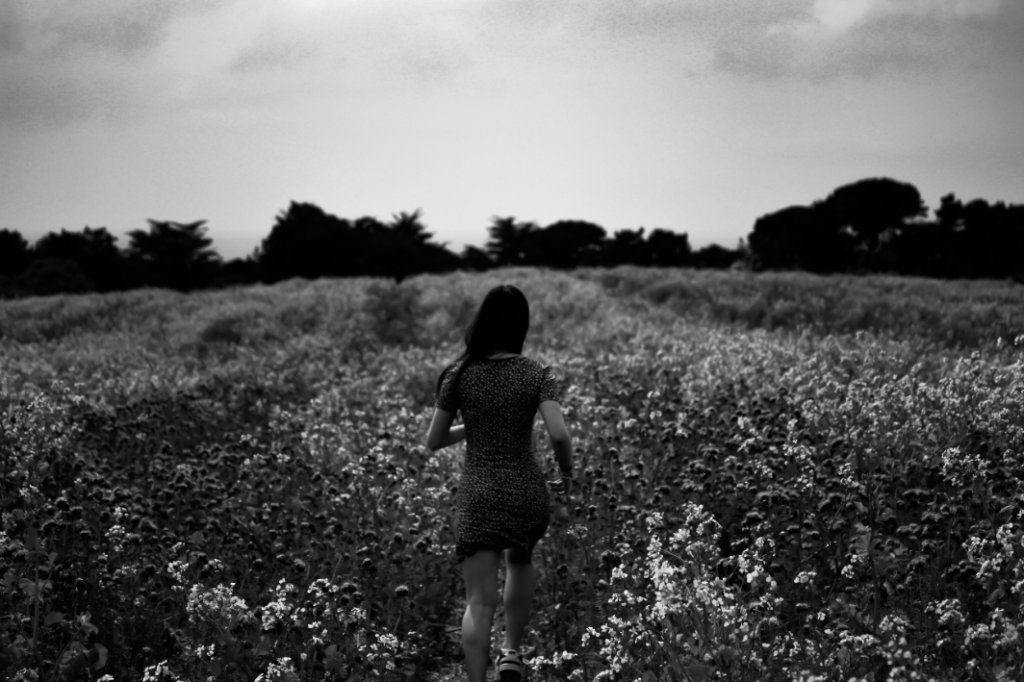
Photo 2

This image is good due to the depth of field and low exposure. The contrast between the model and the background is also nice as it makes her stand out as a focus point for the image.
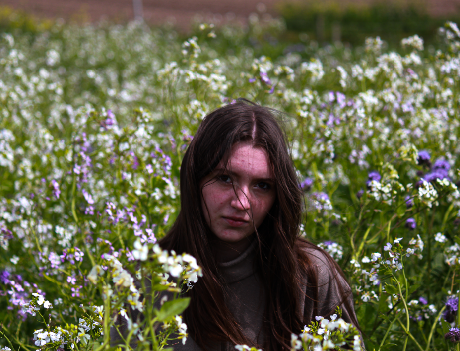
Photo 3

Once again, I like the depth of field in this image as well as the contrast between her dark hair and the bright flowers. I also like how saturated the image is as it makes the image seem more feminine due to the brighter colours.
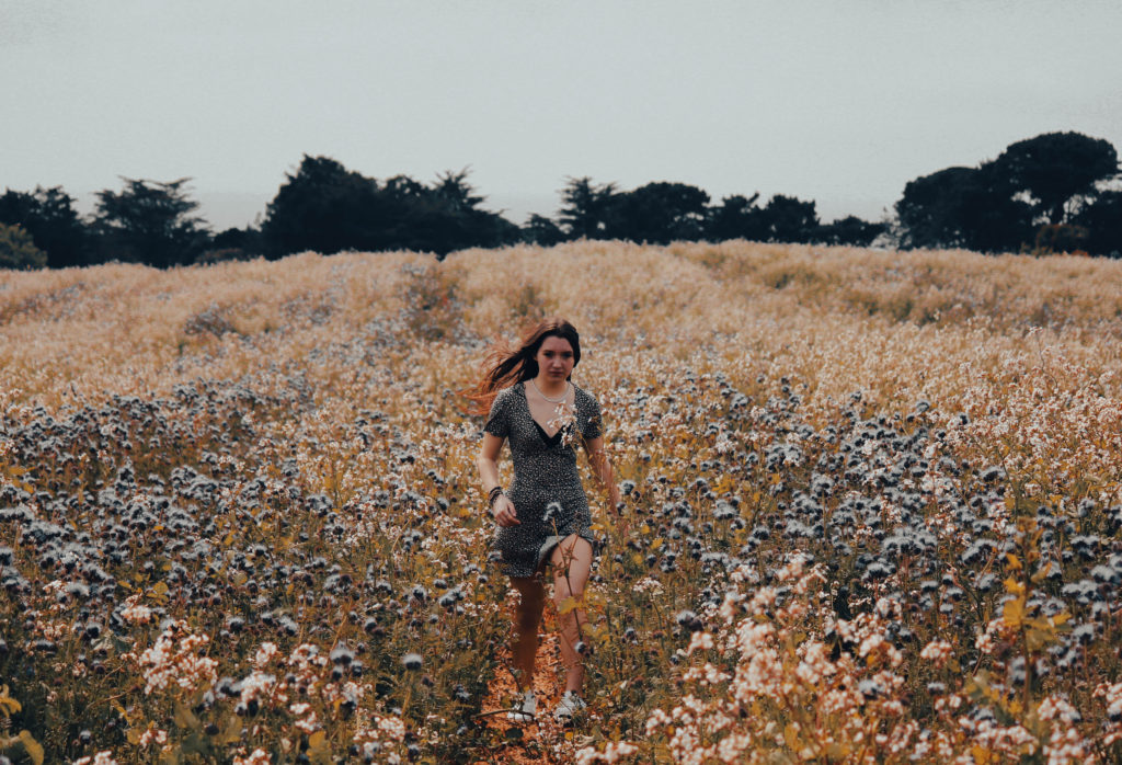
Photo 4

With this picture, I like how the warmer tones in this image produce a more autumn feel to the image. This makes the picture have more of a creative aspect to it since autumn is often associated with creativity and harvesting. I also like how the warm tones on the bottom of the image contrast to the use of cooler ones on the top.
