Set 1
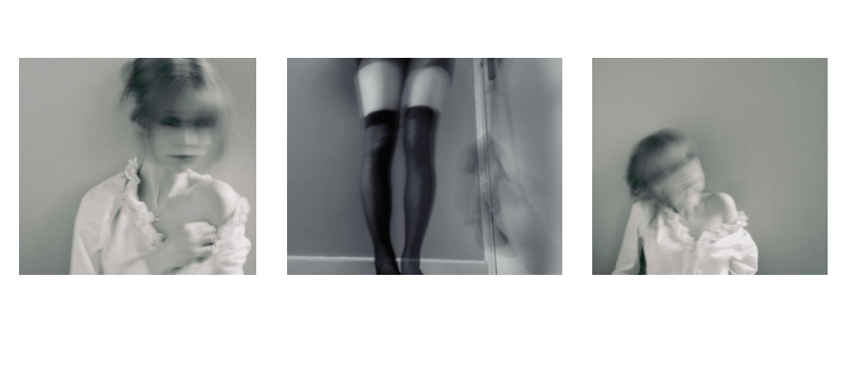
I want to make these pictures look like shots from a old movie, so I will put these in this order on a white foam board. Each of these photos is a A5, as this size is more manageable and easier to put together. I think I will put them on a black background, creating contrast. I will elevate the middle photo on a piece of foamboard too, making it stand out and causing the mount to have more depth.
Set 2
This picture will be framed by itself, as it is A4 and I think it will be more effective by itself.
Set 3
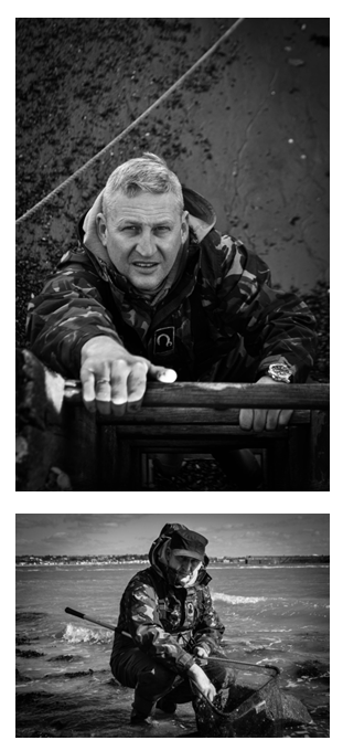
I will frame these two pictures together, and since the top one is A4 and the bottom one is A5, I think they will line up together perfectly. Also they are both based on the same environment, so I think they should be presented together.
Set 4
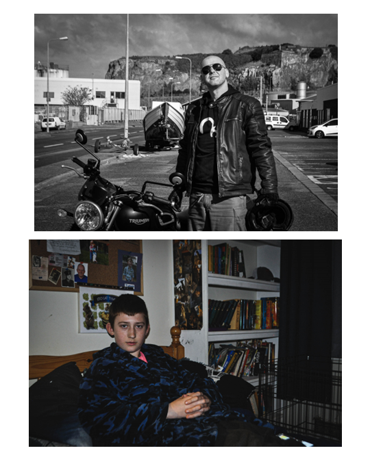
I will frame these two together since I think the contrast between bold colour and black and white is very effective. They are both A4 so they will match up well, but I will mount the bigger one below. The themes (outside/inside, comfortable/dressed up) also another aspect of contrast between these two environmental portraits.
Set 5
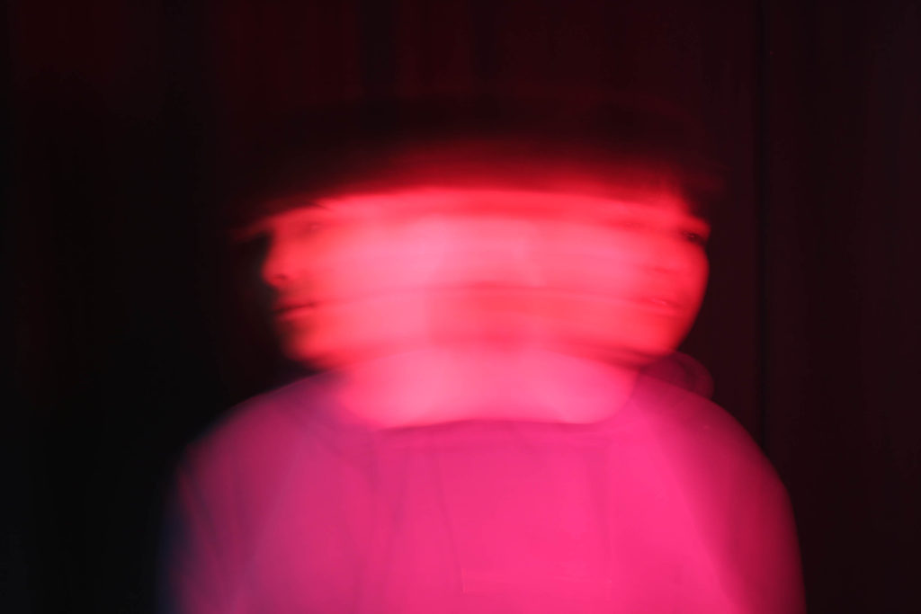
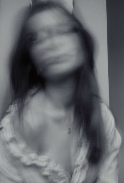
This photo will also be mounted by itself since it is very abstract and I think it would be confusing if it was framed with others. It is A4 so it is big enough to present alone.
Set 6
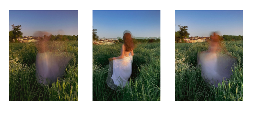
These pictures will be printed as A5, and I will mount them together in a line. The middle is the one with the most defined figure, and I think it will look effectives with two more abstract images on the sides.
